Tuesday, November 1, 2022

Most Challenging InkTober

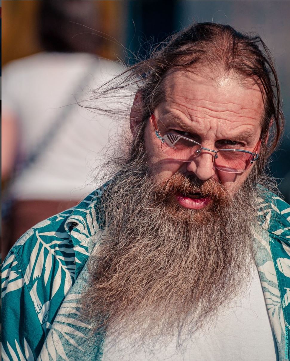
10/22/22 I took longer with this drawing than usual because I was 
participating in Fran's live demo as I drew. She offers a couple of live
draw-along demos with each course.

After my enthusiasm for caricature fizzled (at least with humans), I was still thinking about how I wanted to continue working on portraiture for the remainder of InkTober when France Van Stone saved the day again. She sent another free recorded demo to promote her new Draw Along with France course on drawing critters. It was to feature more of the quick-and-dirty crosshatching techniques she had taught in the previous course except the photographed models would all be animals instead of humans.


Image provided by France Van Stone


My Day 22 InkTober sketch is of Bleu, the French bulldog belonging to one of France’s students. That adorable face was just the fun reprieve I needed. Drawing animals is so relaxing and unpressured compared to humans! Our brains are so keenly wired to learn to recognize human faces that it’s almost impossible not to fixate on resemblance. A drawing of a dog, on the other hand, will be forgiven much more readily. (And a dog will never complain if I make it look fatter or older.)

I was tempted to finish off InkTober with animal portraits, but I knew that human faces would always be the greater challenge. With fresh resolve to keep going for the rest of the month, I pushed on with human portraits.

Days 23 and 24 felt like wins, not so much for resemblance as for crosshatching young skin without the Wolfman look.

10/23/22


10/24/22


10/25/22


10/26/22


10/27/22


On Day 28, I masochistically chose a reference photo with flat lighting, young skin and exposed teeth. I won’t catalog all the ways in which this one went wrong, but I didn’t make that mistake on Day 29: I chose a much easier photo with strong, dramatic lighting and older skin. I did a little better on the exposed teeth. I’ve always believed that profiles are easier to draw than full-frontal portraits because only half the face needs to be drawn. But the curve of the forehead, angle of the nose and even angle of the chin are all challenging (and affect resemblance as much as other features).

10/28/22


10/29/22


For Day 30, I chose the same reference photo I used back on Oct. 13. Using two shades of gray Uni Pin fineliners then, I struggled with the tilted, rotated head, and it was no easier the second time.

10/30/22


Day 31: After abusing the faces of strangers all month, it was appropriate for me to finish InkTober by giving the same treatment to the face I know best. I say it’s the face I know best, but do we ever know our own face until we attempt to draw it? I’ve made plenty of self-portraits in the past 11 years (including a hundred I made during my first few months of sketching), and each has been humbling. (Self-portraits are not for the vain.) However, a month of portraiture did teach me two things: to avoid unflattering lines, the face should be softly lighted from one side; the teeth should not be exposed.

10/31/22

Selfie


On a whim, I tried a new material strategy with the selfie: I used a 1mm point Bic for most of the drawing, and at the end, I used a 1.6mm Bic for the darkest values. (It’s the ballpoint equivalent of starting with an HB pencil and finishing with a 4B.) The finer point is a bit less harsh and hairy for facial crosshatching (avoiding the Wolfman look on my own self-portrait is mandatory). In addition, I can avoid using the blobby, drooly broad point until the end. I wish I’d thought of it earlier in the game – it’s a winning combo.

General InkTober learnings and observations: One thing I’ve observed during France’s demos is that she spends very little time blocking or measuring, which enables her to spend most of her time on rendering values by crosshatching. I spend more of my allotted time measuring and remeasuring proportions because I don’t have enough practice with portraits to be confident about eyeballing them. I’d like to be faster and more confident with the measuring part so that I can get the darker values darker and still spend the same length of time on the sketch overall.

This year was by far my most challenging InkTober. It was also my most satisfying because I pushed myself the farthest out of my comfort zone in material, technique and certainly subject. Despite this, I found myself looking forward to each day’s drawing. I like the ritual nature of doing something similar but different every day – for a clearly defined, limited time. (The ritual nature is the aspect of my 407 daily hands that appealed to me – except that I didn’t know when they would end. That part I didn’t like.)

The easiest aspect was that my chosen subject meant that I could simply grab an image every day from Earthsworld’s rich and varied bank of reference portraits. If you ever need reference photos for portrait study, I highly recommend his work. (Except as noted, all reference photos in this post are by Earthsworld.)

Monday, October 31, 2022

Speed


10/25/22 Maple Leaf neighborhood (9 minutes)

The online courses I’ve been taking with France Van Stone this month have got me thinking about speed – how long I take to make a sketch. France often talks about how her natural proclivity is to spend hours on a single drawing, meticulously and meditatively crosshatching every detail until she is satisfied with the result. The downside of this approach is that she would need a solid block of time (or several such blocks) to draw, but once she became a parent, those blocks of time were no longer possible. Frustrated, she began to develop faster drawing methods that would accommodate her busy life while still giving her the satisfaction of continuing a regular drawing habit. Even if the result wasn’t the same finished quality that she might have preferred, it was more important to her to draw regularly than to draw only when some chunk of time materialized.

Speed is not an aspect of drawing that I consciously thought about until I had been at it for a while. During my early years, I just took as long as I needed to, and sometimes that was frustrating when the subject (a car or a person, for example) disappeared before I could finish. But when I was a beginner, it didn’t do much good to try to draw faster – I only had one speed, and I didn’t know how to vary it. I also didn’t have the experience to know that if I used smaller pages or different media or simplified the composition, I could save time.

11/2/11 Maple Leaf neighborhood. Made through my studio window only a month or so after I had begun sketching, this early urban sketch was an attempt to capture elusive sunrise colors in a 9x12 sketchbook. I recall clearly the frustration of seeing the light and colors change by the second and not knowing how to paint them on any scale, let alone in a large sketchbook.   

Maybe it was my experiences while traveling, especially in the company of non-sketchers, that made me conscious of how much time I took to make a sketch – and taught me to speed up when I wanted to.

Perhaps I’m being presumptuous, but I think that anyone can work on a single drawing for many hours, continually correcting, fixing and changing, and eventually arrive at a result that looks resolved (though possibly overworked). I say this because I’ve seen the works of certain artists who are able to make a polished studio drawing, yet they have a much harder time making a spontaneous sketch in a short time, especially on location. I also know this from my own experience: When I’ve made carefully studied botanical drawings, I know the laborious hours I’ve put into them to make them look finished. It seems counter-intuitive, but to arrive at the point of being resolved in 15 or 30 minutes is much more difficult. By “resolved,” I mean the point when a sketch includes everything I wanted to include, and the page tells a complete story.

9/15/22 In a dental waiting room. Definitely an unresolved sketch.

In the 11 years that I’ve been drawing, I’ve gained many skills, either from books, from instructors, or on my own. The one I value most and that serves me best every day is my ability to draw fast. Or more precisely, it’s my ability to adjust my drawing speed as desired – a skill that comes mostly from experience and that I am constantly refining.

That’s the main reason I’ve been focusing this month on making crosshatched portraits in 30 minutes or less. If I took more time, I know I could make them look better or at least more finished. But how much can I capture and still have the sketch look somewhat finished in a half-hour? That’s a much greater challenge. I’d like to be able to choose any subject I want to sketch, decide how long I want to (or can) spend on it, and still end up with something resolved on the page – not half done (or, for that matter, not overworked).

France is an ideal teacher for this goal, as she seems to set herself a time goal with every demo. “I think I can do this in about 20 minutes,” she’ll say, as she sets her timer. Indeed, when her timer goes off, her drawing has reached a stage that looks resolved. She knows her own sketching speed well enough to know when she’ll reach that stage. She also sometimes says she might keep going to darken some values or add details she’s interested in, but even without those additions, she finds the drawing acceptably finished. It took her many years of drawing to be able to gauge her own speed accurately.

7/30/19 An hour-and-a-half with graphite by a Delft canal: my choice.

Of course, I don’t always want to sketch quickly. After the extreme heat and hustle-bustle of the 2019 Amsterdam Urban Sketchers Symposium, I welcomed the cool, calm serenity of Delft a few days later. Sitting by a canal (yes, I actually brought out my stool – I knew I would be there a while), I took nearly an hour-and-a-half to make a sketch in graphite and enjoyed every minute (at right). Sometimes I take my time – but I want the speed to be my choice.

On a walk last week, it was cold and windy, and a dark gray wall above the horizon promised rain. I was thinking about how I hadn’t sketched any Halloween decorations or even a pumpkin (well, except the huge one, of course) yet this year when I spotted a house with a nice spider web across most of its front yard (top of post). On a warmer, sunny day, I might have wanted to spend a half-hour making this sketch. But on that chilly morning, I didn’t want to take more than 10 minutes. I was done in nine. It’s a handy skill.

Sunday, October 30, 2022

Street of Color


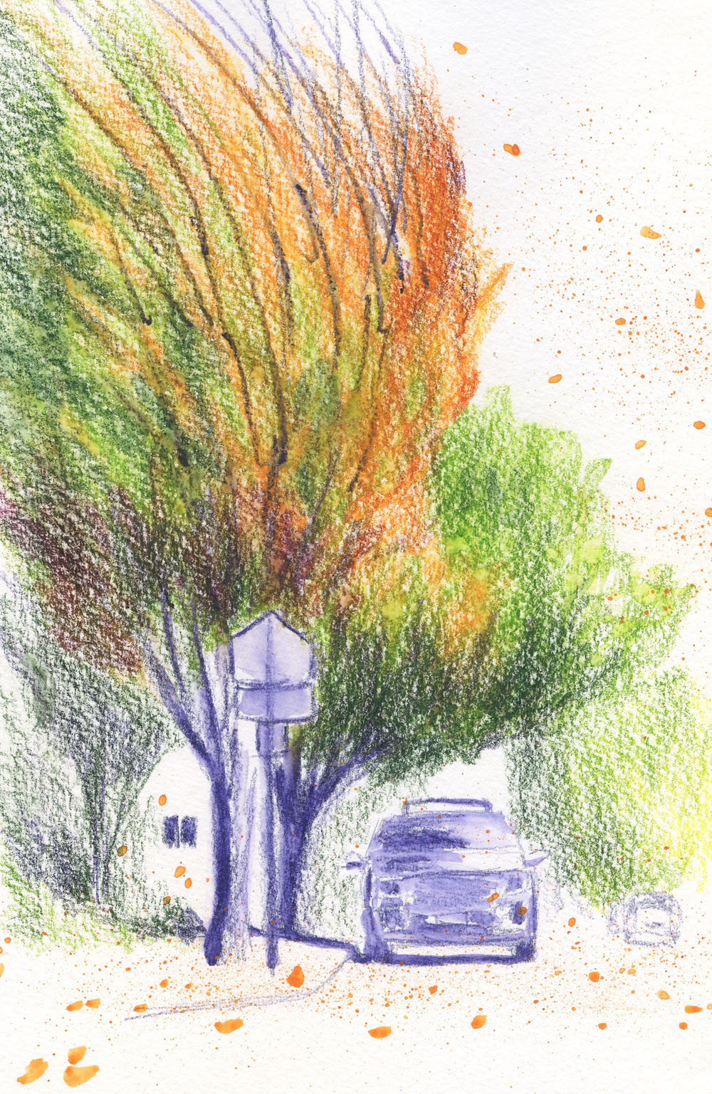
10/27/22 Bryant neighborhood

The “atmospheric river” that the media had been warning us about was preceded by high winds last Thursday. I knew that many trees would be bare by the time all the wind and rain stopped, so I needed to get out there pronto if I wanted any more leaves to peep. The temperature was mild enough by afternoon that I could have stood on the sidewalk to sketch this brilliant street of color, but I stayed in my car against the strong gusts.

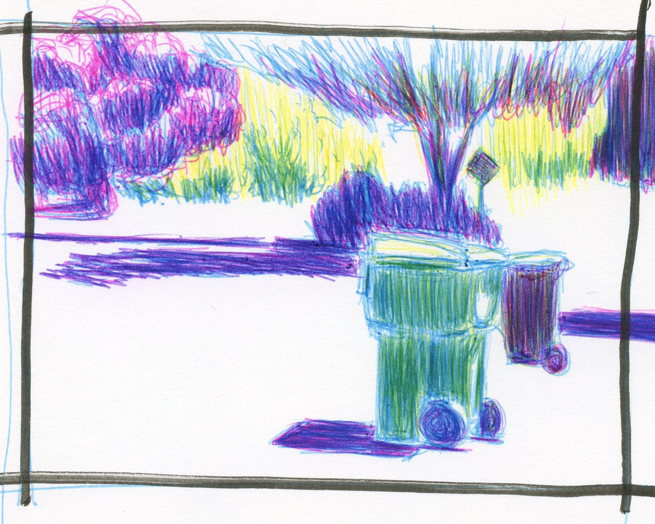
Later that afternoon, I took a walk through the ‘hood and counted no less than 13 empty trash cans that had blown over! I wish my FitBit would give me extra credit for walking against the wind – it’s quite a workout!

Trash can down!


Saturday, October 29, 2022

Rosita’s Tree


10/26/22 Green Lake

The trees in the Green Lake neighborhood are really showing off their colors. Walking through the neighborhood, I spotted several that I wanted to sketch, but often the best views required standing in the middle of an intersection or other awkward places (unlike Maple Leaf, where I have sketched by standing in the middle of the street, Green Lake has too much traffic for that).

Across the street from Rosita’s Mexican Restaurant (one of few Green Lake restaurants that haven’t changed in recent years), I spotted a brilliant tree whose top half caught the partly cloudy morning light – with bonus crane behind it.

I hope this isn’t the last of my leaf peeping/sketching, but we have the first “atmospheric river” of the season coming in.

Friday, October 28, 2022

Pencil Fix from France’s Critters


10/24/22 "Gavi" (Prismacolor in Stillman & Birn Zeta sketchbook)

Although I’m thoroughly enjoying giving ballpoint crosshatching a solid workout for InkTober, I’ve also missed my pencils. Fortunately, just as this week’s rain has kept me indoors most of the time, France Van Stone released her newest course in drawing critters. Since the course is a follow-up to her three-part crosshatching series, the demos incorporate all the techniques taught previously with an emphasis on the quick-and-dirty methods of Part 3. Although she demos with her favorite Bic ballpoints, she encourages participants to use any medium and practice drawing from the same photo multiple times with different media. I appreciate her focus on the process of regular practice over results.

As a relaxing counterpoint to crosshatching human portraits with ballpoint, I decided to follow France’s critter lessons by crosshatching animal portraits with pencil – both colored and graphite. I say “relaxing,” but that doesn’t mean the exercises are less challenging – they definitely aren’t. Animal portraits are just as challenging as humans. The relaxing part is that there’s less pressure for the result to resemble the model (which is not the goal, France says, but the pressure is still there).

Many of the reference images come from France’s students. One is a beautiful photo of Gavi, a yellow lab, taken from below his chin. The lovely backlighting fringing one side of his head was challenging to capture. I wanted to spend only about 30 minutes on this exercise, but if I had taken more time, I would have put in a bit of dark background on that side of Gavi’s face to bring out the backlighting.

10/22/22 "Pixie" (Polychromos in S&B Zeta sketchbook)

Why didn’t I just take the time to do that? Maybe I will when I draw this dog again sometime; France encourages us to take as much time as we want to. Most of her demos are within 30 minutes, though, and I really enjoy pushing myself to finish small drawings (mine are all about 4 or 5 inches) within that timeframe. I’ve been doing that with all of my InkTober drawings too, and I can see that I’ve gotten better at blocking proportions and crosshatching darker values more quickly with practice. It’s remarkable how much France can accomplish in about 30 minutes, and I know she got there only with lots and lots of practice. I’m on it.

Pencil notes: These critter exercises are giving me my colored pencil fixes during InkTober, but I must say that it is not as satisfying as I would like. I made the same discovery when I tried crosshatching with graphite at the beginning of the month. One characteristic of using colored and graphite pencils that I love so much is the gorgeous tonal modulation that’s possible. The rigid marks of rapid crosshatching removes that beauty.

On “Pixie,” I used Faber-Castell Polychromos colored pencils. Their hardness made the crosshatching more visible and also made it difficult to build dark values. Polychromos pencils require more traditional (slow) layering of light pigment application for best effects.

To draw “Gavi,” I switched to a soft Prismacolor. I preferred the effect here with less visible crosshatching, and it was easier to build tones quickly with soft pencils (as I’m used to doing on location – slamming down color rapidly with super-soft Caran d’Ache Museum Aquarelles). The downside is that I had to sharpen frequently, which doesn’t bother me when I’m taking my leisurely time with a sketch, but it is annoying when I’m trying to work within a timeframe.

Images provided by France Van Stone


Thursday, October 27, 2022

Bic CMYK Colors (and Cristal UP Comments)


10/19/22 Bic 4-Color pens in Stillman & Birn Epsilon sketchbook
 (photo reference)

Does anyone remember my SuckUK incident? Early this year, I learned that a company with the unfortunate (and ultimately appropriate) name of SuckUK makes a ballpoint multi-pen containing the four CMYK colors: cyan, magenta, yellow and black. With my ongoing interest in CMYK primary triad mixing, I couldn’t resist giving the pen a try. While I applauded the company’s unique, innovative concept, my applause ended abruptly – as soon as I used it. After I wrote the review, I put the pen aside and dismissed it as another good idea poorly executed.

Fast-forward to a couple of weeks ago when a thoughtful blog reader brought this tip to my attention: The turquoise, pink, yellow and black inks contained in special editions of Bic 4-Color pens are, in fact, CMYK hues! Cue the exploding brain emoji! I could make my own CMYK multi-pen by putting the four ink refills into the same body – the SuckUK concept but with my beloved Bic inks!

The cutest way to get the two necessary 4-Colors

Black is available in all standard Bic 4-Colors, but the other three colors are not. I immediately went to my collection of Bic 4-Colors for the inks I needed. If you want them, the one containing turquoise and pink (along with purple and lime) is the “fashion” edition. The one that includes yellow (with orange, purple and pink) is called the “Sun” edition. The easiest (and most adorable) way to get both is to spring for the Bic 4-Color pen holder collection that looks just like a giant 4-Color pen (the holder is as cheesy as the pens in material and construction; remember, we buy Bics for their inks, not for their bodies or cases). I just happen to have that holder assortment, so I was golden.

First, I made a mixing swatch and immediately liked the secondaries that the C, M and Y could make (below). But what impressed me was the black that came together with the three primaries – I didn’t even need the black refill!

Mixed Bic CMYK hues


Trapped in the house during our seemingly endless days of hazardous smoke, I made this sketch on a trash day – what an ironic heartbreaker to have to resort to using a reference photo! But I was instantly cheered up when I saw the brilliant mixes I could get from Bic’s version of cyan, magenta and yellow.

Just for fun, I also mixed the three secondary colors that
are included in the two 4-Color assortments shown above.

As much as I enjoy drawing with Bics, I use them mostly for layered tones and, just lately, crosshatching. It’s unlikely that I would use Bics much as a coloring medium. Still, it’s good to know I could use Bics for full color if I wanted to (like on my trips to Gilligan’s Island). And color geek that I am, I was tickled to learn of this potential of Bics that had not occurred to me, despite owning all the colors. (Thank you, Dee, for bringing this to my attention!)


Bic Cristal UPs


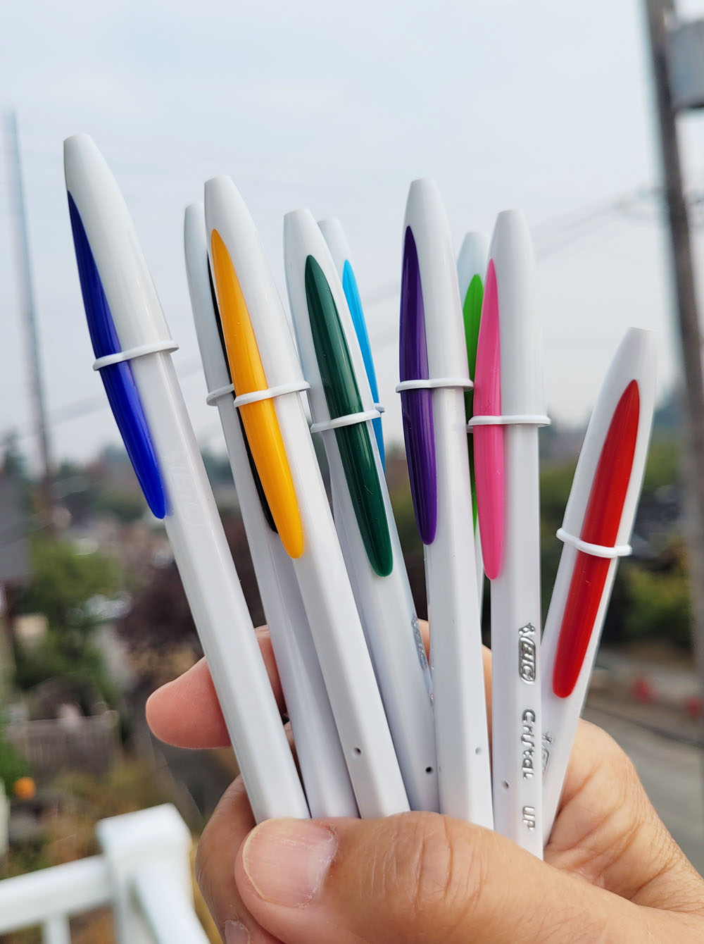
Since Bics are on my mind during InkTober, I’ll also briefly mention one that I learned about from members of the Bic Cristal Facebook group (yes, of course, there’s a Facebook group for that). Because France Van Stone favors “extra bold” 1.6mm Bic Cristals, I had used mine for several exercises in her crosshatching course. I appreciate the bold point that makes crosshatching faster, but the drooly, blobby ink is messy. I eventually switched to my favorite 4-Colors, which have 1mm “medium” points. That’s when I learned about the Bic Cristal UP, which is a separate line of Cristals with a 1.2mm point – just slightly larger than a standard 1mm Cristal and Bic 4-Colors.

I bought a pack, thinking that the Cristal UP might be a nice middle ground between the 1mm and 1.6mm. It is that; and the Cristal UP comes in nine colors (unfortunately, not yellow, or it would be another way to get the CMYK hues). However, its barrel is cheesier than a regular Cristal with a slightly rough texture. The feature I appreciate most about the 4-Color (other than being a multi-pen) is its thicker, more comfortable barrel. I’ll keep using the UPs for InkTober, but I’m not sure the cheesy barrel tradeoff is worth the slightly larger point size. It’s too bad the UP ink cartridges won’t fit into the 4-Color barrels.

Bic Cristal UP: Good point size; cheesy barrel

Wednesday, October 26, 2022

Maple Leaf’s Big Pumpkin


10/23/22 "Magnus" waits to be weighed as neighbors join the festivities.


The Maple Leaf neighborhood is not the kind of place where big things happen. That’s why I was stunned to hear that two neighbors’ pumpkins had attracted media attention: King 5 Evening, a local TV program, had featured the humongous pumpkins that were growing next door to each other. The two gardeners had been having a friendly pumpkin-growing competition each year since the pandemic began. The one with the larger pumpkin this year publicized an event last Sunday to find out how much the pumpkin weighed. Kate and I decided it was an event worthy of sketch reportage!

Almost more amazing than the pumpkin was the huge crowd it drew. The two pumpkin neighbors had turned the weigh-in into a block party with beer and barbecue. Kids and dogs got their photos taken with the huge pumpkin suspended from a scaffold. Another neighbor walked around with a clipboard taking $1 wagers to guess the weight. The Maple Leaf community usually has an annual summertime ice cream social, but it didn’t happen this year, so neighbors were apparently craving an event.

Named Magnus, the pumpkin weighed in at 969 pounds! I had put my dollar on 798 pounds, so I was way off, although the scale was having issues, so it’s possible the weight isn’t quite accurate. But when a pumpkin is the biggest neighborhood event of the year, who cares about accuracy?

"Jack Skellington," the smaller pumpkin, attracted no attention at all, so we took our selfie with him.

You can buy Magnus' seeds and grow your own
humongous pumpkins next year.

The morning before the event, I went to see where
the pumpkin lived. Magnus was still asleep in his
sleeping bag.


I walked only 10 minutes to see the big pumpkin, but Kate drove up all the way from Renton! A dedicated sketch reporter.

Related Posts Plugin for WordPress, Blogger...