Thursday, September 8, 2016

New T-Rex at the Burke

9/7/16 colored pencils, brush pen
Paleontologists at the Burke Museum dug up a new T-Rex skull in northern Montana! It’s one of only about 15 relatively complete T-Rex skulls in the world.

I knew that the skull would be covered in protective plaster for a long time until workers could carefully reveal it, but I went over to the Burke today to sketch it anyway. It’ll make its first unplastered public appearance when the new Burke (now under construction) opens in 2019. You can bet I’ll be there then to sketch it again.

9/7/16 colored pencils
Meanwhile, to get a smaller skull-sketching fix, I went over to one of my favorite areas of the museum where a whole wall is filled with various skulls. This one belonged to a steller sea lion. (Fountain pen with wash used to be my favorite way of sketching skeletons, but lately I’m really liking white colored pencil or gel pen on my orange Field Notes.)

Wednesday, September 7, 2016

A Pair of Pears

9/6/16 colored pencils, Stillman & Birn Epsilon sketchbook
These pears I got at the farmers market are still not quite ripe enough to eat, so I got two more chances to sketch them. First I sketched one with conventional (oil-based) colored pencils, and then finished it with the blender tool. Then I sketched the second one with water-soluble colored pencils. In the second case, although applying water blended the colors quickly, it also smoothed out the natural texture and color gradation that actually look more like pencil strokes in the pear’s skin. So after the water dried I went back in with pencil and put some of the texture back in.

9/6/16 water-soluble colored pencils, S&B Zeta sketchbook
While I like the smoother Stillman & Birn Epsilon and Zeta surfaces (similar to hot press watercolor paper) with conventional colored pencils, when using watercolor pencils, I think I prefer the texture of Alpha or Beta. The tooth is helpful in picking up pigment quickly, and if water is applied afterwards, any paper showing through gets covered easily.

(Can you tell I’m having fun experimenting? ☺)

Tuesday, September 6, 2016

Book Review: Stephanie Bower’s Understanding Perspective

Architect, artist and instructor Stephanie Bower is well-known in the Urban Sketchers community for her sweeping watercolors of landmark architecture as well as more ordinary buildings. Lucky students in the Pacific Northwest (her home is in Seattle) and Urban Sketchers symposium attendees have been illuminated by her “Good Bones” workshops that focus on architectural perspective. Now anyone can learn her methods from her new book, the latest in The Urban Sketching Handbook Series: Understanding Perspective: Easy Techniques for Mastering Perspective Drawing on Location.

Beginning with basic terms and principles related to understanding perspective, the book moves on to its heart: analyzing a view’s potential levels (eye; bird’s eye or aerial; worm’s eye) and angles (one- and two-point perspective; multiple vanishing points). While beginning and intermediate sketchers might choose one-point, eye-level perspective, more advanced sketchers can use the same techniques to challenge themselves with a scene of multiple buildings, each rotated so that none is parallel to another.

The how-to section breaks down perspectival drawing into layers – what Stephanie calls the Shape of the Face, the Shape of the Space and the Shape of the Box. Each step is fully illustrated to explain the concept. In addition, many sketches, either by Stephanie herself or other urban sketchers worldwide, are shown as examples of the concepts taught.

In the final chapter, perspective challenges unique to architecture, such as arches and domes, are covered, as well as more general challenges like ellipses and reflections.

Steve Reddy's sketch of utility pipes was
drawn from a 3-point, aerial view.
While the book is worth skimming for its beautiful location sketches (you’ll find many of your favorite urban sketchers here), those illustrations are not just eye candy. Unique among the many current books focusing on urban sketching, Stephanie’s book is full of sketches annotated with the artist’s view when the sketch was made as well as the number of perspective points. These notes are not limited to architecture. If you’re like me, you might think about perspective issues only when drawing architecture, but perspective principles apply to everything (even clouds! Stephanie points out), and these annotations are surprisingly helpful in driving that point home. For example, Steve Reddy’s sketch of some utility pipes was drawn from a three-point, aerial view (looking slightly down on the pipes from a seated position). An accompanying diagram shows how the lines in his sketch could be extended to a third vanishing point below ground.

Urban sketchers of all levels can be inspired and challenged by this technique-rich volume. It’s a welcome addition to the Urban Sketching Handbook series. 

Monday, September 5, 2016

UK Sketchbook Bound; Back to Rolling My Own

My UK sketchbook is covered with a collage of maps and ephemera from
places we visited. 
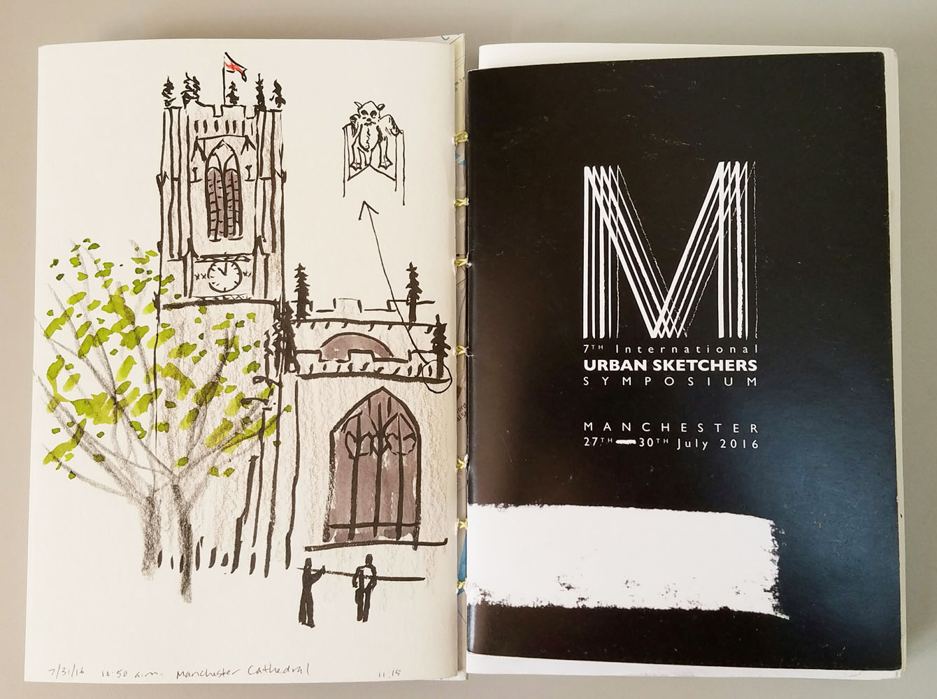
It’s been a month since I got back from the UK, and I finally finished binding my sketchbook from the trip. Since I put all my symposium sketches in a separate Stillman & Birn sketchbook, my handbound book has fewer signatures than books from other trips of the same duration. With the space to spare, I filled some pages with postcards and ephemera. As I did with sketchbooks from previous symposiums, I bound the symposium program right into the book. In addition, my correspondent colleagues and I used two heavily annotated maps and a color-coded spreadsheet throughout the event. They were such an important part of my activities in Manchester that I wanted to keep them, so I bound those right into the book, too. I love the flexibility and versatility of bookbinding that enables me to incorporate such ephemera so easily.
The symposium program is bound right into the book. . . 

Which brings me back to the Stillman & Birn question I raised in early July. After I saw that the softcovers had been fully redesigned (you can read all about the prior problems and their resolution), I decided to give a softcover Beta book a full trial. I started it on July 10, left it at home while I was traveling in the UK for three weeks, and then picked up the Beta again when I returned. I filled its last page Aug. 24.

After carrying it around in my bag during the time I was using it, I was mostly pleased with its
. . . and so are workshop maps and other guides I used as a correspondent.
weight and bulk (certainly much lighter and thinner than its hardcover counterpart), and yet I was constantly aware of two things: One is that it’s still twice as heavy and twice as thick as one of my single signatures of hand-stitched paper. And more significantly, when I’m not using a full page spread, I can’t easily bend the cover and the opposite half of the book backward as I habitually do with my signatures. I didn’t realize how much I’d come to rely on folding the unused part back, making the book so much more compact for holding in one hand while sketching on my feet.

So I gave it a fair shake, and while there’s much to be loved about the Stillman & Birn softcover editions, I’ve decided to go back to rolling my own. Despite the convenience of buying off the shelf (at the cost of nearly four times that of binding myself), my handbound system still meets my needs better – and gives me bonuses like being able to incorporate oddball pieces like programs and maps.

However – all of the above is related only to sketchbooks I carry with me. Seated comfortably at home, I have none of the issues of weight, bulk and portability that I do in the field. I’ve been using hardcover S&Bs all along at home for still lifes, self-portraits and other desk-bound subjects. Beta has been a long-time favorite with watercolor, and I’ve lately grown fond of Epsilon and Zeta for use with colored pencils. One thing about hardcover S&Bs that has always bothered me, though, is that despite the company’s claims that its hardcover editions open flat, it’s still impossible to scan a page spread without a telltale gutter shadow. (That’s true of any hardbound sketchbook I’ve used.)

Thanks to Daniel Smith, I have a nice stash of Stillman & Birn
sketchbooks!
On the other hand, the S&B softcover binding opens absolutely flat without effort. A full-page spread scans beautifully without showing any shadow at the gutter – a huge benefit. I’ve decided to switch completely to the softcover editions for home use going forward. And to lock in that intention, I took advantage of the very generous discount coupon I received from Daniel Smith in my goodie bag at the West Coast Sketchcrawl to stock up! I’m still a tried-and-true S&B girl – at least when I’m sketching at home.

It’s also reassuring to know that if I ever decide I don’t want to roll my own anymore, or if I have some other reason not to make books, I can simply reach for a softcover S&B without having to hem and haw about what kind of book to use. Although I may appear to enjoy testing lots of products (and truth be told, I do enjoy that process), I enjoy even more knowing where my next book is coming from.

Saturday, September 3, 2016

Embracing My Inner Colored Pencil

9/3/16 Luminance colored pencils, S&B Epsilon paper
I’ve had a long (going back to my childhood) but sometimes rocky relationship with colored pencils. More than any other medium, I love them esthetically – how they look straight out of the box or standing upright in vases; how cleanly they apply to paper; how they feel in my hand.

I’ve long admired urban sketchers like Alissa Duke, who uses colored pencils almost exclusively, but I haven’t been able to find my own way of using them on location. The way I use them now – very slowly applied in layers – colored pencils aren’t conducive to urban sketching the way watercolors or other liquid media are, so I’ve mostly kept them at home. I keep telling myself I should stop buying them if I can’t use them in the field, since that’s where I do the vast majority of my sketching. And yet, colored pencils keep sneaking into my bag, and on recent trips, I reached for them way more often than other colored media.

What gives?

8/31/16 Pablo colored pencils, Epsilon paper
I don’t know. But clearly colored pencils call to me in a way that other colored media do not. So I’ve decided to embrace my inner colored pencil. I’ve been using them on rainy days a lot the past few months, and in a couple weeks I’m starting a class at Gage in the medium. I am determined to try to find a way to use them on location, but in the meantime, I’m also happy to continue using them at my desk. (I’m almost looking forward to a cold, wet fall!)

Just recently I started experimenting with a blender tool – it’s like a pencil made of hard plastic. I’m not sure if I know what I’m doing, but by rubbing it over the pencil work, it seems to blend the various colors used and intensify the hues. One thing I learned immediately is that you have to be completely done applying color at the point that you use the blender, because blending takes out whatever tooth is in the paper, and when that’s gone, you can’t apply more color over it. (Note: I wrote “burnished” in the image below, but what I used was a blender tool. A burnishing tool is something else. I have one, but I don’t know what to do with it yet. Stay tuned.)

A blender tool is like a pencil made of hard plastic.
The right side of the line shows where I used the blender tool.

Embracing my inner (and outer) colored pencils!

Friday, September 2, 2016

The View from Foshay (Plus Critters, Dead and Alive)

8/29/16 brush pen, colored pencils, ink (Capella Tower)
Sketching at the Minnesota State Fair was certainly the highlight of our short visit to the Twin Cities, but we had a few quieter adventures that were fun, too.

Foshay Tower, built in 1929, is a lovely art deco building modeled after the Washington Monument. At 32 stories, it doesn’t seem like a skyscraper anymore, and many buildings in downtown Minneapolis now dwarf it. But as a viewpoint of the city, its observation deck is fantastic. Amid the usual boxy, glassy monoliths were a couple of more interesting buildings that caught my eye: Capella Tower, with its halo-like top, and Wells Fargo Center. Sketching both through the imprisonment of the observation deck’s security girding, I really enjoyed the different architectural challenges of each.

The upper part of the Capella are the rounded tiers of a wedding cake, while the lower part is more traditionally flat-sided. I had to observe the shadows carefully to retain those shapes.

8/29/16 ink, colored pencils (Wells Fargo Center)
Wells Fargo was a different matter. Instead of the usual planes and lines, this building seemed to be made of textures and patterns in shades of warm and cool grays.

Coincidentally, Greg and his sister had a family meeting to attend at Capella Tower, so while they were inside, I found a shady spot in Capella’s courtyard to sketch the towers of Minneapolis City Hall (incorrectly labeled on my sketchbook page as Hennepin County Courthouse). Unfortunately obscured by a pedestrian walkway, the rest of the building would have been fun to sketch, too.

On another day we visited the Bell Museum, a natural history museum on the University of St. Paul campus. Compared to our own Burke Museum, the Bell seemed tired and outdated – lots of dimly lit dioramas that had seen better days. (In fact, it is closing at the end of the year for a major move to new digs, so in a couple of years it will be worth revisiting.) Disappointed that there weren’t any dinosaur skeletons to sketch, I had to settle for a white-tailed deer, which was still fun because I’d never sketched one.
8/29/16 brush pen, colored pencils, ink
(Minneapolis City Hall)

In addition to the skeletal and stuffed specimens, the Bell has a few living creatures, including several tarantulas! Squatting next to an aquarium with a hairy, dead-still beast of a spider, I felt the fear and sketched it anyway!

Before leaving the Cities, I got a chance to sketch the skyline over the east bank of the Mississippi and the lovely Stone Arch Bridge that crosses the river. I have fond memories of sketching in the same location three years ago when the Twin Cities Urban Sketchers arranged an outing for me there. 

8/29/16 brush pen, watercolor, colored pencils, ink (Stone Arch Bridge across the Mississippi)

8/28/16 colored pencils
8/28/16 ink, colored pencil

Thursday, September 1, 2016

At Last – the Minnesota Fair Sketchout!

8/27/16 colored pencils (rooster)
Greg and I have been visiting his family in the Twin Cities annually for 30 years. During those decades, due to various family events, we’ve managed to time our visits to coincide with the Minnesota State Fair only a couple of times, and the last time was about 10 years ago – long before I began sketching.

Certainly I’ve been to our own Washington State Fair, and the last few years I’ve even joined Urban Sketchers Tacoma there. But I have to say, our fair cannot hold even a 15-hour votive candle to Minnesota. One of the oldest and biggest state fairs in the country, the Minnesota State Fair is arguably the best.

Ever since I started reading Roz Stendahl’s blog several years ago, I’ve been fascinated with her passion for sketching at the Minnesota fair – and for the fair in general. I could see that she worked very hard to organize a very special outing for sketchers in the area – bringing together not just urban sketchers but art groups of all kinds. Every year her sketches of animals at the event and eventually the sketches of other Twin Cities Urban Sketchers inspired me, and I became more and more determined to get to the fair again someday – this time with sketchbook in hand.

My prized Fair Sketchout button on my bag!
This summer the stars finally aligned, and we were able to make it to the fair again – and even better, I made it to the 8th Great Minnesota State Fair Sketchout! Since I had used the previous day with Greg’s family as a preview, I knew exactly which animals and attractions I wanted to sketch, so I hit the ground running! Before I took off, however, I joined Marty Harris, the current sketchout organizer, and an enthusiastic group of Twin Cities sketchers at the morning meet-up. I was proud to finally wear an official Fair Sketchout button (artwork by Marty)!

I spent quite a bit of time wandering slowly through all the animal barns. The chickens were so colorful, and the bunnies were adorable, but I think I had the most fun sketching a broad-breasted bronze turkey. Constantly twitching, his bluish-pinkish head had a bizarre texture that was very challenging to capture. It was fascinating to watch that thing that normally hangs down over his mouth lift up when he ate or drank. Eyeing me intensely, the tom occasionally turned around to display his rear end.
8/27/16 colored pencils (broad-breasted bronze turkey)

In the Dairy building, I watched a demo of the Smart Masker Pro several times. This product would be 10 times faster than using an ordinary roll of masking tape, he assured us. Although he moved quickly, the demo guy made the same motions repeatedly, which made it easier to anticipate what his next gesture would be.

When the occasional drizzle dried up, I wandered around outside to capture the Sky Flyer ride (I stood on a bench to get above the crowds) and Fairchild, the fair gopher mascot, who is celebrating his 50th birthday this year.

Speaking of crowds, I learned afterwards that a record-breaking 140,000 people attended the fair on the Saturday Sketchout. (A second Sketchout was held the following Monday.) While London crowds completely overwhelmed me, for some reason, I wasn’t bothered by fair hoards. Perhaps eating deep-fried foods on sticks has a sedating effect. (By the way, if you think that making all these sketches kept me from eating, you would be very wrong!)
Spin Art -- something I hadn't
done in decades!

My only regret for the whole day was that I missed sketching Princess Kay of the Milky Way! Crowned during Minnesota fair pageantry, the princess and each of her court members has her likeness carved in a 90-pound block of butter. At a previous fair, I had seen one of the princesses sitting for her butter sculpture (crowned and bundled in a down parka because the sculpting occurs in a refrigerated chamber with glass walls for viewing), and that image was seared in my memory. Where else on earth would I have the opportunity to sketch someone being sculpted in butter? Unfortunately, the sculpting schedule isn’t published, so by the time I got to the Dairy building, the sculptor was done for the day. Oh, well – it gives me a new life goal.

In the late afternoon the sketchers got together again to share sketchbooks, and that’s when I was delighted to meet Roz herself! After all these years of learning from her extremely informative (not to mention entertaining) blog, it was a thrill and honor to meet her in person.

8/27/16 colored pencils (rabbit)
Ken and Roberta Avidor, two more Twin Cities urban sketchers whose work I follow, were also a delight to meet. In addition, I was happily reunited with Amber Sausen and Daniel Green, whom I last saw at the Manchester symposium only a few weeks ago.

I know I’ve said it before, but the single-best thing about Urban Sketchers is the amazing network it offers. Whether I travel around the globe or go to Minnesota, I can find sketchers to spend the day with. The Urban Sketchers world keeps getting smaller.

Many thanks to Marty for organizing a fantastic Fair Sketchout! I can’t wait to get to another one!

Updated 9/2/16: Minnesota Public Radio News has been covering the fair on its website with many sketches by Sketchout participants, including a few by me!

8/27/16 brush pen, colored pencils (pig)

8/27/16 colored pencils (hen)


8/27/16 ink, colored pencils

8/27/16 brush pen (sheep shearing)
8/27/16 brush pen (bunny waiting to compete)
8/27/16 brush pen, Zig marker, colored pencils, ink
(Fairchild, the fair's gopher mascot)

8/27/16 brush pen, rainbow pencil (Sky Flyer)

The Saturday Sketchout sketchbook sharing!

Tina, Roz Stendahl and Marty Harris

Daniel Green, Tina and Amber Sausen

Ken Avidor and Tina
Related Posts Plugin for WordPress, Blogger...