Showing posts sorted by date for query retreat at green lake. Sort by relevance Show all posts

Tuesday, June 30, 2026

Mixed-Media Eavesdropping


6/28/26 Retreat, Green Lake neighborhood

Sipping my Cortado outside Retreat at Green Lake on a pleasant Sunday afternoon, I overheard two conversations, one on either side of me, each in a different language that wasn’t English. For a while, I was frustrated, especially with the pair of men who were talking very loudly and simultaneously (wasn’t either listening?), because I couldn’t properly eavesdrop. Finally, I blocked out those conversations and decided to focus on the sidewalk passers-by: Incomplete discussions but at least eavesdroppable.

Pencils and crayons are my jam!

Media notes: I’m digging my current combo of Caran d’Ache Neocolor II water-soluble waxed pastels with water-soluble colored pencils – Caran d’Ache Museum Aquarelle and Derwent Inktense. Each has its own quirks (well, Museum Aquarelle is so perfect that it’s basically quirk-free, but maybe that’s just because I’ve been using it the longest and most consistently). Using them together, I must still be a bit mindful (pencils need to go before crayons, for example), and Inktense has a mind of its own. But I like the overall effect of the combo, and I love having a wider range of colors to choose from, especially greens.

Paper note: I keep wanting Stillman & Birn Zeta paper to work with this mixed-media combo because I love it so much with dry pencils (especially Derwent Drawing pencils). If I could use just one book for all my media preferences, my life would be perfect! While Zeta works OK when I keep the water light, with this sketch, the colors lost their richness, and I missed the texture of cold-press Hahnemühle. Sigh.

Wednesday, June 17, 2026

Cool Green Lake on a Hot Day


6/14/26 Green Lake walking path

Unusual for mid-June, temps were expected to climb to the mid-80s on the day of USk Seattle’s outing to Green Lake. I encouraged anyone (including myself) who got overheated to retreat to the air-conditioned public library. Almost everyone opted to stay at the lake, though, where a strong, cool breeze and plenty of huge shade trees kept us comfortable. I was surprised by how pleasant it was all afternoon, despite the heat.

Green Lake

Purely conjecture, of course, but something about their 
body language made me think they were on a second date.

Filled with sunbathers, the beach looked like Malibu, while swimmers, paddleboarders and kayakers took to the water. It looked and felt like summer!

Since Im such a frequent Green Lake visitor, the throwdown was especially fun for me. It’s like seeing the familiar through fresh eyes again.

A great turnout, even on a blistering day!

Wednesday, June 10, 2026

View from Retreat


6/4/26 Green Lake Park

After finishing a couple of errands on foot, I stopped for a Cortado break at Retreat. At the café’s sunny outdoor seating area, I picked this view facing a curve in the road around Green Lake – similar to a composition I had sketched several years ago from the same café.

In that 2022 post, I had been complaining about our Juneuary weather. Other than that one freakish day last week when the temps hit the high 80s, we haven’t had summer yet. I don’t mind cool morning clouds, though, when they eventually give way to blue skies. As long as it’s warm enough to sketch outdoors, I’m happy.

Blue notes: I may have to reconsider this Caran d’Ache Blue (260) for sky (see geeky mutterings in this post). This blue is too reserved for the exuberance I feel when the sky finally appears. I may have to bring back my favorite, much warmer Middle Cobalt Blue (660).


Wednesday, December 18, 2024

Finally, My Sketch Journal Sticks


12/4/24 Retreat at Green Lake

About a year ago, I got back on the daily sketch journal wagon that I’d fallen off of several times. This is the longest I’ve continued the habit unbroken, and I’m happy that it has finally “stuck.” I think the factors for my success this time are these:

  • 11/18/24 photo reference
    The journal sketchbook is my daily-carry.
    When I had used a larger sketchbook in the past, my intention was to work on sketch journaling in the evening as a way to review and document the day. But that’s the worst time of day for me to do anything creative, and I often didn’t have energy for it. If I carry the journal sketchbook all day, every day, which is my usual habit with any sketchbook, I can almost always make time for a sketch somewhere. And if I haven’t, I can do one in the evening; once in a while doesn’t feel onerous.

  • I use Uglybooks. Colored paper encourages me to sketch because the color is already there. Somehow even a basic line drawing carries more weight on colored paper, which also allows easy toning with white and black. For me, it’s the hands-down most expeditious way to make a sketch. And the A6 size is comfortable without being too daunting to fill. (See end of post for how many I’ve used this year.)

  • I keep the content, format and approach unrestricted. Instead of “forcing” myself to practice drawing from imagination (which I tried to do for a while when I journaled in the evening), I draw in whatever way I want. Most days, I still draw from life on location (which is my go-to for the foreseeable future). But I also draw from photos, imagination and memory, and sometimes I see stories that work as autobiographical comics. I also make no attempt to record everything that happened (which isn’t possible anyway). It’s just my journal: It’s all acceptable, and it all works.

    11/20/24 Sketch notes from a presentation about sleep

  • I decided I don’t have to share everything. Shortly after I began sketching and sharing on social media, I made the decision that I would share everything – the good, the bad, the ugly. It was to make a point. I had noticed that many artists shared only what must be their carefully curated work. Many beginning sketchers saw all those gorgeous drawings – and only gorgeous drawings – and got discouraged rather than inspired. I wanted to show everything so that my process would be clear: It takes a lot of practice to get good, and I’m not there yet, but here I am on my way.

Now that I’ve been sketching for 13 years, I don’t have to keep making that point. I’m still not curating with the intention of showing only the good. But some sketches I make are just for myself because they are personal in content or are meaningful only to me. That’s not the same as “curating”; it’s just keeping my journal private when I want to.

12/13/24 Aegis residents

Unlike reading my written journals (which I rarely do), paging through my sketch journals makes me happy in the way I had always hoped a sketch journal would – reminding me of things I saw and did; of people I socialized with; of the sheer joy of drawing. It’s been a good year.

12/8/24 Carolers performing at Aegis Living

12/14/24 Four Seasons lobby

These are all the Uglybooks I've filled in 2024!


I like this top view better because it shows all the page colors. You can see how the white one buckled when I used watercolor pencils.

Thursday, September 5, 2024

Fond Farewell to Summer


9/1/24 Green Lake

Late on Sunday afternoon, Natalie and I met at Green Lake to sketch under the shade trees near the kids’ wading pool. As often as I sketch at the lake, I rarely hang out at this part of the park, so it felt fresh to me. Mostly sunny and warm, the day brought out lots of families enjoying Labor Day weekend before school begins. (And Monday turned out to be cool and gloomy, so Sunday really felt like the last blast of summer.) The most entertaining conversation I eavesdropped on was a party of young men sharing bachelor’s party stories about the friend whom they had recently married off.

Afterwards, we had dinner and libations at Retreat, which has a nice outdoor seating area with a lake view. Lingering over our sketches and good conversation, we saw the sun dip behind the lake (or actually behind the trees along the lake path). What a lovely, bittersweet farewell to summer!

9/1/24 Retreat

Wednesday, June 26, 2024

Happy Hour at Retreat


6/21/24 Retreat at Green Lake

In the past, I’ve only had coffee or lunch at Retreat at Green Lake (and recently complained about some loud patrons there), but I also knew about their happy hour. Ching, Natalie and I decided to check it out last Friday, the hottest day of the year so far (but I dare not complain about it, given the dire temperatures in other parts of the country lastweek).

I started with my usual comics-like format by capturing a variety of vignettes that tell the story of Retreat: a pet-friendly venue for enjoying Prosecco and a thick tuna melt on a partly shady deck where a cool breeze kept us comfortable.

As we continued chatting, we switched to a shadier table, which gave me a different view: No comics, no haiku –  just shadows growing longer on a lovely evening.


Thursday, June 20, 2024

Loud Retreat


6/17/24 Retreat, Green Lake neighborhood

Sometimes my urban sketches include haiku that I intend to be quiet reflections on my experiences of making those sketches. Other times, I just want to complain.

After finishing a page of sketches, I like to sit quietly afterwards to write the haiku. I like to do it as soon as possible so that my impressions from the experience are still fresh. (My mom, a haiku poet for most of her life, used to say the same thing about her own writing practice: If too much time passed after making an observation, the poem could be lost.) I had just made some sketches of trees at Green Lake, so I stopped for coffee at Retreat to write. Inside, the café was too noisy with loud music and conversation, so I hoped that the outdoor seating would be quieter.

Unfortunately, the only other party seated outside was a group of three women all talking over each other loudly and continually. I wanted to quote some of the dialog, but they interrupted each other so often that it was difficult to capture anything. I managed to write the haiku (not on this page, though), but not without grumbling.

On top of all that, I had been served the sloppiest Cortado ever: The barista had spilled half a shot on the counter instead of in the glass, then poured the milk over with such bad aim that the glass was sitting in a puddle when he handed me the tray. Oh, well – it gave me more to complain about.

Wednesday, January 11, 2023

Two Babes


1/4/23 Retreat, Green Lake neighborhood

After choosing a less-than-optimal table at Retreat last time, I found a better spot this time facing the opposite end of the room and its floor-to-ceiling windows. A young woman was carrying a baby in a front sling.

While I was finishing that sketch and considering what to sketch next, a party including another baby settled in nearby. The adult party members probably would not have noticed if I had sketched them, but I was given a better opportunity. I rarely see babies close enough to sketch, and I tend to avoid sketching the little squirmers even when I do. The recent drawing of my grand niece, however, plucked up my courage.

Thursday, November 24, 2022

Retreat at Green Lake


11/17/22 Retreat, Green Lake neighborhood


In the Before Times, Zoka Coffee had been my favorite wintertime sketching spot for years. Last year after I got vaccinated, I went back eagerly, but somehow, it just didn’t seem the same. Now freshly boostered again, I was ready to get back into coffee shop sketching, and it was time to find a new venue.

Retreat is a newish spot at Green Lake where we enjoyed al fresco lunches or coffee several times during the summer. In the afternoon, it is usually mobbed with the queue overflowing onto the sidewalk. I had noticed on my morning walks, though, that it isn’t crowded at all in the early hours. Compared to Zoka, it’s much larger, it has a more interesting interior, and it also has a very different vibe with a wider range of music genres. I decided to give it a shot last week.

As I’d hoped, it wasn’t crowded, so I had my pick of tables. Unfortunately, I chose a spot that left most patrons backlit against large windows with their faces difficult to see. (Before I left, I cased the joint thoroughly, so I have a better idea now of where to sit next time.) Fueled by good coffee and a decent (but not perfect) blueberry scone (yes, I’m picky about scones), I filled a few pages in my orange Uglybook, trying to get my people-sketching mojo back. Making all those portraits from photos the past couple of months was good practice, but it made me crave sketching people from life all the more. It felt good to be back at it.


Speaking of Uglybooks, the sketch at the top of the page is the first time I opened one up to sketch across the gutter. When I did, I realized that it is only a tiny smidge smaller than an A5 page! Often while sketching at Zoka, I had wished I’d had a toned sketchbook in A5 size so that I could use white pencil or gel pen for the window light. But I knew that as soon as I brought one instead of my usual white sketchbook, I would want the white one (and I had no intention of lugging around two A5 sketchbooks). Now that a color Uglybook is a daily-carry, it gives me the option of toned paper that is nearly as large as an A5. Sweet! Uglybooks are becoming more versatile every day.

P.S. Happy Thanksgiving to my American readers!

Monday, August 8, 2022

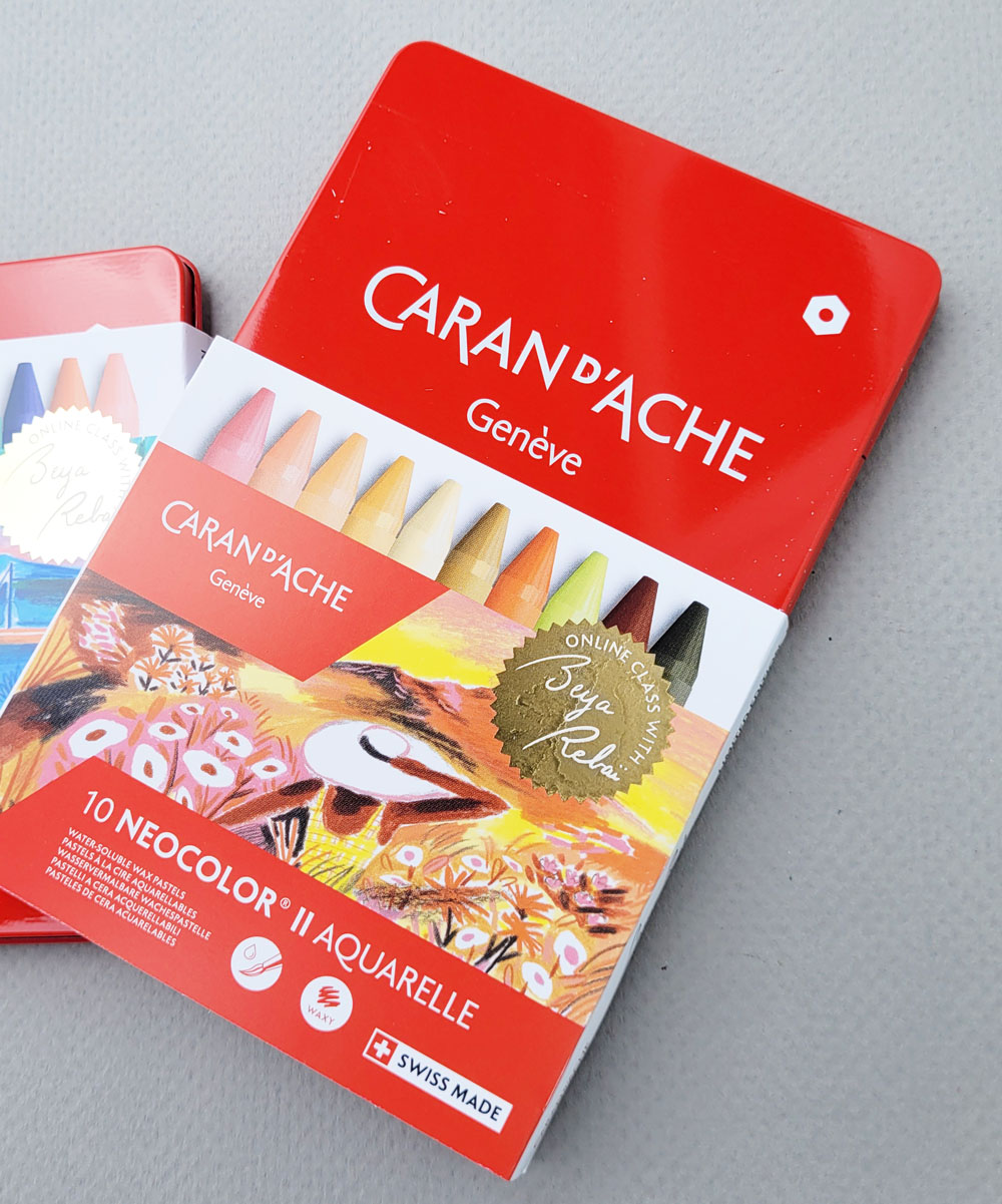
Review: Caran d’Ache Neocolor II (Beya Rebaï Limited Edition Sets)


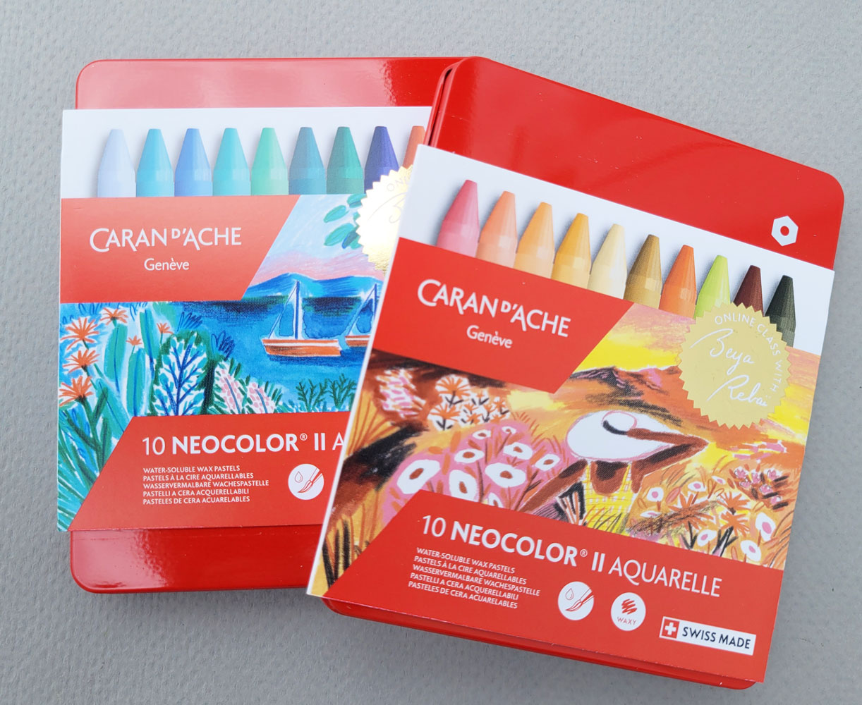
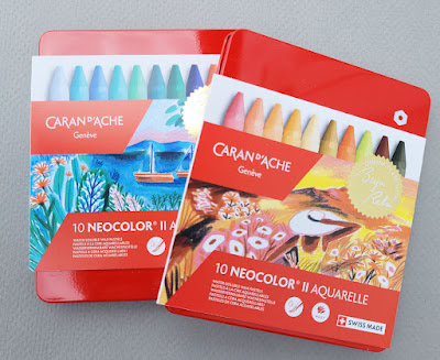
Limited-edition Beya Rabaï sets of Neocolor II

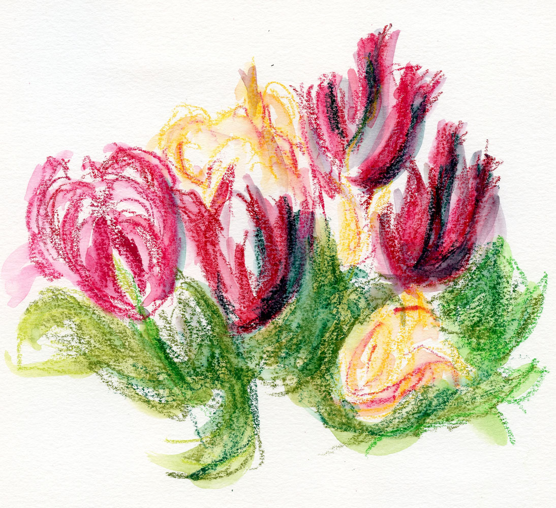
A few months ago when I was loosely sketching some tulips with Caran d’Ache Neocolor II crayons, I realized that I had not yet written a review of these water-soluble wax pastels. I suppose it’s because I don’t use them on location unless the location happens to be my own backyard. They are more fiddly to hold and look for in my bag compared to pencils, and I’d rather be seated at a table so that I can spread them out easily. In addition, the soft, chunky sticks are better used with a sketchbook larger than I like to carry. It means that I don’t use them often, even though I do love them. In fact, they are probably one of my oldest art materials that I still use, going all the way back to my abstract, mixed-media collage days more than 12 years ago.

(Please note that in this review I’m referring to water-soluble Neocolor II, not non-soluble Neocolor I, which I began playing with earlier this year. I wish Caran d’Ache would come up with more distinctive product names to distinguish between these lines! I bet there’s a lot of confusion at stores.)

Cold set and warm set

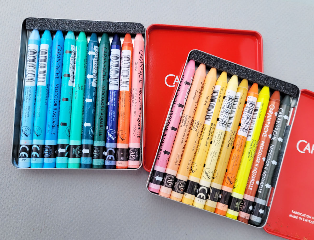
With that long history, it’s funny how I seem to “rediscover” Neocolor IIs every year or so. A product review is long overdue. What prompted me to finally write one was the recent release of two limited edition sets in collaboration with the French illustrator Beya Rebaï. According to Caran d’Ache’s website, “The artist and Caran d’Ache have joined forces to dream up two assortments of 10 Neocolor® II Aquarelle pastels. One in cold shades, playing on a range of blues, greens and pinks. The other in warmer tones with a range of yellows, oranges and umber. Two original palettes consisting of the artist’s favourite colours.”
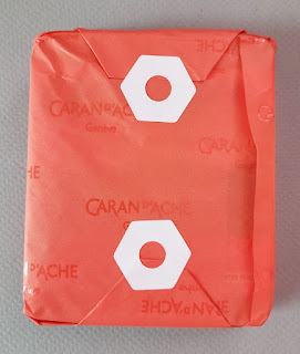
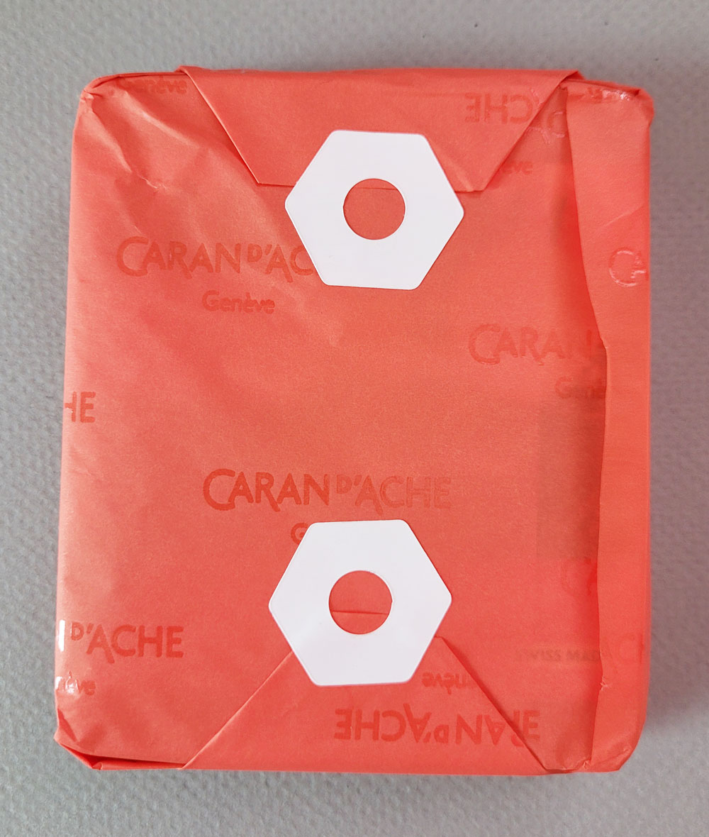
I adore this wrapping paper and stickers from Papeterie! 

If I’d had a normal amount of patience, I would have waited to get the sets at Blick. Lacking that, I opted to order them from Germany before they were available in the US. (Surprisingly, though, I paid about the same as I would have at Blick for the products and even the shipping because the latter has gone through the roof lately [except when Blick occasionally offers free shipping deals]). The benefit of ordering from Papeterie in Berlin is that the sets came wrapped in lovely Cd’A-branded paper and adorable stickers! (Yes, I’m a Caran d’Ache fan, but I also appreciate shops that give customers a nice hand-wrapped touch like that.)
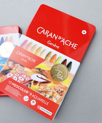
Sleeve slides off to reveal the classic red Caran d'Ache tin.


While the tin sleeves indicate that they are limited editions, the tins themselves are the same iconic red used to hold the Wonder Forest Bicolor set and other products in Caran d’Ache’s “professional” product line (Supracolor, Pablo, Neocolor I, Neocolor II, gouache, Fibralo markers, Fibralo brush tip markers). I always find it amusing that even when the tin contains brush markers or gouache, the white icon on it represents hexagonal pencils – likely alluding to Caran d’Ache bringing the first water-soluble colored pencils to the world in the form of the Prismalo line in 1931.

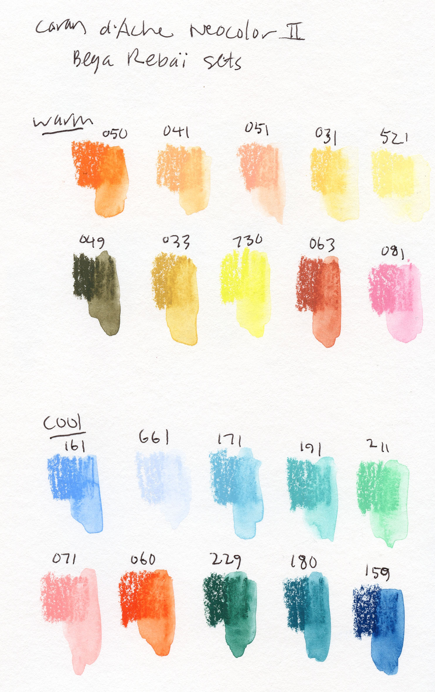
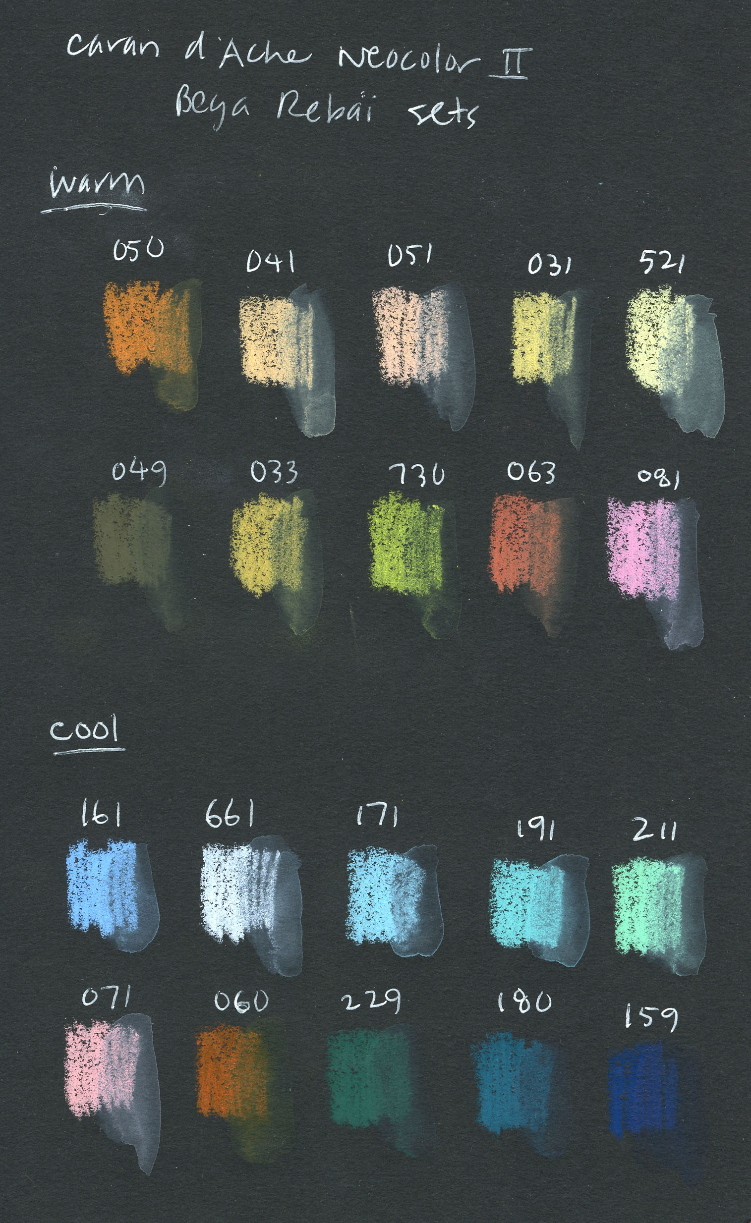
So what’s special about these Beya Rebaï sets? Are the colors themselves new or different from the regular Neocolor II line? No – they appear in standard Neocolor II sets and can be purchased open stock. As is my habit with most of my higher-end colored pencils, I have acquired lots of Neocolor IIs open stock over the years, but I’d never purchased a set of any size. These were a good excuse to finally have some tinned sets.

I was also attracted to Beya Rebaï’s selected palettes, both “cold” and warm. All those pastel peaches and pale blues – they are not part of my usual palette all, nor are they much of an urban sketching palette (except maybe in Italy’s Cinque Terre or Positano!). In addition, I was intrigued that the cool set included a pink and a red-orange that I would have put into the warm set. Clearly, they are intended as lovely complements to the cooler hues. I thought it would be fun and challenging to use a palette so different from my own.

Swatches in Stillman & Birn Beta

Swatches in Stillman & Birn Nova

The top swatches were made in a Stillman & Birn Beta sketchbook. I also made swatches in a black S&B Nova sketchbook to see how opaque the colors are. I love the way the paler colors pop on black. As expected, however, they tend to become less intense and dull on the dark background when activated with water. Although richly pigmented, compared to Caran d’Ache Museum Aquarelle pencils, they don’t dissolve as easily and require a bit more scrubbing.

These limited-edition sets also come with access to two 30-minute online videos of Rebaï demo-ing a few techniques using Neocolor IIs and explaining inspiration for her palettes.

5/12/22 No wimpiness allowed.

One thing I love about Neocolor wax pastels (both insoluble and water-soluble) is that they demand boldness. Unlike colored pencils, which can be used very delicately, it’s almost impossible to lay down lipsticky, crayony, water-soluble wax pastels and be timid about it. You can’t be wimpy with these bad boys, even if you want to. Even after years of using colored pencils, I can still succumb to wimpiness. Putting Neocolors in my hand is a good shove in the bold direction that I can always use. They also encourage looseness, which is another benefit to me.

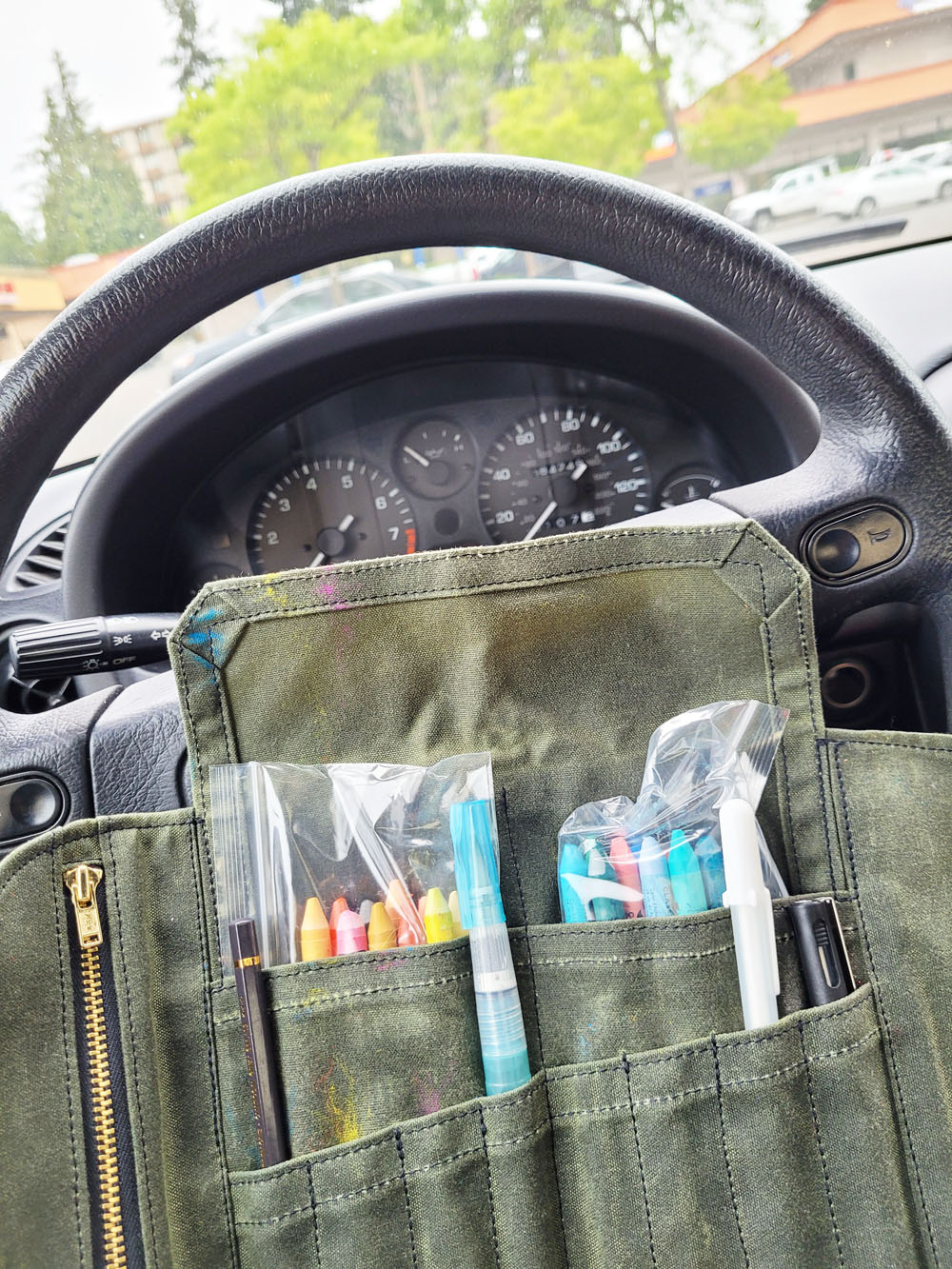
On the first overcast morning after our heatwave broke, it was cool enough to sketch from my car. As I mentioned, the Neocolors are a bit cumbersome to handle while standing, so using my mobile studio was a convenient solution. Driving around Northgate after an errand, seeing nothing that seemed appropriate for those cotton candy-like, summery tints, I realized that it’s just a matter of seeing the palette as a range of cools and warms instead of specific hues. A-ha – color temperature to the rescue! It immediately became less intimidating to use an unfamiliar palette that someone else had picked out for me.

The Neocolor IIs are in plastic bags to keep them
from sliding down into the Sendak pockets. Not ideal,
but tolerable in my mobile studio.

But how’s this for weird? I happened to pull into Northgate Plaza, a typically blah strip mall, and the Rockler Woodworking store had a peach and blue color scheme! So my first sketch with the palette turned out to be a no-brainer (though I forgot to note which colors I used, I think they were mostly English Red ([063], Saumon Rose [071], Light Blue [161], Prussian Blue [159] and Dark Green [229]). I thought my A5-size Hahnemühle sketchbook would be a bit cramped for these chunky sticks, but I made it work. 

8/2/22 Neocolor II in Hahnemuhle sketchbook, Northgate Plaza (which serendipitously coordinates well with the palette)

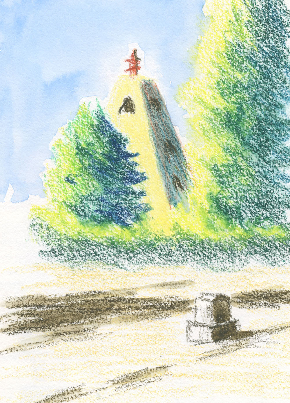
The sun came out in the afternoon, so I took the Neocolor IIs to Evergreen Washelli cemetery (
8/2/22 Neocolor II in Hahnemuhle sketchbook
I showed this sketch yesterday and wrote about what I learned about the interesting shape of this monument). I love that bright yellow (called Chinese Green [730]) for the sunny side of blue-green foliage made with a combination of Malachite Green (180) and Dark Green (229). The monument is off-white, which is something I would typically leave paper white. With this palette, however, I tried Sahara Yellow (521) for the sunny side and a mix of one of the peaches and one of the blues (I forgot to note which) for the shaded side. It’s fun and challenging to push myself to use unfamiliar hues and mixes this way.

Standing in a cemetery path to sketch this, however, I found the wax pastels clumsy to use, as I expected. The tins are altogether unwieldy while standing, and the crayons are too short to fit in the slots of my Sendak. I carried them in Ziploc bags, which required tedious fumbling. (If I decide to use these more in the field, I’d definitely need to come up with a better carrying and usage solution.)

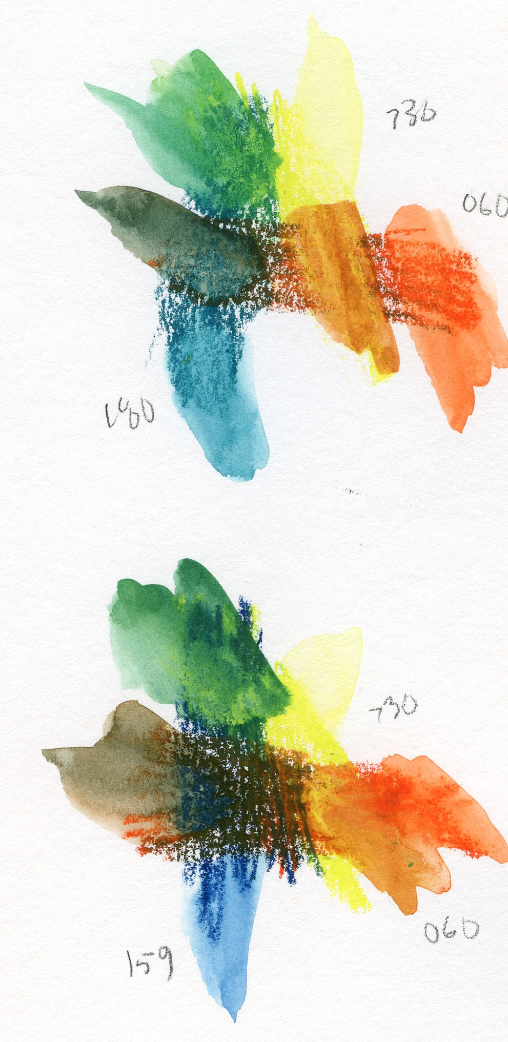
Intrigued by the palette but still experimenting with how to approach it, this thought suddenly popped into my head: What kinds of primary triads could I find? Clearly, I wouldn’t find a CMYK in there, but with a stretch of interpretation, there’s certainly one (or more) triads to be found. Below are two I mixed. In both cases, for yellow, I used Chinese Green (730), and for red, Vermillion (060). The only variable is the blue – Malachite Green (180) in the top trio and Prussian Blue (159) in the lower.
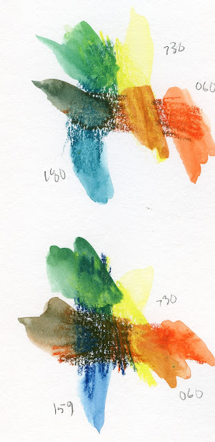
Two primary triads from the Rebaï palette

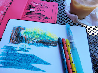
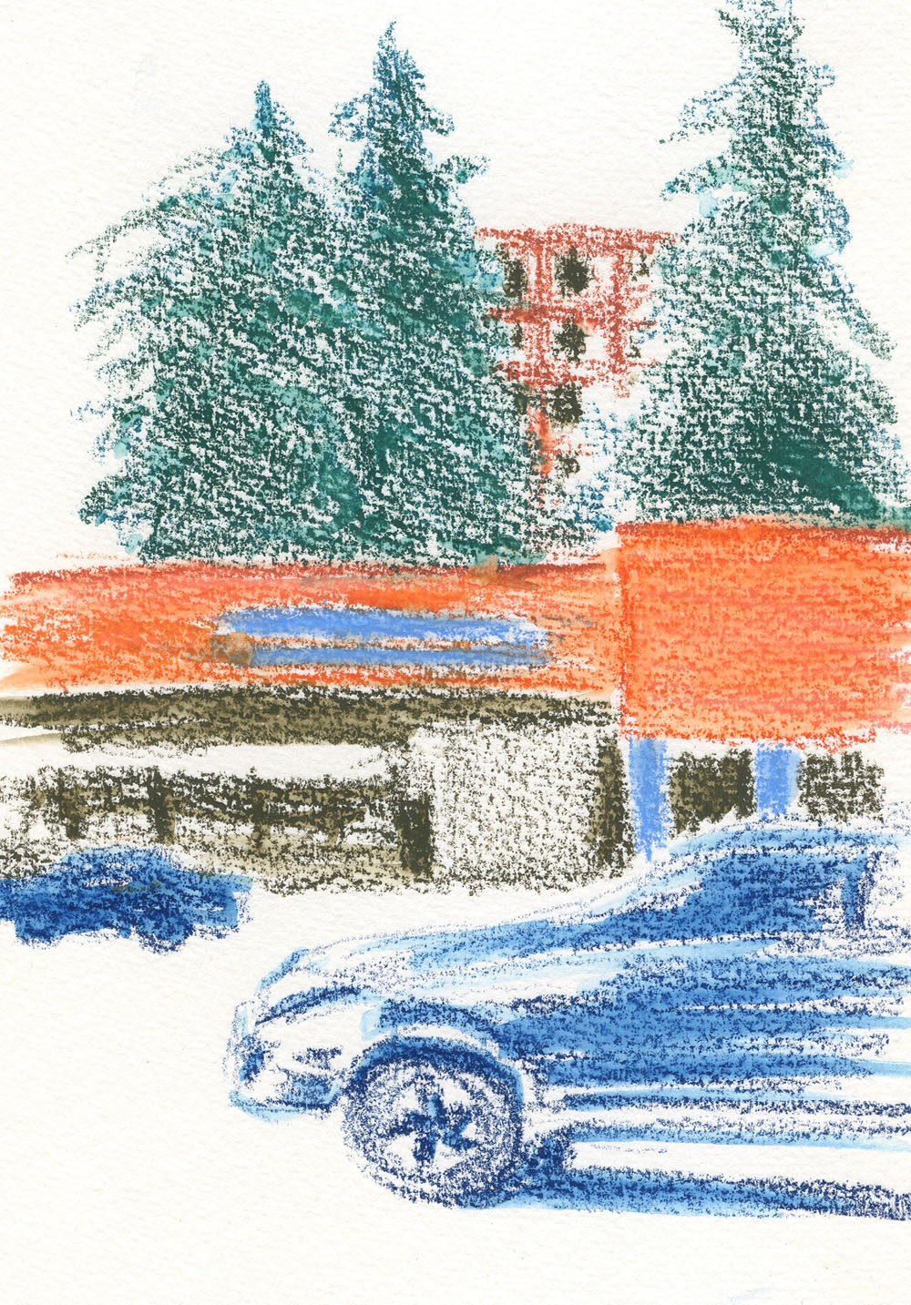
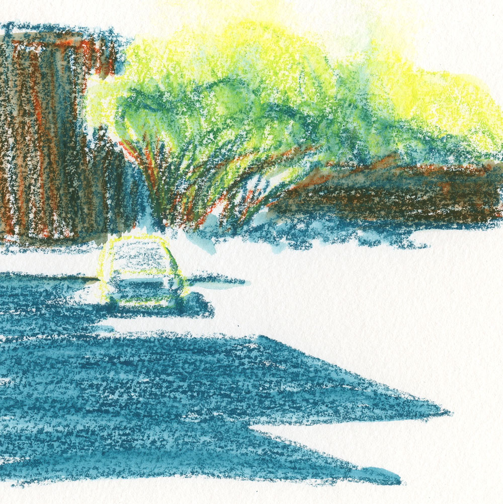
Neither triad mixes a violet, but the grays/browns that result from the red/blue mixtures are interesting neutrals. I preferred the green that came out of the top combo, so I decided to focus on that triad for my next sketch. Sipping an iced latte at Green Lake’s Retreat Coffee, where I had a table to make handling the Neocolors easier, I looked up and saw an intriguing shadow and composition across the street (below). This odd triad is hardly recognizable as a primary one, but once again, I let color temperature be my guide. The buildings were slightly warmer than the street shadows, and I like the contrast against the bright yet cool trees.

I know that some sketchers enjoy using color “recipes” that other artists develop, and many seem to find this easier than working out their own palettes. I suppose my recent explorations of the CMYK-based triad is the closest I’ve come to a “recipe,” but that still requires interpreting hues that can vary widely. In general, I’ve spent so much time exploring and honing my own idiosyncratic palette that it’s actually strange and more challenging to use a store-bought palette – but fun to explore, nonetheless.

From my previous experiences using Neocolor IIs combined with Museum Aquarelle pencils, I’ve discovered that they don’t necessarily mix as well as I had imagined, even though they are similarly high in pigment. If pencils are applied first, wax pastels will layer over them easily, but not vice versa. Neocolor IIs leave behind enough of a waxy surface that pencils seem to slip and slide over it. I do appreciate how easy and efficient it is to color large areas quickly with the Neocolors, and pencils can be used for finer details. It just takes a bit of planning so that they don’t fight each other.

8/3/22 Green Lake (Neocolor II in Hahnemuhle sketchbook)

Neocolors are easy to use when I have a cafe table!

As much as I still love Neocolor IIs (and surely intend to keep using them in studio), I don’t love them more than my Museum Aquarelles and the convenient versatility of pencils, at least for sketching on location. I’m unlikely to keep them in my daily-carry bag. Beya Rebaï’s intriguing palette, on the other hand, is worth further exploration – but not with Neocolors. What am I up to? I’m sure you can guess. 😉 Stay tuned!

Thursday, June 23, 2022

Cool and Rainy Green Lake


6/17/22 Green Lake Way from Retreat Coffee

While the rest of the country burned, boiled and flooded, we were still “enjoying” June-uary. Don’t get me wrong; I’d choose a rainy 58 degrees over triple digits any day (we got a taste of the latter just about a year ago, and it was hell in more ways than one). At the same time, I was resentful that I was still wearing socks (my personal policy is to avoid socks from Memorial Day through Labor Day).

Last week on a drizzly afternoon, dressed in socks and Polartec, I defiantly went to Green Lake anyway, looking for a sheltered spot to sketch from. Retreat coffee house, situated on a corner, has lots of sheltered outdoor tables and chairs on two sides. I found a good spot facing a curve on Green Lake Way.

Thumbnail study

The thumbnail I started with taught me at least two things: One was that I didn’t want the light pole to be in the middle of the composition, so I cropped it into a square instead of a landscape rectangle. It also showed me that the line I had made for the curving street was more prominent than I wanted, but if I made it less so, then I needed something else in the foreground. I didn’t bother to draw the foreground car in the thumbnail, but I knew what I had to do for the final color sketch.

As for color, this sketch was made with primary triad No.1, and I still have my doubts about it. My intention was to find a primary triad that was warmer than the CMYK-based one I had been using, and this one feels too cool. Or maybe it’s just right for the summer we are having: By the time I finished the thumbnail, I had to move my sketchbook away from the edge of the table, as the drizzle had turned to full-on rain.

Cool palette to match our summer.

Related Posts Plugin for WordPress, Blogger...