Showing posts sorted by relevance for query zorn. Sort by date Show all posts

Monday, December 5, 2022

Trois and Zorn

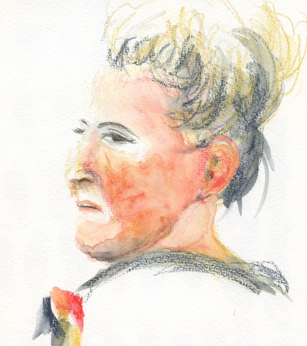
11/30/22 Neocolor II in S&B Nova sketchbook (trois crayons)

A reader had recently commented on the post about my Zorn palette experiments with a suggestion to try the trois crayons technique. Years ago in a drawing class, I recall doing a few exercises with a sanguine Conte crayon, charcoal and white chalk – the traditional trois – but that was the last time I had thought about it.

I still have the traditional materials, but anticipating the dusty mess, I decided to use much neater Caran d’Ache Neocolor II wax pastels instead, picking out the same trois hues (white and black with English Red for sanguine). In keeping with tradition, I also pulled out my tan-colored Stillman & Birn Nova. Since the Neocolor IIs are water-soluble, I could have seen what kind of mess I could make with the addition of water, but sticking with dry materials would be more like the traditional method, too. The slightly elevated view of this man (at right) was an interesting challenge in foreshortening.

11/25/22 Prismacolors in S&B Alpha sketchbook (Zorn palette)

My most recent Zorn palette experiments are shown here, too. For the bald man, I used
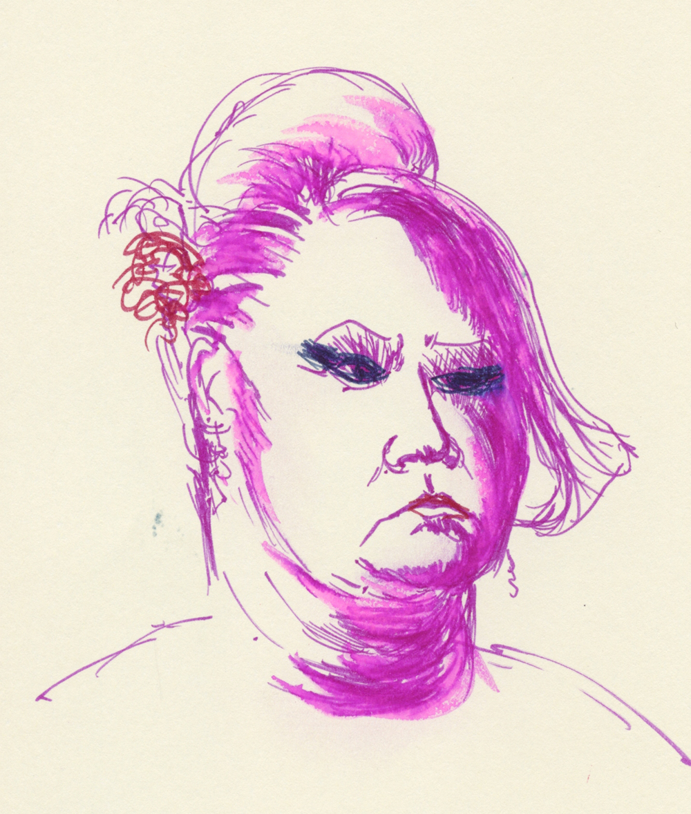
Prismacolor colored pencils, and for the woman – wait for it! – Bic ballpoints (poor Zorn is rolling over in his grave)! I can see why the reader had made the suggestion – the results and techniques are quite similar. The Zorn portraits on white paper depend on Yellow Ochre to keep the skin tones from getting too ruddy. But the tan paper does the same work for the trois crayon palette. Using white for highlights is easier and faster than saving out highlights, too.

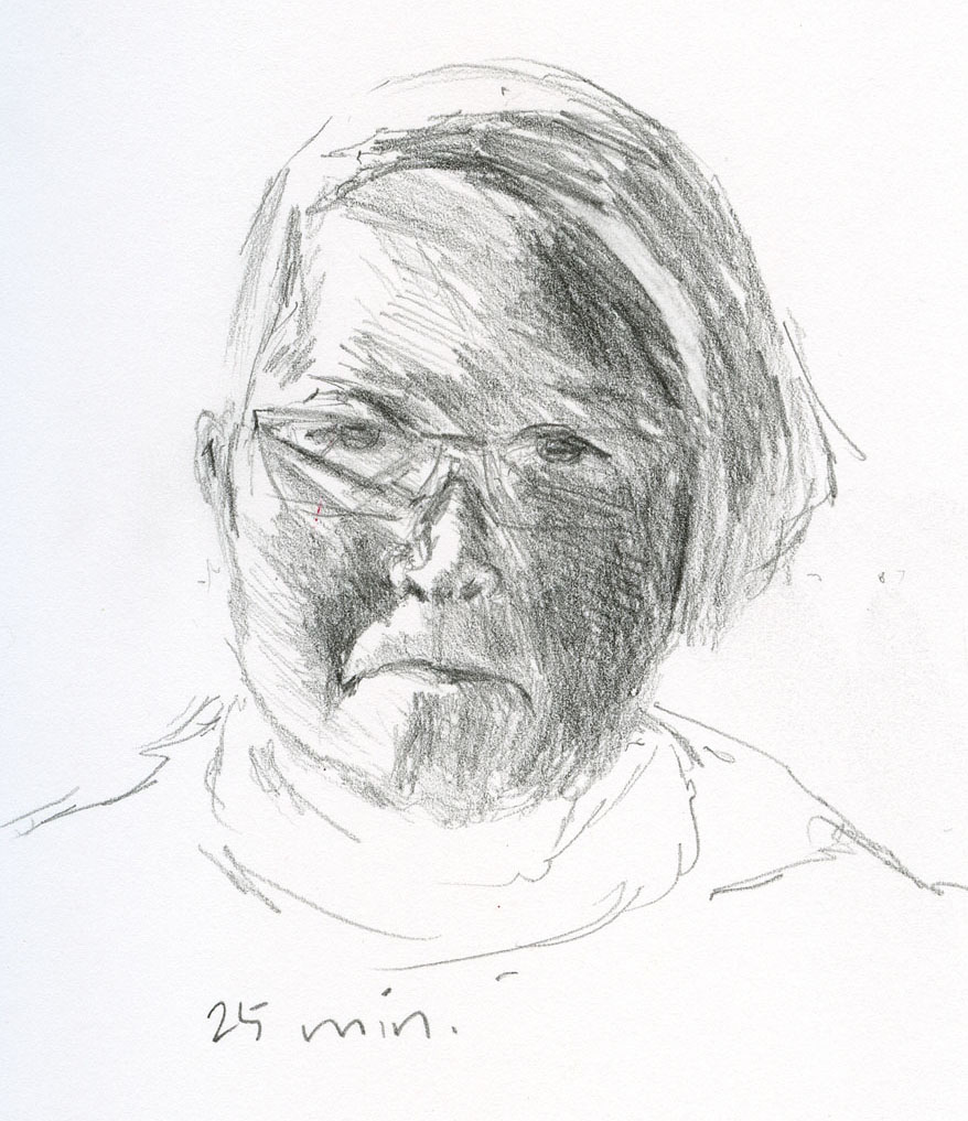
The young woman, by the way, is the same reference photo I used with graphite the other day (shown in my post about vintage Dixon Typhonites). That time, I saw right away that my proportions were off, but instead of correcting, I decided to finish the sketch as a value study. This time my intention was to improve the proportions, but I think I did worse – her forehead should not be that tall (her critical scowl, however, is accurate). I know I mentioned Bics mockingly, but I’m pleased with the skin tones I achieved. Frankly, it was easier to blend with crosshatched Bics than with the wax pastels.

11/30/22 Bic ballpoints in Moleskine sketchbook (Zorn palette)

Whether Zorn, trois, primary or secondary, these limited palettes are truly satisfying to use. Having fewer color choices keeps me focused on values and form. I’m less confused about using principles of color temperature to support values. I also work much faster simply picking a limited palette and staying with it instead of spending time trying to match the many individual hues I see. Finally, what I’ve always heard, over and over, is true: Using a limited palette is much more likely to have a cohesive, unified result.

Given my penchant for wanting all the colors, the irony here does not escape me. But I can still enjoy all the colors without using them all at once.

(All reference photos by Earthsworld.) 


Oooh, look -- three generations of Prismacolors used!

Monday, November 28, 2022

My Take on the Zorn Palette (and Thoughts on Painting)


11/18/22 Neocolor I in Shizen Design journal

I first learned about the Zorn palette from Ching, who has been using it to paint portraits in gouache and oil. Coincidentally, around the same time, a book I was reading mentioned the Swedish painter Anders Zorn (1860 - 1920) and his palette, and I became even more curious. Some quick Googling has been the extent of my research so far, but his work warrants further study – and his intriguing limited palette warrants exploration!

In a nutshell, his palette is Yellow Ochre, Cadmium Red Medium and Ivory Black, plus white to tint the other colors. (This website has an explanation.) The first three hues function as the primary colors. At first, I couldn’t wrap my head around black as stepping in for blue, but Ivory Black is apparently on the cool side. The mixes would be subdued and earthy, and I could see that the palette could work for portraits, which were Zorn’s main body of work.

Of course, without using liquid paints, I don’t have the benefit of pigments actually mixing and blending. I’m used to working with optical mixing, though, when using colored pencils, so the gears in my head started spinning.

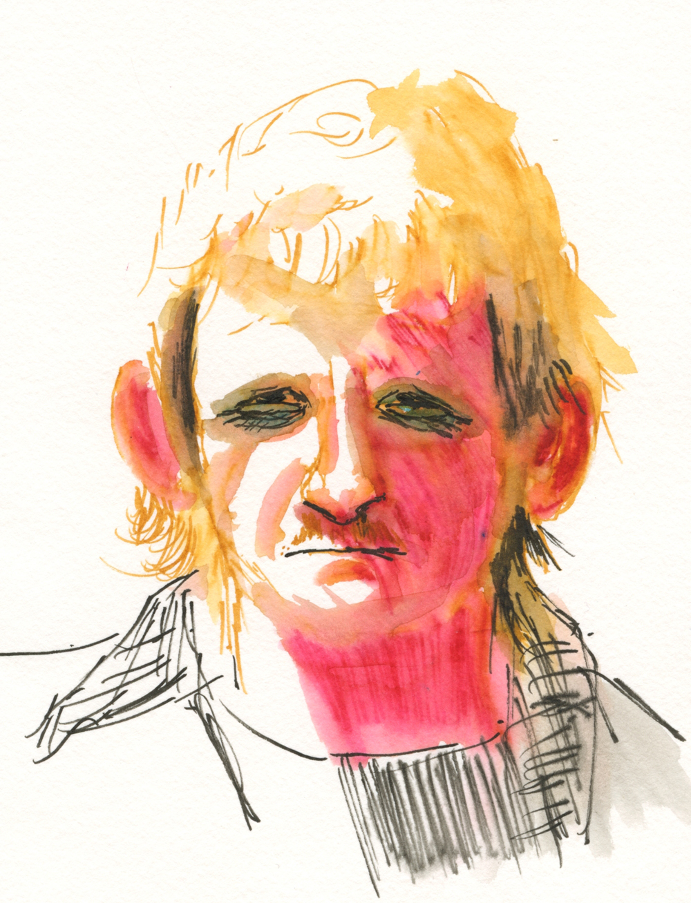
My first two tries were with Caran d’Ache Neocolor I wax pastels (the non-soluble kind) in a red Shizen Design journal. My thought here was that the red paper would serve as an “underpainting.” On the portrait of the blond man (top of post), I didn’t blend at all – I was just getting used to the palette by using black for shading, white for highlights and ochre for hair.

My portrait of the poor younger woman (below) turned into a mess. When I layered black and ochre on the red paper, the result was a ghoulish green! And yet I could see that the red “underpainting” gave a warm glow to her forehead, so maybe my concept was sound.

11/19/22 Neocolor I in Shizen Design journal

Next I used Neocolor II water-soluble wax pastels in my white Hahnemühle watercolor sketchbook so that I could try my hand at wet-mixing of the pigments. (This is the same young woman I abused with ballpoint ink during InkTober; I figured I couldn’t do any worse damage.) Although I gave her a bad case of acne and blotchy skin, I clearly saw the potential for this palette in portraits. Ochre and cadmium red make the basic skin tones, and black would easily darken it.

11/20/22 Neocolor II in Hahnemuhle sketchbook

For the older woman’s portrait, I went back to the red notebook, which has very thin paper. I knew it wouldn’t hold up to much water blending with Neocolor II, but I did it anyway (mostly on the shady-side cheek). Instead of black, I used Payne’s Grey, which has a softer look while still following the basic principle of a cool “black.” Avoiding the ghoulish skin tone this time, I really like the way the red “underpainting” came through (and shows off the white highlights so well).

11/22/22 Neocolor II in Shizen Design journal

Finally, in the last portrait shown here, I used Caran d’Ache Museum Aquarelles in the same three hues as the previous portrait (with Payne’s Grey instead of black). In my Hahnemühle watercolor sketchbook, I had the option of using water if I wanted to, but after applying the color dry, I preferred the softer look of optical mixing. Maybe next time I’ll try water again and see if I can avoid the blotchy acne look.

11/23/22 Museum Aquarelles in Hahnemuhle sketchbook

Related introspection: Every now and then, someone will ask me when I’m going to start painting. The question assumes two things: That painting must be the end-all, be-all of any art-making endeavor; that all these 11 years of sketching must just be a lead-up to eventually making paintings. (I don’t count the first several years of my sketching life when I used watercolors; I don’t consider those efforts “painting,” as I was simply using watercolor as a coloring agent for ink-drawn sketches). I don’t believe that painting is always the ultimate end result of art-making or that it should be.

In the past couple of years, I’ve been actively studying principles and concepts that I have been learning from painters: composition; color temperature; underpainting; and now the Zorn palette. I think many beginning painters struggle because they are trying to grasp those painting principles while also learning to draw and apply paint – that’s a lot to take in all at once. No wonder so many give up after a few classes.

Although I don’t have much interest in pursuing painting at the moment, someday I might. If and when I do, I’ll be relieved to have practiced a few important painting principles before I ever dipped a brush into paint, and it will be easier to focus on painting techniques instead of principles.

(All reference photos were by Earthsworld.)

Sunday, March 26, 2023

Review: Marvy Uchida Le Pen Flex Brush Pens


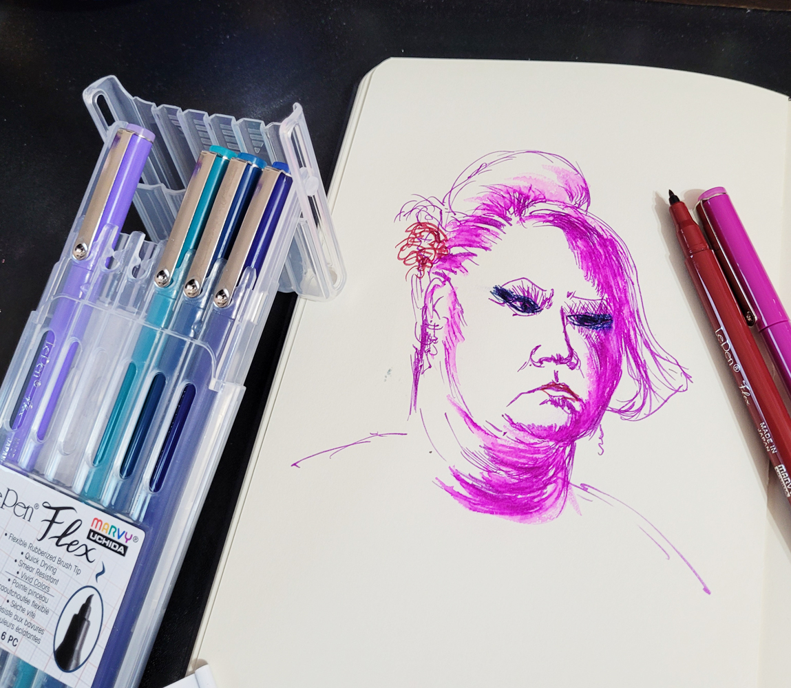
How did these Marvy Uchida Le Pen Flex brush pens hop into my
shopping cart?

Years ago, I tried a few Marvy Uchida Le Pens with the standard writing tips, but nothing about them impressed me enough to keep using them. In fact, the skinny barrel was uncomfortable to hold. I’ve ignored them since.

Perhaps you’re familiar with this scenario: You need a few things at JetPens, and you’re getting close to free shipping. Hmmm, you’d forgotten that Le Pens are available with a brush tip you’ve never tried . . . a couple of colors would get you to free shipping – but oh, the six-pack is a better value! That’s how the “Jewel” color assortment of Flex Brush Pens fell into my shopping cart recently.

The product information describes the Flex as a “rubberized felt tip that is flexible yet firm.” The only other brush pens I own with a similar “rubberized” tip are much larger, and I enjoy how flexy they are.

Unlike a fude fountain pen or the hard brush tip markers I have been using lately (like the Uni Pin and the Faber-Castell Pitt Fude Pens), which vary their line widths by changing the points’ angle to the paper, the Le Pen Flex responds to pressure. It was a delightful surprise to get the same “rubberized” flexiness that I knew from the larger brush pens in a much smaller point size. I’m a little concerned that the tips will mush down quickly under my heavy hand, especially when I get overly enthusiastic about their flexibility. (I’ll update this review if my concerns are warranted.)

First I tried making a couple of Earthsworld portraits (Earth recently featured one of these on his website!) in a Moleskine sketchbook (the old kind with the manila-folder-colored pages and odd, waxy surface). I noticed that the ink took a while to dry, especially on that paper, and if I acted fast enough, I could smudge the ink deliberately the way Don Colley famously works his Pitt Artist Pens. I used a waterbrush to test the ink’s water-solubility, and it literally beaded up on the weird Moleskine paper. Strange but interesting!

3/19/23 Le Pen Flex brush pen in Moleskine sketchbook

3/20/23 Le Pen Flex in Moleskine

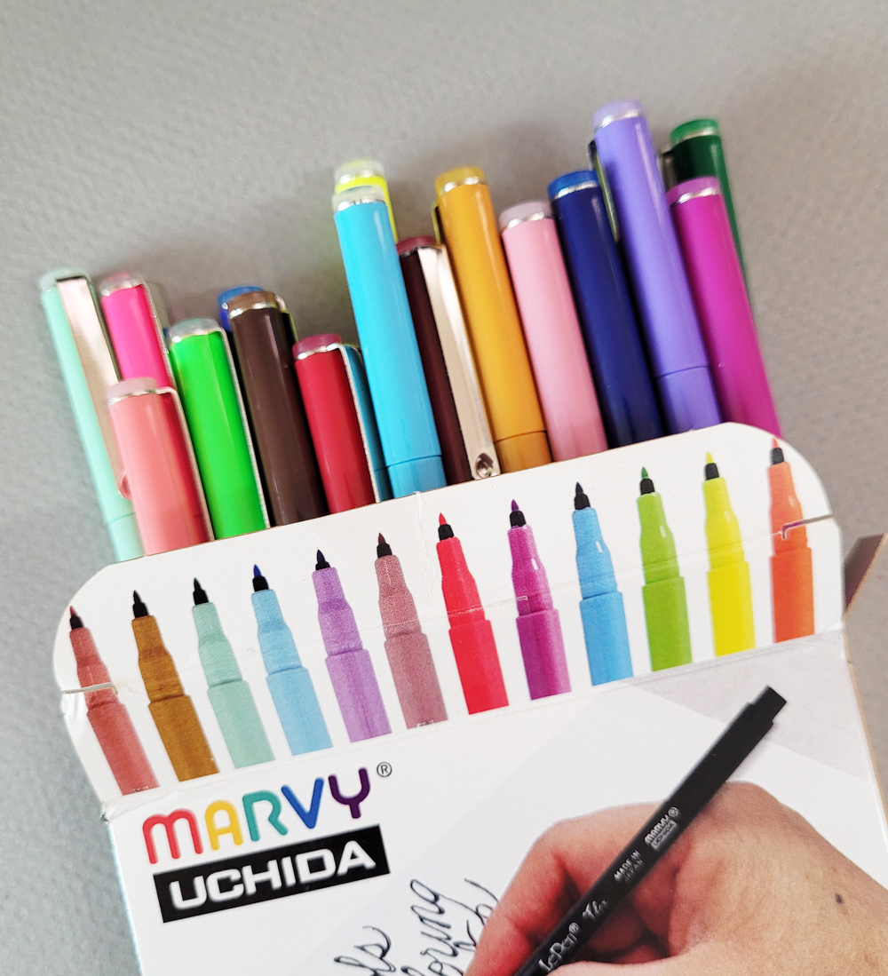
The 6-pack pen wallet has a handy easel top for desktop use.

Next I pulled out my Hahnemühle Akademie watercolor sketchbook to see how the Le Pen ink would respond to paper with better sizing. Though I didn’t think these vibrant colors would do well in a portrait mix, I perversely chose a Zorn palette – red, ochre and black.

3/21/23 Le Pen Flex in Hahnemuhle sketchbook

Look at the black... it's nearly waterproof!

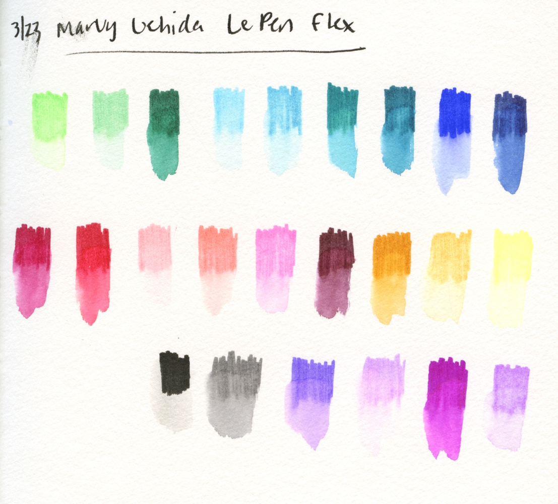
They are rather garish here, but the big surprise was that the black Le Pen Flex barely moved compared to the other very water-soluble colors. I even wondered if black came only in a water-resistant version. I read the product information, but it still claimed that black is water-soluble. It’s strange that only one color would behave this differently.

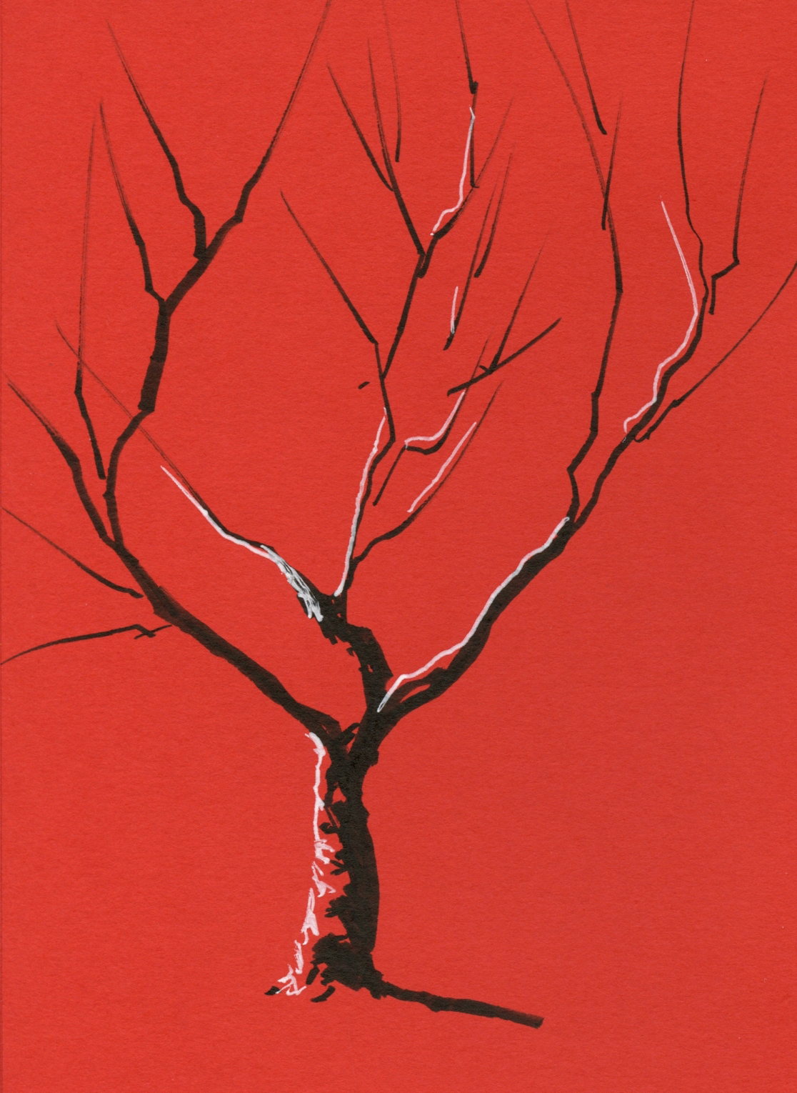
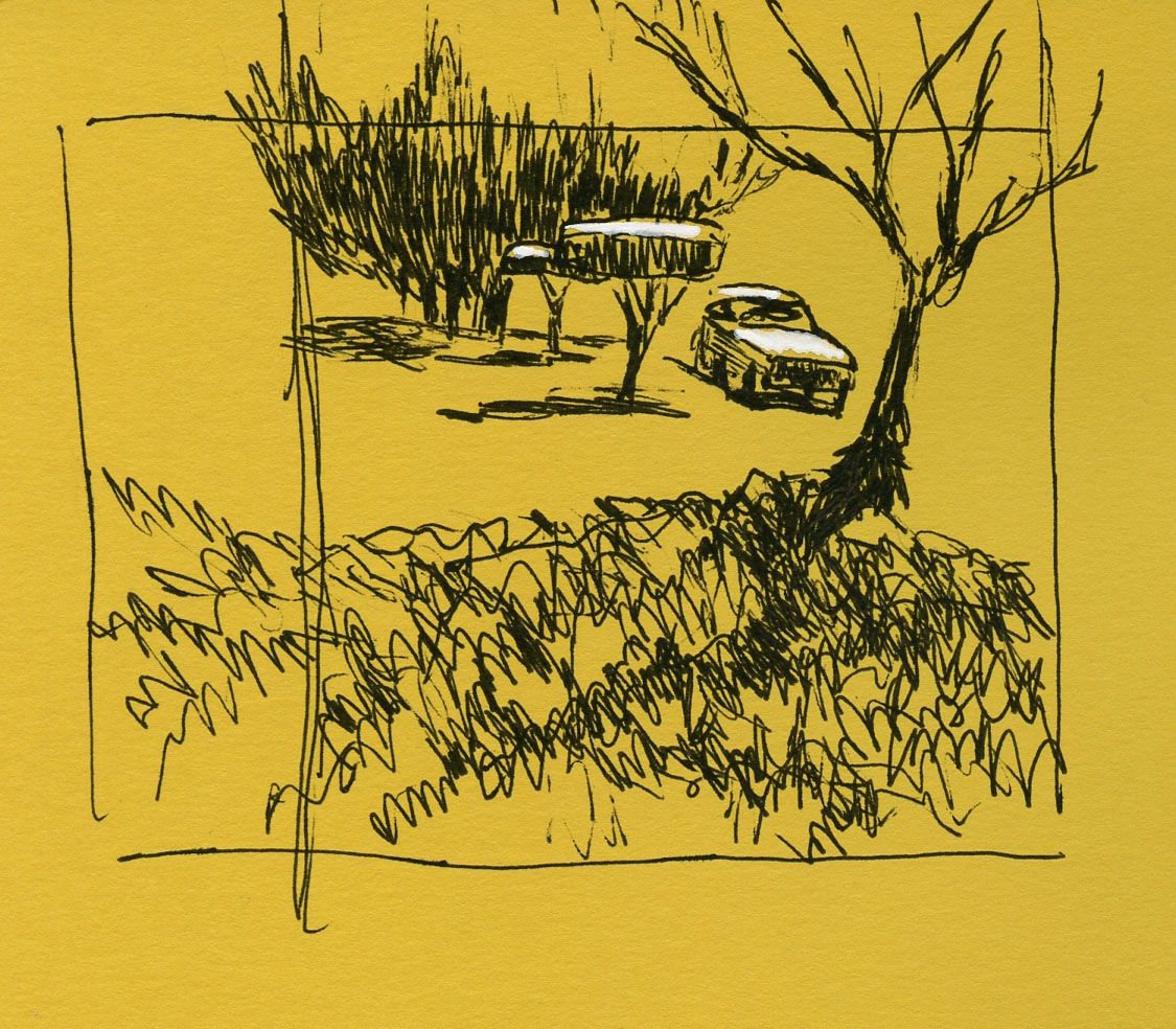
3/22/23 Le Pen Flex and white Gelly Roll in Uglybook 

Of course, if you put any black brush pen in my hand, I will take it out on my next walk and sketch a tree or two – the fastest way to test a brush tip’s line variability. And what a beauty this one is! I love how easy it is to apply pressure for the thick lines like the trunk, then ease up on the pressure gradually to taper the ends of the branches. (Is it even possible to sketch a tree without a brush pen? Of course it is, but it’s not nearly as much fun!)

While I had my color journal out, I decided to see if I could make a CMY triad from Le Pen Flex colors. Unfortunately, the only yellow available is fluorescent, which is a bit weak when mixed, but look at the lovely violet I got when I mixed magenta with oriental blue.


Zorn palette and CMY primary triad mixes

If you’re wondering how I got those Zorn colors and fluorescent yellow from my “Jewel” set, it’s because by then I had already decided I needed more colors – like all 24 of them (a much better value than smaller sets or individually!). I still find the slender barrel uncomfortable, and I admit, I am unlikely to use some of these colors. I find myself smitten with the flexy brush tips, though, and the ink is weirdly fun to smudge and bead on Moleskine paper.

7/22/23: Here's the update on the pen tip.

Unlike the heavy-plastic wallet that the 6-pack comes in, the set of 24 comes in a flimsy cardboard box.


Like many water-soluble colored pencils, some colors wash more vibrantly than others. Black (lower left) hardly washes at all. I'd call it waterproof.)

Wednesday, December 28, 2022

The Crayola Challenge


Mini-sized pencils, jumbo-sized aggravation.

Sarah Renae Clark is a popular, entertaining YouTuber who reviews lots of colored pencils and also designs coloring books. (If you think I have a lot of colored pencils, you should view this video in which she claims to have purchased every colored pencil she could get her hands on “to find the best colored pencils in the world.” More than 4,000 pencils! I’m not worthy!) I also appreciate that she talks about nurturing the creative learning process.

I recently came across a video in which she challenged herself “to see if I can draw a realistic colored pencil drawing with cheap Crayola colored pencils.” (In another video, she puts Crayolas head-to-head with Caran d’Ache Luminance!) Using a solvent to help blend the nearly non-existent pigment (my opinion, not hers) in the kids’ Crayolas, she manages to make an impressive piece of art with the worst colored pencils I’ve ever used.

What I found most interesting was that she said exactly what I’ve been saying about the importance of using the highest quality art materials you can afford (scroll to the end of that post), even if you are a beginner (in fact, I would say, especially if you are a beginner). Sarah points out that when you use low-quality products, you are constantly fighting with the materials instead of learning and supporting your creative growth. Using the Crayolas, she mentions that she’s not enjoying it, and if making art is not enjoyable, it’s much harder to keep practicing and improve skills.

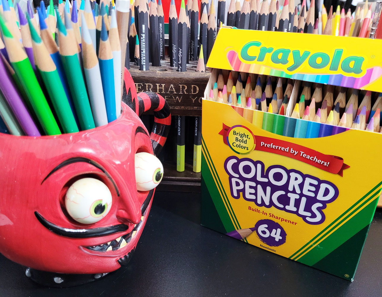
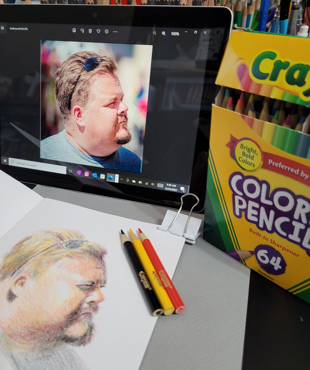
I happen to have a fairly recently acquired set of Crayola colored pencils – 64 mini-sized “bright, bold colors.” I never intended to use this set – I bought it because I love mini-size pencils, and the box is nostalgic, of course. In solidarity with Sarah and our similar perspectives on crappy art materials, I decided to make a sketch with Crayola colored pencils, too.

12/22/22 Crayola colored pencils in Stillman & Birn Alpha sketchbook
(Earthsworld reference photo)

Unlike Sarah, however, I limited my self-torture to a typical small portrait made in my usual messy, crosshatchy way rather than solvent-blended, multiple layers. Choosing a Zorn palette from the Crayolas (poor Zorn is again rolling over in his grave), I couldn’t stand more than 35 minutes with these pencils. Although I’m not unhappy with the results, I certainly found no pleasure eking pigment out of those little sticks, which was like squeezing juice from a stone.

Knowing that Crayolas are hard, I chose a Stillman & Birn Alpha sketchbook with a lightly toothy surface that did at least some of the work of picking up and retaining pigment. I kept the points sharp. Instead of trying to blend, I used a rougher, optical-mixing method (which I prefer anyway). Toward the end, I was scrubbing pretty hard to make the pigments show up, and I could already feel the points sliding on the waxy buildup.

As both Sarah and I found, it’s not impossible to get decent results from bad materials, but it will take much longer, be more frustrating and be less fun. She and I know how it feels to use good materials, and we have enough experience with colored pencils to know when we’re fighting them. Someone with less experience, however, might think their frustration was their own faulty execution or lack of skill and become discouraged or give up. The latter, I think, would be the worst possible outcome of using low-quality materials.


I certainly wouldn’t expect a beginner to invest in a set of Luminance or Museum Aquarelle when they aren’t even sure they will like colored pencils, but using very inexpensive materials can be a false economy if they end up being a frustrating waste. Sarah recommends starting out with a good quality, mid-range set and upgrading gradually later; I concur.

Another point Sarah makes is paper (in her Luminance vs. Crayola video): “If you want to get good results with cheap pencils, you can’t rely on cheap paper, too,” she says, and credits her decent results to her paper choice. I certainly don’t have it in me to make another sketch with Crayolas on bad paper just to prove a point, so I’ll take her word for it that my results could only be worse. As I have learned myself, the right surface can make a huge difference in how a pencil feels and performs and certainly in the results.

This isn’t the first time I took part in self-torture; several years ago, I did a similar exercise using watercolor pencils I had previously rejected. 

Monday, December 19, 2022

Caran d’Ache Prismalo Swiss Wood: The Saga


Caran d'Ache Prismalo Swiss Wood: A checkered past?

Readers of this blog know that once I catch wind of an elusive colored pencil I want, I am unlikely to let it go. Such is the case with a Caran d’Ache product that seems to have had a checkered past (and may still).

In July 2021, a scintillating “coming soon” appeared on Caran d’Ache’s website: the Prismalo Swiss Wood colored pencil set. Swiss Wood is a standard Caran d’Ache line of graphite pencils with the distinction of being “entirely made with wood ‘certified of Swiss origin.’” Caran d’Ache also releases occasional limited-edition graphite Swiss Wood pencils, such as the collaborative sets made partly of reused Nespresso coffee pods. Use of sustainable and environmentally sensitive materials is part of the Swiss Wood heritage.

I have a Swiss Wood graphite pencil that I’m not fond of (either to write with or to smell, as it has a distinctive scent that users describe with many colorful terms; I think it evokes soy sauce, which I like as a condiment but not as a writing instrument). However, I had never before seen any colored pencils within the Swiss Wood line! And unlike the dark wood of the smelly Swiss Wood pencil I have, the Prismalo set was described as being encased in white Scots pine wood, which I knew was soy sauce scent-free. What a wonderful addition to Caran d’Ache’s Swiss Wood collection!

Prismalo colored pencils, of course, are not new to me. As Caran d’Ache’s very first watercolor pencil, Prismalo is an important part of Cd’A history, and I have vintage and contemporary sets (most notably the bicolors) in my collection. It made sense that Caran d’Ache would proudly put its original flagship watercolor pencil core under its “100% Swiss Made” label.

Cult Pens' July 2021 promotion

At least a couple of European retail sites were promoting the new product, and I waited eagerly for the set to become available. It wasn’t long, however, for things to take a dark turn. The Prismalo Swiss Wood pencils suddenly and mysteriously disappeared from the Caran d’Ache site. I inquired at a UK shop promoting the pencils to find out when they would be available, and the date was pushed out further and further.

I inquired regularly. Finally one day, the door slammed shut – not by the shop, but by Caran d’Ache: The UK retailer sadly informed me that Caran d’Ache had pulled the product altogether, citing production issues. No date was given as to the product’s return. All retail promotions I had seen previously were also removed.

Imagine the ensuing speculation: Caran d’Ache had already begun its own promotions before such “production issues” were discovered? And the company had even gone so far as to release product information to retailers before the product was abruptly pulled? How bad could production issues be that an entire product’s release would be halted indefinitely? And most important, I want the pencils, and I want them now! (OK, so the latter is not exactly speculation.)

I stopped pestering the poor UK shop, but I didn’t give up hope. I simply filed away product screenshots I had grabbed before they disappeared. (In our darkest hour, we all need something to cling to.) Every now and then I would search for them, just in case.

Fast-forward to November this year – nearly a year and a half later. During a search for something else, an image of the distinctive Prismalo Swiss Wood tube came up: What??! Could it be. . .?? Indeed, a European shop was promoting it! I did a specific search for Prismalo Swiss Wood and found a total of three shops in Europe selling it! Available not soon but now! You can bet I was not going to let this baby slip out of my hands!

Compact recyclable tube


As described by Vachement Suisse where I bought my set (and where I received exceptional customer service):

For the first time, Prismalo – the iconic color pencil from Caran d’Ache – is made entirely from Swiss wood, becoming Prismalo Swiss Wood, a limited edition set of 18 colors marking another step in the development of the company’s eco-responsible credentials. Made in Geneva entirely from Scots pine certified “Label Swiss Wood,” Prismalo Swiss Wood pencils pay homage to Swiss raw materials while supporting the local economy and production. An assortment of 18 bright colors – that can be used dry or as watercolors – is brought together in a packaging made from recycled and recyclable kraft paper. Its ultra-compact tubular shape makes it the ideal companion for artistic activities on the go.

The lightweight Scots pine semi-hexagonal barrel appears barely varnished. I love natural finish pencils that reveal variations in the wood grain, and the unstained white pine is lovely. A simple glossy end cap indicates the core color.

Unstained white Scots pine and a lovely pine scent

Caran d’Ache’s logo and product name, the watercolor brush icon and color number are printed in black. Instead of the cedar scent I often enjoy when I open a new set of pencils, the Prismalo Swiss Woods gave off a lovely whiff of pine trees! Instantly the scent evoked walking through a Christmas tree lot and the anticipation of the holidays. It’s timely that the set was released right before Christmas.

Colors in the set (names of which I had to look up myself as they don’t appear on the barrels) are Canary Yellow (250), Carmine (080), Golden Yellow (020), Moss Green (225), Prussian Blue (159), Purple Violet (100), Salmon Pink (071), Spring Green (470), Turquoise Blue (171), Ultramarine (140), Venetian Red (062), White (001), Raw Umber (049), Cobalt Blue (160), Flame Red (050), Black (009), Scarlet (070) and Golden Ochre (033). A good selection of colors overall for a set of 18.

All of that was well and good, and I was thrilled to finally have my hands on Prismalo Swiss Woods – until events took a darker turn.

I started examining the sharpened ends more closely. Many had slanted collars (where the wood meets the core), some quite pronounced – a strong indication that the cores were off-center. It’s quite common in inexpensive, low-quality pencils, and occasionally a good mid-range set might have one or two, like my set of Pablo pencils. However, other than those Pablos, I don’t recall ever seeing a Caran d’Ache colored pencil with an off-center core – not even student-grade Swisscolor and Fancolor sets. I quickly sharpened all the pencils, wondering if the factory sharpening may have been a problem . . . but the off-centeredness remained.

Crooked collars!


Dizzy with déjà vu from my recent review of the Colour Treasure Maxi graphite pencils, I could hardly believe my eyes! Prismalo is a Caran d’Ache flagship product! And Swiss Wood is its line of national pride! Crooked cores?? Quick – bring me my smelling salts!

After I recovered, I started wondering if uncentered cores were the “production issue” that had delayed release for a year and a half. Colored cores are softer and thicker than graphite cores, and this was the first time colored cores were put into the soft pine wood barrels. Perhaps the combination caused unexpected problems that Cd’A had initially found unacceptable – and then eventually accepted? Or perhaps the off-center cores I found were actually an improvement over the initial problem more than a year ago? More unanswered questions.

Darker still is the fact that despite at least three retailers offering Prismalo Swiss Wood for sale, Caran d’Ache itself was not promoting or selling it at all, even during the holiday season.

Even as I shook my head at what might be happening with the quality of my favorite colored pencil maker’s products, the Prismalo Swiss Woods were in my hands, crooked cores and all, so I started using them. As I’ve said before about Prismalo bicolors, the hard, thinner (3mm) cores are useful and very pleasant for certain kinds of sketching.

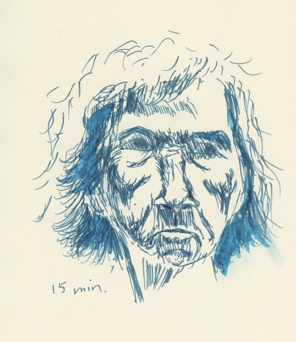
In the two single-color portraits I made below – the adorable Bassett hound again and the bearded man from a reference photo by Earthsworld – I used the Prismalos the way I might use an HB or B graphite pencil to crosshatch. They feel good on both the smoother Stillman & Birn Zeta paper and the toothier Alpha. In each case, I finished the sketch without needing to sharpen – and the point still had more to go.

12/11/22 Swiss Wood Prismalo in Stillman & Birn Alpha; point shown is
what remained after finishing the sketch (Earthsworld reference photo)

12/9/22 Swiss Wood Prismalo in Stillman & Birn Zeta

I realized I didn’t use water with either of those portraits, so I made one more, this time with the Zorn palette – in this case, Black (009), Scarlet (070) and Golden Ochre (033). The last time I water-activated a Zorn portrait, I gave the poor woman a bad case of acne. On the pouty man below, I tried an experiment. First I finished the sketch as if I were using dry pencils only. In other words, I made sure the values were already in place, so I wasn’t depending on water activation to intensify the values. Then I applied water more conservatively and selectively than I did with the acned woman. I like this approach much better with portraits, and I was pleased that the Prismalos stepped up to the plate in terms of color intensity.

12/11/22 Prismalo Swiss Wood in Stillman & Birn Alpha
(Earthsworld photo reference; before activation)

12/11/22 After activation

Although I have not yet forgiven Caran d’Ache for breaking my heart, I admit that the pencils perform just as well, off-center cores or not. And the more I use Prismalos, the more I like them. (See my full review of Prismalo from a few years ago for a caveat.)

Meanwhile, other than the three retailers I found last month – the Swiss shop I purchased from (now out of stock) and two German shops – searches have yielded no hits. Although one German shop still has a few in stock (three as of this writing), a particularly grim note says, “Our supplier reports that this item is no longer manufactured.” The Swiss shop has also confirmed that the Prismalo Swiss Woods will not be restocked.

Barely enough retail stock for one holiday release? A very limited supply, indeed, especially for a product that is not billed as a limited edition. And still not bothering to sell or promote them at Caran d’Ache? Questions and speculations continue.


At the end of the lengthy saga, it was wonderful to eventually buy a set from a shop that provided excellent customer service.

Saturday, December 31, 2022

No Boring Mastery Here


11/2/22 Self-portrait in poor lighting... not my best look.

Writer and artist Austin Kleon has an intriguing post about the art of imperfection. It’s about happy accidents, allowing mistakes and repairs to show, and wabi-sabi. According to Austin’s matrix (go look at his post), the opposite end of the spectrum from imperfections and unintended actions are perfection and deliberate actions, with the result being boring mastery. I think we all know artists who may have fallen into this quadrant after years of success. They have boiled down their success to a formula that they keep following with perfect proficiency (rewarded by sales and acclaim). Unfortunately, the consequence is that they aren’t trying anything new.

I would hope that I never get to the point where I fall into boring mastery of any skill (which seems unlikely, as there’s always more to learn). In fact, I’d have to say that I spent most of 2022 in the other quadrants struggling, making mistakes and happy accidents, and pushing myself to keep going.

6/29/22 A violin busker at Wallingford Farmers Market

Although I took a few formal classes and workshops in drawing trees, taking on large urban scenes, and crosshatching, my most challenging learning opportunities were self-initiated and self-directed (and sometimes self-tortured). The biggest and longest challenge was the 100 days I spent in February through May trying to develop skills in drawing from memory and imagination. Whew – that was tough!

Then right on the heels of that, I spent 30 days in June making daily compositional studies. Studying composition with Ian Roberts’ YouTube tutorials possibly had the greatest impact on my art life in that it changed the way I see and approach composition.

The rest of the year I tried smaller, self-directed experiments and challenges, most of which are ongoing. During and after France Van Stone’s crosshatching courses, I used InkTober to continue practicing “dirty crosshatching,” especially with portraiture, which is a subject area I had been wanting to develop.

11/22/22 Compositional study from photo

Inspired by YouTubes, friends and other artists I follow, I’ve been poking around in the painting world – without ever touching a paint brush! Primary and secondary triads, the Zorn palette, “underpainting” – I’m teaching myself to think like a painter (and maybe someday I might even paint, but I’m in no hurry; there’s plenty to learn just using dry materials).

One surprising outcome of all my self-study was that I finally embraced drawing from photo references. As a dyed-in-the-wool urban sketcher, I resisted using photos for most of my first decade of drawing. I still believe strongly that drawing from direct observation is the most effective way to develop skills – and I believe there’s no substitute for it. But I now also see the value of using photo references for deliberate practice. Chiefly, using photos enables me to practice specific techniques and skills more often – and a key to developing skills is always practice. Accepting photo references as a part of learning became a learning in and of itself.

7/7/22 Geese at Gas Works Park

In summary, 2022 was a year of frustration, struggle, happy accidents, imperfection, joyous discovery and just about everything except boring mastery, which made it a very good year, indeed. I look forward to whatever new things I learn in 2023. Best wishes to you for a creative year ahead!

(On the last day of the year, my mom used to say it was good practice to pay bills, return letters and phone calls, and otherwise tie up loose ends before midnight so that old business wouldn’t be carried into the fresh year. Shown in this post are a few random sketches from 2022 that I never got around to blogging about. In most cases, my intention was to develop themes of related sketches to blog about together, but these ended up being one-offs.)

8/19/22 Ducks at Green Lake

Wednesday, February 1, 2023

Portraiture as Playground

1/23/23 Pitt Artist pen and Prismacolors in Uglybook sketchbook

My portraiture practice based on Earthsworld’s photos has become an excellent playground for trying different media as well as approaches (for those of you who do not have access to Instagram, that link above goes to his website instead). At right, I again used a colored “grisaille” with a Faber-Castell Pitt Artist Pen, this time in dark, cool green. Inspired by the pale green Uglybook paper, it was an odd choice for a portrait, but I thought the complement with the mostly red Zorn palette would be interesting, and I’m pleased with the result.

The portrait below was a dabble in Caran d’Ache pastel pencils. Despite my ongoing aversion to the messy dust they produce, I keep wanting to explore pastels because of their vibrant opacity. I worked on it one evening up to the point shown at left. When I looked at it in the morning, I realized what it needed to make that brilliant white hair pop – and what an easy fix! I also used a stump to blend the facial colors a bit.

1/24/23 Pastel pencils in Uglybook
1/25/23


For the next two portraits, I tried some Stabilo Arty brush pens. Yikes – markers can be so harsh and unforgiving! Apologies to these models!

1/26/23 Stabilo Arty brush marker in Uglybook

Below, I tried one with a vintage Walnut Hollow Farm colored pencil, which was such a delicious match with the slightly toothy Uglybook paper. (I was given a few colors of these rare, much-sought, long-extinct pencils, which are now on my eBay saved-search list!)

1/28/23 Walnut Hollow Farm colored pencil in Uglybook

1/22/23 Bic ballpoint in Moleskine sketchbook

As much as I love to explore different media, sometimes I go back to a beloved Bic ballpoint – an instrument that I struggled with for a long time but that now feels like a familiar, old friend. I now make all ballpoint sketches with gratitude to France Van Stone, whose online courses changed both the way I approach portraiture as well as this common tool.

Most of the reference photos for these portraits were selected by the Drawing Earthsworld Challenge Facebook group. The moderator tends to choose photos that I would typically avoid – those that are either fully in shade, fully lighted from the front, wearing large hats or are otherwise “difficult” by my initial glance. This is exactly why it’s an excellent challenge for me: I am “forced” to use references I would otherwise avoid, and I always learn from them.

Related Posts Plugin for WordPress, Blogger...