Showing posts sorted by relevance for query pcc. Sort by date Show all posts

Wednesday, February 12, 2025

Lunch at PCC


2/4/25 PCC Green Lake cafe 

After standing on the sidewalk for five very cold minutes to sketch the tree that was no longer there, I was relieved to warm up inside PCC Green Lake’s café to sketch and have lunch with Natalie. While I devoured a burrito too quickly to sketch, I noticed a man wearing a fantastic hat. He was still there when I finished eating, so I got him just in time before he left.

My other favorite sketch in this page spread is the man at lower left (he may look like he’s sketching, but I think he was working on a newspaper crossword puzzle). For a while now, I’ve been deliberately trying to draw less than what I see: Make as few marks as possible while still conveying the story (I talk about it briefly in this post from last year and more recently in this one). I could see that he didn’t have hair, but I didn’t have to draw that bald pate for you to imagine it, right?

Wednesday, February 26, 2025

Temperature Study at PCC


2/23/25 PCC Green Lake (color temperature study)

Ching, Natalie and I got together for lunch and a play date at PCC Green Lake. The view from the café area is extremely blah, even by my low standards, but you know me – I’m always up for a challenge (especially with good company). My self-challenge of the day: Use the same color temperature principles I’m learning in Sarah Bixler’s class on location.

Facing the windows, the view was slightly better than the salad bar behind me. The seated woman left shortly after I started the sketch, but not before I had quickly blocked in the color temperatures. When another woman took her place, I knew the values would be the same, so it was easy to put those in even though the original woman was gone. It was another good reason to focus on color first before values, per Sarah’s recommendations.

This murky, hazy style that we are using in class for portraits is sort of the opposite of my hard-line comics style with markers that I’ve been using for a while, so it’s quite a leap for me. I’m not sure I like it, but I’m using it to nail down the concepts in my brain. Ultimately, I want to find a way to integrate what I’m learning with my own style.

Sunday, February 9, 2020

Uncomfortable Chairs at PCC Market

2/6/20 Salad bar at Green Lake PCC Market
2/6/20 Lunchtime patron

I haven’t been going lately to Zoka Coffee, my former favorite sketching coffee shop. Unless I get there when it opens, every table is taken by free wi-fi squatters who seem to stay all day conducting everything from employee interviews to staff meetings (not to mention scrolling through their endless Facebook feeds).

I’m looking for a new regular place I can count on for sketching. On this very rainy afternoon, I tried the dining area at my neighborhood PCC Market. A huge benefit of this food store is underground parking, so I can pull out of my own garage and into theirs without getting wet at all. The downside is that the chairs are very hard and uncomfortable, so no one wants to sit long, including me.

It won’t become a regular place, but with the Atmospheric River still flowing, it was good enough this time.

Saturday, September 19, 2026

Sketchwaiting Stories


7/15/26 Social Security office
6/11/26 medical waiting room

The sketches I make while waiting for someone or something to happen are usually just ways to “kill time” (I’ve always thought that was an odd expression: Why would we want to kill the only resource we truly have in life?). Yet when I look back at them, I realize that almost all vividly remind me of the circumstances in which they were made, even if the subjects are “nothing” (which almost always defines a sketchwaiting sketch), and even if I haven’t written any notes. Or maybe I should say that the sketches evoke the feelings associated with the circumstances.

5/17/26 waterfront
8/6/26 Green Lake PCC

For example, although I didn’t note the temperature, I know that Aug. 6 (above) was a hot day. I didn’t want to turn on the oven to cook, so I went to PCC to get a pizza. I could tell that people were using the café area simply to enjoy the AC.

7/15/26 Social Security office

9/11/26 Federal Way light rail station

The yellow sketch on June 11 (top of post) was made in the waiting room of Greg’s orthopedist, who had examined a broken arm after a fall. He seemed to be declining in other ways, but the fracture was healing well, which gave me hope.

A month later on July 15, I was in the Social Security office with our marriage license, applying for widow’s benefits.

Every sketch tells a story, large and small.

9/14/26 Green Lake

9/16/26 South Lake Union


Monday, July 7, 2014

PCC Courtyard

7/7/14 Sailor Jentle Doyou, Diamine Grey and mixed green inks,
Kuretake brush pen, Caran d'Ache Museum water-soluble
colored pencils, Canson XL 140 lb. paper
The Green Lake neighborhood has a brand new PCC Natural Market with underground parking (duly noted for the rainy season so I can get there straight from my garage and not get wet) and a tree-filled courtyard with both sun and shade. I was there late-afternoon today, so only one couple was eating at the outdoor tables. Although I was pleased to have caught my victim’s jaw mid-chew and full of food (the kind of photo you hate to see of yourself!), by the time I started on his girlfriend, they were done.

With no more dining victims to sketch, I took a longer view to sketch some of the tall yet skinny-trunked trees and afternoon shadows.

Seated in the shade with an iced coffee, I decided this place has a lot of potential for more summertime sketching! Bonus: It’s a block away from my yoga class, so I probably won’t have to play hookey to sketch there.

7/7/14 Sailor Jentle Doyou ink

Wednesday, April 19, 2023

Walking Through the Seasons

2/22/23 Maple Leaf neighborhood

My fitness-walking sketches from the past couple of months distinctly show the changing seasons – yet not changing enough. On Feb. 22, I went out walking in wet snow flurries. Some days in March were so cold that I had to duck into PCC for coffee or shop at Bartell just to warm up. On April 15, I sketched a late-blooming cherry tree, yet I didn’t want to spend more than 10 minutes because the harsh wind made the morning feel much colder than 48 degrees.

The trees and flowers seem to say, “Spring at last,” but I’m still saying, “Will spring ever arrive?”

2/27/23 Maple Leaf neighborhood

3/11/23 Bartell Drugs, Green Lake

3/13/23 PCC Green Lake

4/12/23 Green Lake

4/13/23 First I sketched the line worker to 
be sure I caught him quickly. Then when I saw 
that I had more time, I drew the whole
truck (at right).


4/14/23 Downtown Seattle skyline from Maple Leaf

4/15/23 cherry tree, Maple Leaf neighborhood

Tuesday, December 19, 2023

Tina’s Top 10 Memorable Sketches of 2023


2/5/23 Comforting soup in isolation
One of my favorite year-end posts is the one in which I look back on all the sketches I made during the calendar year and pick out my 10 most memorable. According to my own criteria, “memorable” does not necessarily mean my “best” sketches; these simply stand out in my memory as special sketching moments in 2023.

Even if you don’t share them publicly, I recommend going back through your sketchbooks from the past year. It’s a fun and illuminating way to review your year and perhaps observe how your style or skills have changed. If you are new to sketching and have been sketching regularly, I guarantee that any retrospective will astound you when you see how much your skills have improved.

I don’t look through my sketchbooks often, but when I do, I’m always surprised by some events I had sketched that I had almost forgotten about – and seeing them on the page brings them right back. Other events I clearly remember, and the top 10 show up here in this post. (To see retrospective posts of previous years, use the year-end review search label.)

Feb. 5, Orzo garbanzo soup (top of post): I rarely sketch my food, least of all anything I eat at home. Isolated in our TV room while recovering from COVID, however, I had to sketch this bowl of soup made by a dear friend because it was nourishing in many ways.

April 11, cherry blossoms, Sunset Hill neighborhood: Only minutes before I had sketched these not-quite-peak trees, I had learned the terrible news of Chandler O’Leary’s sudden and very unexpected death. Looking at this sketch now, I recall the sadness I felt for this young woman’s life cut short, for her husband, and especially for their young son who would barely remember her. It’s what I call the super power of urban sketching: Feelings and other associations get permanently embedded in the sketch, just like pigments or ink absorbed into paper.

4/11/23 Cherry blossoms for Chandler

6/17/23 Direct watercolor on location

June 17, Columbia City PCC (right): Though quite blah in content, this sketch in the PCC outdoor seating area was made during the 30x30 direct watercolor challenge, and it is memorable for being the first that felt like a “real” urban sketch – not just painting this way as an exercise. That meant that I was getting more comfortable with using watercolors on location.

July 16, SketcherFest (below): Last July’s SketcherFest weekend in Edmonds was the most fun sketching event since pre-COVID times and certainly the largest ever in Seattle.

7/16/23 SketcherFest in Edmonds


July 16, sketching with Momoko: Although this sketching opportunity occurred during SketcherFest, I have pulled out the sketch as a separate memorable occasion for a different reason. It’s always special to finally meet someone I have known for a long time but only online – and then to sketch with her is even more special.

7/16/23 Sketching with Momoko

July 26,
7/26/23 One of five sketches I made for On the Spot.

Luma the cedar (right):
 My sketch reportage for On the Spot about how Seattle citizens helped to save a 200-year-old cedar tree is certainly my most memorable sketching of the year. The experience left me with a lasting impression of the potential for sketching as a storytelling medium.

Aug. 19, portrait of Kaila (below): By the time it was complete, I was happy with the drawing of my grand niece, but it was one of the most high-pressure drawings I’ve ever done!


8/19/23 High stakes!

Oct. 12, squirrel exclusion (below left): This sketch of Sean, a pest wildlife removal expert, installing exclusion work on our roof marked the end of a nine-month ordeal.

10/12/23 No more squirrels

10/15/23 Frankie Feetsplinters in Ballard

Oct. 15, troll at National Nordic Museum (above right): Although ultimately a very wet day, the USk Seattle outing to Ballard to sketch the newly installed troll had a festive atmosphere. The outing’s focus on Frankie Feetsplinters kept most sketchers concentrated around the museum, which made it an especially fun social occasion as well as a memorable subject.

Nov. 16, pastry and Medicare: I hadn’t planned to sketch my freshly acquired Medicare card along with my chocolate tart, but I got the idea spontaneously as I celebrated a milestone birthday with friends.

11/16/23 A milestone birthday celebration

Monday, March 6, 2023

Coffee Shop Stories

This time of year is miserable if your fitness routine depends on being outdoors. The carrot on my stick to get out for a walk is always a sketch along the way, but sometimes I need a second carrot: A warm-up at a coffee shop before walking home again.

2/20/23 Green Lake Starbucks

At Starbucks one day, a couple was playing chess (above) – unusual to see anywhere and especially at coffee shops, where most patrons have their noses buried in their phones or laptops.

The subject of my second sketch there was unusual, too: A patron taking notes on paper – no laptop in sight (at right).


At Kitanda Espresso, a woman wore a tall stocking cap – like she had something hidden up there. Through the window, I saw a corgi wearing a black jacket. He and his human waited for a second human to come out of PCC. 

Today is the first day of the annual One Week 100 People Challenge, which I’ve been taking part in since 2017. I’ll post whatever I sketch during the week on Instagram and catch up here on my blog when it’s over. I hope you’re joining in, too!

2/27/23 Outside PCC

2/27/23 Kitanda Espresso


Tuesday, January 24, 2023

Color is the New Gray


1/16/23 Study from photo (Pitt pens and colored pencil in Uglybook)

As mentioned a couple of days ago, my intention has been to try using Faber-Castell Pitt Artist Brush Pens as the “underpainting” for sketches that I finish with watercolor pencils. I tried one sketch on location this way as well as a couple of urban scenes from photos (above and below). The concept is that the underpainting hue shows through the transparent pencil color, giving the overall hue greater complexity and richness, especially when the underpainting is a complement. That’s the idea, anyway, but I think I got away from the underpainting concept. My experiments with colored paper probably come closer, although I think it works better with more opaque media like gouache or oils that obscure more of the underpainting color.

1/16/23 study from photo (colored pencil in Uglybook)

1/8/23 Green Lake PCC salad bar (on location;
Pitt pens and colored pencil in Hahnemuhle sketchbook)

Along the way, however, I got the idea to try this concept with portraits. In my head, I was still thinking of these as underpainting studies, but after the first couple, I realized that what I was really doing was making a grisaille of sorts. I first learned about the grisaille from Steve Reddy, who uses varying dilutions of India ink to tone drawings, then paints over the grisaille with watercolors. I don’t care for that look because I think the grisaille muddies the luminous transparency of watercolors. The grisaille concept, however, is useful, because it forces me to establish the values firmly before proceeding with color.

The term grisaille, of course, isn’t correct, since it comes from the French term for gray. But whatever it’s called (I’m sure painters have a name for it), in principle, I’m doing the same thing: Establishing a base of values with color Pitt brush markers. In the first two portraits below, the markers are doing most of the work, and I used colored pencils mainly for details.

1/17/23 Pitt pens and Museum Aquarelle pencils
in Hahnemuhle sketchbook
(all portrait reference photos by Earthsworld)

1/17/23


Once I realized I was using a color “grisaille,” I actively started thinking about what each stage – marker and colored pencil – contributes to the drawing. If I do the “grisaille” stage correctly by firmly establishing the values, then the drawing should look almost complete. What I don’t like about markers is the marker-y look: the blunt, harsh marks. They are diametrically opposite of what I love so much about a pencil’s ability to modulate tones gradually. So I gave colored pencil the job of softening the harshness. Applying water as a final step could further soften and blend.

In the silver-haired lady below, I used a dry watercolor pencil to shade the face in a softer, more transparent way than the marker would.

1/18/23 Pitt pens in Hahnemuhle sketchbook

Pitt pens and dry Museum Aquarelle pencil

For the silver-haired man, I used all three stages: 1. The marker grisaille to establish values; 2. Colored pencil to soften the hard marks (I could have stopped here and been happy); 3. Water to further blend and soften edges. Interesting results, right? (Except the bad sunburn I gave him – even worse than the one he already had. Earthsworld shoots most of his portraits at outdoor fairs, and many of his models look like they didn’t use enough sunscreen!)

1/19/23 Stage 1: Pitt markers to establish values

Stage 2: Museum Aquarelle pencils to soften marks

Stage 3: Water added to further blend transitions

I enjoy making these, and this color “grisaille” thing is worth exploring further. It’s easier to practice on portraits when I can quickly pick faces with strong contrasts from Earthsworld’s huge library. Eventually I’d like to try this on location, but it’s hard to find winter scenes with good tonal contrasts as well as “something” to sketch. (My sketch above of PCC’s salad bar was one of the least inspiring scenes I’ve attempted in a while!) I’m snapping photos on my walks, though, and maybe I’ll be able to practice from photos by bumping up the contrast.

Friday, June 23, 2023

30x30 Direct Watercolor, Days 11 – 20


6/11/23 photo reference

With the 30x30 Direct Watercolor challenge more than two-thirds done, I’m finally feeling a bit more comfortable (though certainly not confident). To give myself a goal for the second half, I started focusing on trees – an urban element I am especially disappointed with when using watercolors. I don’t like the trees I paint that look like flat, formless blobs. Maybe because I have spent a lot of time and work learning to draw trees with graphite and colored pencil to render their unique, beautiful forms, I feel like I’m missing a lot when my painted trees look flat.

The sketch above is one of my favorites from this batch. I used a good reference photo taken during the golden hour of low, warm light. Do you ever reach the “ugly” stage in the middle of a sketch, and you think it’s irretrievable? This painting reached that stage twice, but ultimately, I was happy with it. The biggest loss was the light on the left side of the tree, which refused to be lifted.

The pair of sketches below was done from the same reference photo, which I thought had clear, strong shapes and values (but apparently not simple enough to paint without lines!). I abandoned the first one because I didn’t like the Derwent waterbrush I happened to be using, not to mention losing an important spot of light on the house. I tried again, this time with a secondary triad, which isn’t much better, but at least I could rely on my dependable Kuretake waterbrush. Thinking I had nothing to lose, I went in at the end with a pen to define the architectural shapes better. I think the only thing I like is the truck!

6/11/23 photo reference

6/11/23 photo reference

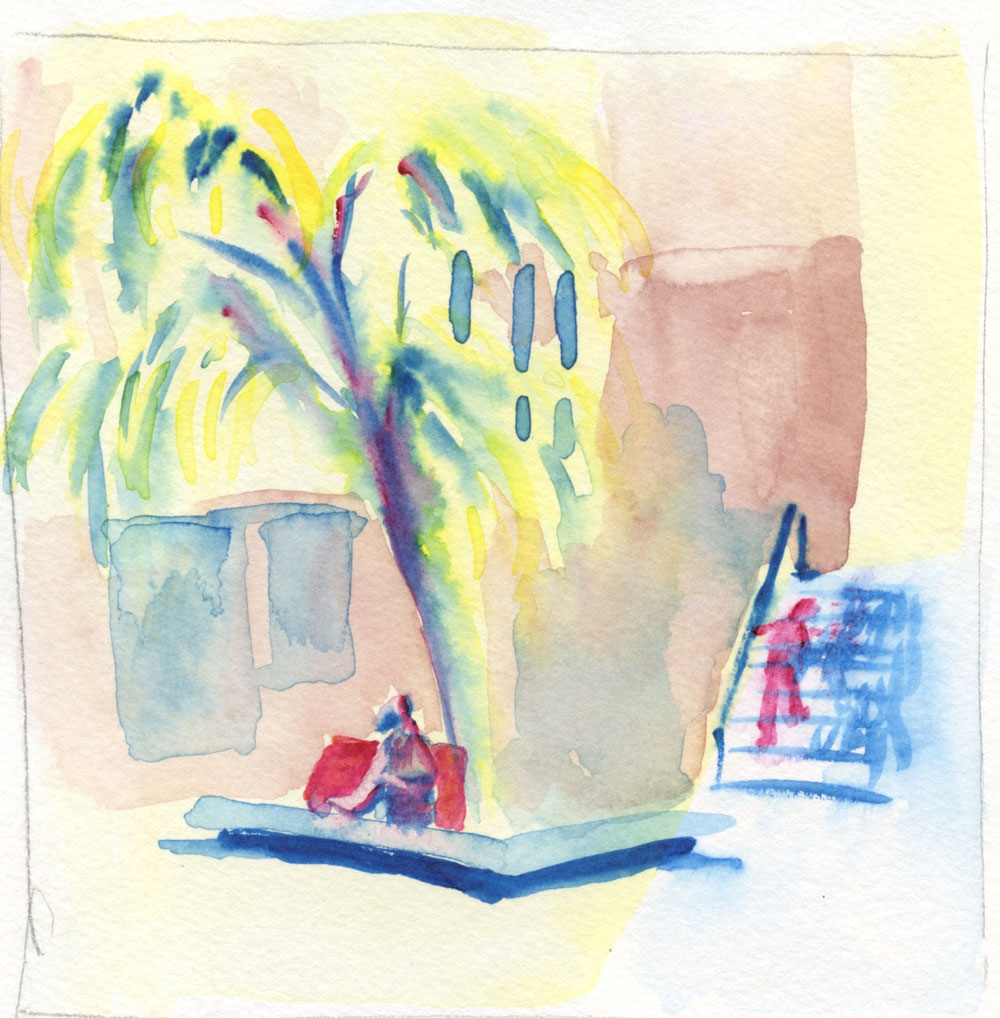
I’ve been looking for more opportunities to take my watercolors out into the field, which, at this point, requires locations that will give me a seat at a table to put my palette on. I sketch often at the Green Lake Village courtyard (below), so I thought the familiar scene would make it easier. I was disappointed with the wimpy colors and distracting figure climbing the stairs and right out of the composition. I was going to leave it alone as a finished disaster, but when I got home, I tried using colored pencils to darken some areas and “dull down” the unfortunate figure. It’s a bit better, but not much.

6/12/23 Green Lake Village

With colored pencil added later.

One day as I waited for a friend at Green Lake, I made a quick thumbnail study of this scene I’ve sketched before (below left). Later I painted it from a photo taken on that dully lighted, overcast day and using the value study as reference. Overall, it’s not bad, but that central, foreground tree is the type I mentioned at the beginning of the post: a flat blob of color.

6/13/23 photo reference

Thumbnail study from life

The sketch below was made from a photo I took at Volunteer Park last summer. While I wouldn’t say this one is a flat, formless blob, it doesn’t “read” well as a tree – the light spots in the center make no sense, as the light wouldn’t be that bright there. I also knew before I began that I probably wouldn’t like that primary triad, but I used it anyway, and I was right. That dark blue (called Indigo by Kuretake, but it looks more like Prussian to me) doesn’t mix into a good green with either of the two yellows in my Kuretake Gansai set (but keep reading, because I use it again later, and it turns out to be useful after all).

6/15/23 photo reference

At an outdoor table at Columbia City’s PCC was the first time I felt less conscious of “painting” – it felt more like “regular” urban sketching – so that was the turning point when I started feeling more at home with watercolors. There wasn’t much color in this metal and concrete architecture, but I was pleased with the variety of grays I got with the secondary triad I used – which I chose because I needed orange for that inexplicable stack of cones in the dining area!

6/17/23 Columbia City PCC

One evening in my “downstairs studio,” too lazy to go get the Kuretake watercolors or even a mixing tray, I pulled out the Sakura Koi set I keep on my reading table. With nowhere to mix or dilute paints, I used only the water in my waterbrush to make two portraits (Earthsworld reference photos). With little hope of capturing resemblance, I felt liberated to focus on the facial forms using a warm and a cool tone.


6/19/23 Earthsworld reference photos

On Day 20 I was back to trees – specifically, ornamental plums and the elusive near-black, dark red of their foliage that I had chased with colored pencils a few years ago. I wanted to capture both their hue and their form. Here’s where that Indigo came in: It mixed beautifully with Rose Madder Deep to get that plum foliage color.

6/20/23 photo reference (Etchr 100% cotton cold press paper sample)

As for the trees’ form, I’m happy with the result I finally got after several wet-in-wet layers (is it still called glazing if they are wet-in-wet?), but this tiny, A6-size sketch took an hour because of all the drying time. With colored pencils, I could do a sketch like this in 20 to 30 minutes – another thing that keeps me from eagerly running out on location with watercolors.

(A couple of days are missing from this post. . . they were covered in this post.)

Related Posts Plugin for WordPress, Blogger...