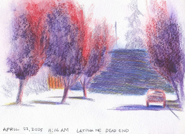
 |
| 4/22/25 Maple Leaf neighborhood |
Now that I’m past the excitement of pink petal peeping and
sketching, I want to get back to studying color temperature. Specifically, I
want to apply what I learned in Sarah Bixler’s class to sketching in the
real world, on location. With all those cherry trees I sketched, I found that I
was too enamored with the subject matter to focus on study, which requires a
different kind of concentration. It’s actually easier to study color
temperature with a “nothing” scene.
These are the same ornamental plum trees I became obsessed with several years ago as I tried to find the right color mixes to capture the reddish-purple, nearly black hue of their foliage. During that first pandemic summer, this dead-end street between Maple Leaf and Green Lake became my favorite safe and easy place to study this confounding color.
 |
| In this photo, the grassy areas look blown out and overly warm; in reality, the fence looked warmer. |
With a limited palette (yellow, red, purple, blue) and nothing tricky to draw, I could see the whole scene abstractly in the same way my classmates and I practiced color temperature concepts on portrait skin tones. The warmest spot was the fence toward the left. Other than the sky, which I decided not to color, the coolest area was the broad freeway barrier wall in the background (in reality, a dark gray; I mixed all four colors). Everything else was somewhere in between. I considered mixing a very warm green for the grass, but instead I just added a bit of yellow to the purple shadows only where the trees’ cast shadows hit the grass. I left the street shadows straight purple.
Now that it’s finally warming up a bit, I intend to do more of these studies on my walks.
You captured the values nicely.
ReplyDeleteThanks! Values are now much easier for me than color temperature!
Delete