Showing posts sorted by relevance for query Gilligan’s Island. Sort by date Show all posts

Wednesday, December 11, 2024

Graphite for Gilligan’s Island


My picks, from top: Dixon's Typhonite Eldorado, Faber-Castell 9000, Staedtler Mars Lumograph. The other two didn't make the cut.

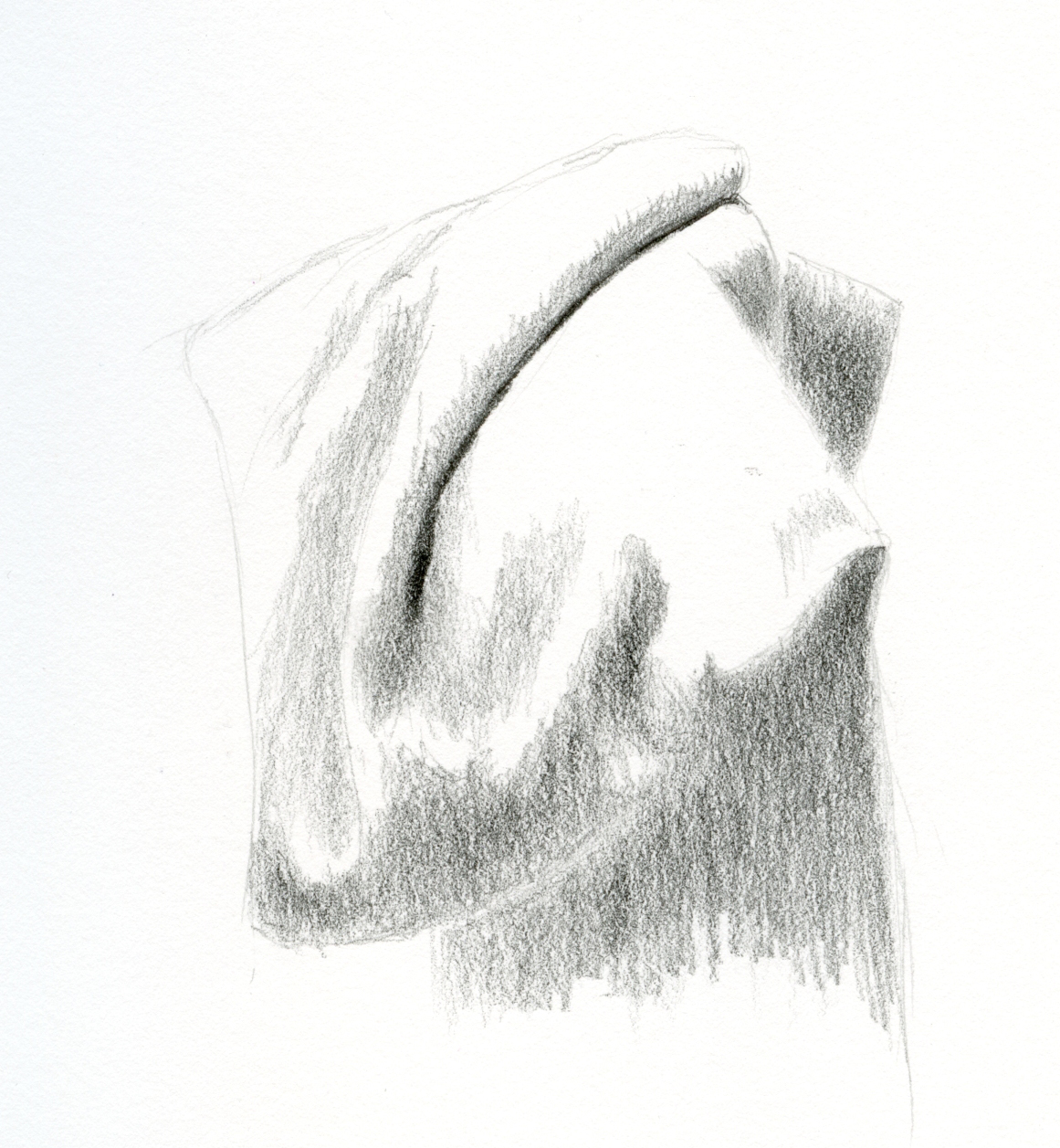
11/27/24 Faber-Castell 9000 8B
Regular readers of this blog know my preoccupation with thinking about what I’d take to Gilligan’s Island. Don’t laugh – when it comes to art supplies, it’s an important question. Although I typically ponder this issue as it relates to my entire sketch kit, which would always certainly include at least one graphite pencil, it was only recently that I began thinking more specifically about which graphite pencil I would take.

The question came up during Pencilvember while I was using a Faber-Castell “Castell” 9000 pencil for a draped scarf study. For a graphite sketch, I typically use one hard grade to begin, then finish with a softer grade. In the case of a full-on, finished drawing, I might use several grades in between. But I was in a hurry that day with only 20 minutes before I had to leave for an appointment, so I tried an experiment: Instead of my typical method, I used only the F-C 9000 in 8B.

I know 8B sounds way too soft, and I thought it would be challenging to draw the initial blocking and lightest values with a pencil that dark. In fact, it is very strangely both hard and soft. While the end result is not as smooth as it might have been had I started with a harder grade, I was happy with it – both the result and the process. Because the entire 9000 range is so hard (compared to any Japanese range and probably even some European ranges), the 8B was suitably hard while also being dark. Huh – I wouldn’t even mind taking it to Gilligan’s Island.

11/29/24 Dixon Typhonite Eldorado 3B
That’s what got me thinking: what other graphite pencils would be good candidates for the “three-hour tour”? Before I get started, let’s consider the criteria:

Multiples and variations must be minimized. Anticipating a potential rescue, the Skipper tells the castaways that they may bring only the “bare essentials” (a term that makes Mrs. Howell gasp and adolescent 1960s viewers titter). Ginger’s 15 evening gowns would not make the cut, and neither would a full range of graphite pencils.

In addition to being compact, each choice must be versatile. If one colored pencil can take the place of two (oooh, bicolors!), that’s great, but if it’s also a watercolor pencil, all the better. The double-sided Viking Verso would be an ideal graphite choice – if only I liked the scratchy graphite.

Practical matters must also be considered. One could make the argument that a clutch and a box of leads in a variety of grades would certainly be a compact graphite set for the island. But how practical would it be to continually change the lead in a clutch while making a drawing? Not at all. I’d be rescued by the time I finished that sketch.

Finally, a subjective criterion is also important. I must enjoy using the pencil, or being stranded for any length of time would be intolerable.

12/1/24 Staedtler Mars Lumograph 2B
With these criteria in mind, I determined that a pencil for Gilligan’s Island must have graphite hard enough to last far beyond that three-hour tour to minimize sharpening, but it must also be soft enough to build darks efficiently. While the result may not be as smooth as using multiple grades, it must be at least adequate. To test the pencils, I made more draped fabric studies using the Field Notes Streetscapes sketchbook.

My top three candidates are the vintage Dixon’s Typhonite Eldorado 3B, the previously mentioned Faber-Castell 9000 8B, and the Staedtler Mars Lumograph 2B. Each is simultaneously hard and dark, making them versatile, compact pencils. The Lumograph is not as smooth and pleasant to use as the Eldorado or 9000, but it does meet the criteria. The Lumograph and the 9000 have the advantage of being readily available almost anywhere (except the Island, of course) compared to the vintage Eldorado (though it can be found often enough on eBay).

12/2/24 Tombow Mono F: Too hard.

Although I had doubts, I tested a long-time favorite pencil to see how it would fare: A Tombow Mono F. Sometimes I start graphite drawings with this F as my first, hardest grade, then finish with a softer grade or two. Unfortunately, it's not soft enough to finish a sketch, at least with my patience level, because it takes too long to build up the darkest darks. (Who’s got that kind of time when there are coconuts to pick?)

My search was by no means exhaustive; I probably have other pencils that would pass the Gilligan test. These were simply the ones that were fresh in my memory from this year’s and last year’s Pencilvember. What are your graphite candidates for Gilligan’s Island?


12/2/24 vintage Eberhard Faber Microtomic 6B: Too soft.


All pencils were freshly sharpened before making the test sketches. This image shows how the points looked after the sketches were finished.

Friday, December 16, 2016

Which Field Notes Would I Take to Gilligan’s Island?

From left: "Pretty Much Everything," Workshop Companion, yellow Sweet
Tooth, red Sweet Tooth, Lunacy
Every now and then I like to think about what kind of sketch kit I would take to Gilligan’s Island. I admit, this is mostly an intellectual exercise, for if I were really going to board the S. S. Minnow from Honolulu for a three-hour tour, surely I would take the same bag I carry day-to-day and everything in it. Every time I step out of the house, my bag contains enough sketch materials to last at least a week stranded on an uncharted island.

But I’m recalling one of the many times the castaways thought they were going to be rescued, and the skipper commands the others to bring only “the bare essentials” (which causes much consternation among the Howells and Ginger, who clearly thought a three-hour tour would require several changes of evening wear). So when I refer to the sketch kit for Gilligan’s Island, I’m really talking about sheer minimalism. The bare essentials. What is the absolute smallest, minimal sketch kit I could have and still survive – not only the three-hour tour but perhaps even stranded for a few days?

Pretty Much Everything's dark orange paper makes a great
background for brush pen and opaque white gel pen. The
pale grid ruling is hardly visible. Alas, this book is a very limited
edition and difficult to find.
I define absolute “bare essentials” as paper in the form of one small sketchbook and one drawing instrument. Since Field Notes Brand notebooks have become my pocket sketchbook of choice, it seems reasonable to assume that one would fulfill the paper part of the essentials. A couple of years ago, I was bemoaning the dearth of small notebooks with paper appropriate for sketching, but now I have my choice of four: Workshop Companion, Sweet Tooth (in three colors), Lunacy and the very limited, orange-paper “Pretty Much Everything” edition. Which would I take to Gilligan’s Island? And with that choice of notebook, which writing instrument would I take?

These were among the weighty questions I pondered as I prepared to head out for Zoka Coffee yesterday. In addition to the one I am currently carrying (a red Sweet Tooth), I grabbed a couple other Field Notes notebooks to test them for Gilligan-ready status.

Red Sweet Tooth with brush pen, white gel pen, white colored pencil.


You know by now how much I like red Sweet Tooth paper (and, similarly, the bright orange “Pretty Much Everything” paper) – it’s an ideal toned background for a black brush pen highlighted with a white Gelly Roll pen or a white colored pencil. But without that white highlighter, I’m not sure dark red or orange paper would get me through a whole week.

A gray-papered Lunacy takes a brush pen or fountain pen beautifully but not a white highlighter, and colors fall a bit flat, so it would be similar to a red Sweet Tooth in that regard – monochrome Island sketches.

A yellow Sweet Tooth, however, could take a brush pen, a pencil or even a compact coloring implement of my choice – maybe a rainbow pencil. Better yet, a Uni Jetstream multi pen containing four ballpoint ink colors and a pencil! And an ivory-papered Workshop Companion could take all of those, too.
Yellow Sweet Tooth with rainbow pencil

Both also go well with my favorite Sailor fude fountain pen filled with water-soluble ink that could be washed for shading – the ultimate in simplicity. But here’s the rub: If I stick with my one-implement rule, then I can’t bring a waterbrush. At the coffee shop with that restriction in mind, I used a handy tool I know Don Colley uses frequently but that I don’t use much – a finger. With spit! I was pleased with the shading I was able to get on the man’s back and head with one finger (see bottom of page), but even my pinky was too wide to shade his hand.

It would be difficult to sketch several days on that island without color, but I think I still get more mileage from a tool that allows me to convey tones quickly. If I could bring two implements, I’d bring the red or orange book, a black brush pen and a white Gelly Roll, and I’d be happy for a long time. But since I can only bring one. . .

I’d pack the Workshop Companion and either a water-soluble brush pen or the Sailor fude filled with water-soluble ink. My spit-finger would always be available for toning, and if we weren’t rescued in a week, I’m sure the island would offer minerals and plants that could be made into pigments.
Yellow Sweet Tooth with ballpoint pen

Now if only one of the gajillions of multi pens available included a brush pen component, I wouldn’t care if I ever got rescued. 

Lunacy with brush pen

Workshop Companion with ballpoint pen
Workshop Companion with rainbow pencil

Workshop Companion with graphite pencil
Workshop Companion with fountain pen
and finger-spit wash

Wednesday, May 7, 2014

What I Would Take to Gilligan’s Island

My bare-essentials sketch kit -- what I would take to Gilligan's Island.
It’s been more than six months since I updated my Current Favorite Art Materials page photos. I used to update the page and the photos nearly every month because I was changing the contents of my sketch bag – and therefore my favorite supplies list – so often. But the past year or more, I’ve settled into a comfortable groove that I make only minor tweaks to occasionally. You can see the updated list and photo of my bag’s contents now.

The page also includes a photo and contents list of my ultra-minimalist sketch kit, but I realized I never did a post about it. When fitness-walking in the neighborhood or around Green Lake, I never used to take sketching gear of any kind. But ever since I spotted an elusive gray heron  at Green Lake and found myself empty-handed, my habit has been to take a small kit that I think of as the absolutely bare essentials.  These are the few items I couldn’t bear to live without on that fateful day when The Minnow washes up on Gilligan’s Island. (I suppose eventually I’d have to peel bark off of palm trees to make paper and wrestle an octopus to make ink.)

The kit is currently housed in a Travelon Convertible Travel Wallet, which has (though barely) enough space for my smart phone and keys too, so it’s actually a serviceable bag. It contains:
What would you take to Gilligan’s Island?

Saturday, June 27, 2020

If I Had to Choose Only One Colored Pencil

6/19/20 Maple Leaf neighborhood (Caran d'Ache Supracolors in Stillman & Birn Beta sketchbook)

Several months ago, I needed a new inkjet printer. Scrolling through hundreds of options, I became frustrated by the many “all-in-one” models. They don’t just print; they also scan, fax, copy, make espresso and serve it to me with music and dancing. All I wanted was a reliable, high-quality color printer. While there may be nothing wrong with a multi-functional device that can do all things, I had a feeling that they would not do any one thing exceptionally (such as print). That’s been my experience, anyway.

All of this is preamble to what I really want to talk about, which is, of course, colored pencils. If you’ve been reading my blog for a while, you know that I occasionally like to think about what I would take to Gilligan’s Island. It’s my way of hypothesizing different ways of simplifying my sketch tools: Beyond a “three-hour tour,” what if I had to use these and only these tools indefinitely (or at least for a specified length of time, like my annual minimalism challenges)? It occurred to me one day that I had never posed the question about colored pencils: If I could choose only one set (perish the thought!), which would I choose?

I have mentioned several times that different types of drawings or parts of the same drawing require different types of pencils (such as soft or hard), so identifying one pencil that can do all jobs well is not possible. My recent picks of top colored pencils short-listed my favorites, but that list still includes three water-soluble pencils and three traditional pencils. If I really had to choose only one set – the footlocker I’m taking to Gilligan’s island simply will not hold six sets – which would I choose? And how would I choose?

The answer comes down to versatility: Even if a single pencil set cannot do all jobs well, which “all-in-one” pencil set can at least print, copy, fax and serve espresso satisfactorily, if not ideally? These are the criteria I used to make my choice:

  • Water-solubility is essential and non-negotiable. That means the water-soluble pencil I choose must also work well dry. This criterion alone eliminates many watercolor pencils I’ve tried that are either unpleasant to apply (Faber-Castell Albrecht Durer, for example) or are difficult to blend and layer dry.
  • The core must be sufficiently soft and thick to accommodate my need to sketch quickly and efficiently on location.
  • Yet it must be hard enough to manage small details.
  • The color range must be wide enough to cover any subject matter I might want to sketch.
  • Replacement pencils must be easily available open stock (even on Gilligan’s island).

The pencil that meets all these criteria best is Caran d’Ache Supracolor. If you recall how often I’ve gone on and on about the virtues of Caran d’Ache Museum Aquarelle, you might be surprised by my choice. As often as I would easily choose Museum Aquarelle as my overall “favorite” pencil, it is the equivalent of a professional quality inkjet printer that makes beautiful color prints but that will certainly not send faxes (let alone make espresso). It’s my all-time favorite because it meets my urban sketching needs ideally. It is not without downsides, however. For example, the Museum Aquarelle is so soft and has such a hefty core that it will not hold a point for small details. Its color range is also narrow compared to most colored pencil lines. When achieving accurate hues is important (such as for botanical drawings), I almost always have to supplement Museum Aquarelles with colors from the Supracolor or Albrecht Durer lines.
6/9/20 Supracolor in S&B Nova sketchbook

The task that recently made me appreciate Supracolors used traditionally (without water) was my daily hand sketches on black paper. When I don’t plan to use water, I tend to choose a traditional pencil, so it was an interesting experiment to use a white Supracolor fully intending to leave it dry. The white Supracolor applied almost as pleasantly as various oil- and wax-based white pencils (without the “stickiness” of some water-soluble pencils), and the dry pigment was rich and opaque.

To continue examining Supracolors dry, I made two similar sketches of bellflowers using the same four Supracolor pencils – one sketch using dry pigments only, the second with both wet and dry layers. Although extremely soft, Supracolors will sharpen to a nice point and stay sharp long enough to draw slender leaves and stamen. In the dry sample, the pigments layered and blended beautifully. In the dry/wet/dry sample, the pigments again layered and behaved predictably well (as I have come to expect from both Supracolors and Museum Aquarelles).

6/18/20 dry Supracolors in S&B Epsilon sketchbook

6/18/20 wet and dry Supracolors in S&B
Beta sketchbook

Incidentally, the four colors I used are Cobalt Violet (620), Ultramarine Violet (630), Bright Green (720) and Olive Yellow (15). The first three are from the Limited Edition 30th Anniversary Set, which means they aren’t available open stock (and therefore can’t be replaced at the Gilligan’s Island art supply store). I sure wish Caran d’Ache would make these “limited” colors part of their standard line, as I often find that the color I want happens to be one of them.

As a final test, I wanted to see how Supracolors perform in the field. Although I normally carry one or two Supracolors (usually seasonal or specialty colors that aren’t available among Museum Aquarelles), I’m not sure I’ve ever made an entire sketch on location with nothing but Supracolors, so it was high time I tried it.

Before going out, I tried to match each Museum Aquarelle in my current palette (which is smaller than usual in the Pandemic Edition of my sketch kit) with an equivalent Supracolor. I was able to find an identical or close match for most colors, but not Museum Aquarelle’s Dark Phthalocyanine Green (719), which I use often for the shady side of foliage. Nothing in the Supracolor line comes close.

The sketch at the top of the page, a quiet alley with interesting shadows one morning, was the result (including a bit of pentimento from a previous sketch that ended abruptly when my subjects went away). Not quite as soft or rich in pigment as my beloved Museum Aquarelles, the Supracolors still held their own and would certainly be sufficient for sketching on location. (I did miss that green 719, though.) I was able to cover large areas almost as efficiently as with Museum Aquarelles, and spritzing the foliage areas with water activated the pigments nearly as vividly.

So if I had to choose only one set of pencils, it would be Supracolors. The irony is that they might not be my first choice for anything. If I want to do a detailed, full-color drawing with traditional pencils, I would probably choose Faber-Castell Polychromos or vintage Prismacolors (or more likely both – an ideal hard/soft combo). If I want water-solubility, then I would go to Museum Aquarelles first, then pull in additional colors as needed from among Supracolors and Albrecht Durer. If I’m stepping out the door, Museum Aquarelles are always my first choice. But while Supracolors aren’t ideal for everything, they can do everything well enough with no complaints from me. It’s my most versatile colored pencil.

Move over, Gilligan... here I come!

Thursday, September 28, 2017

Minimalism

9/24/17 Just paper and pencil.

Maybe it’s when my bag starts to feel too heavy. Whenever I pare it down, the weight gradually creeps up again. You know what I mean. That’s when I start thinking about minimalism – the smallest sketch kit I could possibly use, or which Field Notes I would take to Gilligan’s Island. It’s more complicated than it seems, because the drawing implement I take depends on the notebook I choose.

Dime Novel, the latest edition of Field Notes, is slightly larger than the standard format, giving me just a little more page space, and the pages are blank, making them ideal for sketching. In addition, the 70-pound white paper holds up to most of the sketching media I typically use – brush pen, graphite, colored pencil (though not my favorite Sailor fude fountain pen). It can even take a light swipe from a waterbrush. And with more pages than a standard Field Notes, I could stay longer on Gilligan’s Island. (You can read my full review of Dime Novel on the Well-Appointed Desk.) I decided to put the Dime Novel to the test.

With creamy white paper, it’s tempting to take along colored pencils – but then, of course, I’d need several colors. I could grab a single brush pen – that would be minimal. But “minimal” isn’t just about the number of implements – it’s also about simplicity. What’s the simplest, most basic sketching tool I have? 

Last Sunday, a lovely sunny day, I walked up to Maple Leaf Park with nothing but the Dime Novel and one Blackwing. As much as I love exploring lots of different media, sometimes all I need is paper and pencil.

Friday, November 18, 2022

A Salute to the Lowly Bic

15 colors!
 

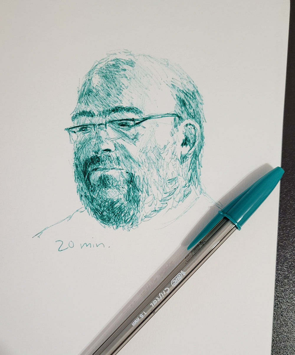
Although I’ve been sketching with Bic ballpoints sporadically for a while, it wasn’t until I took France Van Stone’s crosshatching courses that I learned to fully appreciate them as an art material. During InkTober when I was crosshatching (mostly) human portraits, I tried a few other types of pens that France used in demos, just to see what they were like as a crosshatching tool, but I kept going back to Bics.

1.6mm Xtra Bold tips

Since my first formal experience with hatching and crosshatching was by copying masters using traditional pen and ink, a particularly elegant medium for those techniques (when done by masters), it seems ironic to say that ballpoint crosshatching, when done well, can be almost as beautiful (not to mention faster and with less potential for tragic ink spills). My Bic crosshatching will never be as elegant as France’s (or other ballpoint artists I admire, as seen in the fantastic book, The Art of Ballpoint, by Matt Rota), but I’m good with that. The messy, “dirty” methods I learned from France suit my style and patience level, and I’ve found that Bic mark-making can be expressive and textural, which appeals to me. Although its appearance is different, Bic ink is strangely similar to pencil in application – its pressure sensitivity and in the way it builds up gradually in layers. Bics are the pencils of pens – no wonder I love them!

I think of Bic ballpoints as the lowliest of all my sketch materials (indeed, among the lowliest of art supplies and stationery products in general). In fact, they could possibly be the ideal Gilligan’s Island art medium: If I found myself stranded with absolutely nothing at all to draw with, surely I could sneak into any hotel on the island and help myself to a Bic from the counter. (I have done as much under far less dire circumstances.)

Xtra Bold and lots of drools.

It’s also an egalitarian art medium: There’s no distinction between “student grade” and “artist quality”; the snob value is equally distributed among all types of Bics (that is, equally little for all). Well, there might be a few exceptions, like
 the limited-edition, jewel-studded, gold-plated 4-Color (priced at 390€).

Unlike some pencils, which may have been inexpensive and utilitarian initially but became overly inflated in price due to scarcity, the ubiquitous and probably nearly universal Bic doesn’t seem to have much collectible value. OK, there might be an exception to that, too. By the time I found out that Bic had come out with a limited-edition, “collectible” 50th anniversary 4-Color pen, the anniversary had long gone by, and the pen was only available at inflated eBay prices. Still, the inflated price was only 7 bucks – easy to spring for.

Caution: If you go hunting online for the 50th anniversary edition, beware that some stores show packaging for the commemorative edition, but if you read the fine print, the stock they are selling is the standard 4-Color you can get anywhere. The 50th anniversary edition has a dark blue barrel, and among the standard four ink colors, green has been replaced with purple. (See my photo below.)

The inexpensive price of Bics means that they are easy to acquire – maybe a little too easy. Taking France’s courses prompted me to take inventory of all my Bics, and let’s just say I have a few. The fact that they are easier and much cheaper to buy in bulk quantity rather than singles unfortunately makes over-acquisition a problem. All that disposable plastic is also an issue, although most are refillable.

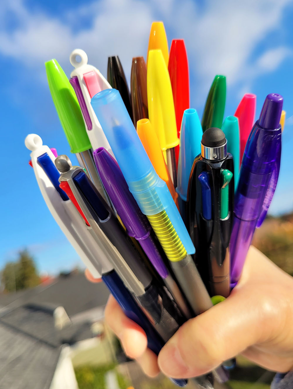
Shown at the top of the page is my latest purchase – a pack of 1.6mm Xtra Bold point Cristals in 15 colors. Some colors are duplicates of those in another pack I bought a few years ago, but I bought this recent pack for colors that are rare among ballpoints, such as metallic gold, brown and neon colors. (I used some of those new colors at the end of France’s “critters” course on the golden retriever and pink cow.)

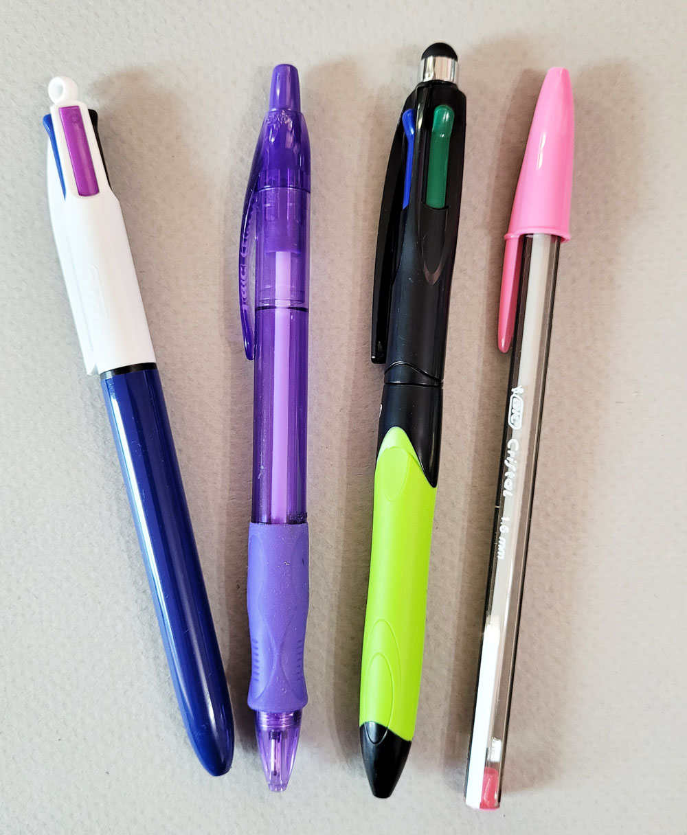
From left: 50th anniversary Bic 4-Color, Velocity, 4-Color with stylus, 1.6mm Cristal

The Bics I used most often in France’s courses are shown at left: the classic 4-Color with medium points; the retractable Velocity with Xtra Bold point (that is strangely even more blobby and drooly than Cristals of the same point size); my newest 4-Color Grip with a stylus on the end; and the 1.6mm Xtra Bold Cristal in various colors.

Each of these has pros and cons. I like the convenient, retractable Velocity, which has a more comfortable barrel than the classic skinny Cristal, but the drooly ink is frustrating. (I don’t understand how a change in the body results in more drooly ink!) The 4-Colors also have more comfortable barrels than the Cristals. I don’t need the stylus, but that one has the additional benefit of better color-selection levers that engage more easily. It costs a few bucks more than a standard 4-Colour, but it has become my favorite Bic body. (If only the 4-Colors came with an Xtra Bold point option, my life would be perfect.)

Despite drooly, blobby ink, France favors 1.6mm Cristals because she can really lay down a lot of dark values quickly when aggressively crosshatching with them. Instead of wiping off the tip constantly as she does, I eventually accepted the blobs as part of the medium. By the end of InkTober, I had decided that I preferred to use a medium point Bic for most of the crosshatching and then finish off the darkest values with a 1.6mm Cristal. As the pencils of pens, this combo is similar to the way I might use HB and 4B graphite pencils together in a drawing.

A bouquet of Bics

So after all these musings, it seems the Bic is not so lowly after all. Whether scribbling a shopping list or making gallery-worthy art, it is rivaled only by a pencil in versatility (and has the added benefit of never needing sharpening). All hail the modest, ubiquitous Bic!

More posts about Bics:

Bic CMYK Colors (and Cristal UP Comments)

A Super-Cool Bic

Review: Bic 4-Color 3+1 Pen/Pencil

Wednesday, July 5, 2017

How Many Colored Pencils Do You Really Need?

The short answer is: as many as possible.

The more reasonable and pragmatic answer requires more thought, and I’ve been giving it that ever since I started writing my review of Blackwing Colors colored pencils, which is a set of 12. I’ll get back to the basic 12 soon, but first, let’s go big.

I confess that I’ve succumbed to more large (sometimes largest available) sets of colored pencils than anyone ever really needs, for any purpose. I find myself doing the math and realizing that, per pencil, a box of 120 is almost always a better price than a box of 24 or 36 or even 72. But if the pencils turn out to be flawed, then the good price isn’t a good value. I don’t recommend this strategy unless you’re familiar with the pencil’s quality. (I’m much better at dispensing good judgment than following it.)

One issue is that an assortment may say it contains 72 colors, but many of those colors will be so similar that they might as well be the same (see below for one example). If it’s a color you use often, then it’s not a bad value – just slightly misleading marketing. In any case, you got fewer colors than you thought.
 
Marco Renoir colored pencils seem like a good value, but many of the reds
 and the blues in the set of 72 are very similar.
The largest sets of most brands contain 120 pencils (Prismacolor and Holbein each offer a whopping 150 in their largest sets; so far, I haven’t succumbed to either), and if they are artist grade pencils like Caran d’Ache and Faber-Castell, most will be unique colors. But many might be colors I typically wouldn’t use, such as subtly varying flesh tones for portraits or a range of floral pastels. (Take a look at the Amazon photo for that Holbein set – one whole tray is full of pastel tints that look gorgeous, but I know I would have no use for them.)

In my experience, assuming that I already know a pencil is of good quality, a set of 36 or 48 is the sweet spot – usually a good value in terms of price per pencil and having all the colors I’d probably ever need for an urban sketch or a still life. Ideally that pencil line will offer open stock, so if there are some subtle or esoteric colors (like construction site yellow or old Europe verdigris) that aren’t found in the set, I can supplement it.

I’d certainly want at least 36 or 48 colors on my desk, but as an urban sketcher with a portable “studio,” that’s way too many to carry day to day. When I first started making the full transition from watercolors to colored pencils last fall, I worked hard to pare my daily-carry selection down to about two dozen (though I kept slipping one or two more in). By the time I discovered the Tran Portfolio pencil case and took it to Italy this past spring, I was committed to the Tran’s 25 pencil slots – no more, no less. I’ve found that to be a very workable quantity for the type of location sketching I do. I change out a few colors now and then if a location I’m planning to sketch requires it, but for the most part, that carefully selected palette serves me well.
 
My current daily-carry palette of 25 colors.

So, for me, 25 pencils are all I really need – if they are the right 25 pencils. (However, I could not have purchased those 25 in a set; my current selection comes from three lines.)

Occasionally the minimalist in me likes to think about the materials I’d take to Gilligan’s Island (here’s a post about which Field Notes I’d take to the island, and another about the most compact sketch kit possible), so that’s how I framed a question to myself: Twenty-five pencils are meeting my needs well for day-to-day location sketching, but how many would I take if the Skipper demanded only the bare essentials? Could I get by with as few as 12?

A few of my novelty colored pencils -- fun and pretty,
but generally of poor quality.
And that brings me back to my original 12-pencil set question. The smallest set most colored pencils come in is 12. Sometimes no more than 12 are offered, especially in the case of novelty pencils and those intended for kids. (As I confessed in that Blackwing review, I am a sucker for such colored pencils – the kind that come in pretty boxes, have clever jokes written on them, or offer two colors on one stick. I always try coloring with them, and they are almost always disappointing in terms of core quality, but I can’t resist anyway.) However, a set of 12 higher quality colored pencils can be a smart way to try an unfamiliar brand. If the basic colors apply and blend well, sharpen smoothly and exhibit other strong qualities, then I might (probably would) buy a larger set.

The annoying part about even high-quality 12-color sets is that they are not the right 12 colors. Just as an example, let’s look at a set of high-end Caran d’Ache Pablo colored pencils (that link goes to Blick’s site where you can see a photo; my review of Pablos is here). The smallest set of 12 contains orange, raw umber, scarlet, purple, violet, ultramarine, cobalt blue, grass green, lemon yellow, gray, white and black. Faber-Castell Polychromos (my product review is here) is similar except it has two shades of green. These basic assortments are typical of almost every box of 12 pencils I’ve seen, whether “artist grade” or novelty.

I suppose that range covers the rainbow adequately, and it’s good for tomatoes, apples and most other produce. Also, I’m always up for a primary palette challenge, so it’s good for that. But with only one yellow and often only one red, that single primary palette would get old fast. If they are high-quality pencils that blend well, then brown, black and even gray are unnecessary. And then there’s that ubiquitous white. I know colored pencil artists use white for burnishing to allow more layers of pigment and subtle hue differences to come through. But that’s a fairly advanced technique in which you’d still want more colors to work with than the other 11 in the box. Does someone buying a basic set of 12 really need white? (I remember being a young child with a box of colored pencils when I first asked myself: It doesn’t show on paper – what’s the point? Indeed!) 

If I were designing an ideal set of 12 colored pencils, I would start with the traditional painter’s palette: a warm and a cool of each primary – red, yellow and blue. These would give me enough variety in warm and cool secondary combinations that I could cover quite a bit of ground before they got old. Since I really enjoy using the secondary triad that I started experimenting with in my colored pencil class and that I used in Italy, I would include a warm and a cool green, a violet (not always easy to mix), and a burnt (cool) orange (warm orange is easy enough to mix). I bet those 10 pencils would cover just about anything I’d encounter in nature (including still lives) and the urban environment. For the last two colors, I’d want the warm gray that I find myself using often for shadows and (at least here in Seattle) the sky, plus indigo or a dark cool gray.

Caran d'Ache Pablo selection
Pablo mixes

Faber-Castell Polychromos selection
Polychromos mixes

Now if Caran d’Ache or Faber-Castell put those colors in a set of 12, that would be an excellent starter box that could then be supplemented with a few open stock colors as needed. Just for fun, I put together a set of each brand based on my suggested palette. I mixed the basic triads to see what other hues I could blend from each set of 12. I think I could be pretty happy with either. Indeed, my everyday-carry palette of 25 in the Tran Portfolio is based on a similar dozen with the addition of a few more greens and some local or seasonal hues.

However, as was the case when I was selecting those 25, I like some colors better in Caran d’Ache and others better in Faber-Castell. Ideally, I’d probably pick and choose from each brand to come up with my box of the perfect 12.

And then the following week, I’d probably change my mind and start swapping out some colors. Plus it’s useful to have a full range of colors in both a softer core pencil and a harder core. (I bet Ginger and Mrs. Howell would have difficulty paring down to 12 pencils, too.) 

Hence, the short answer: I need as many as possible.

As many as possible. (No, these aren't all of them.)
Related Posts Plugin for WordPress, Blogger...