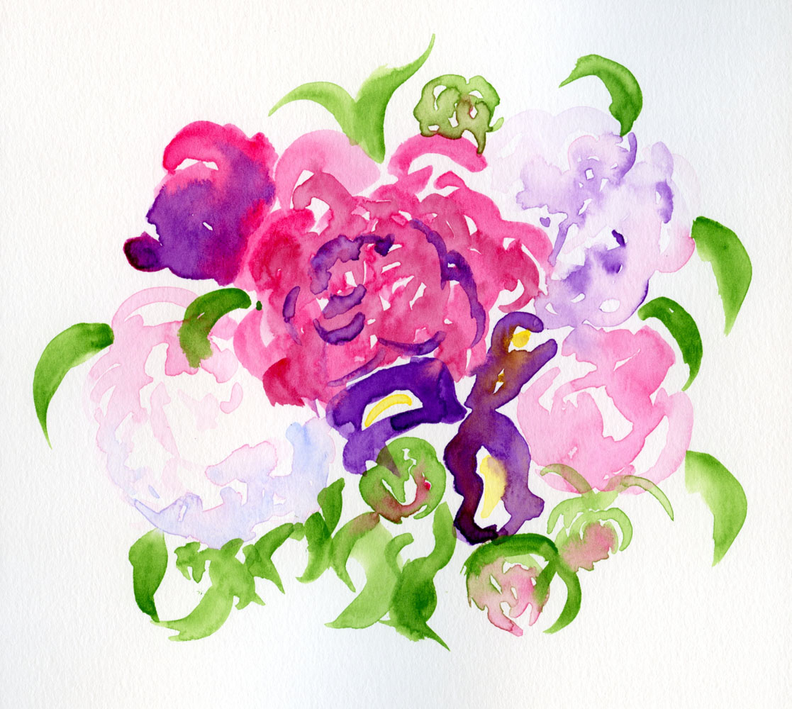
Wednesday, June 7, 2023

National Fat and Sugar Day


6/2/23 National Donut Day observance at Top Pot Doughnuts, Wedgwood neighborhood

Last year I happened to be in the small town of Centralia on National Donut Day, and I was aghast that not a single donut could be found there. I was not about to miss it this year! Kim and Natalie joined me last Friday in observing the day, which has been a personal tradition since 2016.

We started out at the Wedgwood Top Pot Doughnuts, where I resisted scarfing down more than a couple of bites of my chocolate raised until I could sketch it. Unfortunately, while seated at Top Pot’s umbrella’d tables, it’s impossible to see the marvelous giant donut atop its roof. Preferring bagels to donuts, Natalie had the great idea of moving across the street to Grateful Bread Bakery. From there, I could finish my montage with Top Pot’s giant donut, twin palms and celebratory stickers.


Color notes: Every year on this special occasion, I have the same dilemma: Choose a Bavarian crème, apple fritter, or chocolate raised – my favorites to eat but that are not very pretty? Or a bright pink raspberry, multi-colored sprinkles, or pink feather boa – all of which would be more fun to sketch but not my favorites otherwise? The easy solution is to use a secondary triad so that “real” colors don’t matter. Interestingly, I think my sketch looks more like a bagel than a donut!

Tuesday, June 6, 2023

30 x 30 Direct Watercolor Challenge Begins


6/1/23 Google street view reference photo

Not another challenge! With a couple days still to go of my 100 Day Project (final summary on that soon), I impulsively jumped into 30 x 30 Direct Watercolor! Led by Marc Holmes and Uma Kelkar, this annual challenge (now in its sixth year) encourages participants to paint with watercolors daily during the month of June – without an initial drawing before putting brush to paper. According to Marc:

What do I mean by ‘Direct’? Basically, with as little under-drawing or preparation as possible. Preferably none! Maybe just a gesture drawing. We believe that going into the white page with the wet brush guarantees a fresh, authentic experience of watercolor painting.

My recent bouquets painted with direct watercolor were so much fun that I got the idea in my head that I should try the challenge. Then I successfully talked myself out of it, telling myself I’d practice this year and be more prepared to participate next year. Then I gave myself a firm talking-to the way I’ve talked to others who have made similar arguments about why they weren’t taking on a challenge: What better way to “practice” than to take part in a 30-day challenge? With the encouragement of peers and plenty of online inspiration, it’s the ideal time to try something new and very challenging. OK, OK, Tina – you’re right (you’re always right)! I’m in!

As with this year’s 100 Day Project, although I’m committed to practicing each day, I’m allowing myself not to share daily on social media if I don’t feel like it. I’ve learned from other challenges that sometimes the pressure to post just adds to the burden. In addition, I haven’t put together a portable watercolor kit, so at least for this challenge, I’ll be using photo references or sketching things around the house.

6/1/23 Google street view reference photo

Conveniently, the first day of the challenge fell on a session of
Street View World Tour, the free monthly online sketching event hosted by Ellie Doughty and Jenny Adam. The special guest was Sue Heston, who demo’d how she sketches with a focus on “sky holes.” Our reference photos from around the globe included “holes” or other intriguing negative shapes.

I used my Kuretake Gansai Tambi watercolor set (edited 6/9/23: which I reviewed at the Well-Appointed Desk). As I’d hoped, it was easy and convenient to dip into colors without having to mix. In fact, because of my laptop desk setup, if I want to be on a Zoom at the same time that I work, I barely have space for the paint box, let alone a mixing tray. I did have a water glass for rinsing my waterbrush quickly, but it was precarious right next to my laptop!

As for the paper, I used my last Stillman & Birn Beta sketchbook that has just a few pages left in it. With watercolor pencils, I’ve always loved the Beta’s texture, and the sizing was sufficient for the degree of water I use with pencils. With the wet washes I used in these sketches, however, I was disappointed with Beta, especially now that I’m spoiled by Hahnemühle. You can see where the paper buckled, causing shadows when I scanned the images. It’s just as well that this is my last one – I won’t be buying more.

I’ll post my progress here on my blog occasionally. If you want to see what others are doing during the challenge, search for the hashtag #30x30directwatercolor on social media. Are you participating?

Monday, June 5, 2023

Urban Couches and Context


5/31/23 Green Lake neighborhood

Urban couch season is now open, and I bagged my first last week! I must have been slackin’ all summer, because the last one I sketched was more than a year ago. I’m ready – bring ‘em!

As I sketched this, enjoying 61 degrees and a soft breeze in the sunshine, three thoughts occurred to me: One was that in years past when my palette was tied more closely to “real” colors, with rare exceptions, almost all discarded couches were dingey, dirty brown (or formerly some lighter color but brown by the time I sketched it) – talk about sketching mud! This one was too, but using a secondary triad, I was able to get a slightly more vibrant dingey, dirty brown.

Secondly, I thought about how couches make excellent exercises in perspective. Most are basically cubic rectangles with some parts missing (especially if they are lumpy and misshapen), but if you draw them from an angle, it’s quite a challenge. In describing her new online course devoted to teacups, Liz Steel mentions that teacups present a good challenge in drawing ellipses. Maybe I should teach a course on drawing urban couches with perspective as a topic. 😉

Finally, making this sketch made me think about the importance of context in visual storytelling. People new to Urban Sketchers often ask whether something like a potted plant qualifies as an urban sketch if it was drawn from direct observation. I think these two parts of the Urban Sketchers Manifesto address the question:

  • Our drawings tell the story of our surroundings, the places we live, and where we travel.
  • Our drawings are a record of time and place.

Nothing in the manifesto explicitly prohibits a potted plant as subject matter for an urban sketch, but the question is always about the story (no matter how small that story may seem). Does the sketch tell you anything about where the potted plant was when you sketched it – on your own patio, on the porch of a derelict building, in front of an Italian villa? Let’s see the context that shows those location details, and then you’re telling a story.

As for my sketch above, imagine if I had sketched only the couch. It could be in my own livingroom, in my friend’s livingroom, or at the city dump. Or it could be on a residential street near Green Lake where, unfortunately, it’s unlikely to be claimed because the street is closed for pavement work, so no pickup trucks will be able to get to it. But without context, you’d never know it was the latter.

Sunday, June 4, 2023

SFR with AADU


5/31/23 Maple Leaf neighborhood

Within a couple of blocks, several new houses are under various stages of construction in Maple Leaf. All are behemoths compared to the traditional homes around them – the kind that the behemoths have replaced, often two or even three at a time. This one is typical: A large single-family residence with a smaller “attached accessory dwelling unit” in back. (I learned this term by seeing the convenient label AADU on the dwelling.) Even the smaller one has three stories and probably more square footage than our house.

Saturday, June 3, 2023

More Peonies (and Thoughts on a Maximal Watercolor Palette)


5/27/23 Kuretake Gansai Tambi watercolors in Stillman & Birn Beta sketchbook (My favorite spot is the blue shadow on the nearly white peony at lower left. I just know I couldn't have gotten that effect if I had been mixing colors . . . my wet-in-wet approach would have dried.)

I bought another bouquet of peonies (including one perfect iris), this time to take to the cemetery. I just happened to have at my fingertips a brand-new set of Kuretake Gansai Tambi watercolors that I’m reviewing for the Well-Appointed Desk. Tossing caution to the wind, I saw the bouquet as another opportunity to try direct watercolor.

As I implied last time when I was using my set of 24 Akashiya Gansai watercolors, it’s really fun to have easy access to so many colors without mixing – just pick up the paints as if they were colored pencils! (I discovered the same freedom and fun with my Sakura Koi set and Color Meditation Desk exercises.) I’ve been “painting” with colored pencils; I guess now I’m scribbling with watercolors! 😉

In fact, I seem to be doing a 180 flip-flop in the attitude I had when I was taking Kathleen Moore’s winter sketchbook + watercolor course. Back then, I was determined to apply the color principles I had been learning with colored pencils to paints, so I was keeping my palette as minimal as possible. One major frustration during class, however, was that my paint mixes would become increasingly diluted as I tried to achieve the hues I was looking for. I’d add more paint to get the concentration thicker, but then I’d have to adjust the mix again, over and over. It’s no wonder that I always had such wimpy washes as a novice urban sketcher using watercolors. The class was a good education in watercolors when I could work leisurely from photos or still lives at home – but I’m not interested in working that way in the field.

The more colors the better!

As I painted this bouquet straight from the paint box without using a mixing tray, I remembered that in his book, Color First, Ink Later, Mike Daikubara discusses his preference for using a large palette of 20 colors. Saving time by not having to mix on the tray, he prefers to let colors mix dynamically on the page. Knowing how fast and efficient he is at sketching in the field, I now see how much sense his strategy makes for his style.

I don’t know if or when I’ll be ready to take watercolors back out in the field, but new light bulbs are now firing above my head.

Friday, June 2, 2023

Both Sides of the Arboretum


5/25/23 Washington Park Arboretum

We were treated to two fabulous days of “summer” last week as a lead-up to Memorial Day weekend. Nilda and I met at the Washington Park Arboretum, hiked through the quiet, cool, forest-like side, then found a shady bench to sit, chat and sketch. In the distance, I spotted a tree still brilliantly lighted by the afternoon sun (above). By the time we left a couple of hours later, it was mostly in shade.

We didn’t get around to the colorful side of the Arboretum, where the rhodies and azaleas were at peak the prior week. I knew they wouldn’t be around much longer, so the very next day, the spouse guy and I decided to catch the color. Almost exactly a year ago, we had enjoyed the same colorful route, but I had sketched with only graphite. This time, I pulled out all the stops and let the color flow.

5/26/23 Azaleas and rhododendrons

What struck me on this visit was that while the eye is bedazzled by brilliant hues of pink, red and orange, the dark green foliage surrounding the blossoms is what makes the floral colors pop. That seems self-evident, and yet I realized I hardly pay attention to surrounding foliage when I decide to sketch colorful blooms. This time, I did pay attention. (I sure love all the texture I got -- and it’s the Hahnemuhle paper that did all the work!)


Thursday, June 1, 2023

Peony Petal on Black


5/24/23 Pinks appear too cool

One morning I came into the kitchen to find that the palest pink peony in my bouquet had fallen apart in an explosion of petals. Before sweeping up the counter, I picked out a few petals to sketch.

It would have been relatively easy to sketch a nearly white petal on white paper, but to make it stand out would require some kind of tedious background. Since my mind is lately fixated on light-on-dark drawings, I wondered what it would be like to sketch it on black paper. I’ve seen works by colored pencil artists who use black or other dark papers, and one trick they use is to apply white or a very pale tint first to make the later colors show more easily. (I showed how I had used that technique a few days ago.)

In my black Uglybook, I first put down a few layers of a white Derwent Drawing Pencil, which wasn’t opaque enough to completely cover the black, but I thought it was good enough to start. The peony is a relatively cool, pale pink, so I dug through all my Prismacolors, Faber-Castell Polychromos and even Caran d’Ache Pablos (which I rarely use) to find suitable candidates. I started with five. What I hadn’t anticipated was that the black paper cooled the pinks significantly, so although test swatches looked right on white paper and even on black, by the time I had applied several layers, I could see that the hue was still too cool (above). It might have helped if I had put down several more initial layers of white to obscure more of the black.

Warmer pinks applied later -- but still not warm enough.
I then went back through my pencils to find warmer tints of pink. Interestingly, at least among pinks, the Pablos seemed slightly more opaque than either the Prismacolors or Polychromos. That surprised me, as I’ve never used Pablos seriously enough to notice their opacity. (Worth testing further to see if that’s generally true of the range.) Even with those later layers of warmer, more opaque pinks, I didn’t capture the right petal hue (at left). I was at the point where the paper probably couldn’t take more layers, so I stopped.

But here’s something that I only noticed when I took the photo below: The petal lying on the sketchbook is so translucent that the black paper shows through, cooling down its actual pink hue (compare with the other petals on white paper). So my sketch looks closer to the actual petal – if I lay it on black!

I find drawing on dark papers challenging and intriguing in unexpected ways!


Related Posts Plugin for WordPress, Blogger...