Sunday, May 14, 2023

Light on Dark on Location


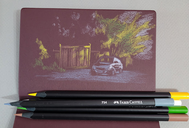
5/89/23 Dogwood tree, Maple Leaf neighborhood

Whenever I experiment with a new technique or approach using photo references, it doesn’t feel “real” until I try it from life. With several light-on-dark sketches practiced in the studio, I decided it was time to take the approach on location.

One advantage to working at home is that I have at my disposal lots of colors to see what works in a variety of dark-colored Uglybooks. On location, it’s tricky, because I don’t want to carry more than a few pencils, so I have to take a chance with a limited palette of tints that will work with most subject matter and in the Uglybook I’ve chosen to carry.

Real-life conditions are also more challenging. In the sketch on dark blue paper below, I had strong sunlight when I began, but within minutes the sun had ducked behind clouds, and suddenly the light and dark contrasts I depended on were less visible.

5/8/23 Green Lake neighborhood


With nocturnes, it’s easy to draw only lights and darks because I can’t see midtones. In daylight, the darks should not be totally dark like night, but if I put in midtones, the brightest lights will lose some contrast. I usually choose to eliminate most midtones and focus on exaggerating the contrast between the lightest and darkest areas. Both of these sketches look a bit like photo negatives because the shadow areas are darker than they should be in daylight. I’m still working on that balance.

It felt good – and “real” – to finally try this in the field!


Prismacolors and a white Derwent Drawing pencil are my current favorites for this light-on-dark approach.

Saturday, May 13, 2023

Grafted Apple Tree


5/9/23 Blossom and bud on a grafted apple tree

“Is that a Japanese crabapple?” I asked smartly. I don’t know a thing about apple trees, but that was the only variety name I had recently learned and could recall, so I thought I’d try it. (Of course, Japanese crabapple has pink blossoms, not white, so let’s just say I was making conversation.)

The owner of the tree, a neighbor several blocks north of us, corrected me with the name of the variety I was looking at. To my surprise, he then went on to tell me the three other apple varieties growing on the same tree. When I looked more closely, I saw that while all the blossoms were white, buds on some branches were white, and others were pink.

Most of the grafts had been done by someone else, he said, but he had done the fourth himself. Pointing to the tiny leaves sprouting from the ends of the spindly, finger-like stumps, he was pleased that the new graft seemed to be “taking.” Unfortunately, I didn’t take notes, so now I don’t recall the variety names, but he said the latest graft was for a fruit that he especially enjoyed eating. He gestured toward two smaller trees elsewhere in his yard that were the same variety and yielded delicious apples.

The latest graft has tiny, new leaves.

I had to get back home that day, but a few days later I went back to make these sketches.

When I was taking Kathleen Moore’s Winter Sketchbook +Watercolor class a couple of months ago, one of my hopes was that it would encourage me to do more spontaneous nature sketching from life. It’s something I enjoy whenever I do it, but somehow I don’t do it much – too busy with urban sketching, I guess. Anyway, now that the weather is more hospitable for all kinds of outdoor sketching, I’m hopeful that I’ll do more.

I won’t go so far as to call what I do “nature journaling,” for surely a true nature journaler would have remembered to note those apple varieties while the neighbor was talking. But anytime I draw anything, I observe more closely and pay better attention, so drawing is the first step.

Friday, May 12, 2023

Pink Dogwood


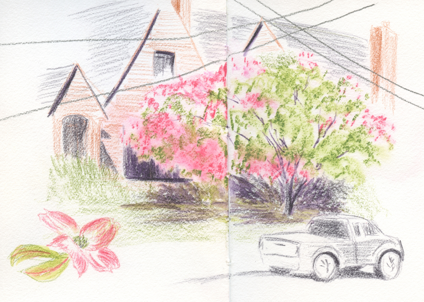
5/7/23 Maple Leaf neighborhood

“Do you walk around the neighborhood and draw things you see?”

The question had come from a girl sitting in a tree behind me as I sketched the pink dogwood across the street. Answering that that was exactly what I do, I flipped to another page in my sketchbook to show her the Eastern redbud I had sketched the previous day and pointed to it down the street. Her expression showed the same amazed wonderment I’ve seen on the faces of adults encountering an urban sketcher for the first time. Showing great curiosity, she asked a lot of questions and even asked permission to take a photo of my sketch. (Aside: Am I so behind the times that I’m still surprised when preteens pull iPhones out of their pockets?)

 After complimenting me, she said, “I wish I could draw like that.”

“I bet you can.”

“I bet I can’t.”

Almost all young kids draw without any doubt that they can, until one day, they decide they can’t and stop. It made me sad that, at the age of 11 or 12, she had already decided that her skills were lacking.

I empathized. I was probably around her age when I, too, saw that my drawing skills were sorely lacking compared to some “talented” classmates. At the same time, teachers and other adults were noticing and encouraging my writing skills, which made it easier to stop drawing and focus on writing (which I also enjoyed). I appreciate that my writing was encouraged – after all, it led to my lifelong career as well as hobby (this blog) – but if drawing had also been encouraged, perhaps I wouldn’t have stopped. That’s why I think it’s so important to encourage whatever creative activity young people want to pursue, even if it’s not their “best” thing or what they show “talent” in, because it’s not for us to decide which is their “best” thing.

Anyway, I very much enjoyed my chat with the girl sitting in the tree and was delighted by her interest. Maybe her amazement that grownups spend their time this way will someday change to walking around the neighborhood with a sketchbook herself.


Color notes:
When I first started seeing all the dogwoods suddenly beginning to open, I realized that the Caran d’Ache Supracolor Pink (081) that I had used for sakura and the Derwent Inktense Fuchsia (700) that I had used for Kwanzan cherries are both too cool for dogwoods. I pulled out my color journal to audition some warmer pinks. 

My options are disappointingly few among my favorite watercolor pencils. The only pinkish color in the Caran d’Ache Museum Aquarelle palette is Anthraquinoid Pink (571), which is not pink at all but coral. Supracolor includes a couple of warm pinks (582 and 270), but Inktense’s Pink Flamingo (405) has a stronger wash. When mixed with Supracolor Pink, it seemed just right for dogwoods. (Huh – saved by Inktense again. I sense a disturbance in the Force.)

Blossoms on dogwoods seem to open unevenly around the tree. This is the tree I sketched above, but the photo was taken from a different angle, looking more symmetrical.


Thursday, May 11, 2023

Review: Faber-Castell Black Edition Colored Pencils


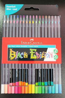
Faber-Castell's Black Edition

A few weeks ago, Faber-Castell USA’s Instagram account made a big splash with several posts showing some black-barreled colored pencils with candy-colored cores shown off on black paper. “JUST DROPPED: THE BLACK EDITION COLLECTION” implied that the pencils were new. Huh? I’d been seeing them on Amazon for months, dismissing them as kids’ stuff. In what way had they “just dropped”? Confused, I posted a question, but it went unanswered. Another follower had commented, “Already have this set since Christmas.”

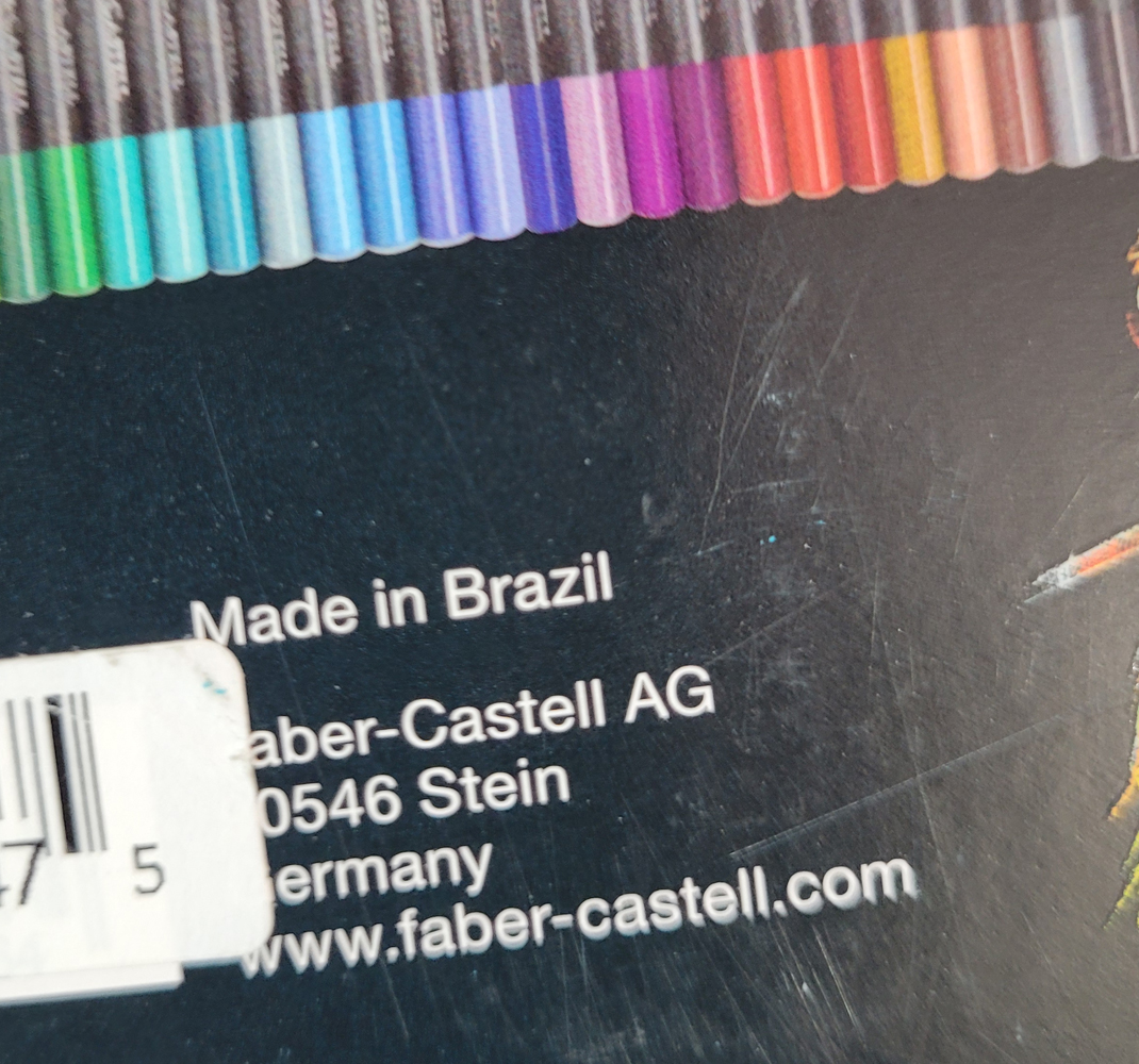
It turns out that F-C wasn’t being misleading by announcing this product as having “just dropped.” Making inquiries with knowledgeable pencil friends, I learned that the Black Edition line is manufactured in Brazil, and up until recently, had been available only in South America. So the big splash was to let us know that we could expect to see them in US stores. OK, that’s fair.

Regardless of the actual newness of the product or where it was available, F-C’s marketing ploy worked supremely: I found myself looking more closely at the set of 36 I had dismissed previously – hmmm, an interesting set of all pastel colors – and then clicking “add to cart.” Funny how that happens.

Available in a variety of set sizes, including the largest of 100 (mentioned by reviewers, but I didn’t see it on Amazon), the set of 36 I bought for $17.99 comes in simple cardboard packaging. The pencils are in two “drawers” that slide out. The drawers are a bit fiddly to get back in, but it’s a nice, compact set. If I paid double that price, I could get the same 36 pencils in a tin. Since I usually use and store pencil sets in plastic storage bins, I’m happy with the cardboard packaging (especially at half the price).

Compact, economical packaging

Originally made for the South American market,
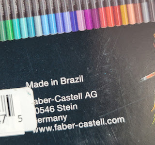
the Black Edition pencils are manufactured in Brazil.

The package information indicates that they are, indeed, made in Brazil (I’ve seen other F-C pencils made in India). The Black Edition seems to be part of F-C’s EcoPencil Supersoft collection, all made in Brazil and at the same price point of about $0.50 per pencil.

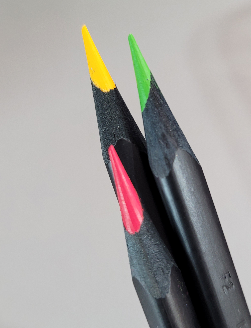
The triangular barrels are made of lightweight wood with the distinctive feature of being black all the way through. (They evoke early sets of vintage F-C Design Spectracolor pencils made of black wood; later sets were made of natural wood. Some sources reported that the change was made because the black wood was found to be toxic. That was a long time ago, so I’m hoping that this black wood is different.)

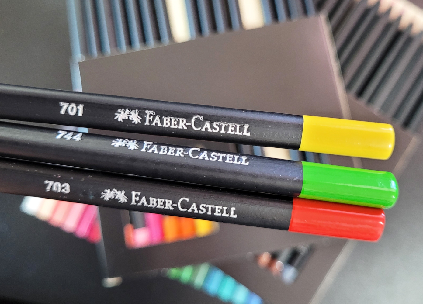
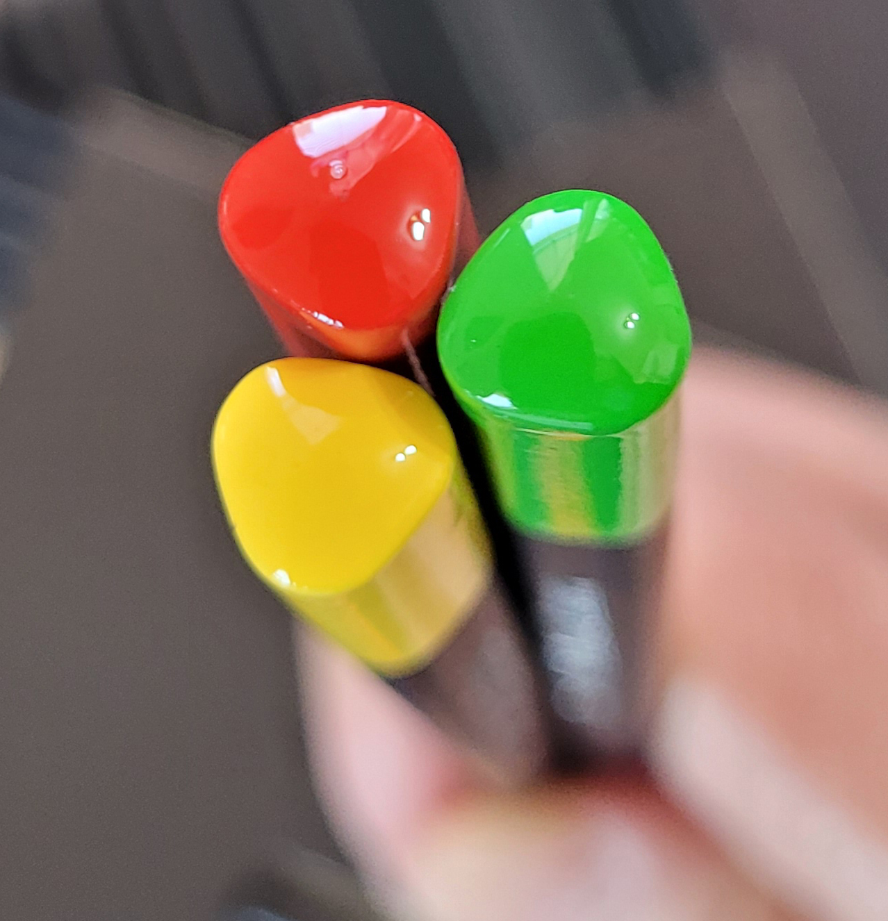
The matte black barrel has a glossy end cap identifying the color. The color number but no name is stamped on one side. Although I’m not a fan of using triangular-barreled pencils, I do like the appearance of the round-cornered, triangular end caps.
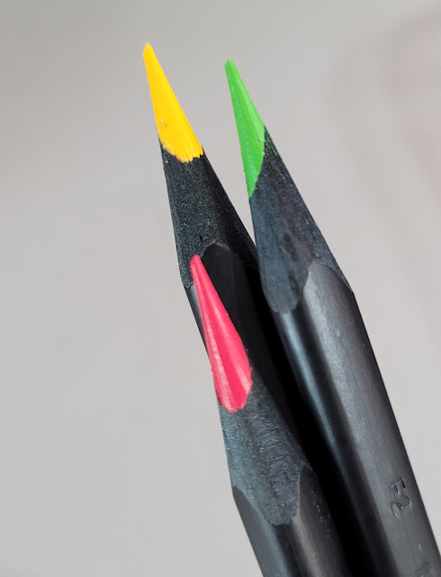
The cores are not off-center as they look here... I think sharpening the triangular barrel gives that appearance.


Compared to F-C Polychromos, the “super soft” Black Edition pencils are surprisingly soft. Not Prismacolor or Caran d’Ache Museum Aquarelle soft, but softer than I expected for Faber-Castell. They are also a bit dry and crumbly, but not so much to be unpleasant to use.

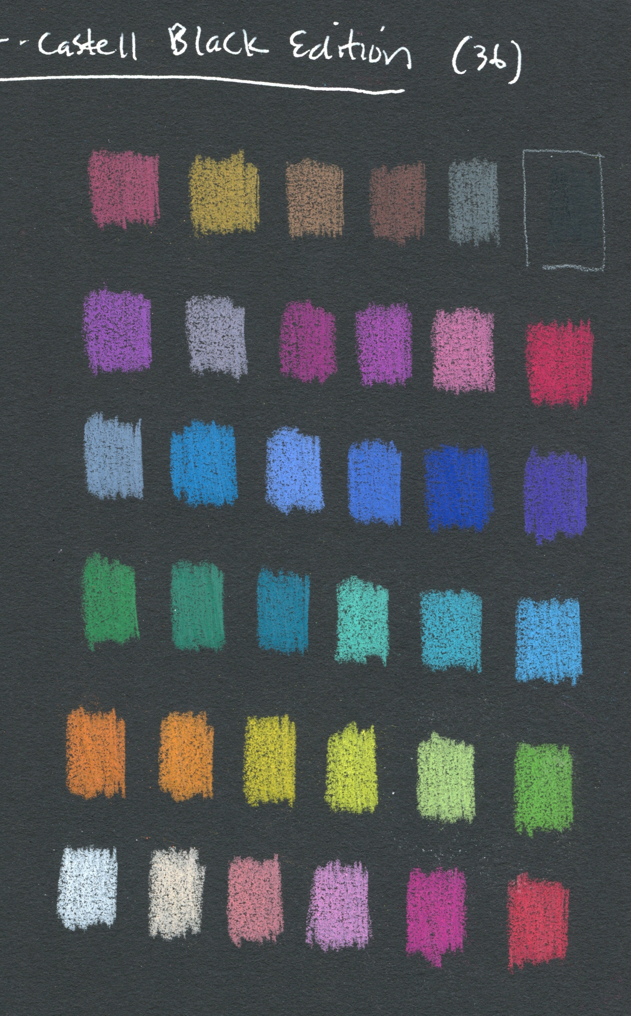
Since the Black Edition pencils are obviously made to be used on dark paper, first I swatched the colors in a black Stillman & Birn Nova sketchbook. After three layers, most colors do pop off the page with brilliant opacity.
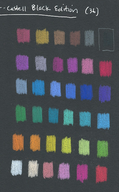
Swatches made in Stillman & Birn Nova sketchbook

Swatched in a Stillman & Birn Epsilon sketchbook, most colors look unremarkable, and some look downright blah. Clearly they are ideally used on dark paper.
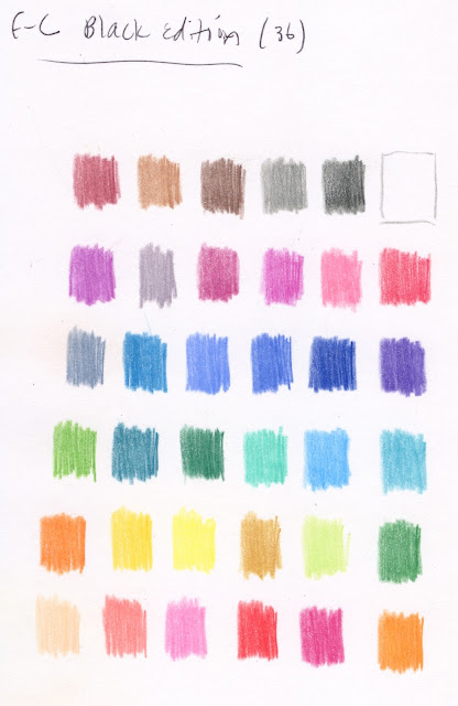
Swatched in a Stillman & Birn Epsilon sketchbook (Sorry that these swatches are not in the same sequence as the black-page swatches! It was my intention to put them in the same order, but you know what they say about that pathway paved with good intentions.)  

To be fair, the Black Edition colors are no more blah on white paper than most other pencils in the same colors would be on white. It’s just that when you have a whole set of nothing but high-key hues, they are bound to look washed out on white compared to black.

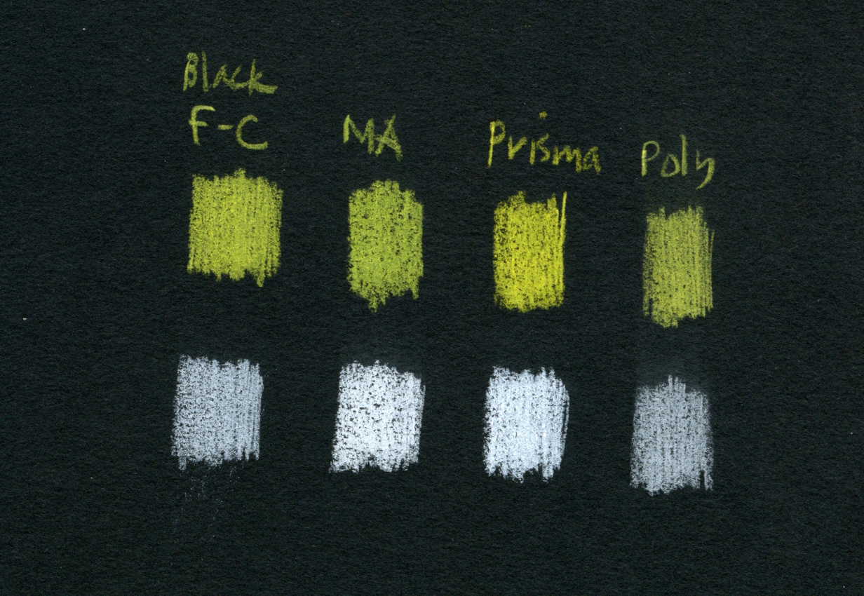
In addition to Polychromos, I grabbed a few other favorites to compare color opacity (from left: Black Edition, Museum Aquarelle, Prismacolor, Polychromos; three layers each). The yellow Black Edition shows strong opacity, but white less so. (It’s hard to beat Prismacolor’s white for opacity.)
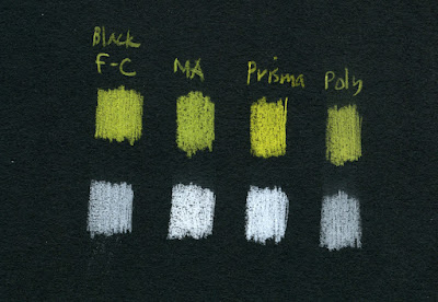
Opacity comparison (from left: Black Edition, Museum Aquarelle, Prismacolor, Polychromos)

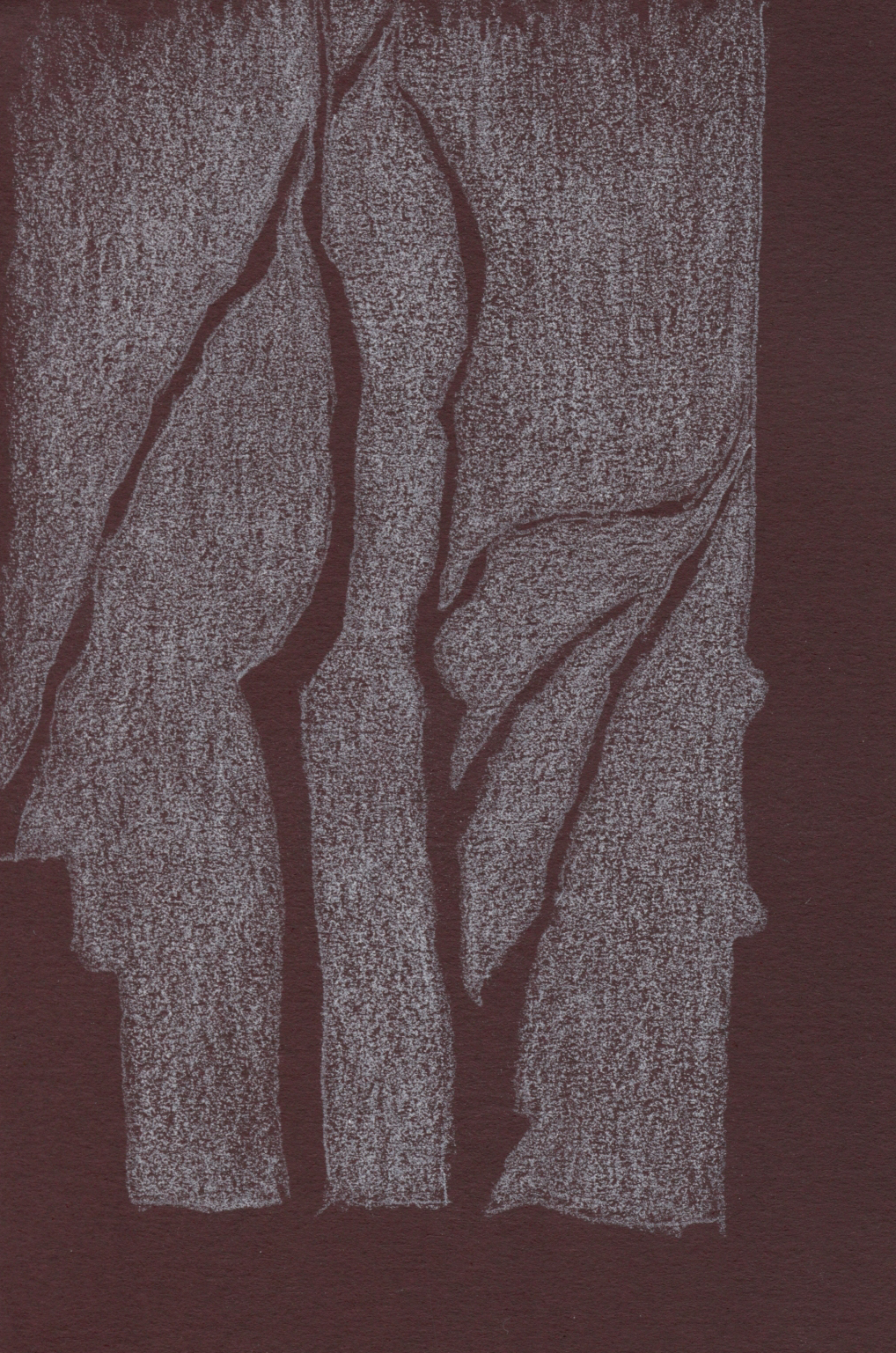
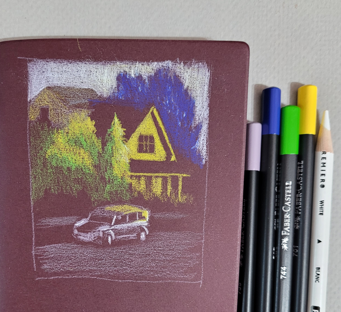
In the abstract-looking sketch, below left (it was actually a negative-space drawing of trees), I was frustrated that the Black Edition white didn’t cover the paper enough. In the sketch of the house (below right), I wanted the sky to be as white as possible, so I had to bring in a Prismacolor for assistance.
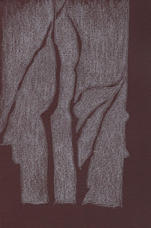
5/4/23 The white Black Edition pencil
didn't cover the dark burgundy Uglybook well.

5/4/23 I used a white Prismacolor to assist with the sky (photo reference).


In general, the Black Edition colors are good but not so opaque or bright that they are better than other good-quality pencils, and some other pencils are more opaque. However, to get a range of reasonably opaque, high-key colors as wide as this, you’d have to buy a huge set of some other pencil. From that perspective, 36 colors for $18 is a good value for decent pencils in an intriguing color range.

I say “intriguing” because, more than anything else about the Black Edition, the idiosyncratic benefit to me is that it inspired me to experiment with light-on-dark drawings. These pencils pushed me to think about both light and color simultaneously, which is a fun challenge that I’m going to continue exploring. You’ve already seen most of these sketches in that post and read about my challenges with them, so I won’t repeat all of that here. I’ll just end this review by saying that, for me, $18 is a very cheap price to pay to start thinking in new ways.
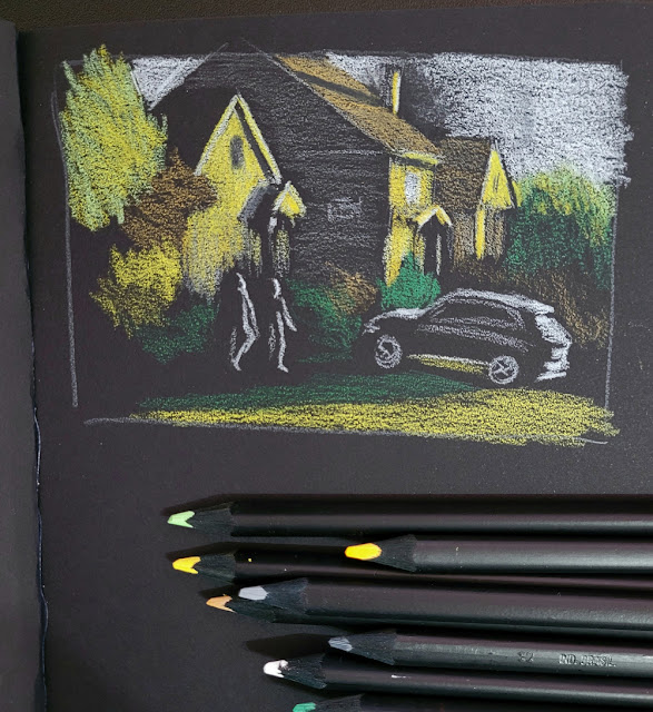
5/2/23 Stillman & Birn Nova (photo reference)

5/3/23 Uglybook (photo reference)

5/5/23 Uglybook (photo reference)

Wednesday, May 10, 2023

Optical Mixing by Eastern Redbuds

5/3/23 Green Lake neighborhood

One morning on my walk through the Green Lake neighborhood, I spotted a tree with such tiny, tiny blossoms that they formed a transparent lavender haze. I didn’t have lavender in my bag, so I tried mixing blue and pink – but I ended up with a blue and pink tree (at right).

A few days later, I was walking in Maple Leaf when I spotted the same type of tree. This time I mixed my cherry blossom pink pencil with dark purple, and I got much closer to the hue I saw – from a distance (below).

Looking more closely at the blossoms this time, I saw that they aren’t lavender at all; their orchid-like shape is made of pink and cool magenta petals. Using colored pencils, I’m always fascinated with optical mixing effects that result from transparent layers of color. This tree, that the PlantNet app identified as an Eastern redbud (Cercis canadensis), is one of nature’s examples of optical mixing. From a distance, all those tiny dots of pink and cool magenta blend together into lavender.

5/6/23 Eastern redbud, Maple Leaf neighborhood

5/6/23 orchid-shape blossoms

By the way, I’ve tried a bunch of plant ID apps, and PlantNet is the first one that gets more hits than misses. (Some apps are so bad that the suggested identifications might as well be random.) If you like to know what plant or tree you’re sketching as I do, this free app is worth using. 


Tuesday, May 9, 2023

Light on Dark

5/2/23 black Stillman & Birn Nova sketchbook

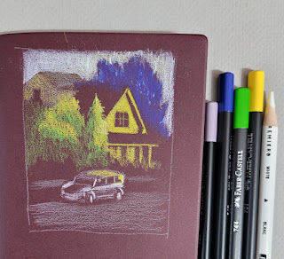
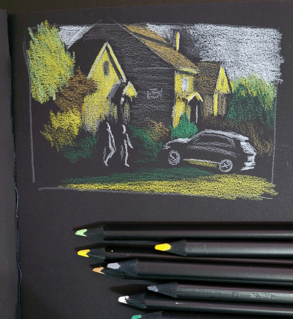
If you follow me on Instagram, you may have seen that I made these sketches with a new set of Faber-Castell Black Edition colored pencils. The entire range in this collection is pastel tints ideally used on darker papers. You’ll see a full review of the pencils soon, but before that, I wanted to write a few thoughts about sketching light on dark.

The process of drawing only the lights is not new to me. For the past few winters, I’ve had a ton of mind-boggling fun making nocturne sketches, almost always with white (or variations of white) on black paper. I’ve also made some skyscapitos at dusk on a base of dark blue paper. This new set of pencils, however, has pushed me to think more about color and light simultaneously on dark-colored papers.

5/3/23 Uglybook

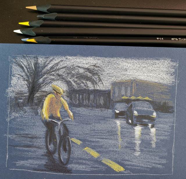
All sketches shown here were made from photos. Two were taken during the golden hour when the low sun cast a beautiful warm light on houses. The third was taken at Green Lake as I was waiting to cross a street on a dark, rainy morning. In all cases, plenty of light was in the sky, so I could see colors – which is very different from sketching in the dark when colors disappear.

Thinking about both color and light is challenging and confusing in new ways. Having Uglybooks in various dark colors also adds to the challenge, especially in terms of color temperature. I’ve done some thinking in this direction in my underpainting studies, but in those cases, I usually chose a paper color with a mid-tone value so that I could apply the darks and lights as I drew. In addition, I often tried to emulate the way painters cover the entire support with their medium so that the underpainting color barely shows, giving all the colors a shimmer of the hue beneath.

With these colored pencils, however, I have been using only dark papers to make the light pencil tones pop, and I leave more of the paper visible. The result is that the darks and mid-tones all sort of mush together without much distinction.

5/4/23 Uglybook. This dark burgundy paper can be problematic in
terms of color temperature. Since it's basically reddish, I would normally
think of it as warm. But because it's such a low-key hue, I think it reads
more as cool. 

An additional huge challenge is resisting the urge to draw too much. (I guess that challenge is ever-present, but it’s worse here.) When drawing light on dark, I think my results are better when I draw as little as possible. With the pitch-black nocturnes, it’s much easier, because I can’t see much. In these photos, I could still see almost everything, but crossing the line into “too much” is easy to do. For example, I could see a lot of bright “sky holes” in the dark blue background trees (at right). I started to put some in to show that the blue darkness was trees, but they were distracting, so I tried to cover up most of them with more blue. Painting instructors always talk about painting only the large shapes – not the itty-bitty sky holes – and I found that I have to think more like a painter with these.

Believe me, I didn’t anticipate any of these challenges when I got these pencils. My only thought was, “Light-colored pencils – cool!” Ha!

Making these sketches presented the usual tension I experience whenever I sketch scenes from photos that I took myself: I wanted to do them from life instead. However, the conditions of these particular scenes – the golden hour light that lasts about a minute and a very wet day – helped me feel OK about using photos because trying to do them from life would have been terribly frustrating. In addition, using photos allowed me the time I needed to focus on things like confusing colors. Yes, I know I don’t have to justify drawing from photos to anyone, least of all myself. But that’s what happens when you’re a born-and-bred urban sketcher.

(In case you’re interested in seeing what I was working with, I’ve included my reference photos below.)


Yes, it pained me to crop out the trash can, but
Ian Roberts' voice was loud in my head.

Monday, May 8, 2023

A6 Hahnemühle is a Win


My first A6 Hahnemuhle sketchbook is full!

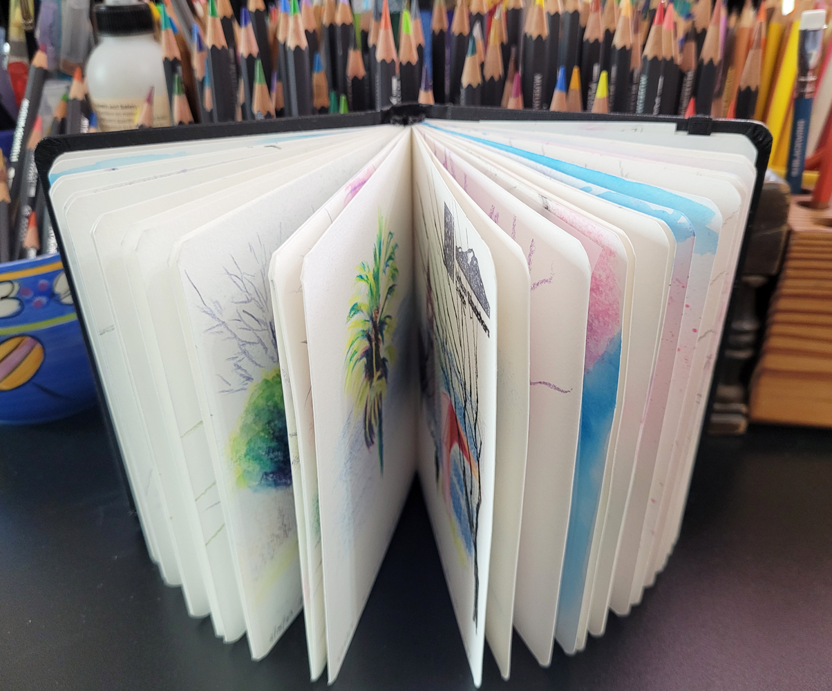
On Feb. 9, I began using a fresh Hahnemühle sketchbook as a test of a new form factor for me: the A6 size. I already knew I appreciated its 100-percent cotton paper from the 5 ½-inch-square Hahnemühle that I had used previously, but I was hoping the A6 size would become an easy daily-carry format. I finished filling its 60 pages on May 2. Was I happy with it? On May 3, I immediately ripped the wrapper off a new A6 Hahnemühle and made the first sketch in it: Definitely my daily-carry going forward!

The first sketch on Feb. 9. . . 

Fitting nicely in my smaller, lighter
 Rickshaw mini-size Zero Messenger Bag (which began as my pandemic fitness-walking bag and eventually became my daily-carry), the A6 Hahnemühle gives me the option to use full color and wet media whenever I want. While I also carry a brightly colored Uglybook regularly for certain types of sketches, I have been able to use color much more often because the A6 Hahnemühle is always by my side. That’s a huge win! Any tool or material that encourages sketching is better than one that doesn’t.

In his workshops, Gabi Campanario always talks about the ease and portability of a pocket-size sketchbook, which I concur with completely.

At Urban Sketchers outings or any other time I anticipated wanting a larger page format, I took my larger bag so that I could carry an A5 Hahnemühle. During that same time period of Feb. 9 through May 2, I filled only eight pages in the A5. That means the A6 size meets my needs almost all the time. Indeed, it’s easy enough to simply sketch across a full page spread in the A6 when I need a larger page, and I did that nine times in the A6 book.

The only thing I don’t like about using page spreads is the distracting gutter through the center, which is unattractive if I decide to reproduce a sketch as a postcard or for some other use. But seeing the physical attributes of a sketchbook is part of what it means to be a sketchbook artist, and I’m good with that.

. . . and the last sketch on May 2. I love seeing how the seasons
changed from bleak winter to colorful spring as I filled this sketchbook.
 

A major benefit of using an A6 is that size is not just a matter of portability; it’s also about composition – and smaller is easier. Unlike many artists who start small and go larger and larger as their experience and skills increase, I seem to be going the other way. Making compositional studies is always done small because it’s faster and easier, but so is making a final sketch. 

When Parka recently chatted with him during the Auckland symposium, Mário Linhares said, “The size of the page has something to teach us.” In his case, he was talking about going larger, not smaller, but his comment still holds true. The size of the page makes me think about composition in different ways, and often I think more effectively on a smaller page.

All of these benefits are related to the A6 size, but Hahnemühle’s 100-percent cotton paper is also a major asset. I used to think that only watercolor painters could fully benefit from the highest-quality papers, and that it wouldn’t make much difference with the materials and techniques I use. However, I have been able to spritz the paper heavily and use dry-into-wet watercolor pencils much more aggressively than I have with other watercolor sketchbooks because I know this Hahnemühle paper can take it. As I mentioned in this post about technique, the paper’s sizing, texture and weight all support techniques I love to use that I had to be more tentative with on lower-quality papers.

If I have anything to complain about, it would be the thickness and the hardcovers. If it were thinner and had softcovers like Stillman & Birn’s smallest format, the A6 Hahnemühle book would be perfect (one more thing to add to my annual wishlist of products that do not yet exist). But even in its current state, I’m more than happy with it.

Hopefully this label will save me heartache if I ever lose my sketchbook.

While I talk about fresh sketchbooks would be a good time for my occasional but important PSA: Whenever you begin a sketchbook, even if you think you’ll never take it out of the house, the first thing you must do is put your contact info in it. Print a sheet of labels, and it will be a quick and easy task – one that might save you much heartache if you misplace the book someday. I have heard many sad stories about lost sketchbooks. I have heard far fewer happy endings when the sketchbooks were returned, thanks to contact info provided in the book. Do it!

Related Posts Plugin for WordPress, Blogger...