 |
| The compact Kuretake Gansai Tambi palette looks like a makeup compact! |
(Please indulge me with a long, process-related wind-up . . . I promise I’ll get to the product review eventually!)
During my first couple years of urban sketching, I spent much time researching and trying out many portable watercolor kits. It was a large part of becoming an urban sketcher: How many paints could I squeeze into a tiny mint tin, and what are the latest creative kit ideas others have come up with? It’s a deep rabbit hole that I happily leapt into.
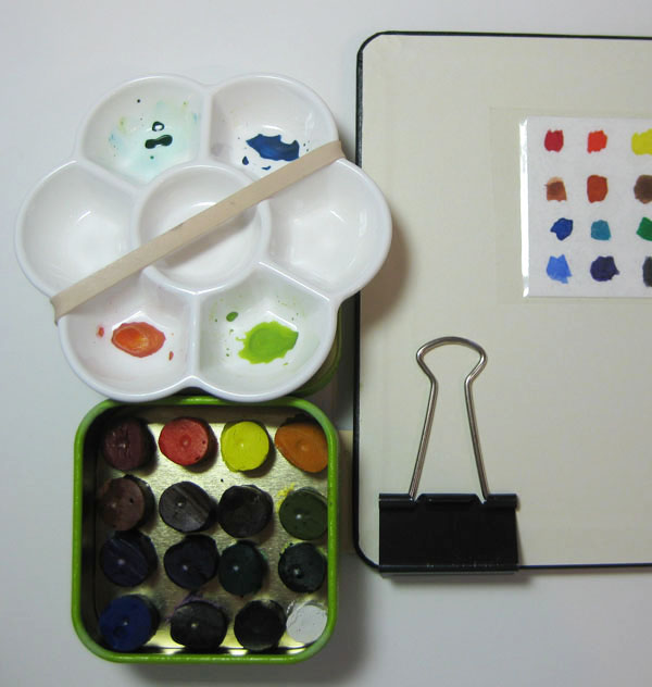 |
| One of many portable palettes I had devised in the early days. This one is from 2013. |
Although I enjoyed the fun, I soon learned that the important question was not how many colors but how to juggle all the painting supplies while sketching. If I would sit like most watercolor sketchers, it wouldn’t be an issue, but my task was made worse because I prefer to stand. When I started to see how often my watercolor setup – getting out my paints, attaching the palette to my sketchbook, holding it all at an awkward angle for both drawing and painting – was discouraging me from sketching, I knew it was a problem. That’s how I gradually moved to markers and then colored pencils. And here I am, so happy with watercolor pencils that I’ve never looked back.
Until now – and I’m still ambivalent. My explorations during the 30x30 Direct Watercolor challenge have made me think about using watercolors on location again. It’s not the “direct” part of the challenge that keeps me going (I’ll be relieved to go back to a preliminary drawing when the challenge is over), but the color mixing. Just as I have been fascinated with various triads and other limited palettes in colored pencils the past few years, watercolor mixing can be both magical and intriguing (and unfortunately also mud-making).
I am amused at the irony that a primary reason I was attracted to the 24-color Kuretake Gansai Tambi set (which I reviewed at the Well-Appointed Desk) is that it has a wide range of colors. After my frustrating class experiences with color mixing a few months ago, I was planning to avoid mixing whenever possible. That didn’t last long; I realized that if I want to avoid mixing, I might as well use colored pencils!
Unfortunately, my conditions for urban sketching haven’t changed: I still prefer to sketch while standing. In addition, I’ve only recently committed to my small walk/sketch bag as an everyday-carry, including switching to a smaller, lighter A6-size sketchbook. The stuffed bag can’t possibly fit another thing, no matter how small the watercolor kit might be. It seems like I just don’t have room in my bag or my urban sketching life for watercolors.
 |
| In the mobile studio |
But you know me – nothing feels “real” unless I do it on location. Learning from photos is all well and good, but if I can’t eventually learn to use watercolors on location, I’ll get bored working from photos and stop.
For now, my immediate solution is to take watercolors only when I know I’ll have a seat and a table (or at least a flat spot next to the gear shift) to put my supplies on. I am using my larger Rickshaw bag, formerly my everyday-carry, which can also accommodate an A5 sketchbook. If I find I’m hooked on watercolors long-term, then I’ll work on the standing solution. But in any case, I wanted to jump right in during the direct watercolor challenge, and I didn’t want to take the time or experimentation to put together a carefully selected palette of paints. To do that, I needed a readymade palette.
Thank you for the indulgence. On to the review!
As anyone who has been down the watercolor rabbit hole knows, the number of premade palettes on the market is staggering. For the most part, I’ve been happy with the Kuretake Gansai Tambi studio set (I’m calling it the “studio set” for lack of a better way to differentiate it from the portable set), so without looking much further, I decided to try the portable version of the Kuretake Gansai Tambi set.
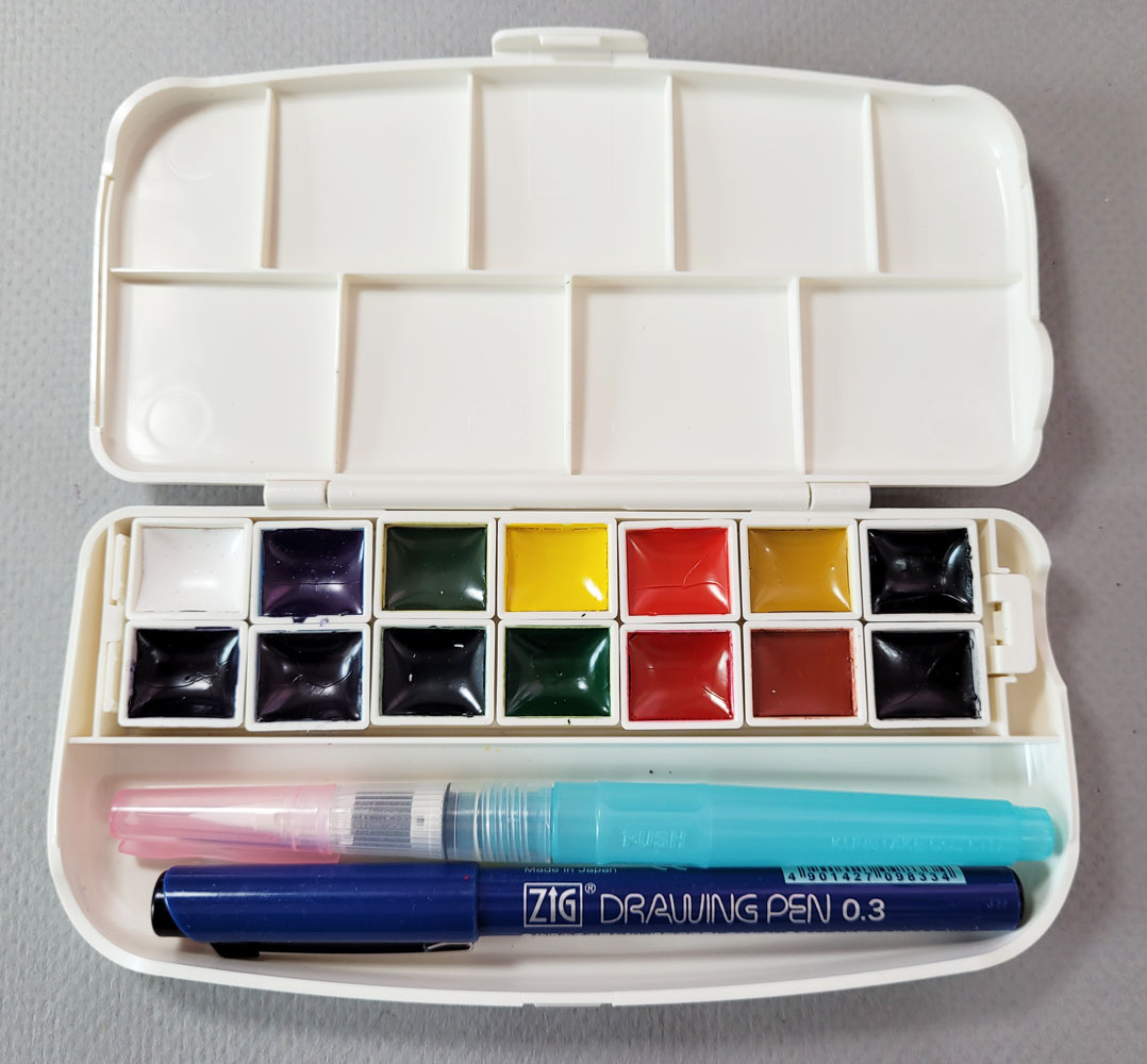 |
| The portable palette comes with 14 color, a waterbrush and a waterproof fineliner. |
I assumed that the paints would be a subset of the studio set with the same color numbers. Unfortunately, they are not – they have different color numbers. I haven’t learned whether they are lightfast as the studio version’s paints are, but the pigment quality seems the same from my brief usage so far.
A confusing factor is that two sets of colors are available in the portable form factor (and not very well distinguished from each other). I chose the set linked above in the floral box (Amazon) because it had three greens and a violet. Another set is available on both Amazon and JetPens in a box with a cat design and more earthy paint hues, including browns and grays. If I could read the packaging, my guess is that the set I chose is themed for nature, and the second set is themed for . . . pets? Anyway, if you buy a set, pay attention to the box design, as the Amazon product descriptions aren’t necessarily explicit (some reviewers grumbled about unintentionally buying a different set than was intended).
 |
| My set came in this floral box. |
Each set of 14 colors comes with a waterbrush and a Zig fineliner pen. The pen differs with each set, so that’s another identifier of the set.
The palette box has a unique design. Half-pan-sized pans have pegs on the bottom that slide and lock into place in the tray, which also comes out. Once they are in the tray, those pans will never fall out, even if you were to drop the box. A quick search did not come up with any, but my guess is that refill pans are available in Japan. In addition, the pans could be rearranged in some color logic, such as all the primaries together or all the secondaries. Although the tray and pans are clever (and very Japanese in their compact, elegant, well-designed esthetic), the proprietary pans cannot be replaced with standard (cheap and easily available) half pans.
 |
| The paint tray comes out... |
 |
| ...and the individual pegged pans come out of the tray. |
Color numbers and names (in Japanese) are printed on the bottom of the pans.
 |
| Underside of the paint tray |
What I like about this compact set (that does look, literally, like a makeup compact) is the compartment intended for the waterbrush and pen. Although the color selection is functional – in addition to the three greens and violet, the set includes two yellows, two reds, two blues, white and the less useful brown and black – I knew I’d want to add at least a few more colors. I immediately took out the waterbrush and pen and used museum putty to adhere 15 empty half pans in the compartment. I can’t imagine needing 29 colors, but what the heck – the pans are in place if I need them.
 |
| Waterbrush/pen slot filled with my own half pans. |
After swatching the set’s colors, test-mixing various triads, and using my usual basic principles for primaries (including a CMY primary) and secondaries, I added five tube paints from my existing supply (I did not buy a single new tube – yet!): French Ultramarine, Sap Green, Lemon Yellow, Cadmium Orange and Quinacridone Pink (a color I learned about from Kathleen Moore as a good CMY magenta).
 |
| New colors added |
 |
| The first two rows came with the palette; my five additional colors below. |
I’m not sure why I put in French Ultramarine; I’ve found it to be one of the less useful blues unless I’m mixing it with the traditional Burnt Sienna, which I didn’t add because the mix looks so traditional that I’m tired of it. But it seemed sacrilegious to put together a paint palette without it. I suppose it makes a good winter sky.
I have many, many more tube paints from my early sketching days that I could fill the palette with randomly, but I’m going to resist heartily. Although I still want a solid range of colors like the Kuretake studio palette, I want the selection to be logical and useful (umm, like that French Ultramarine).
Speaking of the Kuretake studio palette, it comes with a beautiful, deep violet identified as “cobalt violet” but is not anything like the tube of Winsor Newton Cobalt Violet I happen to have. I’m currently searching for a close duplicate of it in a tube paint. The violet that comes with the portable palette is acceptable but a bit cooler. I’ve also mixed a gorgeous violet from Quin Pink and the warmer blue that comes in the portable palette, but it’s handy to have a “convenience” violet for shadows.
So far I’ve taken the set out in my car and to the Green Lake Village courtyard, which has lots of tables, and the Kuretake portable palette has been working out well. The palette and a couple of waterbrushes fit nicely in the “Keeper Pouch” I got a while ago from Peg & Awl (which also made my Sendak and mini Sendak pencil cases).
 |
| The Peg & Awl Keeper Pouch holds my watercolors and brushes together. |
It’s funny – I sketch in that courtyard frequently with my usual colored pencils, and I have never attracted attention from the many passers-by. As soon as I sat down with watercolors, though, a woman who self-identified as a watercolor sketcher wannabe came by to look at my kit and sketch, and we had a nice chat. We all get it: There is something irresistibly alluring about a small palette of watercolors – so much potential for luminous, plein air sketches (and as much potential for frustration, but I soldier on).
 |
| I put the paint swatches in a transparent sleeve (near center) as reference until I get used to this palette. My wiping rag looks prettier than my sketch! |
 |
| Daniel Smith full dot card set... get it while you can. |
Kuretake gansai aren't actually lightfast, see Kim Crick's blog for a test of that. Why would Daniel Smith discontinue the full-range dot cards? They're so useful!
ReplyDeleteThat's too bad about the lightfastness, since JetPens is claiming that they are lightfast! If I stay with watercolors, my intention is to transition to tube paints anyway, so the Kuretake pans are mainly for convenience as I experiment. My guess is that DS discontinued the dot cards because they are so labor intensive to produce. I'm sure each dot of paint is applied by a human, one at a time.
DeleteTina, I hope this information is useful--I think the tube paint you're searching for may be PV23, sold as Carbazole Violet (Daniel Smith), Winsor Violet (Winsor and Newton), and Permanent Violet (Holbein). It is a strong, deep, staining, transparent neutral-to-cool violet. I love it for secondary triads, as it makes beautiful rich neutralized shadow blues when paired with a cool green, as well as wonderful dynamic multicolor browns when mixed "on the page" with an orange. I hope this helps and am always delighted to see a long process post from you!!! Your thoughts on how the "best" materials are the ones that get you sketching are always refreshing.
ReplyDeleteThanks, Lee! And you'll be happy to know that I came to the same conclusion -- DS Carbazole! I just finished testing several candidates and will be blogging about them soon!
DeleteI agree with Lee! I too love your long process posts!
ReplyDeleteThanks -- glad you find them enjoyable! I'm nothing if not analytical about my art processes! ;-)
DeleteHave you ever considered a palette from Art Tool Kit? I have several. They're super compact though you'll need a waterbrush or water cup. You can buy them with or without paint. I buy them empty and fill them with paint from tubes. What I like about them is that their modular and super customizable. The regular palette is the size of a business card case. -TKL
ReplyDeleteYes, I am considering Art Tool Kit, and I do like its size and compactness. But the issue of holding or mounting the palette while standing remains... so I still have to think about that part!
DeleteI use a bulldog clip or one of these magnetic clips that I clip to my sketchbook: https://amzn.to/3NhBOa7
DeleteHere's how Lisa Spangler attaches hers https://www.instagram.com/p/CoGePHZJj-_/
DeleteStanding and holding that size palette wouldn't be easy. I like having a palette that has a ring on the bottom to steady it in my hand. I looked at the Art Tool Kits too, but have rejected that idea because they don't have the thumb ring. Looks like you have found your violet...yay!! I have some of the smaller dot cards that were put out with the colors selected by different artists. It is a good way to try out the colors.
ReplyDeleteI agree that a thumb ring would make it easier to hold... the setup itself is always a work in progress!
DeleteLate to the party, but… The kit with the flowers on the box is a "Kuretake Transparent Watercolour Kit" (i.e. Western-style – transparent – watercolours), the one with the animals is traditional Japanese "Gansai Tambi" (same as the boxed studio sets – more like gouache in behaviour). Hence the different numbering schemes: the numbering in the Gansai Tambi set does match that in the studio boxes, while the Transparent Watercolour numbering is for a separate line of colours. This also explains the variations in colour choices, with the Transparent Watercolour palette closer to what you might find in a Western starter set from a company like W&N Cotman, and the Gansai Tambi palette including colours like Natural Beige and Sap Green Light.
ReplyDeleteThanks for the explanation, Yvonne! That all makes sense!
Delete