Sunday, April 29, 2012

Sketchbooks, Plural

Some of my current sketchbooks.

Many artists keep one sketchbook, carry it with them everywhere, use it wherever they may be, and when it’s full, they have a chronology of their sketches. Then they start a new book.

As a lifelong journal writer, that type of continuous chronology appeals to me greatly. Some part of me wants to have a chronological sequence of my sketches – a visual and parallel analog to my huge collection of written journals, which I have always kept sequentially, one volume at a time.

And yet, to date, I am actively and concurrently using 11 sketchbooks and have filled three others since September 2011 when I began sketching. Why do I use so many sketchbooks at once when my natural and emotional propensity is to use one at a time?

The answer is threefold: paper type, portability and laziness.

The first part is obvious. Unless I bind my own sketchbook (which I have done, but then the sketchbook took on a life of its own and refused to let me sketch in it), I can’t have a single volume that contains both toothy, heavy paper for water media and smooth paper for pens.

12/7/11, watercolor, 9" x 12" sketchbook
Another important factor is portability. The smallest sketchbook I use is 3½” x 5½”, which fits easily in my everyday purse, so I carry it at all times, and it’s ideal for sketching during idle moments in my day. But the drawings in it are necessarily small, and I always end up feeling cramped when I use it. The largest sketchbook I use is 9” x 12”, which stays in my studio for larger studies, and I enjoy the wide expanse of space. But I don’t take it with me anywhere.

In between are other sizes and formats with a variety of paper types and weights. I favor 5¼” x 8¼” (landscape and portrait) and 5½” square formats, which offer both portability and a relatively spacious surface.

10/24/11, F-C Pitt Artist Pen, graphite, 3 1/2" x 5 1/2" sketchbook 
The third major factor influencing the number of sketchbooks I use is the same as the one explaining why I own six pairs of reading glasses: I’m lazy. If I’m downstairs and my sketchbook is upstairs, I don’t want to walk upstairs to get it. I want to be able to sketch wherever I happen to be. (And in the same way that I won’t carry a sketchbook around my neck so that I’ll always have it with me, I refuse to wear my glasses on a lanyard – a flag of middle-age if there ever was one.)

I can think of a couple other practical reasons for keeping multiple sketchbooks simultaneously. Since the sketchbooks I use are all relatively slim, if I were to ever lose one, it would be a loss of only a few weeks of sketches, rather than months or years. (I’d bet at least some of those artists who carry one sketchbook continually have lost a huge chunk of their work. Ouch!) And sometimes when I’m short on time but want to work with watercolors, I can work in a second book while the first is drying.

Maybe sometime I’ll try working in only one sketchbook for a while, from first page to last, to see if my desire for chronological continuity overcomes my need for paper variety and portability. (I doubt it will overcome laziness.)

Thursday, April 26, 2012

Overheard at a Coffee Shop Today

4/26/12 Akashiya Thin Line, Hand Book sketchbook
Stage whispered: “Check it out – she’s drawing someone.”

“Who is it?”

“I think it’s that guy back there. . . yeah, check out the nose. It’s him.”

I must have gotten the nose right.

Tuesday, April 24, 2012

Anatomy 101

4/23/12, graphite, Graphitint colored pencil, Strathmore Grayscale
I’ve heard that college art students are required to take human anatomy courses to help them understand all that stuff under the skin that isn’t visible but that affects how bodies appear, and therefore affects how we see and render those bodies.

If I were a college art student, I would probably be complaining about that requirement, because it sounds like too much work. (“I’m not going to be a doctor; why do I have to take this class?”) It could also be deadly boring, depending on the instructor or textbook.

But since I’m not a college art student, I actually have quite a bit of self-motivation (certainly more now than I ever did in college), so I gave myself the assignment of studying human anatomy. I’ve been shopping in my public library for a good book, and I think I found one worth owning: Classic Human Anatomy: The Artist’s Guide to Form, Function, and Movement, by Valerie L. Winslow. Given my recent interest in drawing hands, I “test drove” the book with that chapter. It provides a thorough description and explanation of how the bones, muscles and other non-visible parts of the hand affect how the visible parts need to be rendered to appear realistic. The author uses scientific terminology without sounding like a pre-med textbook. An artist of the human figure for more than 30 years and an anatomy instructor, she clearly focuses on the interests of artists who want to learn how to draw people accurately.

The book fascinates me, which is surprising; I imagined it to be “hard work.” In addition to the well-written text, the book is illuminated by more than 800 illustrations done by the author herself. Most look like they were drawn with Conte crayons or pastels on toned paper. In general, I’m not a huge fan of illustrations of muscle tissue connected to tendons. But these beautiful drawings alone are enough to make me want to buy the book. In fact, I was inspired to try a few hand drawings on toned paper (using colored pencils and graphite instead of Conte).

(My review of this book appears on Amazon.com.)

Sunday, April 22, 2012

Product Review: Rickshaw Bagworks Folio


4/18/12, Copic Multiliner SP pen, Pitt Artist Pen
One of my favorite sketching locations is in coffee shops, but to sketch there successfully, one has to be discreet. If I’m caught, my “models” are likely to become self-conscious or even offended and move away. So I like to pick out an ideal table quickly (one that faces at a right angle to other people), sit down quietly, and then become invisible. The trick is to be able to observe as many people as possible without being observed (much) myself.

Opening up traditional watercolors is out of the question. Digging around constantly in my bag for pens or brushes might attract attention. In addition, a large or horizontal format sketchbook screams “sketchbook,” so I stick to books in sizes and formats that look more like journals (writing in a journal never attracts attention; I remember that from my grad school poetry-writing days).

Rickshaw Folio cover
After much shopping around, I found the ideal coffee shop sketch kit: a folio intended for a 5¼” x 8¼” Moleskine sketchbook. (I discovered it on Plannerisms, where blogger Laurie keeps journal-keeping geeks like me up to date on all the latest personal planners, notebooks and related bags and covers.) The Smartphone Folio, handmade by Rickshaw Bagworks of San Francisco, is made of a durable Cordura nylon (and other fabrics) in your choice of dozens of colors that can be mixed and matched with trim colors to your custom order at no extra cost. Rickshaw’s website includes a fun, design-it-yourself tool that can make trying out color combinations last all afternoon!

But back to my sketch kit: a zip-around zipper keeps everything secure, and the Folio fits into my (admittedly not very small) everyday bag. Inside the front cover are two vertical pockets intended for pens and a smartphone. I use both to hold a variety of pens, pencils, markers and waterbrushes, and they are easy to slip out quickly and quietly without a lot of digging around. A zipped compartment behind these pockets can hold a passport or other documents securely. A small transparent pocket is ideal for business cards or ID.

Folio front pockets
A protective flap keeps the cover of the sketchbook from getting marred by the pens. The back cover of the Moleskine slides into the flap in the back cover, which also has a second transparent pocket for small papers. (A Global Art Materials Hand Book sketchbook in the 5¼” x 8¼” size will also fit in the Folio, although the Hand Book’s cover is very slightly thicker, so it’s a bit snug. I use both Hand Book and Moleskine sketchbooks, so they can be interchanged easily in the Folio.)

When I first saw photos of the Folio, I wondered whether the bulk of pens in the front pockets would make the sketchbook slant upwards, making sketching uncomfortable or impossible. On my first field test, the Folio passed this test beautifully. The pages lie open flat without having to remove the sketchbook. I can sketch, slip out various pens or brushes I need, and then sketch some more, all without looking like I’m doing anything but writing in a journal.

Moleskine sketchbook in Folio

Tuesday, April 17, 2012

Back to the Coffee Shop


4/12/12, Akashiya Sai, Hand Book sketchbook
The weather keeps giving us teasers of Spring. . . but I’m sketching in coffee shops again.


Saturday, April 14, 2012

Product Reviews: Pentel Color Brush Pen and Kuretake Brush Writer

4/9/12, Pentel Color Brush, Hand Book

In my ongoing love affair with Japanese water-soluble brush pens, I’m currently experimenting with two more brands: Pentel Color Brush Pens and Kuretake Brush Writers.

Like the Akashiya Sai and Akashiya Thin Line pens I reviewed previously, both the Pentel and Kuretake pens have actual hairy brush tips, not formed felt tips. Unlike the others I reviewed previously, however, which are ready to use upon uncapping, both the Pentel and Kuretake brush pens have reservoirs of dye ink that must be punctured before first use. They are identical in this regard: A small ring between the reservoir half of the pen and the brush half is removed, and when the two parts are screwed back together, the reservoir is punctured, allowing ink to flow to the brush. Both pens have an area on the reservoir barrel that can be squeezed to force more ink into the brush, but I found that gravity alone usually kept a steady flow going while sketching and painting. (Use care when removing or replacing the caps on both of these pens – if you inadvertently squeeze the barrel while doing this, you may find yourself with ink on your lap!)

I should qualify “steady flow,” because I found that some colors of the Kuretake flowed more consistently than others. I have four colors, and the purple is practically a gusher, while the other three colors flow more consistently. (I have only one color of the Pentel, so I couldn’t make a comparison with this brand.)

If you’re familiar with Kuretake waterbrushes (also marketed in the U.S. as Niji waterbrushes), the design of the Kuretake Brush Writer will give you déjà vu. I wouldn’t be surprised if the brush tip is made of identical material. And although I haven’t tried this myself, I’m guessing that the ink reservoir, when empty (or emptied), can be refilled with water (or diluted ink) and the pen used just like a waterbrush.

One significant difference between the Akashiya pens reviewed previously and the Pentel and Kuretake brush pens reviewed here is that the latter are both refillable with ink cartridges. Dick Blick carries refills for the Pentel. When I asked JetPens.com whether refills were available for the Kuretake, I was told that they are, but JetPens does not carry them. However, they might consider offering them in the future if enough customers are interested. (Knowing that these pens are refillable makes me feel somewhat less guilty about the landfill I’m personally filling with all the disposable pens I’ve tossed in my lifetime.)

Enough about mechanics – let’s get to the good stuff. Both the Pentel and Kuretake brush tips have a relatively wide range of sensitivity for synthetic brushes. Both were designed for Asian calligraphers, so they are both capable of producing nice variations in thick and thin lines, but I was able to get a narrower line with the Pentel.

The biggest difference between these two competing products is the way the ink interacts with various paper types. I tried them on three: a Stillman & Birn Alpha sketchbook (100 lb.), a Stillman & Birn Delta sketchbook (180 lb.), and a Global Art Materials Hand Book (a somewhat toothy, lightweight paper that usually takes washes of water-soluble pens and pencils well).

On the heavyweight Delta paper, both inks performed nicely, as I expected (since every medium I’ve tried on the Delta paper looks beautiful). Colors were rich, and washes were even (well, as even as I could make them… the variable of the operator is always present). But on the Alpha and Hand Book papers, the Pentel ink feathered and looked grainy, while the Kuretake ink looked the same as it did on the heavier paper.
Pentel on Hand Book
Pentel on S & B Delta

Another important difference is the color range. The Pentel range is what I would call “basic” – three each of blues and greens, only one red – 18 total. The 24-color Kuretake range includes five each of greens and blues, three reds, two yellows and several bright hues (that I would trade in for a few more earthy tones if I could).

One probably minor difference: The Pentel is packaged for western markets, so the packaging and insert are in English. Alas, the Kuretake packaging information is in Japanese only (although the pen itself has a band around it with basic operational instructions in English). From the illustrations, I’m guessing that I’m missing only more detailed operational instructions, or perhaps care information, but I also see some “caution” symbols, so who knows what vital bits I’ll never read?

(When I was in elementary school, many of my Japanese American peers were “forced” by their parents to attend Japanese language school so that they would learn the language of their ancestors. Back then, I was always grateful that my parents didn’t make me give up my Saturdays that way, and those peers considered me lucky. As an adult, I have deeply regretted my Japanese illiteracy, especially in regard to reading packaging information on art materials.)
Kuretake on Hand Book
Kuretake on Delta

Overall, I’d say the Kuretake Brush Writer has a slight edge over the Pentel Color Brush, mainly because of the Pentel’s feathering on lighter-weight papers and its narrower color range. But the thinner brush tip on the Pentel is a strong point in its favor. For my money, though, I think both the Akashiya Sai and Akashiya Thin Line pens make a more variable brush line than either the Pentel or the Kuretake.

Oct. 8, 2012, addendum: If you are traveling to high altitudes, leave these reservoir-type brush pens at home! Or at least don't open a pen cap over your sketchbook. I learned this lesson the hard way.


Friday, April 13, 2012

“I Can’t Draw a Straight Line”

4/11/12, Copic Multiliner SP pen, Akashiya watercolors
People who believe they can’t draw use this expression – “I can’t draw a straight line” – to describe their lack of skill. Where did this phrase come from? It’s as if the ability to draw a straight line were a comparatively easy skill to learn.

I find it much more difficult to draw the perfectly straight lines of buildings, boxes and pencils than to draw the curvy, organic lines of people, animals and plants. Or perhaps it’s not so much that organic lines are easier; maybe it’s just that they allow more ambiguity in perception. Straight lines are much less forgiving. I seem to own a peculiar collection of organic drawing instruments. (See my previous post about sketching art materials for more examples of “organic” lines.)

Thursday, April 12, 2012

Metasketching

4/11/12, Copic Multiliner SP pen, Akashiya watercolors
Years ago, someone introduced me to the term metacommunication, which means communicating about communication.

In images I’ve seen published in books and on the Internet, I’ve noticed that some artists like to sketch their art materials. An Australian artist I admire, Liz Steel, has made it a ritual of her sketching practice to draw and paint her watercolor paint box on the first page of every sketchbook she begins.

I’ve decided that this practice – sketching the art materials that one uses to sketch with – is metasketching. (I was hoping to coin this term, but a Google search indicates that the term already exists, though it seems to have something to do with computer-aided drawing or some such. Drat. You have to get up awfully early if you want to coin a term.)
4/11/12, Copic Multiliner SP pen, Akashiya watercolors

Wednesday, April 11, 2012

Napping Flamingoes

4/10/12, F-C Pitt Artist Pen, Sakura Koi watercolors
Yesterday I found myself with an unexpected gift of time on a fine sunny (warm, even) afternoon, so I grabbed my sketch vest and popped over to the zoo. Before I started sketching, my favorite zoo animals used to be the more active mammals (such as orangutans and meerkats). But now that I visit with the express purpose of sketching, I seek out the slow, lethargic creatures, as well as the more colorful ones.

On previous morning visits, the flamingoes (as well as other animals) were relatively busy, but the zoo in the afternoon has a completely different rhythm. It was siesta time for a number of critters, including the flamingoes, who were all dozing or preening languorously in the sunshine. The cranes, too, moved slowly enough for my pen to keep up with.
4/10/12, Copic Multiliner SP pen, Tombow markers

Monday, April 9, 2012

The Child Within, the Child Without

4/6/12, Akashiya Thin Line
When I’m out sketching in public, other adults who happen to notice what I’m doing will give me sidelong glances, and every now and then I’ll overhear one whisper to another, “Oh, look, she’s sketching.”

Children, on the other hand, are more openly curious. Shy ones will come over and take a peek at my sketchbook without comment or response to my greetings. Others will be bolder and come right out and ask what I’m doing, or tell me about their drawing experiences. In those moments, I feel a kinship with children – they understand the joy of drawing, just for fun, and now I do, too (though it took me several decades to rediscover this joy).

On this sunny but cold afternoon at University Village, I sketched, among several things, a girl walking along the edge of a fountain in the courtyard. She moved too fast for me to capture much detail, but I was pleased to have captured her at all. A while later, while I was engrossed in sketching another scene, I sensed someone behind me, and it was the girl I had sketched, looking over my shoulder at my sketchbook and smiling. She told me she likes to draw, too. At that moment, I did something I’ve never done before in the context of sketching in public: I told her I had drawn her and showed her the sketch. She seemed delighted.

4/6/12, Akashiya Thin Line

Saturday, April 7, 2012

Negative Space

Negative spaces intrigue me. If the object I am attempting to draw – say, an apple – is the positive space, then everything around the apple is the negative space. In Betty Edwards’ Drawing on the Right Side of the Brain, an exercise prompts readers to arrange a simple still life (in this case, a banana and two pairs of scissors), and then draw only the negative spaces around it.
2008, cotton rope
For years I have been exploring the relationship between positive and negative space in three dimensions. This detail, right, from one of my rope sculptures is an example.

Now that I’ve begun working in two dimensions, I’m still fascinated by the tension that develops between positive and negative shapes. Sometimes I find it easier to draw a shape if I focus on the negative space around it instead of the positive shape itself. For example, I was trying, unsuccessfully, to capture the shape of this man’s hairless pate (left). But when I focused on the space around his head (right) instead, the shape was easier to see. I find this to be true of profiles also. 
3/29/12, Akashiya Thin Line

1/12/12, Copic Multiliner SP pen


My hand, too, often presents interesting negative shapes to draw. If I get the shape of the negative space right, then voila – the shape of the fingers pressing around it have a better chance of looking right, too.
3/26/12, Akashiya Thin Line

Friday, April 6, 2012

Homage to the Prehensile, Multi-Fingered Extremity

3/16/12, Akashiya watercolors
The human hand has 27 bones, including 14 phalanges of the fingers and five metacarpals between the fingers and the wrist. Hand muscles are both intrinsic and extrinsic. Wikipedia lists four types of articulations related to the hand and three types of bony arches, which are formed by the fixed and mobile parts of the hand adapting to various everyday tasks. Then there are the four fingers and that all-important opposable thumb, which distinguishes us highly evolved hominidae from other critters who can grasp tools (a gross motor skill) or pick up a pebble (a fine motor skill) only in their dreams. (On the Wikipedia page, you’ll see a delightful photo of a Javanese tree shrew that has remarkably human-like hands, but alas, lacks opposability.)

While these impressive facts alone are enough to make me appreciate my two hands (which, as a lifelong crafter, I’ve always held in high regard anyway), my recent drawing practice makes me respect all the more the complexity and design of hands. Now that I’ve finished sketching my own hand 100 times, I’ve moved on to the hands of total strangers. This means I have come full circle, since my difficulty with drawing hands in coffee shops is what initially prompted my marathon.

Did the marathon help? Even with a 0.25 mechanical pen point, sketching skin stretched over those 27 bones and both intrinsic and extrinsic muscles forming three types of bony arches remains difficult. The four types of articulations result in at least four types of frustration. The rolling hills at the top of the metacarpals require subtle shading that I have yet to master. Defining wrinkles over knuckles alone is enough to make one weep.

4/5/12, Akashiya Thin Line
These challenges are exacerbated by the fact that the hands of strangers have the annoying tendency to move around. However, two things have helped: One is to select slow typists as models. The other is something Don Colley mentioned when he was asked how he is able to capture people’s gestures and expressions with such detailed accuracy when they aren’t paid models who are standing still. Don said that even when people are moving around, they are creatures of habit who tend to repeat the same series of gestures. So if a person he is sketching changes positions, it’s likely that the previous gesture will return at some point.

Don is right; I’ve made the same observation. If I start sketching a man with his chin propped up with his left hand, and he moves that hand to absent-mindedly scratch an ear, if I wait a bit, the left hand will return to the chin. So I take Don’s advice and start a series of sketches, one for each gesture, and as the model moves, so do I, from sketch to sketch.

4/5/12, Akashiya Thin Line
I also work on several victims simultaneously. This method decreases the chances of my being caught by any one victim, reduces my impatience while I wait for the hand to return to the chin, and increases my sketching mileage per cup of Americano.


Thursday, April 5, 2012

100 Hands: Done!

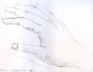
2/22/12, hand #1, Graphitint water-soluble pencil
I finished the 100th drawing of my hand yesterday. Have my skills improved since hand No. 1? You decide.
4/4/12, hand #100, Copic Multiliner SP pen, Akashiya watercolors


Markers, You’ve Come a Long Way, Baby

11/17/11, F-C PITT Artist Pens
The first felt-tip marker pen I ever used was the Paper Mate Flair. I was about eight years old, and these sensuous, richly pigmented pens – available in black, blue and red – seemed far superior to ordinary ballpoint pens. It was the beginning of my lifelong lust for colored pens.

Marker pens, you’ve come a long way in the past half century (ouch) since those first Flairs. Available in a dazzlingly seductive range of colors, marker pens with various types of pigment and tips have been elevated to an art medium by artists who take advantage of their versatility, portability and convenience.

A couple months after I began my adventure in drawing, I went to a demo at Seattle’s Daniel Smith store given by fine artist Don Colley (the multi-pocketed vest he wore that day inspired a quest for my own similar vest). His marker of choice is the PITT Big Brush Artist Pen, so much so that his work is used in maker Faber-Castell’s advertising. These markers, says Faber-Castell, “are famous for combining a modern brush nib design with a tradition of India ink. India ink offers artists odorless, permenent (sic), waterproof, lightfast inks with 48 vibrant colors. The durable nib gives the freedom to create verstaile (sic) ink brush strokes of broad, medium to narrow with an even application of color.”  

Colorful, friendly marker pens? Something I’ve loved since I was a child? Surely, they would become my ideal art medium!

The only problem was that Colley made it look so dang easy! I have a bit more practicing to do.

Wednesday, April 4, 2012

Product Reviews: Tombow, Akashiya Sai and Akashiya Thin Line Brush Pens

2/20/12, Tombow marker
If I could take only one type of sketching medium with me to the proverbial desert island, it would be Japanese water-soluble brush pens. These sophisticated, high-tech marker pens have amazing tips that mimic the marks of traditional Chinese and sumi ink brushes. What’s more, the pigments they contain are water soluble, so a skillful hand (and sometimes even a clumsy one) can create subtle washes for shading and contouring with nothing more than a brush and water. Colors from multiple pens can also be blended right on the paper.

Three of my favorites are Tombow, Akashiya Sai and Akashiya Thin Line. All three types of pens are non-toxic and acid-free but not lightfast. This chart compares lines made with a few sample colors, including the effect of a light wash. (I’ve also included a line made with Akashiya’s Outline Brush Pen, which contains permanent ink.)

Tombow dual-brush pens, so-called because they have a fine point on one end and a “brush” tip on the other, are a favorite among manga artists because they come in 96 dazzling colors. The tips are not actual brushes but made of a hard fiber. They don’t flex like a real brush, but holding the tips at various angles results in varying line weights. The self-portrait above, the hand sketch below and a close-up of the line were all made with the “brush” tip of a Tombow pen.

3/30/12, Tombow marker
Tombow marker
I’ve been experimenting with these pens for only a couple months, and I’ve been using them mainly as a sketching medium. Other artists use them more as a painting medium, which I aspire to. Most notably, Scott Wilson of the Taranaki Sketchers makes lively, colorful urban sketches (that look more like watercolor paintings) using Tombow markers as his primary medium. One technique I learned from his blog is literally painting with Tombow pigment by picking up color from the pen tip with a wet brush, and using the brush to apply the color to the paper, rather than applying it with the pen itself. (This technique works with Akashiya pens also.)


Unlike Tombow markers, both Akashiya Sai (available in 20 colors) and Akashiya Thin Line (in five colors meant to evoke traditional sumi painting colors) brush markers have actual brush tips made of synthetic hair. They both make beautifully variable line widths, and the Thin Line collection can, indeed, make a very thin line – as thin as a Copic Multiliner SP 0.25 mechanical pen. Because the tips are real brushes, they can flex and make such subtle line width changes that it’s difficult to believe the marks weren’t made with a traditional brush and ink.

Compared to the Akashiya pens, the Tombow makes a line that clearly looks like a marker. The Akashiya pens resemble markers only in their convenient (and unfortunately expensive and disposable) plastic casing. Shown here are sketches made with each type of Akashiya pen and close-ups of the lines.
3/8/12, Akashiya Sai
Akashiya Sai


An Akashiya marketing video shows the Thin Line in action. The Thin Line pens are designed to appeal to women by resembling cosmetics. Ironically, I find a pen as slender as an eye liner to be difficult to sketch with – gimme a big, beefy man’s pen! Even worse is the perfectly cylindrical shape, which allows the pen to roll off the table top constantly. But these are my only complaints about an otherwise remarkable pen.
3/29/12, Akashiya Thin Line

Akashiya Thin Line


As with the Tombows, I’ve been using the Akashiya pens for only a short while, so I’m still just beginning to learn about their potential as a sketching medium. With all of these pens, some of the pigments can turn out surprising hues when washed with water, so if accuracy of hue is important to you, it’s a good idea to make test swatches. Me – I live for happy accidents, so test swatches be damned. Rock on, Japanese brush pen makers!

Tuesday, April 3, 2012

Product Review: Graphitint Pencils

3/21/12, Derwent Graphitint pencil
I’m a huge fan of water-soluble colored pencils. They can be used dry like ordinary colored pencils, applied with a wet brush as if they were watercolors, dipped into water to become creamy and crayon-like, or applied dry and then wetted with a brush on the paper to bring out a wash of color. These handy pencils are particularly portable because all you need is a few basic colors and a waterbrush (water is contained within the plastic handle so that a separate vessel of water is unnecessary) to make a color sketch or painting in the field.

I’ve tried a number of brands of water-soluble pencils, and the colors of most look slightly different when water is applied compared to the dry pencil marks alone. One brand that looks significantly different when wet is the Graphitint line made by Derwent. In fact, while each pencil of most brands has two colors – one dry, one wet – Graphitint pencils have three: one dry, one wetted on paper and one wetted on the pencil.

The first row of my color samples shows the pencil strokes dry. The dry hues in the Graphitint line are all relatively dark and neutral, so they work well for sketching the way ordinary graphite pencils would. The second row shows the same colors as the row above, this time with a light wash of water applied with a brush. The third row surprised me. I used a wet brush to pick up color directly from the pencil point and then applied the color to the paper with the brush. As you can see, using the pencils this way produced entirely different hues, so each pencil was like having three colors in one.

The sketch of my hand, above, was done with Graphitint Russet. I did contour shading with a light wash from a brush (as in row 2), and the cast shadows (under two fingers) with color picked up from the pencil point (as in row 3).

A note on lightfastness: I have read consumer reviews stating that Graphitint pencil colors are fugitive (Fugitive is one of my favorite art terms: I imagine David Janssen running from the law with a fistful of colored pencils). I will heed this information when I receive a phone call from MoMA requesting my work for its permanent collection. In the meantime, I’ll just keep my sketchbook closed.

Monday, April 2, 2012

You Get What You Pay For

3/14/12, Akashiya watercolors, no-name brush
As a mixed-media artist, I like to keep a large supply of the cheapest, crappiest brushes I can find so that when I abuse them with my unrefined painting and collage techniques, I can trash them without remorse. Color junkie that I am, when I began sketching, I also began using watercolors almost immediately. Every book I read on watercolor painting recommended buying the best brushes one could afford because they would make a difference in the results. Always the skeptic, I was convinced that the holder of the brush makes a much bigger difference in the results than the price of the brush. But I also love an excuse to go art-supply shopping, so I went out and got my first sable brush.


3/14/12, Akashiya watercolors, WN sable brush


On close examination, I remained skeptical. This tiny but expensive brush looked disturbingly similar to all my tiny but cheap and trashy brushes. I decided to put them to the test. Using the same Akashiya watercolors, I sketched both of these on the same day, one right after the other. The hand shown above was made with one of my crappy brushes. The other was made with the sable. Even with my not-yet-educated painting hand, I could tell that the sable brush has a nice spring to it, while the cheap brush is better equipped for spreading glue. The sable also paints a range of thick and thin lines, while the 10-for-a-dollar brush barely has one line width. OK, I’m convinced.


Sunday, April 1, 2012

Hands in Action

3/22/12, Akashiya Thin Line, Hand Book sketchbook

My difficulty in sketching hands I saw in coffee shops prompted me to give myself the assignment of drawing my own hand 100 times. Lately I’ve been going back to the original challenge by trying to draw other people’s hands (usually typing, mousing or holding a book or coffee cup). Sometimes drawing the hand attached to the person made the task all the more difficult, so to get further practice, I simply detached the hands in my sketchbook.

3/29/12, Akashiya Thin Line, Hand Book sketchbook
Related Posts Plugin for WordPress, Blogger...