Sunday, May 7, 2023

From Pink to May Green


5/2/23 Maple Leaf neighborhood (Bonus: A 
Kwanzan cherry stood behind this cluster of 
May green trees!)

The pink trees in my neighborhood may be fading (I haven’t put away my pink pencils yet, though), but now I have an opportunity to use another color in my spring palette. When fresh, tiny leaves start appearing, they give trees a transparent haze of luminous yellow-green. I especially enjoy sketching them when they stand in front of a contrasting background, like the ones against the red building (below). (A local friend who reads this blog might recognize that building. 😉)

It’s also fun seeing the names that manufacturers use for a range of yellow-greens. In these sketches, I used a Derwent Inktense called Fern (1560) (and if you looked only at its misinformed end cap, you’d think it was dark Army green or some such). In its dry state, it’s darker and more olive, but it turns yellow-green when activated. Faber-Castell unimaginatively calls the color Light Green (171), but it also has a May Green (170) that looks more olive than the green I have in mind. Caran d’Ache calls it Spring Green (470) in English, but the French on the barrel is Vert de Mai – May Green. I like “May Green” best as the name for the hue I see and welcome this time of year.

5/1/23 Green Lake neighborhood

5/1/23 Green Lake neighborhood

Saturday, May 6, 2023

One More for My Symposium Tin Collection

My beloved symposium tin collection

During all the social media buzz around the Urban Sketchers Symposium in Auckland last month, of course I was wistful (perhaps even a bit self-pitiful) that I wasn’t joining the fun and excitement this year. Sure, I missed all my sketcher friends whom I happily reunite with in exotic cities around the globe. Certainly I enjoy attending workshops and sketching sights I never see at home. But we all know what I regretted missing most: the Cretacolor pencil tin with the symposium logo!

Luckily for me, a dear friend who attended isn’t attached to symposium souvenirs, and the Auckland tin was happily given to me (is it still considered a gift if I beg?). When I missed the Singapore symposium in 2015, I had put out an entreaty on Instagram, and I was touched by the number of friends who had offered their tins.

The tins contain varying assortments of Cretacolor
pencils. I don't hoard the contents, though -- in fact,
I let the donor of the Aukland tin keep the pencils.
Begging for pencils? Please -- I have some pride.

Since Paraty was the first symposium with a logo’d Cretacolor tin, I thought my collection was complete – until 2017. That was when I spotted a photo on Instagram of a tin with the Barcelona logo – which I didn’t receive in my swag bag! My first symposium, Barcelona is particularly special to me, and completing my collection with that tin would be especially sentimental.

I went to great heights that year to inquire among friends who had attended Barcelona, but they didn’t get one in their swag bags, either. Perhaps only a select few had received one – symposium organizers only? I even pleaded with a couple of executive board members, but they didn’t have them, either. Perhaps it was a Cretacolor sample, which was ultimately not provided as part of the sponsorship? I may never know.

Someday years from now, perhaps a Barcelona tin will appear on eBay for an astonishing sum that no sane person would pay. Or perhaps, needing a down payment for a house or to put a child through college, the owner of the only Barcelona tin on earth will recall my original plea and offer it to me – for a suitable price. I know which country she lives in; I haven’t ruled out theft.

How far will I go to complete my collection? Only time will tell. In the meantime, I’m ever grateful to kind friends who are willing to indulge me.

Friday, May 5, 2023

Pink and Spectacular (Plus Compositional Mutterings)


4/30/23 Maple Leaf neighborhood

Their time is short, so I’m sketching Kwanzan cherries as fast as I can. In the same walk one afternoon, I spotted all of these close to home – an enormous one on busy Fifth Northeast (at right), and then a row of smaller ones (below). The smaller ones had leaves that were more green than orangey (like most Kwanzans), so they could be a different variety. They were all bright pink and spectacular.

Compositional thoughts: As a pedestrian and general neighborhood citizen, I don’t like it when cars park on the sidewalk (and apparently aren’t ticketed). As a sketcher, though, I like the Jeep that is habitually parked this way (below). Compositionally, it adds an interesting visual element that wouldn’t be seen if it had been parked properly next to the curb.

As an urban sketcher who was “raised properly” to follow the Urban Sketchers Manifesto, which includes the item, “We are truthful to the scenes we witness,” I think frequently about what to include or exclude in sketches. It usually creates a bit of tension in the sketching process, which I enjoy. Like all artists, of course, I use artistic license constantly to move things slightly to improve the composition, change the colors of objects, or omit street clutter that distracts or detracts. I certainly didn’t include every parked car I saw on Fifth Northeast. It’s impossible to include everything one sees, even in a fairly quiet scene, and many beginning sketchers get into trouble when they don’t know how to exclude details or simplify. I don’t think that simplifying makes a sketch less truthful to the scene if it helps to tell the story more clearly.

4/30/23 Maple Leaf neighborhood

Some artists would simplify by eliminating stuff like utility lines and poles, trash cans and even an entire construction crane behind a building because they look messy or unattractive. (Frankly, if construction is going on, that is the story!) As you know, I include most of that kind of stuff because I’m not here to make only pretty sketches. I also think that selective street detritus can be rhythmic and improve a composition.

But what about adding things that aren’t in the scene at all for the sake of an improved composition (the “design” of the piece)? As an urban sketcher, I wouldn’t dream of putting a Jeep into a sketch as a compositional device if it weren’t actually parked there – not only because it isn’t “truthful;” more likely, it wouldn’t even occur to me. But I do think more about this question as I continue studying composition through Ian Roberts’ videos. A master of eliminating and simplifying a scene for the benefit of a painting’s compositional design, Roberts is not an urban sketcher. Although he’s more likely to remove something rather than add it, he would not bat an eye about putting a Jeep on a sidewalk (well, OK, maybe not a Jeep, but certainly a boat on a lake) if it improved the composition. He’s an artist who believes in the truth of his design, not in being truthful to whatever may have inspired the painting.

(To see how Roberts develops a design for a painting by first making a drawing from a photo, his latest video is a great place to start. I do have a problem, however, with one example: His photo reference includes a woman walking a dog – and he eliminates the dog! I suppose he found it “distracting” to the design, but I have not forgiven him for that. Maybe the resulting painting would be better compositionally, but it certainly would tell a better story with the dog included.)

If I were a studio painter, I might add the Jeep – no harm done if it benefits the painting. As an urban sketcher, I have to work harder to find the Jeep – as both a “truthful” element as well as a design element – and that’s at least part of the fun of urban sketching. (And I would never eliminate a dog.)

Thursday, May 4, 2023

Ravenna Third Place Books


4/29/23 Third Place Books, Ravenna neighborhood

For a long time now, I have tried to avoid adding more books to my already overstacked bookcases and use the library whenever I can. Some books, however, are important to own, and one I really wanted was Chandler O’Leary’s latest (and very sadly, last) book, On Island Time. When it was released a few months ago, I planned to eventually buy it on Independent Bookstore Day, which would be a good excuse to shop. I didn’t know then that within a couple of months, Chandler would be gone. I still regret that I didn’t make more of an effort to get to one of her booksigning events to see her again and congratulate her in person for yet another fabulous book. But I thought I would have plenty of time for that – she was planning to be at Sketcher Fest in July, and of course, there would be more opportunities. We always assume there will be more.

I was thinking about all of this as I sat in my car in Third Place Books’ parking lot waiting for the store to open. At the lot entrance, a street sign marks “Michael Coy Way,” which honors the long-time Seattle bookseller and former Third Place Books Ravenna manager. This is the third year I’ve shopped at the Third Place Ravenna store on Indie Bookstore Day, so I guess it’s now my tradition!

This is the third year Blackwing has collaborated with National Independent Bookstore Day
 on a limited-edition pencil design that only bookstores can sell.

Unfortunately, my strategy to wait until Saturday to buy Chandler’s book was a poor one: It had been sold out for a while. On Island Time is now going into second printing, but it won’t be out again for a few more months. I got on the waiting list for a copy.

Disappointed that I didn’t get the book, I consoled myself by grabbing a box of limited-edition Blackwing pencils (OK, OK, I admit it: It was my intention to buy some all along!). If you have been wanting to buy a book (or the Blackwings), this week would be a good time to visit your local indie shop – National Independent Bookstore Day events continue through May 8.

Wednesday, May 3, 2023

U Village Near-Abstraction


4/27/23 University Village

Meeting a friend at U Village, I arrived a few minutes early at the sunny commons area filled with umbrella’d tables. When I’ve sketched there in the past, I’ve been more methodical about drawing the tables with corresponding umbrellas and making sure tables and chairs have the appropriate number of legs. My tendency is to work one area at a time, then move on.

Since I had only a few minutes, I took a different approach here: First I drew all the umbrella tops with a white pencil (I would have preferred to use a Gelly Roll, but it failed me again). Then I took out a brush pen and filled in all the umbrella shadows at once, then drew all the vertical poles, then the tables and chairs, and finally a few people. It was an efficient, nearly abstract, assembly-line way of sketching. I hope the result still evokes the feeling of the place.

Tuesday, May 2, 2023

More Kwanzan Cherries (Plus Techniques)


4/27/23 Kwanzan cherries, Maple Leaf neighborhood

The Kwanzan cherries seem to have an even shorter season than the earlier sakura, so I’m sketching them as fast as I can. Unlike the spots on my annual petal-peeping tour like Sunset Hill, Dibble Avenue, Capitol Hill and the UW Quad, where large groves of cherries grow together in a dramatic display, the Kwanzans in my part of town seem to grow only as individuals or in small clusters. If I discover a concentration of Kwanzans, I’ll be there in a minute, but for now, I’m happy to sketch the onesies and twosies I find on my walking routes. These two are very close to home – just a couple of blocks away.

Process notes: I’m usually not aware of routine techniques I use, but for some reason, I was more conscious of them with this sketch. I thought it would be a good opportunity to point out watercolor pencil and compositional techniques I use frequently:

Selective activation: A huge benefit of water-soluble colored pencils is that they can be activated selectively as desired to control values or the intensity of color. I think this unique, easy-to-use attribute of watercolor pencils is something many (maybe most) sketchers don’t take advantage of – they activate every part of the sketch equally. (It’s fine to do that if you are using the pencils as a substitute for watercolor paints… but at that point, why not use paints? )

The trees are obviously my focal point, so I fully activated the colors as vibrantly as possible. I didn’t want the shrubbery to overtake the trees, but I did want them dark enough to serve as a background for the tree trunks, so I activated lightly with a dry brush. The shadow under the foreground car was actually the darkest value in the scene (in reality). I didn’t want the eye getting locked onto that spot, however, so I applied the pencil fairly heavily but kept it dry. My intention was that the large but not-too-dark shadow spot would balance the otherwise top-heavy composition.

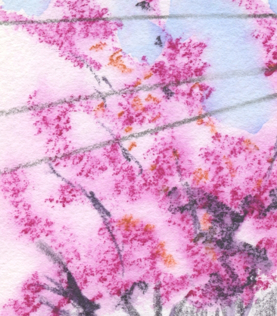
I like the blossom texture that occurs so easily
with Hahnemuhle's paper.

Dry into wet:
For a long time, my favorite technique for activating foliage has been to apply dry pencil pigment heavily, then spritz with a water sprayer to activate. Ever since I started using the Hahnemühle 100 percent cotton sketchbook, however, and especially because it works so well with fluffy blossoms, I’ve been doing it the other way around: Spritz the paper liberally first, then apply the pencil pigment. The sizing and weight of the Hahnemühle paper are critical for this technique because thinner or lower quality papers will pill or otherwise not hold up well. The strong, irregular tooth on Hahnemühle also lends itself well to blossoming trees: The pigment sticks to the texture in an airy, organic way. It’s the ideal combination of paper, pencil, water and subject matter.

When the trees leaf out fully in a couple months, I’ll try this dry-into-wet technique and see if I like it as much as my standby dry-then-spritz method. It might not be as effective if I want a dense foliage look, but it will be fun to experiment.

"Licking" a Derwent Inktense Iris Blue (900) pencil...
not a bad match for Seattle's sky last week!

“Licked” sky:
This was my first attempt at using the “licking” method for the sky with Derwent Inktense. If the sky takes up a large part of the composition, I would typically spritz the area liberally. In this case, the spots of sky were small, so I applied water carefully with a waterbrush instead. Then I used the waterbrush to “lick” pigment from the Inktense pencil (which, to my relief, accomplished the task as well as Caran d’Ache Museum Aquarelles do. Yes, I’m always comparing Inktense to the best watercolor pencils in the world – no point in letting them get off easy).

Monday, May 1, 2023

Ksitigarbha Temple

4/29/23 Ksitigarbha Temple, Lynnwood

 Urban Sketchers Seattle was treated to a unique experience Saturday: an afternoon sketching at Ksitigarbha Buddhist Temple. Lynnwood is a bit farther north than we typically venture for sketch outings, but the experience was certainly worth the extra miles. Open to the public on Saturdays, the Vietnamese temple grounds are a wondrous display of statuary and ornament. The location would have been a fabulous experience any day, but we were also treated to spectacular weather: Clear blue sky and temps in the high 70s!

Built on a steep, wooded hillside, the grounds gave us a good workout as we climbed many staircases to eventually reach the top. All along the way were colorful, intricately decorated religious icons. Most of the ornamentation was related to nature – artificial flowers, birds, other animals – but I spotted a few mythical creatures, too. I wish I understood the symbiology and significance of the amazing sights. Stairway landings often led to small, secluded nooks, most with benches or chairs, which made sketching serene and comfortable.

I had to wander for quite a while to take it all in and decide what to sketch, which was a staggering decision! Overwhelmed by all the color and detail, I started with an icon at the very top of the grounds, which I chose because it was one of the “plainest” displays (above)!

After chatting with other sketchers and wandering some more, I eventually ended up in a studio area where congregation members were having a work party. The large space was filled with more of the colorful ornamentation I saw throughout the temple grounds. Workers were painting items that would be used for more displays.

Congregation members paint items that will be used in future displays. The space was filled with colorful florals and other ormanments.


Filling the few minutes before the throwdown, I made a small tonal study of a beautifully lighted Buddha’s face, which was a relief after trying to capture all the details in the first icon I sketched.

Many thanks to Ksitigarbha Temple for welcoming USk Seattle onto their sacred grounds as we all wandered about with our jaws hanging open in awe!


Related Posts Plugin for WordPress, Blogger...