Monday, March 7, 2022

Drawing from Memory


My first try on this shoe wasn't very successful, so I tried again
the next day (below).

Sketching shoes and hair-dos from my imagined past was nostalgic fun, but to sustain my interest for 100 days, I had to up the challenge. Beginning with Day 15, I decided to focus on drawing less from imagination and more from memory after close, direct observation.

On the second try, I got more details right.
While I would like to continue developing my imaginative drawing skills, drawing from memory is actually a more useful skill for sketching on location. I know we all do some of that automatically: A person walks by, and we catch some part of the gesture, but they are long gone by the time we finish, so the rest must be drawn from a remembered image. It’s a fleeting image, though, and if anything interrupts before getting it on the page – poof! It’s gone.


Developing my memory muscles for this purpose is a worthwhile exercise. When I was practicing life drawing on Zoom, I tried covering up the screen for part of the pose time
to see how much I could draw without looking at the model. It was a good exercise, but hectic to manage so that a portion of the pose time was saved for drawing again from observation. My current project is much easier in one way: I’m allowing myself to study the object for as long as I think is necessary.

So far, my process is to choose an object and observe it closely from all angles until I feel I have a firm, three-dimensional mental image of it. Then I walk away and do a few things for a while so that I’m not drawing immediately. I know the image fades quickly from memory, so I’m hoping to lengthen the time that I can retain the picture in my mind. I have deliberately chosen simple objects with clear forms (nothing amorphous like bushes), but if I improve with the simple objects, I hope to graduate to more complex ones eventually.

On the crank side, it should be red, not black! I did better on the front.

Because I know I have difficulty with even simple mechanisms (how parts are put together), I have been paying special attention to those parts. Ironically, I have focused so much on those parts that I miss really obvious details – like colors! In the first shoe exercise, I completely missed the red interior lining as well as the shape of the sole and how it connects to the leather. I felt I had missed enough that it was worth doing it again the next day, when I did much better.

I did fairly well on the red pencil sharpener (sketched with a new red Blackwing), but I couldn’t remember how the crank handle attached, despite what I thought was careful study of the mechanism. With the soap dispenser, I again focused on some mechanical details, which I did well on, but then the basic bottle shape wasn’t quite right. The soap was particularly illuminating as a subject: It’s something I look at and use multiple times a day, yet it was obvious that I had never really seen it until I made the effort to observe it with the purpose of drawing it.

I find it helps if I talk to myself (hopefully silently) and use visually evocative words to describe what I’m observing: The top of the soap pump is shaped like an alien head. The pump is wearing two turtlenecks. From the side, the bottle has rounded shoulders.


Ten years ago when I took my first-ever urban sketching class, instructor Jane Richlovsky gave us a challenging assignment. At the Ballard Locks one day, we had been sketching from observation in the usual way. Toward the end of class, she instructed us to choose a scene and visually memorize as much of it as possible. We were not allowed to take a photo. Then we were to wait several hours or even until the next day to sketch whatever we could recall. At that point, I had had less than a year of sketching experience in general, and I had never done that type of memory-drawing exercise before. I failed the exercise badly – I could barely visualize the scene beyond the very general, and I did not have enough technical skills to organize whatever I could remember into a drawing.

Now that I have 10 years of observational drawing experience under my belt, drawing from memory is certainly easier than it was that day at the Ballard Locks, but it’s still extremely challenging. I’ll keep at it for as much of the remaining days in the 100 Day Project as my brain can stand! Whew, it’s exhausting!


I did well on most of the details, but I didn't get the shape of the handle right.

I waited 6 hours after observing to draw... which was too long, it turned out! I missed a lot of details that I had mentally repeated to myself and revisualized during the day to help me remember, but by the time I put pencil to paper, I had forgotten. Way off on the proportions! But I'm pleased that I got the hexagonal shape of the button right.

One thing these exercises have taught me is that "everything is designed" (as a designer has been quoted saying), yet I take for granted the design elements of common objects like this electric kettle. It has no straight lines anywhere -- everything is roundish. I would not have noticed that if I hadn't drawn it, and maybe especially from memory.

I missed key elements like the basic shape! You can check my work. ;-) 

Sunday, March 6, 2022

“Brynn” Sketch Kit Organizer


3/1/22 My "Brynn" sketch tool organizer

When I was sketching my new Peg & Awl Sendak Mini Artist Roll last month, it occurred to me that I had never sketched another handmade sketch tool organizer that I have been using since 2018. Although it was based on a concept I had provided, the organizer was custom-made for me by Brynn James, who improved on the design with her sewing expertise. And it’s made from a lovely, colorful fabric that she designed! This organizer was an essential supplement to the Tran Portfolio Pencil Case and serves the same role now to my mini Sendak by holding secondary materials that I don’t use often but at times are still essential. I adore handmade things, especially when they are both useful and beautiful.

At the time, Brynn had an Etsy shop of adorable children’s clothing and other textiles, but she has taken a break from that to raise her five young kids (including No. 3, who was still a large bump while she was making this for me).

Our recent days of record-breaking rain were good for blog housekeeping, so I updated my Favorite Art Materials page. It was an opportunity to photograph the current contents of what I call my “Brynn” sketch kit organizer and finally sketch it, too.

Saturday, March 5, 2022

Quick Look: Blackwing Lab 02-22-22 (Red)


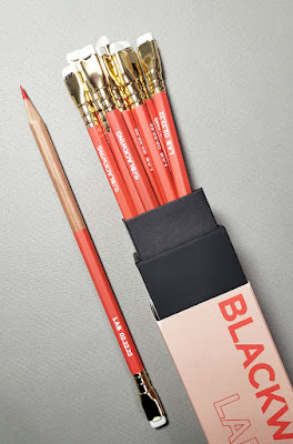
Blackwing's latest limited-edition Lab pencil is red!

Blackwing has done it again: another colored pencil in its ultra-limited edition and experimental Lab series. Last summer, the California company put out a non-photo blue pencil, which surprised me – it’s such a narrow niche. Released on 02-22-22, the latest Lab has a red core, “perfect for marking, editing, and sketching.”

Like the non-photo blue Lab, the new red Lab has a gorgeous half-natural/half-painted barrel. The two look beautiful together.


Blackwing's latest red and its earlier non-photo blue.

I made quick comparison swatches of the red Blackwing and several other red pencils on two types of paper. Although the hue is very slightly cooler, I’d say that the 02-22-22 Lab’s core is the same softness as the red in the Blackwing COLORS set. For a pencil intended for marking and editing, it’s quite soft – probably too soft for those who intend to use it for writing in narrow margins. But since I often tend to favor softer colored cores, I like the 02-22-22 Lab pencil. (I made some small sketches with it in a post you’ll see in a few days.)

Swatches on toothy Col-o-Ring paper

Swatches on smooth Stillman & Birn Epsilon paper

I did a quick erasing test, too. First I used the white eraser attached to the red Lab; it failed miserably, as I expected. The Sakura Foam Pure Slim, my current favorite colored pencil eraser, did better, but I wouldn’t use a red pencil (or any colored pencil) to write with if you plan to erase regularly.

Erasing test

As I felt when Blackwing released its non-photo blue pencil, I’m tickled that the mostly-graphite pencil maker is giving some love to color. But let’s quit this nonsense of one color released at a time that must be purchased by the dozen during 24 hours or less that the Lab editions are available (only 3,000 boxes of this edition were produced). 

Blackwing: When, oh when, will you release a new COLORS set? We’ve had the same 12 colors for years! Surely it’s time for the next 12? Or – be still my heart – 24? And in the lovely half-natural/half-painted design, please! Skip the eraser, though. How about a gold end cap like the silver one on the first COLORS set? See – it’s already designed; just make it and sell it to me. You’re welcome.

02/22/22: a red-letter day for Blackwing

Friday, March 4, 2022

Shoes From My Past


After drawing hair-dos from my past for The 100 Day Project, I was still on a nostalgia binge and moved on to shoes. I can’t believe I walked in some of these without breaking an ankle. I did get smart, however, during my first trip to Europe in 2006. Heeding advice from savvy travelers, I bought some sandals that would put me a cut above other American tourists. They looked nicer than the sneakers many of my fellow Americans were seen wearing, but the sandals were terrible for walking on ancient cobblestones (Rick Steves never gives advice that tourists really need). Realizing that breaking an ankle would put an immediate end to my Italian sightseeing, I packed the sandals away and lived in Lands’ End “rugged” flip-flops the rest of the trip. I may have looked like the sloppy American I was, but those flip-flops were surprisingly sturdy and comfortable. I hiked much of the Cinque Terre trail on a rainy day in those flip-flops.


Technical note: Although I sketched most of these from memory, some parts were more difficult than others, like the ankle strap on the Bare Traps (Day 8). I couldn’t quite picture the shape of how it connected to the side of the shoe. I had to peek at images of generic platform shoes to get a general idea, then finish the drawing. After each one was finished, I checked my work by searching for images of the exact shoes I had (which were surprisingly easy to find on eBay as “vintage”). I did OK, but in general, I have not observed my shoes closely enough to draw details from memory. If I had been drawing more shoes from observation all along, I think I would have done better on technical details like the buckle or strap.


Thursday, March 3, 2022

Fun with Neocolor I


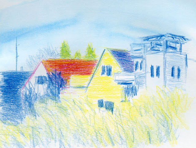
2/25/22 Caran d'Ache Neocolor I wax pastels in Stillman & Birn Zeta sketchbook

As alluded to previously, a late-night retail therapy binge led to buying several new-to-me art media. One was a small set of Caran d’Ache Neocolor I wax pastels. I’ve enjoyed using water-soluble Neocolor II crayons for years, especially when my primary art medium was collage, but Neocolor I, which is Caran d’Ache’s non-soluble version of artist-quality crayons, is new to me. They look like the crayons we used as kids, but unlike Crayolas, Neocolor I contains rich pigment and applies with a less waxy feel.

I was inspired to try these crayons while reading Creative Drawing Techniques: From First Mark to Full Expression, a newly published book by David Brammeld. One of many media the author combines in his works, non-soluble Neocolor I acts as a resist when used with various wet media. He used the crayons mostly with watercolor in the examples he showed, but I figured they could be used with water-soluble pencils and markers, too.

Last week I invited a few friends to join me on Zoom for a mixed media play date to encourage myself to jump in. My first attempt above, which, I admit, doesn’t look very experimental, was nonetheless a novelty for me. I used the Neocolor I crayons to draw the familiar scene through my studio window. Then I spritzed the top half of the page generously with water and used my typical “licking” technique to take color from a Caran d’Ache Museum Aquarelle pencil tip and swipe it across the wet page. Normally, I would have to carefully avoid getting water on the water-soluble pencil work, but because I knew the crayons would resist water, it was easy to swipe liberally. In fact, I deliberately swiped the brush over the top part of the drawing to test the crayons’ resistance. I like the smooth, seamless sky that resulted.

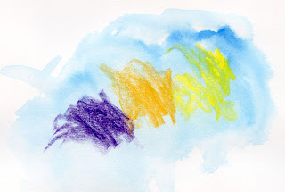
Museum Aquarelle wash over Neocolor I scribbles
The scribbled swatches at right show interesting results. Purple and orange do not show much of the resist effect, but where I applied yellow heavily, the crayon resisted fully. Where I applied yellow more lightly, the glazed transparent blue optically mixed with the yellow to appear green.

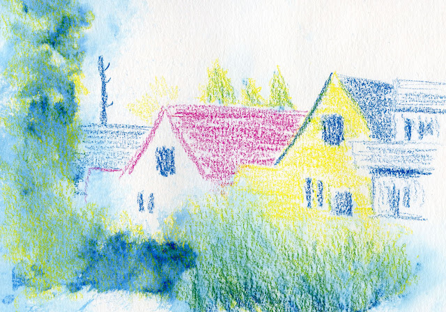
I tried to take advantage of the optical mixing effect in the experiment below, which ended up messy. I used a yellow Neocolor as the base of the foliage at the bottom and left side of the sketch. On the right side of the lower foliage, I scribbled over the yellow Neocolor with a blue Museum Aquarelle pencil. On the left side, I scribbled over with a blue Faber-Castell Albrecht Dürer watercolor marker. Then I spritzed all the foliage areas with water. Since the yellow crayon didn’t activate with water, it couldn’t blend with the blue, but in areas where the blue was more transparent, the yellow shows through as green. The marker ink, however, was difficult to control and got a bit heavy. I do like how the insoluble crayon retained the paper’s texture. I need to practice this technique more if I’m going to use it effectively.

2/27/22 Neocolors, Durer watercolor marker, Museum Aquarelle pencil in Stillman & Birn Beta sketchbook

These crayons will require lots more play to figure out how I might use them on location, and play I will.  

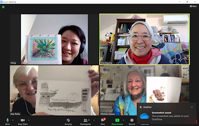
My mixed-media playmates Ching, Kate and Michele

Wednesday, March 2, 2022

More Messing and Mixing with Watercolor Markers


2/24/22 Faber-Castell Durer watercolor markers and Caran d'Ache Museum Aquarelle pencils in Stillman & Birn Beta sketchbook

Here’s another experiment with Faber-Castell Albrecht Dürer watercolor markers combined with Caran d’Ache Museum Aquarelle pencils. I picked out a triad including a garish Middle Purple Pink (125) and Cadmium Yellow (107) knocked back by a subdued Indanthrene Blue (247).

For the sky, I tried a wet-in-wet technique that I often use with watercolor pencils: After generously wetting the paper, I “licked” ink from the marker tip with a waterbrush and swiped the color onto the wet paper. For the three little trees behind the pink house, I wet the paper with a brush, then quickly tapped the blue and yellow markers directly into the wet; they blended nicely just like watercolors. (Those three trees are probably the only bit about this sketch that I like.) But I have to ask: If a wet-in-wet approach is desired, why not use conventional watercolor paints? I can’t see any advantage to using these markers.

The foreground foliage started similarly to the three background trees – markers applied directly to the wet page. I didn’t like the result at all (see below), so after the paper dried completely, I went over it with a couple of watercolor pencils to regain the texture and activated them lightly. I like this result better (top of post), but not better than watercolor pencils alone.

The foreground foliage (Durer markers only) before applying colored pencil.

I’m not really feeling it with these markers; to keep using them, I have to find a way in which the markers uniquely enhance watercolor pencils. However, as far as markers go, I will say one positive thing about these Dürer markers compared to their waterproof sisters, Faber-Castell Pitt Big Brush Artist Pens (which are no longer available but have been reincarnated as a two-headed creature): If you work quickly, the juicy Dürer watercolor markers remain wet long enough that the typical marker-y streak marks mostly disappear. This is almost impossible to do with Pitt ink, which must dry faster. The blue swatch below is a watercolor marker that I swiped repeatedly and quickly. Below it is a swatch of a Pitt Big Brush pen, which leaves behind more telltale streaks.

The Durer watercolor marker streaks disappear better than Pitt Artist Pens.

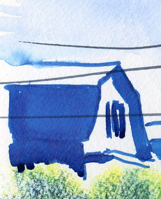
It’s easiest to swipe quickly in small areas, of course. In the details from two sketches below, I swiped solid areas of color on the rooftops and was pleased that no marker-y marks were visible.

The solid rooftop areas here and below show no marker streaks.


I didn’t need to rewet the color to blend out the marks as I had to do in the first sketch I did with these markers a few weeks ago (detail below). I think I was swiping more slowly that time, so the ink had dried more.

I didn't work fast enough in this sketch, so more of the marker streaks are visible.

The upshot is that if I wanted to make areas of flat, solid color, I would choose the Dürers over the Pitts. I used to use a dark gray Pitt marker routinely as a grisaille and for large areas of shadow because it was faster than applying the same amount of gray with a colored pencil. However, in that case, it was important for the grisaille marker to be waterproof so that the gray wouldn’t muddy the colored pencil color when I activated the latter. Once again, I’m not seeing an advantage to using a watercolor marker for this application, either.

Hmmm. Why am I using these Dürers again? At least I’m having fun experimenting and mixing them up with watercolor pencils, but maybe these markers need to be mixed with something else. Stay tuned.

Not feeling it yet with these markers but having fun!

Tuesday, March 1, 2022

Chilly and Sunny in Crown Hill


2/23/22 Crown Hill neighborhood

Our harsh cold snap last week was accompanied by sunshine and glorious clear skies. I drove over to the Crown Hill neighborhood, fully intending to stay in my cozy car as I sketched. Shortly after I began, however, a car parked right in front of me (the nerve of someone wanting to park in front of his own home!), blocking much of my view. Fortunately, I had marked the main elements, so I didn’t have to worry too much about the change in my perspective when I stood behind my car to finish. Although it was chilly, the sunshine felt wonderful. I sucked in as much vitamin D as I could.

Don't you hate it when this happens?

Meanwhile, I was also trying to see whether Faber-Castell Albrecht Dürer watercolor markers play well with watercolor pencils. For this sketch, I decided to use markers for all the human-made elements and use colored pencils for the hedge and trees. My concept was that markers make harsh, unequivocal lines, which suit the hard edges of buildings and poles, while soft pencils can be modulated in an organic way to evoke the texture of natural subjects. The contrast may be a bit severe. I’m having fun experimenting, though.

Incidentally, this sketch was an excellent test of my Sendak Mini Artist Roll’s agility and versatility. While I was still in the car, I had the Sendak leaning against the steering wheel, keeping my materials at easy reach. When I had to get out of the car, I simply put the opened Sendak back into my bag, slung the bag across my shoulder as usual, and everything was just as easily accessible.

Related Posts Plugin for WordPress, Blogger...