|
| From memory |
As effortless as it is for me to draw every day, and as committed
as I am to my daily sketching practice (which I’ve kept up for more than a
decade now), I sure have a crappy track record with a daily sketch journal.
Maybe I just make too big a deal of it somehow being a separate process from
the daily sketching I do anyway, but I can never seem to get the visual journal
habit to stick.
What do I mean by a “sketch journal” or “visual journal”?
The label isn’t important, but it’s more about the process. For example, an
urban sketch is about a place or event – that’s the “story” that is being
documented. Drawing from photos or still lives is usually about exploring specific approaches or media. A sketch journal, on the other hand, documents the sketcher’s day,
whatever that day may include. And often you can do both at the same time.
In the past several years, I’ve tried numerous forms. I
think my “Scribble Journal” format lasted the longest because I
incorporated the sketches (mostly from imagination/memory) with my daily
written entries (I gave an update a year later). Eventually, though,
that morphed into more and more writing and less and less sketching, and now
it’s back to nothing but writing.
 |
| From memory |
Last year I tried incorporating sketches, collage and other
smatterings right along with the random notes I keep in my daily-carry Field
Notes – what I called my “Whatever Journal.”
That format met the sketch journaling need while also satisfying my desire for
chronological continuity. I really enjoyed that format for its portable casualness
(essential if I want to keep up a sketch journal habit) – but then Uglybooks came into my life. And that was the end of that.
With my current attempt, I have circled back on the Whatever
Journal idea, with an ironic twist: I’m using Uglybooks!
Before starting anew, I reviewed the various formats I’ve
tried in the past to identify which aspects were satisfying. The daily-carry
portability of the Field Notes-based Whatever Journal seemed to be the best format –
it’s always with me whenever I have a moment to sketch. When I started
sketching in Uglybooks, I thought I could transfer the same idea from Field
Notes to the colored books, but I was too fickle. I kept switching to a
different color book before the previous book was filled – and there went my
chronological continuity (an aspect that’s important to me to retain with a
sketch journal).
 |
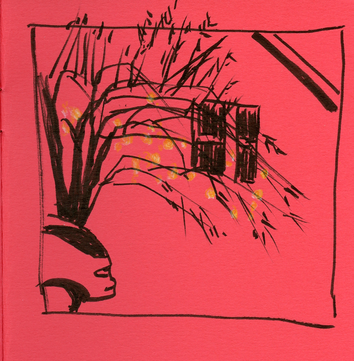
| From imagination |
What’s different this time? The main difference is that I’ve
finally gotten past the novelty of having so many different colors of Uglybooks
to explore. Since summer, I have been going back to previously begun Uglybooks
and sticking to only one book at a time until it is full. (I can hear
your skepticism all the way over here!) And I’m committed to keep doing that
until I’ve filled them all, at which time, I’ll crack open a fresh one and keep
using it until it’s full. I’m saying it aloud here to keep myself honest!
(I should note that I do have a few special-purpose Uglybook
colors, like black and dark blue, that I don’t mind reserving only for their ideal purposes.)
One reason I’m optimistic that this format might stick is
that I already sketch often in the daily-carry Uglybook on my regular fitness
walks. By evening, if I realize I haven’t yet made a sketch in it, I think
about something that I observed that day. (Focusing on observations rather than
feelings or thoughts is something I worked on and valued during my 100 Day Project earlier this year.) Then I sketch from memory or imagination
(which also gives me practice in drawing without a visual source, which is a
skill I’d like to continue developing).
Since I came up with this idea late in the calendar year, I
was tempted to begin the new habit on Jan. 1. But that’s just setting myself up
for “resolution” failure. I simply began randomly one day this month, which somehow
reduced the pressure of it being “a thing.”
 |
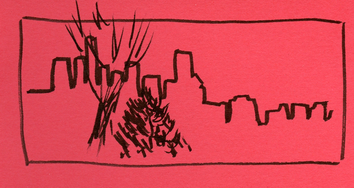
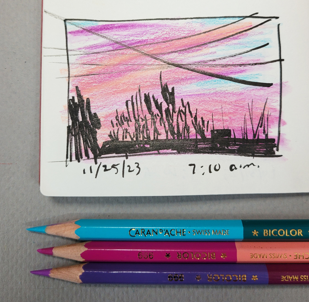
| I had photo asssistance to draw this! |
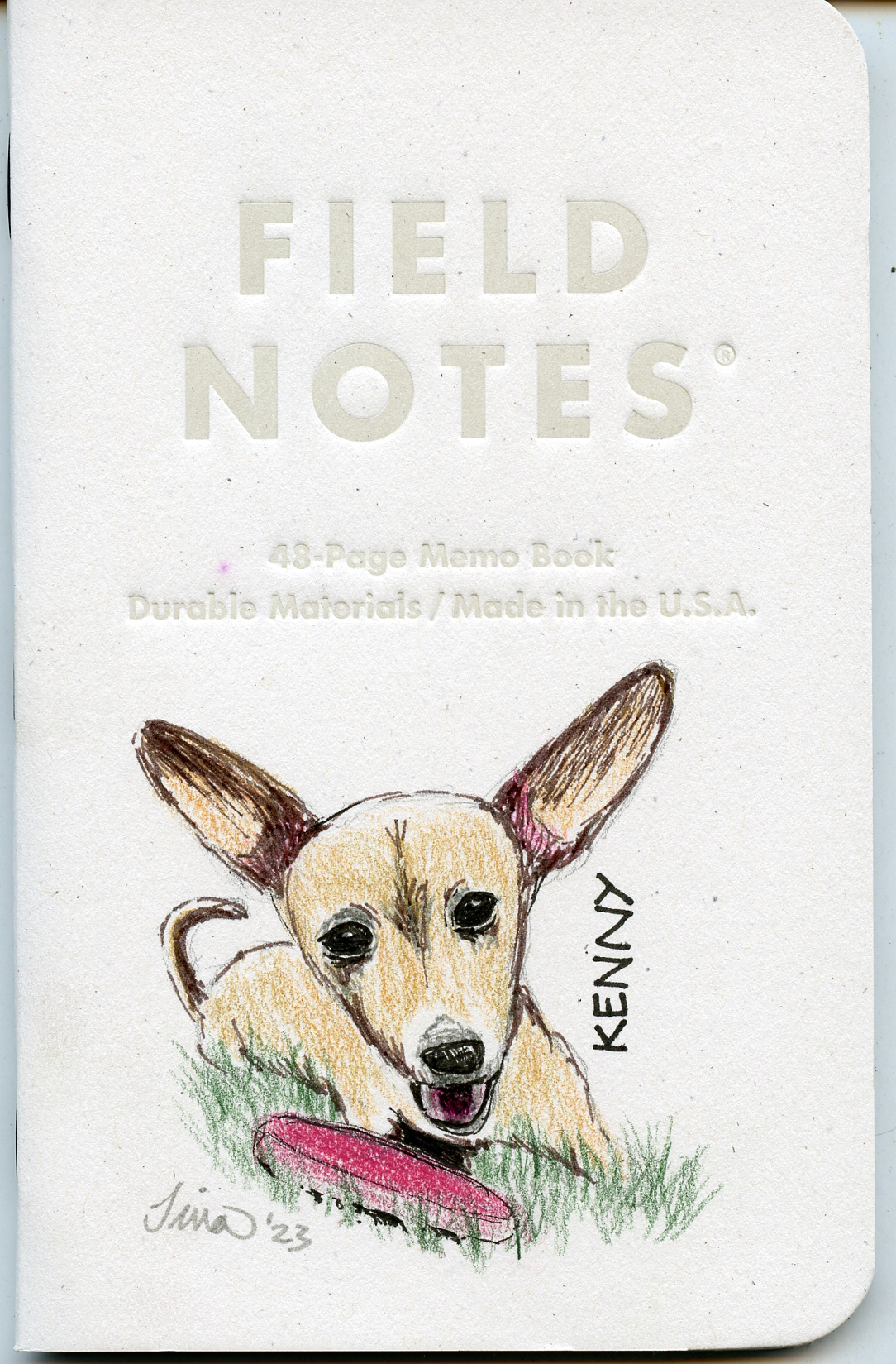
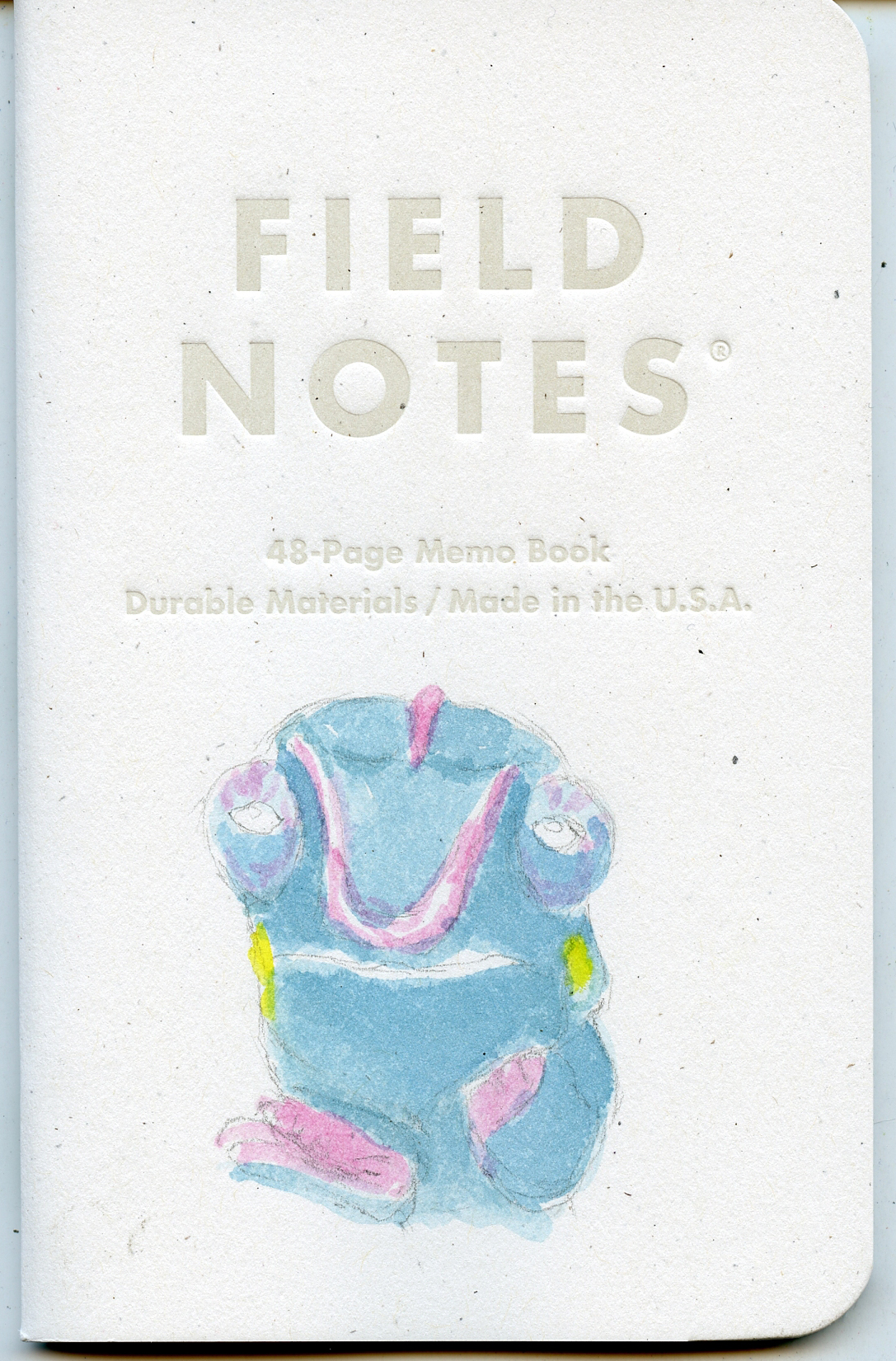
Like previous attempts at sketch journaling, I won’t
necessarily share the pages publicly. But shown in this post are a few examples
that capture the essence of the contents.
At this point, you may be wondering: Since I already sketch
daily and have for many years, why do I have this need to keep a separate
“sketch journal” at all? I’m not sure – but it seems to scratch an itch that
other types of sketching do not. Long before I began sketching, I used to see examples
of how others use drawing to document their days, and that process appealed to
me. Having a visual aspect to my daily journal habit has been a desire ever
since. While I’m doing it, I enjoy it, yet I eventually let it lapse. Like my general drawing habit that took many years to finally “stick,” maybe I just
need to find the process or subject or focus that resonates the way urban sketching does. So I keep trying different things.