Wednesday, August 31, 2022

Alice’s Waterfall


8/25/22 Alice's Waterfall (8"x10"; Caran d'Ache Museum Aquarelles and Neocolor IIs on Canson XL 140 lb. paper)

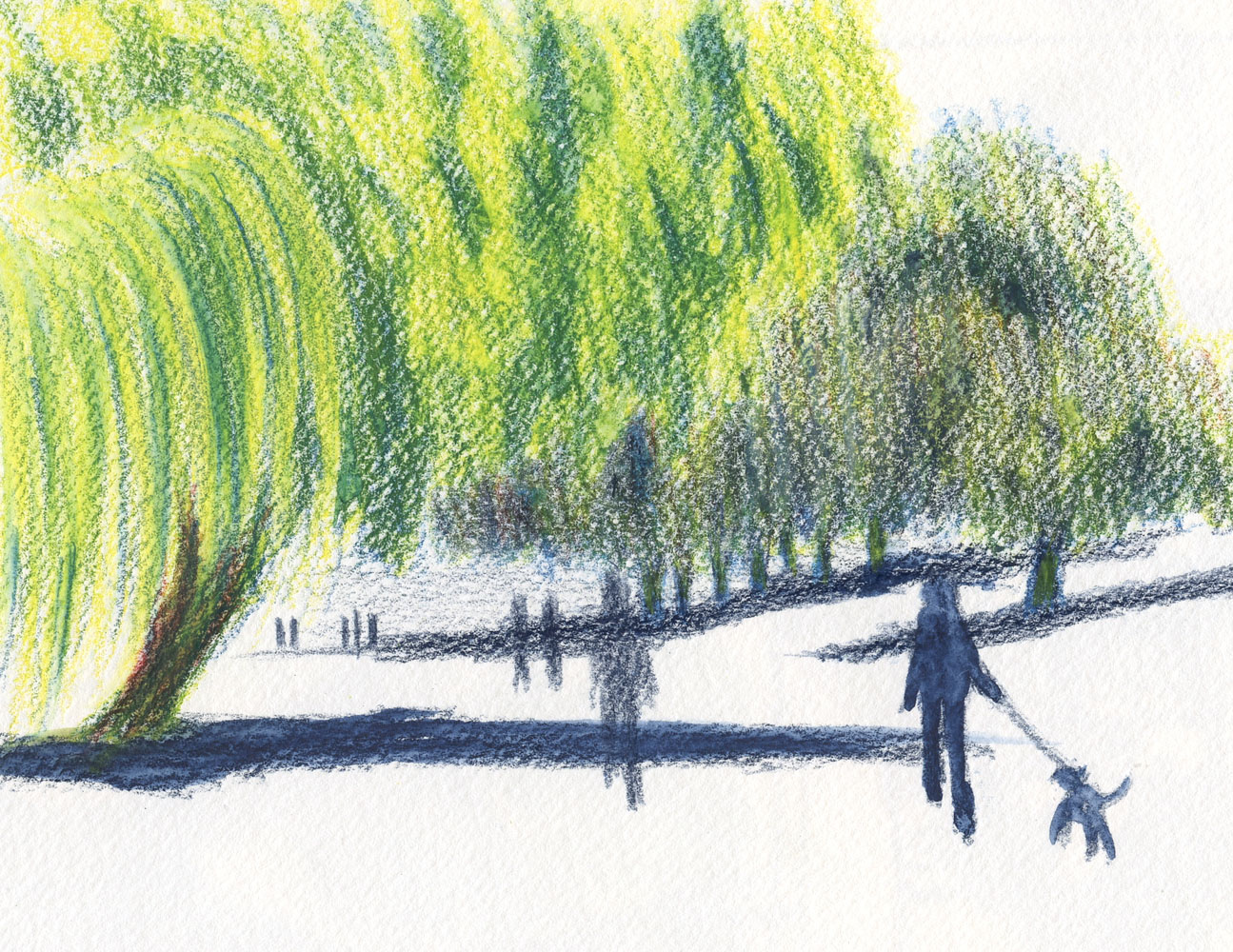
Alice, the friend and neighbor who spoils us with her garden’s produce every summer, asked me to do a commission. After a major home remodel, she wanted to fill her diningroom with art made by friends, and she asked if I’d like to sketch her backyard. Knowing how beautiful it is, of course, I accepted. Subject matter was up to me, but she had made a few suggestions that she thought might interest me, such as the waterfall surrounded by trees and foliage. Yes, there’s an actual waterfall flowing from the upper level of her yard to the lower.

On the warm morning when I visited to make the sketch, the deeply shaded waterfall was a cool oasis (a mood that I wanted to evoke). Walking around the whole yard taking photos, I had to agree that the waterfall and the yellow sumac in front of it were irresistible.  

A hasty thumbnail that doesn't
identify values.

While I worked for about an hour, that side of the yard remained mostly in shade. Although I liked the composition I had found, I was having trouble with the values (note that although I had made a thumbnail, I didn’t use it to identify the values – only the shapes!). Uncertain about using my primary triad colors for the dark rocks around the waterfall, I pulled out Payne’s Grey – and regretted it almost immediately. I also realized very late in the game that even though I had come prepared with a 9-by-12-inch pad, my sketch was only about 6-by-7 inches. I’m so used to working in a sketchbook no larger than A5 that I forgot to work larger!

My intention was to finish on site that morning, but the time I had allowed myself was running out. Just as I was feeling frustrated and unhappy that the drawing wasn’t going well, the sun came around the bend, and the sumac exploded with brilliant yellow. (I have heard experienced plein air painters say that they visit a site as many as three times before they make a painting so that they can see when the best light will hit their subject. Noted.) After taking several photos, I told Alice I would finish at home.

Frowning every time I looked at it, I hemmed and hawed over the sketch for a couple of days. I intended to fix the values (and maybe somehow color over that Payne’s Grey), but I was also dismayed with the waterfall – supposedly the subject of my sketch – which was barely visible. And what about those ridiculous dimensions? She’d have to get a custom frame for something like that. Pffft! There was no saving it; I decided to start over.

Sketch made on site that ended up being my color study.

Although I had plenty of photos I could use, I knew the sketch I’d already made was the best reference: Instead of a sketch that needed fixing, it had become a color study. Ideally, I should have done the studying with quick thumbnails, but I was pleased that the first sketch had provided enough information that I didn’t have to rely on photos (which do not show the waterfall or any other details in the darkness at all). Since I’d done most of the thinking in the initial sketch, the final drawing took less time than it had.

This time I actually measured and marked off an 8-by-10 space on the paper that could be easily framed (duh). I didn’t even have to enlarge the drawing much: My main changes in the composition were to show more of the illuminated sumac and to exaggerate the waterfall so that it would be visible.

The first sketch was done with my usual Caran d’Ache Museum Aquarelles. Now that I was working larger, though, I began with the Museum Aquarelles and eventually switched to Cd’A Neocolor IIs in the same three colors: Phthalocyanine Blue (162), Purplish Red (350) and Yellow (010) (this summer’s final CMYK primary triad). The Neocolor II crayons pack a heavy punch of pigment very quickly, and I love how their softness shows the paper’s texture.

Happy that I had started over instead of trying to “fix” problems, I learned many things about how a commission is different from a sketch in my own sketchbook:

  • I need to make thumbnails that identify the shapes and the values. (Duh – hello? Was I not paying attention during my whole 30-day composition challenge?)
  • When I’m making a piece that will be framed, I must think about and plan for the finished size – not something random that would be expensive to frame.
  • If a result is important (that is, something I’m going to present to someone instead of simply turning the page in my sketchbook), I need to be familiar with the light and be on location during optimal conditions.  
  • I am relieved that I don’t do commissions for a living.

Tuesday, August 30, 2022

Chilly at Green Lake


8/26/22 Green Lake

The day after our mini heatwave when it got up in the 90s, clouds rolled in, and the temperature suddenly dropped nearly 30 degrees. It was a relief, though a somewhat shocking one when I stood on the Green Lake walking path feeling chilly for the first time in weeks!

House on E. Green Lake Way N.

To warm up, I turned toward Green Lake Way, where so many magnificent old houses face the water. I picked one that I’ve always admired. I don’t know what that architectural style is called, but its very complex roofline looks like a hooded cloak. It was challenging enough as a thumbnail; I’m glad I didn’t attempt it any larger.

After that, I made a 90-degree turn to face the walking path looking north, where one of my favorite trees leans heavily toward the path. Next to it is one of many lakeside weeping willows.

Color note: The sketch at top of post is one of my first with a new late-summer primary triad – with a twist. Details coming soon of my palette shakeup and much-needed bag shakeout.

Monday, August 29, 2022

Whatever Loses; Ugly Wins


Dissatisfaction noted on 8/9/22

Early this year I began a new sketch journaling process that satisfied several needs: My carry-everywhere Field Notes notebook became a receptacle for not only my usual memos, lists, ephemera and written observations but also my casual, fitness-walking sketches. Calling it my “whatever” journal, it became an ideal catch-all for skyscapitos, my 100-Day Project sketches and my 30-day challenge compositional studies. I loved the chronological continuity of things I recorded daily, either visually or with words, all in one book – something I had been wanting to do for a long time but never got the habit to “stick.” Finally, it was very satisfying to fill a 48-page pocket-size notebook in a couple of weeks and then move on to a fresh one.

I happily kept up my whatever journal from January through mid-July – and then everything turned Ugly.

Ahhh... so much Ugliness!

I don’t want to sing the praises of Uglybooks too highly; after all, they’re just stapled paper notebooks. How about if I just say that they have changed my life? As soon as I discovered them and started using a few of the brightly colored, 80-pound interior pages, I knew I couldn’t go back to sketching on white, 60-pound paper again. Like the red Field Notes Sweet Tooth books, which changed my whole perspective of toned paper, Uglybooks are everything I have always wanted in a pocket-size sketchbook – with even heavier paper than Sweet Tooth and slightly larger, too! And in more colors!

In fact, Uglybooks are so thin and light that I can carry a white one along with a colored one even in my small, fitness-walking bag (because you never know when you’ll be in the mood for color on the page or whether black and white are just right).

I made both this sketch and the one at right on the same
walk because I had both books with me.

Who knows when I'll feel like color and when I won't?


Sketcher's eye view of my small fitness walking bag's contents. Uglybooks are slim enough that I can carry two at a time. 

Initially, I tried using Uglybooks for my “whatever” process by writing notes and observations on the same page as sketches, just as I did with Field Notes. But with seven books currently in rotation (How could I possibly use only one color at a time? That’s a rhetorical question), the chronological continuity of a daily journal was instantly lost.

Seven Uglybooks currently in rotation! A showcase for two new stickers: Gabi Campanario's publishing company (bottom row, center) and an adorable mouse from Anne (bottom row, right). Other stickers credited in my 8/1/22 post. 

After Uglybooks came into my life, I continued to make a few half-hearted sketches in the whatever journal I was carrying, just to see how that felt. My disappointment was noted right on the same page (top of post).

Logo-drawing practice while waiting
for my takeout order. 
Diagram of a yoga studio's layout
that I was describing to someone.
I did finish up that notebook with the usual writing and a few visual notations (at left and right), but it’s clear that its purpose had changed. I’ll still continue to carry and use Field Notes for writing as I always have, but it’s obvious that it will no longer satisfy my needs for sketching.


It was nice while it lasted, but I guess I wasn’t meant to have a chronologically continuous sketch journal, no matter how much the concept appeals to me. Paper – its weight, color and size – matters to me. Especially when the paper is Ugly.

Sunday, August 28, 2022

Sunny Palms


8/22/22 Green Lake neighborhood

During the first pandemic summer when I really got to know my neighborhood better, I decided to sketch as many palm trees as I could find within walking distance. (Despite their tropical look, the Chinese pinwheel palms growing around here are native and don’t mind cold and rain.) Here’s one and here’s another one. Recently sketching the one across the street made me realize that it had been a while since I sketched a palm.

On my way home from Green Lake a few days ago, I remembered a couple of palms growing side by side. Two years ago (below), the farther tree’s fronds looked a bit scrawny, but as you can see from my sketch above, they have filled out.

6/18/20 My "realistic" palette

Color and process notes: Compared to the one two years ago, I spent much less time on this sketch – it’s smaller, and I didn’t pay as much attention to surrounding foliage or the houses. The colors, though, seem more vibrant in my current sketch because I used my summer primary triad instead of my former “realistic” palette.

It has been more than two months since I decided I was tired of my usual palette and needed to shake things up. Except for the brief diversion prompted by the Beya Rebaï palette, I’ve been mostly using variations of a CMYK-based primary triad all summer. Although occasionally the triad seems to need something (and I don’t always know what the something is), for the most part, it has convinced me that I have no need to go back to my old palette. I just need to figure out what kind of help the triad might need, add to it, and jettison the rest.

Every now and then, I fall back on my conventional palette because those colors are still in my bag like a security blanket. But I’m ready to take them out. If I didn’t have them with me, I wouldn’t fall back on them! Stay tuned for another palette shakeup (or maybe I should call it a bag shakeout!).

Of course, I’m also thinking about exploring secondary triads again this fall, which always seems like the best time of year for rich purples and oranges. Maybe all I need is the right primary triad plus a good purple (always the most difficult to mix from primaries). Or maybe I could follow up on an idea prompted by my yoga instructor . . .

Saturday, August 27, 2022

In Gratitude of Trees


8/5/22 Maple Leaf

In my early years as an urban sketcher, I had so much trouble with trees that I officially declared them a sketching nemesis. (It should be stated here that those were the years in which I was trying to use watercolor on cheap, inappropriate paper and wondering why my trees never looked like Virginia Hein’s or Chris Haldane’s. Even if I’d had the skills, the paper I was using would not have flattered any trees I was trying to paint.)

Many years later, I acknowledged that trees and I had become friends. In fact, I now love drawing them so much that I have taken entire classes at Gage specifically on the topic: once with Kathleen Moore and twice with Kristin Frost. I love trees.

I admit, though, that until I began sketching, I didn’t really appreciate or even notice trees. Sure, I loved the pretty colors they turned in the fall, but beyond that, I hardly gave them a glance or a thought. It was the act of drawing them – either individually as subjects of intense study or, more often, as background or compositional elements – that made me learn to appreciate them.

8/5/22 Green Lake

Even when trees are not the subject of my sketches, I have come to appreciate them during our current long stretch of dry, warm, sunny days: Almost all of these sketches from my daily fitness walks could not have been made if not for the shade of trees. Looking for shade first before I sketch is not something I usually have to consider much (although with the changing climate, its likely to become an increasing consideration). If we’ve ever sketched or painted in the shade of a tree, let’s all say thank you now for their humble, quiet service.

8/5/22 Green Lake

8/5/22 Green Lake

8/8/22 Green Lake

8/9/22 Maple Leaf

8/11/22 Ravenna ravine

8/15/22 Green Lake

8/15/22 Green Lake

...but the job took longer than I expected,
so I was able to get the whole truck.

8/15/22 Green Lake. I worked very quickly, thinking
this line worker would finish before I did ...

8/17/22 The Brothers from Maple Leaf. Mt. Rainier is covered with snow all year round, so I'm always surprised when I see so little white on The Brothers by mid-summer.

8/18/22 Trash day in Maple Leaf


8/21/22 An astonished Mini Cooper in Maple Leaf

8/21/22 Maple Leaf


Friday, August 26, 2022

Nature Sketchbook Retrospective


8/14/22 Steller's jay with accurate proportions

Over the past few years, I’ve shown sketches I’ve made of birds (and the occasional persistent squirrel) that have dined at our feeders or in our backyard. Almost all of those small sketches were done in a pocket-size Stillman & Birn Epsilon sketchbook that I keep by the kitchen window. The sketch on the first page is of a junco made on Nov. 26, 2018, which must have been the first year we put the feeders up. For a brief period in 2019, I tried the book as my secondary daily-carry sketchbook (the role now filled by Uglybooks and before that, Field Notes), but I didn’t like its bulkiness. I put it back on the kitchen counter, and it has stayed there ever since.

3/4/22 scribbles of a Bewick's wren


Now, nearly four years later, its 92 pages are almost full. Many pages show nothing more than scribbles trying to capture quick gestures that didn’t amount to much. Small birds, masters of grab-and-go, give me only a few seconds at a time. But it’s fun to thumb through the book now and see my progress, which isn’t necessarily progressive, of course. Just as I had observed more than a decade ago when I first started drawing, my skills are still being built with one-step-forward, two-steps-back.

The Steller’s jays are visiting us at meal times more regularly again this summer. By “meal times,” I mean ours – we eat lunch and dinner on our back deck whenever weather permits, which has been almost daily for several weeks. When the jays see us out there (or even before, when we’re still prepping meals in the kitchen and have the back door open), they wait for us in the trees or, more impatiently, on our deck railing. They know we will eventually put peanuts out for them. They are endlessly entertaining. Occasionally after gorging on peanuts for a while, they will fall into post-prandial preening or resting on our railing, which gives me the best opportunity to sketch.

12/11/19 first attempts at Steller's jays

My first sketch of a Steller’s jay in the small sketchbook is dated Dec. 11, 2019, which was before we started feeding them peanuts and giving them reason to stay longer. When I don’t have enough time to truly see, I’m drawing mostly from memory or even imagination, relying on my brain’s symbol for “bird shape.”

Over time, the repetitive sightings and practice combined with occasional treats of longer durations result in higher accuracy. At the top of this post is a recent sketch that is one of the most accurate to date in terms of Steller’s jay proportions.

When I look back at the older sketches, I see mostly generic bird shapes. It’s rewarding to watch them change into better renderings as I eventually learn to see them instead of think them.

4/1/22 Bewick's wren

12/25/18 Early sketches in this book are mostly symbols of bird shapes


8/4/21 When we started feeding peanuts to the jays, I had a little more time for each gesture, but not enough to capture proportions accurately.

8/4/21

9/9/21

9/9/21

9/25/21 This jay generously gave me many minutes to observe closely.

I keep the small Stillman & Birn sketchbook on the kitchen counter right next to our local bird identification books, binocs and, of course, colored pencils.

Thursday, August 25, 2022

Closed


8/17/22 I drank my cold brew at home on my own back deck because
 the outdoor tables at the Wedgwood store aren't nearly as scenic.
I rarely sketch my cups of coffee, but on this afternoon, I felt compelled: I had to go to Wedgwood to get this cold brew because my favorite Starbucks in the Roosevelt neighborhood had closed. There was nothing special about that Starbucks (and I spend more time and money at independent coffee shops anyway), but the one at 65th and Roosevelt was in the same strip mall as my pharmacy and a Daiso store, and right above Whole Foods, so it was a convenient stop when I had errands.

More significant is that the Roosevelt Starbucks is where I made many sketches from its patio tables. The patio was especially convenient in the middle of a busy day when I didn’t have much time to sketch, but I could take a quick break between appointments.

During the first COVID summer, feeling a need to do something “normal” again, I went to my familiar Roosevelt Starbucks one day. Though not without some anxiety, I had hoped to sketch out on the patio. I was surprised to see that all the seating had been removed, both inside and out. I would have thought that it was an ideal time to offer outdoor seating.

A year later, post-vax and feeling relatively comfortable again, I went to the same Starbucks, looking forward to sketching on the patio. I was disappointed to see that the patio tables had not been replaced. The store had become a grab-and-go location only, I was told, and seating would not resume for the foreseeable future. That was the handwriting on the wall.

I had read recent news about several local Starbucks locations closing, but I didn’t see “my” store listed, so the closure had caught me by surprise. It’s just a Starbucks, and there are certainly plenty more nearby (though none quite so convenient), but long-time habits and routines are hard to let go of.

Wednesday, August 24, 2022

Backlit (Photo Study)


8/18/22 finished sketch (from photo reference)

I love backlighting, especially of trees. It can be difficult to sketch on location, however, because it often means staring directly into the sun (although sometimes I get lucky). During a recent after-dinner walk, enjoying the Golden Hour, I really wanted to stop and sketch this scene, but I knew the low light would be changing by the second, and it would be nothing more than an exercise in frustration. I snapped a photo for future reference (and knowing how difficult it would be to attempt it from life was consolation about resorting to a photo).

In a recent conversation with Ching, I learned about the gouache painter Tommy Kim and the online Domestika course she had taken from him. She had described a concept he taught that was related to mixing complementary colors for the mid-values. Cocky as I am and dismissing the fact that he uses an entirely different medium, I thought I understood it enough to give it a shot (without taking the course myself).

Original photo
Image converted to black and white

Clicking through the folder of reference photos I had started taking in June when I began the 30-day composition challenge, I came across the backlit Golden Hour scene (above left). I was taken with how purple the shadows were against the bright yellow-green grass: Instant complementaries!

Value/composition thumbnail


Although the photo is mostly two values, I didn’t want to get confused by color, so my first step was to convert the image to black and white. I used that to make my value/ composition study (at left).

For the color study (below), I used both my value study and the color photo for reference. It was an easy choice to use only yellow and purple (though my literal pea brain kept shouting, “Green! Don’t you want green for the trees? Surely you need green, too!” I actually picked out a green pencil and had it out on my desk). 

Color thumbnail study


In the photo, I liked the ragged shadow of the grass edge, but it looked confusing in the value thumbnail, so I decided to leave it out in the color study. Meanwhile, it started dawning on me that I didn’t know what I was doing in terms of Kim’s complementary concept that Ching had explained.

While making the final sketch (which probably looks almost identical to the color study except that it is about 50 percent larger), I abandoned the concept I was trying to practice but was suddenly reminded of color temperature concepts that I have been fascinated by ever since I took Sarah Bixler’s workshops last fall. Although the trees are mostly silhouetted in the photo and therefore should be the darkest, coolest value, I wanted to distinguish them from their shadows, which I wanted to remain the coolest part of the sketch. So I added orange to the trees to warm them up just a bit. Doing that, of course, reignited my excitement for the secondary triad palette (and now I know what I will be focusing on this fall).

I thought the sketch was done, and I even scanned the sketchbook page. But looking at it again, the edge of yellow grass made no sense without the shadow of the edge that I had put in my original value study – so I put it into the final sketch. And now it does feel finished (top of post).

So although I don’t think this exercise helped me to understand Tommy Kim’s concept, it did excite me about color temperature again, and I thoroughly enjoyed sketching this backlit scene (even from a photo).

Tuesday, August 23, 2022

Lynnwood Heritage Park

8/20/22 Historic water tower at Lynnwood
Heritage Park

 I received an invitation a few days ago that I couldn’t refuse: Gabi Campanario offered the local subset of his mailing list a new type of event. Part history, part sketching demo and part sketch outing, the inaugural session of Gabi’s Greater Seattle Sketching Tours took place at Lynnwood Heritage Park. Only 15 minutes away, the park was entirely new to me.

Gabi began by giving us a brief history of the small park and its historic buildings. He chose the old water tower for his demo. Although he typically makes his personal sketches in a pocket-size book, for the demo, he used a large sheet of watercolor paper. (It was closer to the format of the work he used to do for the Seattle Sketcher column he wrote for many years.) As he demo’d, he offered tips on choosing a composition, scaling a subject to fit appropriately in a selected space, perspective, drawing accurate angles and establishing values.

At the beginning of the demo, he had said that at any time, if we preferred to do our own sketching, we were free to wander and do that. I stayed for about half his demo and was especially delighted by his intriguing invention (see photo below). Eventually, I started doing my own sketches. Unlike Gabi, however, I stayed with my comfy sketchbook instead of going large. In fact, I’ve lately become so comfy with thumbnail-size sketches that I decided to make a series of vignettes instead of one large sketch. I couldn’t resist including a fantastic old tree in a couple of sketches as a framing device.

The view of the water tower that Gabi sketched for his demo.

A huge old tree framing the water tower and fellow participants.

Gabi says he plans to offer more of these events throughout the Puget Sound region, and I’m looking forward to them! To find out about them, join his mailing list.

Gabi began by giving us a tour and history of the park.

The device attached to his glasses shows the importance of maintaining a consistent picture plane.


Gabi's completed demo sketch and the subject behind him.

Inaugural participants of the Greater Seattle Sketching Tours!

Related Posts Plugin for WordPress, Blogger...