Saturday, September 30, 2023

Green Ash at Whole Foods


9/23/23 Whole Foods parking lot, Roosevelt neighborhood

Every autumn I admire the trees surrounding the Roosevelt Whole Foods parking lot when they change from their usual lime green to a brilliant lemon yellow. I always intend to sketch them, but whenever I’m there, the car is full of groceries, and I put it off – and the next thing I know, the leaves are all on the ground.

This year I put them on my leaf-peeping walking tour. On the overcast morning when I sketched them, that lemon hue put sunshine back into the gray sky. The PlantNet app identified the trees as green ash (Fraxinus pennsylvanica).

Palette thoughts: Although I had a lot of fun last fall experimenting with different secondary triads, I’ve decided not to tie myself to a specific triad this season. One reason is that yellow is an important color to have for some fall trees, like these. Instead of a triad, my general rule of thumb will be to simply stick with a limited palette by using no more than three or four colors at a time. (I think I broke that rule only once in the four sketches I showed yesterday.)


My current pencil palette may look like a random rainbow, but it’s actually fairly methodical (plus a little idiosyncratic): My favorite CMY primary triad (Caran d’Ache Phthalocyanine Blue 162, Purplish Red 350, Yellow 010) and a secondary triad including both a very warm green and a very cool green (Caran d’Ache Cornelian 850, Light Olive 245; Derwent Iron Green 1310, Dusky Purple 730). To those, I added two “convenience” colors: Caran d’Ache Scarlet 070 and Gold Cadmium Yellow 530 (AKA heavy-equipment yellow). It’s a versatile palette that should get me through any urban sketch I’m likely to make this fall.

Green ash foliage

I do find Phthalocyanine Blue a little too warm for Seattle skies (except in summer), but it’s my favorite in primary triads, and I don’t want to carry two blues. Strangely, even though it’s a primary, blue is not very useful for the way I like to sketch. I find dark violet to be more versatile.

Friday, September 29, 2023

A Walking Leaf-Peeping Tour


9/13/23 Japanese maple, Maple Leaf neighborhood

Now that I’m doing so much more of my urban sketching at locations I get to by foot, my annual leaf-peeping tour has become a walking tour (at least partly). Although I’m dazzled by trees at their peak of color, I especially enjoy catching trees at this early stage when the reds and oranges pop against still mostly green foliage.

With that in mind, I swapped out my default dark green (Caran d’Ache Museum Aquarelle Dark Phthalocyanine Green 719), which I was still using in the Sept. 13 sketch (at left), for a much cooler dark green (Derwent Inktense Iron Green 1310) used in the other three. It’s a lovely cool green for Pacific Northwest firs, but possibly too cool as a shadow color for deciduous trees. I really liked it, though, as the green in the secondary triad I used in Columbia City last week. Mixed with dark violet, it’s a lively shade color.

9/18/23 Green Lake neighborhood

9/19/23 Maple Leaf neighborhood

9/21/23 Maple Leaf neighborhood

The current fall palette

Thursday, September 28, 2023

Eye-Searing Bag and Sketch Kit Update

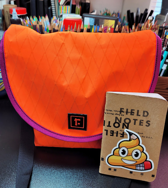
My latest Rickshaw bag in eye-searing orange for fall! (Field Notes shown for scale)

Although I frequently discuss materials I’m using, and I’ve mentioned issues that have come up since I committed to using a smaller bag, it has been quite a while since I wrote a post specifically on my bag and sketch kit. I recently bought a new mini-size Rickshaw Zero Messenger Bag for the change of the season, which is as good an occasion as any for this post.

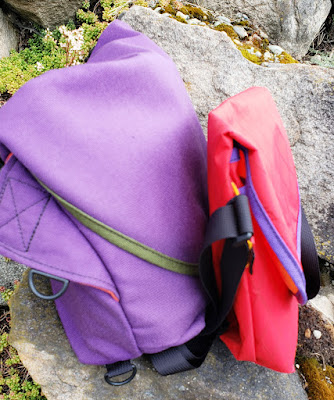
These two older bags show the size difference.
Left: "Small" Rickshaw messenger bag; right: "mini" size.
 
First, I want to summarize various mumblings I’ve made about using a smaller daily-carry bag. After nearly a decade of using Rickshaw’s messenger bag in the “small” size as my everyday-carry, I started using the smaller mini size at the beginning of the pandemic. Since I was hardly going anywhere except on daily walks and occasional errands, I didn’t need to carry as much. I also began sketching more while taking walks, so using the smaller bag as my simplified sketch bag made sense.

After I started going out more again, I used the larger bag at sketch outings and other occasions when I wanted to bring a larger sketchbook, but I still took the mini on fitness walks. (Switching bags constantly was a dangerous business – I left behind my entire wallet once, including my driver’s license, when I drove across town for a sketch outing.) 

Eventually, I realized that the mini bag had become my daily-carry without much conscious effort on my part. I just found myself using the larger bag less and less, and when I did, it felt heavy and cumbersome. I enjoyed the freedom and lighter weight of the mini, whether I was fitness walking or not.

It took me a long time to judiciously pare down my sketch materials, but I knew I was ready. I finally put the larger bags away and made the full commitment to the mini. Now, when I’m in the mood for a larger sketchbook, or on those rare occasions when I use watercolors in the field, I simply grab a tote bag as a supplement. (Ironically, I made the same decision nine years ago when I was considering various bag options for travel – but that time, the tote was a supplement to my larger Rickshaw bag! I’ve come a long way since then, and my shoulder thanks me for it.)

On to the new bag: For the coming wet months, I chose Rickshaw’s waterproof Xpac fabric for the exterior in eyeball-searing Orange Flo! I’ve already had comments from friends as well as strangers on the street about the high-viz color, which makes me feel safer when walking.

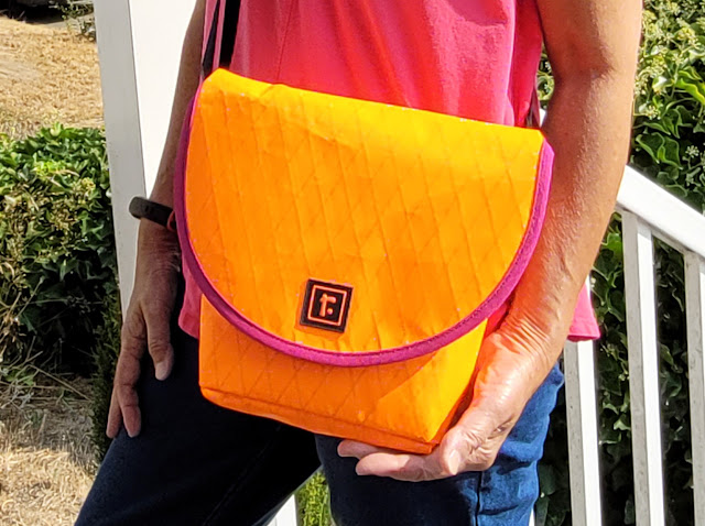
Over-exposed in this image, the bag looks more yellow-orange than it really is. The photo at the top of post shows the color more accurately. But I wouldn't mind a bag in this yellow-orange, too! 

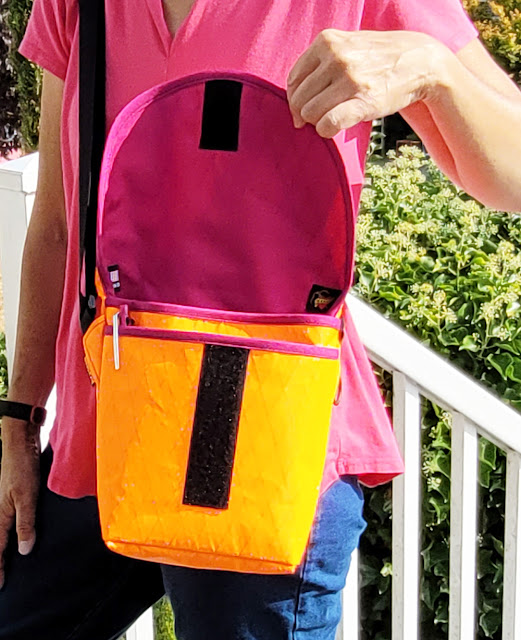
Fuchsia interior and trim

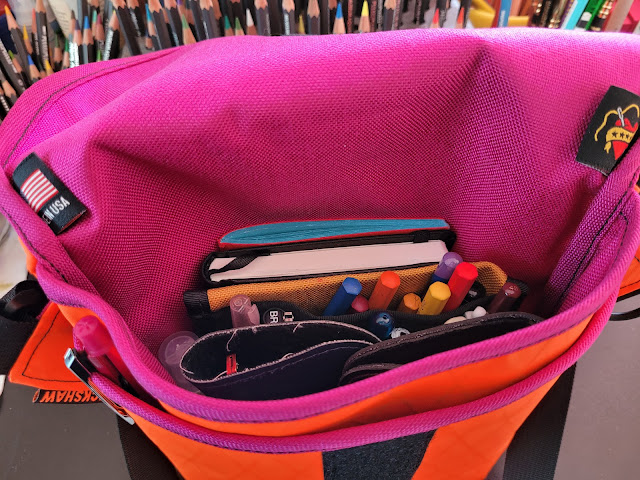
Two A6-size sketchbooks, materials, glasses take up the larger compartment.

As you can see from the bird
s-eye view, my two pairs of prescription glasses (regular and shades) take up a substantial portion of the interior’s larger compartment, which is unfortunate, but I haven’t figured out a way to slim those down. The front pocket holds my phone, a Field Notes notebook, keys and a mask. The only other non-sketching item I carry is my tiny Rickshaw snap wallet (which, other than the bag itself, is my most essential Rickshaw product).

Switching from an A5-size sketchbook (a size I had been using most of my sketching life) to an A6 that is half the size was probably my most radical change in materials. My current favorites are an A6 Hahnemühle sketchbook and a similar size Uglybook.

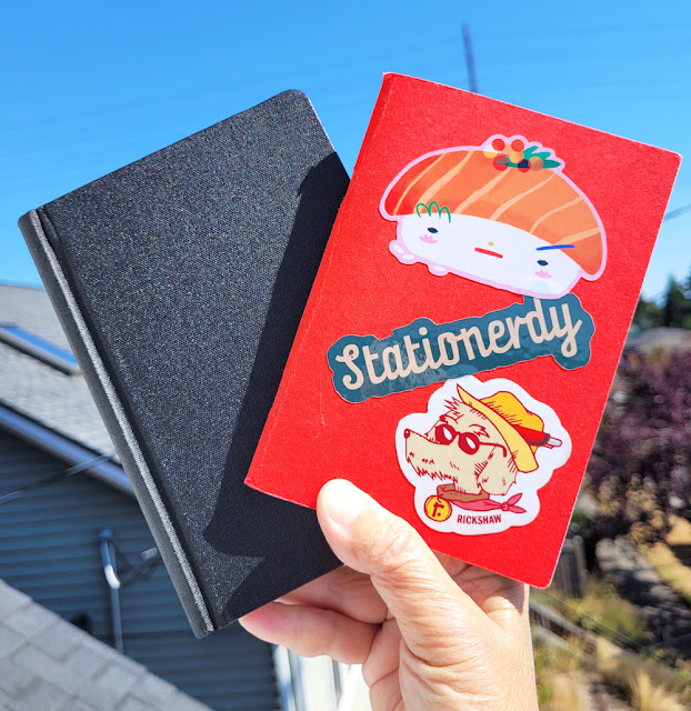
Hahnemuhle 100% cotton watercolor book and Uglybook, both A6, are my everyday-carry sketchbooks. (Stickers by Angelope Design, Dapper Notes, Rickshaw Bags)

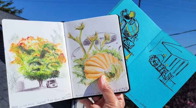
A lot of sketching goes into small books!

My other sketch materials are a bit of a snooze. Other than changing out the colored pencils frequently, the basic materials haven’t changed much in a long time. My rule is that everything except the
Derwent water spritzer must fit into the Rickshaw pencil case. (The one I’m using is a prototype that was never produced. It’s slightly larger than the standard Waldo field case, which is made to hold a Field Notes-size sketchbook.)

Total weight of the mini bag and contents is 2 pounds, 9 ounces. My larger Rickshaw, at its most recent weigh-in in December 2019 after a big diet, was 3 pounds, 10 ounces (according to my minimalism challenge blog post, before the diet, the bag weighed 4 pounds, 2 ounces).

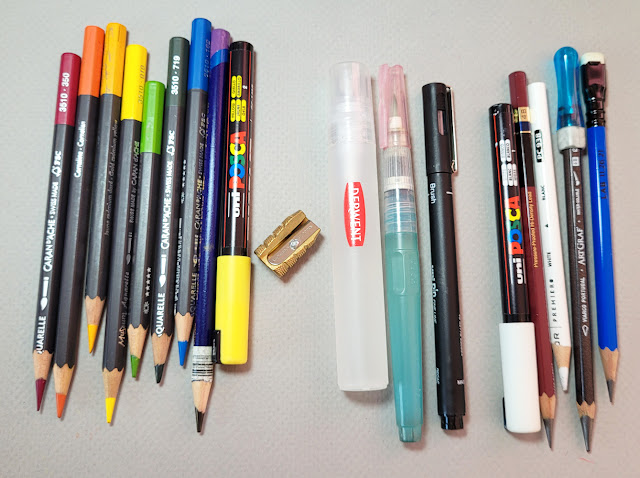
Today's selection. The colors change frequently, but most other materials remain consistent.

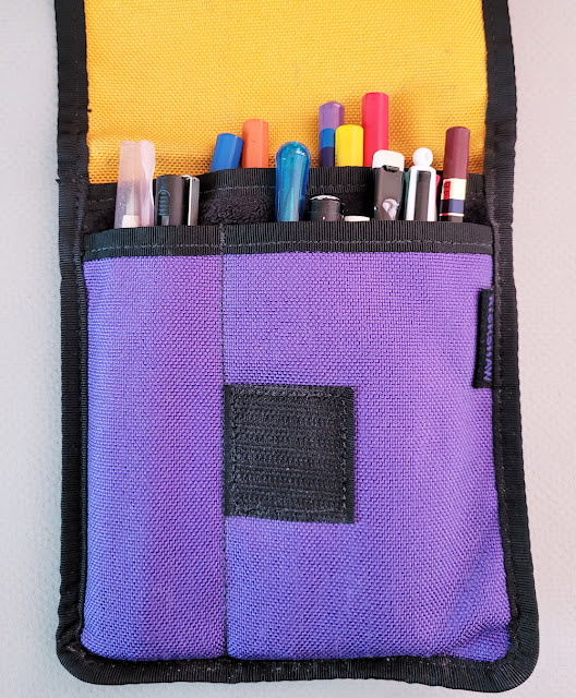
My rule is that all materials except the spritzer must fit in this Rickshaw case.

That’s it – as lean and mean as can be! It’s probably not a sketch kit or even a bag size that most sketchers would willingly use, but it suits my standing sketching style and fitness-walking routine. In other words, it affirms my blog’s tagline: Urban sketching: It’s not a hobby; it's a lifestyle.

Waterproof? Check!

The urban sketching lifestyle! (photo by Kate Buike)


Free goodies from Rickshaw with my bag order!

Wednesday, September 27, 2023

Backyard Raccoon (and Failed Whiskers)


9/20/23 Bic ballpoint in Uglybook sketchbook
(reference photo by Greg Mullin)
Last week when we were eating lunch on the deck, our regular blue-feathered friends didn’t show up, but a new beggar did: a youngish raccoon. Smaller and slimmer than other raccoons we’ve occasionally seen in the neighborhood, this one seemed to be missing most of its tail. Getting up on its hind legs, looking up at us optimistically, it entertained us for quite a while. Comfortable around humans, it had perfected its adorable begging stance for maximum payoff in treats. (I know I’m not supposed to feed them, but I couldn’t resist tossing one peanut.) I wanted to make a portrait first, but I’ll probably make another sketch sometime showing the raccoon’s full stance.

Ratty bear abandoned.

Process notes
: This wasn’t my first attempt at sketching the raccoon. A couple of evenings earlier, I had begun a sketch from the same reference photo but abandoned it when I realized that the space between the eyes and other proportions were way off (shown at left). Even without looking at the photo you can probably see that it isn’t right – the face looks ratty or bear-like. (Hmmm, I’m having déjà vu . . . maybe I just have trouble with raccoons.)

In Gary Faigin’s portraiture workshop several years ago, he advised us to begin with the shape of the head first before adding facial form and features. I usually have proportional problems with this technique; my results are better when I begin with a feature (usually the eyes) and build the rest of the face and head around it. That’s usually what I do with all the Earthsworld portraits I’ve been making. With the raccoon, I thought I’d challenge myself by beginning with the head shape, so I blocked that in first. Sure enough, I got into trouble.

When I tried again, I began with the eyes instead of the whole head, and my proportions were more accurate. I’d like to learn to make portraits the “right” (or classical) way, but I seem to do much better this way.

Failed whisker technique: In both graphite and colored pencil classes, I’ve learned a trick that I call the “whisker technique” (or, if you prefer botanicals to animals, the “leaf vein technique”). To make thin, white lines such as whiskers or veins, use a stylus or other instrument to score the paper. Then apply graphite or pigment to the area, and the incised lines will remain white. Since I’ve used this technique successfully with both colored pencils and graphite, I wondered if it would work with ballpoint ink, too? I’ve always thought of the Bic as “the pencil of pens” because its unique ink is pressure-sensitive and builds in layers, just like pencils. It was worth a try.

Unfortunately, when I tried it on the raccoon, it didn’t work. Afterwards, I made a more formal swatch study (below) to see if I could either make it work or figure out why it doesn’t work. It looks like the ballpoint pen nib is so fine that ink is able to be applied inside the incised lines. With graphite, I used the side of the pencil point, which could skip over the incised lines more easily.

The "pencil of pens" isn't quite pencil enough.

A well-rehearsed begging stance for maximum treats.

Tuesday, September 26, 2023

Astra


9/17/23 Astra's forked trunk

Only blocks from Luma, the tree that was saved by public concern, stands another western red cedar in the Wedgwood neighborhood. Named “Astra” by its supporters, it’s on the edge of a lot where a new housing development is coming. The developer has submitted a permit to cut down this healthy, 100-year-old tree, and according to city code, the tree should be protected. But codes are not always enforced, especially when developers apply pressure. Architects have shown that different designs are possible that would enable the development to be built while retaining the tree.

In photos I saw, Astra has a distinctive forked trunk that I wanted to capture, but most of it was dark and hidden behind a fence. I couldn’t show it well in my sketch, so instead, I walked down the block to get the tree’s full height. Lush and perfectly symmetrical, it’s such a beautiful tree that it’s difficult to imagine choosing to destroy it when other design solutions are possible.

9/17/23 Astra stands tall in the Wedgwood neighborhood

Monday, September 25, 2023

Still Growing


9/16/23 Maple Leaf neighborhood

Last October, Kate and I sketched Maple Leaf’s biggest pumpkin at the neighborhood’s most exciting event of the year. The two neighbors who had a friendly pumpkin competition then are growing more this year. With Halloween still more than a month away, the biggest one, Jack Skellington, already weighs 775 pounds! According to a sign nearby, Jack was planted on May 19 and pollinated on July 7. I plan to sketch him again at his peak, but on a recent walk, I decided Jack was already worth sketching.

As I sketched, the intoxicating scent of ripe grapes from the nearby vine filled the air. I heard rustling among the grape leaves, and a tiny mouse poked its head out. It was such a delightfully fall-ish scene that I embraced it fully with no remaining bittersweetness about summer’s end. Of course, it helped to be sketching in a T-shirt when it was 67 and sunny.

By the way, as any self-respecting pumpkin is, Jack Skellington is on Instagram.

Sunday, September 24, 2023

Art and History in Columbia City


9/22/23 Ark Lodge Cinemas, Columbia City

Spirit of Washington at Columbia Park

With days of clouds and rain ahead on the forecast, USk Seattle may have gotten the last of the sunshine for a while on a beautiful Equinox morning last Friday. Meandering around the Columbia City neighborhood, I stumbled upon a sculpture I hadn’t noticed before in Columbia Park. Called Spirit of Washington, the 16-foot sculpture by Quinault and Isleta-Pueblo artist Marvin Oliver “takes the form of a dorsal fin of an orca whale depicting Salish symbols of power and rebirth,” according to the Seattle Office of Arts & Culture. Instead of hitting it face-on, I went around to the side where I could catch the strong shadow it was casting (at left).

On Rainier Avenue South, Columbia City’s main drag, an old Regency Revival style building with Ionic columns (yes, I had to look it up – I don’t know squat about architectural styles) caught my eye. It turned out to be a 1921 Masonic Lodge that has been operating as the Ark Lodge Cinemas since 2012. (One of the films it was showing was Barbie – I couldn’t resist that pink B.) Columbia City has no shortage of historical buildings.

The problem was that the noon sun was nearly directly overhead, so both sides of the building were in the shade. Of course, just as I was finishing the sketch, the sun came around and put some nice bits of light on the building’s front façade. (What happened was a corollary to Murphy’s Laws of Urban Sketching No. 5: The light you were hoping for will appear just as you finish a sketch.)

On a September day when the weather could go either way, however, I had nothing to complain about!


Saturday, September 23, 2023

Way Up High

9/15/23 Seattle City Light workers, Maple Leaf neighborhood

While all the natural gas action was happening on the street, another kind of work was being done way up high – by Seattle City Light. Just around the corner from our house, two trucks with cranes held baskets of workers who took most of a day installing new cross beams on existing poles. Thankfully, we experienced no disruption of electrical service.

When I sketch trees, it’s an opportunity to feel gratitude toward them for the services they provide. In the same way, sketching utility workers is an opportunity to thank them for services that I take for granted most of the time.


Friday, September 22, 2023

Poplar


Although it’s still an ongoing series, it has been a while since I last sketched a tree that has been cut away to accommodate utility lines. My reportage of trees in trouble has reminded me of the sacrifices of trees even when they aren’t in trouble.

This poplar near Green Lake is so tall that I did something I rarely do: I opened my sketchbook to use the full spread, and I also turned it diagonally to emphasize the vertical composition. Of course, now it’s crooked on my blog, so I’m showing the photo I snapped on the street, too.

9/14/23 Green Lake neighborhood

Thursday, September 21, 2023

Murphy’s Laws of Urban Sketching


Law No. 1: Sketched in Feb. 2019, this sketch from the viaduct was only possible after it was permanently closed and eventually torn down (open to pedestrians only on this one day). I'd always thought that some of the best views of the city were only possible while driving 60 mph on the viaduct.

Every year on the anniversary of the day I began sketching, I write a retrospective and usually introspective blog post about practice, process, learning and other aspects of drawing that I enjoy thinking and writing about.

A big part of my creative process has been everything I’ve learned specifically about sketching on location – all the ways in which it is more challenging but also more rewarding than working in a comfy studio. Today on my 12th anniversary, I present my learnings that every urban sketcher will be familiar with – Murphy’s Laws of Urban Sketching:

Law No. 2: One more sketch before those clouds
bust open? Wrong again.
1. The best view of what you want to sketch will be from the middle of a busy street – like the freeway. (Top of post.)

2. If you think you can squeeze in one more sketch before it starts raining, you will be wrong (at right).

3. The day you forget your sharpener will be the day you break a lead (below).


Law No. 3: Saved by the mechanical pencil.

4. Ten minutes into your sketch, a large delivery truck will park in front of you for the next 30 minutes (below).


Law No. 4: I was sketching those Chevys back there when this vendor unloaded her booth and all her merchandise from her car.

Law No. 5: That beautiful golden-hour light lasted about 30 seconds.

5. The tiny spot of shade you are comfortable in will disappear . . . and so will the perfect light on your subject (at right).

Law No. 6: He seemed to be writing in a journal, so I thought he'd stay around
a little longer.


6. And finally, the Murphy’s Law that every urban sketcher learns first: As soon as you start sketching a person or vehicle, they will leave.


Wednesday, September 20, 2023

Big Utility Action


9/12/23 Maple Leaf neighborhood

We received notification a few weeks ago that our natural gas utility would be doing some major infrastructure work in the ‘hood. While I could almost hear the collective groan from neighbors about traffic disruptions and parking restrictions, I rejoiced: Imagine all the heavy equipment!

On one morning, I had my pick of three machines, all quietly waiting while workers set up cones and directed traffic around them. I thought I’d have enough time to make a leisurely portrait of one (left), but before I could finish, everything burst into noisy action.

One worker used a circular saw to cut a hole in the metal plate in the street (below). As showers of sparks flew in all directions, a guy behind him held a shield to protect the grass, but the worker wasn’t wearing any kind of face protection! (Luckily for him, I was there only to sketch, not report him to OSHA.)


My favorite machine is the one that looks like a long-legged bug with a wide stance (similar to the worker cutting the hole, above). The business end was a noisy jackhammer.


A couple of days later, I went back for more. Unfortunately, I couldn’t get a sketch of the opposite end of the same machine doing its business (the shovel side at left in the sketch below), which was to haul and position a metal plate in the street. One thing I like about heavy machinery is that they are multi-functioning Swiss army knives: They can all do more than one thing. 

9/14/23 Same machine, different big hole.

9/18/23 Concrete pours into the big hole.

The following week, I was rewarded with a cement mixer! When a worker came by to see what I was up to, I asked if I could expect any other big machines on the project. Unfortunately, no – the project was expected to be done in a few days, and then the whole process would be moving to the next block.


Paper and pen notes: My mustard yellow Uglybook is now full. As it came in a Mystery Pack, it was my one and only. It’s a great color – I sure hope Uglybook uses it again sometime.

I liked using a blue Posca paint marker with that yellow paper so much that I decided to reverse the combo with the blue book I went back to (started last spring before I got distracted by several other Uglybook colors) by using a bright yellow Posca.

The honeymoon is over... at least with white.


Speaking of Posca markers, my white one is behaving badly. I thought that my cap-down storage trick was working so well – and it still is with all the other colors. But something is different about white – unlike the other colors, it doesn’t flow well even after shaking and priming, and storing it cap-side down doesn’t help. Even worse, exactly what I had half-expected to happen finally did happen with white: The cap had been posted, and when I replaced it, I realized the pen’s back end (and therefore my hand) was covered with white paint from the inside of the cap.

Huh. Somehow I knew the Posca honeymoon wouldn’t last.


Tuesday, September 19, 2023

Picardo Farm: the Original P-Patch

9/11/23 Picardo Farm P-Patch

Since I’m not a gardener, I usually don’t know about community gardens unless sketchers or other friends tell me about them. Such was the case with the Picardo Farm P-Patch, which I learned about from Natalie. Located only a little more than a mile from home somewhere between the Maple Leaf and Wedgwood neighborhoods, it’s an easy walk due east. It turns out to be Seattle’s “original and biggest garden” – the “P” from which the term P-Patch comes from.

According to the city’s P-Patch website, Picardo’s soil is “rich, black, peaty, sucking with moisture in the spring, powdery dry for digging potatoes, so full of life that crops (and alas weeds) spring out of the ground at alarming rates.” I certainly saw colorful, late-summer flowers and produce growing abundantly. Bees happily did their work nearby as I sketched sunflowers near the edge of the enormous garden.

Speaking of enormous, my poorly scaled composition could not include the full height of the giant sequoia behind the house, but that’s OK. I need to get back there to make a portrait of that beautiful tree on its own. 

Monday, September 18, 2023

Belated Review: Blackwing Labs 11-25-22 (Soft Eraser)


Ordinary pencil; special eraser

Ten months late, it came to my attention that I had never reviewed the Blackwing Labs limited edition pencil that was released last November. After reviewing Blackwing’s soft handheld eraser at the Well-Appointed Desk, I felt like I had already done the job. I would be remiss, however, if I skipped a review completely because the eraser is handier than most (at least on location). So like a birthday card, let’s just say this review of Lab 11-25-22 is better late than never.

The ferrule eraser is made of the same material
as Blackwing's bar eraser.

Although the Blackwing pencil itself is fine – a dark matte gray barrel, matte gold ferrule and with a “balanced” graphite core – it’s nothing special. What makes this release special is the attached soft eraser, apparently made of the same material as Blackwing’s soft handheld eraser. (Kudos to Blackwing for making this Lab release truly innovative and “experimental” rather than a paint job.)


More valuable than the pencils were the two packs of replacement erasers that came exclusively as part of the limited release.

In addition to each pencil coming with a soft eraser, the Lab release came with 2 packs of replacement erasers.


I had spent a rainy day several years ago hacking up bar erasers to find one that could replace Blackwing’s notoriously mediocre ferrule erasers (full details at the Well-Appointed Desk). Results of my comparison revealed the main issue: Softer erasers are generally more effective than harder ones, but if an eraser is too soft, it will break when supported only by a ferrule. Since then, hack-a-thon winner Tombow Mono Smart has been my eraser of choice for ferrules because it has the right balance between softness and sturdiness. I have spent more rainy days hacking erasers for my general use (I’ve found they make great gifts for fellow pencil aficionados, too).

Erasers compared with the Blackwing soft.

Scoring points as a hardcore pencil geek notwithstanding, the fact remains that I would rather spend my time sketching than cutting up erasers, so my interest was piqued.

I compared the soft eraser with a standard Blackwing eraser (this one was attached to a bright green Lab edition that had come out only a few months prior, so I figured its freshness was about the same), a Tombow Mono Zero and a basic kneadable eraser. The latter two are among my favorites to use with graphite. Swatches were made with the Blackwing balanced core and a Prismacolor colored pencil (I didn’t expect the eraser to do well with colored pencil, but I tested it on principle).

Actually, the standard Blackwing eraser didn’t do as poorly as other (perhaps less fresh) ones I’ve used; it did as well as the Tombow in this test. But the soft Blackwing performed as well as the kneadable eraser on graphite – definitely better than the standard Blackwing – and surprisingly better than the Tombow.

Test swatches made in Stillman & Birn Epsilon sketchbook

Unfortunately, because it’s so soft, it must be used gently. To test it, I used more vigor and pressure than I normally would in making a small drawing or writing erasure, and a corner chipped off. But that happened only under testing conditions and not normal (somewhat careful), regular use, which I’ve been doing since I got the erasers last November.

When used too vigorously, a corner chipped off.

The biggest benefit to me is portability. When my daily-carry bag was larger, I regularly carried both a kneadable eraser (in a small box to keep it from collecting debris) and a Mono Zero. Since my drastic downsizing to
a smaller bag, however, I’ve scrutinized every item I carry. With a good eraser now on the end of any Blackwing pencil I carry, I’ve been able to eliminate all other erasers.

A big bonus is that the eraser can’t get lost somewhere in the bottom of my bag – I always know exactly where it is. Since my main use of erasers is to put in highlights, and I rarely erase while drawing, an eraser isn’t critical on location, but it’s always good to have one – and a good one is always better than a mediocre one.

When this Lab was released, the pencil community had speculated that Blackwing would eventually offer the soft eraser packs as a standard product (just as it offers replacement erasers in many colors to coordinate with various Volumes releases). It hasn’t happened yet, but I still hope it will – it would be a more useful addition than, say, an overpriced sharpener.


Related Posts Plugin for WordPress, Blogger...