Friday, July 26, 2019

Vintage Colored Pencils: Berol Karismacolor

A grail pencil: Berol Karismacolor

Although I like to try anything, and I’m always interested in finding vintage pencils that are of better quality than average contemporary products, I don’t have many colored pencil “grails.” Perhaps one that would qualify is the Berol Karismacolor.

When I first saw photos of it, I was immediately attracted to its appearance: a lovely round, natural wood barrel with a clear varnish and a unique diagonal end cut that exposes the core – both brilliant and beautiful! Then I read that it was Roz Stendahl’s favorite colored pencil before it was discontinued years ago, and that really piqued my interest: If Roz favors them, they must be a high-quality product.

Searching for some on eBay, though, was discouraging. Good sets of Karismacolors are now rare and therefore ridiculously expensive. I didn’t need a full set – all I wanted was a few to try – but that was even harder to find.

I hang out in Pencil Land, however, and every now and then, the elves and fairies sprinkle magic pencil shavings on me. A very nice person found out I was looking for Karismacolors, and he generously sent me a handful as a gift. Apparently acquired as seconds, the pencils have some misprints, and some of the end cuts are chipped, so they aren’t of much value to collectors, but they are perfectly good to me.
 
US- and British-made Berol Karismacolors

Most of the mix I received are made in the USA by Berol, but interestingly, one is marked as made in England. The cores are deliciously thick and soft and sharpen beautifully.
 
Thick cores!

The highlight of the pencil’s distinctive design is the bezel end cut. I have never seen any other pencil with this detail! It evokes contemporary chopsticks and decorative bamboo poles.
 
A unique design detail that I love!

How do they apply? Making a sketch of Rainier cherries in a Stillman & Birn Epsilon sketchbook, they were very soft, creamy and easy to blend and layer. The pigment content and quality are similar to vintage Design Spectracolors and US-made Prismacolors, which are both excellent. These are pencils I will happily use, even as I admire those end cuts displayed in a (grail) cup.

6/27/19 vintage Karismacolors in Stillman & Birn Epsilon sketchbook

Friday, July 19, 2019

Amsterdam!

7/8/19 map and flag of the Netherlands

By the time you see this, I’ll be in Haarlem, which is our first stop in the Netherlands before heading for Amsterdam and the Urban Sketchers Symposium. After the symposium, we’ll spend a few days in Delft before returning home.

I won’t be blogging while I’m gone, but I’ve scheduled a couple of vintage colored pencil reviews next and the following Friday, so I hope you’ll drop by. In the meantime, please follow me on Instagram to see what I’m sketching! Tot ziens!


Thursday, July 18, 2019

Othello Light Rail Station

7/13/19 Othello Light Rail Station

I don’t visit the Othello area of south Seattle’s Rainier Valley neighborhood often. In fact, it’s possible that I’ve only ever seen it through the window of a light rail train on my way to or from the airport.

Meeting a friend for brunch in the area a few days ago, I arrived a bit early and walked to Othello station. A shared right-of-way for cars, buses and trains, the station area is a tangled mess of power lines, light poles, traffic signals and signs. It’s a beautiful mess.

Wednesday, July 17, 2019

Zuiderkerk Rehearsal

7/14/19 Zuiderkerk (from photo)

My friend Cathy McAuliffe has been gearing up for the Urban Sketchers Symposium in Amsterdam by sketching from Internet images of the city’s architecture and cityscape. The only time I did that kind of prep was when I was about a month out from our trip to France in 2015, and I decided to practice the Eiffel Tower from a photo. While drawing from a photo is never as challenging as drawing from life, it was helpful to study the tower’s proportions closely at my desk before I stood in awe in the Champ de Mars. 

Cathy inspired me to look for some images of Zuiderkerk, the 17th century church where the symposium activities will be centered. I deliberately chose a grainy, low-resolution image that obscured details so that I wouldn’t be able to get fussy about them (as I undoubtedly will in real life).

Technical note: As I sketched this with Caran d’Ache Museum Aquarelles in a Stillman & Birn Beta sketchbook, trying to be as loose at my desk as I will strive to be on the street, I started to fall in love with the paper’s tooth. I use Beta frequently at home when I sketch still lives with watercolor pencils, and I appreciate both its surface texture and sizing with wet media. I decided a while ago, though, that Zeta’s smoother surface would be more versatile with everything I use – graphite, markers, fountain pens and ballpoint pens as well as traditional and water-soluble colored pencils. But I enjoyed using Beta so much on this practice sketch that I started doubting the choice I made for this trip. It’s too late now – if you read my sketch kit prep post, you know that I’ve committed to the signatures I stitched with Zeta paper. At least I’ll still have my Beta landscape-format sketchbook with me in case I suddenly crave a little more texture.

Tuesday, July 16, 2019

Michael and Music

7/11/19 10-min. pose

The theme of last week’s drink and draw at Capitol Cider was “music.” A bit generic, perhaps, but Natalie and I had fun anyway. Michael, our model for the evening, was dressed like . . . a rocker, I suppose? The entertaining emcee (who had posed as Dumbledore the last time we attended) acted as DJ this time, playing a wide variety of music found by somewhat stream-of-consciousness Spotify searches. Good company, good food, good brews, sometimes good music – what’s not to love?

7/11/19 5-min. pose
7/11/19 5-min. pose

7/11/19 5-min. pose
7/11/19 5-min. pose

7/11/19 20-min. pose
Drinkin' and drawin' like nobody's business!


Monday, July 15, 2019

Amsterdam Sketch Kit: Same as Every Day

Bag dump: My sketch kit contents for Amsterdam (and every day)

As participants gear up for the 10th annual international Urban Sketchers Symposium in Amsterdam, much of the social media discussion is about what sketch materials and tools to bring, accessories to keep them organized, and the bag to haul everything in (And let’s face it: Everyone likes to talk about art materials!). I understand the anxiety; no one wants to be caught short thousands of miles from home, where replacing or finding an essential product might be challenging. This uncertainty would be present for any kind of travel, but the symposium adds another level of challenge because of the workshops. Instructors may have a long list of required or suggested supplies that must be added to the usual at-home arsenal.

Amsterdam will be my sixth symposium since 2013, and with each I’ve attended, I’ve learned more about my sketch material needs. In between those travels, I’ve made numerous other domestic and international trips, and all those travel experiences have helped me refine my sketch kit.

I think I can boil down everything I’ve learned to this one principle: The best travel sketch kit is one that is no different from the one I use and carry every day. There’s nothing to get used to or learn, like bag pockets in unfamiliar places, or new materials and tools. If I don’t reach for a tool during a walk around my neighborhood, then I’m unlikely to use it in Amsterdam. Conversely, if I don’t need it 5,000 miles from home, maybe I don’t need it at home, either.

Before writing this post, I reviewed the posts I wrote before all the previous symposiums I attended and looked at the photos of the art materials to see how they (and I) have changed. I did a lot of hemming and hawing to prep for Barcelona, my very first symposium, and that’s to be expected. At that point, I had been sketching for less than two years, and the trip was also my first international travel since I had begun sketching. Everything would be a new experience, and I didn’t know what to expect. I still recall (fondly now) the high excitement as well as high anxiety about that trip. My uncertainty shows in the amount of stuff I brought! After that trip, I learned so much about travel sketching that I wrote a lengthy post summarizing my new knowledge.

For Brazil and the Paraty symposium the following year, I heeded my own advice from Barcelona and refined my kit. But something happened in 2016 as I prepped for the UK and the Manchester symposium. Maybe my responsibilities as a correspondent that year made me feel like I had to be prepared for any possible sketch material need (once again, my level of anxiety was directly proportional to the amount of stuff I brought). Or maybe it was just that I was making a transition from ink and watercolors to colored pencils and markers, so I had to have everything. When I look now at the photo of my bag dump, my shoulder twitches from the memory! According to the post, my travel haul was very similar to my daily-carry. At least it shows that I was following the same principle I follow today: The best travel kit is one that is the same as usual.

By the Chicago symposium in 2017, I had made the full transition to colored pencils, which slimmed down my sketch kit substantially. It doesn’t look much different from what I carry today. Prepping for Portugal and the Porto symposium last year, my travel kit was so much the same as my daily-carry that I didn’t even bother to show the contents – I just updated my color palette.

Now, as I prep and pack for Amsterdam, I’ve followed my basic principle almost literally: The sketch kit that I’m bringing (top of post) is exactly the same as what I carry every day (except for two items that I took out; see below). Typically I prepare for travel by researching Internet images of the cities I will be visiting to see if I’ll encounter any hard-to-mix or unique hues, and I refresh my colored pencil palette accordingly. Amsterdam, as colorful as it is, doesn’t seem to have any unique colors, so that step was easy: I’m using my usual spring/summer palette:
 
My current colored pencil palette: Mostly Caran d'Ache Museum, a few Faber-Castell Albrecht Durer and one Caran d'Ache Neocolor II water-soluble crayon for sky washes.

(Incidentally, for any European trip, I make sure to bring verdigris (Caran d’Ache 182), which is so useful for statuary and building details. I would normally take it out of my bag upon returning home, but more recently I’ve discovered that a pale, minty green is difficult to mix, so I’ve left it in my bag, and it has come in handy many times.)

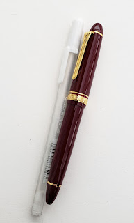
Out: Gelly Roll and fountain pen
The two things I took out of my bag? A white Gelly Roll gel pen (which I use only with toned or red paper) and a fountain pen. The latter is a big deal to me – its removal represents a full transition away from the ink linework I had been using since almost Day 1. I’ve been moving in this direction for a while, but I’ve been carrying a fountain pen all along, “just in case.” I still love drawing with fountain pens, but I’m trying to avoid the fiddly details that fountain pen nibs seem to invite. When I occasionally use linework now, I tend to use a brush pen in that role. As I was examining my bag contents last week, I realized I rarely use a fountain pen anymore, and this trip would be a good opportunity to take it out entirely. (Maybe I’ll take care of my fountain pen needs by devoting next InkTober to one.)

Here’s a closeup of the tools and other materials:


1. Tortillon
2. White Derwent Drawing Pencil. Like the Gelly Roll, I use this only with toned or red paper, which I won’t be bringing on the trip. I almost took it out, but what if I receive some new toned paper in my goody bag as I did in Chicago? There’s no substitute for a white colored pencil.
4. 8B graphite pencil
5. Blackwing graphite pencil with soft core (about 4B)
8. Kneadable eraser (kept in a slender, hinged Daniel Smith watercolor crayon box)
9. Two black brush pens – one waterproof, one water-soluble. I use many different brands with no specific favorites as long as one is waterproof and one is water-soluble. Shown here are a waterproof Tombow Fudenosuke and a water-soluble Kuretake Fudegokochi.
10. Pentel Pocket Brush Pen with dark gray waterproof ink
11. Water spritzer that I find essential for a couple of techniques with watercolor pencils.

If you’re wondering which materials are specifically for workshops, the answer is none! Both workshops I signed up for are related to composition, not materials, so the supplies suggested by the instructors were only the students’ usual favorites.

The sketchbooks I’m bringing represent the largest deviation from my at-home daily-carry:


1. Instead of the softcover Stillman & Birn Zeta sketchbook that I’ve been using the past several months (and for the most part have been enjoying), I bought a 12-by-9-inch spiralbound Zeta sketchbook and removed the spiral binding. After trimming off the binding holes, I folded and stitched the paper into six signatures (four sheets/eight pages each). These will enable me to carry a thin, lightweight signature instead of a bound book while traveling. When I get home, I’ll bind them together with Coptic stitch.
2. As I always do when I travel, I’m also taking a softcover landscape-format Stillman & Birn Beta sketchbook for panoramas. Those two books will cover most of my sketches.
3. The pocket-size Rhodia notebook will serve as both my travel journal and my receptacle for quick sketches on the run. I used Rhodia notebooks for several trips before switching to a Field Notes Signature last year for Portugal. While I enjoyed the slightly larger format of the Signature, it contains only 72 pages, and I filled it before the trip was over. I’m going back to the Rhodia, which has 96 pages (and the hardbound covers are more durable).
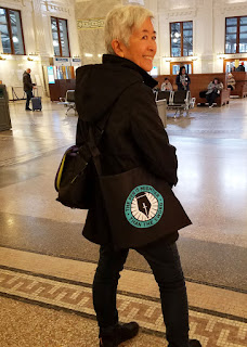
The Rickshaw Musette tote bag
4. The Strathmore watercolor postcard pad is one I carry routinely in my suitcase when I travel with every good intention of using (but you know what they say about where good intentions lead). The problem is that it stays in my suitcase instead of coming with me in my bag – so it rarely gets used (though I did use a few in Porto). I would like to get into the habit of making and mailing at least a few sketch postcards whenever I travel. This time I’ll keep it in the Rickshaw Musette tote bag that will supplement my daily-carry bag.

Speaking of bags, there’s no change at all – I’m again taking my small-size Rickshaw Zero Messenger Bag that I’ve sketched with on four continents since 2012.
 
My trusty everyday-carry since 2012.

Here’s a top view showing how all the materials fit. The colored pencils stand upright in the Tran Portfolio Pencil Case. All other materials are housed in a custom-made accessory organizer.
 
Everything in its place.

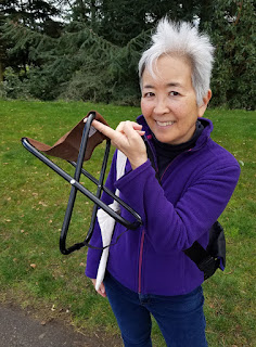
Finally, two other items will be carried in the tote bag when I’m not using them: my new Costco sunhat (festooned with symposium buttons) and my tiny Daiso folding stool. Although most of the time I prefer to stand while sketching, it’s nice to have a seat during workshops and when I’m doing a leisurely graphite sketch that could take a while.

OK – I’m ready to go (well, except for nonessentials like clothes)!

Hoping for sunshine!
Yes, I fit on it -- barely. I'll have to be wary of
my consumption of stroopwafel.


Sunday, July 14, 2019

Air Conditioning

7/10/19

Our neighbors next door are getting air conditioning installed. Through a kitchen window, I could see three men working at the side of their house, one on a tall ladder up to their second story. Standing at the kitchen counter, I tried to capture some of his gestures, but he was constantly moving and seemed to be leaning away from the ladder in a precarious way.


Saturday, July 13, 2019

Finally Summer on First Hill

7/12/19 Town Hall Seattle

Historically, it begins the day after the 4th of July. Following days of gray drizzle, it arrived lazily yesterday a week late. With shades and sunhats on, USk Seattle welcomed summer with a sketch outing on First Hill.

When I first scouted the meetup location a month or so ago, Town Hall Seattle, undergoing renovation, caught my eye. Built in 1916 by The Fourth Church of Christ, Scientist, the Roman Revival building has been an event venue since 1998. As my first sketch of the outing, the building was a bit intimidating, so my intention was to make a value study as a small thumbnail. Fairly quickly, though, I changed my attitude to “what the heck,” and I went for a full-page sketch instead. It was a popular spot: Kate, Alice and Tim all did their variations of the same view.

Next I went to the meetup location at a tiny pocket park (defined as such by a few colorful tables, chairs and planters in the street) at Ninth and University, where the Pike Place Market opens a pop-up farmers market on summertime Fridays. With St. James Cathedral in the distance, the small, quiet market gave nearby Virginia Mason medical clinic employees a sunny respite.

7/12/19 Pocket park and pop-up market at 9th and University

Kate, Tim and Alice sketching Town Hall

Friday, July 12, 2019

Southcenter Mall

7/9/19 Southcenter Mall

If I had to name the least inspiring, most boring location for urban sketching, it would be a shopping mall. I admit, I have been known to sketch Santa at my neighborhood Northgate Mall, which is also a good place to find easy victims for the annual One Week 100 People challenge. In most cases, however, I find malls to be deadly dull.

A few days ago, I had about 10 minutes to kill while Greg ran an errand at Southcenter Mall. A typical tactic in that situation would be to sketch a few passers-by, but on a Tuesday morning, very few people seemed to have need to be there. My eyes were about to glaze over at the mundane uniformity before me when I realized that no matter how blah a scene may be, it always includes lights and darks: Southcenter Mall was a values study waiting to happen. I pulled out yellow and purple colored pencils and got to work.

Thursday, July 11, 2019

Roofers

7/8/19 Maple Leaf neighborhood

Another new house is going up in the ‘hood. I arrived just after the roofing material had been delivered, and the crane was driving away (darn – if I’d been just a little earlier, I could have sketched the crane lifting the materials to the roof). I’ll wander by again in a few weeks to see the progress.

Wednesday, July 10, 2019

Vintage Colored Pencils: Eberhard Faber Design

Eberhard Faber Design

If you hang out in the vintage colored pencil world as I do, you will be familiar with the Design Spectracolor name (branded as both Eberhard Faber and Faber-Castell) as well as the Venus-branded Spectracolor name. All of these thick-cored pencils are richly pigmented and apply with a soft, waxy coverage that many prefer. I love them, too. It’s no wonder they are highly sought by artists and collectors alike.

An interesting item came up on eBay recently that was new to me: a small assortment of Eberhard Faber Design colored pencils. Lacking “Spectracolor” in their name and sporting a metal end cap, they seemed to have the same thick core that evoked the pencils I was familiar with. Could they be similar? I’m used to being outbid because I set low limits for myself (I was super lucky to get a rare EF Design Spectracolor Doublecolor set last year), so I was surprised to be the only bidder – and a bit disappointed. They must not be good pencils if no one wants them, I thought. But I was happily wrong!

Although one was missing an end cap, most of the pencils I received are in good condition and barely used.


The thick cores sharpened up beautifully.

 
Thick cores!
Lovely end caps


I put an EF Design pencil next to an EF Design Spectracolor, Doublecolor and Faber-Castell Design Spectracolor, and they all have the same chunky cores.
 
From top: Eberhard Faber Design, EF Design Spectracolor Doublecolor, Faber-Castell Design Spectracolor

The lovely end cap, logo and general design evoke a few random Eberhard Faber Mongols I have, which are slightly different from the boxed set I reviewed last year. However, the water-soluble Mongols have very hard, thin cores with little pigment.
 
Based on design, the EF Design is probably from the same era as the Mongol.

Left: EF Design end cap; right: EF Mongol end cap

After admiring their appearance for a minute, I put the pedal to the metal. Sketched in a Stillman & Birn Epsilon sketchbook, the Rainier cherries came out deeply pigmented, and layers were easy to apply and blend. Compared side by side, the soft, creamy pigment is very similar to all the “Design Spectracolor” pencils mentioned previously – I’d say identical. Are the Design pencils an early predecessor? That would be my geeky guess. These relatively rare pencils are a joy to use, and I’m now gloating that I got them for a song.

6/20/19 EF Design colored pencils in Stillman & Birn Epsilon sketchbook

A joy to use!

Tuesday, July 9, 2019

On Stage at Phinney

6/28/19 Steve Church

Summer is in full swing at our neighborhood farmers markets. I didn’t allow as much time as I had wanted at the Phinney market – I was there to pick up fresh strawberries and tomatoes – but I couldn’t resist a quick sketch of the featured stage (tent, actually) musician. Singing original tunes as well as folk and country classics, Steve Church played guitar, harmonica and what he called “voice trumpet” – a skill he learned from his mother. A one-man band, for sure.

Monday, July 8, 2019

Professor Trelawney at Capitol Cider

6/27/19 Shawna as Professor Trelawney (5-min. pose)

Gage Academy has been sponsoring a bimonthly drink and draw for a while now at Capitol Cider, but I’d never gotten around to it for various reasons (mainly the challenging parking in that neighborhood, despite its relative proximity to home). However, I recently had so much fun at the cosplay drink and draw in Renton that I became more motivated to give Capitol Cider’s event a shot. Natalie was game to try it with me, so we braved traffic and parking issues, and the fun evening was worth it!

The theme that night was Harry Potter, and the featured model was dynamic Shawna dressed as Professor Trelawney. I’ve sketched Shawna many times at Gage life drawing sessions, but usually when she’s nude, so it was a new treat to capture the flowing gown and red scarf she wore. At Gage, the shortest poses I’ve done are one minute long, so an additional new challenge was the series of 30-second poses Shawna gave us. I’m not sure if the beer helped or hindered me, but I sure had a blast! We’ll be back for more.

5-min. poses

A pose by Dumbledore, who was also the emcee
(10-min. pose)
1-min. pose

30-second poses

Sunday, July 7, 2019

Station No. 17 and Blessed Sacrament

7/6/19 Fire Station No. 17, University District
7/6/19 Blessed Sacrament Church

Several months ago as I was sketching Fire Station No. 17 in the U-District, I realized that the intersection of 50th and Roosevelt offers an interesting mix of architecture: the Seattle Landmark-designated 1930s station itself, the Carnegie-style public library branch, the (now doomed) Seven Gables Cinema, and the Gothic Blessed Sacrament Church around the corner. It seemed ripe for an Urban Sketchers outing location.

Several other sketchers and I all opted to start with the church before we lost our courage. While churches like this are a dime a dozen in Europe, we have very few in Seattle, so I took advantage of the opportunity for some much-needed practice. The mostly cloudy sky occasionally gave way, a few seconds at a time – just long enough to catch some shadows.

Next I went back to the fire station I sketched in February, but this time I stood at a different corner so that I could capture the tower. The two upper windows include white silhouettes of firefighters (artwork that was added during a 1987 renovation).

Summer historically begins on the day after the 4th of July around here, so the overcast skies the past few days have been disappointing. But with other parts of the country facing high heat and earthquakes, I’ve got nothing to complain about. In fact, it was 65 degrees and cloudy when I made these sketches, which means I needed neither sunhat nor Polartec! Hallelujah, summer is here!

Technical notes: As I gear up for Amsterdam, I am trying hard to avoid leaning on my usual crutch of a gray marker grisaille to establish values. It’s a shortcut that saves time, but I often frown at the streaky effects of the marker, and I think it makes me lazy in learning to depict values using hues. I’ve also been working for a while now to depend less on an ink contour line, especially with architecture. The church sketch was the result of both conscious efforts. It has a vaguely painterly look (as far as colored pencils can be painterly) that I like.

The fire station sketch is another bicolor tonal study – and an ironic one! Back in February when I sketched it the first time, I was confined to my self-restricted minimalist palette of secondary triad colors, so I used only a gray marker for tones (see below). Then I bemoaned the fact that I had no red pencil for the fire doors (I made do with a red ballpoint pen). This time, although my bag contained my full palette, I chose complementary yellow and purple to “codify” light and shadow. But as I felt last time, red fire doors are an important symbol, so I went ahead and made the doors red.

The humorous irony is that six months ago, a secondary triad palette felt like a limitation. Now, using only two colors plus a bit of a third, I think the sketch is stronger, yet not having to work with “real” hues felt liberating rather than limited.

The sketch below is also a good example of what I don’t like about using a marker. It’s a fast and easy way to establish values, but the tip gets mushy quickly, so it’s difficult to get sharp corners and edges.

1/29/19 Feeling limited
Related Posts Plugin for WordPress, Blogger...