Showing posts with label Stillman and Birn Nova sketchbook. Show all posts

Tuesday, January 2, 2024

Back Porch

12/26/23 Maple Leaf neighborhood

When the neighbors kitty-corner behind us put up lights for the holidays around their back porch, it surprised me: On that side of the house, we’re probably the only ones who can see those lights. I don’t think they did it just for us, but I did appreciate the simple string of colored lights every dark morning when I came into the kitchen to start the coffee.

Although this is probably the last holiday-themed nocturne of the season, it’s unlikely to be the last overall – we still have plenty of dark mornings ahead. But the good news is that the days are finally getting longer again.

Monday, December 25, 2023

Silent Night, Colorful Night


12/21/23 Maple Leaf neighborhood

At the risk of sounding bah-humbuggy, I’m going to come out and say it: This house has too many lights. I’m all for freeform artistic expression, but this is just messy. It’s the same house I sketched last week in the early morning when only the tree lights were on. Despite my esthetic objections, I sketched it again one evening when all the lights were on because it was a good excuse to use all my Posca glitter pens.

Enough picture-taking! I got work to do here!

And speaking of excuses, this post is a good one to trot out this photo, circa 1960s. What I was really looking for was the photo of myself with Santa, which I know is somewhere in my massive collection of digitized family photos, but I found this one from a Christmas morning first.


Merry Carrots from Weather Bunny!


Wednesday, December 20, 2023

Less is More


12/18/23 Maple Leaf neighborhood

Like their neighbors to the east, this family turns on a lot more colored lights in the evening, but the only lights they leave on overnight are the two trees visible through windows. I prefer it this way. At 6 a.m., I still had plenty of time before dawn would dull the illumination.

Friday, December 15, 2023

Simple Lights


12/12/23 Maple Leaf neighborhood

As far as I can remember, this neighbor on the corner has never decorated for the holidays – until this year. Maybe the lights next door or other houses on the block put her in the mood (or she felt pressured to be in the mood). In any case, I like these simple strings of lights on her bushes and plants. The background lights from the fence across the street add a little more color, too.

Sparkly!

Material note: I’m diggin’ the glittery Posca paint markers. They are slightly more sparkly than the Kuretake Fudebiyori metallic brush pens I used last year. We don’t put up lights anymore, so the Poscas are as sparkly as we get on the north side of Northeast 81st.

Sunday, December 10, 2023

Across the Street, 4:35 a.m.


12/7/23 Maple Leaf neighborhood

I couldn’t sleep. While my coffee brewed, I sketched the house across the street. The owners turn most of them off overnight, but in the evening, many more lights and decorations are visible (similar to last year). I like it best like this – softly twinkling red and white lights on the deck railing – and nothing more.

Wednesday, December 6, 2023

Palm Tree Nocturne

12/3/23 6:45 a.m., Maple Leaf neighborhood

While their house was undergoing extensive renovations, the neighbors across the street had moved out for nearly a year, including last holiday season. Without even a porch light on, their vacated house was dark and dismal, especially compared to the blinding runway next door. They’ve moved back in, and it was nice to see their cheerful but subtle lights go up a few days ago.

That’s not a skinny Christmas tree in their yard; it’s the trunk of their little palm tree, which I have sketched several times, including last December when it was dusted with snow. Wrapped in lights, its profile is very different in the dark.

Technical note: I sketched those colored lights with a new set of Uni Posca Glitter Paint Markers (edited 12/29/23: Review at the Well-Appointed Desk). Usually at this time of year, I find myself buying some kind of metallic or otherwise sparkly product, even as I insist that I’m not a shiny, glittery kind of girl. But the holidays don’t count, right? (And even as I put Posca markers on my year-end Flop list, I get more. This love/hate relationship runs deep, as does my contradictory nature.)

New sparkle!

Speaking of new sparkle, this sticker somehow got produced (my glittery alter-ego apparently works quietly at night). 

Saturday, November 11, 2023

Messing Around With Derwent Tinted Charcoal Pan Paints


Derwent Tinted Charcoal Paint Pan set

In my “messing around” series, I use a product new to me that I know little about and then show the evidence of my mess accompanied by a few uninformed opinions. I don’t consider this a product review.

I suppose what prompted me to want to try Derwent’s Tinted Charcoal Pan Paints set was the hope that I could get charcoal-like effects – the rich, matte blackness and easy blending that results in beautiful tonal modulation – without the mess of actual charcoal. That was also the hope years ago when I bought a set of Derwent Tinted Charcoal Pencils. Although the wood casing on the pencils keeps my hands relatively clean, the charcoal inside is just as dusty and smudgy as vine charcoal. But maybe a watercolor-ish form of charcoal would be different.

For comparison purposes, I swatched the tinted charcoal pencils below. And just for fun, since charcoal is water-soluble, I put my waterbrush through the swatches.

Tinted charcoal pencil swatches

I’m not going to show the palette box exterior or waterbrush because they are identical to those I showed in the post about the Derwent Inktense Pan Paints Set. In fact, they are a little too identical – the outer boxes are indistinguishable, so I have to store them both in their cardboard packages so I can identify them easily. As with the Inktense set, a swatch chart is included, but it’s a bit silly, since most of the swatches look the same.

Tinted charcoal pan paints with waterbrush

Of course, I made my own swatches below – and many of them look the same here, too. Their washes are slightly more intense than the washes of the tinted charcoal pencils. They are similar to dry charcoal in at least one way: After the swatches dried, I ran a finger through them, and they still smudged, but only a little. They somewhat satisfy my avoidance of messiness in that way.

Tinted charcoal pan paint swatches

Interestingly, when I spritz the pans before painting, they behave in a way similar to the Inktense pans: The water starts being absorbed almost immediately, and I have to keep spritzing to keep the “paints” wet enough to use. I used a few different colors in the sketch below, but the differences are so subtle that they can hardly be distinguished. Obviously, as a wet material, the “paints” are not the same as dry charcoal in appearance. They are useful for tonal studies like this, however.

10/22/23 Derwent tinted charcoal pan paints in Hahnemuhle sketchbook
(Earthsworld reference photo)

Perhaps most useful is the white charcoal (which always sounds like an oxymoron, but I have several pencils made of “white charcoal”). From a reference photo by Andy Brunner on Unsplash, I made a small sketch of a white rabbit.

11/4/23 Derwent white charcoal paint in Stillman & Birn Nova sketchbook
(Andy Brunner reference photo)

Pleased by the white’s opacity, I made swatches to compare it with Winsor & Newton white gouache and M. Graham Titanium White opaque watercolor (isn’t that the same as gouache?) that I happened to have, both straight from the tube. Comparing favorably, it is surprisingly opaque for a pan paint.


I’m not sure I have much use for the dark charcoal colors, but since the pans are removeable (and individually replaceable) in all the Derwent sets, I might pull the white out, put it in my pink standing palette and use it for highlights with watercolors.

Tuesday, November 7, 2023

A Choice, Not a Default


9/26/23 Derwent Drawing pencil in Stillman & Birn
Nova sketchbook (reference photo by Rick Clark)

If you’ve been reading my blog for a while, you know that one of my ongoing struggles is learning to grow into “looseness.” We probably all have some idea about what “looseness” is – or at least we know it when we see it. A loose drawing has the illusion of being an easy and casual gesture, but I’m willing to bet that any artist who makes a drawing look easy and casual has many, many years of experience during which that “easy” look has been earned.

Last week when I made the carefully rendered still life for my watercolor class, I called it “competent” – the thing I do that has become my default – but I said it somewhat self-disparagingly because, you know, who wants to make “competent” art? Besides, if I wanted to make a carefully rendered still life, I would much rather use colored pencils, which are so much easier to control (if control is important).

10/23/23 ArtGraf watercolors in Hahnemuhle sketchbook (photo reference)
Then when I tried the version without an underdrawing, I liked the result much better, but it’s clumsier than I would have liked. I guess what I’m looking for is somewhere in between – more expressive than competent but with enough accuracy that the forms are clear. I’m happy, though, that I know it’s there to reach for (and it has become obvious that I have an easier time reaching for it with a brush than a pencil).

Perhaps one reason for my ongoing struggle is that it represents a direct conflict in what I love about sketching. My InkTober noses and now my Pencilvember ears affirm for me how much I enjoy making closely observed and carefully rendered drawings. If I didn’t, I wouldn’t have spent years investing in classes at Gage Academy to develop classical rendering skills. At the same time, I am thrilled when I am able to pull off a still life or urban scene with direct watercolor that conveys more liveliness and energy (if not accuracy). I want to be able to do both, and I want the result to be my choice – not a default setting.

Maybe that’s a tall order, but going into my 12th year since I began this journey, I’m ready for that challenge.

Sunday, July 30, 2023

More Light on Dark


5/14/23 photo reference

Back in May when I was somewhat obsessed with working light-on-dark with colored pencils and colored papers, I had been saving sketches in a folder with the good intention of gathering the many thoughts I was having at the time into a coherent post. Then the whole month of June was taken over by direct watercolor, and then July was too warm and sunny to think about dark papers. And then instead of becoming coherent, the thoughts I was having at the time disintegrated into muddle. Well, you know what they say about good intentions and where they lead to.

In any case, I didn’t want to forget about posting the rest of these light-on-dark studies, the process of which I’m still intrigued by. I’ll probably return to making them in the dark of winter when I can use more of my golden hour reference photos to work from.

5/9/23 photo reference

5/8/23 Earthsworld reference photo


5/6/23 Earthsworld reference photo

5/11/23 Maple Leaf neighborhood (on location)

5/11/23 Maple Leaf neighborhood (on location)

Thursday, May 11, 2023

Review: Faber-Castell Black Edition Colored Pencils


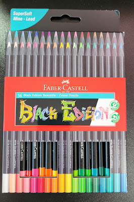
Faber-Castell's Black Edition

A few weeks ago, Faber-Castell USA’s Instagram account made a big splash with several posts showing some black-barreled colored pencils with candy-colored cores shown off on black paper. “JUST DROPPED: THE BLACK EDITION COLLECTION” implied that the pencils were new. Huh? I’d been seeing them on Amazon for months, dismissing them as kids’ stuff. In what way had they “just dropped”? Confused, I posted a question, but it went unanswered. Another follower had commented, “Already have this set since Christmas.”

It turns out that F-C wasn’t being misleading by announcing this product as having “just dropped.” Making inquiries with knowledgeable pencil friends, I learned that the Black Edition line is manufactured in Brazil, and up until recently, had been available only in South America. So the big splash was to let us know that we could expect to see them in US stores. OK, that’s fair.

Regardless of the actual newness of the product or where it was available, F-C’s marketing ploy worked supremely: I found myself looking more closely at the set of 36 I had dismissed previously – hmmm, an interesting set of all pastel colors – and then clicking “add to cart.” Funny how that happens.

Available in a variety of set sizes, including the largest of 100 (mentioned by reviewers, but I didn’t see it on Amazon), the set of 36 I bought for $17.99 comes in simple cardboard packaging. The pencils are in two “drawers” that slide out. The drawers are a bit fiddly to get back in, but it’s a nice, compact set. If I paid double that price, I could get the same 36 pencils in a tin. Since I usually use and store pencil sets in plastic storage bins, I’m happy with the cardboard packaging (especially at half the price).

Compact, economical packaging

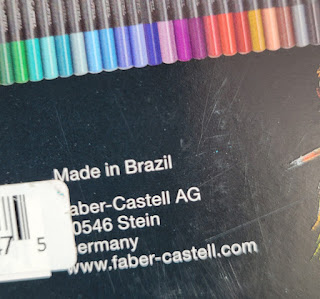
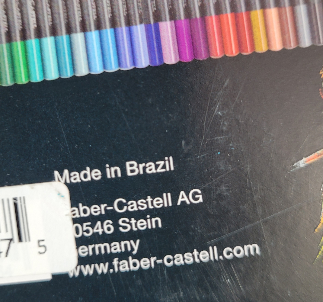
Originally made for the South American market,
the Black Edition pencils are manufactured in Brazil.

The package information indicates that they are, indeed, made in Brazil (I’ve seen other F-C pencils made in India). The Black Edition seems to be part of F-C’s EcoPencil Supersoft collection, all made in Brazil and at the same price point of about $0.50 per pencil.

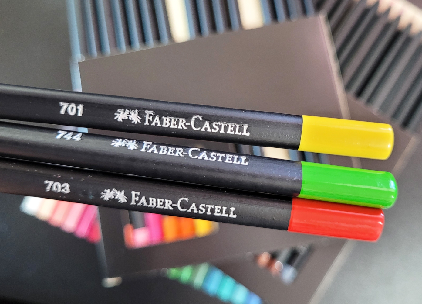
The triangular barrels are made of lightweight wood with the distinctive feature of being black all the way through. (They evoke early sets of vintage F-C Design Spectracolor pencils made of black wood; later sets were made of natural wood. Some sources reported that the change was made because the black wood was found to be toxic. That was a long time ago, so I’m hoping that this black wood is different.)

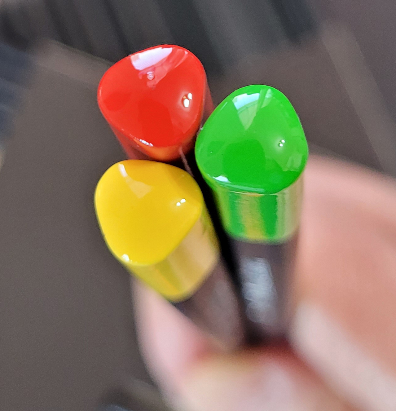
The matte black barrel has a glossy end cap identifying the color. The color number but no name is stamped on one side. Although I’m not a fan of using triangular-barreled pencils, I do like the appearance of the round-cornered, triangular end caps.

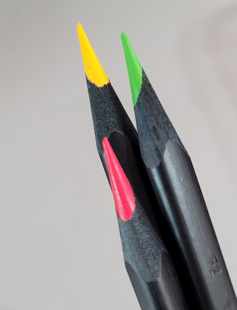
The cores are not off-center as they look here... I think sharpening the triangular barrel gives that appearance.


Compared to F-C Polychromos, the “super soft” Black Edition pencils are surprisingly soft. Not Prismacolor or Caran d’Ache Museum Aquarelle soft, but softer than I expected for Faber-Castell. They are also a bit dry and crumbly, but not so much to be unpleasant to use.

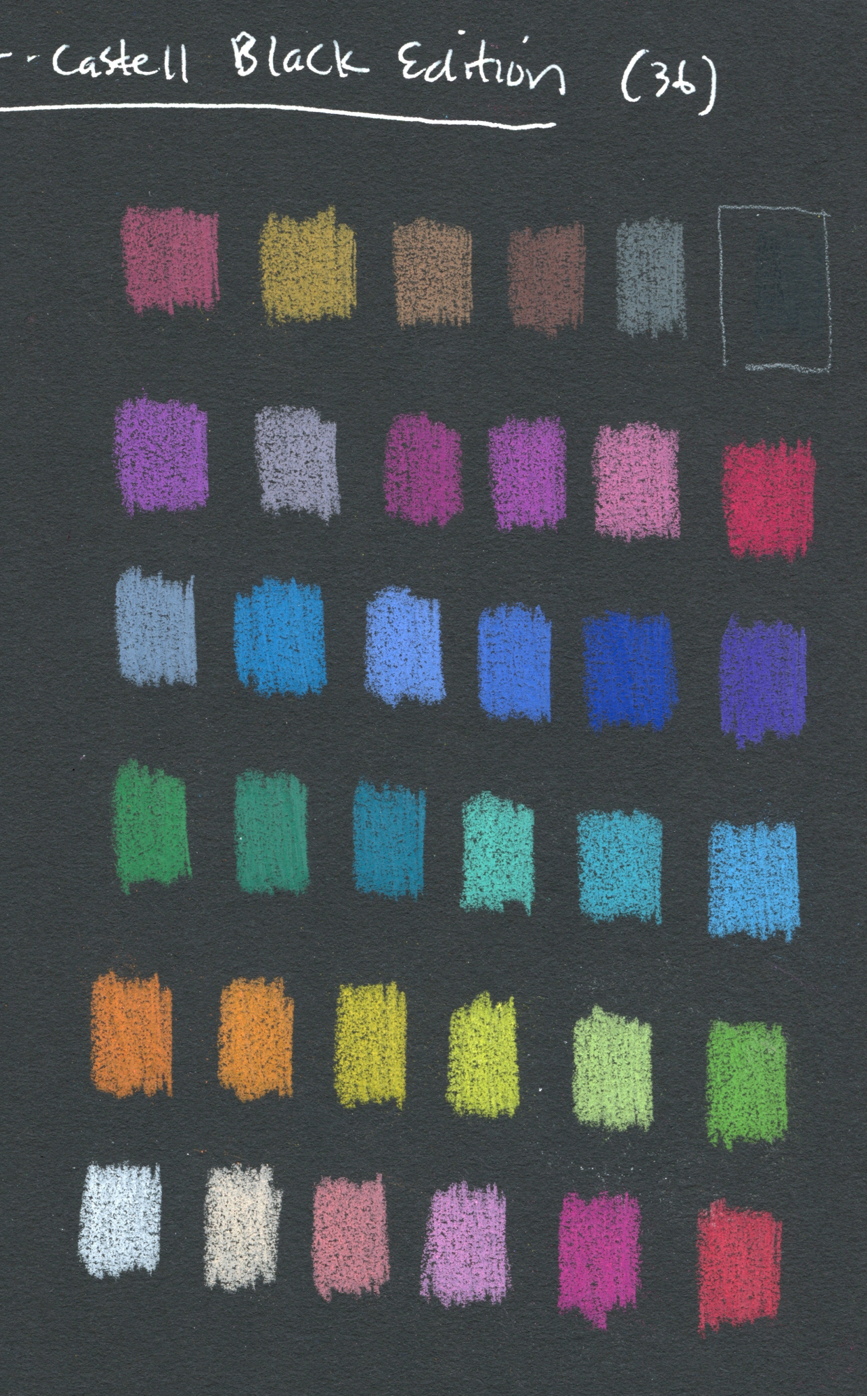
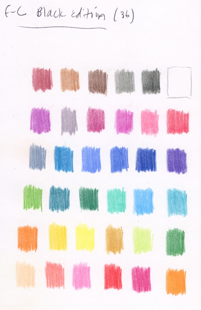
Since the Black Edition pencils are obviously made to be used on dark paper, first I swatched the colors in a black Stillman & Birn Nova sketchbook. After three layers, most colors do pop off the page with brilliant opacity.

Swatches made in Stillman & Birn Nova sketchbook

Swatched in a Stillman & Birn Epsilon sketchbook, most colors look unremarkable, and some look downright blah. Clearly they are ideally used on dark paper.

Swatched in a Stillman & Birn Epsilon sketchbook (Sorry that these swatches are not in the same sequence as the black-page swatches! It was my intention to put them in the same order, but you know what they say about that pathway paved with good intentions.)  

To be fair, the Black Edition colors are no more blah on white paper than most other pencils in the same colors would be on white. It’s just that when you have a whole set of nothing but high-key hues, they are bound to look washed out on white compared to black.

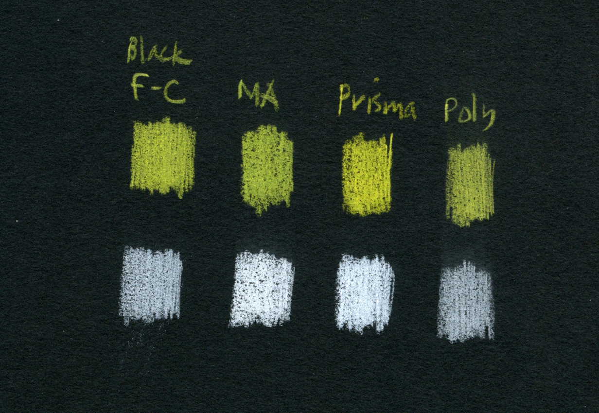
In addition to Polychromos, I grabbed a few other favorites to compare color opacity (from left: Black Edition, Museum Aquarelle, Prismacolor, Polychromos; three layers each). The yellow Black Edition shows strong opacity, but white less so. (It’s hard to beat Prismacolor’s white for opacity.)

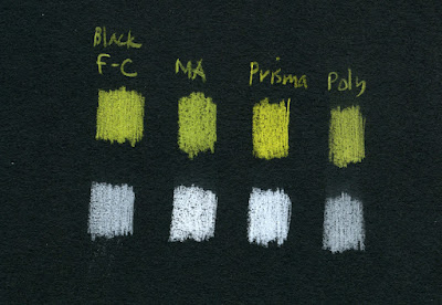
Opacity comparison (from left: Black Edition, Museum Aquarelle, Prismacolor, Polychromos)

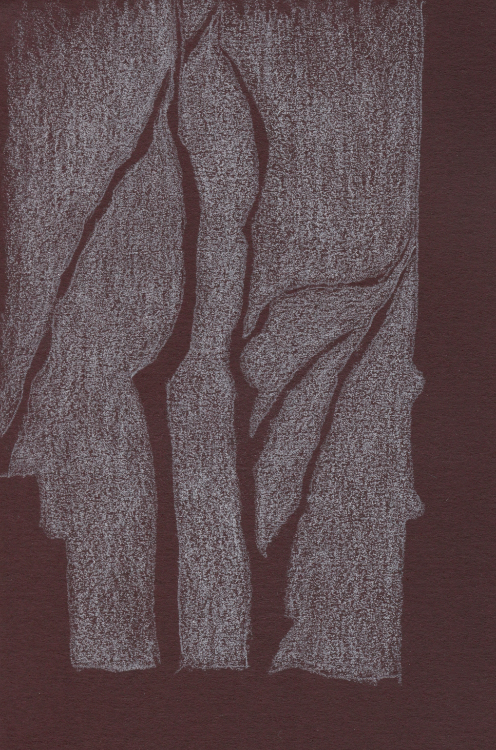
In the abstract-looking sketch, below left (it was actually a negative-space drawing of trees), I was frustrated that the Black Edition 
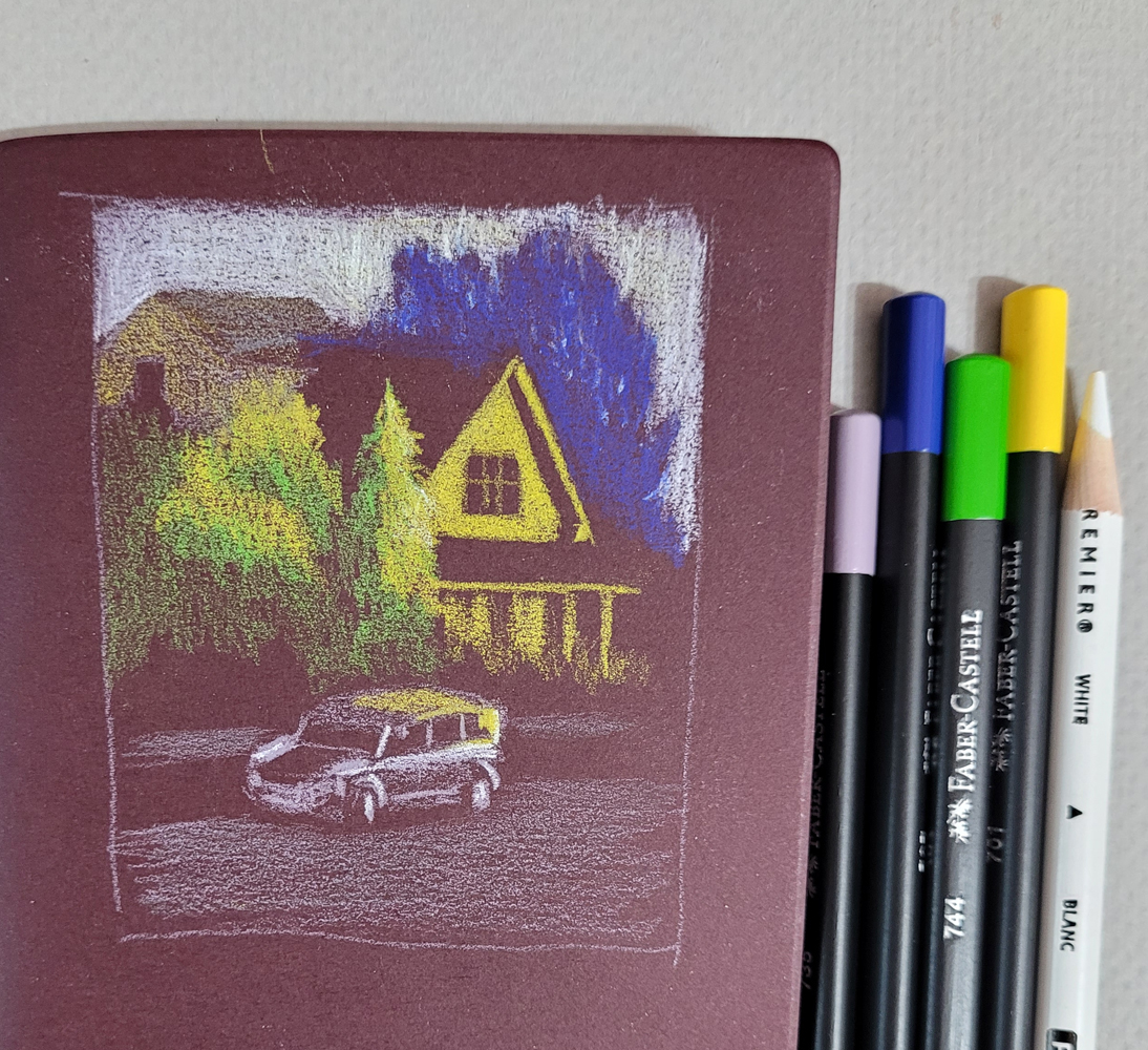
white didn’t cover the paper enough. In the sketch of the house (below right), I wanted the sky to be as white as possible, so I had to bring in a Prismacolor for assistance.

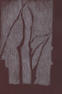
5/4/23 The white Black Edition pencil
didn't cover the dark burgundy Uglybook well.

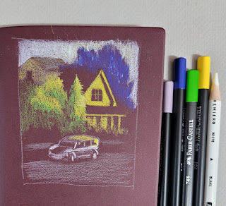
5/4/23 I used a white Prismacolor to assist with the sky (photo reference).


In general, the Black Edition colors are good but not so opaque or bright that they are better than other good-quality pencils, and some other pencils are more opaque. However, to get a range of reasonably opaque, high-key colors as wide as this, you’d have to buy a huge set of some other pencil. From that perspective, 36 colors for $18 is a good value for decent pencils in an intriguing color range.

I say “intriguing” because, more than anything else about the Black Edition, the idiosyncratic benefit to me is that it inspired me to experiment with light-on-dark drawings. These pencils pushed me to think about both light and color simultaneously, which is a fun challenge that I’m going to continue exploring. You’ve already seen most of these sketches in that post and read about my challenges with them, so I won’t repeat all of that here. I’ll just end this review by saying that, for me, $18 is a very cheap price to pay to start thinking in new ways.

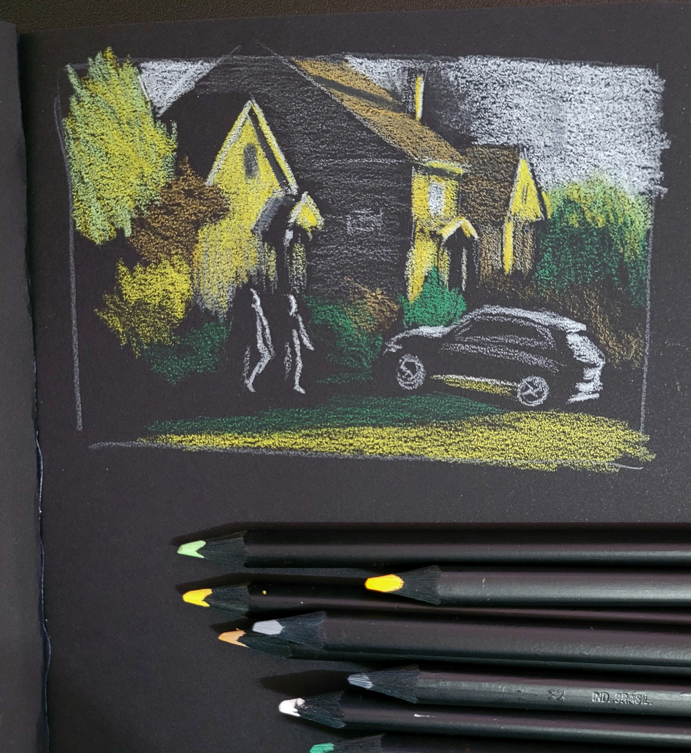
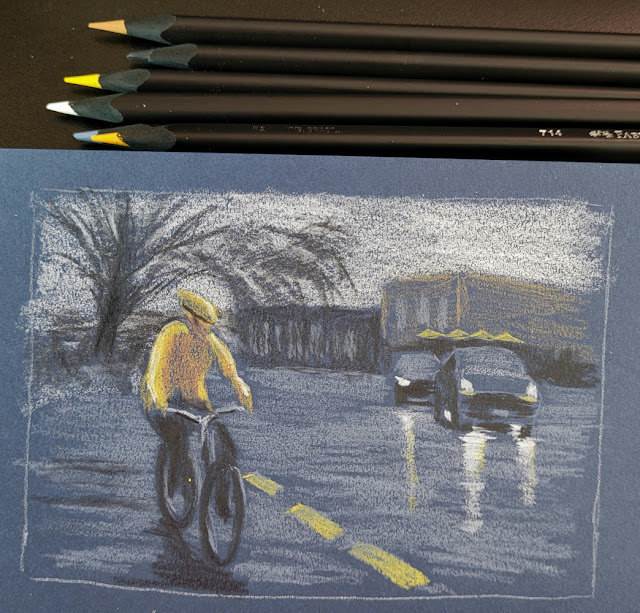
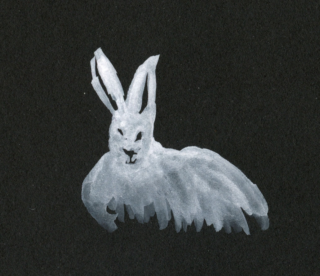
5/2/23 Stillman & Birn Nova (photo reference)

5/3/23 Uglybook (photo reference)

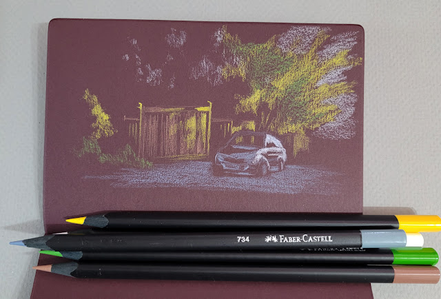
5/5/23 Uglybook (photo reference)

Tuesday, May 9, 2023

Light on Dark

5/2/23 black Stillman & Birn Nova sketchbook

If you follow me on Instagram, you may have seen that I made these sketches with a new set of Faber-Castell Black Edition colored pencils. The entire range in this collection is pastel tints ideally used on darker papers. You’ll see a full review of the pencils soon, but before that, I wanted to write a few thoughts about sketching light on dark.

The process of drawing only the lights is not new to me. For the past few winters, I’ve had a ton of mind-boggling fun making nocturne sketches, almost always with white (or variations of white) on black paper. I’ve also made some skyscapitos at dusk on a base of dark blue paper. This new set of pencils, however, has pushed me to think more about color and light simultaneously on dark-colored papers.

5/3/23 Uglybook

All sketches shown here were made from photos. Two were taken during the golden hour when the low sun cast a beautiful warm light on houses. The third was taken at Green Lake as I was waiting to cross a street on a dark, rainy morning. In all cases, plenty of light was in the sky, so I could see colors – which is very different from sketching in the dark when colors disappear.

Thinking about both color and light is challenging and confusing in new ways. Having Uglybooks in various dark colors also adds to the challenge, especially in terms of color temperature. I’ve done some thinking in this direction in my underpainting studies, but in those cases, I usually chose a paper color with a mid-tone value so that I could apply the darks and lights as I drew. In addition, I often tried to emulate the way painters cover the entire support with their medium so that the underpainting color barely shows, giving all the colors a shimmer of the hue beneath.

With these colored pencils, however, I have been using only dark papers to make the light pencil tones pop, and I leave more of the paper visible. The result is that the darks and mid-tones all sort of mush together without much distinction.

5/4/23 Uglybook. This dark burgundy paper can be problematic in
terms of color temperature. Since it's basically reddish, I would normally
think of it as warm. But because it's such a low-key hue, I think it reads
more as cool. 

An additional huge challenge is resisting the urge to draw too much. (I guess that challenge is ever-present, but it’s worse here.) When drawing light on dark, I think my results are better when I draw as little as possible. With the pitch-black nocturnes, it’s much easier, because I can’t see much. In these photos, I could still see almost everything, but crossing the line into “too much” is easy to do. For example, I could see a lot of bright “sky holes” in the dark blue background trees (at right). I started to put some in to show that the blue darkness was trees, but they were distracting, so I tried to cover up most of them with more blue. Painting instructors always talk about painting only the large shapes – not the itty-bitty sky holes – and I found that I have to think more like a painter with these.

Believe me, I didn’t anticipate any of these challenges when I got these pencils. My only thought was, “Light-colored pencils – cool!” Ha!

Making these sketches presented the usual tension I experience whenever I sketch scenes from photos that I took myself: I wanted to do them from life instead. However, the conditions of these particular scenes – the golden hour light that lasts about a minute and a very wet day – helped me feel OK about using photos because trying to do them from life would have been terribly frustrating. In addition, using photos allowed me the time I needed to focus on things like confusing colors. Yes, I know I don’t have to justify drawing from photos to anyone, least of all myself. But that’s what happens when you’re a born-and-bred urban sketcher.

(In case you’re interested in seeing what I was working with, I’ve included my reference photos below.)


Yes, it pained me to crop out the trash can, but
Ian Roberts' voice was loud in my head.

Thursday, April 20, 2023

David’s Cherry Tree


4/16/23 Maple Leaf neighborhood

This cherry tree belongs to David across the street. The first pandemic spring, I didn’t get out to see the cherries at the UW Quad, so I had sketched it with wistful longing for all the blossoms I would miss that year. Other years I have taken it for granted because I was too busy peeping petals all over town. A year ago, it was a convenient tree to sketch on a rainy day.

And so it was again this year. It was late to bloom -- more than three weeks later than its peak in previous years, according to my sketch dates -- just like all the other cherries in town. I went upstairs to sketch it through a bedroom window on a wet, gray morning.

Monday, April 17, 2023

Can’t Get Enough


4/13/23 Holy Names Academy, Capitol Hill

Did I say petal-peeping season was winding down? In fact, I didn’t get enough of the street I had just discovered on Capitol Hill, and I certainly couldn’t wait until next year. I went back the next day, this time with Ching, Natalie and Suzanne, who concurred that it was a sight to behold.

Petal-peeping cohorts

Once again, walking in the middle of the street whenever possible (where the view is best), I slowly took in the splendor on both sides before settling in for a sketch. At the south end of the long block, a small cherry tree marked the exit from fairyland, and behind it stood Holy Names Academy. All I knew of it was that it was a girls’ Catholic school; a quick Google search told me that it is Washington State’s oldest continually operating school, open since 1880.

Material notes: Since I’ve had a good run of sketching pink trees this season, I felt like I had nothing to lose. Before putting it away, I wanted one more try with the Pentel Milky Brush Pen, which I had rejected early in the season. Since the afternoon was cloudy when I headed out, I grabbed my gray Stillman & Birn Nova sketchbook as a toned base for the opaque pink marker. Mixed with my usual colored pencils, the Milky turned out better than I expected, and the toned page was the right way to bring out the opaque pink. Maybe I’ll pull it out again next year after all.

Friday, March 10, 2023

Skully


3/2/23 Colored pencil in Uglybook

France van Stone recently sent a free video demo to her email list subscribers. The demo featured France drawing “Keith,” her skull friend (named after the Stones’ Richards and his skull ring). The 75-minute recording included a still image of Keith so that participants could draw along with France, but of course, I wanted to draw a skull from life.

I’ve long wanted an anatomically correct human skull to practice drawing, and France’s demo finally gave me to push to get one (easy enough to find in various sizes and styles on Amazon; mine was $13). Meet Skully (inspired by the X-Files character, of course). Her jaw is attached with a spring, which doesn’t allow her to open her mouth in a natural way, but it probably doesn’t keep her from talking if she has something to say. We’ll see.

France had mentioned how drawing Keith has helped her draw portraits, and I can already see how Skully could do the same for me. When I draw and shade the planes of her revealed head bones, it’s suddenly much easier to understand the planes of any face covered with muscle and skin!

2/28/23 Kuretake Gansai Tanbi Graphite
watercolors in Stillman & Birn Nova sketchbook


The two watercolor sketches above were made with the Kuretake Gansai Tanbi Graphite Colors set that I just reviewed at the Well-Appointed Desk.


Skully makes no bones about it... she can help me
draw portraits better!

Related Posts Plugin for WordPress, Blogger...