Monday, February 27, 2017

New Strategy

2/27/17 graphite, white colored pencil, Strathmore toned paper
A few weeks ago we had the first serious snowstorm of the season, which gave me an opportunity to try using gray toned paper to sketch snow. This morning we awoke to a couple of inches of accumulation, but I had a feeling it wouldn’t last (it’s 1 p.m. as I write this, and it’s almost all gone now), so I would have to do it quickly if I wanted another crack at it.


Hmmm. Pull on my boots and hat and gloves and tromp out into the still-falling snow, struggling to sketch on wet paper like last time? Or pour another cup of coffee and sketch through the bathroom window? Yeah, I like my new strategy better! J

Sunday, February 26, 2017

Clouds

2/26/17 colored pencil, smooth Bristol (photo source)
While I was playing on the beach last week, I missed a colored pencil class and got behind on homework from the previous week, which was depicting clouds.

As amorphous as clouds may seem, it’s still tempting to draw their rough contours to get a handle on them, but Suzanne warned against that. Attempting to draw them with a contour line, she said, would undoubtedly lead to the scallop-edged clouds of cartoons and our kindergarten drawings. Fighting that temptation, I did my best to shape them by coloring the shadows and negative spaces around them instead of the clouds themselves. I didn’t try to emulate the source photo exactly, but I attempted to evoke as much of its cloudiness as possible.

I probably say this about every class exercise, but I think clouds were the most challenging of all! I do wish I had done the assignment before going to Cannon Beach, though, because I might have been better prepared to sketch the clouds from life as they continually changed in the sky around Haystack Rock.

Friday, February 24, 2017

Mixed Media at Cannon Beach

2/21/17 water-soluble colored pencils, ink

Possibly our favorite place on earth, Cannon Beach is where we return as often as we can. No matter what is happening elsewhere in the world or in our country, visiting this tiny spot on the Oregon Coast revitalizes our souls and puts everything into perspective. I stand next to monolithic Haystack Rock and feel as small as a sand fly. Then we hike a mile or two down the beach, and Haystack isn’t so huge. We drive to the next beach and look back at Haystack, I see that it’s just another speck on the Pacific’s shoreline, where waves have been crashing in and pulling back out for millennia. At Cannon Beach, I always feel small yet whole.

This week was our fifth visit since I began sketching. Watercolor seems like an intuitively natural medium for capturing water views, so it’s always been my go-to. But the past several months I’ve been focusing almost exclusively on colored pencils, so I decided to leave my watercolors at home. When I was packing, I almost put my watercolors in, “just in case,” but I didn’t want to fall back on an easy old habit. It was an ideal opportunity to face a beloved, familiar landscape with new media.

From the comfort of our oceanfront hotel room (which I was grateful for, since the temperature was down in the 30s), I made my first sketch of Haystack with water-soluble colored pencils (above), which are wonderful for getting both rich color and texture. It helped that the sun came out long enough to put in some shadows. When I got to the partly cloudy sky, however, I switched to ink in a waterbrush. I just haven’t figured out how to make a sky look good with dry pencils (that’s my class homework from last week that I haven’t finished yet), and adding water tends to get streaky.

Later in the day I decided to try the layering techniques I’ve been learning in class using traditional (dry) colored pencils (below). I spent only about an hour on this 4 ½-by-6-inch, not the several hours I would have spent on a class exercise, so I wasn’t able to achieve the depth of tone and hue that I strive for (the overcast sky kept all the shadows away, too). Still, I was mostly happy with the textures (not that gravelly sky, though. . . I have to get to the homework!).

2/21/17 colored pencils

Prepared for rain, I sketched in my waterproof Expedition
notebook (sans glasses!).
 Maybe the most fun I had trying a new medium at the beach was when we thought the rain would continue to come and go as it had all morning. Pulling on my raincoat, I left my bag in the hotel room and stuck only a graphite pencil and my waterproof Expedition notebook in a pocket. Instead of more rain, the sun came out, so I pulled out my tools for a sketch – and I realized my glasses were still in my bag back at our room! No way was I going to hike back up the hill to get them. Not being able to see my small sketchbook well pushed me to stick to the large shapes and tones (below) – and I discovered what a joy it is to use a soft graphite pencil on that crazy Yupo paper! My Mitsubishi Hi-Uni 8B pencil is like velvet on that strangely toothless paper. It’s my designated sketchbook for inclement weather – but who knew I’d enjoy it even in sunshine?

2/22/17 8B graphite pencil, Field Notes Expedition notebook

2/21/17 ink
I also had enormous fun drawing tiny beach-walking stick figures casting shadows and reflections.

During low tide we explored the tidepools surrounding Haystack, where I sketched a variety of anemone, barnacles and other critters clinging to rocks. On a visit in 2014, I had sketched some colorful starfish but didn’t seen any this year, so I asked an Oregon Department of Fish and Wildlife staffer about them. He told me that a virus had attacked 98 percent of the starfish on the Pacific Coast during the past few years, and they are only just now beginning to make a slow comeback.


In any weather, in any season, in any medium, Cannon Beach is still one of the most beautiful places on earth. See my posts from previous visits.

2/21/17 brush pen, water-soluble colored pencils

2/21/17 brush pen

2/22/17 colored pencils
2/22/17 colored pencils, ink
Chilly beach

2/22/17 ArtGraf water-soluble graphite pencil

Tuesday, February 21, 2017

Review and Field Test: Expedition

2/18/17 graphite, Field Notes Expedition notebook
Winter weather curtails my sketching, but not completely. Since it typically doesn’t get deadly cold here, I can sketch quite a bit from my car. The only weather that really stops me is rain: Turning the windshield wipers off and on repeatedly is annoying, and it’s not pleasant standing in the rain. In addition, even watercolor sketchbooks don’t hold up well if you can’t decide where you want the water to go.

But what if there were a sketchbook that could withstand rain?

Last month in my post about the sketching materials I used during the Women’s March, I mentioned being prepared for rain by bringing a Field Notes Expedition notebook. Made of Yupo, a synthetic paper, the notebook is completely waterproof, inside and out, and very difficult to tear. It’s designed to be used by people who need to make notes while working outdoors in various weather conditions.

I did a lot of Internet research and my own tests to see what kinds of drawing materials would work on the slick, plastic-y surface that cannot absorb liquids. Although a variety of pens can be used, some inks take a long time to dry on it. Many pens with waterproof ink like Sharpies and brush pens will draw well on it while the paper is dry, and once the ink has dried, it will be waterproof if the paper gets wet afterwards. But if you try to write on wet paper with these waterproof pens, the ink won’t stick – it just floats away.

On the left side of my test spread below, I used a Sharpie, a Copic Multiliner, a Plumchester brush pen and a Kuretake brush pen containing Platinum Carbon Black ink (all waterproof inks) to make some scribbles on dry paper. I waited a bit to allow the inks to dry, and when I thought they were, I sprayed the page with a water spritzer. The Sharpie and Plumchester were dry, so the water didn’t affect them. The Copic Multiliner must not have been completely dry, as it smeared a bit. The brush pen with PCB ink looked dry but must have been quite wet, because it made a beautiful bloom.

On the right, I sprayed the clean page with water first, then tried to write on it with the same four waterproof inks. As you can see, none was successful.
 
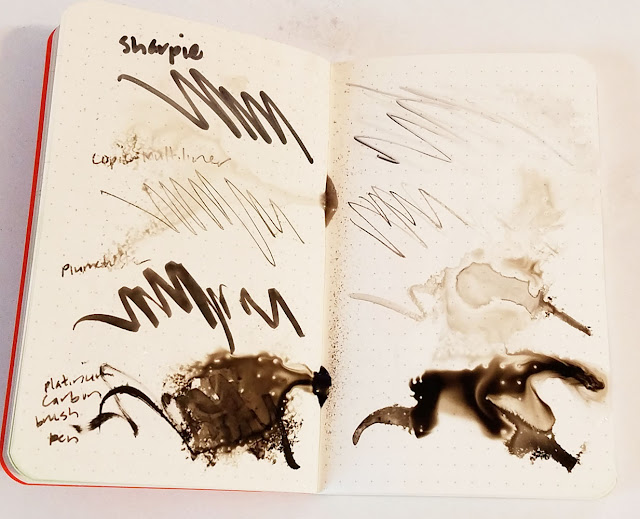
Waterproof ink tests

Most reviews I’d read said that graphite pencil and ballpoint pen fared well on Expedition paper, and my own test results partly concur. On dry paper (below), I used a couple of soft grade graphite pencils and a Uni-Jetstream ballpoint pen to scribble on the left side. On the right I used a few different types of traditional colored pencils.

Then I sprayed the page spread. As expected, water did no harm to the pencil or ballpoint scribbles. While the pages were still wet, I went back in with the same instruments to try scribbling again (those marks are labeled “wet”). While the graphite and colored pencils all did well, the ballpoint pen didn’t.
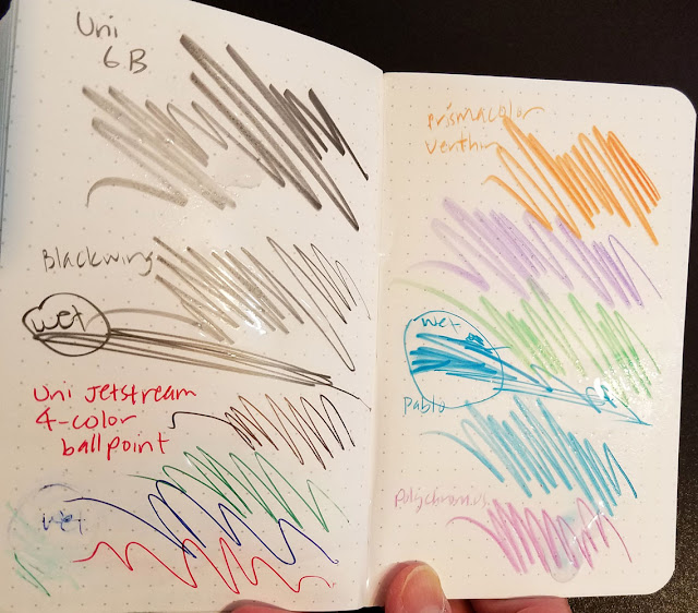
Dry media tests

I don’t really care for the way colored pencil looks on Expedition paper, and without any tooth, it’s hard to build up color. But strangely enough, I do like the way graphite goes on the paper, especially the softer grades – rich and dark – and it feels surprisingly pleasant. Despite the lack of tooth, it goes on well, stays on when wet and – most important – draws on a wet surface.

With laboratory testing done, it was time for a field test. You’d think I’d have plenty of opportunities in Seattle for field testing (and you’d be correct), but I was waiting for just the right rain conditions. I didn’t want to get drenched, so forget about the many downpours we’ve had recently. And I didn’t want to freeze, either, so I skipped the cold, wet days, too.

Then a few days ago it was just right – mild temperature but drizzly. On my way home from the post office, I stopped in the View Ridge neighborhood, pulled up my hood, and got out of the car. Using a Mitsubishi Hi-Uni 6B pencil, I scribbled the street scene, watching the drizzly drops cover my page. The pencil did beautifully, both while the page was relatively dry as well as toward the end of the sketch when it was dripping. When the page spread completely dried, it was as good as new – you cant tell that it was ever wet (see scan at top of page). 

Using watercolors, artists like Joan Tavolott make paintings with gorgeous effects on dry Yupo paper. And now sketchers like me have no excuse on rainy days – Yupo paper is great for drawing on wet, too! 

Note the rain dripping down my pencil and on the page surface!

Sunday, February 19, 2017

Life Drawing on Steroids

2/19/17 ink, marker, colored pencils

One-minute poses at Gage life-drawing sessions seem like pure extravagance compared to the real-life drawing practice we got today at Seattle Bouldering Project. Urban Sketchers Seattle discovered it was more like one-second poses as people attempted to scale the vertical walls of the practice facility for rock climbers.

2/19/17 brush pen
A recreational venue as well as a training facility, Seattle Bouldering is a huge place with multiple artificial mountains for climbers of all ages and skill levels. Scaling the walls like spiders or hanging upside-down like chickadees, most of the climbers fell eventually, too. “Climbing is 90 percent falling,” we were told by Bouldering staff, and I was very happy to be sketching and not participating.

Almost exactly three years ago, USk Seattle visited Seattle Bouldering, and I remember clearly that I didn’t spend enough time warming up with gestural sketches. This time I heeded my own advice and used several pages of my sketchbook doing nothing but small gesture studies with a brush pen. Always looking for Suhita Shirodkar’s “line of action,” I just kept the brush pen moving. The upstairs balcony offered the best view of the high walls where the more experienced climbers were practicing. It was impressive to see these strong, agile people plan and execute each foothold and handhold.

Once I had loosened up a bit, I decided to make a few slightly larger figures and pay attention to shadows. They turned out to be just as challenging as the figures casting them because the light seemed to be coming from all directions.

From the lower level where I could stand nearly at the same level as the climbers’ thickly padded floor, I finally felt ready to take a larger view of both the people and the strangely shaped interior space.

2/19/17 ink, colored pencils

Saturday, February 18, 2017

Pocket Vignettes at Volunteer Park

2/16/17 brush pen, colored pencil
On Thursday we went to see the exhibit Tabaimo at the Seattle Asian Art Museum. Although I enjoyed the show, the sun’s unexpected appearance called to me. Before we got back into the car, I took a few minutes to put into practice the exercise we learned last week in Gabi’s Pocket Urban Sketching workshop. The concept is to use a pocket-size page spread to compose a montage of three small vignettes related in some way. To be visually pleasing and more cohesive, Gabi suggests varying the three elements in size.

While I was still viewing the exhibit, I sketched a dragonfly motif from one of the pieces. Then outside the museum, I started sketching Isamu Noguchi’s Black Sun sculpture when a tour bus of teenagers suddenly climbed all around and inside the sculpture’s hole for a photo opp. I quickly scribbled them into the sketch. Finally I looked out over Volunteer Park toward the Space Needle on the horizon and made a tiny skyline at the bottom of the page. As Gabi had suggested, I wrote a few notes about the visit in the white spaces around the vignettes.

The page spread, which is 5 ½-by-7 inches, took no more than 10 minutes to complete (by that point, I was too cold to stay out longer, since the sun had dipped behind clouds). Individually, each sketch doesn’t show much, but the three together tell a more complete story about my visit to the museum and the park. I don’t usually journal much as part of my sketch page, but the spaces between images asked to be filled in with brief notes. It’s really an ideal format for travel sketching on the go – very little time consumed, yet a lot of information and memories captured. 

Although I know many sketchers use this type of montage format, I’ve never put it into practice myself. Now I can easily see how to use it to my advantage in some situations. It’s an art journal technique (writing that supplements sketches) colliding with urban sketching in a way that fits some of my needs well. 

Friday, February 17, 2017

Color Mixing Chart

Color-mixing chart with colored pencils
If you’ve done anything with watercolor at all, or even if you haven’t but you hang out on watercolor-related websites, then surely you know of Jane Blundell, queen of all watercolor mixing. Her blog is an unbelievable wealth of information on everything related to watercolors, especially paint pigments and what they look like when they’ve been mixed with other paints. Sometimes I go there just for the eye candy.

Several years ago when I took a brief watercolor class, I made a color wheel and small mixing chart for the primary palette we were using. I found the exercise interesting, but I didn’t understand enough about color temperature and other color properties to go beyond what we learned in class. And as much of a junkie as I am in terms of craving color in my immediate surroundings, I haven’t felt particularly compelled to make color-mixing charts for my vast quantities of colored pencils.

This week in the colored pencil class I’m taking, we focused on color mixing, and part of our homework is to make several color-mixing charts of the type Jane would be pleased by. Now that I’ve read a few art technique books and have some years past that brief watercolor class, I think I finally understand enough about color to learn from making color wheels and mixing charts.

An interesting aspect of colored pencils that we talked about in class is that their hues are mixed optically rather than physically. Unlike yellow and blue watercolor paints that are literally mixed together to make green, pencils are layered and remain independent hues, but our eyes experience them as a new color. The effect is closer to layering transparent glazes of watercolor rather than mixing liquid paints.

Shown above is my basic mixing chart (if you were expecting a neatly ruled grid, sorry – that would be Jane’s blog! 😀). I selected a warm and a cool shade in each of the three primaries plus green and then mixed them into the various permutations. The next chart I make will combine three primaries to achieve various grays, and mix each primary with its complement to make additional grays or browns.

If today’s sunshine continues into the weekend, I’m going to have a problem staying indoors to finish my homework! (But this part of the homework is so much easier than the second part – drawing a partly cloudy sky!)

Wednesday, February 15, 2017

Luna Park Café

2/14/17 brush pen, ink, water-soluble colored pencils
A few weeks ago after sketching at the Nucor Steel Plant, a few of us ended up at Luna Park Café for lunch. It’s a funky old place in West Seattle full of fun décor from the ‘50s and ‘60s. It’s named for an amusement park that operated for a short time at the turn of the previous century (and the parks name was apparently inspired by Coney Island’s Luna Park). Vintage photos of the park and area hang throughout the café.


Greg had an appointment in West Seattle yesterday morning, so he dropped me off at the café first. While I nibbled on a cinnamon roll, I sketched a booth with a huge blue guitar above it. I was thinking about sketching the tiny juke box at my table (each booth has one) when Greg finished his appointment and joined me for brunch. I left the juke box for next time – I’m sure I’ll be returning to the fun.

A tiny juke box at every booth.
Vintage posters and lunch boxes are part of the fun decor.

Yeah, I ordered a whole breakfast after scarfing down half a cinnamon roll! Uff.
Look at Greg's egg and hash brown concoction smothered in Hollandaise!

Monday, February 13, 2017

Small Page, Big Picture

2/13/17 ink, brush pen, graphite, Field Notes notebook
The sun came out today, and I was eager to try one of the exercises we did in Gabi’s “Pocket Urban Sketching” workshop to firmly cement the concept in my brain. I took a 3 ½-by-5 ½-inch Field Notes notebook (same size as the Stillman & Birn we used in class) and hit the streets.

When I sketch a neighborhood street scene from my car, I usually choose an intersection and include a parked car and some trees – and that’s typically the horizontal scope of my view (using a 6-by-9-inch page). I found such an intersection today in the Bryant neighborhood, but instead of focusing on the usual view, I looked as far to the right and left as I could see easily through my windshield. Holding up my pen against the height of the house on the right plus the tall tree behind it to determine my measuring unit, I roughly measured out all the other elements that I intended to include in the composition – the other trees in the background and foreground, the parked vehicles, the utility poles and the house on the left. Imagine that – they all fit!

Mind you, that concept is not new to me; in fact, I use it all the time to gauge the relative size of one side of a building compared to its height, the size of a car compared to the tree next to it, or the length of a guy’s arm compared to his torso. But I never really pushed myself to use the same technique to make any scene fit onto any paper space – it just seemed easier to choose a narrower scope. Now I realize it’s not difficult at all!

While I don’t always want to squeeze this large a view into such a small page, it’s nice to know how to do it when I want to. Sometimes I want to include more detail, so a smaller scope is appropriate. But there are many times when I do want to capture a fuller sense of the type of neighborhood or general area by showing more context. It happens frequently when I’m traveling. Being able to do this easily and quickly will be a helpful sketching tool.

Saturday, February 11, 2017

Pocket Urban Sketching with Gabi

Three small vignettes 
Gabi Campanario kicked off Seattle’s series of Urban Sketchers 10x10 workshops with “Pocket Urban Sketching” – an introduction to using the small sketchbook format. Going back to his roots, Gabi showed us some of the many small books he filled before he ever conceived of Urban Sketchers. The portable format enabled him to sketch whenever he found a moment to capture an image, and he encouraged us to do the same.

“A small, easy-to-carry notebook makes sketching less intimidating and is ideal to create fast drawings on the go,” he said in his class handout, and he spent this morning showing 14 sketchers how to put a large picture onto a tiny page.

Three small vignettes 
Amazon campus in the South Lake Union neighborhood was our workshop site. On this cold morning (I sure was glad I wore my down jacket and fingerless gloves!), our first exercise was to create a spread of three vignettes in varying sizes. Making a small-, a medium- and a large-sized image on the same spread gives visual variety and interest to the composition. White spaces can be filled with the date, journal writing and other notations.

Our second exercise was to make a single wide cityscape across the page spread. (This is my personal sketching challenge and the reason I took the workshop: I always feel like I need a large page to capture a large scene, and yet I know it’s just a matter of scaling. I wanted to learn how to fit it all in!) Standing on a street corner facing the Amazon spheres, Gabi demonstrated how he first decides the scope of his composition, then chooses a building to be the relative measuring gauge for everything else that will appear in the sketch.

7" x 5 1/2" page spread
As we started the exercise, my first inclination was to walk across the street to get as far away as possible from the spheres so they would become “smaller” in my eyes. But I wanted the challenge of the full, in-your-face view, so I stood close to the spot Gabi stood for the demo. I was pleased by how much I got into the spread (at left)!

I think both exercises – the three small vignettes and the wide cityscape across a spread – are ideal for travel sketching, because I’d be able to capture more small images in shorter periods of time. We were given 3 ½-by-5 ½-inch softcover sketchbooks (donated by Stillman & Birn) for the workshop, and I think I might use the rest of mine to practice these concepts before the next time I travel.

It was a fun and informative morning learning from Gabi, and it was also a privilege to take a workshop from the Seattle Sketcher!

Gabi demos how he fits a huge scene into a small sketchbook spread.

Gabi discusses the three vignettes exercise.
Chilly workshop participants listen attentively!

Friday, February 10, 2017

US Bank Centre

2/10/17 brush pen, ink, colored pencil
US Bank Centre, a retail/business office building in the middle of downtown Seattle, was a pleasant indoor space for winter sketching this morning for the small Friday sketch group. Three floors are open to the public with lots of art, seating, small tables and wide windows.

I picked a window on the second floor to sketch a couple of the globe lamp posts on Fifth Avenue and a tree between them. Then when I stopped to chat with Anne on the third floor, I looked down over the railing and spotted Steve Reddy sketching a small sculpture on the floor below. He’s a slow sketcher, so I thought I had plenty of time, but I must have caught him just as he was finishing up because I only had a minute or two to look over his shoulder, literally.

For the last few minutes before the sketchbook throwdown, I pulled out a pencil to sketch the back side of the stone archway on the main floor. (Apparently it came from the old Music Box Theatre.) Staying on the back side kept me from attempting all the ornate details.

2/10/17 ink, colored pencil

2/10/17 graphite
After lunch, a few of us got a bonus treat: David Chamness works on US Bank Centre’s 24th floor and invited us upstairs. The huge lobby window faces west toward Elliott Bay. Kate and Vivian were happy to simply enjoy the view, but you know me – I couldn’t resist a quick attempt to capture as much as I could without a panoramic sketchbook. My thanks to David for letting me stay a few more minutes to finish up. (In April I’ll be taking David’s 10x10 Urban Sketchers workshop called “Freedom from Worry and Details” to learn how to do this right!)

2/10/17 graphite, brush pen, colored pencils

Thursday, February 9, 2017

Mountains

2/9/17 colored pencil, smooth Bristol (work in progress; photo reference)
Suzanne Brooker has a systematic way of teaching landscape drawing. In the first class, we worked on the fundamentals of the three-dimensional form by focusing on a tree trunk in monochrome. The following week we used three colors to study a tree’s foliage. Last week the focus was on composition and perspective to show distance and foreground. Each class builds on the concepts learned previously, and we add more hues to our colored pencil palette.

This week the focus is on mountains. As usual, we’re paying particular attention to the way light and shadow describe the distant forms. After choosing an especially boring photo to work from last week, I made sure I picked a mountain photo with some visual impact. I’ve been working harder on getting darker darks with colored pencils, and last week’s image had only a small area of really dark trees, so the shadows in this photo seemed like a good opportunity to practice.  


Reference photo
It’s been raining cats and dogs almost continuously today, so I spent most of the morning on this exercise (taking frequent short breaks). I need to work on deepening some of the mid-values, and the sky needs more work, but I’m happy with the dark shadows I got. A little more work later this week, and I hope it’s done.

Wednesday, February 8, 2017

It All Counts

1/23/17 graphite

Yesterday I read an interesting blog post by Liz Ackerley, whom I had the pleasure and honor of working with in Manchester last summer when we both served as correspondents for the Urban Sketchers Symposium. She described her process of the past few years as she made the commitment to draw daily and how that process changed. Always interested in the creative process, I was especially fascinated to learn how similar our paths have been.

When I first began drawing, the philosophy behind urban sketching was so compelling and resonated so deeply with me that it’s all I wanted to do – draw from life, on location; tell a story with my sketches, no matter how simple; share everything I sketched. I still practiced a lot of non-location sketching at home – still lifes, from photos, lots of self-portraits and my own hand – especially during the bad-weather months. But all those other types of drawing felt like they were “just” practice and didn’t really “count.”

2/2/17 brush pen, gel pen
After several months of that, I must have realized that my line of thinking was ridiculously narrow and that, of course, all of it does “count”! Indeed, the practice I was doing at home – with time, space, and comfort on my side – was probably more constructive and beneficial in improving my drawing skills than trying to learn to draw while also battling the elements and other constraints that make urban sketching challenging. Once I widened my view that way, all of it became more fun – and as a result, I learned more.

That was the point that I began blogging. I realized a blog would give me a place to document my entire process – not just the stories of my urban sketches but also everything else I was learning along the way.

To this day, drawing on location is still the most compelling and personally satisfying type of sketching I do. At the same time, I fully appreciate the value of working in other ways – a studied colored pencil piece that takes hours of diligent work; a five-minute cartoon; a simple object on the street or on my desk without a “story.”

1/31/17 colored pencil
Liz concludes her post with a list of key tips for herself. Reading the list made me realize that I’ve developed a set of personal guidelines, which at first seemed remarkably similar. On second thought, though, maybe it’s not so remarkable; maybe many people explore creativity along a similar path. In any case, here are my current guidelines:

  • Draw every day, no matter how small or simple (or complicated) the subject. It’s not the result that matters; it’s the process.
  • Lower my standards about what is “sketch worthy.” A lamp post is as worthy as a cathedral.
  • Sharing can be as quick and dirty as a “trophy shot” posted on Instagram; it doesn’t have to be a perfectly scanned image. Conversely, I don’t have to share anything if I don’t want to. As Liz puts it, “You don’t have to prove to others that you are a dedicated sketcher!”
  • Have some kind of sketchbook available everywhere, always. No exceptions. It doesn’t have to be the same sketchbook, however. In fact, I’ve found it’s better to have several going at once – a primary one in my everyday-carry bag; a pocket-sized one in any other bag I might use; one in the car; one in every room. (Even walking upstairs to get a sketchbook might distract me long enough to keep me from a sketch!)
  • Carry a variety of media in my everyday-carry bag for different circumstances and available time. At the same time, remember that a monochrome line drawing can be just as satisfying as full color. Just because I’m carrying it doesn’t mean I must use it!

Liz adds one last tip that I couldn’t agree with more heartily: “always always have fun and enjoy the process. If not, there was no point in it!” Here’s to fun and enjoying the process!
Related Posts Plugin for WordPress, Blogger...