Monday, April 29, 2024

The Shapes of South Lake Union


4/27/24 South Lake Union

Spheres selfie

Although the wind and drizzle made Saturday morning feel colder than 51 degrees, USk Seattle made a good turnout at South Lake Union. With rain in the forecast for the throwdown time, I was glad I had gotten a tip from Gabi about The Stumpery, which has a large sheltered area. Part of Amazon’s Urban Arboretum near the Spheres, The Stumpery is a collection of old-growth cedars that originated in the Olympic Peninsula. Some as old as 500 years when they died, the stumps attracted several sketchers (one made a cameo appearance next to the Space Needle in my sketch).

The star of the sketch outing was the vintage Elephant Super Car Wash sign. Amazon received the sign from car wash owner Bob Haney after the business closed in 2020. A beloved Seattle icon for more than 60 years, the elephant gave several sketchers an opportunity for a pop of pink.

In my favorite way lately, I walked around the South Lake Union area dominated by Amazon buildings and tried to capture a variety of small shapes and textures (top of post). Although the Amazon Spheres were another favorite subject among sketchers, I had sketched them often enough in the past that I didn’t feel compelled to sketch them again. Instead, I made a selfie reflected in the Spheres’ geodesic glass panes.

By the time I filled the spread, my gloveless hands were starting to complain. I retreated to Kitanda Coffee to warm them up and finish writing the captions on my urban sketching comic page.

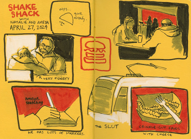
Ameya, Natalie and me at Shake Shack.

After the outing, Natalie and I stopped for lunch at Shake Shack, where we met Ameya. He had missed the throwdown, so it was fun to share sketches over lunch and do a little more sketching as we chatted.

4/27/24 Shake Shack with Natalie and Ameya. (In case you're wondering, SLUT stands for South Lake Union Trolley.)

Despite the cold and rain, it was a terrific day of sketching with my tribe in a part of downtown that’s full of dynamic urban shapes.

Sunday, April 28, 2024

Metro Market Comics: Real Time and Memory

4/21/24 Crown Hill Metro Market

When Ching and I got together last week, it turned into an opportunity for both a real-time diary comic (Drewscape’s term for sketching on location with a comic approach) and a memory-based one. The first spread (above) is the “story” of things I saw at Crown Hill’s Metro Market café as we chatted and snacked.

Later that day when I was taking a walk, I started thinking about an encounter we had at the café (below). My page layout isn’t too pretty, but I’m pleased that the spread is a sequence of scenes forming a story arc. In addition, the text and images provide complementary information without being redundant. Reading the classic book about the comics genre, Understanding Comics, by Scott McCloud, I’m learning that those elements are central to the definition of comics.

Yay – a successful diary comic!

4/21/24 comic diary from memory

Saturday, April 27, 2024

Review: Paper Mate Flair Dual Felt Tip Pens


Flair Dual Felt Tip Pens (I unceremoniously tossed the blister packaging, so the product is presented in the raw.)

The Paper Mate Flair and I go way back – all the way to the late ‘60s (it came out in 1966). It was the first felt-tip marker I had ever used. Available only in black, blue and red, its rich, vibrant ink seemed leaps and bounds better than the crappy, leaky ballpoints of the era (at least the ones that I had access to). My piano teacher used a red one to notate my lessons, I had all three colors, and we were both delighted to have these revolutionary, new pens.

Although I think I continued to use Flairs through the ‘70s, especially after they started coming in many more colors, eventually they were superseded by gel ink, nylon points and other pens of better quality and brighter colors. By our standards now, the basic Flair felt pen was (and still is) exactly that – basic. Although it isn’t stellar, it stands out for its longevity: Other than minor changes to its barrel design, the Flair seems the same as it was in the ‘60s.

One flaw of the venerable Flair is that the felt tip mushed down quickly under my heavy hand (which was heavy even as a preteen) – much more quickly than the ink ever ran out. At some point, I recall a “point guard” was added to the tip (“Won’t mush down!”), but I can’t recall it making much of a difference. Anyway, I hadn’t used a Flair in decades, nor had I kept up with any newfangled developments, if any, the Flair might have had.

Suddenly one day on Instagram, a friend showed some work he had made using Flair Dual Felt Tip Pens – and one of the dual tips was a brush tip! Given my weakness for all things brush-like, I couldn’t order my pack of 16 colors fast enough!

The nostalgic part of me was relieved to see that even though the barrel is longer than the standard Flair’s to accommodate the dual tips, the basic design is mostly the same as the one I remember from my youth. The slender, well-balanced barrel is easy to hold and doesn’t add excessive bulk to my minimal sketch bag.

0.7mm tip
brush tip

Both the brush tip and the 0.7mm tip look like the are made of the same felty material that Flair is known for. I’m not positive about this, but I think the white cross icon on the end of the 0.7mm cap has remained unchanged. (I looked for images of vintage Flairs online to confirm, and while there are plenty on eBay, none showed the end of the cap.)

Iconic white cross still appears on one cap.

The palette of 16 colors (the largest set I could find) is OK for basic markers. I would have added a light gray and a brown and swapped out a couple of the similar peach/pink/carmine hues.

Flair Dual Felt Tip Pen swatches in Hahnemuhle Akademie watercolor sketchbook

Since the inks are water-soluble, I made swatches in a Hahnemühle sketchbook and gave them a swipe with a waterbrush. Water-solubility is decent, at least on this watercolor-sized paper; I can’t get as good a wash as these on Uglybook paper.

I wasn’t too concerned about either the color range or water-solubility, though, because I had in mind a limited and specific use: Simple, cartoonish sketches of the type I have been making to practice diary comics in Uglybooks. I had been using black brush pens for this task, such as my favorites, the Uni Pin, the Faber-Castell Pitt Artist Fude Pen with a “firm medium” brush tip and the Pentel Pocket Brush Pen. As much as I love drawing with them, I often find the tips too broad for lettering on the scale of the small Uglybook A6-size page. With the Flair, I instantly saw that the dual tips would make an ideal, compact combo for thick lines, solid background coloring and fine lettering.

4/22/24 Maple Leaf neighborhood. After the loss of my black Flair, I challenged myself to use the other colors in warm/cool pairs. Since the ink is transparent, the colors are influenced by this Uglybook's strong yellow paper color, but I like the contrast.

Ironically, despite having all 16 color, black became the most useful for those tasks, and I started wishing it were available solo. This wish became more urgent when, after only a week of use, I lost the black Flair while sketching at U Village last week. Also ironically, my biggest disappointment in losing it was that I hadn’t yet photographed how mushed-down the brush tip had already gotten. So the disappointing attribute about Flairs that had made me stop using them decades ago hadn’t changed any more than their iconic appearance: They still mush down under my heavy hand. The 0.7mm tip seems to be holding out, though.

Another drawback is that if you pause the pen point on the page, the ink will feather a bit and may also bleed through. Using it in Uglybooks, this surprised me, because I have not experienced that with most marker-type pens or even juicy fountain pens. The only inks that have bled through Uglybook’s hefty 80-pound paper are Sharpies or oil-based waterproof inks.

If you let the pen point pause on the paper, it can leave
a dot, which then bleeds through (see right image).
Bleed-through from sketch at left.

I hunted online to see if black was available individually, and so far, I’ve come up empty-handed. However, other than for the fun of the hunt (which I can’t underestimate; I certainly enjoy a good sporting hunt), I don’t need to replace the lost black. I’m now challenging myself to use the other 15 colors, and it’s fun to pair them – one cool, one warm – to complement the paper color. Since the comics and other sketches I make in Uglybooks are mostly colorless, using two inks together adds a bit of interest and contrast, especially with the graphic look I am trying to develop. Besides, I have many black Japanese dual-tip brush pens that probably won’t mush down as quickly.

Not ideal in use, but a good value.

While Flair will never be my favorite or the “best” pen for anything, it’s OK for this purpose – as long as I don’t expect the tips to last as long as the ink. And for that, the price is a good value (a lot lower than Tombow Dual Brush Pens and other Japanese brush pens, which I think are more durable). Scrolling through Amazon, I see a lot of inexpensive, dual-tip brush pens available in sets of gazillions of colors. My bet is that they are no better than Flairs (although if some are, I’m eager to hear about them!) and certainly carry no nostalgia benefit, so there’s that.

Unsurprisingly, the Flair Duals reignited my interest in dual-tip markers in general, so I started digging through my stash. I had almost forgotten about a small set of Faber-Castell Pitt Artist Pen Dual Markers. Newish on the market, these pens contain the same waterproof ink as the rest of the Pitt Artist Pen line except that they have a broad brush tip on one end and a fine tip on the other. I’ll probably review these somewhere down the line. Spoiler alert: I like ‘em better than Flairs.

Friday, April 26, 2024

Woman Who Walks Cats


4/20/24 diary comic from memory

For the second half of my 30-day self-challenge to make daily diary comics, I have been focusing on developing narrative – whether the content is drawn on location or drawn from memory or imagination. This one from last Saturday is the best example so far of the kind of comics I am aspiring to: written and drawn from memory but based on actual observations and experiences – and no self-absorbed bellybutton gazing.

Walking home through my favorite alley, I met a woman and her two cats. After our brief interaction, I couldn’t wait to get home to draw the diary comic as quickly as possible while the images were still fresh in my memory. My comic compadre Roy and I regularly exchange comics, ideas and resources and discuss the genre. He made the excellent suggestion that my comic would have benefited from a third panel showing the woman and her cats walking away, for example. The three-panel beginning, middle and end is a classic story arc that works well with almost everything. I concur that it would have been better to end with a third image. My limitation in this case was the page size and format. I couldn’t fit another sketch on the page (the other half of the spread had already been used for other sketches), and it didn’t seem “right” visually to put a lone sketch on the next page. Planning sketches on a comic page layout is similar to planning a composition – both of which take practice! But I’m learning and loving the practice.

4/17/24 memory sketch

Speaking of practice, sometimes I make sketches that don’t get as far as becoming comics, but I still benefit from the practice. Shown here is a scene I witnessed on a different walk. Spotting a bunny, a man’s dog suddenly went ballistic, startling everyone involved, including me. It might become a comic someday, but it was important to capture the gestures right after my walk while still fresh.

Thursday, April 25, 2024

Walk Comics


4/16/24 Mostly sketches made on location during my walk to Northgate, this page spread also includes an imaginary bit at upper left and the purpose of my trip to the optician. I use the FitBit footprint icon the number of steps I clocked, and the number of "active" walking that day to signify that this comic spread represents a walk I took. It is my diary, after all, where I have always tracked health and fitness goals.

Since even before the pandemic, sketching has been a regular part of my daily fitness-walking routine whenever weather permits (and sometimes when it doesn’t). In fact, the potential for a sketch has always been the carrot at the end of my exercise stick.

My sketch subjects haven’t changed – they’re still the mundane bits I find along my walking route. The difference now since I discovered the comic format for urban sketching is that the same sketches have context.

4/17/24 Maple Leaf and Green Lake neighborhoods. It's fun to mix different line widths available with a Flair Dual pen. I'll be reviewing it soon.

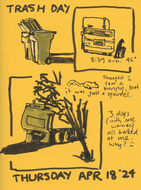
Instead of floating singularly on the page, the small sketches are linked by the story of my walk that day. Although it’s not exactly a narrative with a story arc, it shows how, within walking distance, one neighborhood can include both a luxury convertible Porsche and a tent for a homeless individual. Or maybe the story is nothing more than a typical Thursday morning in Maple Leaf when trash is collected and squirrels run by.

4/18/24 Maple Leaf neighborhood

4/20/24 Maple Leaf neighborhood

Wednesday, April 24, 2024

Maple Leaf’s Most Iconic Intersection


4/18/24 The intersection of 88th NE and Roosevelt Way NE, Maple Leaf

Cloud City Coffee was the site of some of my earliest urban sketches, and I’ve sketched there many times since. On a fabulous afternoon last week – it was 62 degrees and sky the couldn’t have been bluer – I noticed that the shop had gotten several new outdoor tables. After its recent remodel that includes a new tented area, the new tables are no longer blocked by parked cars, so I had a better view.


A fresh Uglybook cracked open! I filled the last one in less than 2 weeks!
Behind Cloud City’s iconic sign is an even bigger icon: Maple Leaf’s beloved water tower (also one of my earliest urban sketches). I made a page of small sketches celebrating spring’s arrival (officially recognized as whenever I have my first iced latte al fresco) and possibly Maple Leaf’s most iconic intersection.

Technical note: Although it probably doesn’t look like a comic, I consider this a comic-y diary because I made a more conscious effort to tell a story about this intersection, not just make random sketches of whatever I see. Does it help to seem more comic-y to include commentary as I did? Maybe in a traditional comic, a character (or persona of the author) would be making those comments in voice bubbles, but I also know that some comic artists write text as captions. Super excited about this new format for my urban sketches, I’m having fun trying out different things to make it my own.

Tuesday, April 23, 2024

Comic Diaries with Roy


4/17/24 The panel at upper left was imaginary. The rest of the page spread was sketched on location at Third Place Commons in Lake Forest Park. 

My friend Roy has become a comic diary afficionado as I have. We met at Third Place Commons last week to talk about the process, exchange ideas and, of course, make comic pages. Fans of comic artist and urban sketcher Drewscape, we were both taken with his video about “real-time” autobiographical comics. It’s really no different from the kind of urban sketching Roy and I always do, but framing the practice with a comic approach gives context and “story” to drawing whatever we happen to see or experience.

I really admire and aspire to Roy’s sequential narrative and strong graphic appearance. Learning from him, I’m trying to apply more solid blacks to backgrounds, which adds to the comic book look and serves as a compositional tool to aid the viewer’s eye. You’ll see more of my attempts in tomorrow’s post.

Look how comic-booky Roy's page spread looks! I aspire to that -- or my own version of that.

Monday, April 22, 2024

Spring Comics


4/15/24 Maple Leaf neighborhood

Just as I was lackadaisical about keeping up with my sketch journal last year, I was also lax in doing as much nature sketching as I had intended to. Now that spring is here, it’s the best time to say it again: I want to do more nature sketching. And maybe this year I’ll actually do it and not just say it!

Dazzled by all the color I saw on my walk one morning last week, I picked out a few blossoms to sketch. Since the comic book layout I learned from Drewscape has been working well with my urban sketches, I thought it would be fun to try it with nature sketches, too. There’s no sense of narrative or story, of course; it’s more of a visual structure. Simply drawing a box around a couple of flowers immediately designs the page better than blossoms randomly floating on the page. I also sketched one Kwanzan cherry tree from a distance to balance the close-ups of the other three vignettes – another tip from Drewscape taken from comic book design.

Looking again at this page, I take back what I said about a lack of narrative: It’s about taking a walk on a lovely morning warm enough to stop four times for small sketches filled with color. If that’s not a story of spring, what is?

Sunday, April 21, 2024

Sunshine, Watercolors and Comics at U Village


4/19/24 University Village

The requested sunshine was delivered for USk Seattle at U Village last Friday, and we all agreed the temperature and conditions were nearly ideal: 66 degrees with a clear blue sky!

Arriving a little early, I found a sunny spot and started sketching immediately to stay warm. The rest of the morning continued apace – one small sketch after another until I filled a spread in my bright yellow Uglybook that seemed to reflect the day’s sunshine (top of post).

4/19/24 Why do I keep torturing myself?

I was having so much fun that I could have immediately started another spread, but I thought I “should” do a watercolor. Since I knew that comfy benches and tables were plentiful at U Village, I felt compelled to bring along my watercolor palette and A5-size Hahnemühle sketchbook. I found a suitable composition and even dutifully made a thumbnail first in my Field Notes, but I admit I didn’t enjoy using watercolors nor the result (at left) nearly as much as I do comic-style urban sketching with markers. I should stop torturing myself with watercolors and just embrace me doing me!

With that over with, I sighed with relief and happily pulled out my smaller A6 Hahnemühle for another comic-like spread (below). White paper enables me to use a little color – I’d be happy with that if I could just let watercolors go.


After the meetup, I stayed to have lunch with Natalie and Oralea. (U Village is great for that because everyone can choose what they want from the many food venues and meet later at the community tables.) The busy ramen shop I chose required a bit of a wait, so that got me started on another page (below). Then when I unwrapped my takeout, it turned out to be a “kit” that I wish had come with assembly instructions. The toppings, the noodles and the broth each came in its own plastic layer, and then all the layers snapped together into a covered bowl. Whew! I was already starving before I started, but I certainly worked up an even bigger appetite by the time I got all the parts together.

Sketchwaiting at Hokkaido Ramen Santouka and illustration of my takeout ramen "kit"

I realized too late that I should have taken photos of the elaborate packaging. To make up for it, I sketched an “exploded view” of the kit.

Saturday, April 20, 2024

Evolution of a Comic Diary


2/5/24 Most of my early sketch journal/comic diary entries were simple observations I had made that day, usually on my walks.

Late last year I quietly (that is, by not sharing the results on social media) restarted the sketch journal habit that I had previously let fall to the wayside several times. Keeping it up daily, I reported on my progress in January.

3/6/24 I still find it especially challenging to imagine and 
then draw myself in various scenarios.
Around the same time, Drewscape’s YouTube videos and his comic book approach to urban sketching opened my mind to telling stories with multiple small scenes on a page. As often happens on the YouTube rabbit trail, I then became intrigued by the comic diaries of Drewscape and others. In fact, I revisited my own exploration of Lynda Barry’s books on comic diaries a few years ago. With all of these fascinating methods and ideas for telling personal, visual stories crashing around in my brain, my daily sketch journal habit began to morph organically (without my pushing consciously in one direction or the other). To reinforce the habit and encourage more organic morphing, I challenged myself (again, quietly) to make a comic diary entry daily for 30 days beginning April 1.

Since I’m more than halfway through the month, it’s a good time to share some of my progress and process (which actually interest me more than whatever results I may end up with).

As with other self-challenges, my objective is to avoid naval-gazing (which I do enough of in my written journal) and stick as much as possible to sensory-based observations and related thoughts. Although internal monologs are unavoidable when one considers the diary format, which by definition is writing for oneself, I try to minimize that.

4/2/24 More observations

With travel planned for the first week of April, I was afraid I’d have difficulty keeping up with my self-challenge while I was away from my usual routines. Instead, travel turned out to be
 an ideal opportunity for a comic diary. With ongoing family activities, I couldn’t always sketch when I wanted to or spend as much time as I might if I were alone, but I made mental notes to sketch from memory later. The small sketches were easy to make during moments of downtime. I also used my photos as memory prompts and sometimes for reference.

4/8/24 A comic diary page I made from photo references and memory.

As you can see from the examples shown in this post, some entries are nothing more than crudely illustrated notations similar to my original pandemic scribble journal. They hardly resemble “comics,” even the single-panel type. Although I’ve made some attempts at using a theme (“Things I Missed/Didn’t Miss While Traveling,” below), I still have difficulty with developing a story arc visually. (As a lifelong writer, I find it ironic and frustrating that it’s much easier for me to do that with words.) That’s my goal for the rest of the month.

4/11/24 A "theme" comic from imagination

The closest I’ve come to any kind of “narrative” is the page I made after I met a friend for brunch in West Seattle’s Admiral District (below). You already saw the sketches I made on location the same day; it was an additional challenge not to duplicate what I had already sketched from life. The comic diary page (made from memory and photos) has a behind-the-scenes feeling to it – editorializing about the sketches from life. I didn’t plan to do this, but it was another organic outcome: Making the urban sketches first helped to give narrative to the diary page.

4/14/24 Based on memory and photo references, this comic diary page
is "behind-the-scenes" of the urban sketches made earlier that day.

I recently had a V-8 moment which would probably amuse others: For most of my urban sketching life (which began in 2011), I’ve been very strict with myself about keeping the sketches I make from direct observation “pure.” For example, I would never start a sketch on location, then finish it at home by embellishing it with imaginative details or polishing it up by using photo references. Unlike many urban sketchers, I don’t even add color later. It’s just my personal policy: A sketch begun onsite is finished onsite.

In the same vein, making a comic diary that includes sketches done from life alongside those made from memory or imagination was unacceptable to me. I seemed to have an unconscious desire to protect the Urban Sketchers philosophy from getting muddied (as an admin for USk Seattle, I have enough work trying to explain that philosophy to new members regularly). To avoid potential confusion, I simply kept memory/imagination sketches segregated from urban sketches.

Suddenly one day, it hit me: This is my diary, for cryin’ out loud! Most pages will not be seen by others, let alone judged for mixing urban sketches with imaginative ones. Heck, I could put sketches made from photo references right there on the same page as an urban sketch! Lightning will not strike me down!

4/13/24 The statue of James W. Washington, The Brothers and the magnolia blossom were sketched from life. The donut and poke bowl were sketched from memory -- and all of it on the same page! Lightning did not strike me!

You’re laughing, I know. I’m sure most people never think twice about mixing sketches made from a variety of sources. But after being a dyed-in-the-wool urban sketcher exclusively for most of my sketching life, evolution comes slowly.

As for materials, I am staying simple: a brush pen or other black marker in whatever is my current daily-carry Uglybook sketchbook.

Using one Uglybook as a chronological sketchbook/comic diary
makes it easy to complete in two or three weeks.

Speaking of that, I am keeping up my personal pledge to completely fill each Uglybook before switching to a new color. Although I sometimes miss the fun of jumping from color to color, the much larger benefit is that I am maintaining chronological continuity in that one book.

I still use my daily-carry A6 Hahnemühle sketchbook when I want to use color, and I also occasionally use an A5 Hahnemühle when I want a larger page, especially with watercolor or chunky Derwent Inktense Blocks. With multiple sketchbooks, I can’t keep all sketches in chronological order, but I enjoy filling the Uglybook every day with something – a sketch on location; a sketch from memory, imagination or photo reference; a comic diary entry. (Another benefit is that I complete each 48-page Uglybook much faster now – in only two or three weeks.) It’s something I’ve always wanted to do for a long time but couldn’t figure out a way to make it work. That makes it especially satisfying now.

Friday, April 19, 2024

Admiral District

4/14/24 Admiral District, West Seattle

Before meeting a friend for brunch, I took a walk through West Seattle’s Admiral District. This neighborhood’s gem is the 1942 Admiral Theatre. While this type of historic theater is dwindling away in many neighborhoods (or being reused for other purposes), this one is still in operation, showing first- and second-run films.

Cheesy eggs and Croffle at the Bebop Waffle Shop. My friend had
a Monte Cristo sandwich made from waffles. You can also get waffles
made from Cocoa Pebbles or Fruity Pebbles! 

Walking on a quiet residential street filled with well-kept, older homes that I think of as quintessential Seattle architecture, I happened upon the Kingdom Hall of Jehovah’s Witnesses, which looks like an ordinary house if it weren’t for the sign.

Eventually I made my way to the Bebop Waffle Shop, where I had a Croffle: a croissant baked on a waffle grill! Sorry, no sketch of it (at least not from life; you’ll see it from memory later) – I scarfed it down so fast I barely got a photo of it. But I did get a sketch of the Bebops logo, which is apparently a two-headed wiener dog.

Thursday, April 18, 2024

New Bag, Old Bag, Big Bag


Lilac is the new pink!

Bags, bags, bags – how I love ‘em. I seem to acquire them the way some women acquire shoes. Here’s my latest (at right): Lilac for spring and summer! (It looks larger in the photo, but it’s the same favorite mini-size Rickshaw Zero Messenger Bag style that I’ve been using for years.)

I hadn’t planned to get a new bag – I wanted to keep using the neon pink one (below) that I had gotten to brighten up the early months of the pandemic. When I pulled it out last month, though, it was so faded and dingy that it didn’t evoke the freshness of spring. Laundering didn’t help. After three years of spring and summer use, the sun had really taken its toll on this known fugitive color. It may be the type of fabric that exacerbated fading. Last fall’s neon orange bag, made of waterproof X-Pac fabric, is still as bright as ever.

I always carry bags with the flap facing out. You can see how badly
it has faded compared to the back, which was consistently away from sunlight.
 

Yarn and knitting needles instead of guns and ammo.

While on the subject of bags, here’s another: I snapped the photo at left a couple of months ago right before a trip to Goodwill. It’s my “Jack Bauer” bag, named for the main character of the TV series, “24.” (We loved the series so much that we watched all nine seasons twice. The series began in 2001, which tells you how old the bag was.) Jack used this basic, utilitarian, canvas bag to haul various firearms, ropes, hacksaws, cigar guillotines, hand grenades, flashlights, ski masks and other devices necessary for fighting off terrorists. I used mine to store and haul my knitting projects. I had to laugh at the scale: Somehow it fit Jack better than it did me.

Wednesday, April 17, 2024

Dallas, Part 3: Travel Comic Diaries

4/5/24 On my flight to Dallas, I ruminated on my lunch, my flight entertainment, and my flight discomforts.

Just as Drewscape has inspired me to take a comic book approach to urban sketching, he has also prompted me to try my hand at making comic diaries. I have another post planned soon about how my latest sketch journal process has been morphing gradually into a comic diary, so I won’t get into the nitty-gritty here. However, I was surprised to find that my trip to Dallas turned out to be an excellent opportunity to explore comic diary approaches. Shown here are two page spreads I made on a flight and during a layover in Phoenix.

4/9/24 During a long layover and on the flight, I again ruminated on my lunch, a girl I had overheard on the walkway, and other observations.

Tuesday, April 16, 2024

Dallas, Part 2: Eclipse


4/8/24 Viewing the eclipse in Grand Prairie, TX

Who knew that a few clouds could cause so much tension?

As a Seattle native, I consider overcast skies my natural habitat and certainly not a cause for consternation. In the days leading up to April 8, 2024, however, the weather was a primary topic in my family’s ongoing chat thread.

When we got together in Oregon for the 2017 eclipse, clear summer skies were the forecast, and we enjoyed a perfectly unobscured viewing. In Texas, though, conditions were iffy.

The eclipse was to begin in the early afternoon. Over breakfast, we yay’d when it was sunny; when clouds reappeared, we boo’d. All morning, the sun dipped in and out of clouds over Grand Prairie, where my family had found an ideal house to rent for the long weekend. In addition to having exactly the number of beds we needed, it was also in the center of the path of totality, ensuring maximum viewing time – nearly four minutes – of the event’s climactic phase. Ensured, of course, as long as the sun was unobscured.

Donning our ISO-approved safety glasses (made of cardboard and in two styles) and matching T-shirts, we gathered on the back lawn. My brother had staked out an ideal location to set up his high-end camera gear. I came prepared with a white Prismacolor pencil and an Uglybook containing dark blue paper, which I thought would be the most efficient way to document the moon’s path.


At 12:52 p.m., I made my first sketch of the partial occlusion. Clouds continued to drift past sporadically; when the coverage was thick, the sun could not be seen at all.

As totality inched closer, the tension and anticipation increased. By 1:30 p.m., it had become perceptibly cooler and darker.

At 1:40 p.m., the clouds parted. Birds we had heard earlier stopped singing, and an eerie darkness, very different from night, fell. The totality phase had begun! Finally able to view the sun without protection, we screamed and cheered, awed by the spectacular experience for nearly four minutes – completely unmarred by clouds.


At 1:44 p.m., the “diamond ring” appeared (a moment sought by photographers), signaling the end of totality. Scrambling to put on our protective glasses again, we sighed collectively and applauded.


Although I would have been disappointed if clouds had kept us from seeing the moon’s alignment with the sun, that long weekend would not have been less special. For me, reuniting with my family is the part I cherish.

(I held off on publishing this post until after the slightly shorter version appeared in On the Spot, Gabi Campanario's zine of sketch reportage. You can read that version here. I'm thrilled to be published there again!)


Kaila napped through the whole eclipse, but I wanted to include a photo of her, too.

The "diamond ring" signals that the total eclipse phase had begun. (photo by Frank Koyama)

Related Posts Plugin for WordPress, Blogger...