Tuesday, January 31, 2023

Rare View of the Strongest Bite


1/27/23 Jaguar, Woodland Park Zoo

Taking our fitness walk through Woodland Park Zoo last week, we got the best view we’ve ever had of a jaguar. Usually the big cats are roaming in the distance, and although I was able to sketch a lion once, I’ve never gotten close enough to a jaguar to sketch it. A docent told us that jaguars have the strongest bite of all the wild cats. What a beauty!

When we needed to warm up, we popped into the tropical aviary, home to an impressive variety of colorful and exotic birds. Dressed in down parkas and gloves, we got a bit too toasty in the humidity, but it was fun to try to find the tiny birds hidden within the foliage. The toco toucan was the only resident who perched long enough for me to sketch.

Toco toucan

Photo by Greg while I was busy sketching.

Monday, January 30, 2023

Color “Grisaille” – Photos vs. Life


1/20/23 Maple Leaf neighborhood (on location)

After practicing the color “grisaille” from photos, I wanted to give it a try on location. (After all, that’s my main motivation for anything I practice – I want to eventually apply what I learn to drawing from life.) Rain and cold temps haven’t made it easy, but on-and-off sunshine helps.

On a cold morning neighborhood walk, the low sun (when isn’t the sun low in the winter?) illuminated the side of a tree and the house behind it (at right). I used a purple Faber-Castell Pitt Artist Brush Pen for the darkest tone and filled in the midtones with colored pencils. Typically I would leave the lightest tone paper-white, but because I was using a coolish, pale green Uglybook, I tried warming the bright side of the house with yellow pencil. (The composition feels a little unbalanced since I left the other side of the tree empty.)

That same day, I had to pick up my car that was being serviced in the neighborhood during the golden hour – an unusual time for me to be walking in winter. The light was spectacular, but I knew it would be brief, so I snapped several photos quickly. I regretted not sketching on the spot, but that low, late light is the one circumstance when even this fast sketcher can’t keep up: The best part of the golden hour lasts about five minutes. 

I knew the photos would make great studies later, though (below). Using Pitt pens in only blue and yellow, I made the “grisaille” for two compositions. Then I used a pale orange pencil and a blue pencil to add a little more color and to round out the gradation on the water tower.

1/22/23 Two studies from photos

A few days later, I had another rare experience: I sketched from life the same scene at Green Lake Village that I had sketched from a photo previously (below). I didn’t have the benefit of those nice reflections on the wet pavement when I sketched from life, and I think the composition was a bit better from the photo. Of course, I enjoyed the experience of sketching on location more, but I noticed that making a study first from a photo took away some of the freshness of my experience on location. Maybe if I had waited longer between the two, it wouldn’t have affected me that way.

1/19/23 Study from photo

1/23/23 Green Lake Village (on location)

Other observations:

  • Although I’ve come to realize that this color “grisaille” technique is no different from what opaque media painters do, my roundabout way of arriving here with colored pencils – one underpainting idea leading (or misleading) me to the next – has been an interesting process of self-study. I’m enjoying the exploration.

  •  Using Pitt brush markers has reminded me of something I realized years ago when I was using gray-tone Pitt markers as an actual grisaille: I don’t care for the look of making the initial contour drawing with markers – the lines are too thick and solid. I’m going back to doing that task with a colored pencil, then filling in afterwards with markers.

  • Although Pitt brush markers come in something like 90 colors, and I have a lot of them, the palette is missing a blue-violet that I often want. I’m trying to find no more than two colors that work for most scenes because I don’t want to carry around a huge fistful of bulky markers.

Sunday, January 29, 2023

Roofers Across the Street


1/23/23 Roofers across the street

In my ongoing, frustrating saga of what I mostly can’t see, I had a bit of satisfaction last week. While trucks and heavy equipment come and go constantly, almost all the construction action at the house across the street has been hidden in back. Now the roof is being replaced, so at least I got to sketch workers up there.

It’s a huge relief to us: Although we can see that they’ve extended their house toward the back, it was unclear from the “design” in progress (or lack thereof, in my opinion) whether they were planning to eventually build a second floor on top (as their neighbors to the west did). Going up another story would have taken away our tiny, partial view of Mt. Rainier. Whew! Roofers, carry on!

Saturday, January 28, 2023

What is “Process”?


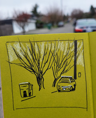
1/26/23 Trash day, Maple Leaf neighborhood

Please indulge me while I rant:

Anyone who has read my blog for longer than a minute knows that I am a process-oriented artist. I enjoy thinking about and writing about what is going on in my mind as well as on the paper as I draw. More importantly, I learn from that kind of thinking and writing, so my process is both purposeful and motivating. Documenting that process is the primary purpose of this blog.

If you follow a lot of artists on Instagram or other social media, you know that producing “process” videos is a thing. A big thing. Apparently artists are under enormous pressure to post such videos because the almighty algorithm favors them, garnering more followers and likes. 

Call me old-fashioned, but I have an attention span longer than three seconds. Reducing an hour of work to a few seconds of jittery, frenetic, time-lapse travesties, these videos often do not even reward the viewer with a still image of the finished work at the end – it just instantly repeats! That is no way to view art. It is also taking a presumably relaxing, enjoyable, even meditative process and making it look like an epileptic seizure. 

These videos have nothing to do with “process,” since the viewer is not privy to the thinking behind whatever convulsive behavior we are seeing the artists hand and pen or brush doing. We might be able to guess a choice that was made, based on what we saw in a flash now long gone, but we can’t go back to consider it, because on Instagram, you can’t rewind – you can only start over and hope that you pause at the right moment (not that I have ever bothered). When I know a video like that is beginning, I scroll right past. And if an artist posts nothing but videos like that, I stop following.

By contrast, Instead of a “process” video, Matt Gibbons recently posted a still image of a lovely painting. I would have enjoyed simply viewing it at my leisure, but he also gave me three sentences describing his intention, how he tried to execute it, possibly less successfully than he had wanted, and a concluding thought. I’m guessing that writing those three sentences took less time and effort than setting up lights and a phone over a desk to produce a time-lapse video. Understanding his process enhanced my appreciation for his painting tenfold (even if I didn’t agree with his assessment that it wasn’t quite successful), and I also learned from it.

He does occasionally post time-lapse videos, but they are tolerable because they are few and far between his other posts of fresh, delightful sketches (many of which are done on disposable coffee cups!).

I guess it’s not a thing, but I wish more artists would take a moment to write a sentence or two about what they were thinking when they made the work. I will always stop to read and view more closely. And what a bonus if I learn from it!

End of rant. 

Ironically, I have no process thoughts to share about today’s sketch, which was made on trash day. As I sketched, a collection truck came by to pick up these cans, and I saw the pressure the collectors are under to work quickly, a line of cars stacked up behind their truck. My only thoughts were of appreciation for this service that we usually take for granted (until the service isn’t there).

Friday, January 27, 2023

UW Biology Greenhouse

1/25/23 UW Biology Greenhouse Bromeliad room


It may have been cloudy and chilly on Wednesday, but USk Seattle members stayed toasty-warm. Sketching inside the University of Washington Biology Greenhouse, we were dazzled by all the plant species we could sketch. Completely rebuilt and newly reopened at the end of 2022, the greenhouse is open to the public weekly, but we got an exclusive visit to ourselves so that we could sketch at our leisure. What a treat!

It had been nearly 10 years since USk Seattle met at the UW’s old greenhouse facility, which was in the same location but much smaller. After facility manager Katie gave us a tour,  I spent a while just walking through the various labs trying to focus. If I’d had all day, I might have comfied up with a stool and picked one plant to do a detailed botanical study, but with Urban Sketchers, I felt more like making a variety of vignettes instead. I started with a corner of the Bromeliad Room, also called the Tree of Life Room, where Kim was sketching an enormous dark red and green Vriesea imperialis (above).

Inspired by the imperialis’ gorgeous hues, I spotted a slightly hairy, carnivorous Nepenthes alata (blossom? leaf?), also known as a tropical pitcher plant, in similar colors. The bold vein pattern on an Alocasia micholitziana, also called green velvet taro, seemed like it should be easy to sketch, but its completely matte surface had no reflection or shadow to help me with form. The pitcher plant was easier in that regard.

Two fascinating and beautiful plant parts

In the few minutes before the throwdown, I made a quick sketch of some plants against a corridor window.

Facility manager Katie giving us tour and corridor plants.

Many thanks to UW Biology for giving USk Seattle full run of the place! We certainly intend to make this venue a winter mainstay.


Thursday, January 26, 2023

Did I Really Sketch Today?

1/3/23 Rainy in Maple Leaf.

Richard Johnson is well known for his many years of sketch reportage for The Washington Post. Literally working in the trenches of military combat, he exemplifies capturing life from direct observation on location. In an Instagram post covering US Marine Corp Operation Freezing Winds in Finland, Johnson says, “There is something far more real about a bad drawing attempted live, than a good studio drawing any day of the week.”

I enjoy using the wet, dark days of winter to experiment with color, composition or other elements by working with photos, comfy in my studio. After making peace with drawing from photos, I’ve done more than usual of this type of study in recent months, and I’m learning much from it. I don’t often take the time for that kind of study during the good-weather months when I’m too busy sketching outdoors.

1/11/23 Green Lake
By comparison, the tiny sketches I make on my fitness walks are often hasty scribbles captured before my hands go numb. I’m not in the trenches. And yet those scribbles always feel far more “real” to me than anything I do in the studio. If I’ve done nothing but draw from photos, I may have learned, yet I end the day wondering, “Did I really sketch today?”


1/11/23 Interstate 5 from Ravenna Blvd.

1/19/23 Roosevelt neighborhood

10/29/22 Kona Kitchen from Javasti Coffee, Maple Leaf

11/9/22 Green Lake neighborhood

11/9/22 trees at Green Lake

11/14/22 Green Lake

11/23/22 Maple Leaf neighborhood

11/25/22 Rainy at Green Lake.

11/28/22 Green Lake neighborhood

12/5/22 roofers in Maple Leaf

12/26/22 Trees wrapped in lights, Green Lake Village

Wednesday, January 25, 2023

Review: Techjob Mechanical Colored Pencils


A set of 36 Techjob mechanical colored pencils

How the heck did I even get on the Amazon trail that led me to these pencils? I can tell you for sure that I was not searching for “mechanical colored pencils.” For one thing, I generally prefer woodcased pencils over mechanical lead holders any day (epic searches not withstanding). And for another, almost all colored leads are hard, low in pigment and usually disappointing in other ways.

Whatever I was actually looking for, Amazon presented me with a set of 36 Techjob Mechanical Colored Pencils. With mild curiosity, I scanned the reviews, which were surprisingly positive. Being in the depths of the dark, cold, wet winter doldrums, $17.99 seemed a low price to pay for potential entertainment. I bit. (Ah, Amazon, you win again.)

The non-water-soluble Techjob pencils (I can’t imagine what kind of technical job would use these pencils, but I hope, somewhere in the world, there is one) with “free cutting color leads” come in a distinctive, sensible, oval-shaped plastic tube. It takes up little space on the desktop compared to the flat tins that most sets of 36 pencils come in, and the pencils are easy to pull out. I like that.

End caps indicate the color numbers.

Less likeable is the esthetic of the pencil itself, which, despite its desire to resemble its woodcased counterpart, looks and feels very . . . plasticky. The color-matched end cap, which looks like an eraser attached with a ferrule, pulls off for lead insertion. The end cap also identifies the color number (a color name does not appear on the barrel).


When I first opened the container, I saw what looked like an empty tube that I thought was intended for storing refill leads. Instead, it turned out to be the included
 “free pencil sharpner” [sic], and a good one, at that. Although many lead holders come with pointers either attached or as separate units, most are open, allowing the shavings to fall out, so they have to be held over a wastebasket while in use. The Techjob’s lead pointer enables shavings to fall neatly into the transparent tube, and the cap snaps shut over the pointer. (I do fear for the longevity of the cap’s hinge, however; it feels like it could break off at any moment.)

Lead pointer

Shavings drop down into the tube.

Swatching the 36 colors in a Stillman & Birn Alpha sketchbook, which has a medium tooth, I was immediately impressed by the pigment level and vibrancy. The 2.6mm leads are as soft and vibrant as the Caran d’Ache 2mm colored leads I reviewed a few years ago for the Well-Appointed Desk – but at one-tenth the price! The slightly crayon-y leads produce some dust, but not an intolerable amount.

Each swatch is 3 layers in a Stillman & Birn Alpha sketchbook.

I compared the white Techjob to a white Prismacolor, and they are equally opaque. The set also includes metallic gold and silver (the sparkle doesn’t show much when scanned, but they are average for metallic colored pencils).

Swatches made in black Uglybook.

For my first test sketch, I picked out three pencils that come closest to a Zorn palette for a portrait from an Earthsworld photo reference. In a relatively smooth Stillman & Birn Zeta sketchbook, the leads were easy to apply and blend multiple layers. I spent more time on this portrait than I usually do because the pencils are so enjoyable to use. Their softness meant that I had to sharpen often, but I like the tidy lead pointer.

1/21/23 Techjob mechanical colored pencils in S&B Zeta sketchbook
(Earthsworld reference photo)

I had so much fun on that portrait that I immediately made a second one, this time with a secondary triad and in the toothier Alpha sketchbook. You can see how soft the pencils are by the paper’s visible tooth, and yet I had no problem layering colors. Sometimes I don’t enjoy using soft pencils on paper this toothy, but these were just as pleasant to use as they were on the smoother Zeta.

1/21/23 Techjob mechanical colored pencils in S&B Alpha sketchbook
(Earthsworld reference photo)

At 50 cents each, these Techjob pencils are amazingly good! I am hard-pressed to think of any woodcased colored pencil in a similar price range that I enjoy using as much. They also set a technical precedence: I always thought that colored leads were hard and lacking in pigment because it was not possible for them to be made as soft as woodcased leads without the wood support. The Caran d’Ache leads mentioned earlier proved that it is possible to make soft leads – but at an extremely steep price (not to mention a range of only four colors). And now I see that it is possible to make excellent soft leads for a very low price.

Several Amazon reviewers had pointed out that refill leads were impossible to find; my own searches seem to confirm that. If no refills exist, I suppose that’s no worse than all the many sets of colored pencils on the market that offer no open-stock replacement singles. And yet it’s somehow worse to have a full set of refillable, color-matched mechanical pencils with nothing to refill them with. It’s hard to recommend all that plastic left behind with nothing to do.

One reviewer said that 2mm June Gold colored leads will fit, but I immediately tried mine, and they do not fit. Besides, I think the Techjob leads are better than June Gold (which, up to this point, would have been my recommendation for low-cost leads in a full range of colors). I don’t expect to use up all of these leads, but I’ll keep looking for refills, just on principle.

Oh – and wouldn’t it be nice if I also found a set of equally soft and highly pigmented water-soluble Techjob leads? That would make a better use case for plastic mechanical clutches: When I use the “licking” technique with woodcased pencils, I’m always concerned that the wood may be compromised if it doesn’t dry completely. A plastic barrel would be a practical solution. Something to put on next year’s sketch material wish list!


Fog with a Matte Finish


1/21/23 Maple Leaf neighborhood through our bedroom window, 8:30 a.m., 33 degrees F.


In addition to basic cold and rain, January in these parts is known for foggy mornings. It was already beginning to lift when I started this sketch at around 8:30 a.m., so I had to rush. On a whim, I grabbed a Faber-Castell Pitt Graphite Matt pencil, which I hadn’t used in a while, thinking it would be ideal for the flat, matte look of fog. I forgot, though, that one if its benefits is that it doesn’t smudge as much as standard graphite pencils, so it was harder to get the soft foggy look. Most of the smudginess that appears here probably came from the graphite that was already on the stump from previous drawings.

Tuesday, January 24, 2023

Color is the New Gray


1/16/23 Study from photo (Pitt pens and colored pencil in Uglybook)

As mentioned a couple of days ago, my intention has been to try using Faber-Castell Pitt Artist Brush Pens as the “underpainting” for sketches that I finish with watercolor pencils. I tried one sketch on location this way as well as a couple of urban scenes from photos (above and below). The concept is that the underpainting hue shows through the transparent pencil color, giving the overall hue greater complexity and richness, especially when the underpainting is a complement. That’s the idea, anyway, but I think I got away from the underpainting concept. My experiments with colored paper probably come closer, although I think it works better with more opaque media like gouache or oils that obscure more of the underpainting color.

1/16/23 study from photo (colored pencil in Uglybook)

1/8/23 Green Lake PCC salad bar (on location;
Pitt pens and colored pencil in Hahnemuhle sketchbook)

Along the way, however, I got the idea to try this concept with portraits. In my head, I was still thinking of these as underpainting studies, but after the first couple, I realized that what I was really doing was making a grisaille of sorts. I first learned about the grisaille from Steve Reddy, who uses varying dilutions of India ink to tone drawings, then paints over the grisaille with watercolors. I don’t care for that look because I think the grisaille muddies the luminous transparency of watercolors. The grisaille concept, however, is useful, because it forces me to establish the values firmly before proceeding with color.

The term grisaille, of course, isn’t correct, since it comes from the French term for gray. But whatever it’s called (I’m sure painters have a name for it), in principle, I’m doing the same thing: Establishing a base of values with color Pitt brush markers. In the first two portraits below, the markers are doing most of the work, and I used colored pencils mainly for details.

1/17/23 Pitt pens and Museum Aquarelle pencils
in Hahnemuhle sketchbook
(all portrait reference photos by Earthsworld)

1/17/23


Once I realized I was using a color “grisaille,” I actively started thinking about what each stage – marker and colored pencil – contributes to the drawing. If I do the “grisaille” stage correctly by firmly establishing the values, then the drawing should look almost complete. What I don’t like about markers is the marker-y look: the blunt, harsh marks. They are diametrically opposite of what I love so much about a pencil’s ability to modulate tones gradually. So I gave colored pencil the job of softening the harshness. Applying water as a final step could further soften and blend.

In the silver-haired lady below, I used a dry watercolor pencil to shade the face in a softer, more transparent way than the marker would.

1/18/23 Pitt pens in Hahnemuhle sketchbook

Pitt pens and dry Museum Aquarelle pencil

For the silver-haired man, I used all three stages: 1. The marker grisaille to establish values; 2. Colored pencil to soften the hard marks (I could have stopped here and been happy); 3. Water to further blend and soften edges. Interesting results, right? (Except the bad sunburn I gave him – even worse than the one he already had. Earthsworld shoots most of his portraits at outdoor fairs, and many of his models look like they didn’t use enough sunscreen!)

1/19/23 Stage 1: Pitt markers to establish values

Stage 2: Museum Aquarelle pencils to soften marks

Stage 3: Water added to further blend transitions

I enjoy making these, and this color “grisaille” thing is worth exploring further. It’s easier to practice on portraits when I can quickly pick faces with strong contrasts from Earthsworld’s huge library. Eventually I’d like to try this on location, but it’s hard to find winter scenes with good tonal contrasts as well as “something” to sketch. (My sketch above of PCC’s salad bar was one of the least inspiring scenes I’ve attempted in a while!) I’m snapping photos on my walks, though, and maybe I’ll be able to practice from photos by bumping up the contrast.

Related Posts Plugin for WordPress, Blogger...