Tuesday, February 28, 2023

Trash Day Mutterings


2/23/23 Maple Leaf neighborhood

It was 31 degrees and overcast on trash day. I had no intention of sketching outdoors, but on my way home from an appointment, I pulled over in the neighborhood to make this sketch from my car. Here are a few things I muttered about to myself that day:

Values: When I scanned the image (below), I realized that my darkest values were a bit wimpy. After those experiments in January, I had sort of forgotten about using a Faber-Castell Pitt Artist Brush Pen as a color-based “grisaille,” which I think would have helped this composition without strong lighting or shadows. But it wasn’t too late: I got out a dark violet Pitt pen and darkened a few spots in the sketch, and I think it’s better now (top of post). I have to remember to use it when I need to.

Wimpy values (without the Pitt pen).

Sketchbook size:
I’ve made only a few sketches in it so far, but my new A6 Hahnemühle sketchbook is giving me a lot more freedom to use color spontaneously because it stays with me in my small fitness-walking Rickshaw bag. I tend to take the small bag almost everywhere now, not just on walks, because it’s so much lighter and slimmer than my long-time daily-carry larger Rickshaw. In other words, my fitness-walking bag has become my daily-carry.

The only times I still use my larger Rickshaw are when I plan to use my A5 Hahnemühle sketchbook. If it weren’t for that, I probably would have switched to the smaller bag full-time long ago. I’ve enjoyed using the A6 book enough so far that I’ve started wondering if it could become my full-time sketchbook? An A6 page spread opens to the size of an A5 when I want more space (though I’d have to contend with the gutter, which I don’t enjoy doing).

A6 vs. A5: Can I stand the smaller real estate full-time?

Whoa, switching full-time to a pocket-size sketchbook would be quite a shift for me. I guess the only way to find out is to carry only the small A6 the next time I think I would prefer my larger A5 and see how it goes.


Monday, February 27, 2023

Fat (and Sugar) Tuesday

2/21/23 Top Pot Doughnuts, Wedgwood neighborhood

Fat Tuesday was a good excuse to have a donut. The Wedgwood Top Pot was almost as quiet as the last time I was there, but I didn’t mind: The one patron who stayed long enough to sketch was beautifully backlit by the large front window. A high window on his right side complicated the lighting on his back, but I enjoyed the challenge.

I wish I could have worked on this guy
more, but he got away too fast.


An apple fritter and colored pencils... does it get any better?
This sketch also became a lesson in using watercolor pencils. As my primary color medium for going on seven years, watercolor pencils should be second nature to me by now, and yet they still present surprising challenges at times. I knew I wanted to leave the color on the man unactivated because I prefer the subtle gradations I can get with dry pencils (like that subtle shift on the back of his head). But to make the slivers of backlighting stand out on the left side of his face and shoulder, I had to intensify and darken the background bookshelves. 

When I activated the books with water, though, they stood out too strongly, so I had to go back in and intensify everything with more dry pigment. Ultimately, I think the whole sketch improved with my being “forced” to add more color, but it was one of those humbling moments when I see that I am still not a master of my medium and always have more to learn.

Sunday, February 26, 2023

Secondary Triad Portraits


2/18/23 Derwent Lightfast pencils in Stillman & Birn Zeta sketchbook 

After making that portrait of Gabi with a secondary triad (which was mostly a whim), I got interested in the idea of trying more portraits with secondaries (the first three shown here). It brought back to mind the color temperature concepts I learned from Sarah Bixler more than a year ago.

Obviously, the secondary triad hues are difficult (and generally unflattering) to use for skin tones, especially green, but let’s be honest – the portrait practice I’ve been doing is not with the intention of flattering the models! Once I let go of the zombie potential, I started becoming fascinated with mixing interesting neutrals and trying to convey values based on color temperature. All three of these Earthsworld reference photos were taken in flat lighting, which made them even more challenging. On the other hand, the absence of sharp shadows and strong highlights gave me more opportunities to work on subtle value shifts based on color temperature.

2/19/23 Lightfast pencils in S&B Zeta sketchbook

My general approach is to begin with the lightest/warmest value (orange) to block in the large shapes and features lightly and to color the overall face. Then I use the darkest/coolest value (violet) to gradually darken values. Finally, I mix in green in some areas to continue neutralizing the hues. The greens I’ve chosen in these three examples are cool – close to my urban sketching “cool” secondary triad for winter – so it’s in between warm orange and cool violet, but closer to violet.

2/19/23 Bic ballpoints and Walnut Hollow pencil in Uglybook

The weirdest mixed-media attempt is at right: Bic ballpoint with colored pencil! I don’t normally mix ballpoint with pencil – to me, they are the wrong textures to combine – but my motivation was less than inspirational. It was a late-evening sketch, and my “downstairs studio” contained purple and green Bics, but the orange was upstairs. What the heck – I grabbed a convenient orange pencil. Laziness is the mother of creativity.

Most of the other portraits in this post (all references by Earthsworld) were made in my more conventional manner with two colors – a cool and a warm or a light and a dark – which is the simplest way to make value studies of faces.

2/13/23 Faber-Castell Pitt Artist brush pen and
Walnut Hollow colored pencils in Uglybook 

2/13/23 Walnut Hollow colored pencils in Uglybook

As for resemblance, I find I still grapple with my own need for it. When I try a looser approach, such as the long-haired man below, its at the expense of likeness. When I’m “tight,” I have a better chance of capturing resemblance (most of these are not too bad in that regard). I keep telling myself that resemblance is not the only goal for portraiture and that I shouldn’t care so much about it, but then I do. It’s hard to let go.

2/13/23 Pitt Artist pen, Walnut Hollow colored pencils
in Uglybook

Looseness at the expense of resemblance.


2/15/23 Conte pastel pencils in Uglybook

Probably my best capture of resemblance among the examples
shown here, but also one of the "tightest."


Saturday, February 25, 2023

Trapped


2/20/23 Finally caught.

For more than three weeks, a squirrel had been living under the dormer roof just above our bedroom. It woke us at night with its loud scurrying, digging and who-knows-what-all. Three small holes in our ceiling appeared, and it amazes me that a critter without a beak could do such damage. Two traps had been set.

After much frustration on our part, two squirrels were finally trapped one night. At least one was the guilty party, and it was quiet for two days, so workers at Willard’s Pest Control made repairs to the roof where the critters had gotten in. 

Much to our aggravation, another squirrel must have snuck in before the repairs, and we have had to start over with more traps! I can hear it scrabbling around up there even as I type this.

I’m not happy about euthanizing any animal (especially when I’ve enjoyed sketching their brethren), but I’m also not happy about damage to our roof and ceiling.

Willard’s Pest Control told us that if the trapped squirrels turn out to be native species, they would be relocated instead of killed. Unfortunately, the common Eastern gray squirrels we trapped were out of luck.

One of two squirrels that were trapped in one night.

Friday, February 24, 2023

Greenwood Public Library

2/17/23 Greenwood library

I already miss my easy walk to the library whenever I want a book. The Green Lake Branch of the Seattle Public Library, my “home” branch, is closed until early next year for a seismic retrofit. The book I had on hold got sent to the Greenwood Branch for pickup, which is definitely not within easy walking distance, but it does have the advantage of underground parking.

On the drizzly morning when I went to get my book, I opted to park across the street so that I could make a quick sketch of the library. It’s not a lovely Carnegie building like the Green Lake Branch, but it’s large, modern and bright. I knew I would be there only for a few minutes, so I parked on the wrong side of the street. Before I could finish, though, this guy parked even more illegally than I did (right on the corner beyond the sign saying “no parking east of here”), blocking much of my view. How rude!

How rude!

Incidentally, I recently read an article about the relative “walkability” of Seattle neighborhoods. According to one definition, a walkable neighborhood is one in which a resident could walk to food stores, public libraries, parks, public transportation stops, restaurants, coffee shops and public schools within 15 minutes. Apparently Paris is a model for this ideal. Paris it ain’t, but based on these criteria, I’m pleased to say that Maple Leaf qualifies as an ideal neighborhood.

Thursday, February 23, 2023

Review: Derwent Metallic Colored Pencils (20th Anniversary Limited Edition)


Shiny!

Did I really say out loud that I don’t care for metallic colored pencils? I can’t imagine, then, how this Derwent 20th Anniversary Limited Edition set fell into my shopping cart, but stranger things have happened.

Other than Lightfast and the limited-palette Drawing Pencils, Derwent products do not impress me, and I’m not a general fan of the company (as I am of Caran d’Ache, for example), so I had no compelling reason to buy this commemorative set rather than a standard edition set. But since the per-pencil price is about the same, it didn’t take long to talk myself into it. (This set can be purchased on Amazon and elsewhere, but I enjoy shopping at Cult Pens, which has excellent customer service and carries some items not available in the US, like the Tombow Urban Sketching Set I reviewed recently.) The pencils are still made in Great Britain.

If you already have Derwent’s metallic pencils in smaller sets or open stock, you’ll find that the colors in the anniversary set are not new or exclusive. However, Derwent has put them together in a nice gift box that isn’t over-the-top too fancy and pricey for everyday use (like so many wood case sets we’ve all seen). In fact, I like this simple clamshell box with a magnetic closure much better than the tins with detached lids that Derwent pencils usually come in (the lids never seem to close without struggle).

A practical clamshell box with magnetic closure

A foam tray stores the pencils neatly and safely. Mine came from the UK without any of the pencils getting loose, which has not been the case with some tins with plastic trays.

The foam tray keeps the pencils in place.

The hexagonal barrel has a metallic coppery paint with Derwent’s diagonal end cap indicating the color. The color name and number appear on one facet.

Metallic coppery paint on a hexagonal barrel

Derwent's trademark diagonal end cap


Making color swatches indicated that they are softer than I expected, but not in a “creamy” way. They feel more powdery and dry, and they do produce a bit of dust (not nearly as much as the Cretacolor Mega Color metallics, though). As I’ve come to learn from the few metallic pencils I’ve tried, even when other colors are soft (like Prismacolors), metallic hues tend to be harder and drier, which must have something to do with the sparkly ingredients.

Scanned image (all the sparkle goes flat)

Photographed image shows the sparkle a bit better.

The most challenging part about reviewing metallic colored pencils is trying to show how shiny they are. Scanning takes all the sparkle out of my images, so I have also included photographs with my desk light shining directly on the page, which then also makes bad reflections on the black Stillman & Birn Nova sketchbook. It may not show in these images, but they seem plenty sparkly to me.

Instead of looking for something shiny to draw, I first used an Earthsworld photo and sketched the portrait in the black Nova sketchbook. (Whoa, it was challenging to draw all the lighter parts of the face and leave the features the black of the page! It’s always a good brain workout to do this kind of negative sketch occasionally.)

2/15/23 Derwent metallic pencils in Stillman & Birn Nova sketchbook (scanned image)

Photographed image

Then, temporarily overcoming my snobbishness that metallic pencils are a cheap shortcut to rendering metallic surfaces, I couldn’t resist drawing something shiny – a Graf von Faber-Castell ink bottle with a chrome-like cap. Honestly, I think an ordinary white pencil could have done the job better (and I did use a white Prismacolor on the brightest spots where the cap reflected the white paper under the bottle).

2/16/23 Derwent metallic pencils and white Prismacolor in Nova sketchbook (scanned image)

Photographed image

I’m not jumping up and down with excitement, but I’m not disappointed, either. Though their application may be limited, metallic pencils are fun to use, especially on black paper. I’m looking forward to using these on nocturnes next holiday season.

Wednesday, February 22, 2023

Unidentified at Green Lake

2/15/23 Green Lake Park

Although this is one of my simplest compositions of them, I’ve sketched these trees at Green Lake Park many times. This sketch from 2015 shows the whole row of them. One of my better compositions, this one is from 2020; I sketched it from the best window at Starbucks. When I sketched them in 2016, I was with USk Seattle. And here’s another from 2020 that shows more detail of their knotty trunks.

They are among my favorite trees at the park and possibly among my favorites in the whole city, but I have yet to find out what kind they are. The city parks department has published a map of the major trees growing around the lake’s periphery, but these trees are at the edge of the park a distance from the lake itself, so they aren’t included on the map. This spring when their leaves return, I’ll take some photos to help me identify them once and for all.

Color and paper notes: This simple sketch shows why I love a secondary triad so much. There was a time when I would have used some generic brown to draw tree trunks. With a secondary triad in my palette (and in my brain), look at that lively neutral mix I got from dark violet and orange! It’s hard to ever go back to brown.

Someday soon I'll ID these lovely trees.
As for paper, I wanted to show some bark texture, and since it was only 41 degrees out, I wanted to do it quickly. Having my new A6-size Hahnemühle in my walking bag made that easy – the toothy texture was just right, and so was the page size. In 10 minutes, I was done.


Tuesday, February 21, 2023

Gabi on the Reportage Experience


2/16/23 Gabi on Zoom talking about sketch reportage

Since last summer, Gabi Campanario has been publishing a Substack newsletter called On the Spot, which focuses on reportage sketching. His first Zoom presentation exclusive to paying subscribers was all about his decade-plus of weekly reportage experience for The Seattle Times.

Although we think of the art in the forefront of reportage illustration, he stressed the importance of writing, which supports the sketch in telling the complete story. Using three specific reportage examples, he shared in-depth details about how he got the ideas and how he planned and conducted research before sketching. “It’s not sketching in the park with a friend,” he said. While covering the story, “you are always ‘on’,” working in sometimes intense or rapidly changing conditions that require flexibility. He also offered practical advice to wannabe reportage artists, such as knowing where to find a restroom when you need a break. He often spent as long as five hours at a time on location covering a story or went back a second day to finish the work.

As a journalist, he can’t cover a story just because it’s interesting to him. He must always be aware of why the story would be of interest to his readers. To be newsworthy, a story must also be timely. He continually asks himself, “Why should readers care? So what? Why now?” He keeps that focus firmly in mind while he’s on location because it’s easy to get distracted.

Using the example of the historic Elephant Car Wash sign, he said the story was not just a sketch of the beloved, iconic sign itself. “I’m always looking for the context.” In this case, it was about growth in the South Lake Union area and the car wash’s closure.


More than 30 of his worldwide paying subscribers joined what he called his “brown bag presentation” (around lunchtime Seattle time). Based on their questions, some were already working sketch journalists themselves, while others hoped to bring their urban sketching to the next level. Still others, like me, simply wanted to learn more about sketch reportage while supporting Gabi’s latest ventures. (Of course, I had the ulterior motive of a portrait practice opportunity.)

As a long-time fan of his weekly Seattle Times column (who was very sad when he finally retired the column a couple of years ago), I was impressed to learn that he had published a total of 989 columns during The Seattle Sketcher’s career! That’s a lot of reportage!

Gabi plans to offer monthly presentations to his supporters on various reportage topics.

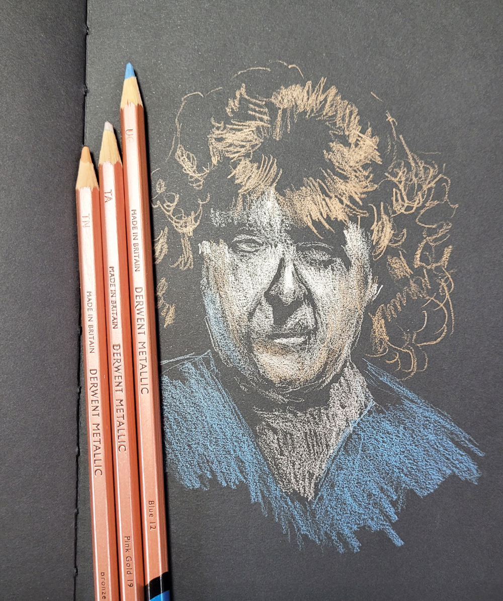
Derwent Lightfast secondary triad

Palette notes: What do you think of the secondary triad I chose for this portrait of Gabi? I’ve used a more saturated “summer” secondary triad to sketch portraits in the past, but this time I thought I’d try a more subdued trio using Derwent Lightfast pencils: Olive Earth, Mars Orange and Violet. It’s similar to the “winter” secondary triad I’m using now for urban sketching except the green is warmer. I started to use a bit of the green on his face, but I pulled back when I didn’t like the mix (and I think the orange and violet alone made a vibrant neutral for facial tones). Next time I might go with a cooler green and see how that works on faces as well as trees.

Process notes: I think this was my first opportunity to sketch someone live on Zoom (I don’t count my selfie) since I started practicing portraiture last fall. A moving, talking person is not as easy to sketch as a reference photo, but I realized that all the practice I’ve done from photos certainly helped a lot. I’ve gotten used to eyeballing proportions without measuring (which is hard to do when the model is constantly moving his head), and I knew where to look for key facial planes to block in the face quickly. I don’t know if Gabi’s wife Michelle or his mother would agree, but I think I captured some likeness. (Well, I may have given him a few extra pounds. Sorry, Gabi.) Ideally, this is the way I’d love to be able to sketch any portrait: From a live model who isn’t necessarily posing but maybe just talking naturally as I sketch. After all, that’s how a reportage sketcher would do it.

Monday, February 20, 2023

The Impulse to Capture


1/23/23 Green Lake

Though it’s tough on cold, windy, drizzly days (I draw the line at hard rain), my walk-sketching fitness program continues. My carrot on the stick is always an opportunity to sketch something, anything, in the neighborhood. Even when I feel too cold to pull the tops off my convertible mittens long enough to sketch, I’m always happy afterwards that I did. Because any sketch on location is better than no sketch on location.

One day I wanted to make a postcard for someone, but the weather had been inhospitable, and I wasn’t sure when it would improve long enough to make one. The solution was simple: I grabbed a Hahnemühle postcard on my way out the door for my fitness walk (below). I knew that I probably wouldn’t find anything “special” to sketch, but then, when do I ever? The subject matter is never as important as the impulse to capture it or the desire to say, “I thought about you as I made this sketch.”


1/28/23 Maple Leaf

1/28/23 Maple Leaf

1/28/23 Maple Leaf

1/29/23 Mt. Rainier from Maple Leaf Park

2/1/23 Green Lake

2/3/23 Maple Leaf

2/13/23 Green Lake
2/13/23 Green Lake


Sunday, February 19, 2023

Violet Sky

2/14/23 Green Lake

My weekly walking partner and I had been touring other neighborhoods the past couple of months, but we’re back on track now at Green Lake. Despite the dusting of snow Tuesday morning (which thawed before noon), the sun was supposed to make an appearance by afternoon. I arrived a few minutes early for our walk to make this sketch from my parking spot facing the lake.

Palette notes: After last fall’s secondary triad experiments, I have continued to stay with secondaries for the most part. Their subdued mixes work well for winter’s somber hues. In fact, I removed the warmer secondary hues from my kit and have been using a cool secondary triad. However, I also added a few more colors to make a full palette, but it’s definitely not a random rainbow. As I pondered in November, my satisfaction with secondary triads made me think I could go most of the year with that scheme if I added a CMYK-based primary triad for the summer months.

Somewhere around that time I landed on the palette shown here as my daily-carry, and it has been serving me well: a cool secondary triad, a CMYK primary triad, and my convenience “heavy equipment yellow.” I think I’d be happy with this palette year-round (though I’d probably switch to a warmer secondary in summer).

All colors are Caran d'Ache Museum Aquarelle

A sketch like the one above always presents a challenge: When I decide to use a secondary palette, I like to stay with it and avoid bringing in other hues. The cyan in my palette is wrong for another reason – it’s a summer-sky blue, which just isn’t right for winter. That means the sky must be violet. This literal colorist still needs to pause for a second before making the sky purple, but it’s good for me to get this shove. And I never regret the result.

By the way, the credit for those clouds (a happy accident) goes to the Hahnemühle 100 percent cotton again.


Saturday, February 18, 2023

A Few Reflections on COVID


1/22/23 Dusk

Whenever I blogged about the daily sketches of my hand during the Before Vax Times (my term for that era, which was distinctly different from the current Not-Yet-After Times), I often used the opportunity to express my anxiety, grief, outrage and insights about the pandemic. Now that I’m fully recovered from COVID-19 and have had some time to process, I thought I’d use my blog to reflect again, this time from the other side.

First, I can’t help but begin with anything but gratitude for all the science and sacrifice that went into development of the vaccines that kept my symptoms light and tolerable. Although I had some anxiety about potential long-term consequences, I never feared that COVID would kill me. I had full faith that all those boosters (each one of which caused me inconvenient side effects at the time) would do their job, and they did.

1/23/23 Dusk

During the course of the pandemic, I have felt a moral and social obligation to help protect others, but let’s be honest: My first priority has always been protecting myself. Sure, I knew my mask would help keep my potential cooties away from others, but I wore it to keep their cooties off me. 

Once I learned of my definite exposure, however, everything changed. Because I felt confident that the vaccines would help me recover relatively easily, my primary concern shifted to others – specifically the spouse guy I was trying to protect (our caution paid off, and he dodged the bullet completely). I also suddenly felt a much greater responsibility for protecting random strangers who might not recover as easily as I hoped to. The meme from the first pandemic year, “Don’t kill someone inadvertently,” took on greater meaning. Suddenly I had become the person that I had feared and avoided for three years.

1/26/23 Sunrise

My perspective also shifted in another way. For three years, I have been vigilant about avoiding large crowds and generally cautious about being around others. Even post-vax when I started venturing out more, I never stopped being cautious, especially indoors, but the face of COVID was always an anonymous stranger (or more like crowds of anonymous strangers). That’s why I find it deeply ironic that when COVID finally caught me, I was enjoying lunch with a dear, trusted friend.

Other than short masked walks around the neighborhood, I stayed home for 11 days, including six full days in isolation. When I finally tested negative and started running errands again, I felt oddly invincible. Oh, I’m fully aware that it’s still possible to get it again (many people have been through it multiple times by now), but I figure that during the days and weeks following my infection, my body has as much natural protection against these damn cooties as it will ever have. At least for a short while, I am among the least likely people to get COVID. Walking into a grocery store the other day (yes, still masked, of course), I felt safe for the first time since March 2020. It was a bit exhilarating! At least for a moment. (Edited 2/18/23: This article says I might be good for as long as 10 months.)

1/30/23 Sunset

During my solitary confinement, the only window in my sequestering room has a view of a scrappy corner of our backyard that is mostly blocked by a tree. I could barely see the sky. One of many things I missed was the luxury of running to any window of my choice to make quick, small skyscapito sketches like these. 

If there’s one thing the pandemic teaches me over and over, it’s that I must never take anything for granted.

2/11/23 Sunset

2/12/23 Sunset

2/13/23 Sunset

Related Posts Plugin for WordPress, Blogger...