Saturday, December 31, 2022

No Boring Mastery Here


11/2/22 Self-portrait in poor lighting... not my best look.

Writer and artist Austin Kleon has an intriguing post about the art of imperfection. It’s about happy accidents, allowing mistakes and repairs to show, and wabi-sabi. According to Austin’s matrix (go look at his post), the opposite end of the spectrum from imperfections and unintended actions are perfection and deliberate actions, with the result being boring mastery. I think we all know artists who may have fallen into this quadrant after years of success. They have boiled down their success to a formula that they keep following with perfect proficiency (rewarded by sales and acclaim). Unfortunately, the consequence is that they aren’t trying anything new.

I would hope that I never get to the point where I fall into boring mastery of any skill (which seems unlikely, as there’s always more to learn). In fact, I’d have to say that I spent most of 2022 in the other quadrants struggling, making mistakes and happy accidents, and pushing myself to keep going.

6/29/22 A violin busker at Wallingford Farmers Market

Although I took a few formal classes and workshops in drawing trees, taking on large urban scenes, and crosshatching, my most challenging learning opportunities were self-initiated and self-directed (and sometimes self-tortured). The biggest and longest challenge was the 100 days I spent in February through May trying to develop skills in drawing from memory and imagination. Whew – that was tough!

Then right on the heels of that, I spent 30 days in June making daily compositional studies. Studying composition with Ian Roberts’ YouTube tutorials possibly had the greatest impact on my art life in that it changed the way I see and approach composition.

The rest of the year I tried smaller, self-directed experiments and challenges, most of which are ongoing. During and after France Van Stone’s crosshatching courses, I used InkTober to continue practicing “dirty crosshatching,” especially with portraiture, which is a subject area I had been wanting to develop.

11/22/22 Compositional study from photo

Inspired by YouTubes, friends and other artists I follow, I’ve been poking around in the painting world – without ever touching a paint brush! Primary and secondary triads, the Zorn palette, “underpainting” – I’m teaching myself to think like a painter (and maybe someday I might even paint, but I’m in no hurry; there’s plenty to learn just using dry materials).

One surprising outcome of all my self-study was that I finally embraced drawing from photo references. As a dyed-in-the-wool urban sketcher, I resisted using photos for most of my first decade of drawing. I still believe strongly that drawing from direct observation is the most effective way to develop skills – and I believe there’s no substitute for it. But I now also see the value of using photo references for deliberate practice. Chiefly, using photos enables me to practice specific techniques and skills more often – and a key to developing skills is always practice. Accepting photo references as a part of learning became a learning in and of itself.

7/7/22 Geese at Gas Works Park

In summary, 2022 was a year of frustration, struggle, happy accidents, imperfection, joyous discovery and just about everything except boring mastery, which made it a very good year, indeed. I look forward to whatever new things I learn in 2023. Best wishes to you for a creative year ahead!

(On the last day of the year, my mom used to say it was good practice to pay bills, return letters and phone calls, and otherwise tie up loose ends before midnight so that old business wouldn’t be carried into the fresh year. Shown in this post are a few random sketches from 2022 that I never got around to blogging about. In most cases, my intention was to develop themes of related sketches to blog about together, but these ended up being one-offs.)

8/19/22 Ducks at Green Lake

Friday, December 30, 2022

Vintage Caran d’Ache Supracolor Soft Colored Pencils (and History Update)


The first edition of Supracolor Soft?

More than three years ago, I wrote a post summarizing everything I knew about the history of Caran d’Ache water-soluble colored pencils (and the Swiss company’s ever-confusing product names), including variations of Prismalo (I and II), Supracolor (I and II) and a generic “water-soluble” line. I’ve been updating that post as new information came to light from readers.

I recently acquired a couple of vintage Supracolor sets that initially raised new questions. Before I get to those, though, I need to begin with reader Julia who had contacted me more than a year ago. She had sent me images of her set of Supracolor Soft, purchased in 1993, that came in a mostly solid red tin with a large “Artists’ Colours” swash in the center. The pencils themselves had branding and design similar to my contemporary Supracolors except that the end caps were white instead of the same color as the barrel.

Fast-forward to a couple of months ago when another reader, Femma, contacted me initially with dating information about my oldest set of Prismalo. Based on my research and assumptions, I had deduced that my set could have been from the 1930s. However, Femma showed me images of a tin with a similar design that was from 1951, leading her to deduce that my set is from the ‘50s also, and her dating logic makes sense. It also fits with information I had learned about sculptor Alberto Giacometti’s Prismalo set, which was seen in his studio anytime after the late 1920s (information and a delightful image brought to my attention by yet another reader, George). Based on some preparatory drawings Giacometti had made, he was definitively using colored pencils in 1952 – likely that set of Prismalo. I’m now convinced that my oldest set is a couple of decades younger than my earlier deduction.

That was just the beginning of many interesting e-conversations with Femma, who also collects vintage Caran d’Ache colored pencils! Eventually we got around to her set of Supracolor Soft. In the images she sent me, it was clear that the tin matched exactly with the one I had seen in Julia’s images – mostly red with the “Artists’ Colours” design. Intriguingly, however, Femma’s tin of 18, purchased used, came filled not with Supracolors but with nameless Caran d’Ache pencils with three sailboats on the barrel. These “sailboat” pencils are identical to the ones I have that came in a different tin (shown in my Cd’A history post and below) – a blue background with three pencils. In the many examples I’ve seen on eBay, the blue tin with three pencils contains the “sailboat” pencils. These sets have been dated by sellers as originating in the early ‘60s.


These "sailboat" pencils came in the blue tin shown above.

Femma believes that when Caran d’Ache initially launched Supracolor Soft in 1988, the company wanted to use up their water-soluble “sailboat” inventory by filling early Supracolor tins with them. At first, this seemed intriguing, and if it was true, her set was likely quite rare. But the more I thought about it, the less it made sense. Why would Caran d’Ache release a brand new product emblazoned with “Artists’ Colours” on the tin but filled with an older product? I argued that the more likely scenario was that the seller or previous owner had replaced the Supracolors with the “sailboat” pencils. (Stay tuned for an upcoming post in which this scenario occurred with a different set of Caran d’Ache pencils I purchased.)

In any case, Femma surprised me by generously offering to give me the set, which I happily accepted! 

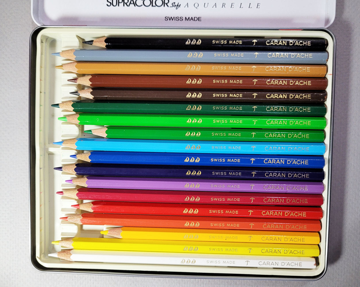
The tin that Femma kindly gave me contained the pencils shown below.


Curious about her hypothesis, as dubious as it seemed to me, I started searching eBay specifically for Supracolors in the same tin, which I had seen only rarely, in case another such existed containing “sailboats.” A set of 40 in the red tin was for sale on eBay, but it contained actual Supracolor Soft pencils. As this red tin design and the white-capped pencils are the first known design for Supracolor II Soft (as opposed to “Supracolor I” or “Supracolor Fine”), I snapped it up. I have since seen a few more Supracolor sets on eBay in the same tin design and containing the same Supracolor II Soft pencils. (Has anyone else who hunts regularly on the secondary market noticed that the thing you are searching for won’t appear for months and months, and then suddenly two or three show up in rapid succession? It’s the Universe rewarding you for your patience.)

Purchased on eBay

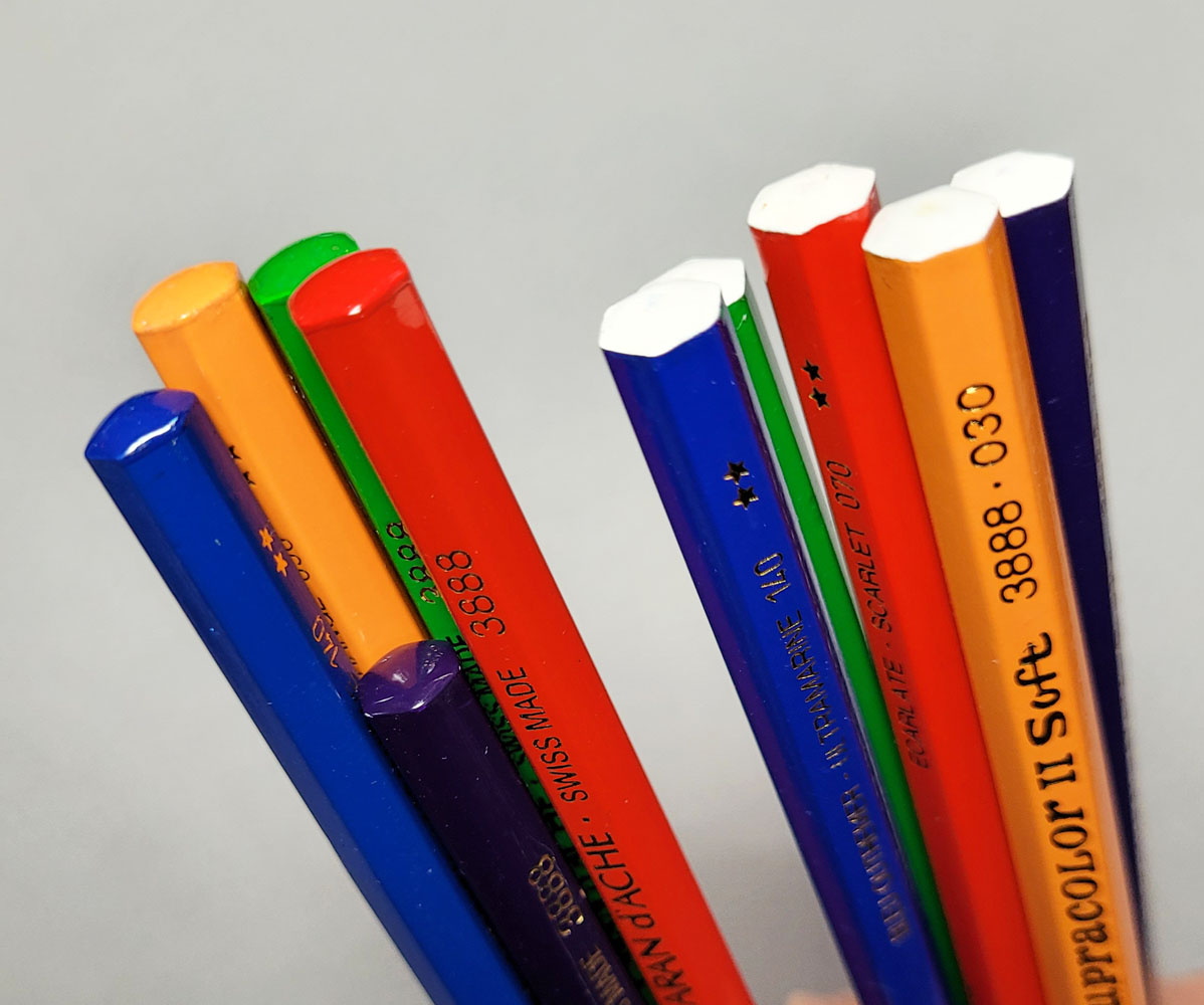
The set I purchased contains Supracolor II Soft pencils that look identical to the ones in the images Julia had sent me. The barrel design elements are similar to the contemporary design except the end cap is white (Prismalos of the same era also have a white end cap).

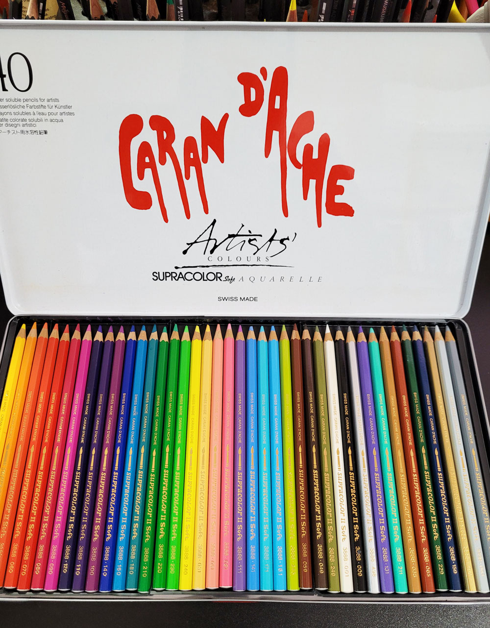
The set of 40 purchased on eBay


The top group are from the vintage set of 40; the lower group are my contemporary pencils.

The vintage pencils have white end caps.

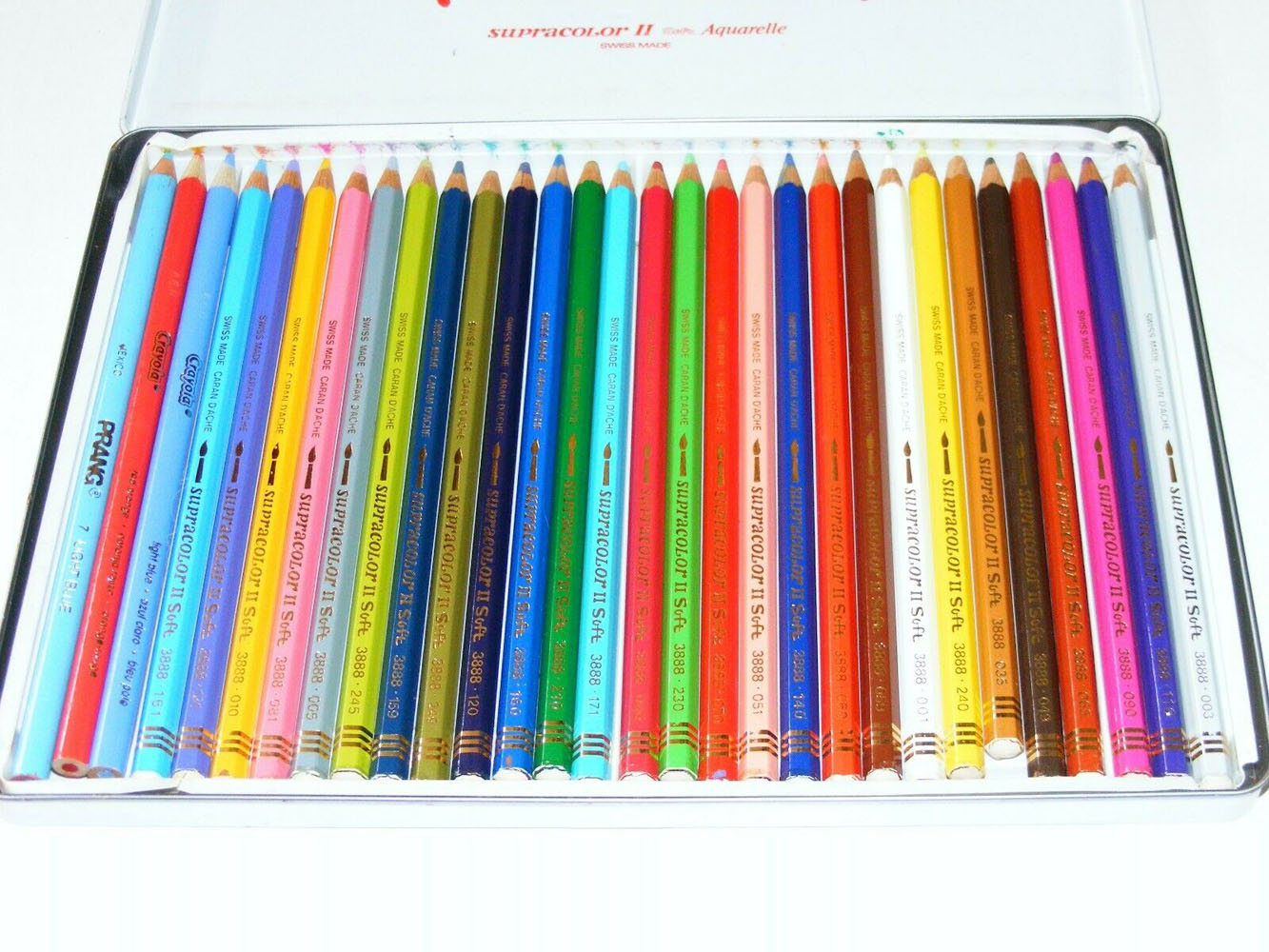
I made swatches of a few colors that were common or close in three sets – my contemporary Supracolors, the Supracolors that I bought on eBay, and the “sailboats” that Femma gave me. The vintage Supracolors are surprisingly close to my contemporary ones – maybe just slightly drier from age and with slightly less pigment. The “sailboats” are much harder and have less 
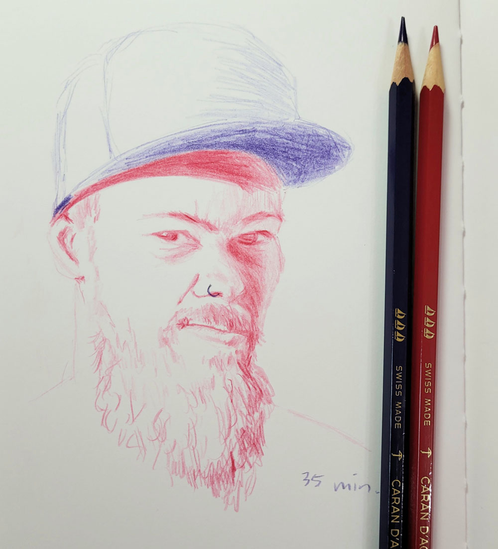
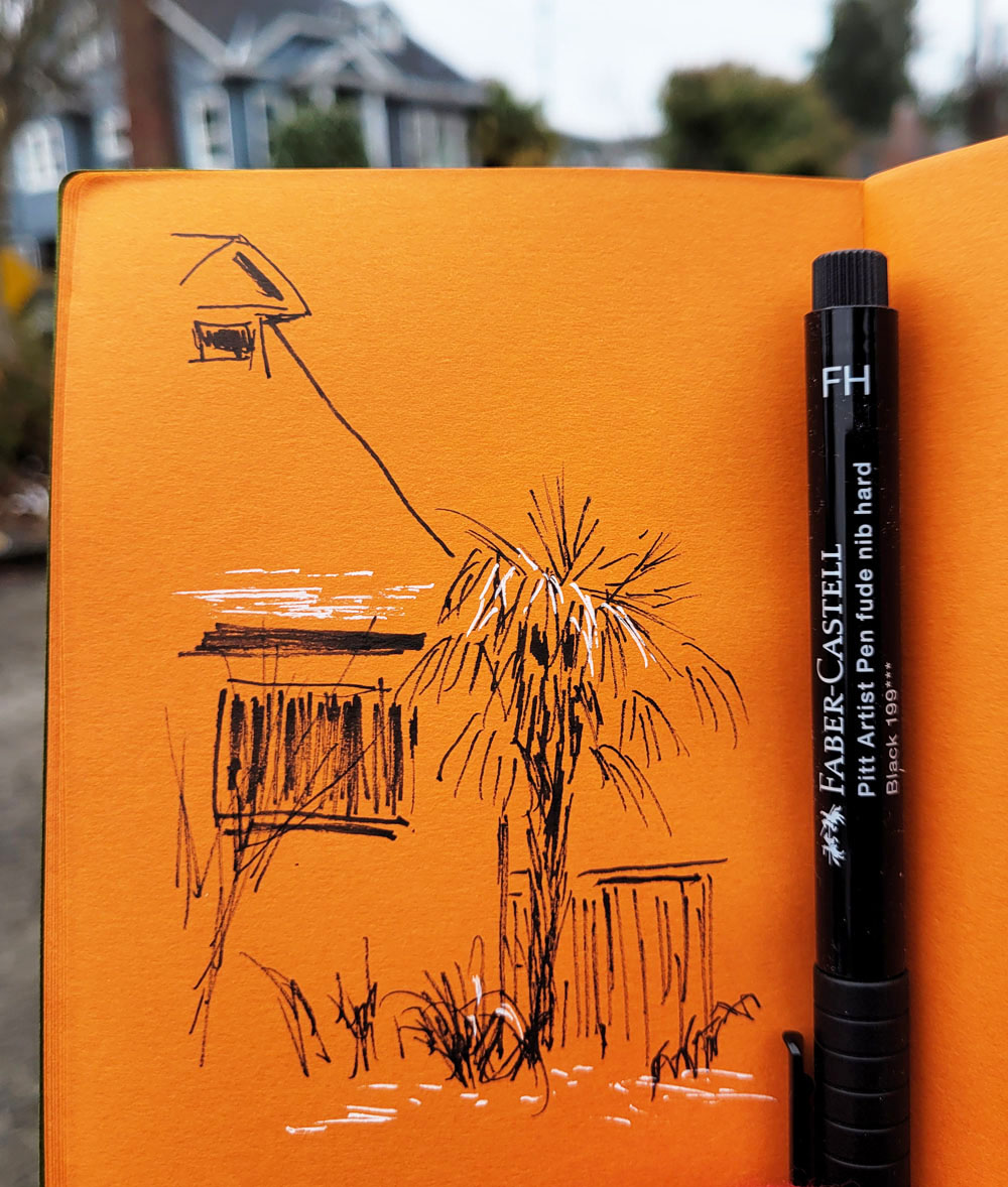
pigment – similar to Prismalo. I also made a sketch to see how they feel and perform.


12/19/22 Caran d'Ache "Sailboat" pencils in Stillman & Birn Zeta sketchbook
(Earthsworld photo reference)

If I would learn to use my analog calipers (which are as close to a slide rule as I have ever come and consequently cause me to break out in hives), I’d be able to tell you the exact diameter, but I think it’s clear in the image below that the “sailboat” cores are thinner than the Supracolor cores. In fact, they look the same thickness as Prismalos.

The "sailboat" cores are thinner than Supracolors.

In another Caran d’Ache mystery, why did the “sailboat” pencils exist when they were so close to Prismalo, Cd’A’s flagship at the time? The redundancy probably explains, however, why the “sailboats” eventually went out of production. In any case, they bear no resemblance to Supracolor Soft. I have no reason to believe that Cd’A would have filled Supracolor tins with the “sailboats,” even to use up inventory. In fact, if that were the case, Cd’A would have been better off filling Prismalo tins with “sailboats,” since they are a close match.

Although Julia’s set acquired in 1993 is strong enough dating evidence for me, determining when the product called Supracolor first appeared and what it looked like are a bit squishy. We must consider that for some muddled period, “Supracolor I” and “Supracolor Fine” were names used to identify what was actually the same product as Prismalo I. Does Caran d’Ache consider those uses of “Supracolor” to be the product’s birth, even if the product was different? And for some period, “Prismalo II” was the name used to identify the product that eventually became Supracolor Soft! (Ouch, my head aches.)

According to Atelier Caran d’Ache’s (unfortunately incomplete) product history, the product called Supracolor Soft was launched in 1988. I’m going to put a stake in the ground and say that the Supracolor Soft set in the red tin that I acquired on eBay is the first design of that product, and that’s the product that was officially born in 1988.

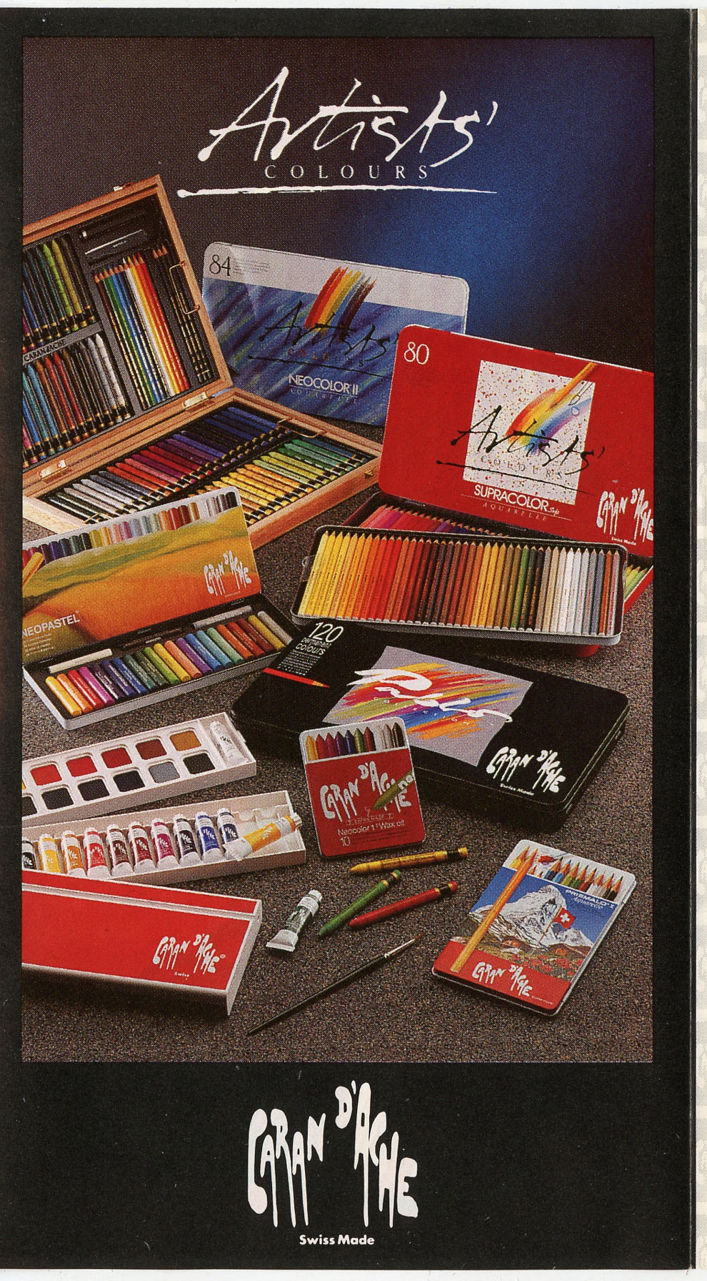
From a collecting standpoint, perhaps the most valuable item in the set I purchased is the brochure that came with it (see below). Along with Supracolor Soft, the cover shows all of Caran d’Ache’s color products of that time, including Pablo, Prismalo I, Neocolor I, Neocolor II, Neopastels, watercolors, gouache, and a lovely mixed-media set in a wooden box. The tin designs shown offer useful dating information. For example, the Prismalo I tin design with the Matterhorn and red flowers is the same as the one used for multiple versions of the product I now think of as Prismalo (the thinner, harder core) as seen in my history post. I had deduced at the time that my Prismalo sets were from the ‘90s, but their appearance in this 1988 brochure dates them as even older.

Edited 1/5/23: Correction: The Atelier Caran d'Ache historical timeline dates Pablo pencils as being introduced in 1990, so the brochure must have been produced since then. So my original dating hypothesis for my Prismalo sets still holds.

A valuable product brochure came with the set of 40.

Brochure image shows Caran d'Ache's color products of that time (1988).

I can’t end this post without a heart-felt thank you to my readers, especially Femma, Julia and George, for their valuable insights, information and even a very generous gift of pencils! Their feedback and conversations are what make the “vintage” part of my blog even more fun.

As far as I know, I am missing only one specimen from the Supracolor Soft line. The set shown below, too overpriced for a used, mixed set for me to buy, showed up on eBay (images below swiped from that listing) some months ago. The distinguishing design element are the three gold stripes near the end cap, which is white. They were sold in the tin shown, but since this dubious set includes random other pencils, who knows if they originally came in that tin. The triple-striped design must have come after the ones shown in this post and before the current design.

Since readers have been my best source of information, I will appeal to you now: Does anyone know anything about these triple-striped Supracolors and when they came out?

This image from an eBay listing shows the triple-striped Supracolor Soft pencil design. (A dubious specimen with random Prang and Crayola pencils thrown in to fill the tin.)

The tin shown with the pencils.

Thursday, December 29, 2022

Eclectic Top Nine


Nine Instagram posts that received the most "likes" in 2022

Despite some ambivalence, I usually jump on the Instagram Top 9 bandwagon each year (what else is social media for but to jump on bandwagons?). In case you’re unfamiliar with it, the Top 9 app generates the nine posts from an Instagram account with the greatest number of “likes” during the year. I’m usually indifferent or only mildly amused by the results. I know that the number of “likes” has more to do with algorithms (which I make no effort to learn about or try to turn to my advantage) that determine who sees my posts and rarely represents anything that is necessarily significant to me.

This year’s Top 9 was a rare exception: The grid includes an eclectic mix of my favorite things of the year or things that were otherwise special. I, too, give them a “like”! (You think maybe I like color? And that my followers do, too?) From top, left to right:

Wednesday, December 28, 2022

The Crayola Challenge


Mini-sized pencils, jumbo-sized aggravation.

Sarah Renae Clark is a popular, entertaining YouTuber who reviews lots of colored pencils and also designs coloring books. (If you think I have a lot of colored pencils, you should view this video in which she claims to have purchased every colored pencil she could get her hands on “to find the best colored pencils in the world.” More than 4,000 pencils! I’m not worthy!) I also appreciate that she talks about nurturing the creative learning process.

I recently came across a video in which she challenged herself “to see if I can draw a realistic colored pencil drawing with cheap Crayola colored pencils.” (In another video, she puts Crayolas head-to-head with Caran d’Ache Luminance!) Using a solvent to help blend the nearly non-existent pigment (my opinion, not hers) in the kids’ Crayolas, she manages to make an impressive piece of art with the worst colored pencils I’ve ever used.

What I found most interesting was that she said exactly what I’ve been saying about the importance of using the highest quality art materials you can afford (scroll to the end of that post), even if you are a beginner (in fact, I would say, especially if you are a beginner). Sarah points out that when you use low-quality products, you are constantly fighting with the materials instead of learning and supporting your creative growth. Using the Crayolas, she mentions that she’s not enjoying it, and if making art is not enjoyable, it’s much harder to keep practicing and improve skills.

I happen to have a fairly recently acquired set of Crayola colored pencils – 64 mini-sized “bright, bold colors.” I never intended to use this set – I bought it because I love mini-size pencils, and the box is nostalgic, of course. In solidarity with Sarah and our similar perspectives on crappy art materials, I decided to make a sketch with Crayola colored pencils, too.

12/22/22 Crayola colored pencils in Stillman & Birn Alpha sketchbook
(Earthsworld reference photo)

Unlike Sarah, however, I limited my self-torture to a typical small portrait made in my usual messy, crosshatchy way rather than solvent-blended, multiple layers. Choosing a Zorn palette from the Crayolas (poor Zorn is again rolling over in his grave), I couldn’t stand more than 35 minutes with these pencils. Although I’m not unhappy with the results, I certainly found no pleasure eking pigment out of those little sticks, which was like squeezing juice from a stone.

Knowing that Crayolas are hard, I chose a Stillman & Birn Alpha sketchbook with a lightly toothy surface that did at least some of the work of picking up and retaining pigment. I kept the points sharp. Instead of trying to blend, I used a rougher, optical-mixing method (which I prefer anyway). Toward the end, I was scrubbing pretty hard to make the pigments show up, and I could already feel the points sliding on the waxy buildup.

As both Sarah and I found, it’s not impossible to get decent results from bad materials, but it will take much longer, be more frustrating and be less fun. She and I know how it feels to use good materials, and we have enough experience with colored pencils to know when we’re fighting them. Someone with less experience, however, might think their frustration was their own faulty execution or lack of skill and become discouraged or give up. The latter, I think, would be the worst possible outcome of using low-quality materials.


I certainly wouldn’t expect a beginner to invest in a set of Luminance or Museum Aquarelle when they aren’t even sure they will like colored pencils, but using very inexpensive materials can be a false economy if they end up being a frustrating waste. Sarah recommends starting out with a good quality, mid-range set and upgrading gradually later; I concur.

Another point Sarah makes is paper (in her Luminance vs. Crayola video): “If you want to get good results with cheap pencils, you can’t rely on cheap paper, too,” she says, and credits her decent results to her paper choice. I certainly don’t have it in me to make another sketch with Crayolas on bad paper just to prove a point, so I’ll take her word for it that my results could only be worse. As I have learned myself, the right surface can make a huge difference in how a pencil feels and performs and certainly in the results.

This isn’t the first time I took part in self-torture; several years ago, I did a similar exercise using watercolor pencils I had previously rejected. 

Tuesday, December 27, 2022

Mini Review: Faber-Castell Pitt Artist Fude Pens

From left: Faber-Castell Pitt Fude Hard, Fude Medium, Uni Pin
brush

When I bought some new mixed packs of Faber-Castell Pitt Artist Pens recently, I was surprised to see one with a tip called FM for “Fude Nib Medium.” I thought I was on top of all things fude, and yet here was one new to me! I then learned that the Pitt line also includes a tip called FH – “Fude Nib Hard.” Just what I needed – two more fude pens! (That may have sounded sarcastic, but it was actually genuine – I always need more fude pens to try.)

(Aside: I find it amusing that these particular nibs are called fude, which means nothing more than “brush” in Japanese – why aren’t all Pitt brush tips (including B and SB) called fude? What makes a brush pen more fude than brush? Is it just cooler to have a product with fude in the name? Another thing to keep me up at night.)

My everyday-carry, on-location brush pen the past few years has been the Uni Pin because it is both flexy yet firm enough not to mush down quickly. Taking the two new Pitt FH and FM pens on location, I noticed that the FM and the Uni Pin brush are very close in size, shape, flexiness and line-width range. (I haven’t been using the Pitt long enough to know how well the tip holds up to my heavy handedness, but I’ll update this post later if needed.)

The FH tip, however, is noticeably stiffer and pointier. As you can see from the scribbles below and in my sketches, held at its most upright angle, the FH can make surprisingly fine lines (most noticeable in my palm tree fronds). In fact, I find it a bit too thin overall; when making quick urban sketches in the way I typically use brush pens, I prefer a broader brush (see notes in sketch captions).

From top: Pitt FM, Pitt FH, Uni Pin brush

As expected from initial scribbles, the FM tip and the Uni Pin are nearly identical.

12/12/22 Pitt Fude Medium, white Gelly Roll in Uglybook

12/14/22 Pitt Fude Medium, Gelly Roll, white colored pencil


12/19/22 Pitt Fude Hard, Gelly Roll. The FH tip can impart very find marks,
as seen in the palm fronds.

12/21/22 I started this sketch with the Fude Hard, but it was 25 F degrees,
so I switched to the Fude Medium to put the darker areas in quickly.

Like all Pitt Artist Pens, FH and FM pens contain waterproof, India ink-based black ink (Uni Pin pens, also waterproof, are pigment-based).

I’m not sure there’s enough distinction among these pens to recommend one over the other, but the two Pitt options offer different line widths and degrees of flexibility. I couldn’t compare costs directly because neither the FH nor the FM seems to be available individually, at least at Blick or other typical sources. Shown below are the two packages that include FH and FM. Although it might seem wasteful to buy whole sets to get one desired pen, I use Pitt pens of various tip sizes for many purposes, not just drawing, so it wasn’t a problem for me. (Bonus: Both new packages display art by Don Colley, which made this fan girl happy.)

This pack containing black Pitt pens of various sizes includes a Fude Nib Hard (FH) pen.

The Pitt Fude Medium nib is included in this pack of brush pens in shades of black and gray.

One more buying tip: I’ve seen these packs at Blick and on Amazon, but check eBay before you buy. If you can wait a bit longer for shipping, some sellers are offering excellent prices on these and other Pitt packs.

Monday, December 26, 2022

Tina’s 2022 Tops and Flops


My top top: Uglybooks!

I always enjoy considering which products to put on my list of Tops for the year. (My blog stats show that this topic is also a reader favorite.) These products were not necessarily released this year but ones that were new to me or that I gained greater appreciation for during the year. Since 2018, I’ve also included fails and flops of the year in the same post. Here we go:

Tops 

Uglybooks: My top-most top was an easy pick: Uglybooks! It’s the type of product I would have put on my annual wish list if I’d thought of it! With boldly colored papers of a hefty weight with a nice tooth and in a versatile size, they inspire me to try new things. Any art material that does that is an easy candidate for this list.

The mini Sendak on location

Peg & Awl Mini Sendak
: This versatile tool organizer and her big sister keep all my pencils and other tools in order and easily accessible. I’m currently in my ultra-slim phase and using a Rickshaw Sinclair Model R, but I’m not sure how long this phase will last (the lack of order in the Sinclair annoys me at times). When it’s over, I know the Sendaks will be waiting for me.


On top with new respect

Bic ballpoint pens: Whoever would have thought the pedestrian, ubiquitous Bic would ever make the “top” list of anything? Even though it’s not necessarily something I reach for every day, Bic ballpoint ink’s oily, gloppy consistency and ability to layer are still without competition. And as one of the cheapest art materials you can buy (or help yourself to at any hotel or bank lobby), it’s hard to beat in value.


Honorable mention
(below): Although the
Kuretake waterbrush has appeared on my Top 10 list from previous years, I don’t mention it much otherwise. Yet it’s probably the one tool I have used consistently for the entire time I have been sketching. (I don’t mean “one” literally; the brush does wear out, and I replace it when I need to – but not as often as you’d think. It’s an amazing value.) Neither new nor exciting, it remains faithful and reliable.


Honorable mention: Hard-working every day, my Kuretake waterbrushes
 have never let me down.

SuckUK multi-pen lives up to its name.
Flops

SuckUK CMYK multi-ballpoint pen: Such a great idea gone bad with execution. The good news, though, is that the idea can be hacked easily with the right inks!

Pretty... and pretty useless.

Karst Woodless Artist Pencils: Among the worst colored pencils I’ve used, Karst Woodless Artist Pencils redeem themselves only with their beautiful design – barely.

Tops and flops from previous years:

2021
2020
2019
2018
2017
2016
2015
2014
2013
2012

Sunday, December 25, 2022

Snowy Palms


12/20/22 Sketched from my cozy livingroom window.

On Monday, intermittent snow flurries came in from the north. Sidewalks were icy in the morning, but they thawed by afternoon, so I took a short walk through the neighborhood. The snow wasn’t enough to speak of, but it always tickles me to see a palm tree dusted with snow (below).

By Tuesday, a couple of inches had piled up in Maple Leaf, but the temperature dropped into the 20s. The streets and sidewalks were a treacherous mess. I didn’t have to leave my cozy livingroom to sketch another snow-covered palm – it was right across the street (where the same Honey Bucket has been standing since August).

As I write this a few days before Christmas, the forecast says it will be a wet one instead of white, and I’m perfectly OK with that. Have a safe and warm holiday!


12/19/22 Maple Leaf neighborhood
(6-min. sketch before I froze)

12/23/22 Our street has been a treacherous skating rink!


Saturday, December 24, 2022

A Small Breakthrough


12/19/22

Back during InkTober, I got the idea to try my hand at caricature with the portraits I was drawing. I was pleased by a Bassett hound I had drawn like a cartoon, but I wasn’t happy with the humans. I think my focus on resemblance had held me back. I drew interesting faces, but they bore no resemblance to the source material. I may as well have been drawing from my imagination (which isn’t a bad thing, but wasn’t my intention or goal). I gave that up, especially since it wasn’t as fun as I had expected it to be.

Earthsworld, the photographer whose portrait reference photos I have been using (all photos shown here), inspires many artists. Recently I was scrolling through his hashtag and in a Facebook group devoted to works inspired by his photos, and I was taken by all the cartoony images and caricatures. It was fascinating that even though features may have been wildly exaggerated, I could still recognize the reference photos (some of which I had drawn from myself). I became inspired to give it another shot.

The first portraits shown here of the young woman are the most interesting to me because I had tried drawing her realistically twice (below in purple ink) and really struggled. After that frustration, it was fun to draw her as a caricature (top of post). (I had stopped including reference photos in my posts, but I’ve put them in here because I thought it would be informative as well as fun to show what I was working with.)

12/14/22

12/15/22


For the next two, thinking that it might be easier to get past my need for realism, I again used photo references that I had drawn from previously. They don’t look wildly exaggerated, but they felt very different compared to my attempts in October. I didn’t hesitate the way I did then, and I wasn’t hampered by feelings of being disrespectful. (I’ve already abused so many people by drawing them that I guess I’m long past feeling disrespectful!)

12/19/22


12/19/22 I thought I was exaggerating his pout,
but his actual pout defies exaggeration!


The bald man below is the best example of achieving my intention: Although I exaggerated features and turned him into a caricature, I think I still retained the essence of his expression instead of just making distortions. I’m not saying all caricatures must retain expressions, but it feels like a transition I must make before leaping completely away from realism.

12/20/22


As I was making these, I started wondering about the processes of the artists whose caricature and cartoon works I have been admiring. It’s obvious that they have strong drawing skills. Did they start out drawing realistically and gradually transition to cartoony takeoffs? My guess is that they did, as I think it would be much more difficult to draw a caricature without a solid base of drawing faces realistically. Maybe in the Facebook group, I’ll have an opportunity to ask some of them or see their other works.

My thinking here is also related to the concept of “looseness.” Many (most?) artists who are known for their “loose” styles (Suhita Shirodkar and Melanie Reim come to mind) were classically trained in realism and drew much more “tightly” before they ever became the “loose” artists we now recognize. It took me a long time to understand this, but I have come to realize that you can’t just decide you’re going to “do loose”; looseness is something that you choose to grow into – and that takes a long time to develop.

I think one reason I struggle with caricature is that my training in realism is based on observing closely and drawing what I see – the opposite of being sloppy and careless, which often get confused with “looseness.” Sloppiness is not at all the same as what we call “looseness” (in the sense of Suhita’s and Melanie’s styles). If I draw a sloppy, careless face, I’m not observing at all – I might as well be drawing from imagination (though not easily – that’s a whole other challenge, as I learned earlier this year). So my struggle is at least partly because I’m still observing closely, but now I’m deliberately trying to draw what I don’t see.

I think it would be easy to simply make a bad drawing with inaccurate proportions and distorted features, then call it a caricature. My intention is to continue observing closely but to make conscious choices about how I want to exaggerate or distort what I see.

As a geek of the creative learning process, this is all super fascinating to me!

Related Posts Plugin for WordPress, Blogger...