Monday, July 31, 2023

That River in Africa

7/29/23 Maple Leaf neighborhood

In late July and early August, I often see previously bright green foliage turning a yellowish-orange, as if they are already beginning to turn. I know that trees begin to turn in response to the shortening hours of daylight as well as the temperature, neither of which should be indicating “autumn” yet, but seeing these colors always prompts a bit of a panic in me. It doesn’t help to see “back to school” promotions.

Is summer already waning? It can’t be! It’s just the beginning of the season named after that river in Africa.

Color note: This was an odd primary triad that I don’t usually use. Instead of lemon yellow, I used heavy-equipment yellow, also known as Gold Cadmium Yellow, which is close to yellow-orange. At first I didn’t like it, but looking at it again, it evokes a heaviness or dryness that trees probably do feel by late July. It’s the opposite of May green, which reflects the fresh luminosity of spring.

Sigh.

Sunday, July 30, 2023

More Light on Dark


5/14/23 photo reference

Back in May when I was somewhat obsessed with working light-on-dark with colored pencils and colored papers, I had been saving sketches in a folder with the good intention of gathering the many thoughts I was having at the time into a coherent post. Then the whole month of June was taken over by direct watercolor, and then July was too warm and sunny to think about dark papers. And then instead of becoming coherent, the thoughts I was having at the time disintegrated into muddle. Well, you know what they say about good intentions and where they lead to.

In any case, I didn’t want to forget about posting the rest of these light-on-dark studies, the process of which I’m still intrigued by. I’ll probably return to making them in the dark of winter when I can use more of my golden hour reference photos to work from.

5/9/23 photo reference

5/8/23 Earthsworld reference photo


5/6/23 Earthsworld reference photo

5/11/23 Maple Leaf neighborhood (on location)

5/11/23 Maple Leaf neighborhood (on location)

Saturday, July 29, 2023

Triangles and Triad

7/27/23 University Village

Sketchwaiting at University Village, I wandered around for a while looking for an interesting composition. I love all the landscaping that has been done in recent years – so much lush color from flowers and foliage. Knowing that I didn’t have much time, my intention was to make a few small thumbnail studies with black ink as I so often do, but the brilliant light and color in this spot demanded that I pull out a primary triad.

Friday, July 28, 2023

Just Peachy


7/26/23 Peachy in Maple Leaf

Although they would be neck-and-neck with strawberries, peaches may be my favorite summer fruit. Since I refuse to buy fruit that came on a truck from California or Mexico the rest of the year, I can get local peaches only for a few weeks each summer. Like strawberries and sakura blossoms, they are fleeting seasonal jewels.

I’ve sometimes blogged about Metropolitan Market’s Peach-o-Rama peaches (available right now), which are the best I’ve ever eaten, but I rarely sketch those peaches because they don’t last long in our kitchen before we breathe them down. In recent weeks, however, I’ve been watching peaches grow on a nearby neighbor’s sidewalk tree. Although the tree has been there for years, it hasn’t always grown fruit as abundantly as this year. We must have had just the right spring conditions of temperature and rain. Not yet ripe, they are just beginning to show a pink blush, so I stopped one morning to sketch one.

Although I was tempted to eat one, I’m perfectly happy with just a sketch. And now, off to Metropolitan Market!

Thursday, July 27, 2023

Vintage Eagle Turquoise and Eagle Berol Prismacolors

Vintage Eagle Turquoise "Chemi*Sealed" Prismacolors

A couple of weeks ago when I was writing my answers to 12 pencil questions, I mentioned that old Prismacolors are my favorite vintage colored pencils to both use and to collect. It wasn’t until that moment that I realized I hadn’t yet blogged about the more “collectible” sets I’ve acquired since I first wrote about vintage Prismacolors in 2018 (reading that post first, by the way, would be a good introduction to this one). Back then, all I had were handfuls from purchased random lots and gifts from generous friends, but they were good for studying the various eras as signified by name and logo changes and, of course, for using.

Since then, I have acquired a “few” (ahem) sets of most eras – some beautifully complete for collecting and others incomplete or lightly used, which are a bargain and ideal for using. This post will show a couple of my complete sets from the Eagle Turquoise and Eagle Berol eras.

(Advice to buyers: One of these days, I’ll get around to blogging about my Sanford Prismacolor sets. In the meantime, I’ll just make a couple of comments here related to collecting vs. using: If you want to collect old Prismacolors, by all means, go for the older Eagle-branded ones, which seem to be getting scarcer and pricier by the minute [and are oh-so-pretty]. If, on the other hand, you want US-made Prismacolors to use, my recommendation is to stick with the younger Sanford-branded ones. I’ve compared pencils from all eras, and the quality was still excellent through the Sanford era. If anything, Sanford Prismacolors are better than their older sisters if only because the earliest Eagles have deteriorated a bit due to age [though they are still in excellent condition, considering that some could be more than 50 years old].

The other reason to buy Sanfords to use is that reasonably priced sets are still available if you don’t mind lightly used pencils or sets missing a few. Used sets can be a great value. However, even in the five years that I’ve been paying attention, I’ve seen vintage Prismacolors going for ridiculous prices. A couple of years ago, I was able to get used Sanford sets for about the same price as contemporary Prismacolor Premier sets, but recently they are getting harder to find. Not that I’m looking for more. Really. I have enough! I do! Oh look, there’s a complete gold foil limited edition set! Where??)

(This blog post by no means intends to give a comprehensive history of Prismacolors. It’s just a show-off post plus bits of historical information I’ve collected over the years. I’ve referenced a couple of sources below.)

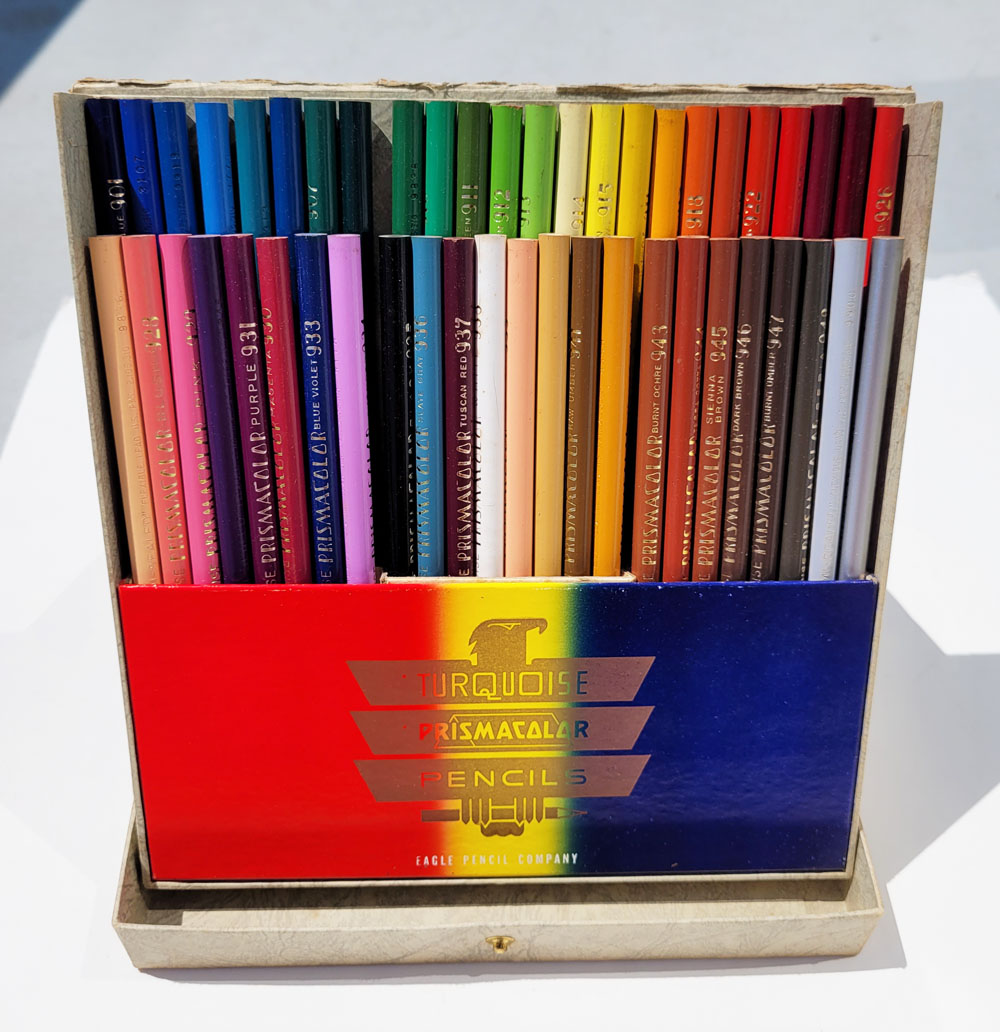
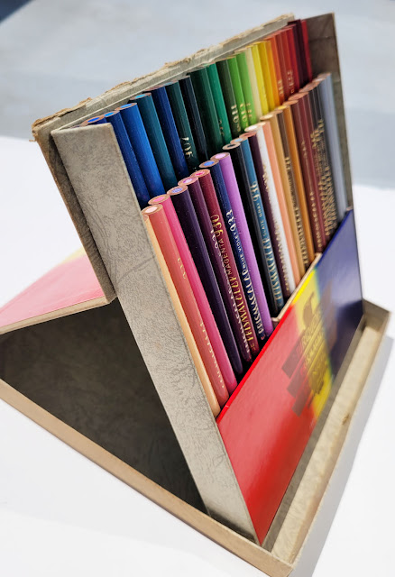
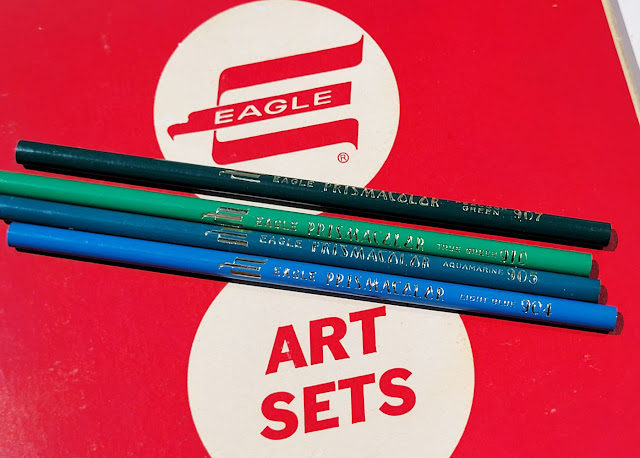
Shown first is my pride-and-joy set of Prismacolors – a complete, unused set of 48 Eagle Turquoise-branded pencils (top of post). While I’ve seen images of graphite pencils and Verithin colored pencils with older Eagle logos along with the use of “Turquoise” and the “Chemi*sealed” tagline, this is the oldest generation of Prismacolors I’ve ever seen for sale. If a set exists with the older logos, I sure would love to see photos of it!

According to the highly informative, well-researched blog, Pencil Fodder, the term “Chemi-Sealed” was patented in 1933 by the British pencil manufacturing company Eagle. (See that article for detailed information on what, exactly, “Chemi-Sealed” means.)
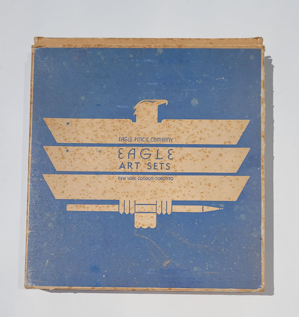
Outer box


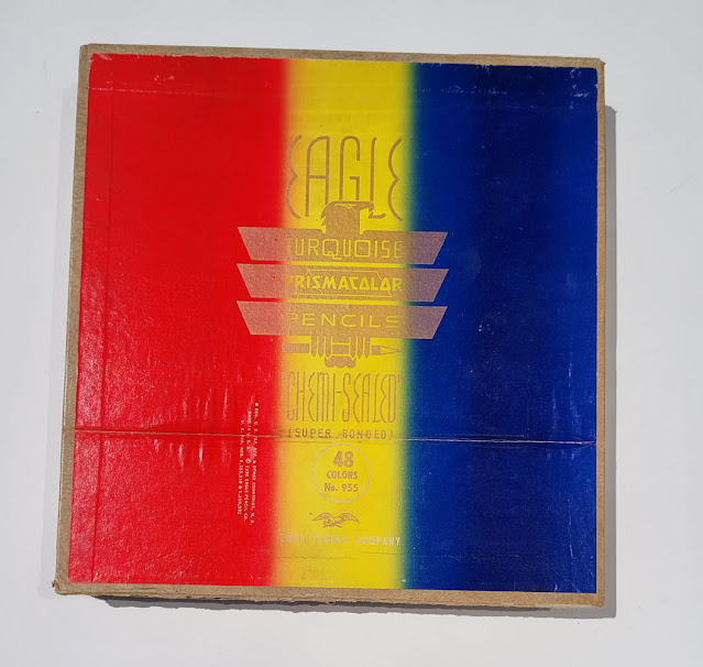
Inner box. Look at that gorgeous eagle!


Although the outer box is discolored, and the inner box is a bit worn (which is probably why this set was affordable), the pencils are all unsharpened and in perfect condition.


I’m not sure which I love more, the pencils or the design! That eagle with a pencil in its talons – they just don’t make logos like that anymore, especially for a colored pencil!

Eagle Turquoise Prismacolors: my pride and joy!

Also shown on Pencil Fodder is a 1958 Eagle catalog that includes Verithin and Colourcraft colored pencils but not Prismacolor. The Prismacolor site’s historical timeline, however, states that Eagle launched Prismacolor in 1938.

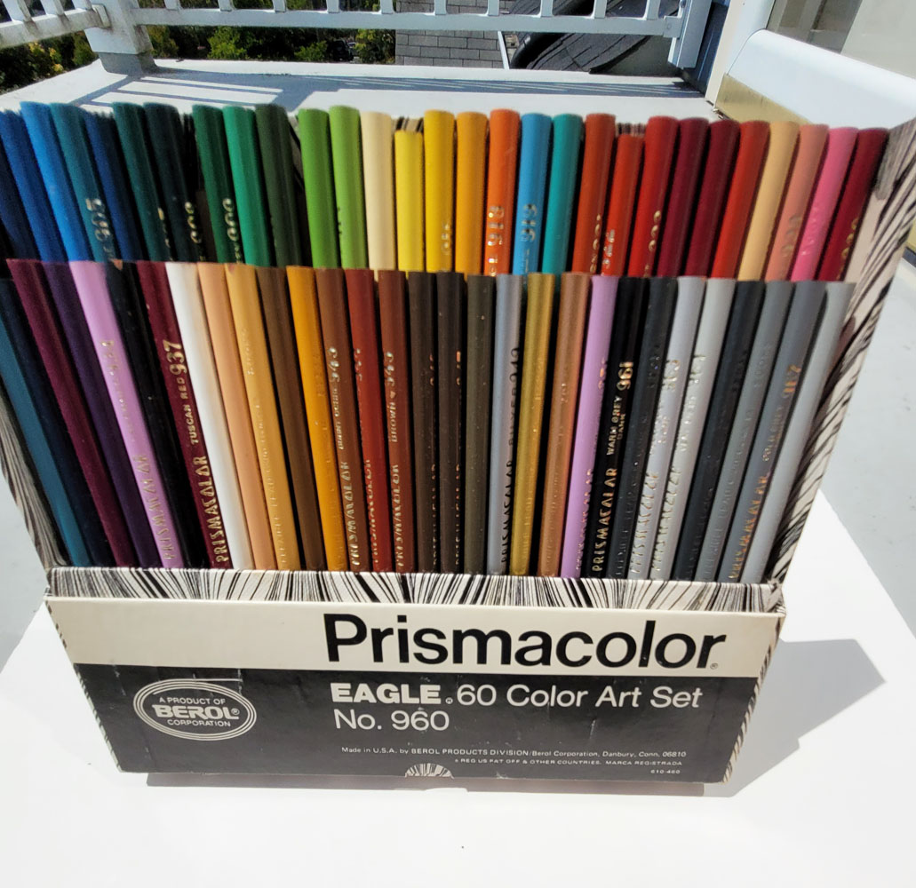
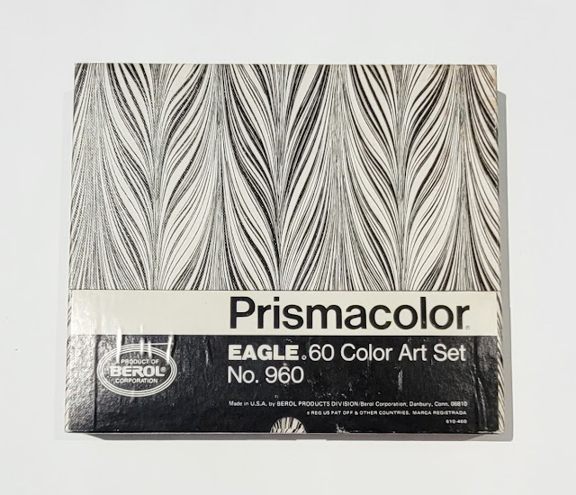
Shown next is my set of 60 Eagle Prismacolors made by Berol. According to Prismacolor, Berol purchased the Eagle Pencil Company in 1969. My set says it was made in Danbury, Connecticut, where it was produced before 1987 (when Berol was acquired by Empire). The historical timeline says Newell purchased Prismacolor in 1995. (The name Sanford is indicated on my Sanford-branded sets as being “a Newell company.”) I don’t think I’ve seen Prismacolors with Empire branding, so I don’t know what happened between 1987 and 1995.

Eagle Berol Prismacolors outer box


Promotion on the inner flap: No space is wasted.

Inner box


Although the Eagle Turquoise box with the eagle holding a pencil is my favorite overall design, this stylized E logo and Art Deco typeface is my favorite Prismacolor pencil design.

One more note to collectors: If you are a “completist,” you’ll want to know that some Prismacolor colors have been discontinued through the years, and those individual colors can be hard to track down. If you find an old set that seems disproportionately expensive, perhaps they include some of those discontinued colors, and the seller would probably make that clear. Personally, I’m no longer hunting down discontinued colors like six of the metallics or Clear Lemon Yellow (971) or Clay Rose (1017) because, you know, life goes on. Not that that I’ve stopped looking, just in case.

Edited 8/5/23: A kind reader sent me a Clay Rose (1017)! Thank you so much!

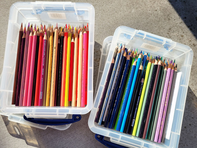
With a slightly less elegant presentation than the previous sets, these are my "user" Prismacolors. The majority is a consolidation of as many colors as I could acquire from vintage sets and lots, and then I filled in missing colors with contemporary Prismacolor Premiers.

Multi-generational family

Wednesday, July 26, 2023

Both Sides of the Street

6/5/23 Maple Leaf

6/7/23 Northgate Community Centery

My daily fitness-walking routes take me all over my own Maple Leaf neighborhood plus the three adjacent neighborhoods – Green Lake, Roosevelt and Northgate. I vary the streets I walk on for different views. Out of habit, I sometimes find myself taking the same side of a street I always take, and I have to make a conscious effort to walk on the opposite side. When I do, it always surprises me that having a slightly different viewing angle makes me notice different things or appreciate something I’ve ignored before.

6/7/23  Green Lake

6/7/23 Green Lake Village

Sometimes I turn around and walk backwards for a few steps because, again, the vantage point or light will be different.

6/9/23 Maple Leaf

6/9/23 Maple Leaf

It reminds me that it’s important to walk on both sides of the street – in both directions.

6/11/23 Maple Leaf Park

6/13/23 Green Lake

6/15/23 Maple Leaf

6/18/23 Maple Leaf

6/18/23 Maple Leaf

6/21/23 Green Lake

6/29/23 Maple Leaf

7/12/23 Green Lake

7/12/23 Green Lake (workers on the same project as above)

7/18/23 Maple Leaf

7/19/23 Green Lake

7/20/23 Roosevelt

7/20/23 Roosevelt

7/24/23 Maple Leaf

Tuesday, July 25, 2023

Too Early for Ruthless Ryderz


7/22/23 Chevrolets at the Ruthless Ryderz Car Show

For the annual Greenwood Car Show, I like to arrive at least an hour before the start time to beat the crowds, and most of the cars have long been in place by then. Using the same strategy, I arrived at the Ruthless Ryderz first annual car show at 8 a.m., an hour before the official “roll in” time, and I was too early – hardly any cars had set up yet. But that gave me a chance to take my fitness walk up and back down the 10 blocks of the show on the same street as the much larger Greenwood’s “mile and a half of classic rides.”

I found a row of jacked-up and otherwise tricked-out Chevrolets, including one that was displayed at an intriguing angle. In addition, their wheels were not in the expected locations, so I couldn’t use my usual wheel well shorthand to draw!

I think the Impala on the right was the same year as one our family had (not with gold trim, however). The black Chevy was a convertible – wish the owner had taken the top down!

It was a fun show, but I’ve made a note for next year: Don’t bother arriving early.

Gold and mirrored trim... even inside the hood!

Still rollin' in.


Related Posts Plugin for WordPress, Blogger...