Sunday, March 31, 2019

Most Cheerful Colored Pencils Ever

Pencils by Otomo Design Studio

As you saw from yesterday’s post, after our long, dark, cold winter, the sakura are finally blooming! It’s a good time to show you the most cheerful set of colored pencils in my collection: flower pencils made by Otomo Design Studio.

The box is an elegant pentagonal shape of quintessential Japanese design, and inside are five unique pencils. According to Spoon & Tamago, “made at an environmentally-conscious factory in Japan, the pencils are manufactured from a process that eliminates resource waste.” The barrels are made from recycled paper.


The transparent box ends reveal why these pencils are special. Their ends are shaped like a bellflower, evergreen tree, dandelion, plum blossom and cherry blossom.


Even the empty box is unique: Transparent dividers that keep the pencils in place turn the box into a kaleidoscope!


Softer and containing more pigment than I would have expected for novelty pencils, they have ridgy barrels that are not exactly comfortable to hold.


The uniquely ridgy barrels, however, are what make the pencils so much fun to sharpen. Using the sharpener that came with the pencils to accommodate the large barrels, I made a colorful pile of shavings that look like the petals of the flowers and the tree.


These delightful pencils were a gift from a friend who knows what makes a colored pencil geek happy!


Saturday, March 30, 2019

Nearly Peak Experience at the Quad

3/29/19 UW Quad

Between the weather and peak blooming, timing an Urban Sketchers Seattle sketch outing at the University of Washington Quad is a tricky matter. Yesterday we hit it just right: While the cherry blossoms weren’t quite at 100 percent, they were close enough, and the sunshine on a cool morning was a bonus.

Roy DeLeon invited me and three other sketchers to participate in a 360-degree sketch. The only other time I’ve done that was at the downtown library a few months ago, and it was a lot of fun, so I came armed with my panorama landscape sketchbook. As expected, hundreds of people milled about, enjoying the magical, ethereal blossoms, and some – like the three ladies in the foreground of my sketch – were having a traditional hanami picnic under the clouds of sakura trees.


360-degree sketchers hard at work.
Magical sakura blossoms

Friday, March 29, 2019

More Selfies (and Surprisingly Good Daiso Ballpoints)

3/19/19 8B graphite, S&B Epsilon

I’m still doing self-portraits to practice the method I learned from Gary Faigin a few weeks ago. I think the one at right has stronger resemblance than the one from a couple of weeks ago. Like last time, I used soft graphite, but instead of Yupo, I used my Stillman & Birn Epsilon sketchbook. Although Epsilon has some tooth compared to Yupo, it’s still smooth enough that I can use the basic techniques that Faigin teaches with charcoal – lots of smudging to achieve tones and a kneadable eraser for highlights. I’m thrilled to pieces that I can practice his methods without resorting to charcoal! If I had to force myself to use charcoal to practice, I might as well have not taken the workshop, because I tend to avoid practicing when I hate the medium. On the other hand, when I love the medium, I enjoy practicing.

Ultimately, though, I’d like to be able to take what I learn about portraiture and apply it to any medium. Ballpoint ink is quite different from graphite (and charcoal) because it can’t be smudged or erased. On the other hand, it’s similar to graphite in that it’s easy to build tone with multiple layers of ink. If I drew my initial block-ins very lightly, I wondered if I would be able to get away with using ballpoint?
3/25/19 Daiso ballpoints, S&B Epsilon

I had recently picked up an extremely inexpensive set of ballpoint pens in a variety of colors at Daiso, the Japanese dollar store (where everything costs $1.50). Given the price, I didn’t have high hopes about the quality, but in fact, they contain the same kind of oil-based, pressure-sensitive ink as Bics – the only kind I like to draw with. I’m not proud that they’re plastic, disposable pens just like Bic Cristals that will end up in our landfill someday, but I couldn’t resist the fun colors! I used a couple for selfie No. 3 (in my eventual total of 20 to 30 portraits that I plan to practice, per Faigin’s recommendation). I like the pens – they will give me a fun splash of color next InkTober.

Daiso ballpoints, 10 for $1.50

Thursday, March 28, 2019

Pergola

3/22/19 Pioneer Square

Sometimes I like to walk around downtown and pretend I’m a tourist. If I were visiting Seattle, which things would I decide were “must-sketch” icons? Certainly one would be the cast iron and glass Pergola in Pioneer Square. The first and only other time I sketched it was nearly five years ago with USk Seattle, so it’s not as if I’ve over-sketched it. In fact, as I struggled with simplifying all the curlicues, finials and other Victorian ornamentation, not to mention perspective challenges, it occurred to me that it wouldn’t hurt to sketch it more often.

 Built in 1909, our beloved pergola (a National Historic Landmark) has seen hard times. After decades of deterioration, it was finally restored in 1972, only to be destroyed when a semi crashed into it a few decades later. Thankfully, it was fully rebuilt (with reinforcement in case of future crashes).

The most interesting bit about its past, though, is that it used to mark the entrance to a glamorous “comfort station” back in the day. In a Seattle Times article a couple of weeks ago, I learned that this public restroom had “tiled walls and floors, porcelain and nickeled brass fixtures, stalls of white Alaskan marble with louvered hardwood doors” and was “proclaimed ‘the finest underground facility of the type in the United States’ when it opened in 1908” for the Alaska-Yukon-Pacific Exposition. The restroom was closed in 1948, and the stairway to it was paved over, but the fixtures are all still down there. Just like a lot of old stuff from Seattle’s past is still down there.

Speaking of which, while sketching, I stood at the top of a dark stairway that I thought was unused. Suddenly about 50 people appeared from across the street and walked down the stairway and into a doorway at the bottom, taking the Underground Seattle tour. I guess tourist season has begun, so I fit right in.

Wednesday, March 27, 2019

Three for Three

3/21/19 Green Lake neighborhood

Three excavators in nearly as many days – I was on a roll last week! This one, however, was more ominous than the first two, which were a utility job and a private home. I could see from the size of the property (a second smaller excavator is working behind the big one) and its surroundings that some small, traditional houses had been taken down. They’ll likely be replaced by yet another big, ugly “multi-use” box, just like the ones growing all over Seattle. Now that the weather is improving, I’m going to get back to my neighborhood architecture series so that I can “save” as many old, traditional homes as I can.

Meanwhile, for good or for bad, I seem to have no shortage of heavy machinery to sketch.

Tuesday, March 26, 2019

Sketchbook Review: Stillman & Birn Zeta

3/17/19 watercolor pencils spritzed with water

I’ve been a big fan of Stillman & Birn sketchbooks ever since they came onto the scene around the time I started sketching. Although I’ve used various S&B editions (the New Jersey company offers seven types of paper in hardcover and softcover) sporadically for urban sketching, I have consistently used Alpha, Beta and Epsilon editions in my studio. Any time I work at my desk, whether I’m using water-soluble pencils, colored pencils, graphite, watercolor, ink or markers, I reach for one of these books. Most of them are filled with still lives as well as swatches and tests I make whenever I try a new product.

My Zeta book, which contains 180-pound white paper, has gotten the lightest workout. Its smooth surface is the same as the lighter-weight Epsilon, and I haven’t had much need for a water-media-friendly heavy paper that’s also smooth. While I’ve gone through many multiples of Alpha, Beta and Epsilon, my single Zeta still had more than half its pages remaining.

When Eduardo Bajzek’s workshop in Porto last summer inspired me to make graphite a permanent part of my urban sketching kit, I was thrown into a tizzy. The student-grade 140-pound Canson XL watercolor paper I had been happily using for years in my DIY sketchbooks was too toothy to use with graphite. After unsuccessfully trying to find a single type of paper that would work with all the media I like to use, I settled for carrying two signatures – one with smooth Canson Bristol for use with graphite; one with my usual Canson XL for everything else.

That wasn’t an ideal solution, though, and I was still restless. With renewed fervor brought on by thoughts of minimizing my entire sketch kit, I started wondering again: Can’t I find a single paper that would meet all my needs if I’m willing to make some compromises? And that’s when I remembered Stillman & Birn’s Zeta.

I knew its smooth surface would be great with graphite because I had already tried graphite with Epsilon. Its 180-pound weight is certainly heavy enough for the light washes of water I put on watercolor pencil, but I had grown fond of Canson XL’s tooth. I also hadn’t used Zeta consistently enough to feel familiar with it when using a variety of media. I decided to throw my full arsenal of typical urban sketching materials onto the 31 remaining pages in the Zeta book for some everyday-carry, real-world testing.

That was a month ago. I’ve now filled the book, and I’ve had opportunities to use all the media I typically use on location; shown here are a few examples.

The ballpoint sketch of a house near Green Lake turned out to be an interesting example of how carrying a new type of sketchbook can open new possibilities. Normally I would probably reach for colored pencils to sketch this house, but because I knew I had Zeta paper in my hands, I tried ballpoint instead. I had been focusing on graphite as a medium that requires a smooth surface (to achieve the soft, smudgy tones that appeal to me), but ballpoint, too, is much more pleasant when used on smooth paper.
 
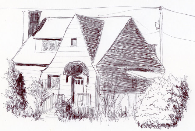
2/26/19 ballpoint pen

As expected, markers and brush pens were a joy to use for the gesture sketches of people at Hing Hay Park, and there’s no danger of bleed-through.
 
3/2/19 Pitt Artist Brush Pen, Zebra brush pen

Also as expected, I was able to build gradual tones with graphite beautifully in this sketch at a coffee shop. Zeta’s surface allowed highlights to be easily and cleanly erased.
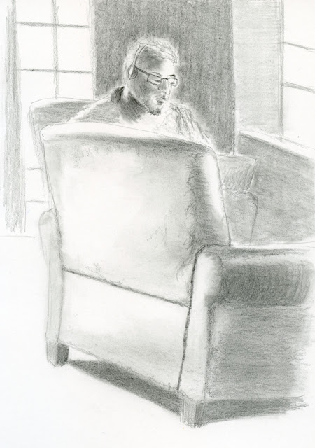
 
3/4/19 graphite

I was more skeptical about how Zeta would perform with my favorite coloring medium – water-soluble colored pencils. I appreciate the rich texture that Canson XL’s tooth imparted, especially with organic subject matter like trees and rocks. This sketch of the grassy hill at Gas Works Park came out OK, and the Caran d’Ache Museum Aquarelle pencils showed more texture than I was aware of in Zeta, but it was still smoother than I like. Colors seem slightly less vibrant on Zeta’s sizing (but not enough to be a deal-breaker).
 
3/16/19 watercolor pencils

One of my favorite techniques when sketching trees and foliage is to use a spritzer instead of a waterbrush to intensify the hues of watercolor pencil pigments. If a paper could not handle this technique, it would be a deal breaker, so I had made a preliminary test with an imaginary tree last month. This time, I sketched some real trees on location (top of post). I still miss that Canson texture, but I was pleased that Zeta’s weight handled spritzing sufficiently.

I made several sketches like this one of an excavator that incorporate several media – a Faber-Castell Pitt Big Brush marker, watercolor pencils and even a little ballpoint ink. This mix of media is typical for me, and the paper took all of them well.
 
3/18/19 watercolor pencils, ballpoint, Pitt Artist Brush Pen

Book filled and real-world testing completed, I went on to analysis:

Pros:
  • The biggest and most important benefit of using a Zeta sketchbook is that the paper is compatible with all the media I typically use in the field. I would no longer need to consider which type of paper to bring when I leave the house or carry more than one type, just in case I change my mind. Though it’s not ideal with everything, it is acceptable with everything. In fact, once I had accepted that Canson’s tooth wasn’t there, I started to really enjoy Zeta’s easy surface and substantial weight that seem to take everything with aplomb. I like Zeta a lot – much more than I expected.
  • Zeta’s surface is identical on both sides. I know that seems like a non-issue, but it has always annoyed me that student-grade Canson XL is slightly toothier on one side than the other. I was used to it, but it wasn’t until I used Zeta for a continuous month that I realized how pleasurable it is to have a reliable, consistent surface.
  • Although I have generally enjoyed the hand bookbinding process the past six years, especially the flexibility of using any type of paper, lately the process has felt more burdensome than fun. In particular, I don’t enjoy gluing and preparing the covers. The idea of filling a book and simply grabbing a readymade one from the store is very appealing. (The one exception is when I travel. . . more thoughts on that after my analysis.)

 Cons:
  • In my ongoing quest to make my sketch kit as lean as possible, a significant drawback of the Zeta softcover sketchbook is that it is more than twice as thick as a single signature of paper and weighs nearly three times as much.
  • Colors do not look quite as vibrant on Zeta’s sizing.
  • I often miss Canson XL’s cold press texture that gives an appealing grittiness to watercolor pencil sketches. (But of course, that same tooth is what became intolerable with graphite.)
  • The material cost of a 96-page handbound sketchbook – paper, cardboard covers, thread – is about $6.50. The cost of a 52-page Zeta sketchbook is $15.19 (cost for both based on Blick prices). That means a Zeta sketchbook costs more than four times a handbound book. Price is certainly not the main consideration for binding my own books all these years, but it’s one factor.

Thoroughly considering all of these pros and cons as I filled the Zeta book, I made the decision to use Zeta as my regular sketchbook going forward. It’s the first major everyday-carry sketchbook change in nearly six years, so I’m not one to make this type of change lightly. But I haven’t stockpiled a lifetime supply, either – I always give myself permission to make new choices as circumstances (or media) change. For now, I’ve purchased two more, which will last me until this summer’s travel season. And that brings me to . . .

Travel considerations

I have one special and important consideration related to handbinding. Although I’m relieved to give up bookbinding in exchange for a reliable, off-the-shelf sketchbook, the one time I truly enjoy bookbinding is when I travel. Having a travel sketchbook that stands alone as a self-contained unit for that trip appeals to me immensely. When I return, I love using maps, tickets, postcards and other ephemera from my travels as the collage for my book covers. (See examples of some travel sketchbooks: Portugal, Japan, France.) Sometimes I even bind brochures and programs right into the book (a wonderful advantage of handbinding).

I wouldn’t want to begin a trip in the middle of an ongoing sketchbook, and if I filled the book before coming home, I wouldn’t want to start a fresh book that I’d then have to finish back at home. And I especially wouldn’t want to start a fresh book for a trip, then leave a bunch of pages blank because I couldn’t finish it during the trip. That kind of messiness annoys me. As much as chronological continuity is important to me, I want my travel sketchbooks to be set apart from the rest. There’s also the practical matter of being able to carry a slim, lightweight signature while touring instead of an entire bound book.

So – how can I possibly resolve this issue? I’m glad you asked, because I came up with the ideal solution: I bought a Zeta spiralbound sketchbook in the 9-by-12-inch size. I’m going to pull out the pages and stitch them into 6-by-9-inch signatures just like I used to do with Canson XL paper. I’ll still have the all-media benefits of Zeta paper, and I’ll still be able to come home and bind and collage travel-related ephemera to my heart’s content, creating a single, self-contained unit.

Ahhh – life is wonderful again.

Here are other reviews I’ve written of Stillman & Birn products:


Zeta: It takes everything I throw at it daily. 

Monday, March 25, 2019

Brew and Draw at the Georgetown Elysian

3/24/19 Elysian's tanks on Airport Way

While starting a lazy Sunday afternoon with a decaf espresso is more my speed, I’m not opposed to making that drink a Split Shot Espresso Milk Stout instead, and that’s exactly what I did in Georgetown yesterday. USk Seattle was in full force (maybe close to 30 sketchers?) at the Elysian Taproom and brewery, which was very accommodating as we took over most of the taproom with sketchbooks and paint.

Before settling down with my brew, I walked across the street to sketch a couple of the brewery’s painted tanks visible from Airport Way. Behind them are Interstate 5’s Corson Street ramps.

Behind the taproom, rows and rows of kegs filled the warehouse (below), and I had to make sure I bit off only a small piece, or all those circles and ellipses would drive me bonkers. Fortunately, by that time I was enjoying my stout, which kept everything in perspective.

3/24/19 Warehouse of kegs

Looking around at all the sketchers, I started to capture a few in front of Elysian’s 20 taps (and Jason serving up the brews), and my intention was to include an inset of my fancy schooner glass. But then I realized I had only 12 minutes left before the throwdown, so it turned into a small value study instead.


3/24/19 Sketchers in the taproom

Throwdown in the taproom

Tim made this delightful sketch of me!
Tim's sketch of me, including my fancy schooner that I didn't
have time to sketch.

Sunday, March 24, 2019

Busy Yellow


3/20/19 Maple Leaf neighborhood
3/20/19 gesture sketches

Unlike the excavator I showed you yesterday, which was snoozing on a trailer, this one was working busily. I watched with fascination as its big mouth scooped up dirt from one side, spun around, and opened its jaws to dump the dirt on the other side – over and over. I wasn’t sure how I was going to capture all that activity, so I started by making a few quick gesture sketches of its various positions.

Eventually I noticed that it was pausing for longer periods in one position than the others, so I chose that one to make a final sketch. Whenever it spun around to the other side, I just waited a bit for it to return to the original position. It’s like sketching birds at our feeder; they move quickly, but they always seem to return to the same gesture again.

(While all of this was going on, a team of gardeners decided to work on the parking strip where I was standing and turned on their noisy leaf blowers. I had to pause to put in my ear plugs!)

Saturday, March 23, 2019

Sunny Yellow

3-18-19 Maple Leaf neighborhood

When I saw workers returning from their lunch break, I thought it was going to be the end of my sketch. One came by to see what I was doing, so I asked if he was taking the excavator away. “Naaah,” he replied. “The other guys didn’t show up, so we can’t do our part yet anyway. I’ll leave it here overnight for you.”

Sketching an excavator with my heavy-equipment yellow pencil while it’s 70 degrees and sunny: It doesn’t get any better than this.

Friday, March 22, 2019

Strong, Vulnerable


3/14/19 Shannon (5-min. pose)
3/14/19 5-min. pose

I’ve been attending Gage Academy’s life-drawing sessions for nearly seven years now. Some models I have drawn only once; others I sketch time and time again. A few I have drawn so regularly that I have gotten to know them, and we follow each other on social media. But regardless of the model, I am always awed by his or her courage and willingness to stand before us for three hours, naked. It’s a job that requires a certain combination of both strength and vulnerability.

With each pose, an unspoken dialog occurs between the artist and the model that involves trust and sensitivity. While my main objective in attending figure sessions is to improve my people-drawing skills, I also feel compelled to try to express whatever I sense of this person who is willing to take off his or her clothes for our scrutiny.

3/14/19 20-min. pose

3/14/19 10-min. pose

3/14/19 10-min. pose

3/14/19 This final 7-minute pose was my favorite of the afternoon -- what an awesome foreshortening challenge!

Thursday, March 21, 2019

Spring Palette Refresh (Screw Minimal Palettes)

Getting ready for spring!
My basic palette

The sunshine and warm temperatures we’ve been having this week have made me optimistic: It’s time to refresh my palette for spring. Working with my usual basic palette (shown at right), I’ve substituted Caran d’Ache Museum Aquarelle 015 (though it may look yellow in my photo above, it’s a very yellow yellow-green) for 245. I’ve also added Caran d’Ache Supracolor 091 with the hope that I’ll soon be sketching cherry blossoms (or at least plum blossoms). It’s a slightly darker pink than the one I’ve used in previous years because pink always becomes less intense than it looks in the test swatch.

I’ve been thinking more about primary palettes, choosing a palette based on frequency of use, and other palette minimization attempts, and today I’m here to say: Screw them all. That doesn’t mean I’m going to add a hundred pencils to my palette; I’m still sticking with not exceeding the 25 slots in my Tran Portfolio Pencil Case. But the more I think about it, the more I realize that it doesn’t make sense to be so stingy with specific hues, especially if they are difficult to mix and convey meaning that another hue might not.  

Just the right green.
Case in point: A couple of weeks ago at Union Station, I began drawing the large pottery vases and tile walls, and I was thrilled to pieces that I happened to have the color verdigris (Caran d’Ache 182) in my bag. Although I don’t have much use for it in Seattle, it’s a hue I always make sure I take with me to Europe for statuary and building details. I guess I had left it in my palette ever since my trip to Portugal last summer. In any case, it was just the right kind of green that would be difficult, if not impossible, to mix, especially with colored pencils. More important, it conveyed meaning in terms of the décor of the place. Someone went to a lot of trouble to find vases that match the wall tiling.

However, my renewed liberalism about color does not mean I’m letting myself go in terms of my sketch kit in general. In fact, even as I allow more hues, I’m going to be more conservative than ever about considering everything else I carry.

Wednesday, March 20, 2019

Kite Hill

3/16/19 Kite Hill at Gas Works Park

I’ve sketched at Gas Works Park probably more often than any other Seattle city park. The massive gas works themselves are almost always my focus; it’s hard to resist those mysterious, steampunkish structures. Last Saturday, though, I wanted to focus instead on all the happy locals reveling in the sunshine on Kite Hill. It’s been a long, record-breakingly cold winter, and just being able to take a walk without a down jacket felt like a celebration.

Tuesday, March 19, 2019

Coming Down

3/15/19 Heavy equipment ready for action on the viaduct.

The Alaskan Way Viaduct has been closed for more than a month now, and its demolition has been occurring gradually, a small area at a time. After seeing the Jeffrey Gibson exhibit at SAM, we wandered through the north end of Pike Place Market to see if any destruction was ongoing. Lots of heavy machinery was scattered about the otherwise empty viaduct, waiting for some action. We could hear activity further south, but nothing was happening near Steinbrueck Park where I sketched this. Soon enough, it’ll be a noisy, dusty mess there.

The graffiti’d lane signs shown in this sketch are the same ones I sketched in February when I walked on the viaduct – but from the other side.

(According to my phones weather app, it was 63 degrees while I sketched this! Spring could happen yet!)

Related Posts Plugin for WordPress, Blogger...