Sunday, July 31, 2022

The Tree Next Door


7/26/22 graphite on Stonehenge Lenox Cotton

More than a year ago, on a freakishly warm day for April, I went out on our back deck to sketch a tree I marvel at every time I’m out there. It belongs to our neighbors. Strangely pruned, at least on the side we can see, the missing foliage reveals an amazing branching structure.

Knowing that the comfortable day was an anomaly, and I couldn’t count on more, I used an ArtGraf water-soluble carbon pencil so that I could finish the sketch in one sitting. Although I was happy with the sketch, I felt I hadn’t done the tree full justice; it deserved the details, delicacy and full attention of pure graphite. I vowed to do again someday.

Inspired by Kristin Frost’s class, I decided it was time to do it right – and I knew the forecast of many consecutive dry, warm days would give me the time I needed (it took three days, an hour or two each day). This time I included a suggestion of foliage in the composition, which I had totally avoided last time – with good reason. Compared to the limbs and trunk, it was terribly challenging! I’m not happy with that part, but I did give that complex branching structure the close study it deserves.

Material and tool notes: As I’ve been doing in Kristin’s classes, I chose a graphite set I rarely use – the Kitaboshi Art Set. Unlike the others, though, which haven’t been my favorites, I enjoy using Kitaboshi, but I sort of forget about them because I seem to reach for Mitsubishi Hi-Unis or Tombows first. Kitaboshi are truly under-rated among Japanese graphite pencils. For this drawing, they were a pure joy to use on Stonehenge Lenox Cotton paper.  

My outdoor studio fully equipped with Kitaboshi pencils, Uni sharpener and iced tea.

I’ve also been using a new tool lately with graphite drawings: the SmudgeGuard Glove. As a lefty, I’ve learned to live with smeary, smudgy writing, and it doesn’t bother me. The only time I get annoyed is when I’m working on a graphite drawing, and I see the mess I’m making – both on my drawing and on my hand. (And that’s not even a lefty issue; righty artists make smudgy graphite messes as much as lefties do.) I decided to try this weird-looking glove with only one finger – and it works! A full review will be published at the Well-Appointed Desk soon, but for now, I’ll just say that it does the job: Keeps me from smudging my work as I go, keeps my hand clean, and prevents transfer of graphite from my hand to the paper.
Edited 8/1/22: Here's the review at the Well-Appointed Desk.

SmudgeGuard Glove


Saturday, July 30, 2022

Fleeting Light

7/25/22 Maple Leaf neighborhood

Going out during the Golden Hour recently motivated me to try it again. The low, warm light is beautiful, but at that angle, it changes so quickly that it is extremely challenging, even for a fast sketcher like me.

I went out a little earlier this time, hoping that would help. The first thing that caught my eye was a small patch of backlit gladiolus. Glowing with golden halos, they were irresistible. Even as I made this small sketch, the light was dropping and fading rapidly. Scribbling frantically, I missed most of the backlighting, but at least I caught the shadow.

Sketching during the Golden Hour takes more practice than I’ve had! I suppose it would help if I picked subject matter a little farther off the ground.

Friday, July 29, 2022

The Shady Side of the Street


7/26/22 Mt. Rainier from Maple Leaf Park

Here in the Pacific Northwest where we have a solid cloud cover much of the year, and blistering heat is rare (though, alarmingly, increasingly less rare), I’m not accustomed to having to find shade first before I look for something to sketch. I’m also fast, so on a “normal” weather day, I don’t mind standing in the sun for the time it takes me to make a sketch. I know I’m fortunate; many sketchers in other climates must seek shade as a normal routine.

On the first day of our heatwave this week, during which the city opened public cooling centers for people without AC, I went out early in the day to get ahead of the heat. Though the horizon looked a bit hazy, I could see from our partial view of Mt. Rainier that Her Majesty was out. My first stop was Maple Leaf Park to pay a quick homage. I didn’t think I’d find any shade there, and it was still comfortable enough that I wasn’t concerned, but I did find a tiny bit of shade that helped. At 8:17 a.m. when I finished the sketch, it was 75 degrees.

7/26/22 Maple Leaf neighborhood
After taking a walk, I had had plenty of sun and rapidly rising heat, so I zig-zagged my way home to stay on the shady side of the streets. I usually don’t like to limit my compositional view, but being motivated to stay cool gave me a fresh challenge. There’s always something to sketch if I’m looking for it.

Thursday, July 28, 2022

Green Lake Alleys


7/25/22 Green Lake neighborhood

I love sketching alleys. They usually have intriguing shadows and converging verticals and horizontals that make compositions fun. In addition, they get little traffic, so I can stand in them safely.

Green Lake seems to have more alleys than Maple Leaf, and I’m having fun finding them. Out walking early on Monday to get ahead of the forecasted heat, I found these two on the same street only a block or so apart. 

Instead of making a thumbnail study first, I’ve lately been trying to visualize the thumbnail in my mind without drawing it, then going directly to the sketch. For the first one (above), I had seen a square composition (influenced by my square Hahnemühle sketchbook’s format), and I made the sketch mostly as I’d visualized it. (Sketching only part of a car when I can see the whole thing is always challenging for me!)

For the next one (below), I had another square in mind. Unfortunately, I had space left on the page outside the imaginary square, so I kept on adding more. The “more” didn’t improve the composition, so I cropped it out. In both cases, you can see in the photos below what I actually sketched compared to my cropped scans.

It occurred to me that if I’m going to skip the thumbnail, maybe I should at least draw the boundaries of the format I envision on the sketchbook page to keep me from filling in any blank space. I had tried that a few times during my 30-day composition project, and the box was helpful that way.


Wednesday, July 27, 2022

Kimono

7/21/22 Asumi at Gas Works Park (each sketch about 20 min.)

The email notification about last week’s life-drawing session had mentioned that our model Asumi would be dressed in a kimono. For some reason, I had pictured a bright red one with a gold obi sash. I got the obi almost right (it was yellow), but Asumi’s kimono was an elegant but subtle taupe color. (The lining, however, showed slashes of red, so my imagination wasn’t completely wrong.) I didn’t try to match that challenging hue but instead focused on the equally challenging task of rendering the drape of all that fabric.

For my last sketch, I walked around to draw Asumi from the back so I could include some of the painters. That’s when the surprise came: From the front, she was mostly in shade, but from the back, her silk kimono was shimmering with both red and green, depending on how the fabric laid. It was gorgeous! Wish I could have captured some of that shimmer.


Waiting for the model to arrive, I killed a few minutes with the geese. Given how much they eat (and there are lots of them), I’m surprised any grass is left at Gas Works Park. 


Tuesday, July 26, 2022

Review: Uglybooks, No. 1 Tall Size


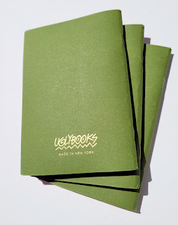
Very pretty Uglybooks!

Readers of this blog know that although I am loyal to my primary sketchbook brand (Stillman & Birn for many years and currently Hahnemühle), I can be fickle about my secondary sketchbook. The latter is my small, daily-carry notebook that contains casual walk-taking sketches, thumbnail studies, notes, skyscapitos, written observations, backyard bunnies and raccoons, phone numbers, shopping lists and other random what-not. Since the sketches are often made with nothing more than pencil or marker, the paper doesn’t have to be great, but I’m thrilled when it can take a light wash.

For years, I tried every pocket-sized notebook on the market, hoping to find one with paper that could meet my demands. Frustrated, I even made my own for a while. Eventually, instead of continually being annoyed that notebooks intended for use with pencil or ballpoint couldn’t accommodate water-soluble materials and juicy fountain pens, I asked myself: Why not just sketch with simple media that these notebooks were made for? I changed my attitude instead of my notebook. Most Field Notes Brand notebooks have met my needs adequately, if not ideally, and I’ve been adequately happy. I stopped shopping around.

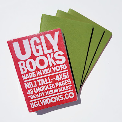
Product info is on the outer wrapper only.

Fast-forward several years, when someone who knew I enjoyed using
red Field Notes Sweet Tooth edition notebooks contacted me: Did I know about Uglybooks?

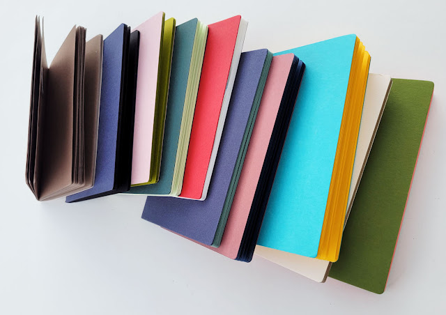
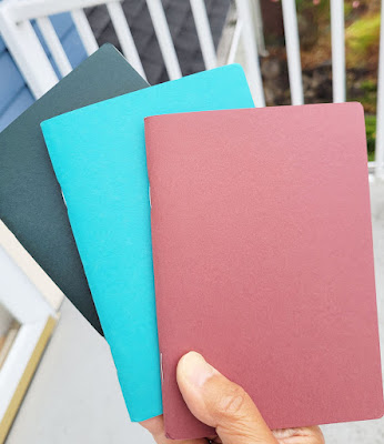
Made in New York, Uglybooks are simple, staple-bound, pocket-size notebooks like so many others on the market – with two significant differences: They contain 48 pages of unruled, 80-pound paper, and the paper inside is colored. I had never seen a pocket notebook with 80-pound paper of any color! Excited about both features, I ordered cautiously (I’ve been disappointed too many times by other claims of high-quality paper).

The product description and main branding appear only on the plastic wrapper. When removed, the wrapper reveals covers that are entirely blank – an ideal blank slate for stickering or drawing on. The only branding that remains is a logo on the back cover.

111-pound cover stock in bright colors

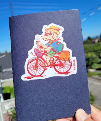
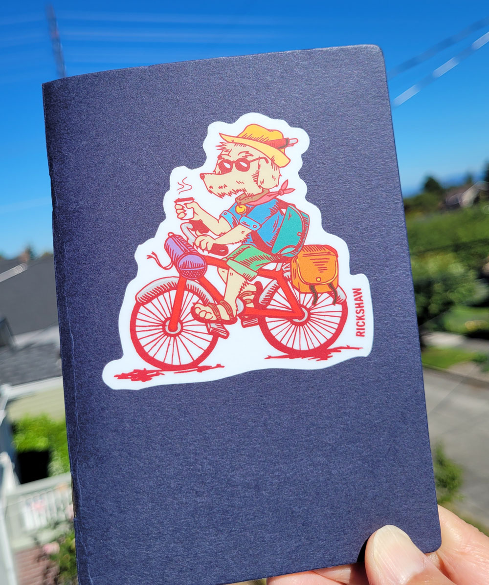
A great place for a sticker (this one is from my favorite
bag maker, Rickshaw)

Logo on the back is the only branding.

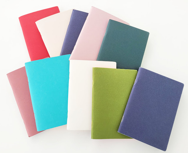
The colored covers contrast well with their interior papers. While design is minimal, it’s clear that someone is having fun pairing paper colors and naming themes.

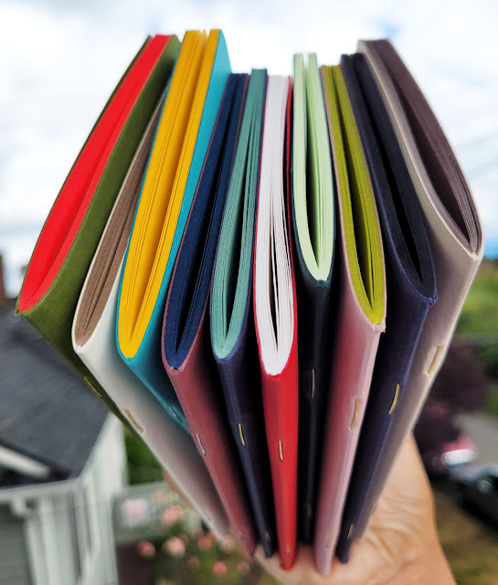
Contrasting covers and innards.

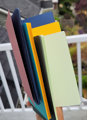
The “No. 1 Tall” size I bought is 4-by-5 ¾ inches, which is right between the classic pocket size of 3 ½-by-5 ½ inches and the
Field Notes Signature edition (alas, no longer available), which is 4 ¼-by-6 ½ inches. Uglybooks are also available in a “No. 2 Wide” 8-by-5 ¾ landscape format. Although the classic pocket size is fine for thumbnails, I’ve always felt a little cramped otherwise. Uglybooks are an ideal size – large enough to sketch comfortably, yet small enough to fit in a bag pocket or my smallest fitness-walking bag.

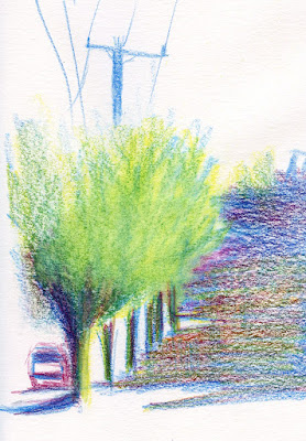
7/8/22 gray and black brush pens,
white colored pencil

At three books for $16, the pocket-size Uglybooks are priced competitively for a slightly larger size and heavier paper. The larger landscape-format books are three for $30. (It’s worth noting here that when I had a minor shipping issue, customer service took care of me immediately. I don’t take good customer service for granted anymore – it’s worth a lot to me.)

All books feature hefty paper inside and out: 111-pound cover stock and 80-pound interior paper. “Because the paper in Uglybooks are so colorful and durable, we encourage you to try out whatever type of mark-making utensil you have!” says Uglybooks. Challenge accepted!
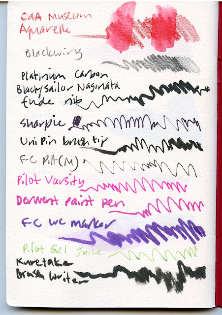
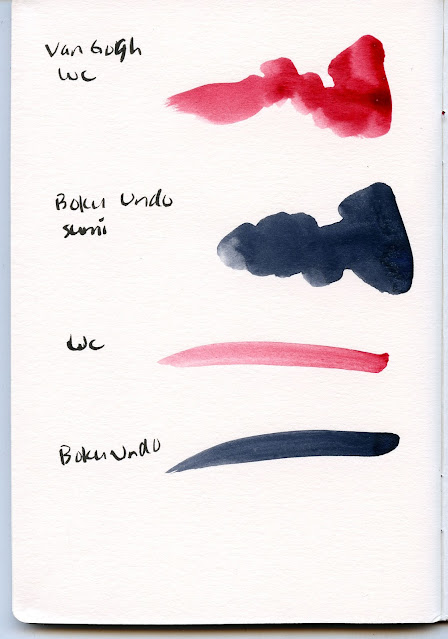
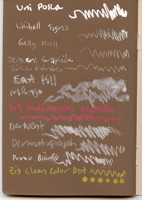
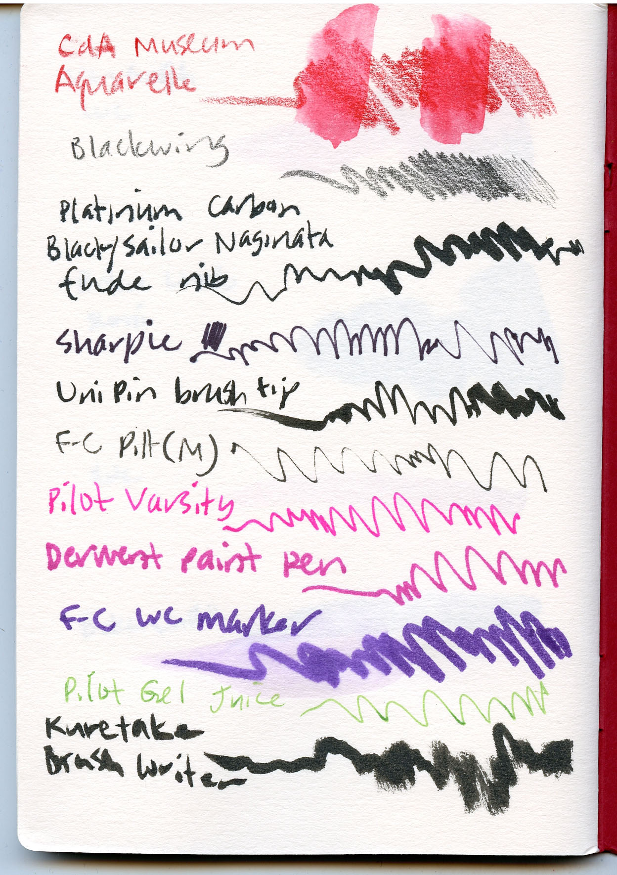
Media tests 1

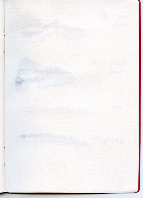
Reverse side of media tests 1


The paper surface is mildly toothy but has no visible pattern (in fact, its similar to my current favorite drawing paper, Stonehenge Lenox Cotton). Media tests yielded no surprises. The only materials that bled through were the Sharpie, Derwent paint pen (minimal) and juicy washes of watercolors. I wouldn’t recommend this paper for watercolor painting, but light, dry-ish washes are fine. (Edited 7/29/22: Customer service confirmed that the paper is acid-free.)

Media tests 2

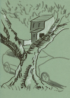
Reverse of media tests 2

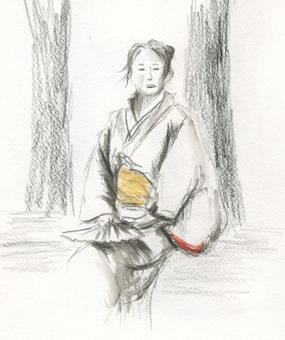
Long before I made the test swatches, I took an “Atlantic” book (navy cover with mossy green interior) out for field testing. The green is just the right midtone for use with a black brush pen and a white pencil or gel pen, my favorite combo for quick urban sketches and value studies. My juiciest brush pens and
Sailor Naginata fude fountain pen, which usually bleed through notebook papers, were no match for this 80-pound Uglybook paper!

7/13/22 The juicy Sailor fude nib was no match for this hefty paper! No bleeding or feathering at all.
(This photo does not show the color accurately; actual color is closer to the scanned image below)

7/5/22 Gray and black brush pens, colored pencil

The “Cane” book (red cover with white interior paper) became my field test for water-soluble colored pencils. The paper took light waterbrush washing better than other notebooks I’ve tried – no buckling or bleeding. Although the sizing is probably not intended for watercolors, it was enough to keep my Caran d’Ache Museum Aquarelle colors true. The only treatment the paper couldn’t handle was a heavy water spritz, which caused the color to bleed through to the reverse side, and the paper buckled.

7/12/22 Museum Aquarelle water-soluble colored pencils washed lightly

7/14/22 Museum Aquarelle spritzed with water

Reverse of spritzed sketch at left


I was impressed! In my next order, I didn’t hesitate to get all the colors I wanted, and it’s a good thing I didn’t. When I went back to the site a week or so later, all the color options had been changed – and the colors I had ordered previously were no longer available! Uglybooks are apparently limited editions, which means that if I really like one, I’d better hoard buy extras! (I’m guessing that white interior paper is always available.)

An interesting addition was the “Mystery” pack, which promised “cover and interior pages picked completely at random.” Who could resist that? Spoiler alert: Here’s what I got – that yellow looks very promising! I don’t know whether every Mystery pack purchase contains the same three colors, or distribution is truly random, but either way, it’s fun to get a surprise.

The Mystery Pack I received contained these three books

I love the yellow paper with sky blue cover!

7/6/22 colored pencil

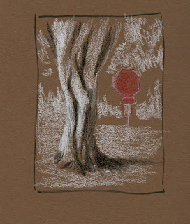
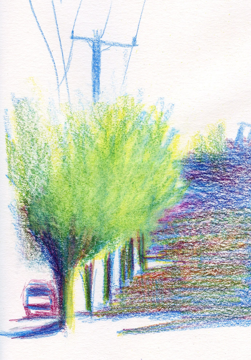
I’m picky about midtone colors for tonal sketching: The colors must have enough contrast with both white and black. I’m looking forward to trying pinky-red “Watermelon” and bright avocado green (called “Grunge”), which look like they have potential. I’ve already tried the dark brown “Smores,” at left (I showed more a few days ago), but it’s a little too dark as a midtone. Opaque, light-colored markers and colored pencils pop on it, though. I’ll try it this winter for night sketching, which is also my intention with the black paper of “Lost at Sea.”

As my secondary sketchbook, Uglybooks are a winner! A great size, unruled, high-quality, 80-pound and colored paper – Uglybooks, where have you been all my life?

Media tests 3 on "Smores" paper

Monday, July 25, 2022

Double Fun in Queen Anne


7/23/22 Seattle skyline from Kerry Park, Queen Anne Hill

USk Seattle’s outing in upper Queen Anne was two events in one: A celebration of our 13th anniversary and also participation in the 76th quarterly World Wide SketchCrawl.

Prepared for the meetup at Kerry Park and its sweeping skyline view, I brought along my panorama-format Stillman & Birn Beta sketchbook. I pack the book whenever I travel, expecting to see and sketch some new skylines, but I haven’t traveled much since 2019. It had been a long time since I’d sketched the Kerry Park skyline (I think 2017 was the last time), so I decided to pretend I was a tourist in Seattle and sketch the postcard view of the Space Needle (unfortunately, Her Majesty Rainier was hiding behind the thick overcast). Plenty of actual tourists stopped by to snap their selfies as I sketched (and some asked me for help taking their photos) – it was a popular spot.

Detail view of the panorama


After that, I took a walk around the Queen Anne neighborhood, which I dearly love for all its beautiful, old homes. (My first apartment was in Queen Anne, so it’s also nostalgic.) Along the way, I made a small sketch of Queen Anne United Methodist Church.


Circling back toward Kerry Park for the throwdown, I made a brief stop at Parsons Garden, which always feels cool and serene compared to the touristy skyline. I caught some girls picnicking just before a mom came by to break up the fun.


In the early years, USk Seattle used to try harder to make our outings coincide with the SketchCrawls, but truthfully, we admins don’t always remember to check the dates when planning. Lately it has fallen by the wayside. But after we sent out the announcement for the Queen Anne outing, Parker Gambino, enthusiastic urban sketcher and SketchCrawler, informed us that the date coincided with the 76
th SketchCrawl. Formerly an active member of USk New York City, Parker now lives in Seattle. I was grateful to him for reminding us of the SketchCrawls again.

What a great turnout – I counted more than two dozen at the throwdown! 

Toward the center in baseball cap is Parker.

Sunday, July 24, 2022

Poor Crow

7/20/22 Maple Leaf neighborhood

Anticipating the forecasted heat by afternoon, I went out early Wednesday morning. I didn’t have to walk far to find some action: a Seattle City Light truck gearing up in an intersection. Pen poised to catch the action as the crane raised the worker into position, I heard the story:

A poor young crow had gotten into the fuse box, causing neighbors on the east side of Eighth Northeast to lose power. (We live on the west side and rarely lose power for any reason.) As I sketched, I overheard neighbors chatting nearby, and they said this type of outage happens to them multiple times a year. Apparently crows are attracted to the buzzing sound. The City Light worker said it’s always juvenile crows – I guess if you live long enough, you learn to avoid fuse boxes.

Neighbors were grateful for City Light’s swift response.

Once the worker was in position, flipping the switch took only a few seconds, so I missed drawing the crane that supports the cherry picker’s basket! But it was fun to be in the right place at just the right moment.

Saturday, July 23, 2022

Crocosmia


7/19/22 Maple Leaf neighborhood

I only recently learned the name of the Crocosmia (the Lucifer variety), which blooms vigorously around town this time of year. After sketching some hastily during an evening walk, I went out the next morning to look for more. I didn’t have to go far to find this traffic circle on my block, where the caution diamond is nearly obscured by a maple.

Primary triad 5 is summery enough for me!

After five tries, I think I finally found the summer primary triad I had been looking for. Or maybe the triad doesn’t make much difference . . . maybe it’s just me finally feeling like summer is reliably here.

Friday, July 22, 2022

The Golden Hour


7/18/22 Maple Leaf neighborhood

Other than when I’m traveling, I rarely go out to sketch in the evening. I don’t have the same creative energy as I do the rest of the day. In the summer, though, we occasionally take short neighborhood walks after dinner to enjoy the long daylight hours, and I’ve often regretted that I don’t sketch in that special light. I follow a couple of sketchers who routinely sketch or paint during the Golden Hour, and I know how beautiful it can be.

Monday’s marine layer (our typical June gloom has extended into July) lasted long past noon. When the sun finally came out, it seemed a shame to waste it. I went out immediately after dinner and walked only a couple of blocks when I spotted some brilliant red Crocosmia arching over a stairway. The sun was dropping fast behind the roofline. By 7:30 p.m., most of that golden light was gone, but my hasty sketch was done.

Thursday, July 21, 2022

A Few Thoughts on Drawing from Photos

7/6/22

Readers of this blog know that I have a thing about drawing from photos – not about others doing it, just myself: I don’t like it.

After the pandemic began, I saw a lot of sketchers enjoying “traveling” by drawing from Google map photos. Sometimes I thought about joining them, but if I haven’t seen a place with my own eyes, I feel no connection. I can’t get into it.

If I can use my own photo references of places I’ve seen and experienced, it’s better. At least I feel a personal connection with the location and memories the photos may evoke.

When taking classes, I understand the value (and usually necessity) of drawing from photos, and I’ve certainly learned much from instructors who taught from photo references. Even so, I did it begrudgingly, especially when I was required to use photos of unfamiliar places. It felt like an academic exercise (which I guess it was).

Lately, though, I’ve been thinking I need to get over my “issue” with drawing from photos, if only for practical reasons: Seattle has a limited number of days when it’s possible to sketch on location (even from my car if it’s raining), and my house has a limited number of windows. I’ve been doing a hardy job of mostly avoiding photo sketching all these years, but I could be missing out on learning opportunities.

7/4/22

Last month’s 30-day composition challenge was a prime opportunity to “get over it.” Ian Roberts makes no requirement that the compositional studies must be done from life. In fact, although he is known for his plein air workshops and his own plein air paintings, he often paints and makes compositional studies from photos. I knew I could learn from making studies this way – and I did! I made at least a dozen thumbnails from photos in June.

I think it made a big difference that I had a specific goal in mind each time I made a study from a photo; I wasn’t simply trying to copy the photo. I also always used photos I had taken myself, with one notable exception: A friend had shared a photo of her steps with interesting composition potential. Because the scene was unfamiliar, I found it easier to abstract “things” into values and shapes. I couldn’t really see what they were and didn’t know what they were.

My current Gage class in drawing trees in parks has added a new angle. Since I haven’t been able to finish most drawings on location, I’ve been finishing at home with the help (or not) of photos. When beginning a drawing from life that will have to be finished with photos, instructor Kristin Frost pointed out the importance of getting the forms in place while still on location – for example, the branching structure of a tree. Forms are harder to draw from photos when you can’t walk around to the other side of a tree for a better look. Details and values are easier to fill in later from photo references. In fact, she suggested taking closeups of details like bark texture, which may not be visible in shadows.

7/5/22

In the interest of further coming to terms with drawing from photos, I’ve continued occasionally making composition thumbnails that way. It’s weird, though – when I sketch this way, they don’t feel like “real” sketches. Even though I’m using my own photos, and even when I learn from the thumbnails, they continue to feel academic rather than a connection with my life.

Paper notes: I’ve been using an Ugly Books notebook (review soon) for these thumbnails. I usually find traditional tan toned paper to be too pale as a midtone, so I thought this darker brown would work, but it may be a little too dark. The white pops nicely, but there’s not enough contrast with black. The dark blue colored pencil is interesting, though.

7/7/22

7/17/22


Related Posts Plugin for WordPress, Blogger...