Tuesday, April 30, 2019

Bicolor Lessons in Values

4/23/19 Maple Leaf neighborhood

In Shari Blaukopf’s book, Working with Color, I saw many appealing examples of limited color palettes. Shari herself showed examples of the lovely, cohesive paintings she achieves by using only three primaries, and other artists made striking sketches using just one distinctive hue plus black.

Since I often think about using a limited palette to minimize my sketch kit, seeing these examples reignited my interest in trying again, but this time with a specific purpose in mind: helping me see and interpret values.

4/22/19 Green Lake neighborhood
I tried a similar exercise last year with limited, unrealistic hues, hoping to trick my brain into ignoring the local colors and seeing the values more easily. This time I am using two high-contrast colors only – one warm and one cool. I tried the green and orange sketch first, assigning orange to the lighter values and green to the darker values. Where the value was darkest, I mixed orange and green together.

The orange and green I chose didn’t have high enough contrast for my purpose, so next I chose a red/blue (or more specifically, vermillion and Prussian blue) bicolor editing pencil (above). This time I assigned red to lighter values and blue to darker. These hues had the added benefit of better evoking warm/light and cool/shade. This sketch required playing serious mind games with myself! The truck was actually dark red, so it was very tempting (and natural) to use red to sketch it . . . but squinting at it, I could see that its values were mostly dark except for reflections on top. So I sketched it in blue (partially from memory, since it drove off before I could finish).

Also, the caution diamond in the traffic circle was, of course, bright yellow, and the traffic cone (why was it there? Who knows) was bright orange, and I was so tempted to use the appropriate colors! But in fact, they were in shade, so I tried to hint at their warmer local hues while coloring them mostly blue.

I find it helpful to codify values this way by assigning unrealistic hues to them. Even better, I like the effect of the red and blue used together beyond the purposes of the exercise.

A vintage Mitsubishi editing pencil
Geek note: The red/blue editing pencil is a vintage Mitsubishi. You may recall that I have a particular fondness for bicolor pencils, even though most are not useful to me. This Mitsubishi has strong pigment and is pleasantly soft to use. Its contemporary version has the same cores, as far as I can tell. (A reason to use bicolor pencils always makes me happy!)

Updated 6/28/19: Here's an article containing interesting history about vermilion and Prussian blue.

Monday, April 29, 2019

Book Review: Shari Blaukopf’s Working with Color

The latest in the Urban Sketching Handbook series

When I first heard that Montreal painter and urban sketcher extraordinaire Shari Blaukopf was authoring Working with Color, I wondered if there would be much in it for me. Blaukopf is well-known for her vibrant, luminous cityscapes in watercolor; it would be expected that her book, the latest in the Urban Sketching Handbook series, would focus on watercolor painting. It’s been several years since I stopped carrying watercolors in my sketch kit, and I’ve been loving using colored pencils ever since. Would it be worth reading? I hesitated for all of five seconds.

Spoiler alert: It’s worth reading. Blaukopf is a master of color, period. Whatever your chosen medium, her color principles and practices will apply. You don’t need a degree in color theory to understand these principles – you just need Blaukopf to explain them simply and succinctly (with a heavy dose of excellent sketch examples so that you can see what you are reading). As with the other books in the Handbook series, the emphasis is on using portable materials in the field. (The book’s subheading is Techniques for Using Watercolor and Color Media on the Go.)

The first three sections cover the basics of materials (including watercolors as well as other media), pigments, color mixing, and values. Watercolor sketchers will probably especially appreciate seeing her specific palette choices and recipes for mixing neutrals, darks and a beautiful range of greens. But even as she reveals her favorites, she encourages sketchers to experiment and get to know their own palettes well. Thoroughly understanding how one’s chosen pigments behave and interact is the key to successful color use.

Recipes for mixing greens

Exciting dark mixes
Working with gray scales to learn values


Even though I’m not using paints, I am still learning from the color logic behind her choices. For example, I often use Caran d’Ache Museum Aquarelle pencils in Payne’s gray or Prussian blue for deep shadows because they seem the safest choices. But seeing her examples of permanent Alizarin crimson mixed with indigo for a vibrant dark made me think about putting my Prussian blue together with Alizarin crimson from the Supracolor line for a more interesting shadow mix. I got several other ideas from those chapters that I will be experimenting with soon.

The sections I am getting the most value from are the ones on limited color palettes (something I think about often) and color relationships (especially warm/cool and complements). I’d like to get out of the lazy habit of using grays for shadows, and these chapters got my wheels spinning on using complements more often for that job. Just the other day when I was sketching red tulips in a neighborhood traffic circle, I was about to reach for gray to darken the ones in shadow. But I had just read the chapter on using complements, so I instead used the same dark green that I had used on foliage elsewhere in the sketch. Voilà! The flower shadows were both more cohesive and more vibrant.
 
Example of complementary hues by Mike Kowalski

I was also inspired and intrigued by examples of sketches done in a single ink color and the use of spot color with black or gray – exciting ideas that I am already experimenting with.

Example of using a single ink color by Brian Gnyp

Example of spot color by Nina Johansson

 
A final technical chapter on mixing neutrals – something that Blaukopf does without resulting in mud, which is startling, since that’s what most of the rest of us are getting! – would be a delight to painters.

How to mix grays without getting mud!

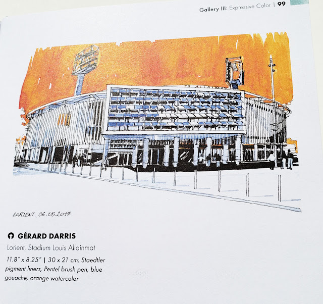
 The four Galleries at the end of the book are pure eye candy: Examples from urban sketchers worldwide show how they put those color principles to work. The use of color as expression – What! The sky can be pink or orange?! – is especially eye-opening to a literal sketcher like me.
 
Expressive color by Gerard Darris

Vibrant hues in pastels by William Cordero Hidalgo


Like other editions in the Urban Sketching Handbook series, Working with Color isn’t intended to be a comprehensive technical guide (about either color or watercolor). It’s meant to be a succinct, easy-to-grasp digest of tips that will get you excited about using color (if you haven’t dabbled in it much yet) or shake you loose from your lazy color habits (which was my hope for myself in reading the book). It’s worth a read and a re-read!

(Other books I’ve reviewed in the Urban Sketching Handbook series are Architecture & Cityscapes and People & Motion by Gabi Campanario, Understanding Perspective by Stephanie Bower, and Sketch Now, Think Later by Mike Daikubara.)

Sunday, April 28, 2019

Heavy Equipment Heaven

4/25/19 Viaduct demolition between Marion and Madison

Although the project is apparently behind schedule, demolition of Seattle’s viaduct has been ongoing since March. I’ve been waiting for it to warm up a bit to get down there to sketch the destruction. On Thursday the temperature was supposed reach the high 50s, so Greg and I checked it out. We went to the same area where I had made my farewell sketch of the viaduct last December.

4/25/19
I thought I had died and gone to heavy equipment heaven! I think I can confidently say that Alaskan Way between Marion and Madison streets has the highest concentration of bulldozers, excavators and cranes (and other things I can’t name) in the city. I couldn’t even count them all, but I saw things I’d never seen before, including a whole fleet of mint green machines bearing the FERMA logo. Specialty equipment must have been brought in just for this job, which is a huge mess of concrete, dust, rebar and metal.

For the first sketch, I stood on the ferry terminal pedestrian overpass. It was overwhelmingly challenging to capture the scope of everything going on. Although most of the viaduct is still standing, it’s strange to see large chunks of it gone. The area already seems brighter.

I went to the street level for a closer look. Mesmerized, I watched the monsters gobble up debris, swivel, and barf it all out onto growing mountains. Over and over. They move surprisingly fast for such huge beasts, but I caught a couple making repetitive gestures.

I’ll be back for more!

Big chunks of the viaduct are gone.


Just a couple of the many hungry beasts waiting to gobble
up the viaduct.

Saturday, April 27, 2019

I’m a Magnet for Heavy Equipment

4/26/19 former Key Arena under renovation

Ostensibly the Friday sketch outing was scheduled for the Cherry Blossom and Japanese Cultural Festival at the Seattle Center’s Fisher Pavilion. An indoor venue, it was a safe bet for these iffy spring days. My secret intention, however, was to sketch outdoors as long as the weather was hospitable, and it was. In the sunshine, I would even go so far as to call it “warm”!

4/26/19 at the foot of the Space Needle
In all directions, the Seattle Center is full of things to sketch, but I just followed my ears to the noisy commotion at the former Key Arena, which is undergoing a major renovation. Sitting on the edge of the International Fountain, I caught a crane and a few smaller machines doing their thing. The only problem was that from that distance, I didn’t realize the crane was standing on a lower level, so I couldn’t see most of its base. It looks like a crane without an engine. (Still, I’m pleased that I was able to get both the crane and the arena in the same composition while maintaining the correct proportions on both – all on a 5½-by-8½-inch page. I credit Gabi Campanario’s Pocket Urban Sketching workshop for that.)

I seem to be a magnet for heavy equipment – no matter where I go, I find some. (I realize that’s not a challenge in this city.) At the foot of the Space Needle, I found a machine with nothing to do, but its tire treads made an interesting study of light and shadow, as did the Needle itself.


Happy sketchers in the sunshine!

Friday, April 26, 2019

An Even Better Mobius + Ruppert Sharpener

Left: my new M+R covered sharpener; right: its brass uncovered counterpart

Several months ago, I reviewed the Mobius + Ruppert portable brass sharpeners, which have been serving me well, both at home and in the field. Their key attribute is that they accommodate my favorite Caran d’Ache Museum Aquarelle and other larger-than-average colored pencils, which won’t fit into most sharpeners.

In my review, I pointed out a design flaw of all its models: a hazardous exposed blade corner. In regular use, I also discovered an inconvenience that I didn’t have with the domed KUM I had been using previously: The M+R sharpeners are not covered, so I must take care to collect and dispose of the shavings. It’s a minor thing, but I have to remember to carry a plastic bag or tissue, and on more than one occasion, my shavings have blown away with the wind even as I conscientiously tried to contain them.

A bit larger than the "grenade" I had been carrying.
I may have solved both small issues with my only purchase during our recent trip to Victoria. As you’d expect, I poked around in three of downtown Victoria’s art supply shops (all within walking distance of our apartment!), and the best was Island Blue. There, I found an M+R sharpener with a plastic case that both captures shavings and – bonus! – protects me from the exposed blade corner.

The sharpener inside looks nearly identical to the double-hole wedge version except that it is not made of brass. I haven’t tried replacing the blades, but it looks like the same refills will fit. It’s a lot bulkier than the tiny “grenade” version I have been carrying since January, but unless I’m pressed for space, the convenience outweighs the bulk. I may switch back to the grenade when I’m traveling and need to minimize overall bag bulk. But as a daily-carry, it’s fine.


The M+R sharpener inside looks nearly identical to the double-hole M+R brass.

A "trap door" keeps shavings from spilling
back out.
A very nice design feature is a “trap door” in the holes, which keeps shavings from spilling back out into my bag. Boy, do I appreciate small but excellent features like that! (If I didn’t know M+R was a German company, I’d think this sharpener was made by the tidy Japanese.)

My new M+R has already served me well. I was in the Royal British Columbia Museum sketching the Legislative Assembly Building’s beautiful dome when I needed to sharpen several pencils for all those details. The M+R gave them perfect points and kept the shavings neatly contained.

Unfortunately, I don’t see the sharpener in Island Blue’s online catalog. If I need a replacement, I might have to make another trip to beautiful Victoria. A pity.


Sharp pencils for details

Thursday, April 25, 2019

Balmy

4/21/19 Maple Leaf neighborhood

It was 57 degrees and sunny on Easter afternoon. Walking leisurely through my neighborhood, it felt downright balmy compared to chilly Victoria the previous weekend. Even better – I didn’t sneeze once during the whole walk, which means the worst part of my allergy season is over. Dare I say the best of spring has begun?

Wednesday, April 24, 2019

Forklift

4/19/19 Maple Leaf neighborhood

The Maple Leaf Ace Hardware store shares a parking lot with Reckless Video, so although I don’t go into the hardware store often, I frequently use the parking lot to pick up our weekend entertainment (Reckless is one of only a couple of remaining video rental shops in the city). On this rainy afternoon, I was delighted to spot this cute little forklift. After picking up our video, I reparked the car at a different angle so that I could see the forklift through a side window more easily.

Tuesday, April 23, 2019

Showbox Theater and Pike Place

4/20/19 Showbox Theater, downtown Seattle

Last year, the historic Showbox Theater near the Pike Place Market was in the news when its owner announced that it was selling the property. The theater, opened in 1939, would be demolished and replaced by a (yet another, most likely boring and boxy) 44-story apartment building. (It’s the story of Seattle these days.) After that, nostalgic venue fans, historic preservationists and even high-profile musicians like Eddie Vedder stepped forward to try to save the Showbox. The debate rages and is still unresolved. Meanwhile, the venue continues to operate.

I wasn’t even aware of that last part until I arrived Saturday to sketch the theater and saw that the marquee was current. Although I’ve never seen a concert there, the marquee and Showbox sign are downtown icons, and I wanted to document them, since it’s likely that they’ll eventually come down. Others must have felt the same way, as we got a good turnout of Showbox sketchers.

4/20/19 buskers at Pike Place Market
It probably helped that the morning was dry and mostly sunny (though not warm). After the Showbox, I swam upstream through the throngs (what is this, July or something?) at the Pike Place Market to my favorite busker spot near Rachel the Pig. Performing were a ukulele player and a tuba player – a colorful duo that I’ve sketched before.

Swimming further upstream, I spotted the usual long line of people waiting their turn to buy coffee at the “original” Starbucks location on First and Pike. As I captured the storefront and P. K. Dwyer (another busker I have sketched many times) playing guitar and harmonica outside, I overheard a couple of young men (visiting from the UK, based on their accents). Taking photos of each other with upheld Starbucks cups, it was clear that this was an important stop on their tour. Reviewing the photos, one man was especially delighted to finally be photographed in front of his mecca. I didn’t have the heart to tell him that the actual first Starbucks on Western no longer exists (though natives like me remember it), and this second store on First somehow became the “original.”

Times change, old buildings get torn down, history gets rewritten. Meh. I may be a grumpy, overcrowded native, but at least I’m sketching it all.

4/20/19 One-man band P.K. Dwyer busks in front of the "original" Starbucks on First and Pike.

A good turnout at the Showbox!

Monday, April 22, 2019

Victoria, Part 3: Chilly but Charming

4/12/19 Yates & Douglas, Victoria, B.C.

Despite the less-than-comfy weather, Victoria had too many architectural and other charms to keep us indoors the whole visit. On my first afternoon, I found a quintessential (to me) urban street scene on the same block as our apartment (above).

As you might guess by now, I have a fondness for sketching historic churches, and Victoria is full of them. Within a few blocks of each other, I found several. I also sketched one that turned out to be a music conservatory (formerly a church).
 
4/16/19 Anglican Church of St. John the Divine

4/15/19 Christ Church Cathedral
4/15/19 Victoria Conservatory of Music
(formerly a Methodist church)

The downtown Victoria area is entirely walkable – if you don’t mind clocking 15,000 Fitbit steps a day! One morning we gave our feet a rest and caught a city bus to picturesque Fishermen’s Wharf. (Yes, the sky was blue, but don’t let that fool you – it was windy and cold.)
 
4/15/19 Fishermen's Wharf

As in most urban areas, construction sites were easy to find, but we spotted one of a type that we would never see in Seattle. On the harbor front, the facades of several old buildings were being preserved, and new construction was being built behind them. This seemed to be an ideal compromise between preservation and new construction.

4/17/19 construction around facades near harbor front

4/17/19 cement pumper
Butt receptacles -- a great idea!

Hanging out with the locals.

The blossoms are gone in Seattle, but they were still at peak in the north.

Fishermen's Wharf


4/17/19 Farewell, Victoria! We'll be back!

Sunday, April 21, 2019

Victoria, Part 2: Strategic Windows


4/13/19 Yates Street, Victoria

As Part 1 indicated, Victoria, B.C., was chilly and sometimes wet and bitterly windy on the days we were there. Strategically placed windows were my best friends.

After Gabi’s Architecture workshop on Saturday morning, my plan was to follow his afternoon People workshop students to wherever the workshop location was, but my teeth were still chattering! I went back to the Airbnb apartment that I was sharing with Cathy McAuliffe and spent a leisurely afternoon sipping hot tea as I sketched the spectacular street view (above). Within the scope of our huge picture windows on the seventh floor, an interesting mix of historic, modern and funky architecture shared the block.

When the sky was partially clear, we could see the snow-capped Olympic Mountains to the west. Although the Olympics are visible from various spots in Seattle, including our own street, the portion I see from there is different, so it was cool to see a new view.
 
4/16/19 Olympic Mountains

Another apartment window offered a view straight down into a courtyard. This mind-bending perspective gave me a fun challenge!
 
4/17/19 From the 7th floor

An especially strategic window was the one I learned about from Cathy: a perfect view of the Chinatown gate from Starbucks.  
 
4/15/19 Chinatown from Starbucks

On Sunday morning, Greg joined us, and we spent a few more days exploring Victoria. One of our favorite spots to escape the chill was the Royal British Columbia Museum, an excellent natural and human history museum. Our Burke Museum reciprocal membership allowed us free admission, so we visited twice. I found a number of skeletal and stuffed critters to sketch and even a couple of live ones.

 
4/16/19 taxidermy falcon and grizzly
4/16/19 bison skull, ammonite and weather symbols
as part of an excellent exhibit on climate change.

4/17/19 more skulls

4/16/19 These critters were sketched from life in a tank.


Finally, on the top floor of the BC Museum, I found my most treasured window sketch: the crowned dome of the Legislative Assembly Building. This is the kind of detailed sketch I thoroughly enjoy making, but the distance, cold and a sore neck would have made it difficult from any other location.

4/17/19 Dome of the BC Legislative Assembly Building

Of course, Victoria has plenty of other indoor attractions
during inhospitable weather, such as shopping at Bulk
Barn. . . I was so tempted to plunge my arm in.


It's never too cold for ice cream!

Sampling macarons!

I wanted the full Canadian experience... breakfast at Tim Horton's.

Related Posts Plugin for WordPress, Blogger...