Tuesday, June 30, 2020

White Party, Part 2: Water-Soluble Colored Pencils

White water-soluble colored pencils

A while back when I was asked my opinion on the most opaque white colored pencil, I compared the best examples from among my traditional (wax- or oil-based) colored pencils. I’ve lately been fascinated with using white pencil on black paper for my daily hand drawings, so I started pulling out every white pencil in my stash, including watercolor pencils, just to give them a try. It seemed worthwhile to compare some of the artist-quality white pencils from among my water-soluble collection.

To no surprise, my two favorite Caran d’Ache watercolor pencils – Museum Aquarelle and Supracolor – came out on top for opacity. Next would be vintage Sanford Prismacolor watercolor pencil and Faber-Castell Albrecht Durer. Staedtler Karat Aquarell, the hardest artist-quality water-soluble colored pencil I’ve used, is the least opaque. (All swatches were made with three layers of pigment.) In fact, in the hand sketch I made with it, I had to use a Supracolor to bring out the brightest highlights (below).
 
Water-activated swatches (Typo alert: The third sample should be labeled Albrecht Durer)
6/11/20 Karat Aquarell wasn't opaque enough
so I used Supracolor for the highlights. 
When activated with water, white water-soluble pencils don’t get me overly excited. Instead of intensifying the pigment as it does with most watercolor pencils, water applied to white dilutes the pigment (see samples above). In the hand sketch at the bottom of the page, I used a white Supracolor and applied water sparingly to fade the highlights into the shadows. The whole drawing looked a bit too gray, so I had to go back in with the dry pencil to reinforce highlights and also add more light where the water had faded the pigment too much. Since it was my first time using water-soluble white, I’m not sure I took best advantage of this quality, but it’s worth exploring further.

6/24/20 Supracolor pencil used dry and wet in Stillman & Birn Nova sketchbook

Monday, June 29, 2020

Plum for Plums

6/25/20 Green Lake neighborhood

A few days ago I showed you a sketch of some ornamental plum trees. I had a used a russet pencil for the trees’ intensely dark purplish-red foliage because it was the only dark red I had with me at the time, but I wasn’t happy with it. I’ve been digging through my pencils to see if I had something closer to the right hue, and wouldn’t you know it, the best color I could find was a Caran d’Ache Museum Aquarelle Dark Plum (106). I went back to the same dead-end street a few days later and made the sketch above.

A tricky hue to capture!
I’m happy with the color this time in addressing the question that my previous sketch might have raised: Are those red-orangy trees supposed to be maples in November…? Even if a viewer weren’t necessarily able to identify these trees as plums, I hope they would still see from the unusual color that these aren’t maples.

The big challenge with a hue this dark is conveying enough contrast between the highlighted parts and the shaded parts. My intention was for the paper’s texture showing through to impart some of the sparkle of the leaves reflecting light, but I’m still missing more contrast. A painter would probably leave most of the highlights paper-white and paint only the shadows. I’ve occasionally tried that technique, but it doesn’t seem to translate well to colored pencils.

6/28/20 color study of ornamental plum
A comment from a reader on that earlier post prompted me to try Prismacolors in Black Cherry (1078) and Black Grape (996). Sue had also suggested Black Raspberry, which I don’t have, but I substituted a Faber-Castell Polychromos in Dark Red (225). I have become so reliant on the fast, easy richness of both hue and texture possible with watercolor pencils that I don’t typically use traditional (non-water-soluble) colored pencils in the field because they take longer to achieve those effects with layers. But I was curious enough about finding the elusive color for this tree that I grabbed those three pencils and took them out on our upstairs deck to make the color study at right. (Usually I curse this rather unkempt tree next door because it blocks so much of the view down the street, but on this day, it came in handy.) At a much closer distance to the tree than when I made the sketch above, I noticed that some of the top-most leaves have a brighter red tone, where the Polychromos was just right. I would have to spend more time on it to get the same richness of tone that I obtained with a spurt from my spritzer on the sketch at the top, but the colors are a good choice.

Sunday, June 28, 2020

Things I Miss


The good news is that Dr. Fauci is “cautiously optimistic” about a coronavirus vaccine being available by the end of this year or early next year. That’s the best news I’ve heard in months.

The very bad news is that he is also seeing a “disturbing surge” in infections since states have begun to “open.” In fact, the US hit an all-time high a few days ago. No surprise there. While some people behave as if everything is normal again, I continue to behave the same as I have since early March. If anything, it’s probably more important to remain vigilant now, since others may be more careless.

On Day 100 of this series (an arbitrary milestone, since I don’t know what I’m counting), I took stock of things I’ve missed and haven’t missed during the past three months. The obvious big miss is travel – we forfeited one trip that was planned for April and will not be traveling anywhere this year. (It’s probably the first year in more than three decades that we won’t be getting on a plane.)

Socially, I miss Urban Sketchers the most. I miss the friend I had been walking around Green Lake with every Wednesday for the past decade. I miss my family, too: A funeral and a 50th anniversary party – events we would have traveled to L.A. for – both got Zoomed instead.

Compared to some sketchers who have home-quarantined more strictly, I don’t miss sketching outdoors as much as they have. My neighborhood sidewalks are so sparsely used, especially in the early morning, that I’ve been sketching safely and easily all along. But I do miss sketching at parks, downtown, farmers markets, Seattle Center and so many other populated places. I miss sketching people in coffee shops and on the bus. I miss life drawing at Gage.

I miss summer treats that I look forward to all year, like getting fresh local berries at the farmers markets. (I went to the U-District market last week, masked and ready; when I saw the length of the entry lines wrapping around the block, I lost my courage and went home.) I don’t miss the crowded summer events that I tend to avoid even during normal circumstances, but I very much missed the Greenwood Car Show.

I don’t miss shopping, dining out or getting my hair cut. But I miss the simplicity of running ordinary errands like the post office without having to arm myself with mask, gloves and sanitizer.

I miss feeling safe.

What do you miss most?


Saturday, June 27, 2020

If I Had to Choose Only One Colored Pencil

6/19/20 Maple Leaf neighborhood (Caran d'Ache Supracolors in Stillman & Birn Beta sketchbook)

Several months ago, I needed a new inkjet printer. Scrolling through hundreds of options, I became frustrated by the many “all-in-one” models. They don’t just print; they also scan, fax, copy, make espresso and serve it to me with music and dancing. All I wanted was a reliable, high-quality color printer. While there may be nothing wrong with a multi-functional device that can do all things, I had a feeling that they would not do any one thing exceptionally (such as print). That’s been my experience, anyway.

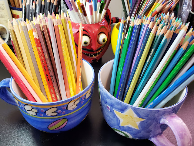
All of this is preamble to what I really want to talk about, which is, of course, colored pencils. If you’ve been reading my blog for a while, you know that I occasionally like to think about what I would take to Gilligan’s Island. It’s my way of hypothesizing different ways of simplifying my sketch tools: Beyond a “three-hour tour,” what if I had to use these and only these tools indefinitely (or at least for a specified length of time, like my annual minimalism challenges)? It occurred to me one day that I had never posed the question about colored pencils: If I could choose only one set (perish the thought!), which would I choose?

I have mentioned several times that different types of drawings or parts of the same drawing require different types of pencils (such as soft or hard), so identifying one pencil that can do all jobs well is not possible. My recent picks of top colored pencils short-listed my favorites, but that list still includes three water-soluble pencils and three traditional pencils. If I really had to choose only one set – the footlocker I’m taking to Gilligan’s island simply will not hold six sets – which would I choose? And how would I choose?

The answer comes down to versatility: Even if a single pencil set cannot do all jobs well, which “all-in-one” pencil set can at least print, copy, fax and serve espresso satisfactorily, if not ideally? These are the criteria I used to make my choice:

  • Water-solubility is essential and non-negotiable. That means the water-soluble pencil I choose must also work well dry. This criterion alone eliminates many watercolor pencils I’ve tried that are either unpleasant to apply (Faber-Castell Albrecht Durer, for example) or are difficult to blend and layer dry.
  • The core must be sufficiently soft and thick to accommodate my need to sketch quickly and efficiently on location.
  • Yet it must be hard enough to manage small details.
  • The color range must be wide enough to cover any subject matter I might want to sketch.
  • Replacement pencils must be easily available open stock (even on Gilligan’s island).

The pencil that meets all these criteria best is Caran d’Ache Supracolor. If you recall how often I’ve gone on and on about the virtues of Caran d’Ache Museum Aquarelle, you might be surprised by my choice. As often as I would easily choose Museum Aquarelle as my overall “favorite” pencil, it is the equivalent of a professional quality inkjet printer that makes beautiful color prints but that will certainly not send faxes (let alone make espresso). It’s my all-time favorite because it meets my urban sketching needs ideally. It is not without downsides, however. For example, the Museum Aquarelle is so soft and has such a hefty core that it will not hold a point for small details. Its color range is also narrow compared to most colored pencil lines. When achieving accurate hues is important (such as for botanical drawings), I almost always have to supplement Museum Aquarelles with colors from the Supracolor or Albrecht Durer lines.
6/9/20 Supracolor in S&B Nova sketchbook

The task that recently made me appreciate Supracolors used traditionally (without water) was my daily hand sketches on black paper. When I don’t plan to use water, I tend to choose a traditional pencil, so it was an interesting experiment to use a white Supracolor fully intending to leave it dry. The white Supracolor applied almost as pleasantly as various oil- and wax-based white pencils (without the “stickiness” of some water-soluble pencils), and the dry pigment was rich and opaque.

To continue examining Supracolors dry, I made two similar sketches of bellflowers using the same four Supracolor pencils – one sketch using dry pigments only, the second with both wet and dry layers. Although extremely soft, Supracolors will sharpen to a nice point and stay sharp long enough to draw slender leaves and stamen. In the dry sample, the pigments layered and blended beautifully. In the dry/wet/dry sample, the pigments again layered and behaved predictably well (as I have come to expect from both Supracolors and Museum Aquarelles).

6/18/20 dry Supracolors in S&B Epsilon sketchbook

6/18/20 wet and dry Supracolors in S&B
Beta sketchbook

Incidentally, the four colors I used are Cobalt Violet (620), Ultramarine Violet (630), Bright Green (720) and Olive Yellow (15). The first three are from the Limited Edition 30th Anniversary Set, which means they aren’t available open stock (and therefore can’t be replaced at the Gilligan’s Island art supply store). I sure wish Caran d’Ache would make these “limited” colors part of their standard line, as I often find that the color I want happens to be one of them.

As a final test, I wanted to see how Supracolors perform in the field. Although I normally carry one or two Supracolors (usually seasonal or specialty colors that aren’t available among Museum Aquarelles), I’m not sure I’ve ever made an entire sketch on location with nothing but Supracolors, so it was high time I tried it.

Before going out, I tried to match each Museum Aquarelle in my current palette (which is smaller than usual in the Pandemic Edition of my sketch kit) with an equivalent Supracolor. I was able to find an identical or close match for most colors, but not Museum Aquarelle’s Dark Phthalocyanine Green (719), which I use often for the shady side of foliage. Nothing in the Supracolor line comes close.

The sketch at the top of the page, a quiet alley with interesting shadows one morning, was the result (including a bit of pentimento from a previous sketch that ended abruptly when my subjects went away). Not quite as soft or rich in pigment as my beloved Museum Aquarelles, the Supracolors still held their own and would certainly be sufficient for sketching on location. (I did miss that green 719, though.) I was able to cover large areas almost as efficiently as with Museum Aquarelles, and spritzing the foliage areas with water activated the pigments nearly as vividly.

So if I had to choose only one set of pencils, it would be Supracolors. The irony is that they might not be my first choice for anything. If I want to do a detailed, full-color drawing with traditional pencils, I would probably choose Faber-Castell Polychromos or vintage Prismacolors (or more likely both – an ideal hard/soft combo). If I want water-solubility, then I would go to Museum Aquarelles first, then pull in additional colors as needed from among Supracolors and Albrecht Durer. If I’m stepping out the door, Museum Aquarelles are always my first choice. But while Supracolors aren’t ideal for everything, they can do everything well enough with no complaints from me. It’s my most versatile colored pencil.

Move over, Gilligan... here I come!

Friday, June 26, 2020

Ornamental Plums

6/23/20 Green Lake neighborhood

Among Seattle’s common trees is a very dark red, nearly purple one (see below) that has small pink blossoms in spring. The foliage stays this color year-round until the leaves fall off in autumn. With the help of social media, I finally learned that it is an ornamental plum.

These ubiquitous trees are tough to sketch. If I make them too bright red or red-orange, they look like maples in the fall. If I try to replicate that very dark color, it’s often too violet or nearly black. Since I’m sketching and not making a botanical drawing, accurately representing the hue is not critical; I don’t expect viewers to be able to identify a tree species from a sketch. Trees do, however, provide information about the location and season, so they can be an important part of an urban sketch’s “story.” I don’t want a sketch to be mistaken for late-autumn if I made it in June.

In this sketch, I used Caran d’Ache Museum Aquarelle Russet (065), which is too orange and too bright (with French Grey 808 for the shadows). I’m looking through my pencils to find a better hue and will report back the next time I sketch one of these plums.

Ornamental plum trees, Green Lake neighborhood


Thursday, June 25, 2020

Pandemic Sketch Kit Update: More Colors!

More colors! (That's not hand sanitizer... it's my water spritzer.)

A while back, I showed you the pandemic edition of my sketch kit – the bare essentials to serve my somewhat furtive, hasty sketch opportunities. Initially, I think my spartan kit was also intended to represent some kind of austere stoicism – cutting back on sugar for the war effort, as it were. At the very least, I figured it was another opportunity for the minimalism I challenge myself with each year.

Now, two months later, I realize that’s nonsense. The main reason I want to continue keeping my sketch kit small and light is that I often sketch as a reward for my fitness walks (a program that I had initiated last winter). I’m still using a mini-size Rickshaw Zero messenger bag instead of my former larger daily-carry, but minimalism is not my current goal. Carrying a few more pencils never hurt anyone! Every time I make a sketch and feel frustrated by not having a color I want, I go home and put another pencil in. And with so few places to “go to,” this slim bag is now my only-carry – I might as well get the most of it.

I’m sure the kit will continue to change over time, but it currently contains 11 colored pencils, including two Caran d’Ache Bicolors (which are convenient for floral colors I use infrequently but feel disappointed when I’m without). That’s about half the number of colored pencils I used to carry regularly, so it’s still a compact kit. It’s interesting to build a palette based on needs as they arise rather than anticipating those needs.
 
Judiciously selected palette and other essential tools for specific needs

The other materials and tools also meet specific needs:

Although the kit has expanded, the materials still fit in two flat rows using all compartments of the Rickshaw bag organizer I have been using (the larger compartment is intended for a small sketchbook, but I store that separately). As seen from the top, it’s still svelte and tidy – and there’s room to spare for maybe a couple more pencils.
 
A few more pencils, but still slim and tidy.
Clockwise from top: Stillman & Birn Beta, Field Notes
Expedition, Field Notes Sweet Tooth (with a hacked cover),
Field Notes Signature

Speaking of sketchbooks, that may be the part that has changed the most to accommodate my corona-conscious fitness walk/sketch outings. A 5 ½-by-8 ½-inch softcover Stillman & Birn used to be my daily-carry. I still grab it occasionally, especially now that the weather is improving and I stay out longer, but I also rely on simpler, smaller sketchbooks. The 4 ¼-by-6 ½-inch Field Notes Signature is now the daily-carry. Sometimes I grab a red Field Notes for a change. And when it’s drizzling? A waterproof Field Notes Expedition and a soft graphite pencil (which feels so good on the Expeditions Yupo pages) are all I need.


Different sizes and formats for different needs

My revised kit reflects my new attitude. I’ve waited all winter and spring for the best sketching weather, which is right now and doesn’t last long; I’m not going to waste it. As long as I’m safe and have consideration for others, I see no reason to be furtive or hasty. While my perimeter has gotten smaller, I still find plenty to sketch. And I refuse to let fear and anxiety keep me from it.

Everyone knows that a new attitude requires a new bag. My red Rickshaw mini-bag wasn’t bright enough – I got a new one in eye-searing neon pink with a neon green lining! After a couple of months of pandemic-required closure, my favorite San Francisco bag maker is open again and fulfilling orders. (They were making masks only during the closure, which I also bought.) I was happy to welcome them back with my order.

Mini-size Rickshaw and sketch kit: Grab and go! (The pin is from Draplin Design Co.)


Like I said -- more color!

Wednesday, June 24, 2020

Two Palms

6/18/20 Green Lake neighborhood

Here’s another sketch from the other side of the freeway. I’m always tickled by palm trees here in this decidedly non-tropical climate. Even if they are only Chinese windmill palms, which apparently thrive here, I like pretending I’m in Hawaii or even L.A.

Tuesday, June 23, 2020

Sketchographer

6/17/20 Sketches from live video

A couple of months ago, my introduction to the Zoom videoconferencing app occurred in a Facebook group meetup. Since then, I’ve used it numerous times for life drawing, classes and other events, and now it seems like the new normal.

Last week the same Facebook group had another meetup – multiple times, in fact, to accommodate various time zones around the globe. As the self-appointed sketchographer again, I tried to capture as many participants as I could. It was so much fun to see faces and chat with folks in North America and Europe.


Monday, June 22, 2020

Blind View

6/16/20 Maple Leaf neighborhood (modified blind contour)

The modified blind contour selfies I made were a fun warm-up to the challenge initiated by USk Japan: Make a sketch on location using the same method. Standing on our upstairs deck looking out on this familiar view, the technique gave me a fresh perspective. Each time I lifted the pencil, I looked down at the paper to regain my footing, but changed pencil colors to indicate the path. Although I would be hard-pressed to recognize this view as my neighbors’ houses and trees, I like the stark contrast between the marks indicating the architecture and those of the foliage.  Like the selfies, this sketch was a non-threatening and engaging way to approach a view I’m usually not excited by.

Sunday, June 21, 2020

Think More, Draw Less


After getting past the initial shock of how challenging it is to draw on dark paper (with focus on the highlights instead of the shadows), I am now having endless fun exploring this mind-twisting exercise!

I’ve also lately taken on the additional challenge of attempting to draw as little as possible while still evoking the whole hand. If I draw too little, the result might become abstract or look like amputated fingers. It’s a fine line to tread. One thing I have learned so far from this minimalism exercise is that the more time I spend thinking before I put down the first mark, the less time I spend drawing. When I was drawing the whole hand, I didn’t do much pre-thinking at all – I just sat down and drew. Now I spend more time examining the form and how the light defines it. I’m sure books and art teachers have given me that advice many times, but I guess it takes a pandemic and 96 drawings to learn the lesson.  


Saturday, June 20, 2020

Selfie Mode

6/14/20

Every now and then I get in the mood to do a self-portrait. Typically, these are “serious” drawings in which I attempt to capture a likeness. This always spells doom, and I’m rarely happy with the results (I’ll show them to you one of these days).

One day after another frustrating attempt, I thought about how easily and quickly I sketch small portraits of other people – why can’t I do that with myself? At left is the result, and I must admit I like this one – pandemic hair and all.

This week USk Japan issued yet another inspiring challenge: Draw using the modified blind contour method, which means keeping your eyes on the subject and avoiding looking at the paper. We can look down at our paper occasionally to regain footing on the drawing, but when we do, we change pen or pencil colors. The changing of colors indicates the path and process we took, which is fascinating to track.

I warmed up with a couple of selfies in front of our full-length mirror (below). I like these better than most selfies I’ve made! 

6/15/20 (modified blind contours)


Friday, June 19, 2020

Dead Ends Galore

6/17/20 Green Lake neighborhood

Our usual walking territory is bordered on one side by Interstate 5. Back in the day when I rode the bus often, I crossed over the freeway regularly to get to the bus stop, but it’s a noisy, unpleasant walk, so I avoid it otherwise. We have been tiring of the four-by-10-block area we’ve been walking daily since March, though, so I proposed a change. Venturing over the freeway, we have a whole new neighborhood to explore.

The best discovery so far: three streets that dead end at the freeway wall! I love dead ends like this because I can stand in the street with my back to the wall, safe from cars and without getting in the way of pedestrians. And lucky for me on this morning, the clouds suddenly parted.

Thursday, June 18, 2020

Houses of Maple Leaf

6/13/20 Maple Leaf neighborhood

A couple of years ago I began a series of sketches to document the architectural styles of my Maple Leaf neighborhood. Most were “portraits” of individual houses I found especially charming or that exemplified the various styles I see around here. I usually stood directly across the street, and on warm, sunny mornings, it was sheer delight (and extremely challenging, I might add) to spend close to an hour trying to capture these homes.

I continued the series last year, and my intention was to keep going this summer. But now I don’t feel I should stand on the sidewalk for an hour while pedestrians may be trying to get past me safely. Stepping 6 feet away each time I see someone coming is difficult to do while sketching.

I’m undeterred, however. I am taking notes on houses that face in directions that I can find safe spots to stand for a while. And I have also changed my approach to this series. The sketches do not all have to be color portraits as I have made in the past. Quick, small sketches also tell a story, especially when shown together.

Above are three small sketches I made while standing on the corner of Northeast 80th Street and Fourth Avenue Northeast. Eightieth is a busy, noisy arterial that leads to the freeway entrance, so pedestrians rarely walk where I stood. Within 15 minutes, I simply pivoted to make each sketch. I’ll let you decide which one is not like the others, but they all tell the story of Maple Leaf architectural styles.

Wednesday, June 17, 2020

A Walking Sketch Journal

6/12/20 Maple Leaf neighborhood

Stopping for a sketch has become an integral part of my daily walk. On many days, I stop for only a few minutes (each of these took 5 to 10). On especially pleasant days when it just feels good to stand in the sunshine, I might take a good 30 minutes or more. As I walk, I’m constantly looking around for a sketch; it keeps me engaged and observant.

When I recently tried making a sketch journal page spread to record the events of an ordinary day, I enjoyed both the process and the result, but I also knew it was not a format I was likely to continue: I felt under too much pressure to do things that were sketchable. When I look back at my small walk sketches such as these, however, I realize that they collectively form a sketch journal in some way. Nothing extraordinary ever happens on those daily walks, but if one thing catches my attention for the length of a drawing, then those few minutes are not wasted.

My sketches have also become my fitness record: Instead of looking at my steps on a FitBit, I can just look back at my sketchbook to see the days I took a walk.


6/2/20

6/3/20 A squirrel lunching from a bird feeder!


6/11/20


Related Posts Plugin for WordPress, Blogger...