Tuesday, November 28, 2017

The Feeder is Back Up

11/28/17 chickadee
We put our bird feeder back up last week right after Thanksgiving. After enjoying watching and sketching the birds all last winter, we took it down in the spring so they wouldn’t get too fat and lazy. It’s fun having it back up again, especially on these days of seemingly relentless rain. (Lucky for me, birds don’t have a problem with wet-weather dining.)

I keep a pocket-size Stillman & Birn sketchbook and a few water-soluble colored pencils on the kitchen counter next to the window that looks out on the corner of our backyard where the feeder hangs. Whenever I pass through or get a hankering to sketch something live (and lively), the tiny birds are endlessly entertaining. Most of my sketches are small, unfinished and in varying poses. After viewing the birds repeatedly over the course of a few minutes, I add details a little at a time. Eventually some sketches start to look complete. Shown here are two of the most finished sketches from the past few days.

Though the smallest, the chestnut-backed chickadees are the most aggressive (and fastest!), chasing away any other birds that perch nearby. The dark-eyed juncos seem the most reticent, waiting on the nearby fence for the chickadees to move out before they go in. The juncos also like to drop down to the ground and peck the seeds that have spilled out. A newcomer we hadn’t noticed before is a pine siskin. The only reason I can identify any of these birds is because we bought a book on Seattle and Puget Sound birds from our local Audubon Society office.
 
11/28/17 junco
That’s also where we bought the feeder, which is a Brome Squirrel Buster. Recommended by my friend Alex, a birder and urban sketcher, the feeder is designed to keep squirrels and large birds out. We’ve enjoyed highly comical entertainment when a squirrel tried to maneuver his way onto the perches, but his weight caused the feeder to close access to the food. A Steller’s jay and a flicker each tried to feast from the feeder too, but both were too big to use it. I would have loved to have had the chance to sketch those larger birds, but I guess we’d have to get a separate feeder for them.


Even as it is, those tiny birds are going through quite a bit of feed each day – a small price to pay for our winter entertainment.

Monday, November 27, 2017

Product Review: Stabilo CarbOthello Chalk Pastel Pencils

Stabilo CarbOthello chalk pastel pencils
When I was in London last year, I made a brief stop at the L. Cornelissen “artists’ colourment” shop, a very old store crammed from wall to wall and floor to ceiling with brushes, paints and paper. I didn’t need any paints, I already owned all the colored pencils they carried, and I didn’t want anything heavy to pack like sketchbooks, but I couldn’t leave a London institution like Cornelissen without buying something, could I? The only thing I bought was a small set of Stabilo CarbOthello chalk pastel pencils, which I wasn’t overly interested in. Chalk pastels were not really my thing – I tend to shy away from anything that smears easily, creates dust or is otherwise messy – so I put them aside as a lovely souvenir from London.

Stabilo CarbOthello
At the Chicago symposium, my swag bag contained a few General’s chalk pastel pencils (which I reviewed at the Well-Appointed Desk) and some samples of Stillman & Birn’s toned Nova paper, so I put the two together and experimented with a few small sketches in Chicago. As expected, I didn’t care for the way chalk pastel smeared and transferred to whatever was next to it, but I did like how opaque it is on toned paper. I didn’t do much with the pencils after that, but a mental note had been filed.

Fast-forward to the many continuous days of rain we’ve been having this month, and I started thinking about chalk pastels again. Something I read recently reminded me that chalk pastels are partially water-soluble, and that gave me an idea. I decided to give them another try, this time using water with the Stabilo set I bought at Cornelissen.

Compared to the General’s chalk pastels, the CarbOthellos have richer and more intense hues, but they also produce quite a bit more dust. (Cough, cough – that can’t be good to breathe!) I found myself working somewhat carefully to avoid producing too much dust, and I tapped the excess off into my waste basket.

11/25/17 CarbOthello with water applied (Stillman & Birn Alpha)

Compared to colored pencils, the chalk pastels are very quick to apply to Stillman & Birn’s toothy Beta paper (above). I left some of the paper’s tooth showing, and then I took a blending stump to blend the pastels and work them in further, easily covering most of the surface. Their blendable opacity is really fun – whatever you put on top covers most of what’s underneath, but when that’s blended, the pigments underneath are still on the surface, so they return as part of the mix. (I find colored pencils to be much more transparent, so colors tend to mix optically rather than blending like paints.)

CarbOthello test swatches with water applied.

As expected, chalk pastels smudge and smear easily, so I was eager to get to the next step: water application. (I meant to scan the apple sketch before applying water to show the difference in appearance, but I forgot. And truth be told, I was skittish about putting that mess on the scan bed.) Chalk pastels don’t dissolve completely or as vibrantly as water-soluble colored pencils, but they do blur just enough with water to get similar blended effects. The larger benefit, though, is that they hardly smudge at all once the paper is dry. In my test swatch on S&B Beta paper, water was applied with a waterbrush to the lower half of the swatch (below). After the paper dried completely, I gave the whole swatch a smear with a paper towel. The top half, which had no water applied to it, still smeared, but the lower half hardly smeared at all.

Application of water stops much of the pigment from smudging.

Hmmm, this interesting discovery encouraged me to keep experimenting – maybe I could grow to like chalk pastels after all, if water tames their smudge and dust factors! I pushed on, this time with black S&B Nova paper, which I figured would really show off CarbOthello’s opaque hues.

As I’d hoped, the colors really pop on black paper. I deliberately left some of the paper’s texture showing through because I intended to apply water to blend the chalk pastel further. Before I did that, though, I made a test swatch just as I did on the white Beta paper – with a very different result. On black, the dissolved pigment on the bottom half of the swatch was much less intense than the dry chalk pastel. As before, although applying water did keep smudging at bay, I didn’t like the way the color became less vibrant. Well, that was disappointing!

11/25/17 CarbOthello left dry (Stillman & Birn Nova)
Application of water prevented smudging but also
took away much of the hue's vibrancy.


I decided to leave the sketch on black paper dry (and despite my trepidations, I put it on the scan bed, then cleaned the glass furiously afterwards. Yuck, what a mess). 

I don’t think I’m ever going to be a huge fan of using chalk pastels – not only because of the inherent mess, but also the potential for inhaling pigment particles. But they kept me busy on another rainy day.


Friday, November 24, 2017

Mastodon and Elasmosaur Redux

11/24/17 Mastodon, Sage and Tina
The Burke Museum is one of my favorite indoor places to sketch. Full of dinosaur skeletons and other natural and human history artifacts, it’s a treasure trove for any sketcher. Yet, as many times as I’ve sketched there, I seem to gravitate toward the same few artifacts over and over. They never cease to be challenging, and I apparently never tire of them.

That said, it’s been a good two-and-a-half years since I last sketched the mastodon (whose skull I had first attempted the year before). Like last time, today’s visit was with USk Seattle, and I finally caught the mastodon with a couple of sketchers nearby for scale. He’s a massive, formidable form.

Another favorite is the Elasmosaur, a marine reptile with oar-like flippers that are structured remarkably similar to our own hands. The last time I sketched his whole skeleton was three-and-a-half years ago, and that time I used a full sketchbook spread to capture his enormous length. This time I used a single page only, which may not seem like a big deal, but it’s a mark of growth for me because I have always been challenged by scaling large objects on a small space. Then, as today, I marveled at his tiny, tiny head compared to the massive yet most likely graceful body as he swam through the oceans in search of critters to chomp with his interlocking teeth. 

I had a feeling that sketchers would prefer the Burke to Black Friday madness, and I’m happy that I was right – we had a great turnout of USk Seattle today!

11/24/17 Elasmosaur

Thursday, November 23, 2017

29 Minutes

11/22/17 Roosevelt neighborhood

In Mike Daikubara’s book on urban sketching, he talks quite a bit about how to manage one’s time and expectations to get great sketches, no matter the circumstances. He uses a quadrant graph to explain how he manages his own sketching based on his energy level and the time available. For example, if he’s tired and low on energy, he would need more time to sketch, and conversely, if has plenty of energy, he might attempt a sketch in a very short time. If he’s low on both, he might not attempt it at all. He also has ideas for scaling back on color or details if he’s running out of time but wants to leave a sketch at a place of completion rather than simply stopping and leaving it unfinished. He has developed a solid set of strategies that he has honed over the many years that he has been sketching.

As I was reading, I realized that although I have slightly different tactics, I, too, have come to develop my own strategies for managing my time and expectations for sketching. Like Mike, I’ve been honing these strategies for a while. Unlike Mike, however, I don’t know how to teach them (or whether they can be learned) – I think they come from experience.

When I first started out, I used to think I needed a relatively large chunk of time to “do urban sketching,” and I did. That large chunk of time began even before I left the house, choosing and prepping my materials: Should I bring watercolors today? Then I’d better bring the watercolor paper sketchbook. But it’s so heavy – maybe not. Oops, I’d better not forget brushes and a water cup. Oh, maybe I’ll skip it and just bring markers. If so, which colors? If I go to the park, I’d better have lots of greens. If I go downtown, I won’t need many greens. Hmm, I do want to try this larger sketchbook today – I need a different bag now. Should I bring a stool? On and on.

Once I finally arrived at my destination, I’d spend quite a bit of time looking for subject matter that appealed to me or looking for the “right” angle (without really understanding what the right angle might be). I would draw a woman sitting on a park bench by starting with her face, her hair, her jewelry, the pattern on her jacket, and suddenly, she would leave. Then I’d have to start over with a new sketch. Three hours later, I’d go home with one or two complete sketches, and indeed, “doing urban sketching” took a substantial chunk of time.

After about a year, I got tired of the whole kit-prep process of deciding which materials to bring each time I sketched. I made a significant shift – both practically and mentally – by carrying all my materials with me all the time, every day, whether I planned to use them or not. To do that, I had to pare down my options and think about what I really needed (obviously still an ongoing process!). But more important, my choice to do so changed urban sketching from a hobby (defined by me as something I do during a substantial chunk of planned spare time) to a lifestyle (something that doesn’t require much thought or prep because it’s integrated into my ordinary day).

That shift changed not only my sketch kit; it also changed my attitude and ultimately the amount of time I “needed” to make a sketch. I still have many occasions when I consciously set aside a chunk of time to sketch subject matter that particularly appeals to me or that I want to observe closely, and every time I go out with Urban Sketchers is such an occasion. But day to day, sketches fit into whatever slot of time is available. And that means I sketch regularly, which is important to me in maintaining a practice and a habit.

Yesterday after running an errand, I returned to my car and realized that I still had 29 minutes left on my meter. I had paid for that time; I intended to use it – and I spent exactly 29 minutes on the sketch at the top of the page. How did I know it would take me exactly 29 minutes? I used one page of my standard 6-by-9-inch DIY sketchbook, and almost amazingly invariably, it takes me about a half-hour to make a sketch of that size (with color, a little longer – maybe 35 or 40 minutes). As you can see, I also didn’t spend any time looking for appealing subject matter or the right angle – I just drew what I saw through the wet windshield.

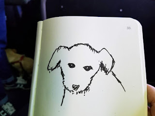
11/17/17 Furry commuter
A few days ago on the bus, I spotted a puppy in the aisle nervously twitching and circling his standing human’s feet. That small sketch took a few seconds because I knew that’s all he would give me. (Actually, it probably took a minute longer than that if you count the time I waited for him to face me.)

The hooded man on a different bus took five minutes. I know this because at the point that I started sketching him, it takes five minutes to reach the transit station. (There was a small risk that he would get off at an earlier stop, but I could tell by the way he was sitting that he probably wouldn’t.) I finished most of the sketch in probably four minutes, then used the remaining time to add a little more detail, like the stitching around his hood and a few more hairs on his beard.

11/17/17 Hooded commuter
On rare occasions I have what would be considered optimal circumstances by most sketchers’ standards. One was in Varenna, Italy, last May. Greg was fully occupied with photography, so I didn’t have to worry about him. It was a beautiful morning – warm but not hot, a partly cloudy sky, not windy. Lake Como and the mountains around it were exactly the hues of the secondary triad palette I had just learned about in my colored pencil class and was eager to try on location.

In class, working from a photo, I would have probably taken many hours to complete a drawing, and I knew I didn’t want to spend that long, but I wasn’t sure how much time it might take. The landscape-format panorama spread I used is just a little smaller than two 9-by-6-inch pages in my regular DIY sketchbook, and remarkably, my Lake Como sketch took just about an hour. Even under optimal conditions, I still seem to sketch at about the same rate. Maybe that’s just the limit of my sketching patience. (I really didn’t set out to develop such a reliable time frame, but it’s convenient.) In any case, I had to focus my attention on the aspect (color) that was important to me about this composition so that I would have time for it. (And drafting took very little time, because I decided these mountains didn’t require much accuracy.)
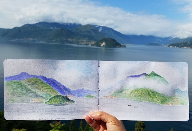
5/17/17 Lake Como

I wish I had a formula for developing a strategy like this, but as I mentioned earlier, I think it just requires some experience. When beginning sketchers tell me they need “more time” to sketch, I jokingly respond with, “Just lower your standards.” It sounds snarky, but I’m being realistic to my own experience. If you spend less time looking for “inspiring” subject matter, you learn to find something interesting about whatever is in front of you. If you’d like to sketch the whole puppy, lower your standards and sketch only his face, which is all he’ll sit still for. If color is important to you, don’t worry about getting the shape of the mountains right. If you have limited time (which is almost always), spend some of it deciding what’s important to you about what you see, and focus on that – not on everything. 

It’s not important to find out whether a 6-by-9-inch sketch takes you a half-hour; your process might or might not lead to a reliable time frame. What is important, though, is sketching regularly, because that’s what gives you the experience that helps you gauge how much of a sketch you can do before your meter runs out (or whether you care). 

Wednesday, November 22, 2017

Rusty at Zoka

11/21/17 Warming up
I’ve been spending so much time this fall focused on my graphite drawing class (now completed) that I haven’t done much people sketching at all – usually my primary subject as soon as the rainy season begins. Last winter and spring it was the same thing as I worked many hours with colored pencils instead of having fun at coffee shops or at life-drawing sessions. As much as I’ve enjoyed and learned from the intensive classroom study, I’ve missed drawing people – and I’m feeling very rusty.

According to my blog, I hadn’t been to Zoka Coffee, my favorite coffee shop for sketching, since March when I was feverishly trying to get through #oneweek100people. Since then, the signage and some décor had changed and, remarkably, their already delicious blueberry scones had somehow gotten even better! Or maybe I had just missed them, too.

Feeling very creaky, I warmed up first with a brush pen (above), just like I do at life-drawing sessions.

The guy below was drawing too, but not urban sketching. He kept his eyes pinned to his sketchbook and never glanced up long enough to notice that I was drawing him. He kept twisting himself into interesting, challenging-to-draw pretzel positions. His hands were always moving, but I tried a couple of details anyway.

11/21/17 Sketchy

Dripping wet when he arrived, Mr. Hoodie never removed his jacket as he stared at his laptop all morning.

11/21/17 Drippy


Mr. Fidget kept me busy trying to keep up with his three arms.

11/21/17 Fidgety

Monday, November 20, 2017

Minimal Sketch Kit: A Personal Challenge

My current daily-carry sketch kit.

After reading my review of Mike Daikubara’s book in which he talks quite a bit about maintaining a minimal sketch kit, a blog reader asked me what my minimal sketch kit would be. Believe it or not, I have tried to answer this question for myself many times, at least in theory. However, I can’t say I’ve ever answered it in practice – at least for more than a day or so.

The photo above shows my current daily-carry sketch kit. Although I’ve carried much more at times, my current kit could hardly be called minimal. (If you do a search on my blog for “bag dump,” you’ll see variations of the contents through the years.) I don’t ever need all of these supplies every day, but since I never know what subject matter I’ll encounter or what I’ll feel like sketching on any given day (and this is doubly true when I travel), I always feel a need to carry everything – just in case. And more to the point, I don’t want to stop and choose which materials to bring each time I go out, because that just adds to the general maintenance and overhead of sketching. I want to grab and go each time I step out the door, and this kit serves me well that way.

Nonetheless, I do think often about lightening my load and streamlining my supplies, especially when I’m due to travel, but also here at home. So, my reader’s question prompted me to review the various ways I’ve tried to answer it for myself.

The one time I really don’t want to be encumbered with a bag is when I go out fitness walking around Green Lake, which I’ve been doing regularly for nearly 30 years. Until I started sketching, I carried nothing but my phone, ID and keys on these walks. You can read about the event that eventually prompted me to carry a minimal sketch kit while fitness walking; here’s what it looks like:

My fitness-walking kit

 The contents change from time to time, but in general, the kit consists of a small notebook and two or three pens.

When I began using Field Notes notebooks for quick, casual sketches, I started thinking about the concept of a minimal sketch kit further, and I realized that my choice of media was determined by my choice of small notebook. Depending on which one I used – one with red paper, one with bright orange paper, or one with white paper – I could choose one or two pens appropriate for the paper. That’s fairly minimal as well as compact, just like my fitness-walking kit, but I also find the page size limiting. (I do carry and use a Field Notes daily, but only in addition to the rest of my kit – not instead of.) Here are a few variations:

Field Notes Sweet Tooth, white Gelly Roll, Franklin-Christoph fude fountain pen

EEEK Field Notes, white Derwent colored pencil, white Gelly Roll, Copic brush pen

Dime Novel Field Notes and Zebra brush pen
Dime Novel Field Notes

Of course, I know it’s possible to streamline even further, and a couple of months ago I set out to prove it to myself by taking nothing but a slim, A5-size notebook and a pencil to the park. If my goal is to simply capture daily scenes from my mundane life, a pencil and paper could easily serve that need. Who needs all that color anyway? (I can hear you laughing all the way from here.) Well, that lasted only for the one trip to the park, but it was a good theory. Again, I do regularly use that particular notebook (a Baron Fig Vanguard) with a single pencil, but I carry them in addition to everything else – not in place of.

Baron Fig Vanguard and Blackwing pencil

When I started using a new Stillman & Birn Nova sketchbook with toned paper a couple of months ago, I realized it could be the centerpiece for a nicely streamlined sketch kit. A brush pen or gray toned markers, a white pencil or gel pen for highlights, and a couple of colored pencils for spot color were all I needed.


Stillman & Birn Nova sketchbook, brush pen, fountain pen, colored pencils

Of course, then the trees started turning, and I got frustrated that the brightest, boldest urban palette I can use all year seemed dull on gray paper, so I quickly put away the Nova and went back to my standard white paper – and all 25 colored pencils as usual.

Every sketch kit begins with paper: The sketchbook you choose sets the stage and determines all the other choices you make. For example, if you choose a small notebook with thin paper that can’t stand up to any media other than pencil, that would make an ideally minimal kit. If the book has red paper, then you don’t need color – a black and a white pen will do – another minimal kit.

My problem is that for most of the years I’ve been sketching, I’ve been making my own sketchbooks with paper I chose specifically to hold up to as many wet and dry media as possible. Although not of the highest quality, Canson XL 140-pound watercolor paper can take everything I’ve ever tried with it – watercolor paints, watercolor pencils, traditional colored pencils, inks (applied with a pen or a waterbrush), graphite, brush pens, India ink, and water applied with a brush or sprayer. Since the paper accommodates everything well, I have a challenging time eliminating media options. And that’s how I end up with a relatively hefty, non-streamlined kit. 
Not exactly minimal.

I’m motivated to simplify my kit, but I know I wouldn’t last long using only a pencil, or even only a red Field Notes and brush pen. I’m thinking I’d do better with a kit somewhere in between. What about that toned Stillman & Birn? I’ve been intending to give it another try anyway once the dead gray of winter settles in, and I’m mostly sketching indoors. So here’s my plan: Come January when the red Santas and green wreaths are a fond memory in the white pages of my usual DIY sketchbook, I’ll switch to the tan S&B Nova. At the same time, I’ll streamline my tools to a half-dozen (or so) colored pencils, a pen, a couple of gray markers and a white pencil. And I’ll commit to that kit until the book is full (or until the cherry blossoms bloom, if that comes first! Every promise has a cherry blossom clause). It’ll be my version of a New Year’s resolution (which I otherwise never make).

Sunday, November 19, 2017

Foreseeable Future

11/18/17 Wedgwood neighborhood
Yesterday was the only rainless day for the foreseeable future (10 days, according to my weather app). Not only was it rainless, it was sunny enough for this piece of heavy equipment in the Wedgwood neighborhood to cast a shadow. I’m guessing it will be noisy on this block come Monday.

Friday, November 17, 2017

Wyeth Retrospective at SAM

11/17/17 The Hammering Man's boot at SAM
The Seattle Art Museum’s current show is Andrew Wyeth in Retrospect, which covers the span of this American painter’s remarkable 75-year career. In the two hours that I was there today, I saw only about half of it, so I’m going to go back sometime soon to see the rest. My friend Anne and I agreed that it’s an intense exhibit; you can’t breeze through because each work requires – demands – your full attention and scrutiny. And whenever you observe a detail – each hair and its shadow; a complex skintone created with egg tempera; the sharp light slanting on a building at night that must be coming from the moon – you are rewarded for your attention.

The 110 works in the show are mostly tempera and “dry brush” watercolor paintings, but several pencil drawings are also included. As always when I see an exhibit that includes studies, I was as intrigued by these preliminary works as I was by the finished paintings – perhaps more so. I love seeing the fresh, incomplete marks and wondering what the artist was thinking about as he restated a line. Of course, they hardly looked like sketches or studies to me; most were as exquisitely rendered as the finished works. Maybe it’s just that I, as a sketcher, can somewhat identify with making the drawings in a way that I can’t identify with making the paintings (which would require about 500 years of practice for me!).

And speaking of practice, here’s a thought by Wyeth about his studies that served as a reminder of why sketching and practice are important:

“I never consider these studies as drawings. All I’m doing is thinking with my pencil and brush. . . There would have been a time when I would have made hundreds of close, methodical, even oddly dull drawings of an object when I was learning to catch a subject off balance. And slowly, one learns to know anatomy, to know structure, proportion, perspective, when to modify, when not to, when to exaggerate, when to thin down. These are all things an artist should train himself to do so that at the right moment, the decisive moment, one is there to catch it, whether it’s imaginary or graphically right there in front of you.”

Having just completed 10 weeks of a graphite drawing class, I found that this quotation spoke to me of the potential expressiveness of this medium that I have only barely touched (and I imagine what I might do with 75 more years of practice): 

“To me, pencil drawing is a very emotional, very quick, very abrupt medium. . . . I will perhaps put in a terrific black and press down on the pencil so strongly that perhaps the lead will break, in order to emphasize my emotional impact with the object. . . . Sometimes my hand, almost my fingertips, begin to shiver and this affects the quality of the lead pencil on the paper. It becomes dark and light, dark and light. The thing begins to move. The drawing begins to pull itself out of the blank piece of paper. You can’t concoct that.”

Thursday, November 16, 2017

Graphite Weather

11/1/17 Maple Leaf neighborhood

Every year around this time, I start sketching more with graphite. The subtle tones of gray that are so easy to impart with a pencil seem to fit well with the flat light, overcast skies threatening rain, and the mostly colorless trees.

11/7/17 Montlake neighborhood

11/14/17 Montlake neighborhood
Yet just when I become wistful that most of the color in my neighborhood has blown away, I turn a corner, and I see a sudden spark of fire again.

11/15/17 Maple Leaf neighborhood

Wednesday, November 15, 2017

Book Review: Mike Daikubara’s Sketch Now, Think Later

Mike Daikubara's new book (and the little workshop
handbook that inspired it)
Boston urban sketcher Mike Daikubara has done it again – published another fantastic book. Self-published, his other books are collections of his work by topic or travel location, such as the one I reviewed a few years ago about his journey along Boston’s Freedom Trail. This time, his book has been commercially published by Quarry in the same format as the popular Urban Sketching Handbook series. (In that series, I’ve reviewed Architecture & Cityscapes and People & Motion by Gabi Campanario, and Understanding Perspective by Stephanie Bower.)

Sketch NOW Think Later is Mike’s first instruction book. Subtitled Jumping Right into Sketching with Limited Time, Tools, and Techniques, the book is based on principles of urban sketching that he introduced to his workshop participants at the Manchester Urban Sketchers symposium last year. I got a brief sneak peek at that workshop, which I covered as one of my duties as a symposium correspondent, but I wished I could have stayed for the whole thing to learn more. His new book is a much-expanded version of the pocket-sized booklet he gave out to his workshop participants (I was lucky enough to snag one).

It’s no wonder I’m a huge fan of his new book: Mike’s approach toward sketching on location aligns exactly with mine. A travel lover like I am, he would sketch all the time if he could, but he’s realistic enough to know that the weather, the needs of travel companions, or other constraints can keep him from taking as much time as he’d like on a sketch. Mike believes firmly that a sketch can be done – no matter how little time you have – as long as you keep your tools and methods simple and adjust your expectations to the conditions.

To help explain his principles, he has developed a unique quadrant graph to help sketchers evaluate their own energy level (and therefore ability to concentrate) balanced with how much time is available. Ideally, we’d all like to have plenty of time and energy to make all of our sketches, but if either is short, a good sketch can still be made – if you follow Mike’s approach.

Fully illustrated step-by-step instructions
Sketch NOW Think Later begins with an overview of his compact, portable sketch materials, tools and bag that all help him work as quickly and simply as possible. Unique to the book is his emphasis on his favorite fountain pen, and – surprise! It’s a Sailor with a fude nib – my favorite fountain pen, too! (Full disclosure: Mike’s the one who got me started on my epic search for my grail fountain pen that led back to the same kind of pen he loves.) One reason he favors the Sailor fude is that its ability to impart a wide range of line widths enables him to carry only one pen instead of several (which keeps his kit slim).

Also like me, Mike prefers to stand while he sketches because it gives him greater flexibility in finding a good angle. And since standing is not as comfy as sitting, he’s more likely to sketch faster and get the sketch done – something that motivates me, too. He does, however, occasionally take a seat – on the world’s tiniest stool! In his Manchester workshop, he demo’d how the stool fits in his back pocket. (If you thought my little Daiso stool is ridiculously tiny, you’d love the photo of him on his even tinier stool!)

Other chapters focus on line, color, composition, and other sketching elements, all with an emphasis on working efficiently to capture the moment with spontaneity and energy. For example, if time is short, don’t color the entire drawing, Mike suggests. Instead, choose the parts that caught your attention first, and color what you want your viewer to focus on. Or a symmetrical subject, like a building or a car, could be colored only on one side, since the opposite side is the same. Mike’s step-by-step instructions are fully illustrated with his precise yet whimsical diagrams.

Throughout, the text is beautifully illustrated with many full-color examples from this prolific artist’s sketchbooks.

Targeted toward beginning and busy sketchers who want to learn how to make the best use of their limited time, Sketch NOW Think Later also has practical ideas for more experienced sketchers. We can all use tips on how to streamline our sketch kits and optimize time so we can do more of what we love most – sketch NOW!


Tuesday, November 14, 2017

My Grail Tote

Rickshaw Zero on one shoulder; new musette on the other.
If you’ve been following my blog for a while, you know that I’m a big fan of Rickshaw Bagworks of San Francisco. (I swear I have no affiliation with them, and I certainly receive no perks – I just love all their products.) Within my first year of sketching, I discovered Rickshaw’s Folio, which, at the time, met my needs perfectly. Back then I was still a little self-conscious about pulling out all my sketch gear at a coffee shop, but the Folio was an ideal discreet way to carry a sketchbook and a few pens. I looked like I was just writing in my journal, I figured, so no one would notice. (Of course, it didn’t take long to realize that I could pull out a full easel and oil paints, and all those people staring at their phones and laptops probably wouldn’t notice.)

Shortly thereafter I got my first Zero Messenger Bag – the very same purple one that has traveled with me to three continents. Last year I got a second one in an identical design but made with waterproof fabric for the wet season (here, that’s October through May). Rain, gray or shine, a Zero messenger has been my daily-carry bag for more than five years.

One of my Rickshaw vanity totes.
While those are all products I’ve gotten specifically to meet sketching needs, I’ve also gotten several non-sketch-related items: a larger Zero for road trips, a smaller one for air travel, a backpack, and tote bags purely for vanity (large and small).

And that brings me to the subject of totes. I sometimes carry one as a supplement to my Zero messenger bag, especially when I travel or go on sketch outings in town. Water, snacks, jacket, maps, stool, sunscreen – all the stuff I don’t carry day-to-day but that I might need when I’m out for a while go in a tote. I have been using a variety of inexpensive muslin giveaway totes, including ones I’ve received at each USk symposium. One problem with such totes is that as soon as I wash them (they tend to get dirty quickly on the street), they shrink to about half their original size. A second issue is that the handles on most totes (including the two Rickshaw vanity totes) are only long enough to slip over one shoulder, and I prefer to carry bags cross-body. Although I must have a couple dozen tote bags hanging in my closet, none is ideal.

One of several totes that shrank. 

Even my beloved Paraty
symposium tote shrank.
On a whim, I got a new tote that happened to be on sale a couple weeks ago as part of Rickshaw’s Fountain Pen Day promotion: a musette with “the pen is mightier than the sword” emblem. I saw that it had a strap long enough to be worn cross-body like my messenger bag, so I was optimistic. I tried it out Saturday at our extra-long outing for USk’s 10th anniversary, and I was pleased by how easy it was to haul around. A bag on each shoulder, both carried cross-body, distributed the weight more evenly. With a somewhat squarish shape rather than the traditional lengthy rectangle, the musette is proportioned perfectly for me. Bonus: It’s made of the same fabric as my purple Zero messenger, which machine-launders beautifully without any shrinkage or fading, so I know I can toss the musette into the washer when it gets dirty, too.

I wasn’t even looking for my grail tote bag, but I think I found it! 

It gets better: The musette can be custom printed with any design – like a sketch!
Related Posts Plugin for WordPress, Blogger...