 |
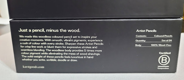
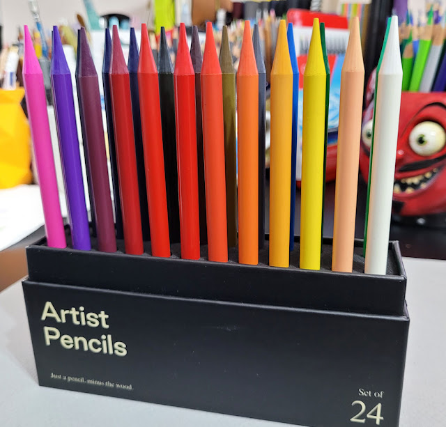
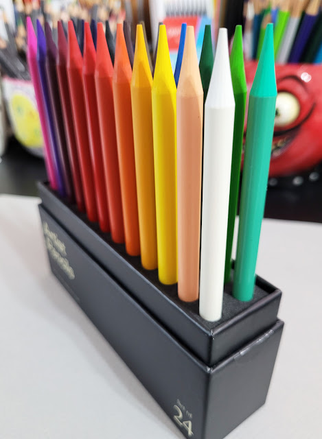
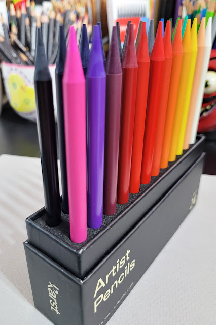
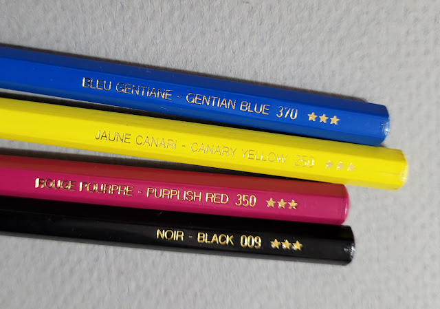
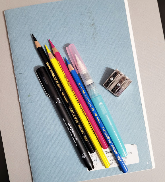
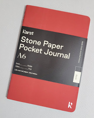
| Karst Stone Paper Pocket Journal |
I don’t go out of my way to sketch in the rain, but when it’s
drizzly, my only reward to go out fitness walking is that I might be able to
sketch. That’s when I grab my Field Notes Expedition (see my review),
which contains Yupo, a waterproof paper. A “synthetic paper” made of
polypropylene, it feels just like plastic – toothless, tear-proof and nearly
indestructible by normal means.
I kept hearing about another line of notebooks containing
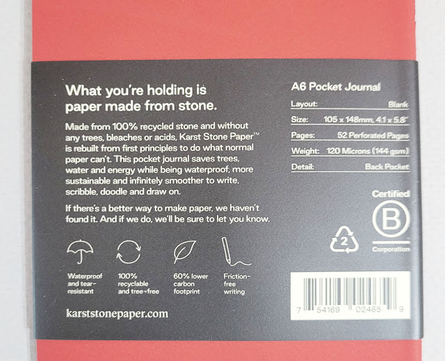
waterproof, tearproof paper: Karst Stone Paper. Claiming to be made of “100%
sustainably recycled stone,” the paper piqued my curiosity, and I picked up an A6-size pocket journal. Information on the bellyband goes on to say that the paper,
made without trees, bleaches or acids, is produced with a 60 percent lower
carbon footprint.
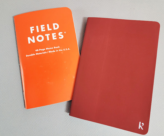
Right off the bat, I like the size and format better than
Expedition (which is Field Notes’ standard 3 ½ by 5 ½ inches): A6 (105 x 148mm)
offers just a bit more page real estate but still fits in my bag pocket.
Also right off the bat, I detected an unpleasant smell to
the paper – synthetic-y, plasticky or chemical-y. How’s that for articulate? I
can’t describe it, but I don’t like it.
The matte covers are pleasantly smooth without feeling
plasticky (which is how the Expedition feels, inside and out). The only
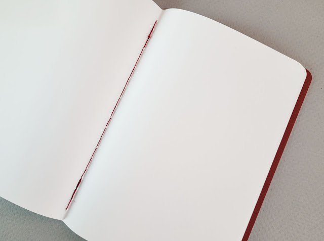
branding on the front is a small logo in the corner. The sewn binding allows
the pages to open completely flat. I can also easily fold back the side I’m not
using while sketching. The latter two are both important features to me.
 |
| The Karst's A6 size is a smidge larger than Field Notes Expedition. |
 |
| Information on the bellyband about environmentally friendly stone paper. |
 |
| Red thread used for stitched binding. |
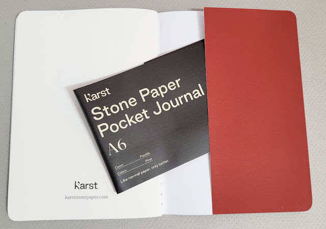 |
| On the inside back cover is a pocket for storing ephemera. |
Although it was not my intention to do a head-to-head
comparison between Expedition and Karst, I thought it was important to at least
compare the papers in how various media react to them. In general, the media I
tested reacted about the same on both paper types. All wet media stay wet much
longer than on most papers, so they are prone to smearing (especially for this
lefty).
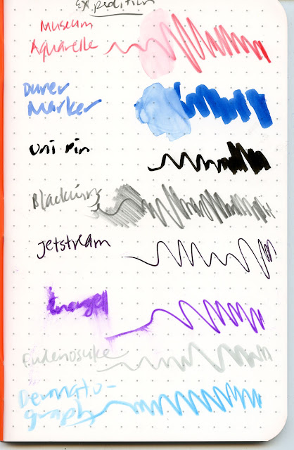
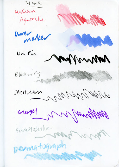 |
| Scribble tests on Karst stone paper |
 |
| Same media on Expedition. I nearly obliterated the word "Energel" when I inadvertently touched it before the ink had dried, which took a long time. |
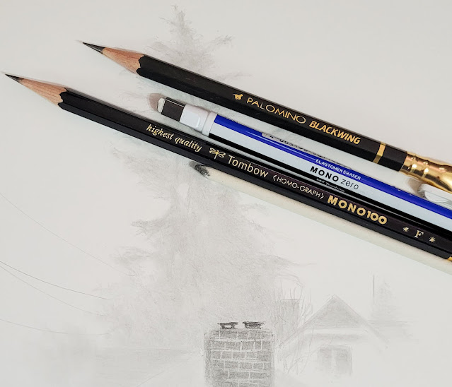
When I tested the soft Blackwing graphite pencil, I was surprised
to see that the Karst paper has a tiny bit of texture, because I certainly can’t
feel it as I scribble (it offers “friction-free writing,” says Karst’s
marketing copy). When I run my hand on it, though, the Karst does feel more
like a matte finish, while Expedition feels more glossy – even less friction
than “friction-free.”
Shown below are the reverse sides of the Expedition and
Karst scribble test pages. The Expedition is completely opaque, while the Karst
has faint ghosting. Of course, neither shows any bleed-through; I don’t think
either paper is capable of absorption.
 |
| Reverse side of Expedition |
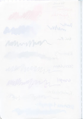 |
| Reverse side of Karst |
The challenge with either of these papers is finding an
acceptable medium to draw with. As you can see, many (though not all) pens will
work, but some inks will take so long to dry that smearing is inevitable
(probably even for righties). And yes, both papers are completely waterproof,
but what’s the point of waterproof paper if you can’t write or draw on it while
the page is wet? There’s the rub: The only things I’ve tried that work on
a wet page of either Expedition or Karst are graphite and colored pencils – the
softer, the better. In the test below, I spritzed a Karst page with water, then
immediately tried to scribble with a ballpoint pen and a graphite pencil. The
pen stopped writing immediately, but the pencil was fine. (This is exactly the
same as what happens with Expedition.)
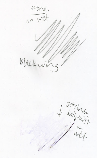 |
| Soft graphite is the only medium I tried that will work when stone paper is wet. |
I’ve been using Expedition for a few years now, and soft graphite
is my favorite to use in it. There’s never doubt about whether it will work,
and I can count on it to work even if the page is wet. That’s also the case
with Karst – I like the way soft graphite feels on it. Graphite does smudge a
bit (see the word “Blackwing” above, which I smudged after the page was dry),
but no worse than on regular paper.
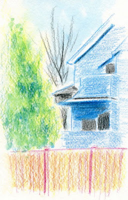
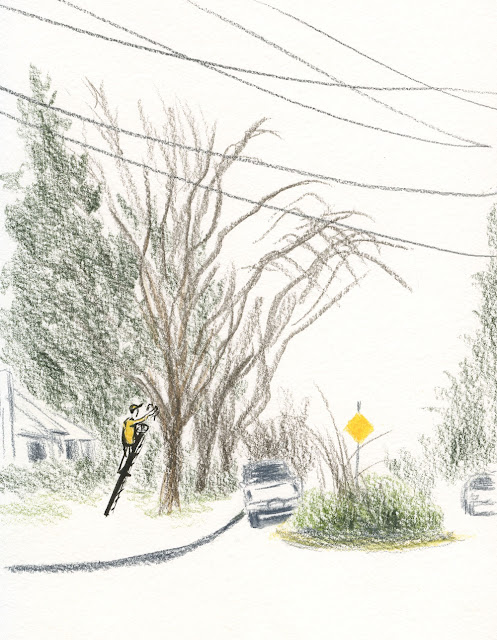
Instead of frowning the next time it was drizzly, I gleefully
took the Karst notebook with me on my walk. You can’t see it in my sketch photo,
but the page was misted with rain as I sketched. The cover also withstood moisture
nicely (a few drops visible in that photo). When the page and cover dried
completely, they showed no trace of ever having been wet. The Karst stone paper
notebook makes a fine rainy-day sketchbook.
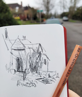 |
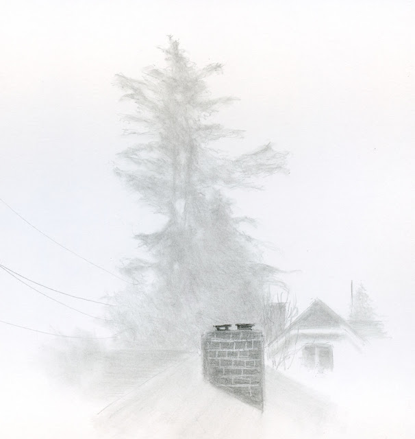
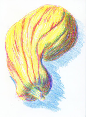
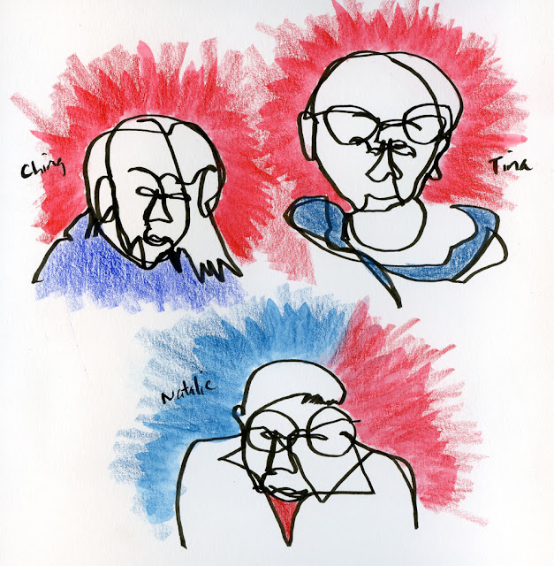
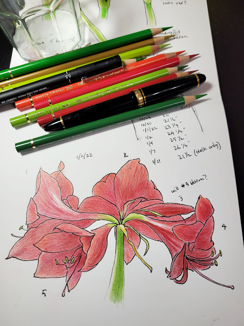
| 1/20/22 Gekkoso 8B graphite in Karst Stone Paper journal |
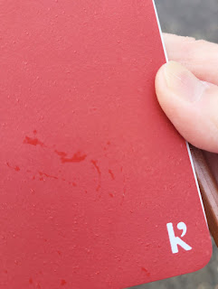 |
| Drizzly cover |
Is it better than the Expedition, though? That’s probably a
matter of personal preference. I like the Karst’s A6 size better, and it’s nice
having a completely blank page (Expedition has dot grid ruling). At $9.95, the
Karst is double the cost of Expedition (three for $14.95). If the environmental
impact (or lack thereof) of production is important, that’s something to consider;
I haven’t seen information about what it takes to produce Yupo paper by
comparison. For me, the weird smell of stone paper is a deal-breaker. I don’t
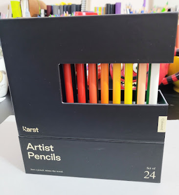
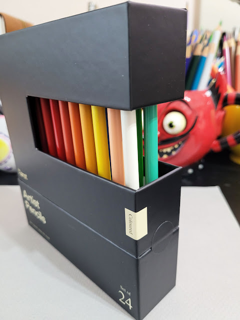
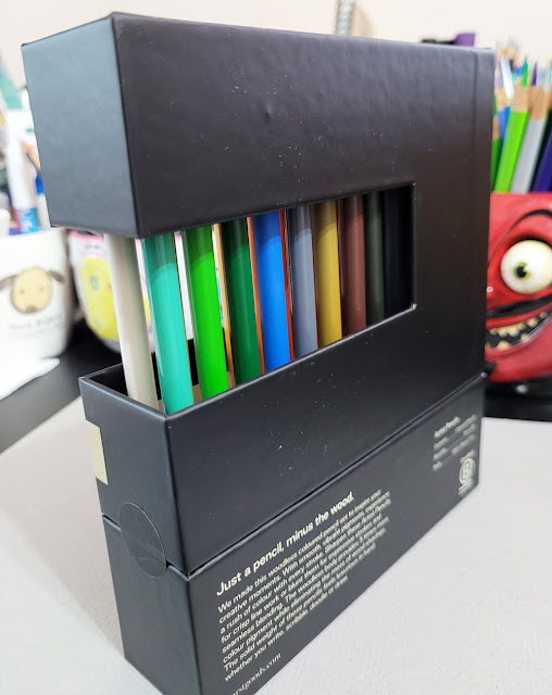
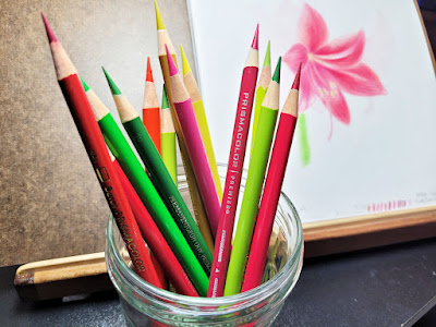
like it, and I don’t want to smell it every time I sketch.This is not the last time I’ll be talking about this Karst
stone notebook, however, because I have another review coming up: a set of
colored pencils that was ostensibly “designed specifically for use with Karst
paper”! Stay tuned.