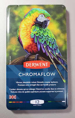
Sunday, October 31, 2021

Pre- and Post-Breakfast


10/28/21 Across the street, 6:15 a.m. (metallic brush pens)

While my kettle boiled water for coffee, I sketched Heidi and Joe’s illuminated front porch and car with some Zig metallic brush pens (my review at the Well-Appointed Desk).

After breakfast, the sun must have been close to the horizon but not quite up. When I had been sketching earlier, Beth and Dylan’s house had been dark inside, but now the lights were on. I used colored pencils for most of the sketch but added dots with the Zig brush pens for their Halloween lights (below).

Technical notes: I prefer the softness of pencil for nocturne sketches, but the metallic brush pens are nice for sharp points of light. Although they aren’t as glittery as some solvent-based metallic markers I have, I like these Zig markers better because they are non-toxic and non-stinky. I prefer them to Posca Paint Markers, too. Posca markers are brilliantly opaque, but I tire of the maintenance – all that agitating and potential clogging, blobbing and blurping. I've put the Zig metallics into my night sketching kit.

With so many shades of white among my colored pencils, I’ve been paying more attention to which I use. In the sketch below, I used Prismacolor Beige (997) for the interior lighting and the cooler Warm Gray 30% (1052) for the sky.

10/28/21 Across the street, 7:30 a.m. (colored pencils and metallic brush pens)

Saturday, October 30, 2021

The Story of One Maple


10/27/21 Maple Leaf neighborhood

Our days of high winds and heavy rain did a number on many trees. When I walked around Green Lake the first dry day after the “bomb cyclone,” I saw lots of newly bald trees as well as torn limbs strewn across the path.

That afternoon, I went to check out the same maple in the ‘hood that I’ve been watching: Just a few yellow leaves are barely hanging on. This is probably the last time I’ll sketch it this year, but if I remember next spring, I’ll continue this story of one maple.

Previous sketches are shown below.

10/21/21

10/12/21

Friday, October 29, 2021

Nocturne Season


10/26/21 6:30 a.m.

Last winter I made several predawn nocturne sketches during the darkest weeks of the year. Although the solstice is still a couple of months away, it’s dark for quite a while after I’ve gotten up in the morning. It occurred to me that once we turn the clocks back again on Nov. 7, I won’t have as much predawn time, at least for a while, so it’s a good opportunity now to sketch the darkness.

The easiest things to see from our livingroom window are Greg’s car and the one across the street illuminated by a street light. I forgot to get my book light, but I decided to wing it using ambient light from the kitchen. It felt like an unintentional blind contour!

Thursday, October 28, 2021

Bomb Cyclone Sky


10/24/21 A break in the bomb cyclone through our skylight (Derwent Lightfast pencils)

Our long foreseen “bomb cyclone” arrived on Sunday, spewing fast rain and high winds. A hundred-thousand people in the region lost power, but we were safe and cozy at home, thankfully. Sometime in the late afternoon, the rain stopped, the deep gray clouds split open, and when I looked up through the skylight, I saw big cracks of blue and even some bright spots of sunlight fringing the clouds.

Grabbing my Stillman & Birn Nova Trio sketchbook (with three colors of toned paper) and Derwent Lightfast pencils, I tried to capture that bit of sky through the window as quickly as possible. It was a fool’s errand – the clouds changed every time I looked back up again – but it was the most exciting thing I did all day.

(Strange: I chose a gray page, but my scanner made the paper look more beige than gray.)

Overnight and the next day, the storm continued. For a moment in the afternoon, the sun tried to break through again, but I didn’t see any blue this time. I turned to a black page in the Nova to try to capture some of that cloud drama and warm light near the horizon. It wasn’t quite this dark in reality, but it felt like it.

10/25/21 (Caran d'Ache Museum Aquarelle pencils)

Wednesday, October 27, 2021

Day for Night (Plus All the Whites)

10/23/21 Through my studio window

Last winter I had a ton of fun using black paper to sketch night scenes. I’ve also enjoyed using it for life drawing and part of my pandemic hand series. Just recently I saw Kumi Matsukawa share some sketches she had made on black paper, and I was reminded of its challenging fun. It was time to pull out my black Stillman & Birn Nova sketchbook again.

“Day for night” is a cinematic term that means filming in daylight to look like it’s night. I thought about that term as I sketched this scene from my studio in the middle of a dark, wet, dreary afternoon. It was daylight, but when I squinted through my (somewhat dirty) window to see the values, the overcast sky was the only brightness – everything else looked equally darkish. The cool white houses were actually darker than the sky, but in trying to make them show against the warm white sky, they came off looking brighter. My sketch looks more like night than day.

Since I needed something geeky to do to fill the rest of the rainy afternoon, I took inventory of all the white and near-white pencils in my major colored pencil collections (defined as the ones I use most frequently). Some pencil manufacturers include many variations of white that are barely discernible from each other. It’s like looking through house paint chips! It’s also interesting to see the differences in opacity. (All swatches were made with three layers of pigment.)

As you might guess, I’ve had other thoughts on white pencils, both non-soluble and water-soluble.


Tuesday, October 26, 2021

What Motivates a Sketch? More Musings


10/22/21 This sketch made through a rain-spattered window was motivated by wanting to use two pencils I hadn't used in a long time that I had found while looking for something else. As good a reason as any to make a sketch. The pencils were a Cretacolor Nero pencil and a Derwent tinted charcoal pencil.

As a process-oriented sketcher, I think a lot about what motivates me to continue drawing, day after day. By extension, I also wonder what motivates other sketchers. I’ve talked about the question frequently, most recently earlier this year and last year.

For myself, motivation usually breaks down into three categories: subject matter (like all the colorful trees I’ve been sketching lately); materials (we all know what this is about 😉); and practice. I haven’t talked as much about the third category, practice, because it’s always the central motivator behind the other two. In this latter category, I would put anything like the Inktober challenge, my pandemic hand project, and maybe even sketchwaiting.

I use the term practice with all of its meanings: a regular activity in an effort to improve, like practicing the piano; and also a regular activity not necessarily to improve but to simply keep doing because it is part of one’s larger lifestyle, like yoga.

The one motivator that I don’t talk about much is always there behind the other three: Fun. If it ain’t fun, why do it? Yet this is more complicated than it seems. When I’m working hard to draw complex architecture or think about drawing in a new way, it’s challenging and maybe even frustrating – and yet also fun. Many people would not use “fun” and “frustrating” in the same sentence, and I admit that I didn’t always feel this way. In my early sketching years, I was often frustrated, and it didn’t feel “fun” in the sense of entertainment. Eventually, though, this changed, and maybe that’s because I’ve had enough experience with my own process to know that if I just keep going, it’s always enjoyable overall.

What motivates you to keep sketching?

Monday, October 25, 2021

Bald


10/21/21 Maple Leaf neighborhood (on trash day)

10/12/21

Last week I showed you the maple in my neighborhood with the interesting coloring pattern (at right). Although it had lost some leaves on top, it was still mostly green on the bottom half. Nine days later, I walked by again, and it was nearly bald! Some parts of the green areas were now yellow, and all the rest of the leaves were scattered all over the pavement. On a gray, blustery day threatening rain (which came a short time later), I knew it was now or never if I wanted to sketch it again: Surely our impending “bomb cyclone” would take down the rest of the leaves.

Sunday, October 24, 2021

A Few Comments on Tinted Graphite


10/20/21 Cretacolor AquaGraph in Stillman & Birn Beta sketchbook

Now that our beloved Daniel Smith store is closing, our brick-and-mortar options are few. Artist & Craftsman Supply is a decent and convenient choice (one of my first stops after I got vaccinated), but the selection is somewhat limited. A much better selection can be found at Blick, but that store has always been inconvenient to me: scarce, expensive parking or a lengthy bus ride, despite being only a few miles away. However, with the opening of two new light rail stations, both extremely convenient to me, Blick is suddenly much more accessible: an easy, 10-minute train ride away.

"Tinted graphite" pencils, from top: Cretacolor AquaGraph, Caran d'Ache Technalo RGB, Derwent Graphitint, Spectrum Noir ColourTint

All of that is a long-winded way of explaining how I found myself in possession of a new Cretacolor AquaGraph pencil last week when Greg and I took the light rail to Capitol Hill. (Our destination was lunch, but Blick was only a couple of blocks away – what a coincidence!) I know Blick’s online catalog fairly well, so I didn’t expect to find anything new, but there it was – a water-soluble pencil that had managed to escape my radar (clearly, I’m off my game). I came home with a green one. It’s also available in red and blue. 

Cretacolor AquaGraph is an interesting hybrid of graphite and “color” (pigment or dye; information on specific product content is usually scarce from manufacturers). I have three other such “tinted graphite” pencils: Caran d’Ache Technalo RGB, Derwent Graphitint and Spectrum Noir ColourTint.

All four swatches are subtle shades of green.

Although I’m not a huge fan of Cretacolor’s color products, I love the Austrian company’s Nero pencils, and its Graphite Aquarell pencils have strong washes. Similarly, the AquaGraph has a surprisingly rich wash with a subtle green tint that only appears when activated with water. Although the barrel is labeled HB, the 4mm (unfortunately off-center) core feels much softer.

In terms of wash quality, AquaGraph seems most similar to Caran d’Ache’s RGB pencils but with a higher ratio of color to graphite. It’s also similar to Caran d’Ache in appearing much like ordinary graphite when dry. Both Derwent Graphitint and Spectrum Noir Colourtint are disappointing by comparison: Although they exhibit slightly more color in their dry states and come in a much wider range of colors, both have weak washes when activated. (In my sample swatches, I chose Derwent and Spectrum Noir greens that came closest to the AquaGraph’s green.)

“Neither here nor there” but somewhere between water-soluble graphite and watercolor pencils, tinted graphite pencils are typically not what I reach for. On this day last week, however, portentous of the “bomb cyclone” of wind and rain headed our way, the subtle tint seemed just right for the wet, gray, toneless scene outside my studio window. The green tint hardly registers visually as a hue, but I like the contrast between the activated areas (houses) and the dry marks (foliage).

The eraser shown in the image is only to keep the round pencil from rolling. I did not test the pencil for erasability. 

Saturday, October 23, 2021

Inktober, Week 3: Still Mostly Blind


10/20/21 attitude

My Inktober intention is to continue with blind contours. The only exception on Week 3 was the day that I was so excited to be sketching people on public transportation again that I forgot.

The most fun was making a couple of partial blind contour selfies – what a hoot! I liked one so much that I used it as my Facebook profile image. If you have never tried one, I recommend it highly. Not only is it super fun, but it may also reveal attitude you didn’t know you had! 😉

10/15/21 pencil sharpener

10/16/21 slightly less attitude

10/17/21 light rail passenger (the only non-blind contour this week)

10/18/21 parked cars in Maple Leaf

10/19/21 light rail passenger

10/21/21 excavator


Friday, October 22, 2021

Elementary Maple

10/18/21 Olympic View Elementary School, Maple Leaf neighborhood

Although Olympic View Elementary School is easily within walking distance, we usually don’t go in that direction on our daily walks. I have been determined to peep as many leaves as possible while the peeping is good, however, so we have been taking different routes lately. This maple in front will be a keeper on my annual tour!

As many trees as I sketch, each is still a challenge in different ways. This one had relatively loose foliage compared to some densely packed trees. I can’t recall which artist said this, but he had recommended that painters leave “holes for the birds to fly through” when painting trees. I tried to leave some sky holes, but I inadvertently filled in more than I had intended. I also lost some of the light because I got a bit carried away with those colors I love so much. That’s probably one of the biggest challenges of working with a primary triad: Sometimes I have to choose between the local colors and the values. The answer is to always choose values – but it’s hard not to be dazzled by a brilliant maple.

Thursday, October 21, 2021

Local Color

10/16/21 NE 83rd facing west

A leaf on the trees in the sketch above

Just a couple blocks from home, I had spotted a short row of brilliant yellow and red-orange trees that lit up the whole block (above). After sketching them, I pulled into a driveway to turn around – when I saw what had been behind me while I was sketching: An even more colorful mix (below)! I reparked in the opposite direction to catch that wall of color, too. It always pays to look around, even if you think you’re done sketching! (I’ve now added this very nearby block to my regular leaf-peeping tour.)

I snapped a photo of the leaves of the trees in the top sketch to try to identify them. My plant app suggested that it’s an Acer tataricum, or Tatarian maple. Although the leaf looks slightly different, I thought it could also be an Acer Ginnala, whose leaf I sketched last fall. It’s clearly a variety of maple, but the leaves are elongated rather than hand shaped as most maples are. Anyone know for sure?

10/16/21 NE 83rd facing east

Wednesday, October 20, 2021

St. James Cathedral


10/14/21 St. James Cathedral

Completed in 1907, St. James Cathedral is one of my favorite old buildings in Seattle. I admire its twin towers from Interstate 5 whenever I’m downtown. An appointment brought me to First Hill last week, so I used the opportunity to sketch one of its bell towers from Ninth Avenue. At 8:59 a.m., a half-hour after I began this sketch, the bells started chiming. By that point, I was dang cold on that gray, drizzly morning, so the bells cheered me up until I finished a short time later.

Despite the Roman Catholic cathedral’s architectural complexity, which continues to challenge me, I have attempted it many times over the years. My favorite sketch might still be my very first brave attempt in 2013 (shown below) when I had been sketching for only a little more than a year. Sometimes I think I had more courage then than I do now!

1/24/13

Tuesday, October 19, 2021

Pike Place Market People


10/17/21 Pike Place Market

Sunday was the international Urban Sketchers 24-hour event, USk Sketch Together, with sketchers around the globe taking part with live videos and images from their respective sketch outings. USk Seattle chose iconic Pike Place Market for our event. The forecast all week was for rain that day, but once again, the weather gods were with us: Not a drop!

Before the pandemic, I used to happily sketch people on buses and light rail trains whenever I had somewhere to go. Throughout the wet-weather months, I had taken for granted being able to draw people in coffee shops. The thing I missed most during the worst of the pandemic was sketching people in public. For Sunday’s outing, I decided it was time to get back on public transportation. As a personal celebration during the Sketch Together event, I dedicated the outing to sketching nothing but people. In fact, I used the “observational cartooning” technique I learned from Taylor Dow in his workshop a couple of weeks ago to help tell the story of people at the Market: drawings made from life combined with written commentary.

On the level below the Market Commons, I could look up at a corner of the pedestrian area with one of the best waterfront views (above). It turned out to be a popular corner to take selfies and other photos. I started there but realized quickly that my view was limited.

Next I got up on the upper level myself so that I could see and sketch more people, especially their various photo stances – both taking and posing. Many were selfies, but others were couples and families who asked a passing stranger to snap a photo for them. When I wasn’t sketching, I timed a few: On average, I have about six seconds to capture a selfie. If someone else is taking the photo, I have a bit longer. The typical pose for couples is for one to put an arm around the other. When couples take a selfie together, they snap one, then usually one person is more interested than the other in the result and often needs a retake. I had as much fun people-observing as people-sketching.


It feels good to sketch people again!

To see what the rest of the world sketched that day, search the hashtag #usksketchtogether.

Many snoozers on the light rail train, a.m.
and p.m.


I seem to be the only one awake
on this train. It was my first public
transportation ride in 19 months.


USk Seattle knows how to Sketch Together!

Monday, October 18, 2021

Review: Derwent Chromaflow Colored Pencils

I like the parrot.

It’s always fun and exciting to open a fresh set of colored pencils and use them for the first time. I try to adjust my expectations based on a variety of factors – where they were manufactured, their price, the maker’s reputation, reviews by others, how they smell, how they look. Sometimes I have learned an intriguing fact about them – for example, a European manufacturer is distributing the set only in the US and not within its own country. How interesting! Bring ‘em on.

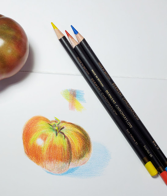
Although the basic set of 12 doesn’t include hues I would choose according to the CMYK-based primary triad I have been experimenting with, I still like using a primary triad to make initial sketches because it’s a good test of blending capability.


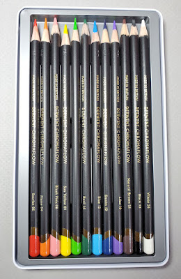
The basic set of 12 colors


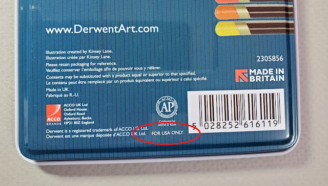
For the USA market only

Attractive, asymmetrical end caps that are Derwent's trademark

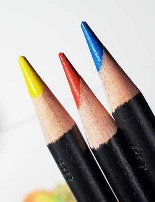
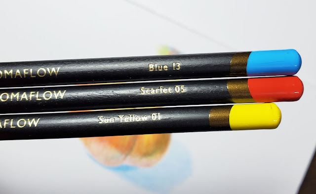
Two out of three of my triad pencils have off-center cores.

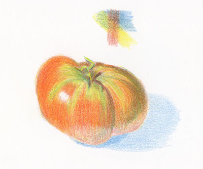
10/13/21 Derwent Chromaflow pencils in Stillman & Birn Zeta sketchbook 

The new pencils are on the harder side, but as a big fan of
Faber-Castell Polychromos, I don’t hold anything against a hard colored pencil if it is richly pigmented. Unfortunately, these pencils do not seem to be, but I keep going with my sketch. 

Using light pressure, I apply a few layers of pigment. I start to notice that it’s becoming more and more difficult to see that additional pigment is transferring from pencil to paper. I remain patient as long as possible, trying to apply more layers. Now I’m getting frustrated, so I start to press harder, which doesn’t help. I’m using my favorite Stillman & Birn Zeta sketchbook, whose smooth surface typically takes hard colored pencils beautifully, but now I’m getting angry because I feel like I’m drawing on waxed paper.

Three-quarters of an hour later, I stop – I’ve had enough. I admit, sometimes I enjoy the challenge of fighting with a difficult pencil, but this wasn’t one of those times. Now you might look at this sketch and think, “Well, she eked out some decent color there . . . maybe those pencils aren’t so bad.” But I had to work dang hard to get even what you see there.

That is what it’s like to use a low-quality colored pencil with low pigment content.

Whoa, Tina – that’s harsh! And this made-in-Britain Chromaflow set is from Derwent, a highly reputable UK colored pencil maker!

But that’s just it: These are not Crayola or Rose Art pencils (and they certainly aren’t priced like those kids’ pencils: My set of 12 Chromaflow was $14.99 at Blick). I know that Derwent makes some very fine colored pencils. In fact, I am currently having a love fest with Derwent’s artist-quality Lightfast line, and I have long appreciated the company’s Drawing Pencil collection for life drawing, so I know they make high quality products. (Derwent’s low-end Artist and Studio pencils are more in line with Chromaflow’s quality, and those I do not love.)

That brings up another matter: How many low-end, low-quality colored pencil lines does one manufacturer need? And now a new one just for the US market!

I try to find one positive thing to say about any product I review. In this case, I love the drawing of the parrot on the tin. But I’m certain it wasn’t made with Chromaflow pencils.

Save your money.

Related Posts Plugin for WordPress, Blogger...