Friday, June 30, 2023

Etchr Paper Samples


300g cold press, 100% cotton paper.  This paper comes in the Perfect Sketchbook, Etchr's top-of-the-line book. It was definitely the easiest to work with wet-in-wet, even outdoors, because the surface stayed wet longer.

A couple of months ago when Parka was showing daily video coverage of the Urban Sketchers Symposium in Auckland, he gave a discount code from Etchr Studios, a symposium sponsor, that was offered to anyone viewing, not just symposium attendees. Wanting to try an Etchr sketchbook for a while, I took advantage of the discount and ordered a pack (review forthcoming as soon as I get around to using one). I also got a swatch pack including samples of four Etchr papers. The pack price, $10 for four A6-size sample sheets, seems a bit steep – until you see that the $10 can be applied toward purchase of a sketchbook in the next order. Fair enough!

So that my experiences would be relatively fresh in my memory, I decided to use all four paper samples on consecutive days during the 30x30 Direct Watercolor challenge. You’ll see some of these sketches again in my direct watercolor finale post, but here they are together uncropped so that the paper type is visible. With only one sample of each paper, I can’t give any a thorough review. But at least with the techniques I used – mostly wet-in-wet, some with multiple layers – all four performed very well, even the 50 percent cotton cold press. (A few specific comments are in the captions.) I’m looking forward to using an Etchr sketchbook as soon as I fill my current Hahnemühle.  

230g cold press, 100% cotton. Even this lighter-weight version of 100% cotton paper took to multiple layers of wet-in-wet work well.

300g cold press, 50% cotton. Although I've been converted to 100% cotton by Hahnemuhle's excellent paper (250g), I must say that even this 50% cotton Etchr paper performed beautifully, maybe because of its weight. I'd want to use it several more times before recommending it, though.

220g hot press, 100% cotton. Whoa, after using nothing but cold press (except for a few random tries years ago), this hot press paper gave me a rattle -- and not in a good way. I imagine it's great to use with a fine nib fountain pen line that would be painted over afterwards, but otherwise, I would surely miss the texture of cold press. The paint flows very differently on hot press without all those bumps to catch on. It would take me a while to get used to this. Actually, it might be worth trying with super-soft watercolor pencils like Caran d'Ache Museum Aquarelles . . . hmmm.

Thursday, June 29, 2023

What Would a “Direct Pencil” Challenge Look Like?


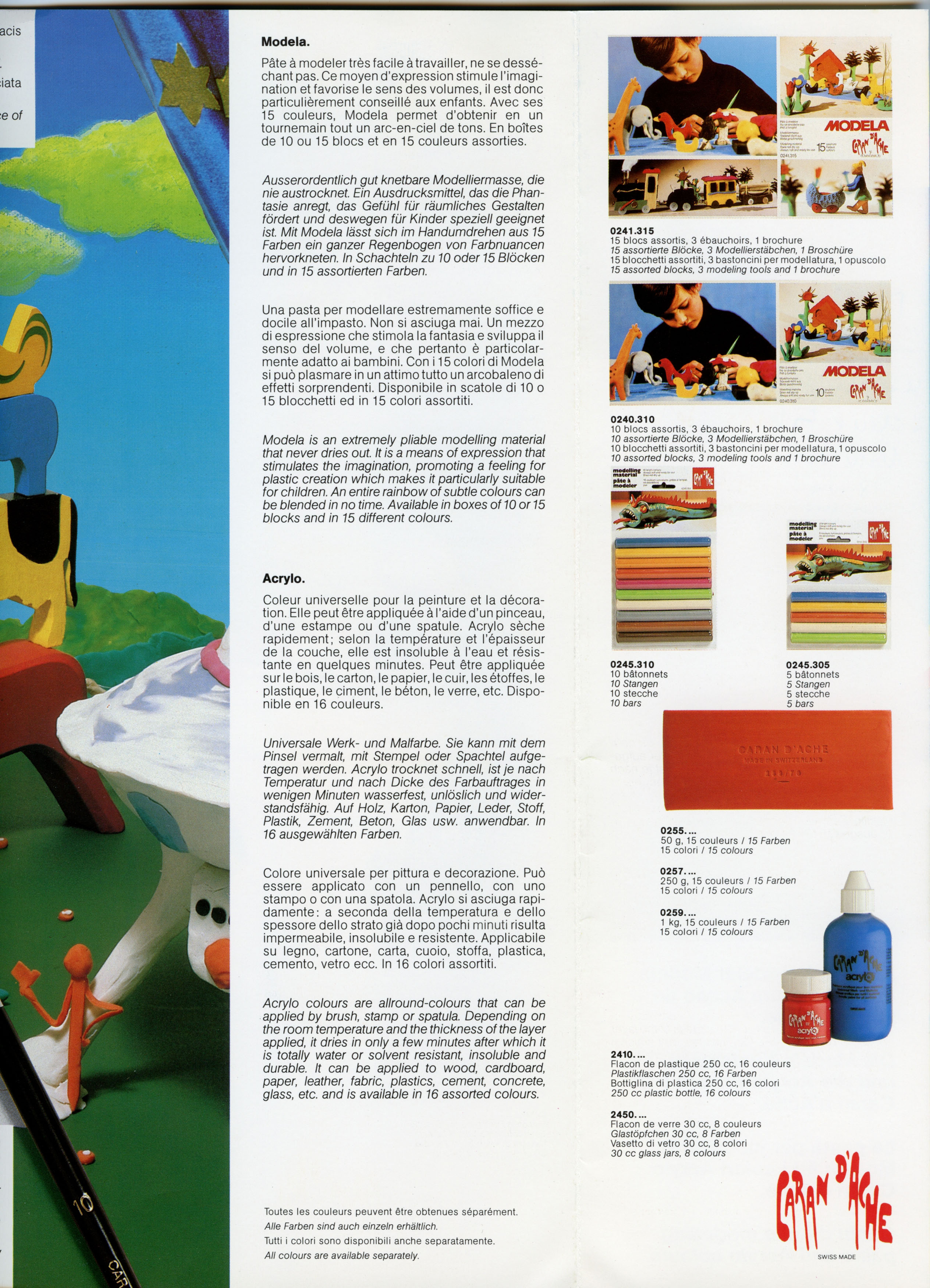
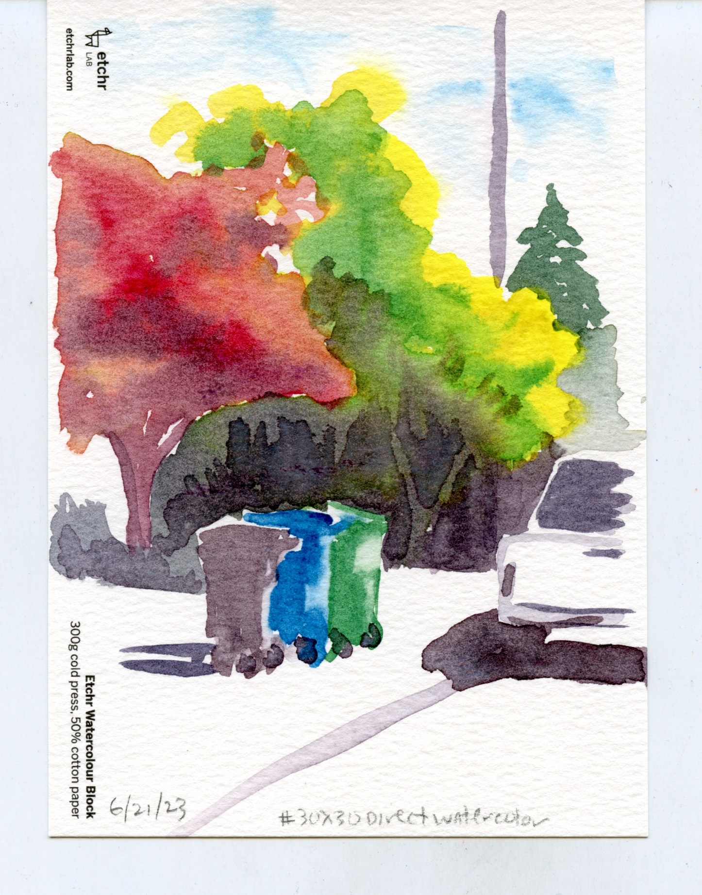
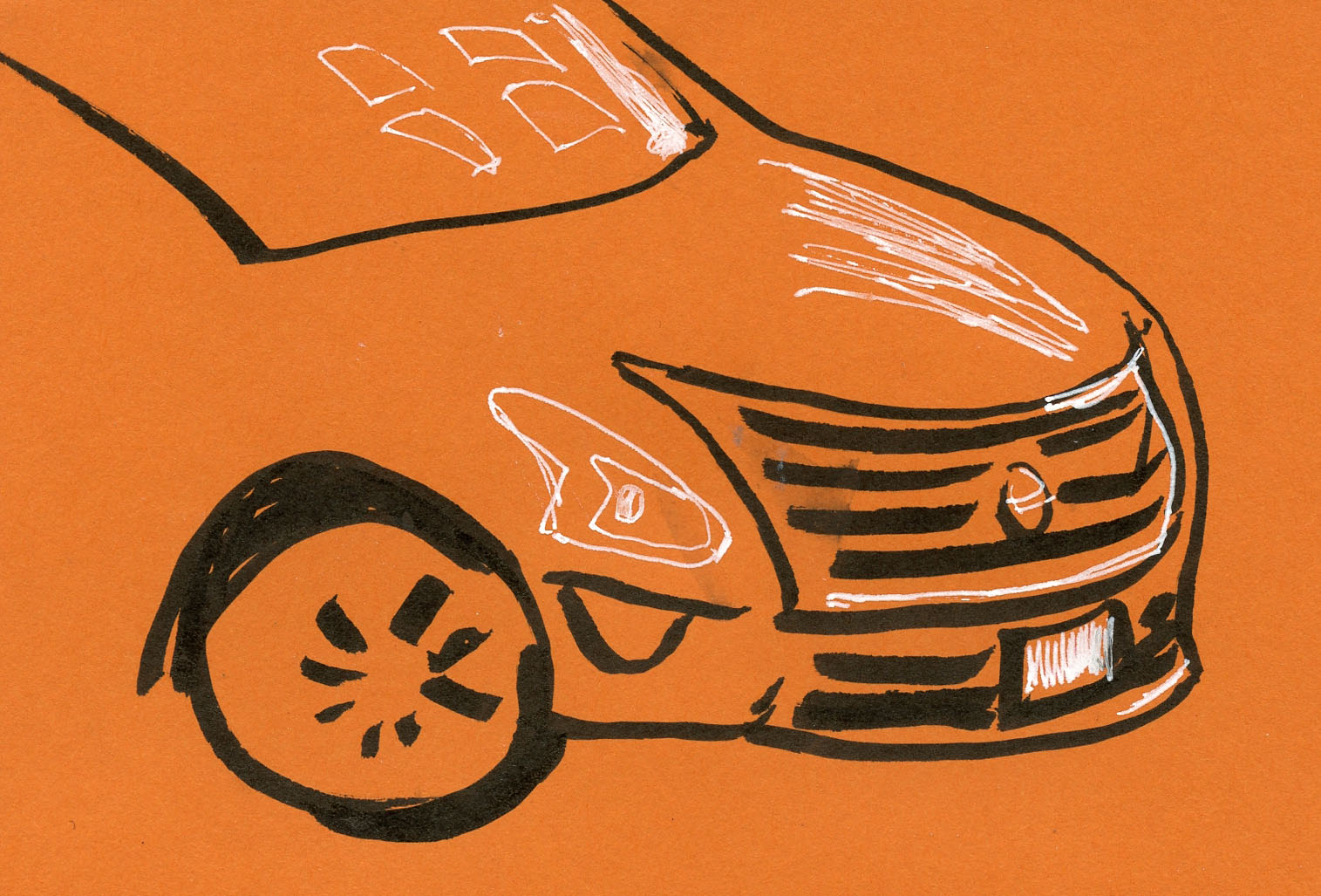
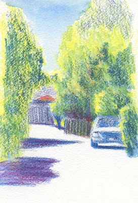
6/26/23 Maple Leaf alley

When I showed the watercolor pencil sketch at left on social media a few days ago, I was feeling frustrated with my ongoing direct watercolor practice. I quipped that I should start a “direct pencil” challenge in which paints would not be allowed. Ha-ha.

I was kidding, but as usual, I started to think about it more than I should, and the question stayed on my mind: What would a “direct pencil” challenge look like? If we use the 30x30 Direct Watercolor challenge as a model, its purpose is to encourage daily practice, experimentation, making mistakes and learning from them. This is the part of Marc Holmes’ intention statement that engages me most:

“It’s an opportunity to deep-dive into your own art-making process. Knowing you will return the next day, your brain keeps thinking about art-making between sessions. Even while you sleep. If you commit to the process, you’ll find your work changing quickly. You can make sudden leaps in your technical ability, or discover new lines of inquiry.”

That principle is exactly the same as the one behind InkTober, the 100-Day Project, Ian Roberts’ 30-day composition challenge and other such challenges that encourage committing to a consistent creative activity for a sustained length of time. That type of practice is known to push people past whatever resistance they may have, and the result is often that they make breakthroughs in their work. (I know it has worked for me more than once.)

As for the “direct” part – hitting the paper with the paint-filled brush without the guidance of a line drawing – Marc is not overly strict on that (he even admitted to using a line drawing on one of his complex paintings this month!). But I get why he encourages the “direct” approach: It’s a method most likely to result in a fresh, spontaneous expression, even at the expense of accuracy (and in the hands of a master like Marc and many others I’ve seen in the 30x30 Direct Watercolor Facebook group, that’s very much the case). Or, as he likes to put it, the direct approach allows watercolor to do what watercolor does best (without those of us clumsily wielding the brush to muck up watercolor with continual fiddling and trying to stay within whatever lines we may have drawn).

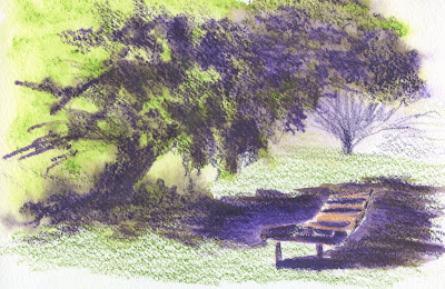
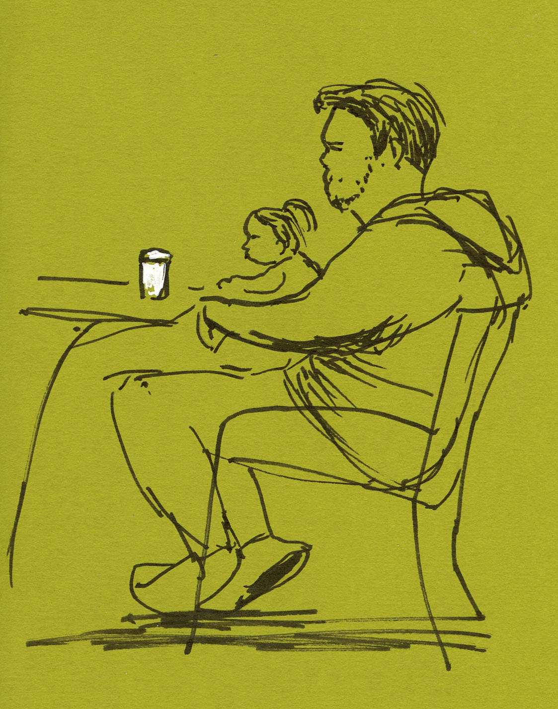
6/27/23 Green Lake. This watercolor pencil sketch would have taken much longer without
 the value and intensity boost of water
.

With pencils (both graphite and colored) being my primary medium for the past several years, I’m not sure how I would challenge myself; I already use them nearly every day. Since many sketchers begin with a pencil when they first start out, it might not feel like much of a push for anyone.

One obvious challenge with pencil, however, is the same struggle I have with watercolor: It’s easy to be wimpy and difficult to be bold. Pale, weak watercolor washes are easy to make; strong, vivid colors are not. In the same way, a pencil sketch in which all the values look pretty much the same is easy to do. But using dry media to show a wide range of values is challenging and requires more effort. That’s one big reason why I favor watercolor pencils to dry colored pencils on location: It’s so much easier and more efficient to intensify colors quickly by applying water.

During the 30-day compositional challenge, I sometimes used graphite pencils to make studies, but even for small thumbnails, I often used markers because they were faster. Using dry pencils is more work, but certainly they are hard to beat for expressing a full range of values.

What if the challenge were to make a small, dry (colored or graphite) pencil drawing daily for 30 consecutive days with the specific goal of learning to see and develop values? I bet we would all get better at using dry pencils by the end of the challenge – and our values would have higher contrast, too.

I’m not ready to propose a challenge yet, but be warned: I’m still thinking about it.

Wednesday, June 28, 2023

Vintage Caran d’Ache Marketing Brochure


Brochure front cover

An item that was billed as a “vintage Caran d’Ache catalog” came up on eBay recently. Although the images looked more like a marketing brochure than a catalog, I was curious either way, so I put in a bid – and I was the sole bidder!

As I suspected, the “catalog” includes product information with product codes, but it’s a marketing brochure intended for consumers, not a wholesale catalog that might be more informative as a historical piece. Still, as a vintage Caran d’Ache collector, I’m happy to have the brochure, which is in excellent condition.

It’s a huge piece that barely fits on my scan bed, and every page spread includes a fold-out panel where the product details are. I’ve scanned everything here for your perusal.

Of course, from my perspective, the most interesting pages cover the colored pencils, which includes only Prismalo I (“regular lead thickness for detailed drawing and painting”) and Prismalo II (“thick, soft leads for covering a larger surface. Particularly recommended for children of pre-school age”). Based on my research and some speculation, I have deduced that Prismalo II eventually morphed into Supracolor II Soft. The brochure makes no mention of any Supracolor product, so it’s clear that the brochure dates to pre-1988 when Caran d’Ache introduced Supracolor (or at least the branding for a product called “Supracolor,” even if the pencils were the same as the former Prismalo II). In addition, Neopastel, which was introduced in 1985 (according to Atelier Caran d'Ache), is included, so the brochure must date between 1985 and 1988.

Unfortunately, there’s not much to be learned from the brochure, but it’s cool to see a piece that includes so much uncredited original artwork that was probably done by staff or freelancers. Based on the fairy tale-like art, Caran d’Ache’s audience seems much more focused on school kids than professional artists (back then, Museum Aquarelle, Luminance and other artist-grade products didn’t exist). A contemporary marketing brochure would more likely be dominated by sexy photography and maybe one or two art pieces made by an established, named artist who collaborates with the manufacturer on lots of co-marketing. I love the unsophisticated look of this old brochure.


This page is of the most interest to me. . . though not particularly informative.


Included with the brochure was the packing slip that came with it when it was shipped to Miss Virginia Hiller of Montvale, NJ, from Caran d'Ache's US agent in New York City. I wonder if Virginia was a Cd'A geek like me?


Tuesday, June 27, 2023

Reviving Time


11/14/22

The PC folder where I store “sketchwaiting” sketches until I put them in a blog post was starting to bulge, so it’s time for a catch-up. It’s fun to see the passage of time – some of these go back more than six months – through the colors of my ever-changing Uglybooks.

Recently in a Facebook group that is not related to sketching, someone showed some doodles he was drawing to “kill time” while waiting for takeout food. Some may think of this activity as killing time, but I think of sketchwaiting as reviving otherwise dead time.

Urban sketchers who sketchwait are probably the only people in medical or dental waiting rooms who are a bit disappointed when they are called for their appointments; it means they can’t finish the sketch they surely started while sitting there.

12/3/22
1/2/23

My sketchwaiting tends to happen more while I’m waiting for takeout food or waiting to meet others. Sometimes I deliberately arrive a few minutes early to appointments so that I’ll have more sketchwaiting time.

3/1/23

3/23/23

While sketchwaiting, there’s always a little tension because you don’t know if you have a minute or 15 or 30. Enjoying that tension, I always sketch as if I have only a minute or two to wait. Any time on top of that is just frosting on the cake.

4/8/23

4/10/23

As you might guess, I appreciate the spontaneity that is integral to sketchwaiting. There’s no time to think about composition or color or good lighting. Just hit the page and run with it.

5/3/23

5/6/23

If a sketch is (inevitably) unfinished when the waiting ends, I don’t mind, nor do I feel frustrated. The abrupt end is then built into the sketch – a record of the few moments that were not wasted or “killed” but brought to life.

5/9/23

6/2/23

6/20/23

Monday, June 26, 2023

“Sketching Cascadia” Opens at Graphite


6/24/23 Gabi Campanario gives a presentation at Graphite Arts Center

Behind Roy DeLeon's head is his accordion-style sketchbook that takes up nearly
the whole wall horizontally!

For the first time in many years, an exhibit entirely of urban sketches has opened in the Puget Sound area, and I’m thrilled to be included! As part of Sketcher Fest next month, the nonprofit Graphite Arts Center in Edmonds is hosting a show of art for purchase as well as a display of sketchbooks, all by Pacific Northwest artists. With the theme “Sketching Cascadia,” the entire exhibit showcases work made on location in the region.

The huge gallery space is an ideal facility for hosting the wide range of work being shown. Some artists have poster-size paintings and montages; others have tiny sketchbooks. Roy deLeon has one of the most visually striking pieces: An accordion sketchbook stretched out for the length of one exhibit wall. Mark Ryan contributed two-sided pages removed from his sketchbooks. They are displayed vertically between Plexiglas panes to show the art on both sides (I regret that I didn’t get a photo of this unique display). Full sketchbooks are displayed in glass cases.

Sue Heston with her sketchbook in foreground

Andika Murandi 

Loose artwork hangs unframed on the walls. It was obvious that some artists simply tore sketches right out of their sketchbooks, ragged, spiral-bound edges exposed. It’s rare to see original art exhibited without framing, and I found it especially engaging to view sketches this way: I experienced a raw, immediate intimacy that is not possible when the art is neatly matted and separated from the viewer by glass. It’s as close to being able to thumb through an actual sketchbook as any exhibit could be.

David Hingtgen

Gail Wong

Jane Wingfield

In addition to all the original artwork and sketchbooks, a digital display in the gallery is continuously showing a loop of many more sketch images contributed by USk members.

I didn’t want to tear pages out of my sketchbook, so I opted to make a new piece on loose paper just for the exhibit (it’s the top sketch in this post). Using larger paper that turned out to be less than ideal – and using gouache for nearly the first time! – I took a lot of chances making the piece. With only a couple of weeks’ notice to prepare during iffy spring weather, I wanted to make a couple more pieces, but I had time and opportunity for only one. When I first walked through the show and didn’t see mine on the walls, I thought it had been rejected at the last minute! Interestingly, since I was the only artist who submitted a single piece, the curators decided to put mine in the glass case with the sketchbooks instead of on a wall.


I was surprised to find my loose sketch in a display case instead of on a wall!

I also contributed a recent sketchbook, and it is opened to one of my favorite sketches in the book: Gas Works Park during Gabi Campanario’s sketch tour. The curators also photocopied a couple other pages from my sketchbook so that they could be shown, too. It was a cool surprise to see which sketches were selected to be visible. The sketchbook display cases are made from old studio tables covered with paint marks. Used paint palettes and pencils are scattered among the sketchbooks, giving the whole display the look of “artists at work.” I love the hands-on look!

My opened sketchbook plus photocopies of other pages in the book.


During the reception, Sketcher Fest producer Gabi
Gabi's presentation
gave a presentation about his journey toward urban sketching and how he began the phenomenon that became the global Urban Sketchers organization.

It was fun as well as an honor to attend the opening reception Saturday evening with so many of my urban sketchers friends who also have work in the show. Many thanks to Graphite owner Tracy Kay Felix, Jane Wingfield, Gabi and others on the team who organized the excellent exhibit. If you are local, I hope you will be able to catch this unique show, which is on through July 29.

Blog-related trivia: When I was chatting with Tracy, she mentioned that she once owned and operated the Edmonds art supply store ArtSpot (now operated by her children). Back then, when she was curious about the quality of supplies she was considering carrying, she would search for reviews – and more often than not, the reviews would be on my blog! Fast-forward to this year when she began following me on Instagram and saw one of my posts related to an art supply review. That’s when she made the connection that I was Fueled by Clouds & Coffee!

Ellie Doughty

David and Brenda Chamness


Alex Hollmann

Greg, Gabi and me

Behind Gabi and his wife Michelle Archer is a wall where visitors are invited to post their urban sketches. 

Me and my date!

Related Posts Plugin for WordPress, Blogger...