Wednesday, May 31, 2023

California Poppies (and My Genius Moment)


5/24/23 California poppies in Maple Leaf

Suhita Shirodkar and Nina Khashchina have been giving me California poppy envy. They’ve been sketching the gorgeous blooms growing profusely right now in northern California.

I pass these poppies on my walks now and then. Not quite as vibrant and extravagant as the ones in northern California, they still make me happy with their sunny outlook, even when they aren’t fully awake.

Process notes: Spontaneously, I tried an interesting experiment prompted by the subject matter: Here’s a case in which I didn’t want the bright yellow and orange poppy hues to get muddied by the green foliage around them. Using Derwent Inktense pencils, I drew and then activated the poppies with a waterbrush. While that dried, I put in the foliage greens around them with more Inktense pencils. Then I spritzed the flowers and foliage liberally. Since Inktense pencils are supposedly “permanent,” the poppies I had initially activated shouldn’t reactivate and mix with the foliage. I think the flowers did stay relatively unmuddied, so that’s one way to take advantage of this unique Inktense quality. 

Caran d'Ache Museum Aquarelle replication of sketch


To be fair, I thought I should test this real-life situation by making a similar sketch using only Caran d’Ache Museum Aquarelles (at left). I replicated the poppies and foliage doing just that, in the same Hahnemuhle sketchbook. The flowers did blur with the foliage a bit more than the Inktense did, but not significantly. I must say, though, that the Museum colors are more vibrant, aren’t they?

The lines on the fence, too, are something I wanted to stay crisp and sharp, but since I had already drawn them, they were prone to being blurred when I spritzed the foliage. However, I just happened to have a Black Cherry non-soluble Prismacolor in my bag. I used that to draw the fence – ta-da! No blurring. (Every couple of decades or so, I’m a genius! But only for 30 seconds at a time.)

One of these pencils is not like the others.


Actually, I recall some similar experiments I did a few years ago, using watercolor pencils alongside non-soluble ones to take advantage of the soluble/non-soluble properties of each. It’s a great strategy, but I don’t remember why I stopped doing it – maybe the non-solubles got ejected during a bag refresh because I wasn’t using them much. This idea is worth exploring further, though, and just one non-soluble pencil would do the job.

Tuesday, May 30, 2023

Graphite


5/23/23 Graphite, downtown Edmonds

The most exciting urban sketching event to happen in Seattle since pre-pandemic is this July’s Sketcher Fest, a weekend of workshops, sketch walks, book fair and all-around sketching fun. Held in Edmonds, 20 minutes north of Seattle, Sketcher Fest is the brain child of Gabi Campanario, who hopes the event will be a model for more events like it around the country.

As part of the festivities, Sketcher Fest has partnered with Graphite in Edmonds, a beautiful gallery and studio workspace for artists, to put on an exhibit of urban sketches and sketchbooks. I’m both thrilled and humbled to be included in the show alongside many of Seattle’s best urban sketchers.

After dropping off my work at the gallery, I stood across the street to draw the huge Graphite building – one of the most challenging architectural sketches I’ve attempted in a long time! So many weird, unexpected angles – whew! The building actually stretches further in both directions, but this was all I could get in without a panorama-format sketchbook. (And being able to scale even this much on a 4-by-6-inch page is something I owe to Gabi.)

Pointless to use graphite.

(If you’re thinking that surely I should have made this sketch with graphite, you’re not the only one. Unfortunately, when I pulled a Blackwing pencil out to do that, this is what it looked like (and the only sharpener I had with me was the one that fits thicker colored pencils!). Luckily, I always have a mechanical pencil in my bag, so I could still block in the sketch with graphite (but not the kind I would want to draw with).

Monday, May 29, 2023

Flying Abstract Colors


5/27/23 Flags at Sunset Hills Memorial Park, Bellevue

We use Memorial Day weekend each year both to pay respects at family gravesites and to express gratitude to all who gave their lives in service to our country. Sunset Hills Memorial Park in Bellevue always puts out a glorious display of flags. They are among the most frustrating of subject matter to sketch – constantly moving, even in a slight breeze, their amorphous, fluid shapes a blur of red, white and blue. Usually I try to capture them fairly literally, but this time I took a more abstract, symbolic approach. After all, the flag itself is an abstract symbol of the freedom we take for granted most of the time and of the enormous price that has been paid for that freedom.

Process notes: Ever since I became enamored with the CYMK-based primary triad, I haven’t carried Caran d’Ache Museum Aquarelle Scarlet Red (070) and Dark Ultramarine (640), which had always been my standby “flag colors” (I’ve never been completely happy with Scarlet, but it’s the closest I could find in the Museum line). As I just got through saying, the flag is an abstract symbol, so it might have been interesting to see how the stars and stripes would have looked represented by magenta + yellow and cyan. But on my way out the door to the cemetery, I grabbed Scarlet and Dark Ultramarine anyway. Colors are also abstract symbols, but some are more important than others. Even if my marks expressing flags are less than literal, it seemed important to me that the colors be “right.”


But you know me. When I got home, I became curious: How would the flag look using my basic Museum CYM (Phthalocyanine Blue 162, Lemon Yellow 240, Purplish Red 350) hues? Shown at right are the CYM flying colors.

Sunday, May 28, 2023

“Painting” Without Brushes


5/22/23 thumbnail study

Here’s how an interesting process unfolded:

On my walk near Green Lake, I made a one-minute thumbnail study (at right) capturing the shapes of organic foliage next to stark, straight utility poles – my favorite compositional contrasts. I thought the composition had potential for further study, so I snapped a photo reference. Just as I did, a woman and her dog walked through – but unlike most photobombs, they improved the composition and added interest!

Reference photo fortuitously photobombed. 

Among the darkest values in the scene are the shaded parts of the trees, so I thought my dark maroon
Uglybook would make an intriguing complementary “underpainting.” Using it for other light-on-dark sketches, I’ve found the color to be difficult to use. It doesn’t exactly “read” like darkness, and it seems like it should be warm, but it’s so dark that it looks cool next to most colors. With those challenges in mind, I decided to treat it the way painters treat an underpainting – by covering the entire “canvas” instead of using the maroon as the darkest dark.

To do that was a brain buster! The woman and the dog were also among the darkest values, but it was difficult to draw around them with white, and dark colors are hard to see on dark paper. I employed the colored pencil technique of applying white first, then coloring over it with the desired color, which makes the intended color appear brighter. This stage looks sort of like a photo negative.

Most areas covered with white, even where dark colors would ultimately appear.

Finally, I went in with the colors I wanted to use. I think the only part of the sketch revealing the actual paper color is the dark part of the stairway behind the woman. But the little bits that show through do provide a subtle complexity that would be missing if I used, say, black paper or white paper. It’s like the “sparkle” that watercolor painters revere, but in reverse – dark instead of paper white.

5/22/23 Prismacolor and Derwent colored pencils in Uglybook (photo reference)

Unbelievably, this little sketch (4-by-6 inches) took more than an hour because I had to think so much! Fortunately, it was evening, because by the time I was done, I needed a nap.

A couple of my social media followers keep accusing me of being a painter. Others ask when I’m going to give in and start painting. I say I’m already doing the fun part – who needs brushes to clean? 😉

"Painting" without the cleanup.

Saturday, May 27, 2023

Green Lake Bar & Grill

5/22/23 Green Lake Bar & Grill, Green Lake neighborhood

It’s been years since I last ate at the Green Lake Bar & Grill, mainly because I wasn’t impressed with the food that time. According to the yellow banner under the awning, they have “The World’s Best Milkshakes,” which I wouldn’t know about. However, I do like their bright yellow umbrellas, which previously made an appearance in a sketch when they were all open. On this overcast morning, only one was open, making a nice counterpoint to the row of closed ones.

Friday, May 26, 2023

Peony Bouquet


5/21/23 Akashiya Gansai watercolors in Stillman & Birn Beta sketchbook

In the spring and summer, a family of flower growers has a weekend kiosk at a neighborhood gas station. I always admire the colorful bouquets when I walk past, and sometimes I can’t resist buying one. Last week these peony colors shouted for me to take them home.

Although I’m generally not huge on sketching bouquets, I was in a rare mood. Not only did I feel like sketching them – I felt like using watercolors! And to make matters worse, I felt like going direct to paint! In fact, the portrait I made with Inktense Blocks recently gave me this idea: Paint with watercolors without using a mixing tray! With the portrait, the idea was rooted less in creativity and more in laziness; late in the evening, I didn’t feel like getting out my mixing tray. But maybe it’s not as farfetched as it seems. As I noted in the Inktense Blocks post, in a weird way, the method is somewhat similar to colored pencils: Layer and mix the colors directly on the paper (except with zero control compared to pencils, of course).


To further increase the mayhem, I suddenly remembered a set of Akashiya Gansai watercolors that I think I had bought during my first year of sketching. (Edited: I totally forgot that I had written a review of these 11 years ago. . . my very first product review!) Without reading the dimensions carefully, I had imagined the set being small enough to take on location. It’s actually a large cardboard box containing loose pans that are larger than full pans – about as un-portable as a set of watercolors could be. Since I couldn’t take them out with me, they rarely got used. At home with the peonies, I thought, Why not?

A very un-portable set of watercolors that I'm glad I hung onto.

When I saw that my mess wasn’t overworked enough, I grabbed a couple of handy Caran d’Ache Museum Aquarelles, dipped the points into my water glass, and made some marks to try to delineate some of the petals. Now, I almost never dip my Museum Aquarelles in water because I’ve heard that doing so frequently can eventually damage the wood and make the cores break more easily. Yet, in my moment of carefree exuberance, I lost my head.

I guess that’s what spring-nearly-summer flowers will do to me.

Thursday, May 25, 2023

Review: Derwent Spritzer


Who's got the best spritz -- Derwent or Honest?

I rely heavily on a water spritzer to activate trees and other foliage sketched with water-soluble pencils. It’s one of my most useful watercolor pencil techniques. I’ve tried many spritzers over the years, and my all-time favorite originally contained The Honest Company hand sanitizer. It releases a fine, reliable, mostly consistent mist that’s easy to direct and control. My only minor complaint is that it takes up more space than I want it to in my small, streamlined sketch bag, so I’m always looking out for smaller spritzers.

When I was placing my order for the new Derwent Inktense colors at CultPens, I spotted a spritzer that was being promoted as a useful support for Inktense pencils. Its slender profile looked promising, so I popped one into my shopping cart.

Indeed, the Derwent spritzer is the same height but significantly slimmer than my usual Honest Co. spritzer.

For my first test, I scribbled a couple of swatches with Caran d’Ache Museum Aquarelles in a Hahnemuhle Akademie watercolor sketchbook (below). I held the book about an arm’s length away and gave the top swatch two spritzes with the Derwent. Then I did the same with the lower swatch with the Honest spritzer. The Derwent put out a wetter stream that was a bit harder to direct.

Two spritzes each

In a real-sketch situation, I would wait a few seconds for the pigments to activate, then spritz again as needed. Shown below, right, is the result. I gave the Honest spritzer two more spritzes to get the amount of activation I wanted. I didn’t spritz the Derwent swatch again – it was more than wet enough – so what you see is the dried result of the two original spritzes.

At left: Two spritzes from each spritzer, then dry pencil scribbled into each puddle.
At right: Spritzed dry swatches.

On the left, I spritzed the paper twice with each spritzer – Derwent on top, Honest on the bottom. Then I ran a dry pencil through each puddle. The results are similar, but the Derwent puddle is larger and spread out further.

Next I took it out on our back deck for some real sketches (which you saw in my messing-around post about Derwent Inktense Blocks). I used the Derwent for both sketches because they were relatively large areas being spritzed, so I knew there was less risk of over-spraying. It worked fine in these cases, but I’m concerned about smaller areas that I tend to spritz in my A6 sketchbook.

In these relatively large sketches, the Derwent spritzer worked out OK. 

Overall, the Derwent spritzer puts out more water per spritz than the Honest, so it’s more difficult to control; it’s easy to over-spray. However, its spritz is acceptably fine enough that I think I could learn to adjust my technique to accommodate it. I’m going to carry it around for a while and see if it works out long-term. (I’ll update this review as needed.) I definitely prefer its size as a daily-carry.

Wednesday, May 24, 2023

Iris and Alley


5/20/23 Museum Aquarelle pencils on Hahnemuhle postcard

(“Iris & Alley” – sounds like it should be a pub, doesn’t it?)

A few years ago, I discovered a garden a few blocks from home with a spectacular display of purple irises. I’ve been walking by occasionally this month to see how they were doing, and like everything else this year, they bloomed a couple of weeks later than in previous years – but as spectacular as ever.

This one took a bit of planning to sketch. I wanted to make a postcard to send to a friend, which would be easy enough – I just had to remember to bring along a Hahnemühle postcard. But I also had to make sure I had the right shades of cool purple in my bag – and that’s when I remembered that the purple Derwent Inktense I was carrying is likely fugitive. While I’m not too concerned if sketches in my sketchbook eventually fade, I don’t want to give anyone a sketch with that fate. Inktense’s lightfastness (or lack thereof) is a distinct disadvantage for spontaneous gifts.

Iris notes in my color journal

Before I went out to sketch the irises, I studied their colors closely from life and also took a photo for reference. Then I went home to look through the relatively limited range of purples and lavenders among Caran d’Ache Museum Aquarelles (which are all in the 3-to-5-star range for lightfast ratings) and picked out three that looked right. I also picked out the two greens I used to carry regularly for foliage before I got hooked on primary triads. (I remembered to document them in my color journal for reference next year. I love how this journal is working out for me!)

After sketching the iris, I still had all the purple and green pencils in my hand when I remembered that one of my favorite alleys was just a few steps away – with lavender flowers in the distance. I couldn’t resist the convenience.

5/20/23 Maple Leaf neighborhood


Tuesday, May 23, 2023

North Seattle College (and New Primary Triad)


5/18/23 North Seattle College

Although North Seattle College is less than 6,000 steps from home, I rarely go in that direction on my walking-sketch outings. If the campus interested me visually, I would, but the mostly bland, boxy buildings don’t excite me much.

Still, I found myself walking in that direction on a comfortably cool morning last week, which gave me an opportunity to try out a new primary triad. Last summer when I experimented with various Caran d’Ache Museum Aquarelle triads, mostly with a CYMK focus, I found that Lemon Yellow (240) and Purplish Red (350) mixed well, but I exhausted all the blue options in the Cd’A palette that played well with them. Now that I’m feeling friendlier toward Derwent Inktense, I auditioned several blues to see which would mix well with the Museum duo. Warmish blues that don’t lean too heavily in the green direction seem to work better with Lemon and Purplish Red, so as a first try, I’m using Dark Cerulean (1010), one of the new Inktense colors. In its dry state, it looks cool, but warmer hints come out when washed. I like the way it mixes with yellow for late spring foliage. I’ll probably try some of the other blues over the course of the summer, which I find the ideal time to use warm primary triads.

Derwent Inktense blues I auditioned to mix with Caran d'Ache Museum Aquarelle Lemon and Purplish Red for a primary triad.

While testing Inktense for my review, I wanted to use them exclusively, so I removed all Caran d’Ache pencils from my bag. Shockingly, this was my first *syncretistic sketch in years! (I don’t count the occasions when I brought in single colors from different brands for specific purposes, like the pink Prismacolor watercolor pencil I used one year for cherry blossoms.) Will Derwent and Caran d’Ache coexist peacefully? We’ll see.

*Syncretism: The amalgamation or attempted amalgamation of different religions, cultures, or schools of thought; the belief in a fusion of faiths in harmony. (Google helped me find the term I wanted.)

Monday, May 22, 2023

Messing Around with Inktense Blocks


Uninformed opinions about Inktense Blocks (the spritzer was
not included; you'll be hearing more about that soon).

In my “messing around” series (three or more of anything is a “series”), I use a product new to me that I know nothing about and have done little research on how it is intended to be used – and then show the evidence of my mess with a few uninformed opinions. It’s kind of the opposite of a product review: No experience or knowledge necessary!

Having recently acquired two such products in that category, first up is Derwent Inktense Blocks. Familiar with the Blocks for a long time, I had ignored them because my historically shaky relationship withInktense pencils gave me no confidence about using its Block version. But now that the pencils and I have reached détente and are even feeling friendly, I thought I’d try the Blocks as a show of goodwill.

Before seeing the product in hand, my first thought was that the Blocks would be similar to Caran d’Ache Neocolor II water-soluble wax pastels. Just making the color swatches, however, convinced me that they are a whole different animal. While soft and waxy Neocolor IIs feel (and look) closer to kids’ crayons than anything else, Blocks are harder, drier and dustier. The square-cut Blocks are entirely unwrapped, so they also leave a messy residue on the hands. For those inclined, the chunky shape encourages using big paper and making broad, expressive marks.


As you can see from the swatches below, deliberately rubbing a thumb across the dry swatches will cause them to smudge slightly. But I will say one thing for the Blocks: Their water-activated colors live up to their “Inktense” name and heritage!

Inktense Blocks swatches in Hahnemuhle sketchbook

On the first day of our recent heatwave, I took the Blocks out on our shady back deck for my first mess-about. And since it’s only natural that a Caran d’Ache fangirl like me would end up mentally comparing the Blocks with Neocolor IIs anyway, I brought out a few of those, too. What the heck – I’d do a showdown!

Fueled by an iced latte, the showdown commences on our shady back deck.

Using my typical urban sketching techniques, I loosely drew our neighbors’ house and their sour cherry tree with a primary triad available in my set of 12 Blocks. I activated the house with a waterbrush and the tree with a spritzer. Finally, I used my “licking” method to paint the sky.

5/14/23 Inktense Blocks in Stillman & Birn Beta sketchbook

Beyond frowning at the muddy triad mix (which I didn’t test before sketching), I was disappointed by the spritzing action on the tree – the color didn’t activate even as well as Inktense pencils (which don’t activate with spritzing as well as I’d like them to, either). The “licked” sky looks splotchy, but that might have been my messy water application. (I’ll give them the benefit of the doubt.)

Picking out a similar triad, I then sketched the same scene again using all the same techniques, this time with Neocolor IIs. The result of spritzing is much more vibrant and fully dissolved, and the “licked” sky looks better, too.

5/14/23 Caran d'Ache Neocolor IIs in S&B Beta

In demos I’ve seen on Derwent’s Instagram promotions, a popular way to use the Blocks is as watercolor pan paints. The slotted tray that the Blocks come in serves as a palette, making it easy to simply swipe a wet brush across the bars. As concentrated as Inktense pigments are, you don’t need much to get a rich dip of color.

I don’t know what got into me, but I decided to try a direct-to-watercolor portrait with the Blocks, combining a challenging method with a challenging subject! Using an Earthsworld reference photo, I swiped a waterbrush onto a few colors lightly and mixed directly on the paper without using a mixing tray. In retrospect, I realized I was using watercolors almost as if they were colored pencils: Apply a tentative layer, then apply more paint over it without waiting for the previous layer to dry – just applying more and more and moving paint around. If I were faster and more confident, this method would probably be called “charging in.” I call it an overworked mess, but it was a good way to test the Blocks as watercolor pans. I discovered that it is possible to mix subtle skin tones with Inktense’s verging-on-garish palette.

5/15/23 Inktense Blocks in Hahnemuhle Akademie Aquarell sketchbook (Earthsworld reference photo)

Although Ive used a blue Neocolor II for the licked sky method, I dont generally use them as watercolor pan paints. I suppose if I really enjoyed using these bars in the same way that I use watercolor pencils (not holding my breath on that one), this set could be a versatile, compact set for both drawing and painting.

Another discovery was that Inktense’s feature of being “permanent” after drying has a weird effect on my hesitant “charging-in” method. Where some parts did dry completely before I applied more paint on top, hard lines stayed visible, even after scrubbing, but other parts were damp enough to move a bit, so there’s a weird mix of hard and soft lines, all of which were unintentional (but looking at the portrait now, those unintentional results aren’t always bad, but none were conscious choices).

I must say that what impresses me more than the Blocks in this portrait is how well the Hahnemühle paper held up to my abuse. I was putting wet onto damp onto puddles, sometimes scrubbing fairly hard to blend colors, and the paper took it all – without so much as a buckle afterwards, and certainly no pilling or other surface damage. This wasn’t even the 100-percent cotton paper – just the “Akademie Aquarell” watercolor sketchbook. The more I use Hahnemühle, the more impressed I am!

My overall reaction toward Blocks so far is lukewarm at best, but it took me more than a decade to warm up to Inktense pencils – maybe I’ll eventually warm up to the Blocks, too. I do think they are worth exploring more on larger sheets of paper. Blick’s product description offers these ideas:

“Use them dry to apply fine lines or broad strokes directly to the paper. Wet, they can be used like pans of paint, dipped in water to apply color directly to the paper, or applied to wet paper for instant, intense color. Inktense Blocks are ideal for loose, expressive landscapes and colorful still life paintings. They can also be used for rubber stamping, decoupage, or on fabric to create stunning silk paintings and quilts.” (I’d be hesitant to use them with any kind of fiber art, given Inktense’s reputation for being fugitive. Imagine spending hundreds of hours on a hand-stitched quilt and having colors fade!)

One benefit of using the Blocks was discovering the unusual Leaf Green (1600) color. In a basic set of 12, it’s a surprising inclusion. On my swatch chart, it’s third from the right in the second row. (Sorry that the swatches aren’t labeled – the color numbers are debossed nearly illegibly on the bars. Hmmm, I’m having déjà vu of unhelpful Inktense pencil end caps.) Dry, the hue looks like mossy mud, but activated, it looks like no other green I’ve seen among my pencils.

Looking for Leaf Green in my Inktense pencil collection, I wondered what kind of secondary triads I could mix with it. After auditioning several oranges and violets in my color journal, I picked Nightshade (770) and Orange Sorbet (255). (Ignore the Supracolor pink 582 on the right, which is part of another audition. As you can see, I’m none too careful about keeping my color journal entries in tidy grids.) I’m looking forward to giving it a go.

Trying out some purples and oranges to use with Leaf Green (1600)

See posts about two other products I’ve recently messed around with: Caran d’Ache Pastel Pencils and Faber-Castell Albrecht Durer Watercolor Markers.


Sunday, May 21, 2023

A Sunny 11th Anniversary in Greenwood


5/19/23 Sakya Tibetan Monastery, Greenwood neighborhood

With traditional architecture on quiet streets, the Greenwood neighborhood has a lot to offer sketchers, not the least of which is at least a few houses of worship to choose from. USk Seattle met Friday in front of the bright yellow and orange Sakya Tibetan Buddhist Monastery, which we last sketched in 2018. The first time I sketched it was in 2014. Another time I sketched one of the entryway-guarding lions in winter from my car. This time I chose a corner with a large white bell and spinning prayer wheels (and a couple of sketchers). I think almost everyone chose the monastery for at least one of their sketches.

On this morning, a service was being held inside, so those of us nearby were treated to soft chanting drifting out to the street. At some point, a thoughtful monastery member came out and offered us tea!

St. John the Evangelist Catholic Church

A short walk away is St. John the Evangelist Parish, another church that I’ve sketched before but never seem to tire of. I can see the “bishop’s hat” from my house, which is a couple miles due east. Its proportions and elegant shape challenge me every time, but when the light hits it just right, it’s beautiful to render.

One of the sketchers mentioned yet another church within walking distance, but I didn’t have time for that one. I’m sure we’ll be back in Greenwood again, but I doubt it will be as perfect a morning as this one was – 68 degrees and sunny!

I meant to mention it during the outing but forgot: My first USk outing was May 20, 2012, so Greenwood was only a day off from my 11th anniversary as an Urban Sketchers member. As I am at every outing, I was delighted by all the new members who have joined lately. I wish them as much fun and camaraderie as I have experienced the past 11 years and intend to continue having for years to come.

11 years with my tribe!

Saturday, May 20, 2023

Review: Derwent Inktense Pencils (and New Colors)


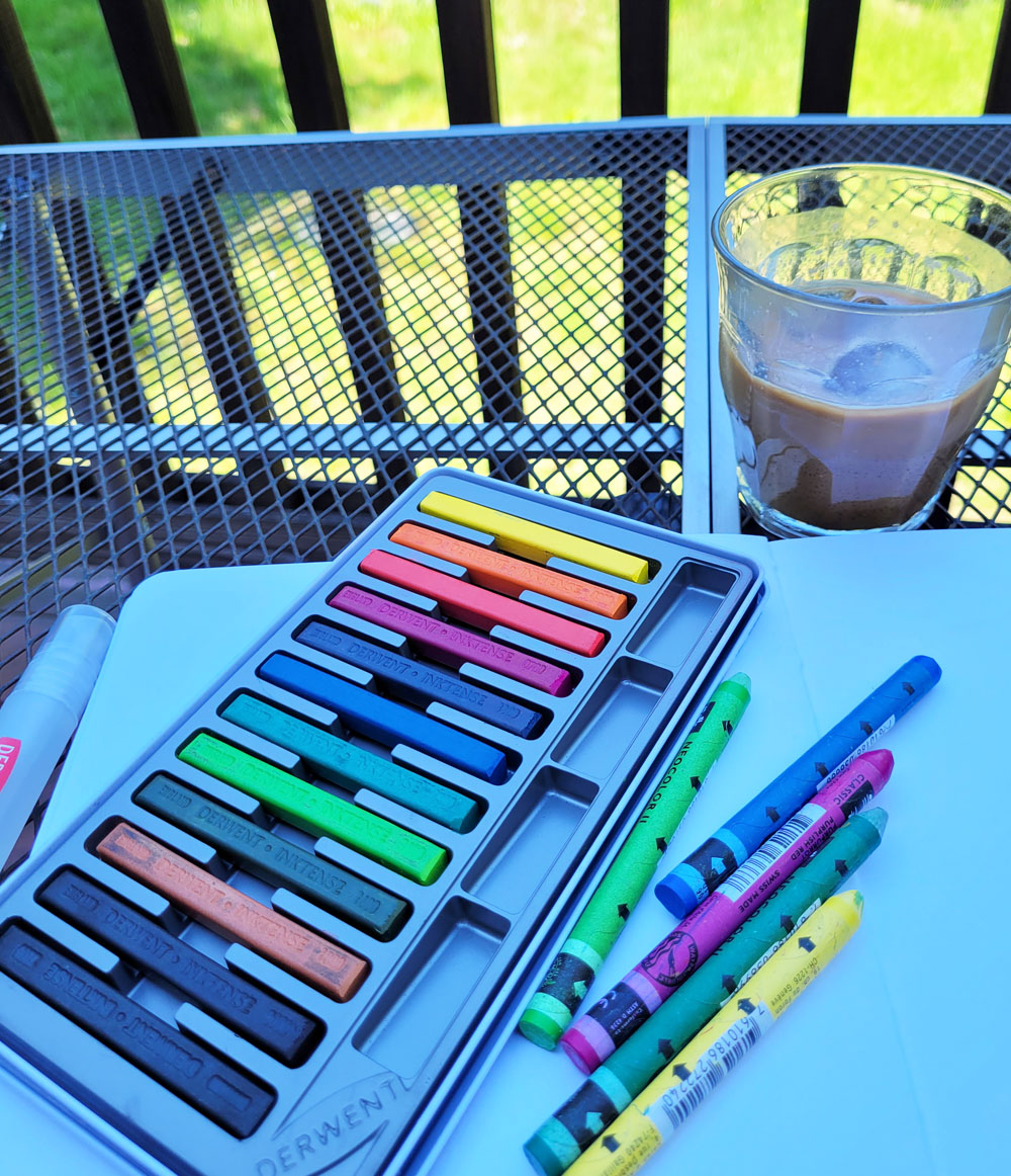
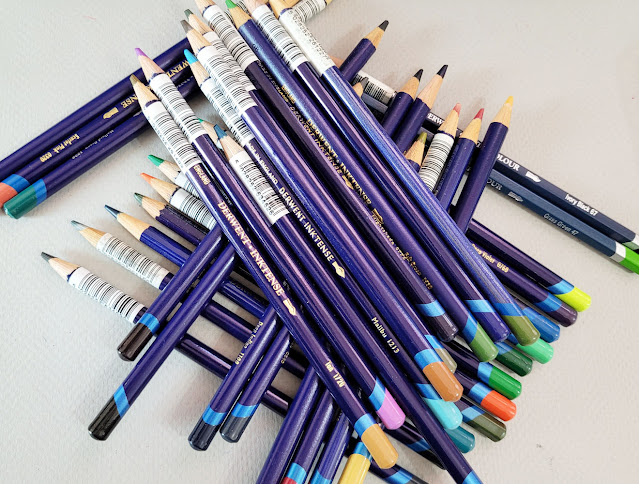
Inktense: My complicated relationship. (An unfortunate consequence of buying all my Inktense open stock is the barcode sticker on each one. At least the adhesive allows easy peel-off.)

Derwent Inktense Pencils and I have a “complicated” relationship. We always have. Despite their being possibly my oldest water-soluble colored pencils – I’ve had most of them since my mixed-media collage days long before I began sketching – I have never reviewed them. I kept wanting to, or maybe I just felt like I “should” review them in the same way that I felt like I “should” love them. Whenever I thought about a review, I would use them for a while to refamiliarize myself with them, and then I would get annoyed or frustrated and put them away – and put off the review yet again. The last time that happened was a couple of years ago, and before that, in 2017 when I cataloged some complaints (but never got around to the review that time, either). And yet I could never reject them completely – and so the cycle would repeat at some point.

You see how complicated our relationship is?

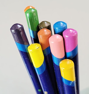
Inktense end caps are a crap shoot.

My biggest problem is that I keep wanting Inktense to change. I keep wanting them to be soft without being waxy or crayony, and I don’t want them to be crumbly. I want the pigment to be strong and intense without being too strong and intense. I want them to have useful end caps that indicate the actual pigment color (or even hint at it). In short, I want them to be more like Caran d’Ache Museum Aquarelles. I know that’s unfair as well as pointless – why not just use Museum Aquarelles and forget about Inktense? Why keep going back?

Because there’s always something about Inktense that lures me back. To find out what that is, I decided to give Inktense a full, fair review (as fair as possible, anyway, from a reviewer who never claims to be objective). And to do that, I removed all Museum Aquarelles from my bag about a month ago and replaced them with a selection of Inktense. That way, I wouldn’t be tempted to reach for a Museum instead and constantly compare. My intention was to treat Inktense as if it were totally new to me (ha!).

First, a little more history: I have only ever purchased Inktense as open-stock singles in small batches. Many were purchased more than 12 years ago, and I’ve learned that some colors have deteriorated over time. I’ve also noticed that some feel softer than others, but softness can be affected by specific pigments as well as age.

When I compared my oldest pencils to my newest, I couldnt detect a consistent trend. Sometimes I thought newer pencils felt softer and less dry, but not consistently. Other than the fugitive issues brought up in the post linked in the previous paragraph, they seem to have held up reasonably well over time.

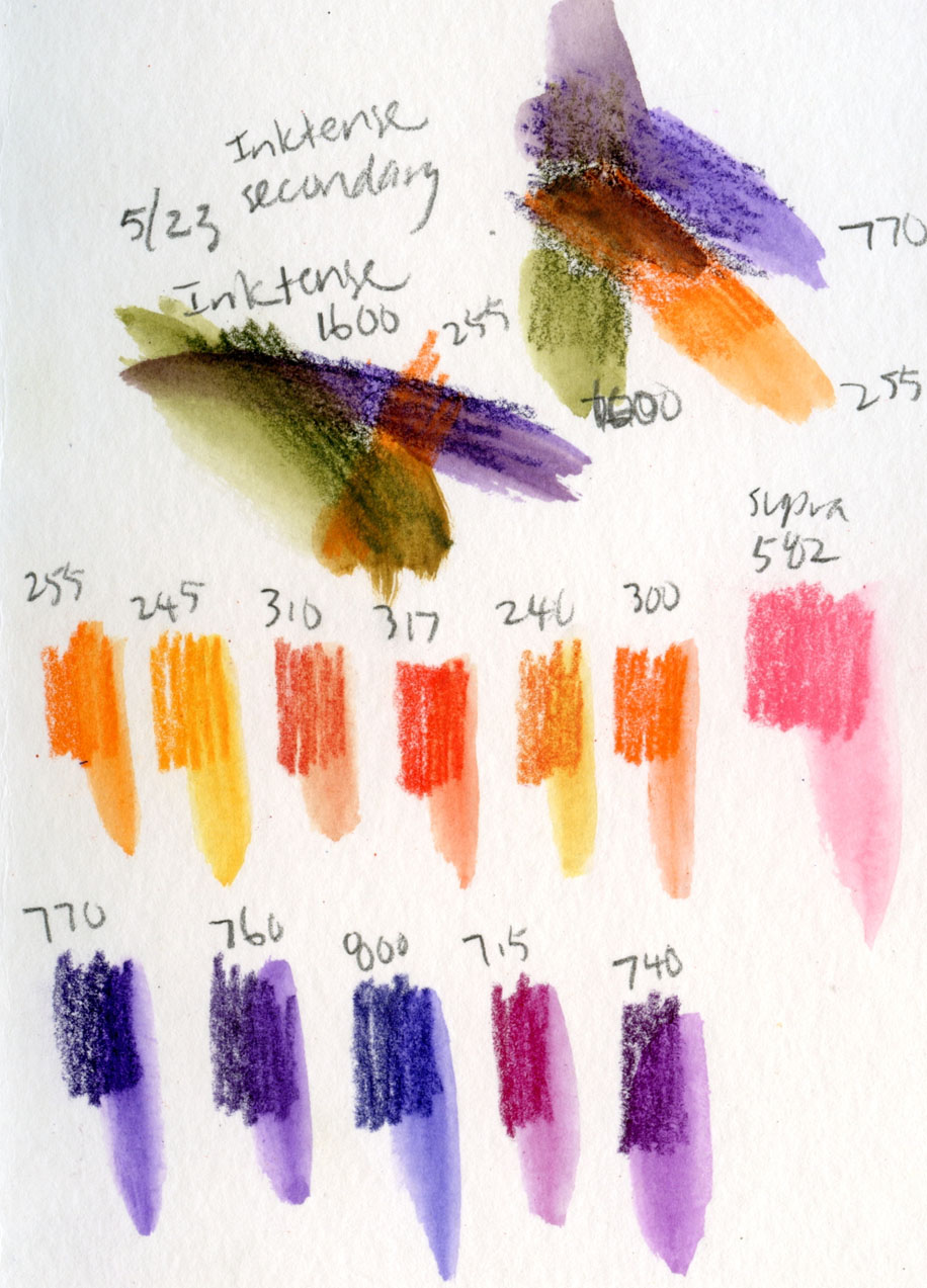
The first thing I did to begin my review process was to use my color journal to audition some hues for a limited palette – a CYMK primary triad and a secondary triad. Right off the bat, I was happy to have several dark purples to choose from, even among my less-than-complete set (but I tended to favor purples, pinks, reds and greens in my mixed-media collage days, so that’s not surprising). In addition to being important to my secondary triads, dark purple is a great basic shadow color. As has been well-documented by other reviewers, Inktense pencils are known to be fugitive, especially purples, pinks and reds (hues that tend to be fugitive in many media). If lightfastness is not a primary concern, however, then Inktense offers an excellent range.

My color journal page auditioning Inktense palette colors

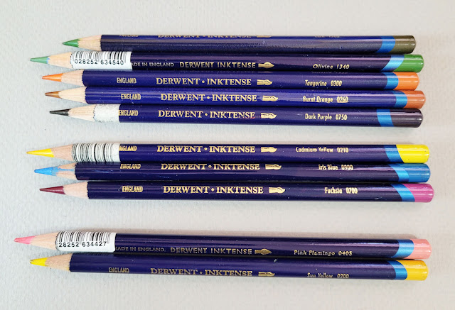
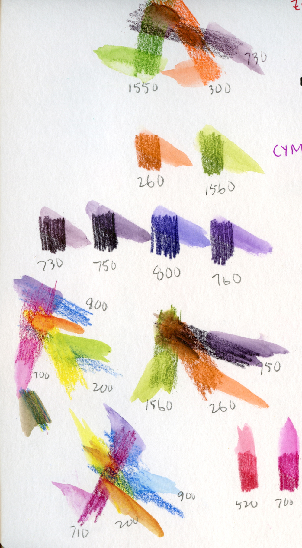
My current palette of secondary, primary and special-purpose colors. Dark Purple (750) is especially useful. (The two pencils at the bottom show how the Derwent branding has changed over the years. Pink Flamingo is the current branding; Sun Yellow is the former.)

In fact, one reason I keep going back to Inktense, despite our “complications,” is its distinctive color range that is unfound in sets 
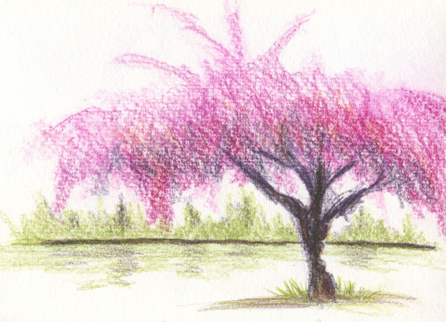
from other manufacturers. Back when I was looking for pinks and purples for cherry blossoms and their shadows, it didn’t occur to me to look in Inktense, but I should have – I would have had many more options. And now that Derwent has released 28 new colors (more on that later), bringing the total range to 100, Inktense’s range has far surpassed a certain Caran d’Ache collection that I’m not comparing Inktense to.

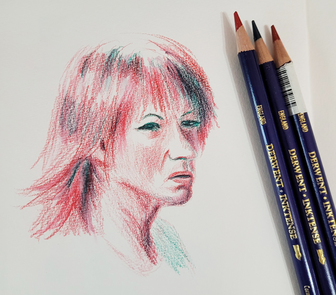
Now that those seductive colors are out of the way, I’ll get to pencil performance. To refamiliarize myself with them, I made a portrait in an odd mix of two reds and a dark green (inspired by both the Earthsworld model and Inktense’s vivid palette). I daresay they felt softer than I remembered (and also crumbly, which I do remember with annoyance). Activation with a relatively dry waterbrush made the already vibrant colors even more intense (downright garish, but the hues I achieved aren’t too far off from the model’s actual hair color).

4/20/23 Inktense pencils in Hahnemuhle sketchbook
(Earthsworld reference photo)


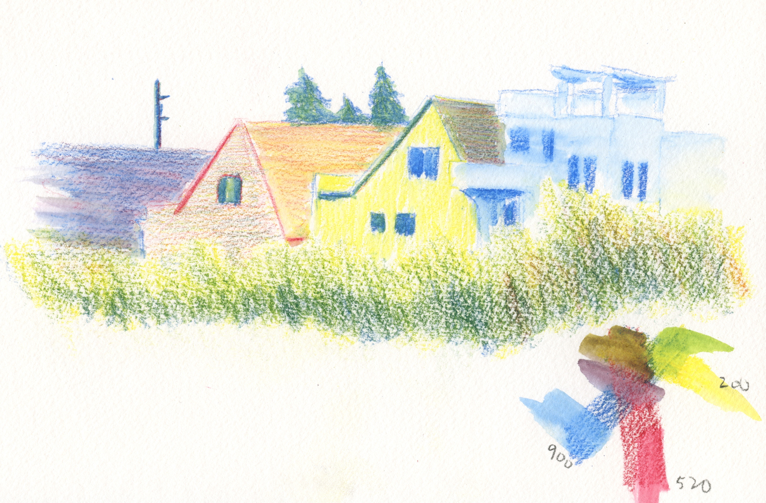
Next I did a sketch out the studio window to test a curious attribute that seems to be Derwent’s primary marketing angle: Unlike watercolor paints and most watercolor pencils, “Colour becomes permanent once dry leaving an ink-like stain. Inktense can be layered and keep colours vivid.”

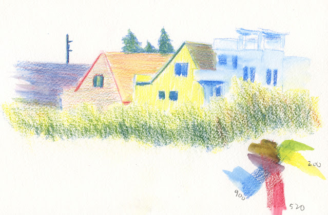
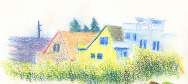
4/23/23 Inktense in Hahnemuhle sketchbook. The foreground foliage has not yet been activated. I used a waterbrush to activate only the houses.

With my constant use of a spritzer, I have sometimes unintentionally reactivated some areas and ended up with a blurry mess. Inktense’s “permanent” attribute could be useful in this application. My intention here was to activate the rooftops and let them dry so that when I spritzed the foliage at the bottom of the composition, the previously activated areas would remain undisturbed. As you can see from the closeup below, the dark rooftop did reactivate and blur a bit.

Closeup of rooftop where previously unactivated particles have blurred with spritzing.

Finished sketch fully activated

While it’s true that Inktense moves much less than other watercolor pencils after drying completely, I would be hard-pressed to call it fully “permanent” (as in waterproof). To achieve as much permanence as possible, every particle of pigment must be activated and fully dissolved. If any unactivated particles remain, then when the second application of water hits it, it will dissolve (which I think was the case in my rooftop example).

This unique attribute could be useful, for example, if one were to carefully and fully activate an entire area of color, then glaze a transparent color over it, the previous color would likely remain intact and reasonably permanent.

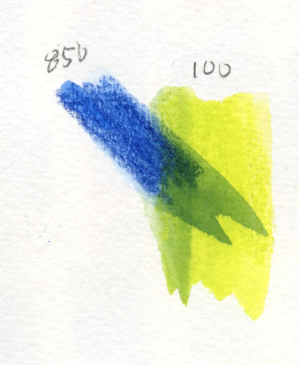
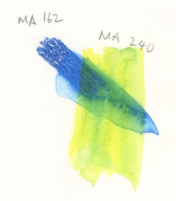
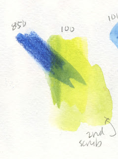
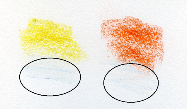
But is this a truly unique attribute? In the test below, I first made a swatch of blue and activated it loosely (so that I knew some pigment particles would be unactivated). When dry, I drew a yellow swatch over it and activated that. The fully activated part of the blue swatch is clearly visible with a hard edge under the yellow glaze – a nice effect if desired. Some previously unactivated blue particles dissolved a bit into the yellow mix, making a green (also a nice effect, if desired).

Inktense 


But look what happens when I do the same test with Museum Aquarelles, below (oopsy, I’m comparing… oh, well). That’s a hard edge on the blue, too. So with a simple glaze without scrubbing, my guess is that most watercolor pencils can be somewhat “permanent.”

Museum Aquarelle

I pushed it further. After the yellow glaze had dried completely, I scrubbed the glazed area hard to see if I could make the blue Inktense layer budge. I couldn’t. When I did the same with the Museum Aquarelle swatches, both the blue and the yellow continued to redissolve, and the hard line softened significantly.
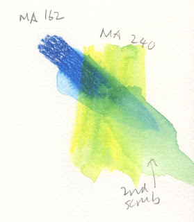
Museum Aquarelle

Inktense

In general, with my usual street methods, I don’t notice much difference in Inktense’s solubility. It only surprises me when I try to continue blending some previously activated colors on the page, which I occasionally do, and some colors no longer move as much as others. If I used Inktense regularly and consistently, I could probably learn to anticipate this feature and change the way I work to take advantage of it instead of fight it. The glazing aspect definitely has potential.

On location, for the most part, Inktense has been behaving and performing acceptably with my typical methods. When spritzing tree blossoms and foliage, it doesn’t dissolve and disperse as fully and vibrantly as, ahem, “other pencils” I use (which, admittedly, are hard to beat in that regard), so I have to use more water. Used dry-in-wet, however, Inktense performs superbly (in other words, just as well as the “other pencils”).

4/25/23 Green Lake. Spritzing dry pigment is accetable, but it takes more spritzes to activate.

I like the dry-into-wet effect I get with Inktense when using Hahnemuhle 100% cotton paper.

Inktense also performed well with the “licked” sky technique, which I had talked about in a previous post.

After a month of testing, I am surprised to find myself saying that I would be OK with including Inktense in my overall range of pencils that I select from to take to the streets (along with “other pencils”). Expanding the color range beyond my usual Caran d’Ache palette is exciting to consider (though with the caveat about Inktense’s fugitive nature). Summer is coming (already here, according to our early heat wave) . . . it will be fun to explore some new primary triads that include Inktense (maybe even mix Inktense with Museum Aquarelles!). Ultimately, I think it’s the range of unusual, unique colors that lures me back every time.

I don’t expect to ever love Inktense the way I love Museum Aquarelles, but at least now we can be friends. Heck, we’re more than friends: I decided that we are certainly friendly enough for me to go all-in on those 28 new colors I mentioned. In fact, Pink Flamingo (405), which I used for pink dogwood trees, is one of the new colors.

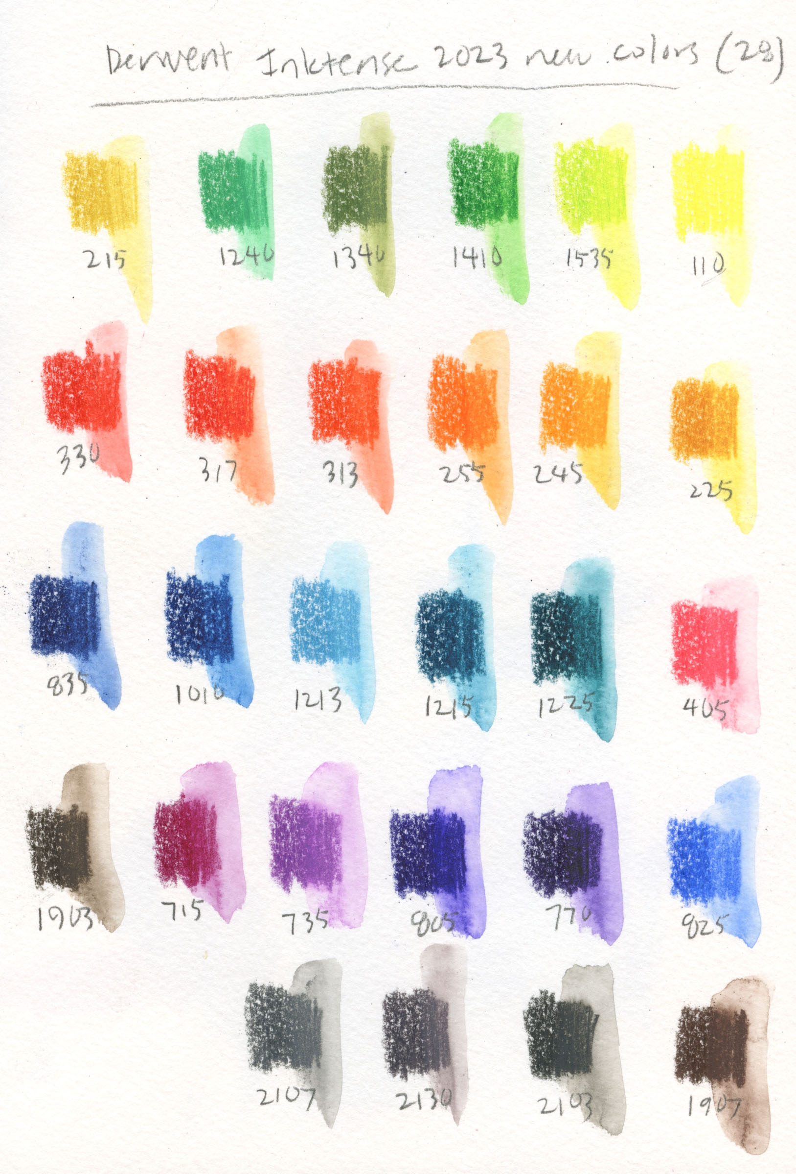
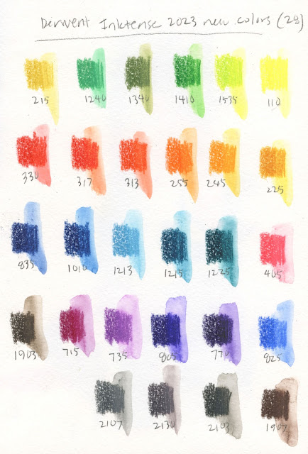
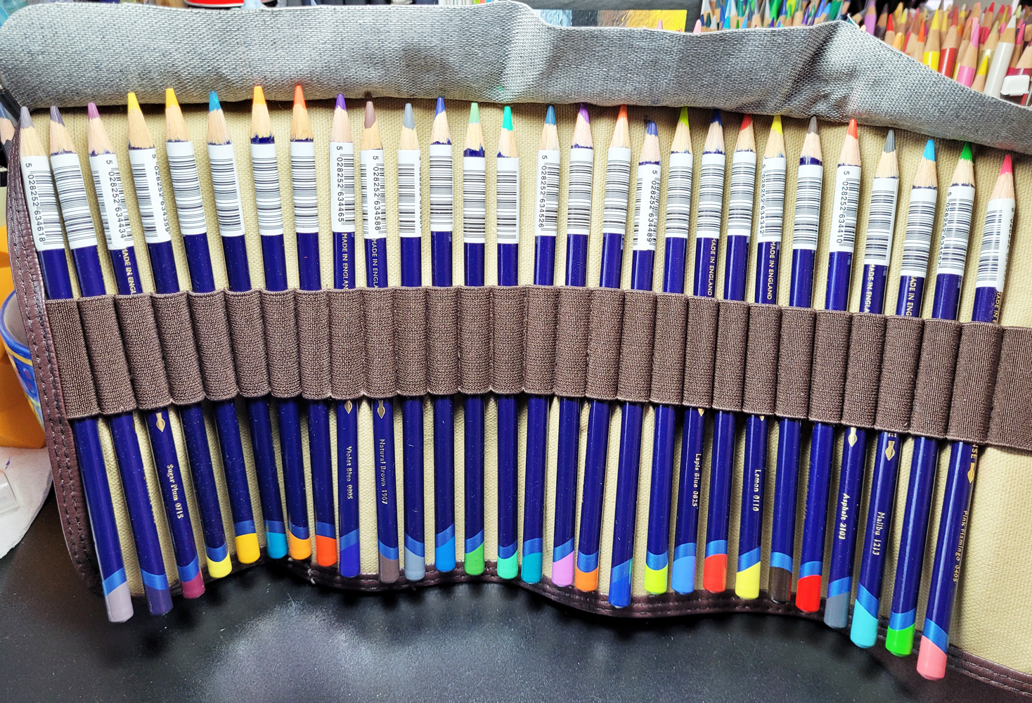
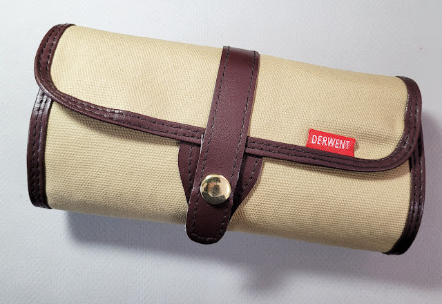
28 new Inktense colors from Derwent

I bought the new colors from CultPens in the UK. Yes, I could have waited an indefinite number of months for Blick to stock them, but who’s got patience for that? Despite being across the pond (and despite its name), CultPens is a great shop for colored pencils and certain products that are difficult to get in the US (like the
Tombow Urban Sketching Kit I reviewed a while back). The shop makes it (overly) easy for customers like me by offering all the new Inktense colors contained in a free Derwent pencil roll. (Apparently the roll was a limited offer, because it doesn’t seem to be included anymore.)

CultPens made it so easy for me to hit "add to cart"!


I also appreciate CultPens’ customer service and nice touches like the cute paper clip on my packing slip. (A piece of candy was also included with my order, but it mysteriously disappeared before I could take this photo.)

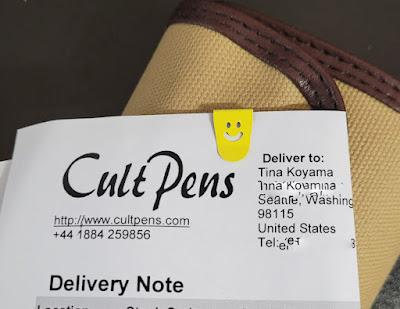
Great customer service from across the pond.

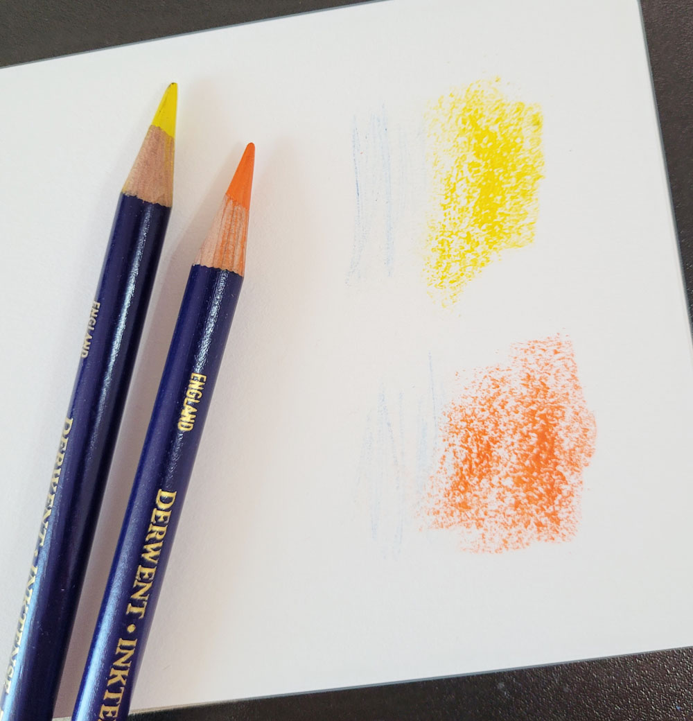
Edited 6/3/23: (I have been meaning to amend this review with an annoyance about Inktense pencils that I was aware of at the time of the review but didn't mention. It has annoyed me enough times that it was worth updating with images.) When I’m applying heavy color to large, rough areas such as foliage, I often use the side of the pencil’s core. When I do this with Inktense pencils, the paint on the dark blue barrel rubs off on the paper. I have not encountered this issue with any other colored pencil. I can avoid the marks by keeping the point at a slightly more acute angle, but anything about a pencil that makes me have to be conscious of its angle is a drawback.


Inktense's blue barrel leaves tell-tale marks where I applied color aggressively with the side of the core.


Related Posts Plugin for WordPress, Blogger...