Tuesday, November 30, 2021

Rainbow Avenue (and a New Field Experiment)


11/24/21 Color temperature study; west window view

One of the studies we did in Sarah Bixler’s color temperature workshop was what I think of as “Rainbow Randy” (see below). The assignment was to choose about six saturated hues to express a full range of temperatures from warmest (yellow) to coolest (blue) and the steps in between. We were to avoid mixing, allowing the saturated hues to do the work of showing the changes in color temperature.

Rainbow Randy

No part of Randy’s back was green, yet I could see that the shadow there was slightly warmer than the coolest area behind his neck (farthest from the light). The warmest parts – his face, chest, shoulders – were those that faced the light most directly. The sketch is a garish rainbow, but it very clearly shows where I saw the relative color temperatures.

On yet another gray, colorless morning, I looked out my studio’s west window at the usual view with a new thought: I bet the “rainbow Randy” treatment would have interesting results! The challenge I hadn’t anticipated, though, is that unlike Randy’s neutral-toned skin, the view does have some identifiable local hues, pale and dull as they are. The warmest spot is the yellow house, which is, indeed, yellow (though not nearly as bright as I’ve made it). The house to its right is pale gray, the coolest part of the view, so I made it blue. Those were the easy parts. But what of the trees and other foliage? Now I was confused: They looked varying shades of “green,” but were they warmer or cooler than the dark rooftops I had decided were purple because they were warmer than the coolest gray house?

Suddenly I realized that rainbow Randy was easy by comparison because his complexion has no saturated hues; it’s made of a range of neutral tones. It was becoming increasingly clear to me that a model is an ideal subject for learning color temperature. But I’m determined to figure out how to use color temperature to describe anything I see in the real world (not just life-drawing models) – describe them as well as express them in (I hope) a more interesting way.

With that in mind, I assembled a limited palette of 14 Caran d’Ache Luminance pencils (I’m fickle; I’ll probably choose different pencils next week). The palette is based on a warm and a cool of each of the three primaries (including my favorite CMYK triad, which is checkmarked). Using secondaries in the workshop was more difficult than primaries, so I also included a warm and a cool of each secondary for when I am up for the challenge. The last two are relatively neutral French Grey and Indigo for when I need to lay on the darks. 

Limited palette of Caran d'Ache Luminance

I could have used my usual Museum Aquarelle palette, of course, but the workshop showed me that it’s easier to see how color temperatures work together when the glazing property of transparent (dry) colored pencils results in optical mixing. If I use watercolor pencils, I would be too tempted to mix colors with water instead of learning from the glazing. And in any case, it would be a fun reason to take my non-soluble pencils out in the field, which I rarely do otherwise.

Tomorrow I’ll show you the case I’ll be using to tote this pencil palette (dont you love cliffhangers?). 

(Hmmm… this turn of events has thrown a wrench into my sketchbook plan. I just filled a Stillman & Birn Beta, and I had been looking forward to starting the Hahnemühle watercolor book I bought a couple of months ago. But I think its tooth is too strong for soft Luminance pencils; I prefer a smoother S&B Zeta with those.)

Monday, November 29, 2021

What is a Colored Pencil Layer?


Caran d'Ache Luminance pencil on Stonehenge White paper

A reader contacted me recently with an interesting question. In the colored pencil world, we hear and talk about “layers” all the time as the basic method of applying pencil pigment to the paper’s surface. But what, exactly, constitutes a “layer”? How do you know when you’ve applied enough of the first layer to move on to the second?

It's a good question because I had wondered about that myself for quite a while. In books I’ve read and even in classes I’ve taken, the term “layer” is usually not defined; it seems to be assumed that we all get it. What I told the reader, and what I’m going to describe as follows, is my own interpretation of what layering means, but the meaning might be up for grabs by other colored pencil users. In any case, I thought it would be worth answering the question here on the blog.

In the bar above, made with a traditional (dry) Caran d’Ache Luminance pencil, each patch shows how many layers I applied (I’m left-handed, so I started from the right). It took eight layers of this soft pencil to almost completely cover the paper’s tooth (the paper is Stonehenge White with a light tooth). I could probably apply a few more to completely cover it.

In the bar below, I used a water-soluble Caran d’Ache Museum Aquarelle pencil (same Stonehenge White paper). With watercolor pencils, the layers are less straightforward because a dry layer can be activated with water before more dry pigment is applied, or it can be left dry.

Caran d'Ache Museum Aquarelle pencil on Stonehenge White paper

Starting from the right, “Dry” is one layer of dry pencil. “Wet 1” is water applied to a single dry layer. “Dry 2” shows another layer of dry pencil applied over Wet 1 and remaining dry. “Wet 2” is the same as Dry 2 but activated with water, and so on. There’s not much apparent difference between layers 2 and 3 even after water is applied, but typically the layers would be made with different colors, which would make the layers more obvious.

With watercolor pencils, it wouldn’t be possible to continue adding as many as eight dry/wet/dry/wet layers as you could with traditional dry pencils because at some point the paper will start to break down, even strong watercolor paper (which is essential for this type of work). In addition, you must wait until the paper is completely dry before applying more layers. However, you also don’t need as many layers to cover the paper’s surface because the water-solubility does a lot of that work for you.

Sunday, November 28, 2021

Puffy


11/24/21 Female Northern flicker

Ever since the fun we had all summer feeding peanuts to the Steller’s jays, I haven’t been sketching birds much. We still enjoy watching them at our feeders, though. One cold, dreary afternoon, I filled my teacup and then walked over to the kitchen window. A female flicker, puffed up against the cold, was resting on the fence. She gave me a leisurely three or four minutes to capture her fat form. I love the sliver of the red-orange shaft showing under a wing.

Saturday, November 27, 2021

Review: Faber-Castell Pitt Graphite Matt Pencils


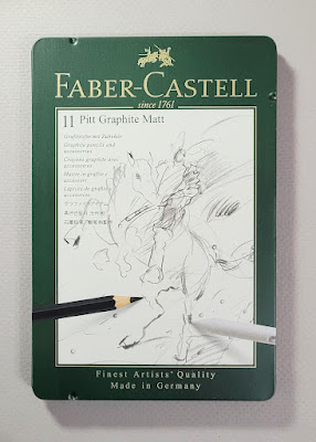
Faber-Castell's innovative Pitt Graphite Matt pencils

Those of us who hang out in the pencil world see many, many graphite pencils come and go with different colors and designs on the outside. It’s a rare occasion, however, when a pencil manufacturer releases a new product with a genuinely new type of graphite core on the inside. It was, therefore, with much anticipation and excitement that I tried a set of Faber-Castell’s new Pitt Graphite Matt pencils.

Anyone who has applied a heavy area with graphite has seen the silvery reflection that results. As long as a drawing is viewed without direct illumination, the graphite appears dark, but when tilted toward the light, the shiny reflection changes its appearance significantly. I find this reflective characteristic annoying even while I am drawing if the paper is flat on the desktop and a light is shining directly over it. (It’s one reason I find the Art Stand Desktop Easel essential.)

According to Faber-Castell, Pitt Graphite Matt (I’m using the German spelling that is used on the product tin), a “revolution” in graphite drawing, “was specially developed to reduce light reflections on the paper.”

Available in eight grades – HB and even grades through 14B – the German-made Matt pencils come in a set of six (missing HB and 14B) and a set of all eight with an eraser, sharpener and blending stump. Blick also sells them open stock.

The set I bought includes all 8 grades plus accessories. If you don't need the accessories, it's a better value to buy the set of 6 grades and add on the missing 2 grades by open stock. Somehow my math capabilities were also missing the day I shopped, as I don't need these accessories. What I just described would have been the smarter purchase.


Available in 8 grades

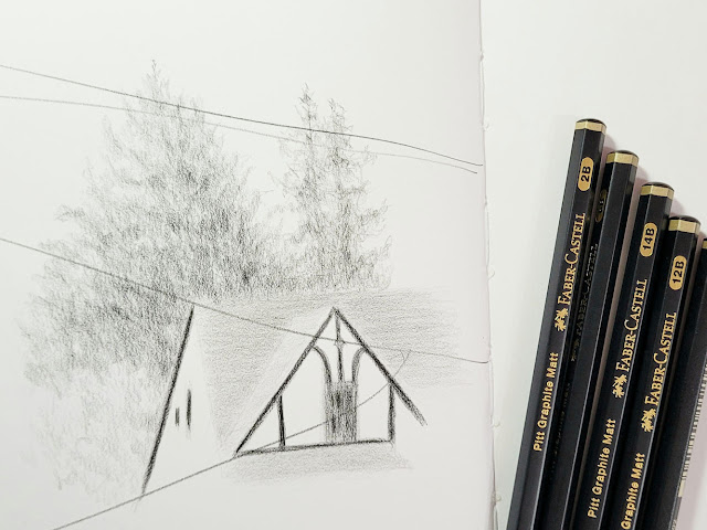
When I have a product that is entirely new to me, I usually make comparison swatches and tests before making a sketch. Call me bold and daring: I ripped the plastic off the tin, sharpened all eight pencils (after I snapped the photo above, of course), looked out the window at the blah, gray view and made a sketch.

11/22/21 Pitt Graphite Matt pencils (HB, 2B, 6B, 12B, 14B) in Stillman & Birn Zeta sketchbook

My first impression was that all the grades I used (HB, 2B, 6B, 12B, 14B) seemed much lighter than other pencils of comparable grades. I’m used to and sketch most often with Japanese pencils (Mitsubishi Hi-Uni being my favorite), which are consistently softer and darker than other pencils, but I’m not unfamiliar with Staedtler, Faber-Castell and other European brands. The Matts also felt different – smoother than Faber-Castell’s Castell 9000, for example, though not in a Japanese-smooth-graphite kind of way (how’s that for articulate and unbiased commentary?). As promised, however, the areas of darkest application in my sketch showed very little reflection.

Faber-Castell is not forthcoming in marketing information about what the graphite is mixed with to impart its revolutionary matt appearance, so I wondered if it could be some form of carbon, like Staedtler’s Mars Lumograph Black. Now that I have the Matt pencils in hand, however, I don’t think it’s carbon at all: The material looks and especially feels very different.

It was time for some testing and comparisons. First I made swatches with the Matts in each grade and Faber-Castell 9000, Staedtler Mars Lumograph and Mars Lumograph Black, and Mitsubishi Hi-Uni in comparable grades (as available in my studio). As I thought, the Matts are lighter than all the other pencils in comparable grades, even F-C’s own Castell 9000.


The Matt’s 14B grade, which may be unprecedented as a graphite grade, is unremarkable in darkness: It’s certainly lighter than the Mars Lumograph in 12B and Hi-Uni 10B.

More significant is the comparison for reflection. Below are the same five pencils with several layers of 4B. The top image was photographed to avoid reflective light. The lower photo shows the page tilted toward my desk lamp. Only the Mars Lumograph Black remains as matte as the Matt. (Apologies for the fuzzy focus – tilting the page to catch the light confused my phone’s camera.)

Swatches without direct lighting

Page tilted to reflect light

Equally interesting is the smudge test. I don’t typically test graphite for smudginess since I assume all graphite pencils are prone to smudging. But while I was making the initial sketch, I inadvertently smeared a thumb across part of the drawing and was surprised that it didn’t smudge as expected. I thought it would be worthwhile to compare this characteristic. Indeed, using one clean finger to make each smudge, the Matt smears the least. I repeated the test using the blending stump that came with my set and had the same results. I’d say this reduced smudging property is a notable benefit that Faber-Castell doesn’t even mention in its marketing information!

Top row smudged with finger; bottom row smudged with blending stump


Erasing with a Tombow Mono Zero was average.

Do I love the Matts? Not really. Although I do appreciate their non-reflective property as well as their lower smudginess, I’m not crazy about the way they feel. (Yes, yes, I know I’m spoiled by that Hi-Uni silky-smoothness. So sue me.) But as I was making the swatches, a light bulb snapped on over my head: The non-reflective quality only matters on the final application of graphite. Perhaps I could make most of a drawing with my favorite Hi-Unis, then apply the Matts as a final layer over the areas most heavily covered with graphite and therefore most reflective. Would it work?

The test result is below: At left is a swatch of heavily applied Hi-Uni 4B. At right is a similar swatch of Hi-Uni, but as a final layer, I applied a Matt 4B. I tilted the page toward my lamp to photograph it.

Two swatches of Hi-Uni 4B; the one at right has a final layer of Matt 4B

A-ha! It’s possible to take advantage of the Matt’s non-reflective quality without having to use the pencil for the entire drawing. Which I will be doing!

Whatever the Matt’s secret ingredient, Faber-Castell has definitely created an innovative, unique pencil.


Friday, November 26, 2021

Lunch Break


11/20/21 Capitol Hill neighborhood

On my lunch breaks during the workshop I took last weekend, I sketched a couple of views I could find through my windshield on those cold days. On Day 1 my brain was buzzing with complementary colors and temperatures, so a brick stairway and surrounding greenery caught my eye.

On Day 2 I had less time. I grabbed a water-soluble ArtGraf pencil to scribble a corner of a building with interesting archways.

11/21/21


Thursday, November 25, 2021

Boostered


11/23/21 A volunteer firefighter fills syringes at 
the Shoreline Community College vaccination clinic. 

Something I missed immensely during the pandemic’s long pre-vaccine phase was sketching people. In general, I avoided them, and if I saw any, they were too far away to sketch. Now that I’m gradually doing more around people, I’m also sketching them more. As usual, the sketches don’t amount to much since people in public places usually don’t stick around long. But I have always enjoyed that tension – how much can I capture in however long I have?

The downside is that I can’t practice sketching noses and mouths. Now that I’m boostered, though, I’ll feel safer spending time in coffee shops again, where more complete faces will be revealed. I’m looking forward to that this winter.

11/15/21 Costco

Speaking of being boostered, I used a walk-in clinic at Shoreline Community College that was staffed by volunteer firefighters (at left). Of the three COVID vaccine doses I’ve received, this was by far the fastest and easiest. We all know the drill now, and it’s no longer the competitive race to the syringe that it was six months ago.


On this Thanksgiving, I’m grateful for many things, not the least of which is all the medical technology and information that continue to keep me as safe as possible. It feels good to take baby steps toward normalcy.

9/21/21 waiting room

10/19/21 light rail rider

10/19/21 more light rail riders

11/15/21 Costco

11/16/21 Starbucks


Wednesday, November 24, 2021

Color Temperature: Back for More


11/20/21 Dee, 5-minute pose (Prismacolors and Strathmore Bristol Smooth used on all drawings)

After I took Sarah Bixler’s portrait workshop a couple of weeks ago, I felt like I had barely touched the tip of the iceberg in terms of understanding color temperature. I wanted another opportunity to internalize the concepts so that I can apply them on my own. Last weekend, she offered a second workshop on the same concepts, this time for two days in figure drawing, and I jumped right on it.

5-minute pose; warm/cool scale

The exercises during Day 1 were similar to ones we did in the portrait workshop. With a complete figure to work with, though, instead of a head and clothed shoulders only, we could more fully explore a wide range of color temperatures. Humans have a remarkable range of subtle hue changes throughout the body: The palm is a different color from the back of the hand; the thigh is different from the forehead. In the previous workshop, I thought that the same concepts could be taught using inanimate subjects like still lives, but I no longer think that’s true. The human figure is a much richer though subtler “palette” of local hues than a blue vase of red flowers – a palette that’s much more challenging to see.

Further complicating matters is the type of lighting – natural or synthetic – and how close it is to the model: Skin closest to the light source tends to be warmer in color temperature, and local color is usually more apparent on the side away from the light. In the morning, we took advantage of natural light in the studio and kept the spotlight off. By late afternoon, we needed the lamp, which was cooler than natural light.

After a set of one-minute poses to warm up, we used two contrasting colors – one warm, one cool – to draw model Dee for a series of five-minute, 10-minute and 40-minute poses. Before settling on this pair of muted blue and red, I tested it by making a scale from warmest to coolest in two values (above).

40- and 10-minute poses

For the final 40-minute pose, we were to use two analogous colors (I chose green and blue), which made it much harder to make distinctions between cooler and warmer areas. By the end of the second 20-minute session, I felt I had lost the warmest spots, so Sarah suggested I add something like neon yellow to make those spots pop.

40-minute pose - analogous colors

On Day 2, with Randy as our model, we explored a wider range of exercises and palettes. In the morning, we used a veritable rainbow of hues. The colors were not used randomly, however; they were all still used to express color temperature differences (though not very subtly). Since the human figure is basically a palette of neutral tones, these extremely non-neutral, saturated hues really forced us to observe and then decide on the relative color temperatures we saw. One of my stated goals for the workshop was to get out of my rut of depicting colors so literally in sketches, and these exercises in drawing “rainbow man” certainly helped!

11/21/21 Randy, 40-minute pose

40-minute pose

In the afternoon we did a fun value study using adhesive tape in two colors to make a collage.

Tape collage value study, 20-minute pose

For the final two drawings, first a 40-minute and then a 20-minute pose, we were to choose three colors and then two. For the 40-minute pose, I used a secondary triad of a bright purple, a muted orange and a bright olive green. Surprisingly, the green turned out to be the warmest hue when I made the initial color swatch (shown below after the sketch).

Secondary triad, 40-minute pose

Testing color mixes in a triangular format

When testing three hues such as a triad, Sarah prefers this triangular-shaped format instead of the traditional circles. With circles, the blended areas end up being fairly small. Triangles give all the swatches equal space. I prefer triangles too and will be making my blends this way going forward.

When we got to the final 20-minute drawing (I chose complementary orange and blue), I repeated the neon yellow trick to bring out the warmest spots at the end.


20-minute pose

Throughout the weekend, Sarah showed us examples from art history and even computer animation in which the artists had manipulated color temperature to give the sensation of the direction of the light. It was all so fascinating!

In the same way that I marveled at Crystal Shin’s sharply honed eye for color inbotanical subjects, I was impressed by Sarah’s equally keen eye for subtle differences in color temperature.

With a more intensive weekend of training under my belt, do I know enough now to apply what I learned about color temperature to real-world sketching? I guess we’ll both find out! In any case, it was an amazing opportunity to have my eyes opened to an aspect of color that I had never paid much attention to before.

Instead of the Faber-Castell Polychromos I used at the first workshop, I used Prismacolors this time. I found the softer Prismacolors to be easier to work with when under time constraints of even the longer poses. 

Tuesday, November 23, 2021

Puddles


11/19/21 Maple Leaf neighborhood

Our recent deluge and wind caused flooding, downed trees, power outages and other devastation in some parts of the region, but we were thankfully safe in Maple Leaf. During a dry morning last week, I went out walking on First Avenue Northeast parallel to Interstate 5. Next to the freeway barrier, it’s gravel instead of paved sidewalk, and cars park in weird ways, making some of my favorite compositions. One benefit of rain is that it leaves behind puddles in the uneven gravel.

Monday, November 22, 2021

Birthweek Cakes

11/18/21 Apple Cinnamon Bread Pudding

It’s important to milk celebrations for as long as possible.

My favorite neighborhood bakery is Honoré Patisserie & Espresso, which is (dangerously) within walkable distance of home. I’ve sketched several of the bakery’s creations before devouring them, sometimes with friends. Since it’s closed on Tuesdays, I couldn’t go on my birthday, but that was fine because it meant I could extend the indulging further into the week.

After our morning walk through the neighborhood, we made a stop at Honoré so that Greg could buy me a slice of cake. I thought I was set on the chocolate ganache, but then I spotted apple cinnamon bread pudding, which brought back tasty memories of the best bread pudding I’d ever had, years ago in New Orleans. I was hemming and hawing about which to get when he said, “Get both.” (That’s why I married that man.) He was happy that Honoré always has several gluten-free treats for him, too.

I daresay Honoré’s bread pudding was even better than the one I remember in New Orleans. However, it was certainly difficult to sketch, especially the challenging texture. I rarely sketch my food, but maybe I should – I could use the practice.

As it turned out, the ganache was even trickier! As I started drawing the swirly pattern on top, I immediately regretted making this sketch. And the fluted pastry liner with all those pleat shadows! The sketch was taking longer than I wanted, and it was keeping me from devouring the cake! Arrghh!

I’m going back to my personal policy: Don’t let a sketch come between me and my food.

11/19/21 Chocolate Ganache and gluten-free Coconut Macaroon

Milkin' it.
Whew... done at last so I can get to the important part!

Sunday, November 21, 2021

Much to Celebrate

11/16/21 Bryant neighborhood

I had a birthday a few days ago, and with the deluge we’ve been having lately, I assumed it would rain that day, too (most of my childhood birthday party memories include rain, so I’m used to it). To my surprise, it was mostly dry, and the clouds kept parting sporadically to let the sun through.

I had also assumed that our “atmospheric river” surely would have put an end to leaf-peeping season, but call me optimistic. Driving around the Bryant neighborhood, I saw that most trees were bare, but a few were reluctant to give ‘em up. A little bald on top, this maple still had some shining to do. It just goes to show that I can’t make assumptions. And the sunshine was an unexpected birthday treat.

Speaking of birthday treats, Greg took me to our favorite sushi restaurant that evening to celebrate. The last time we had dined inside a restaurant was February 2020 for his birthday – only a couple of weeks before the global pandemic became more than just a disturbing news article. We went to Kisaku that time, too. We chose Kisaku again because, like more and more Seattle restaurants, proof of vaccination is required to dine there. Other than the masks, not much had changed in 21 months; they still had my favorite hamachi appetizer, and the whole meal was delicious. It was very special to be back.

I rarely sketch my food, especially during special occasion dining. It was important, however, to document this meal as a celebration of more than just my birthday.

Greg was happily eating his own appetizer so he didn't have to wait
while I sketched. ;-)

Much to celebrate!


Saturday, November 20, 2021

Gray


11/12/21 Across the street
Gray is not my favorite color. Living under a gray sky so much of the year, I often wonder why people willingly choose to drive a gray car or paint their house gray. (It’s urban camouflage, I suppose.) The only gray thing I willingly use is my Stillman & Birn Nova sketchbook, which this particular morning was made for.

Friday, November 19, 2021

Rainy Trash Day

11/11/21 Maple Leaf neighborhood

On my way to an errand, heavy mist gave the morning a soft, muted look almost like fog, which I’ve had fun capturing in the past. By the time I finished my brief errand, though, the mist had turned to full-on rain. Undaunted, I pulled over anyway. After all, it was trash day in Maple Leaf.

Thursday, November 18, 2021

Parabéns, USk Brazil!


11/13/21 Kitanda Coffee and Acai, Green Lake Village

The farthest I have ever traveled was to Brazil for the 2014 Urban Sketchers Symposium in Paraty. Even with six international symposia under my belt, Paraty is still my favorite. The warmth and friendliness of the Brazilian people, the smaller, more intimate feeling of the symposium, the spectacular beaches and landscape, the unusual but not overwhelming architecture, the best coffee in the world – all of it made for an unforgettable (and very sketchable) time.

USk Brazil is celebrating its 10th anniversary this week by inviting sketchers worldwide to post sketches made while visiting Brazil or anything from their own countries representing Brazil. Long before the pandemic, I remembered seeing Kitanda Espresso and Açaí at Green Lake, but I had never been there. Relieved that it was still in business, I took Greg along so that we could both enjoy Brazilian coffee and pão de queijo (Brazilian cheese bread), which is made of gluten-free tapioca flour. It was chilly in the Green Lake Village courtyard, so my sketch was hasty, but we were warmed by fond memories of our time in mostly sunny Brazil.

Shown below are a few of my favorite sketches from that trip. Parabéns, USk Brazil!

8/26/14 Pousada do Ouro courtyard, Paraty

8/30/16 Santa Teresa, Paraty

9/3/16 Cristo Redentor, Rio de Janeiro

Related Posts Plugin for WordPress, Blogger...