 |
| 12/18/23 photo reference by Andrew Banks |
 |
| ArtGraf "tailor shape" block, Uni Pin and Polychromos |
Roz Stendahl often talks about the challenging fun of
painting on papers not intended for wet media. Even if a paper is generally
considered unsuitable, she adjusts her “normal” working methods to get whatever
effect she wants to achieve from the incompatible mix of media and support. Chandler O’Leary (RIP) used to favor the weird, waxy, manila-folder-like paper in
Moleskine sketchbooks for watercolor sketching. While fine for most pens, that
paper is among the worst with wet media: The sizing (or lack thereof) allows
the paint to sink in almost immediately, and pigments look dull and flat. But Chandler
liked the unique, comic-book-like results she got with the paper and learned to
work with it to get what she wanted.
I thought of both Roz and Chandler as I continued making more pet portraits on Field Notes Birch Bark edition covers. I know the paper is not intended for wet media (heck, it’s probably not intended for any kind of media – it’s a cover stock, not art paper), and yet I’m intrigued by some effects I’m getting.
Below I’ve compared various media on Birch Bark cover stock
(which is 110-pound Mohawk Loop) and Hahnemühle Akademie Aquarell sketchbook
paper. You can see how the watercolor doesn’t flow or wash on the cover stock the way it does on appropriately sized watercolor paper.
 |
| Various media on Birch Bark cover stock |
 |
| Most of the same media in Hahnemuhle Akademie Aquarell sketchbook |
The first time I was surprised by the cover stock (and the media, too, for that matter) was when I sketched the kitty named Tucker (shown in my post about Viarco ArtGraf water-soluble graphite). Without appropriate sizing, the medium expresses a great texture, especially when worked wet-in-wet. I like it better on this cover stock than I do on “appropriate” paper.
Encouraged by that attempt, I sketched Bailey, the handsome chocolate lab (top of post), with Viarco ArtGraf “tailor shape” blocks (which are made of debatable materials, but it’s believed that they’re at least partly graphite). The paint, which doesn’t glaze transparently like watercolors, looks more like gouache, and I like the flat, matte look.
 |
| I tried watercolors first, but I didn't like the effect. |
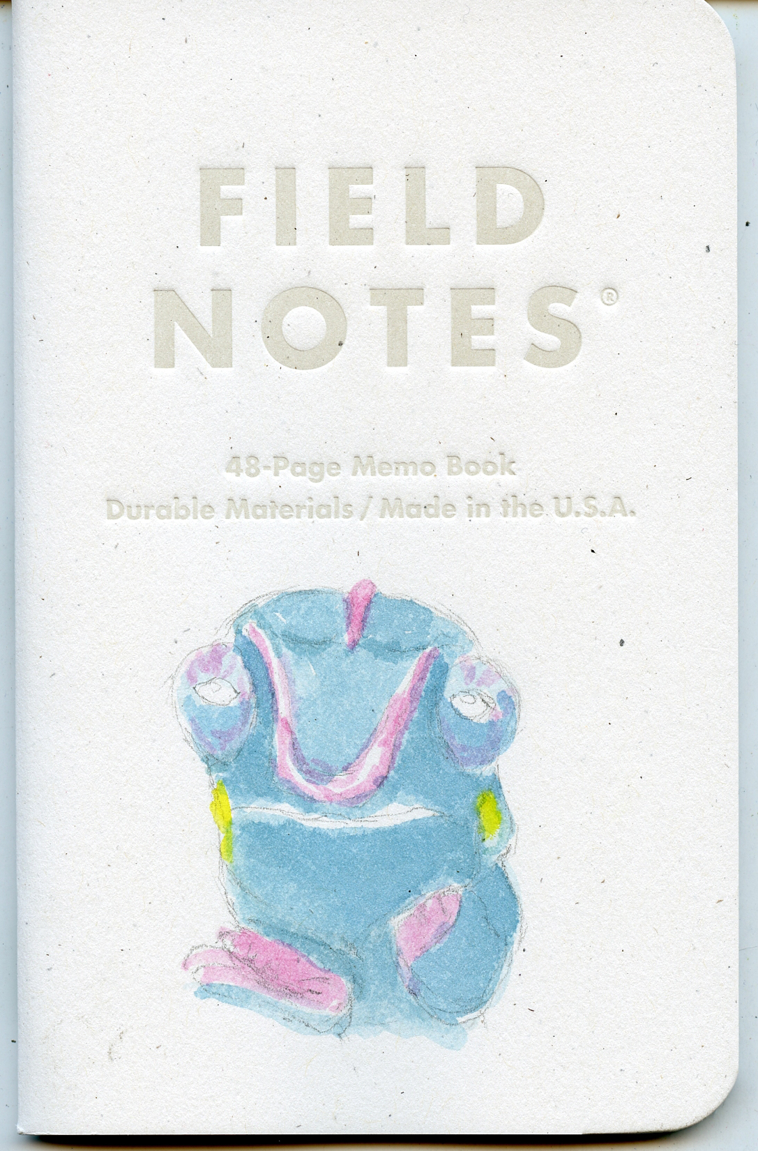
Now it was time to pull out the big guns – actual watercolors – and I chose what turned out to be the most challenging pet so far: a “nosy be panther” (what??) chameleon named Sirulean! Using Kuretake Gansai Tambi watercolors (which I chose because the set includes a blue that I thought would be close to the hue I needed), the pigments did exactly what I would expect from inappropriately sized paper: They sunk in immediately (at left), and successive layers did not glaze or even particularly deepen the values as they would on watercolor paper.
Realizing that I wouldn’t get the effects I wanted with watercolors, I abandoned them and switched to Prismacolors. After the color was done, I tried drawing that scaly chameleon texture with a couple of Uni Pin technical pens, but I think I got a little heavy-handed. In any case, this frontal chameleon view is somewhat disorienting (downright intimidating to be stared down by an in-your-face chameleon), and I regret that I didn’t quite capture Sirulean’s brilliant blue hue (with pinkish markings!).
 |
| 12/20/23 reference photo by Amanda Ready |
 |
| Prismacolors and Uni Pin pens |
With Cuppa Joe, an adorable white Scotty, I took a safer route: gray and black Uni Pin technical pens. To help bring out his white face, I used ArtGraf water-soluble graphite for the background, and I love the diffused, mottled texture that resulted.
 |
| 12/20/23 reference photo by Kathleen Murray |
 |
| Mostly Uni Pins and ArtGraf background |
I’m learning that maybe it’s not the Field Notes cover stock alone that is so intriguing . . . maybe it’s the ArtGraf products interacting with it that has such interesting results. In any case, the notebooks and the ArtGraf products coming into my life at around the same time has turned into a material geek’s dream come true! Bring on the experiments!
I am still amazed that you are able to use wet media on the covers and get these great results. You go, girl!!
ReplyDeleteThanks! Who knew a cover stock would be so good to sketch on!
Delete