Monday, September 29, 2014

National Caffeine-Fueled Sketching Day

9/29/14 Pilot Iroshizuku Take-sumi ink, Caran d'Ache Museum water-soluble
colored pencil, Zig marker, Canson XL 140 lb. paper
Today is National Coffee Day! With a blog called Fueled by Clouds & Coffee, how could I not make my favorite coffee shop my sketching destination on this drizzly, overcast day?

Settling into my favorite table at Zoka Coffee, I was feeling rusty; I hadn’t sketched in a coffee shop since April. I decided to warm up with a couple of sketches using a twig and India ink. KK’s technique is starting to grow on me. When I sketch people, I tend to focus on the details of their faces and stances, and it makes for great life drawing practice. But working on facial details can also make me lose sight of strong values. My twig, as slender as it is, won’t allow me to scratch in any level of detail, so I’m forced to see and sketch only the darks and lights plus some texture. It’s a different kind of practice that I’m starting to really enjoy.

9/29/14 India ink, twig
That done, I took out my favorite Sailor pens and went for the kind of sketches of people that can put me in the zone immediately. I’m sad to see summer’s sunshine and outdoor sketching weather end, but today is as good a day as any to celebrate going back to Zoka for more than one kind of fix.
9/29/14 Diamine Chocolate Brown and Pilot Iroshizuku Take-sumi inks
9/29/14 India ink, twig

Sunday, September 28, 2014

Wabi-Sabi

From the 19th century, a Japanese "shop box" with plenty
of history and character.
A few days ago I promised I would soon reveal the purchase I made at Kyoto Arts and Antiques. Ta-da: It’s a Japanese “shop box” (according to the tag) from the 19th century.

You may recall that about a year and a half ago, I found a Hello Kitty Pez dispenser set/lunch box for my (then) manageable ink collection. As you might guess, my collection almost immediately outgrew the box. Since then I’ve been using a variety of plastic storage bins, which are serviceable but not esthetically pleasing. I wanted something functional yet interesting – something with a little history and character.

I’m not an antique collector or shopper, but for the past year and half I’ve had my eye open for a box, small cabinet, set of drawers or something else that would be “just right.” My criteria for “just right” included a reasonable price, modest overall dimensions to fit in my small studio and, most important, the right interior dimensions to accommodate my collection of elegant yet relatively tall bottles of Pilot Iroshizuku inks.

Some of my favorite inks, including the
elegant yet relatively tall Pilot Iroshizuku
ink bottle.
That last criterion turned out to be the tough one. I spotted a number of small Japanese chests of drawers (shop boxes, stationery cases, sewing boxes, etc.) that appealed to me and that seemed ideal, but the drawers were often too shallow. I cut out a cardboard template the height of the Iroshizuku bottle and started carrying it around in my bag at all times, just in case I happened to stumble upon the just-right thing, so I could check the depth on the spot. (We all know the No. 1 rule for antique shopping: If you want it, you have to buy it then and there, or it will probably be gone later.)

My contemporary inks and pens filling ink-stained drawers
well-used by a kindred spirit.
Finally last Thursday I found it: a small chest that fits well in my studio and has drawers just deep enough to hold all my ink bottles (with some room to grow! But fortunately, not much). What’s more, the shallow top drawer is just right for my fountain pen collection. The finish is substantially worn and the top handle is missing, giving it wabi-sabi appeal (as well as an affordable price). Bonus: All the drawer interiors are ink-stained! This “shop box” was once used by a kindred spirit to hold ink, brushes and pens.

Saturday, September 27, 2014

Sunny Pike Place Market

9/27/14 Platinum Carbon, Diamine Grey and Pilot Iroshizuku Chiku-rin inks, watercolor, Caran d'Ache Museum water-soluble colored pencils, Zig markers, Canson XL 140 lb. paper

As much as I love to shop and sketch at farmers markets, I don’t spend much time doing either at Seattle’s most famous one – the Pike Place Market. When I go there, I’m usually playing tour guide to out-of-town guests; if I have time to sketch there, I tend to focus on buskers.

The first time I dared to sketch the iconic, overly-photographed Public Market Center sign was more than a year ago when I was there as part of Gail Wong and Frank Ching’s “Line to Color” workshop. Sketching well-known sights is intimidating; standing on a busy street corner to get that view makes it all the more difficult. But that bright blue sky behind the clock was too much of an invitation to ignore.

Best wishes to Ben Luk, urban sketcher from Hong Kong, now on his way to his next sketching destination!

Gail, Ben, Tina and Don at Pike Place Market

Friday, September 26, 2014

Breezy Jefferson Park

9/26/14 Platinum Carbon and Diamine Grey inks, watercolor, Caran d'Ache
Museum water-soluble colored pencils, Canson XL 140 lb. paper
Under breezy rainfall, only six diehard sketchers showed up at Jefferson Park this morning for our Friday ad hoc outing, but by the time we started sketching, the rain was barely spitting. Underdressed (my head is still in Brazil, I guess), I got chilled sketching this bright red sculpture, which doubles as a skateboarding structure. Apparently boarders aren’t as hardy as sketchers, because none came to use it while I was there.

After walking around the park twice trying to find a place that would block the wind while I sketched, I didn’t find anything, so I settled for a view of some wind-tossed trees. Using a twig and India ink again, I added a touch of color this time.

We welcomed Hong Kong urban sketcher Ben Luk, a first-time visitor to Seattle, who joined us. “Is it always like this here?” he asked about the weather. I let him know about our nearly-record-breaking beautiful summer that apparently ended on Monday.

9/26/14 India ink, twig, Pilot Iroshizuku Tsuyu-kusa ink, Museum pencils

Thursday, September 25, 2014

Antique Shopping

9/25/14 Pilot Iroshizuku Take-sumi and Diamine
Grey inks, Caran d'Ache Museum water-soluble
colored pencil, Canson XL 140 lb. paper
If you have any interest in Asian (mostly Japanese) antiques, you might want to check out Kyoto Art and Antiques, which is open to the public through Oct. 5 for its warehouse sale in Georgetown. These semi-annual sales last for only about 10 days each. Although I’m generally not an antique shopper, I’ve had something specific in mind for a while. When I went to Kyoto Art’s sale last spring, I saw lots of interesting antiques, but not quite what I was looking for.

Today I spotted this large devil-like stone sculpture dated 1773 (with a price tag of $510). As I sketched it, I had one of the strangest public sketching encounters yet. A man took out his phone and said, “Would you like me to take a photo of it for you?” assuming that I was sketching it because I had no camera!

No, I didn’t buy the devil. But I did find what I was looking for! And yes – it’s sketching-related! All will be revealed soon. (Don’t you love cliffhangers?)

Wednesday, September 24, 2014

Double-Theme Redux

9/24/14 Platinum Carbon ink, watercolor, Canson XL
Last fall and winter I did a series of sketches of trees that had been mutilated to accommodate power lines. And every fall and spring I sketch plenty of “portraits” of trees wearing their seasonal colors. This afternoon as I drove home from an appointment in Ballard, I spotted a maple that qualified for both themes. Still more green than red, this tree wasn’t too badly hacked up for the power lines running down Northwest 85th

The last time I hit two themes in one sketch was last spring with a couple of blossoming cherries.

Edited after posting: I just realized that Ive also hit two sketching nemeses in one! (I dont play slot machines, but this must be like getting two cherries and two lemons, right?)

Tuesday, September 23, 2014

Equinox

9/23/14 Van Gogh watercolors, Stillman & Birn Delta sketchbook
It’s a sad day in September when rain finally keeps an urban sketcher indoors for the first time in literally months (according to KOMOnews.com’s weather blog, Seattle nearly broke a record from June 21 through Sept. 21 with an average high temperature of 79 degrees – the second hottest summer since 1945). I’m not complaining – it was an incredibly beautiful sketching summer – but it’s still sad to see it end.

At the Urban Sketching Symposium last month, I heard a lot of talk about going straight to watercolor with a sketch instead of making a line drawing first. Unfortunately, I missed Behzad Bagheri’s workshop and Kumi Matsukawa’s demo on the subject. But fortunately, I found a huge peach (yes, we still have fresh local peaches! Surely an outcome of all that sunshine) and a banana on the counter asking to be painted.

Technical note: I usually prefer white paper for watercolors and sketching in general. For two of these still lifes, I used my Stillman & Birn Delta book, which has a creamy ivory color. It might not be apparent in the scans, but I sure like the way the warm fruit hues came out on that Delta paper. The white Beta paper in the second still life gives the sketch a cooler tone. The same Van Gogh paints were used for all three.

9/23/14 Van Gogh watercolors, Stillman & Birn Beta sketchbook
9/23/14 Van Gogh watercolors, Stillman & Birn Delta sketchbook

Monday, September 22, 2014

A Color Fix

9/22/14 Platinum Carbon ink, watercolor, Zig marker,
Caran d'Ache Museum water-soluble colored pencils
Yesterday’s monochromatic experiments at the sculpture park were both fun and informative, and I’m definitely going to do more sketches with twigs and sumi. But today I needed a color fix. On my way to the grocery store, this tree in the Wedgwood neighborhood caught my eye. It’s just barely getting started with fall – perhaps even a bit reluctantly.

Sunday, September 21, 2014

Channeling My Inner KK at the Sculpture Park

9/21/14 India ink, twig, Canson XL 140 lb. paper
We’ve all heard of the proverbial artist who can create a masterpiece using only a toothpick and ketchup. I haven’t seen a demo using those media yet, but the one I saw in Paraty last month came close: Ch’ng Kiah Kiean (better known as KK) wielding a twig and Chinese ink. After his inspiring demo, I gave it a shot myself, vowing to try it again later at home. This sunny morning at the Olympic Sculpture Park, which got a huge turnout of Seattle Urban Sketchers, I had an opportunity to give my twig a better workout.

I didn’t have Chinese ink at home, so I used India ink. KK’s trick is to place a piece of medical gauze in a small jar and pour only enough ink into the jar to saturate the gauze. This trick addresses two issues: It keeps the ink from spilling (especially important when wearing a white sweater), and it allows the twig to pick up a very small amount of ink, which results in KK’s signature “dry” ink look.

9/21/14 India ink, twig, Canson XL 140 lb. paper
Once I picked up my twig, I had to dispense with a few things immediately. The first was the illusion of control. The second was my penchant for details: twig sketching is all about big shapes. The third was color. The latter was a tough one – who doesn’t want to put a big splash of red across the page when sketching Calder’s Eagle? (It helped that I’d already been to the sculpture park with a sketchbook several times.) Once those were out the window, I had so much fun sketching with that most primitive of sketching tools. A big benefit of twig sketching is speed. I finished five sketches during the two-and-a-half-hour sketch outing, which may be a personal record.

During KK’s demo, participants kept asking him questions about the types of trees his twigs come from, the angle at which he cuts the tips, creating sort of a “nib,” etc. Although he answered the questions, it became apparent by watching him that his magical sketches have very little to do with the twig. They have everything to do with the hand holding the twig.

9/21/14 India ink, twig, Canson XL 140 lb. paper

9/21/14 India ink, twig, Zig marker, Canson XL 140 lb. paper

9/21/14 India ink, twig, Canson XL 140 lb. paper

Resonance

9/20/14 Pilot Iroshizuku Asa-gao ink, Zig marker, Canson XL 140 lb. paper
Three years ago today, I started drawing.

It’s become a personal tradition to write an introspective post on my drawing anniversary. I think it’s important to honor and celebrate something as important to me as sketching, especially since it was a part of me that lay dormant or repressed for most of my life. An anniversary is also a convenient annual retrospective of my progress and process.

Today I’m still thinking about the excellent, inspiring post I read a few days ago by Alex Zonis, a Chicago urban sketcher, about “talent” versus persistence, tenacity and 10,000 hours of practice. (If you haven’t yet, go read her post now.) Although I still have many (I’ve estimated 9,000) hours yet to go before I reach the 10,000 I need to consider myself sufficiently well-practiced, I identify strongly with everything Alex wrote.

Every now and then when I’m out sketching in public, someone will approach me, and the conversation goes something like this: “Oh, you’re so talented. . . I wish I could do that. I can’t draw a straight line.” I accept this comment as a compliment, since I know it was intended that way, but then I also always say, “It’s not talent. I only started doing this a few years ago, and before that, I couldn’t draw a straight line, either.” (At this point, they look at me with skepticism.) Then I say, “The only reason I can do this much now is because I’ve practiced nearly every day for the past three years. That’s all it takes – not talent.”

At this point, the person’s expression changes from skepticism to dismay, and I assume they are doubtful that they could do it themselves. But I also think they are disappointed that I wasn’t born with this “talent,” because it means they can’t let themselves off the hook – “I wasn’t born that way, so I could never do that.” If what I just told them is true, it means they could draw, too – but they’d have to practice, and they don’t want to hear that part.

My very first post on this blog was about the topic of regular practice, and it’s something I think about a lot. When I consider all the times prior to three years ago that I started learning to draw, and then eventually quit, I’m not sure what all the factors were that led to quitting, but I know that at least one of them was that I got bored with the subject matter I practiced with. Whenever I took a drawing class, the subject matter was inevitably something suited to classroom studio teaching, such as still lifes or piles of cubes and spheres. Drawing books were the same. While I accepted that basic drawing principles are easiest to teach when using readily controlled subjects as these, and while I also knew that something of value can be found in anything I might draw, I could not get past the fact that these subjects did not resonate with me. I was well-intentioned – I didn’t mind working hard and practicing; I knew that to improve at anything requires practice – but I didn’t have the discipline to keep doing something that bored me.

It wasn’t until I discovered urban sketching that I finally, finally, found subject matter that resonated meaningfully. I no longer felt like I “had to” practice; I felt compelled to. “Practice drawing” wasn’t something I checked off my to-do list; it was something I couldn’t wait to get out the door to do.

So this post today on my third anniversary isn’t about the virtues of urban sketching versus still lifes. It’s not a lecture about how you should draw more often. And it’s not even a list of suggestions for making regular practice easier.

All I have to say is that if you want to get good at something and you don’t want to quit before your 10,000 hours are up, look for subject matter that resonates with you. After that, you will not feel forced to practice – you will feel compelled. And the 10,000 hours will take care of themselves.

Saturday, September 20, 2014

Seattle Busker Week Finale

9/20/14 Diamine Chocolate Brown ink, Zig marker,
Caran d'Ache Museum water-soluble colored pencil,
Canson XL 140 lb. paper (Jim Yun)
After a week of special events around the downtown area, local buskers turned out for a grand finale performance this afternoon outside EMP. Seattle Busker Week was the 40th anniversary celebration of an ordinance that made busking legal in Seattle. In 1974, busker Jim Page became a local hero when he took on the city prohibition that made performing in the streets for money illegal.

“Busking is based on the principle that if you can talk, you can sing,” Page said, giving anyone an opportunity to perform for an audience. An original song he performed today was a lampoon of Bertha, the expensive tunnel-boring machine which has been stuck for months.

Ukulele player and singer Jim Yun, a Seattle busker who had been in Chicago for a while, began his performance by complaining about that Midwest city’s highly restrictive busking laws. “This is an awesome city for creativity and creative expression,” Yun said, praising Seattle and its liberal busking policies.

Since I’m a frequent sketcher of buskers at farmers markets and street fairs, and it’s my personal policy to put money in the hat of any busker I sketch, it was a surprising change to see today’s buskers performing without their hats out. But as a celebration of Seattle’s liberal ordinance, it made sense: They gave back to an appreciative city with a free show.

9/20/14 Pilot Iroshizuku Asa-gao ink, Zig marker
(Bob Crosby and Jim Page)
9/20/14 Pilot Iroshizuku Take-Sumi ink, Zig marker (Katy Keenan)
9/20/14 Pilot Iroshizuku Asa-gao ink, Zig marker, Museum pencil
(didn't catch this guy's name)

Friday, September 19, 2014

Tibetan Buddhist Monastery in Greenwood

9/19/14 Platinum Carbon and Diamine Grey inks, watercolor, Canson XL 140 lb. paper

I know nothing about the Sakya Monastery of Tibetan Buddhism, which is on the corner of North 83rd and First Avenue Northwest in the Greenwood neighborhood. Sketching it today, however, taught me two things: Bright yellow and red must be symbolic, reverent colors for this Buddhist sect, so although I usually don’t pay much attention to getting the colors of buildings exactly right, I tried my best for accuracy in this case. The second thing I learned is that animals and nature must be important; two lions flank the stairway leading up to the ornate façade and doorway, and two deer are atop the front overhang.

9/17/14 Pilot Iroshizuku Take-Sumi ink
When I first spotted this monastery on my way to an appointment a few days ago, I had only five minutes to spare, so I quickly hopped out of the car to sketch one of the lions. Today on a sunny afternoon, I took my time with the colorful front.

Not shown in my sketch is the whole right side of the building, where an elaborate percussion system stands exposed. At first I thought the cylindrical objects were bells, and I wondered how the monks kept neighborhood children (or adults) from ringing them at all hours. (I figured the clappers must be removable.) Today after school let out, a few kids walked by, and right on cue, they made a swing past the cylindrical objects. Instead of gonging them, however, the kids knew to spin the cylinders, which made a soft rattly sound, like they were filled with seeds or pebbles. I have to come back another day to sketch them.

Thursday, September 18, 2014

My Brazil Sketchbook: Completing a Cycle

My Brazil travel sketchbook is bound.
This rainy morning was a good opportunity to finish binding my Brazil sketchbook. As with last year’s Spain/Germany sketchbook, I kept my symposium workshop and activities sketches in a separate collection from what I would call my “usual” travel sketches. In fact, the symposium sketches all went into the Moleskine watercolor sketchbook that I received in my goodie bag. Even though I would normally prefer the chronological continuity of keeping everything in one sketchbook, I liked putting all my workshop sketches in one self-contained volume peppered with class notes, related ephemera and cards I exchanged with other sketchers.

I bound the symposium program right into the sketchbook.
I ended up filling seven signatures with non-symposium-related sketches. Like last year, as a symbol of the initial impetus for the trip, I bound the symposium program right into the sketchbook. So the eight total signatures turned into my thickest handbound sketchbook yet, which gave me a little concern about how well the stitching would fare, but I needn’t have worried. Coptic stitch is stronger than it looks (or perhaps my technique is improving).

Creating the book covers was especially fun; it gave me a sense of closure on the trip (and also took care of a potential packratting issue). I pulled out all the maps, brochures and other ephemera collected during the two weeks. This is the kind of stuff I used to haul home, shove into a box, store in the attic and never look at again (until I throw it out a couple decades later). Now, after carefully selecting and preserving the most meaningful images on the covers, the rest goes into the recycle bin (right away!). The front cover is a collage of images of Paraty and the symposium logo. The back cover is made of map scraps and brochures of Rio, plus an image of the spectacular Cristo Redentor cut from a postcard.

My July - August sketchbook covers remind me of a lovely summer.
Since I had all my bookbinding supplies out, I also finished binding my July – August sketchbook. On the covers are the Smith Tower sketched on Kate’s birthday and L.A.’s Marina del Rey – both redolent of the peak of summer (now a fond memory – sigh.)

Last year’s symposium and related travels were my impetus for developing a flexible, portable sketchbook system that led to handbinding. Now, 14 handbound sketchbooks later (in as many months), I feel like I’ve completed one cycle – and look forward to the next one. 

Wednesday, September 17, 2014

Triple Color

9/17/14 Platinum Carbon ink, watercolor, Caran d'Ache Museum water-soluble
colored pencil, Zig marker, Canson XL 140 lb. paper
When I first spotted the maple growing in this Greenwood neighborhood traffic circle from a few blocks away, I thought it was curious that one side was still completely green, while the other side was turning. Then I drove up closer and realized there were actually three maples (another curiosity: that’s a lot of trees for one traffic circle). Perhaps the arborist or gardener who planted this circle planned the varieties carefully to lengthen the time that the intersection of North 83rd and Dayton North would be glowing with color. I might come back in a month or so and see what it looks like then.

(I do a lot of whining and lamenting at this time of year, sad to see the prime outdoor sketching season nearing its end. But despite that, I do love fall.)

Tuesday, September 16, 2014

Words of Wisdom from Chicago

I just read an excellent, inspiring blog post by Alex Zonis of Urban Sketchers Chicago. Every word could have been stated by me (uh, well, except the part about having reached 10,000 hours)! After three years of sketching, I probably still have about 9,000 hours of practice to go, and I’m looking forward to every one. 

Still Green

9/16/14 Platinum Carbon ink, watercolor, Pitt Artist Pen, Zig marker,
Canson XL 140 lb. paper
Since many of the maples near Green Lake are beginning to show color, I walked up to Maple Leaf Park to check on the huge sugar maple I sketched last April, wondering if it had started coloring, too. Not at all – it’s still fully green. Since it enables me to hang onto the illusion that we still have some summer left, I sketched it anyway.

Monday, September 15, 2014

Mug Bugs Coffee

9/15/14 Platinum Carbon ink, watercolor, Pitt Artist's Pen, Canson XL 140 lb. paper
The Chevron gas station at the corner of Northeast 85th and Fifth Northeast has had an independent espresso stand on one side of its property for years. The caffeine biz is a difficult, competitive one. (During the half-hour that I took to make this sketch, the stand had one customer besides me.) If I’m filling my gas tank there, I sometimes get a coffee, and I’ve seen a recurring cycle of mood swings: At first there’s high enthusiasm and optimism, lots of fun marketing ideas and perky, hand-lettered signs. Gradually the hours shorten, the signs and smiles fade, and the next time I drive by, the stand has a new name. These cycles rarely last longer than a year – sometimes as short as a few months.

I’ve occasionally considered sketching the stand whenever it changes hands, but the nondescript, shed-like structure hasn’t interested me much as a sketching subject. Until today.

The latest rendition, Mug Bugs Coffee, has been open for two months, but only yesterday put up an eye-catching display: the front half of an actual VW Bug perched on top of the stand. The barista told me that the owner has another store in Kent, and when I Googled it, I discovered that the Kent store is adorned with the rear half of what looks like the same Bug. I don’t know how long this one will last, but the iced mocha tasted fine, and I give them bonus points for the Bug.

Sunday, September 14, 2014

Product Review: Rhodia Rhodiarama Pocket Notebook

My travel journal in Brazil was a Rhodia Rhodiarama notebook.
When I’m home, I keep an ongoing journal/log book using an A5 (about 5 ½” x 8 ½”) size Leuchtturm notebook. But when I do any major traveling (longer in duration than a few days), I switch to a pocket-size format. Aside from the practical matter of a smaller size being easier and lighter to carry, I also like keeping a separate, independent journal for each trip.

Unlike my sketchbook, this little notebook is used mainly for writing (a useful pastime while riding trains in Japan and Europe) and gluing in ticket stubs, chopstick wrappers (Japan), beer coasters (Germany) and other thin ephemera. Before I became a sketcher, I used to bring along a POGO portable printer and stick in small self-adhesive prints of select photos as a visual token of the day. (Sometimes I miss that little printer, but when you do carry-on baggage only, something has to go. Besides, now if I want a visual token of the day, I just sketch it.)

A travel journal page from my 2010 trip
to Japan. I used a Pogo printer to capture
favorite images.
I like to begin the travel notebook as soon as I commit to taking the trip because I want to document the whole process, not just the trip itself: the date I began applying for a visa; the purchase date and price of my airfare; the currency exchange rate. It’s also where I write key vocabulary words and phrases in the language of the country I’m visiting that I need to learn; the addresses of hotels we’re staying in (so I don’t have to dig that out of my carry-on bag when we’re sleep-deprived and bleary-eyed at the airport); our list of must-see sights. In other words, it becomes both a personal travel journal and a reference.

When I wasn’t sketching yet, the type of paper wasn’t very important, so I most often used a Moleskine or other similar hardcover pocket-size notebook. Last year I took a Pen & Ink notebook to Europe. It has smooth, heavy paper (similar to Moleskine’s manila-folder-like “sketchbook” paper) that I enjoyed writing on, but the binding started falling apart before the two-week trip was over.

7/10/13 ballpoint pen, Pen & Ink notebook (An attempt at
reportage sketching on Barcelona's La Rambla.)


This year for our trip to Brazil, I gave a lot more consideration to the notebook itself than I usually do. I recalled a time in Barcelona last year when we were walking to dinner, and we ran into a commotion on La Rambla. I couldn’t read the signs that people were carrying, but I got the impression that it was some kind of protest. Since we were only going to dinner, I had left my sketchbook and supplies at the hotel. (HA! I’d never make that mistake again!) I couldn’t let this first-ever opportunity for sketch reportage slip away! I quickly pulled out my travel journal notebook and a Bic ballpoint from my purse and sketched. I never did find out what the protest was about, and the sketch didn’t convey much. But the significant thing was that I realized the importance of always – always – having something in one’s possession to sketch on, even if only going to dinner.

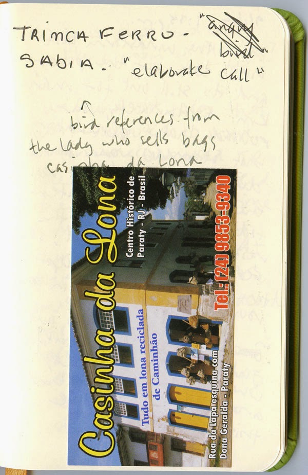
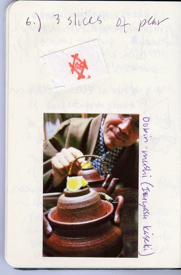
A typical page from my Brazil journal:
Notes from a conversation I had with a
local shopkeeper about birds in Paraty.
With that incident in mind, I set out to find a pocket-sized notebook that would be good for writing but could also take a sketch or two in a pinch. I’ve already tried quite a few commercial notebooks that I had hoped would fill this bill; my continual disappointment is what led me to make my own. For example, Moleskine’s pocket-size watercolor sketchbook is the right size and weight, but I hate writing on landscape-format pages, and I also prefer a smooth, nontoothy paper for writing. Moleskine’s standard notebook paper (and that of most competitors) is too thin and could never take even a light water-soluble ink wash. Moleskine’s so-called “sketchbook” paper (the yellowish manila type) is substantially thick (nice for collage), but I hate its waxy surface for sketching.

I considered briefly making my own, but I didn’t think a handbound book with enough pages to last two weeks (I write a fair amount when traveling) would hold up well to daily-carry and general travel abuse.

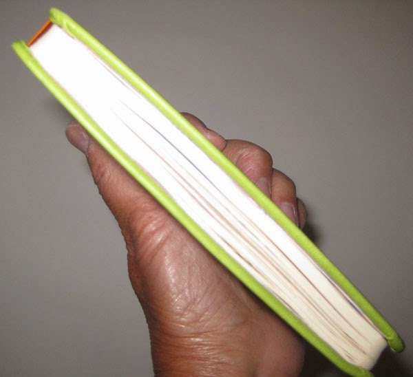
The Rhodia pocket notebook is slightly
thicker than most notebooks in this format.
The one commercial notebook I hadn’t yet tried was the Rhodia. Much lauded by fountain pen users for its smooth, non-bleed-through paper, it’s more expensive than Moleskine and most other brands, and its thicker (albeit higher quality) covers and paper make it bulkier and heavier than Moleskines. (It’s about three-quarters of an inch thick compared to Moleskine’s half inch.) With 192 pages (96 sheets), it also has more pages than I would normally use in two weeks.

I bought one and gave it a quick water-soluble ink wash test, and the paper held up acceptably. Doubtful, I tried watercolor on it, too. It held up OK to the light wash, but the surface gave a flat, unpleasing look to the color, and the ivory tint isn’t very flattering to watercolor.

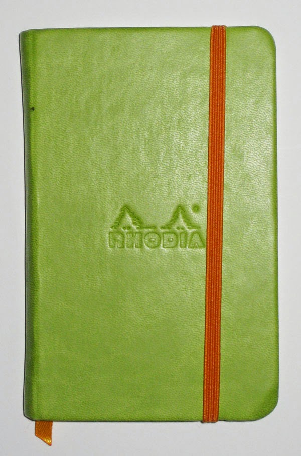
The cover feels lovely
and comes in bright, rich
colors.
Esthetically, the Rhodia’s cover and paper both feel wonderful to the touch, and the Rhodiarama series comes in a wide range of bright colors that appeal to me. But the Rhodia would definitely be a tradeoff of slim size for superior paper. I waffled quite a bit – my goal was to get my bag down to the lightest possible weight, and realistically, how often would I be sketching in my travel notebook, anyway? – but ultimately, the Rhodia won.

And what a winner it is! First of all, the binding stayed strong, and I believe it could withstand months of daily-carry (though I’ll probably never test that myself; my travel endurance is about two weeks). The paper is a dream to use with fountain pen, cheap hotel ballpoint pen, pencil, rollerball, gel pen, you name it. Although I didn’t fill it, I ended up using more than two-thirds of it (maybe I’m getting more verbose).

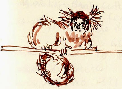
A monkey captured in my Rhodia notebook.
The most important thing, though, is that it met my sketching needs at exactly the right moments. You already saw this sketch of the tiny monkey I had the luck to be able to draw on my way up to the top of Sugarloaf. I had my Stefano with me at the time, so I could have used it, but I was afraid that the commotion I would have to make to dig it out would spook the little guy away. (It was a gosling moment!) It was much easier, faster and quieter to slip the Rhodia out. (In fact, the monkey seemed fearless and hung around for quite a while.)

8/23/14 Diamine Chocolate Brown and
Private Reserve Velvet Black inks,
Rhodia notebook
Another example was on the outbound flight – the long, overnight leg between Atlanta and Rio. After a night of fitful dozing, I woke early when most other passengers were still asleep, including Greg. Bored, I wanted to sketch, but getting out my sketchbook would have meant digging around in my backpack, which was under the seat. Not wanting to wake Greg with my commotion, I simply pulled out the Rhodia, which was in the passport case around my neck, and entertained myself by sketching sleeping passengers in the near-dark.

Would I consider using a Rhodia as my everyday catch-all sketchbook instead of a handbound sketchbooklet? After all, although the Rhodia’s paper isn’t as good as the 100-pound watercolor paper I use in my sketchbooklets, the type of sketches I end up doing in a sketchbooklet tend to be of bus commuters when I want to be surreptitious, so I wouldn’t haul out watercolors anyway. But the Rhodia’s biggest drawback is its bulk, which is about three or four times the thickness of a sketchbooklet. Still, it’s worth considering. And it’s definitely my notebook of choice when I travel. 


9/2/14 Private Reserve Velvet Black ink, Rhodia notebook (a napping dog at
the Paraty bus station)

Related Posts Plugin for WordPress, Blogger...