 |
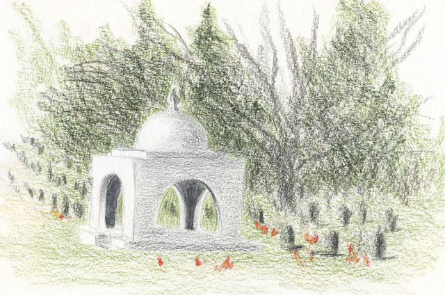
| 12/21/21 Evergreen Washelli cemetery |
An errand took me right past Evergreen Washelli Memorial Park, so before returning home, I pulled into the cemetery for a sketch. I knew it had been a while since I last sketched there, but when I searched my blog, I was surprised to find that it had been more than six years (when I sketched the same mausoleum). I enjoy sketching at cemeteries because it’s always quiet and peaceful. If others are around, they never question what I’m doing (probably in case I’m grieving and want privacy). I made a mental note to sketch there again soon.
A thick, overcast sky held back most of the late-morning light. Squinting hard to see which side of the all-white mausoleum faced the sun, I could barely discern it. I started thinking about things I’d learned from Kathleen Moore earlier this year. Even if they are hard to see, it’s OK to exaggerate the differences in values to indicate the form. It seemed a shame to darken that brilliant white dome, but I did it to show the light.
 |
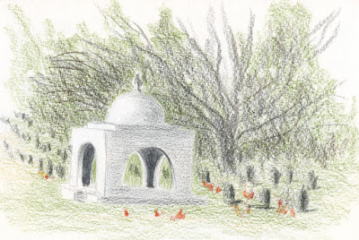
| Before darkening the background to increase contrast. |
When I looked at the sketch at home later, I realized that the mausoleum and the background were too similar in value (at right) – not at all what I saw in reality, with the stark white structure standing out clearly against the dark trees. What would Kathleen do? She would advise me to darken the background and increase the contrast, so I did (above). It still doesn’t stand out as much as I wish it did, but it’s a bit better. (I always know I got more than my money’s worth from a class if I continue to hear the instructor’s advice in my head long after the class is over.)
I think darkening the trees helped make the dome stand out. Nice work!!
ReplyDeleteThanks! I think it could have used even more, now that I'm looking at it again.
Delete