 |
| 12/22/21 Polychromos and Prismacolor on Strathmore Bristol Smooth |
If you’re on Facebook, you know there’s an app that will
enable you to design an avatar for yourself by the Mr. Potato Head method:
You start with a generic, genderless template, then pick eyes, nose, mouth,
hair color, body shape, etc. as desired. During a bored moment, I tried it, but
I didn’t like the result. After wasting 10 minutes of my life on that, I struck
myself upside the head and said, What am I doing? I don’t need no stinkin’
Facebook app . . . I can draw this avatar myself!
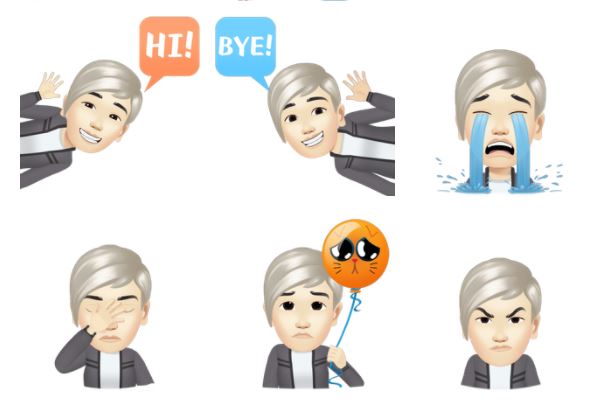
From there, the process was more interesting than I expected. First I studied the avatar that Facebook had generated for me (below) as well as those of my friends. I started recalling things I’d learned in Taylor Dow’s Observational Cartooning workshop about how cartoon characters are developed. Some cartoonists design a whole cast of characters based on a template they create with minor changes in features. I started to see how Facebook’s app was doing something similar.
 |
| The avatar I made with Facebook's app |
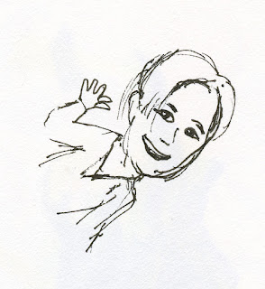
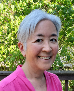
As a basis to work from, I used the photo of my face that has been my Facebook profile image for a while now. I made a quick sketch based on the “Hi!” avatar image shown above. (So the 10 minutes I thought I had wasted weren’t a waste after all.) Then came the fun part: Colored pencils!
 |
| Rough sketch |
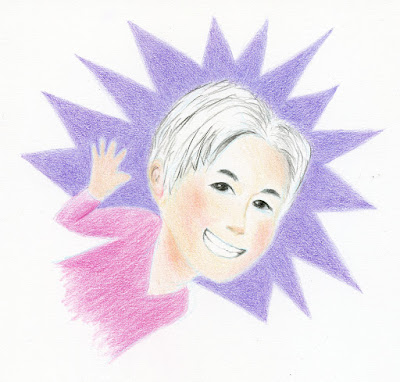
But which pencils and which paper? I gave that some thought, too. To emulate the flat, digital look of the Facebook avatar style, I chose my smoothest drawing paper – Strathmore Bristol Smooth. With that choice made, I knew that Faber-Castell Polychromos would pair well with it to give me the untextured look I wanted.
For the initial contour line, I used a Blackwing non-photo blue pencil. Then I completed most of the drawing with Polychromos. When I thought I was done, the white hair washed out with a white paper background, so I realized some background color was needed – the purple starburst.
As I was coloring the starburst, I thought about the drawing method I had mentioned in my recent review of the Blackwing extra-soft core graphite pencil: It’s easier to achieve a smoother, more consistent result if I start with a harder grade and step up gradually to the softest grade (explained in more detail here). Although I use various degrees of hardness and softness in colored pencils for specific reasons or effects, I don’t usually think of layering based on the graphite method just described. By that point, I had applied a solid base of several layers of hard Polychromos to the smooth paper. I pulled out a soft Prismacolor in a similar hue and applied it over the Polychromos. Although I often mix pencil brands, I’m not sure I’ve ever applied Prismacolor over Polychromos for this smooth, flat result. They are an effective pairing: Hard, oil-based Polychromos covers as much of the paper’s minimal tooth as possible, and soft, wax-based Prismacolor spreads pigment quickly and efficiently without having to be concerned about paper coverage. I’ve heard some artists say that applying oil-based pencils over wax-based can be troublesome, but vice versa gave me no trouble at all.
So this silly, rainy-day drawing turned into a useful technical exercise for learning more about colored pencils.
Love your Avatar and love that you let me see it without being on Facebook (grin)
ReplyDelete