 |
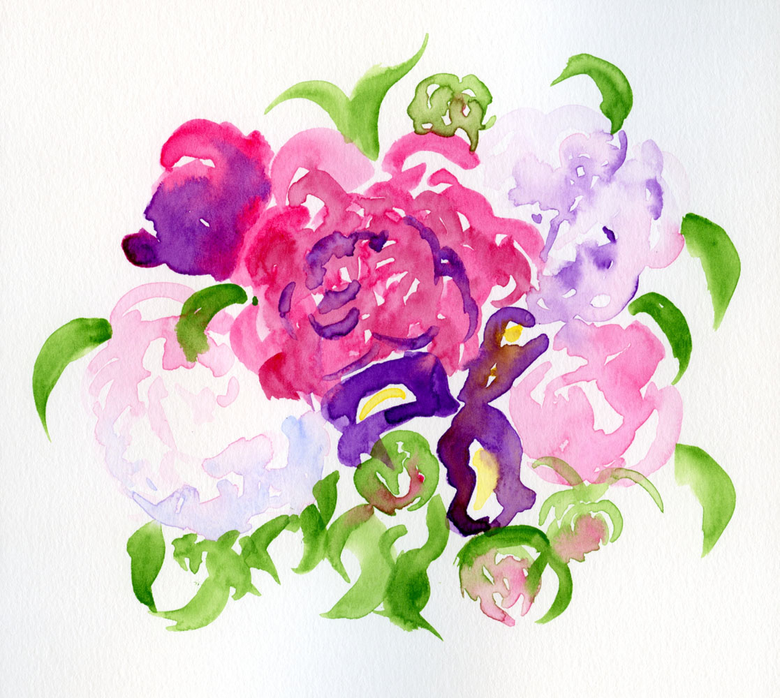
| 5/27/23 Kuretake Gansai Tambi watercolors in Stillman & Birn Beta sketchbook (My favorite spot is the blue shadow on the nearly white peony at lower left. I just know I couldn't have gotten that effect if I had been mixing colors . . . my wet-in-wet approach would have dried.) |
I bought another bouquet of peonies (including
one perfect iris), this time to take to the cemetery. I just happened to
have at my fingertips a brand-new set of Kuretake Gansai Tambi watercolors
that I’m reviewing for the Well-Appointed Desk. Tossing caution to the
wind, I saw the bouquet as another opportunity to try direct watercolor.
As I implied last time when I was using my set of 24 Akashiya Gansai watercolors, it’s really fun to have easy access to so many colors without mixing – just pick up the paints as if they were colored pencils! (I discovered the same freedom and fun with my Sakura Koi set and Color Meditation Desk exercises.) I’ve been “painting” with colored pencils; I guess now I’m scribbling with watercolors! 😉
In fact, I seem to be doing a 180 flip-flop in the attitude I had when I was taking Kathleen Moore’s winter sketchbook + watercolor course. Back then, I was determined to apply the color principles I had been learning with colored pencils to paints, so I was keeping my palette as minimal as possible. One major frustration during class, however, was that my paint mixes would become increasingly diluted as I tried to achieve the hues I was looking for. I’d add more paint to get the concentration thicker, but then I’d have to adjust the mix again, over and over. It’s no wonder that I always had such wimpy washes as a novice urban sketcher using watercolors. The class was a good education in watercolors when I could work leisurely from photos or still lives at home – but I’m not interested in working that way in the field.
 |
| The more colors the better! |
As I painted this bouquet straight from the paint box without using a mixing tray, I remembered that in his book, Color First, Ink Later, Mike Daikubara discusses his preference for using a large palette of 20 colors. Saving time by not having to mix on the tray, he prefers to let colors mix dynamically on the page. Knowing how fast and efficient he is at sketching in the field, I now see how much sense his strategy makes for his style.
I don’t know if or when I’ll be ready to take watercolors back out in the field, but new light bulbs are now firing above my head.
I love this sketch, and that particular shadow you pointed out really glows! I heartily agree with yours and Mike Daikubara's approach; especially in the field I find it invaluable to select a broad palette of "signpost" colors I know I tend to build paintings around. Your thoughts on mediums are always interesting!
ReplyDeleteUsing a broad palette at my desk is easy, but choosing the right colors for the field is going to be an interesting challenge!
Delete