 |
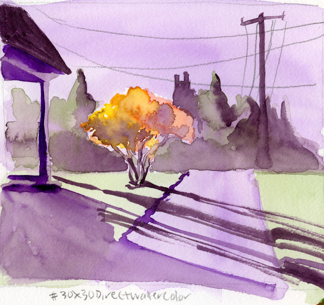
| 6/9/23 This is my favorite from the first 10 days; I think the composition, the color scheme (secondary triad plus a bit of yellow) and the painting technique were all successful, which rarely happens with any medium. In retrospect, I wish I had mixed the yellow from the tree with the green I used for the grass, which would have integrated the overall palette better and made the grass warmer. (Photo reference) |
Already near the halfway point of the 30x30 Direct Watercolor challenge that began June 1, I’m enjoying it even as I struggle heartily. I told
myself I wouldn’t apply the additional pressure of sharing paintings daily on
social media if I didn’t feel like it. I’m finding, however, that the Facebook group dedicated to the challenge is motivating and encouraging.
Participants from around the world have a vast range of painting experience
from sheer beginners to obvious masters. I am continually awed and inspired as
I learn helpful tips. The team of moderators (led by Marc Holmes and Uma Kelkar) offers suggestions and feedback as well as general encouragement. In
fact, many participants are also active in commenting.
 |
| 6/2/23 Earthsworld reference photo |
Here are a few things I’ve learned or observed so far (comments
specific to individual sketches are in the cutlines):
This is an excellent challenge for me at this stage of
learning watercolors because direct painting is something I definitely would not
be doing without an external push. It’s challenging but not so daunting that I
feel like quitting.
A key to direct watercolor success is to use reference
photos with strong value contrasts and simple shapes (see, Ian Roberts –
I’ve been paying attention!) that are easy to draw so I can focus on the painting.
Beyond the practice of painting without a preliminary
drawing, I’m also exploring ways to use watercolor paints that are different
from what I learned from Kathleen Moore a few months ago. Specifically,
I’m mixing more on the paper instead of the tray and using more wet-in-wet
techniques.
 |
| 6/3/23 The view through our livingroom window |
Trees are once again my nemesis – at least as far as watercolor goes. Ten years ago when I was just starting out, I had declared trees my nemesis – I really hated the blobby, unformed trees I was sketching with watercolors and had no idea how to improve (this post shows some early ones and talks about how trees and I eventually became friends). I never really liked the trees I sketched until I switched to watercolor pencils, which enable me to give trees both form and texture. I’m back to hating my painted trees again – blobby yet flat, without form, and mostly without texture. For the remainder of the challenge, I’m going to make an active effort to study the watercolor trees of artists I admire (Virginia Hein and Chris Haldane immediately come to mind) and see if I can improve by the end of the month.
 |
| 6/4/23 Possibly my least favorite from this batch. Poorly integrated palette, weak composition, shapeless tree with unclear lighting and unfortunate dark blobs, and bright red awning that was my primary interest in this reference photo until I put it in. |
In the first 10 days, I did mostly portraits and urban
scenes from photo references. With so many additional challenges on location, I
was planning to do direct watercolors only at home, but you know me – I can’t
stay away from urban sketching for long. I attempted it twice – once from my
livingroom window and once from my mobile studio. Using paints on the
livingroom couch is fraught with peril (though there are benefits to having old,
dirty furniture). Painting in my car, which has a narrow center console, isn’t
much better, but I now have a portable palette that’s tolerable (though not
ideal). Stay tuned for the review.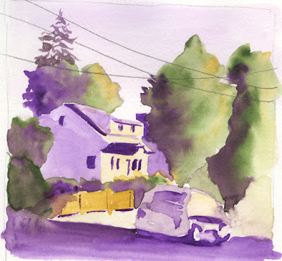 |
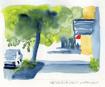
| 6/5/23 The trees at right are the only trees I like from the first 10 days -- with some form, not so blobby and good use of wet-in-wet. Never mind the wonky vehicle! (Photo reference) |
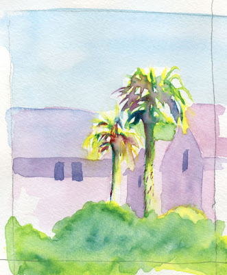 |
| 6/6/23 This is the full sketch that includes the palm trees I discussed in my 6/12/23 post. I like this simple composition, but I could have used darker values somewhere -- maybe the windows. (Photo reference) |
 |
| 6/7/23 The dark violet in the Kuretake palette that I used prominently here is exactly the kind of cool violet I like to use in a secondary triad. I'm trying to duplicate it in a tube color for my portable palette. (Photo reference) |
 |
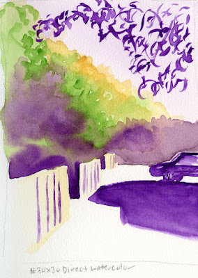
| 6/8/23 Wedgwood neighborhood. My only true urban sketch, made from my mobile studio. Exactly the kind of trees that have become my nemesis all over again. I like the sky, though. |
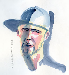 |
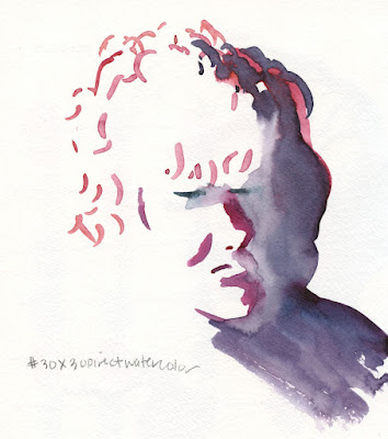
| 6/9/23 My first try at a Zorn palette with watercolors (Earthsworld reference photo) |
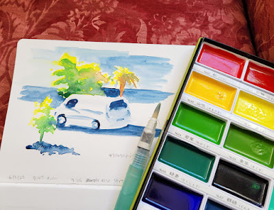 |
| Precarious couch painting! |


I appreciate your colour pencil works, an interesting medium that is seldom explored properly. Having said that, "6/9/23" is phenomenal and showcase what watercolour is all about!
ReplyDeleteThank you -- I really appreciate your comments! Watercolor can be truly magical and unbeatable in capturing light, but it must be one of the most challenging media in the world to master!
DeleteWell, you know, your experiments are very convincing already ! I could not hope doing that good when just starting to learn watercolours !
ReplyDeleteThank you! I think it helps a lot that I have a sturdy base of drawing experience (rendering form and values) so that all I have to focus on is the watercolor itself.
DeleteSeeing your direct watercolors all together makes them even more impressive. You have NO FEAR! I don't think I would have attempted this when I first started doing watercolors. I like a lot of your pieces!!!
ReplyDeleteThanks so much, Joan! I'm not sure if I'm fearless ;-) , but I'm definitely intrepid! :-)
Delete