 |
| 6/11/23 photo reference |
With the 30x30 Direct Watercolor challenge more than
two-thirds done, I’m finally feeling a bit more comfortable (though certainly
not confident). To give myself a goal for the second half, I started focusing
on trees – an urban element I am especially disappointed with when using
watercolors. I don’t like the trees I paint that look like flat, formless blobs.
Maybe because I have spent a lot of time and work learning to draw trees with graphite
and colored pencil to render their unique, beautiful forms, I feel like
I’m missing a lot when my painted trees look flat.
The sketch above is one of my favorites from this batch. I used a good reference photo taken during the golden hour of low, warm light. Do you ever reach the “ugly” stage in the middle of a sketch, and you think it’s irretrievable? This painting reached that stage twice, but ultimately, I was happy with it. The biggest loss was the light on the left side of the tree, which refused to be lifted.
The pair of sketches below was done from the same reference photo, which I thought had clear, strong shapes and values (but apparently not simple enough to paint without lines!). I abandoned the first one because I didn’t like the Derwent waterbrush I happened to be using, not to mention losing an important spot of light on the house. I tried again, this time with a secondary triad, which isn’t much better, but at least I could rely on my dependable Kuretake waterbrush. Thinking I had nothing to lose, I went in at the end with a pen to define the architectural shapes better. I think the only thing I like is the truck!
 |
| 6/11/23 photo reference |
 |
| 6/11/23 photo reference |
I’ve been looking for more opportunities to take my watercolors out into the field, which, at this point, requires locations that will give me a seat at a table to put my palette on. I sketch often at the Green Lake Village courtyard (below), so I thought the familiar scene would make it easier. I was disappointed with the wimpy colors and distracting figure climbing the stairs and right out of the composition. I was going to leave it alone as a finished disaster, but when I got home, I tried using colored pencils to darken some areas and “dull down” the unfortunate figure. It’s a bit better, but not much.
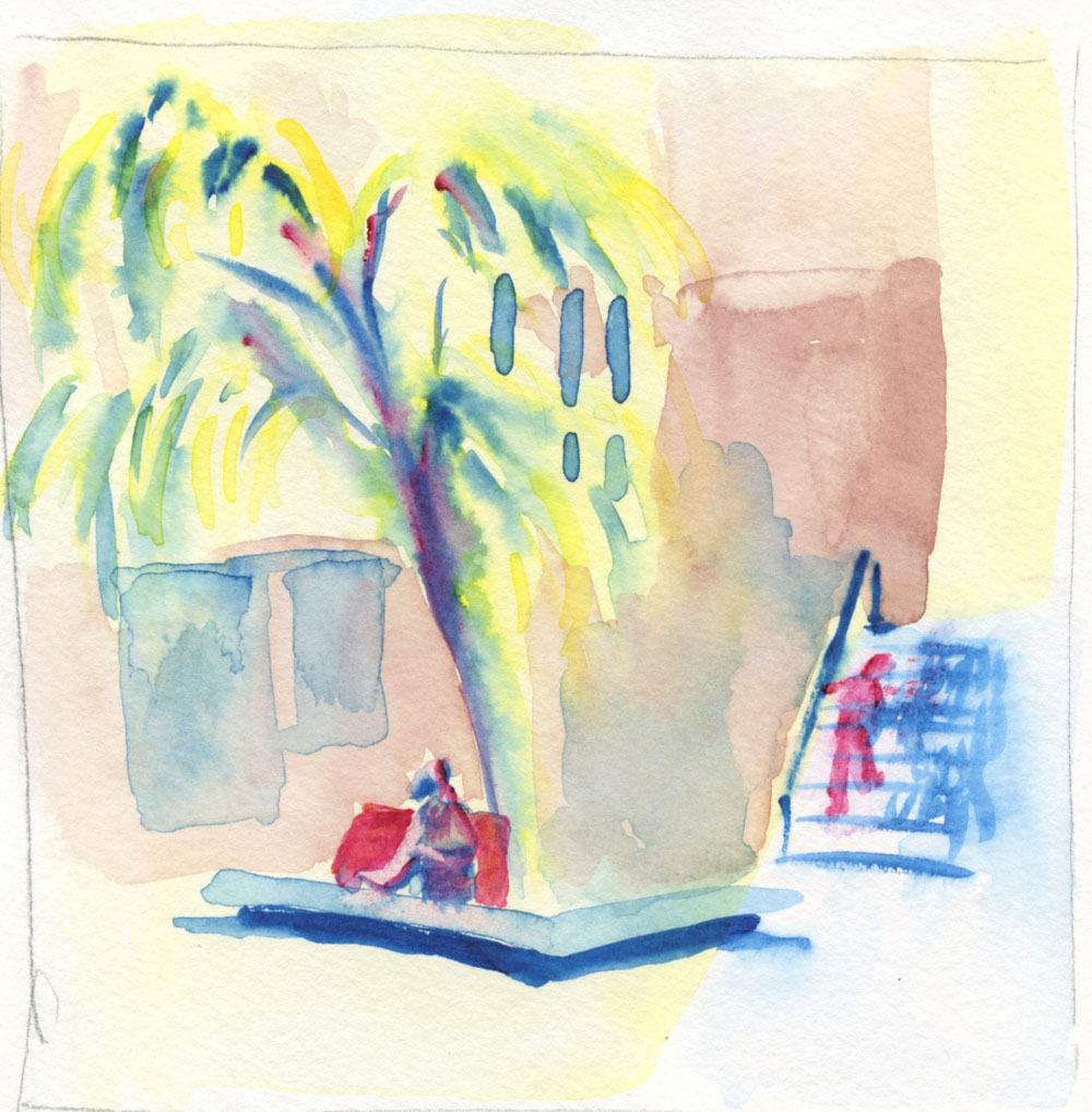 |
| 6/12/23 Green Lake Village |
 |
| With colored pencil added later. |
One day as I waited for a friend at Green Lake, I made a quick thumbnail study of this scene I’ve sketched before (below left). Later I painted it from a photo taken on that dully lighted, overcast day and using the value study as reference. Overall, it’s not bad, but that central, foreground tree is the type I mentioned at the beginning of the post: a flat blob of color.
 |
| 6/13/23 photo reference |
 |
| Thumbnail study from life |
The sketch below was made from a photo I took at Volunteer Park last summer. While I wouldn’t say this one is a flat, formless blob, it doesn’t “read” well as a tree – the light spots in the center make no sense, as the light wouldn’t be that bright there. I also knew before I began that I probably wouldn’t like that primary triad, but I used it anyway, and I was right. That dark blue (called Indigo by Kuretake, but it looks more like Prussian to me) doesn’t mix into a good green with either of the two yellows in my Kuretake Gansai set (but keep reading, because I use it again later, and it turns out to be useful after all).
 |
| 6/15/23 photo reference |
At an outdoor table at Columbia City’s PCC was the first time I felt less conscious of “painting” – it felt more like “regular” urban sketching – so that was the turning point when I started feeling more at home with watercolors. There wasn’t much color in this metal and concrete architecture, but I was pleased with the variety of grays I got with the secondary triad I used – which I chose because I needed orange for that inexplicable stack of cones in the dining area!
 |
| 6/17/23 Columbia City PCC |
One evening in my “downstairs studio,” too lazy to go get the Kuretake watercolors or even a mixing tray, I pulled out the Sakura Koi set I keep on my reading table. With nowhere to mix or dilute paints, I used only the water in my waterbrush to make two portraits (Earthsworld reference photos). With little hope of capturing resemblance, I felt liberated to focus on the facial forms using a warm and a cool tone.

 |
| 6/19/23 Earthsworld reference photos |
On Day 20 I was back to trees – specifically, ornamental plums and the elusive near-black, dark red of their foliage that I had chased with colored pencils a few years ago. I wanted to capture both their hue and their form. Here’s where that Indigo came in: It mixed beautifully with Rose Madder Deep to get that plum foliage color.
 |
| 6/20/23 photo reference (Etchr 100% cotton cold press paper sample) |
As for the trees’ form, I’m happy with the result I finally got after several wet-in-wet layers (is it still called glazing if they are wet-in-wet?), but this tiny, A6-size sketch took an hour because of all the drying time. With colored pencils, I could do a sketch like this in 20 to 30 minutes – another thing that keeps me from eagerly running out on location with watercolors.
(A couple of days are missing from this post. . . they were covered in this post.)
Some of your watercolors really have a nice richness to them and wonderful blending of colors. The first painting at the top is one of my favorites...so rich with light and warmth!
ReplyDeleteThank you, Joan! It would be awesome to get rich color every time, but I'm still at the hit-or-miss stage. ;-)
Delete