Showing posts sorted by relevance for query sarah bixler. Sort by date Show all posts

Tuesday, February 11, 2025

Color Temperature with Sarah Bixler


Prismacolor and Polychromos palettes recommended by Sarah Bixler

Although I’ve taken quite a few classes and workshops in the past decade with colored pencils and watercolor pencils as the primary medium, none has intrigued me as much as the ones I’ve had with Sarah Bixler. My introduction in 2021 was a weekend workshop with portraiture as the focus. Still reassembling my brain after having it blown open with new concepts, I took another workshop a few weeks later that was similar but used the full figure as our subject.

In both cases, it wasn’t necessarily life drawing that interested me; it was her focus on color temperature and her application of colored pencils with a strong painterly approach.

Polychromos
For quite a while afterwards, I worked on trying to apply her principles and approach to urban sketching, but I realized I still had so much more to learn to think like a painter. When I saw that she was offering another class, I jumped on it. Instead of in-studio weekend workshops like the previous two were, this course is five weeks, which I’ve found to be the most effective format for me when I want to get a solid handle on complex concepts.

 “Interpreting the Portrait” again focuses on the portrait, and this one is online. Typically I wouldn’t be interested in taking a life-drawing course online, but since the subject is less important to me than the concepts, I decided that learning from photos would be OK. After nearly a year of trying something entirely different with a comics approach using mostly markers, I’m super excited to get my brain back into color, color temperature and especially colored pencils!

To begin with, Sarah recommended a specific palette of Faber-Castell Polychromos pencils based on color temperature (a cool and a warm of each hue, plus some grays, black and white), which I was already familiar with from her previous workshops. A former user of Prismacolors, she now prefers Polychromos, but not because of expected reasons such as hardness or color range; she just got tired of contemporary Prismacolors breaking all the time!

For the kind of application technique she uses, I prefer a softer core than Polychromos. Hearing her reason for favoring them, I used the Polychromos palette she had specified as a guide and pulled out comparable hues from my Prismacolors (vintage, of course, to avoid the breakage issue). I plan to try both as the course goes on.

Prismacolor (mostly vintage plus a few contemporary)
In an online course from home, I would normally have my full sets easily accessible. But my studio has been in a transitional mess for the past several months, and I’m starting to pack my drawing desk (poor timing with this class, I know!). With the hope of avoiding constantly digging through packing boxes, I’m acting like I’m taking an in-person class and filled a pencil case with the two limited palettes. It’s a stretch of the imagination, I know, but I’m pretending these are the only colored pencils I own! (Ha-ha, I can hear you chuckling!)

For today’s post, which is already long, I’ll just show you the palettes. When I finish the first week’s assignment, I’ll write a separate post.

Friday, September 9, 2022

Reluctance (Optical Mixing vs. Mud)


9/4/22 Maple Leaf neighborhood

Some trees are definitely turning. Others have made half-hearted gestures in that direction but seem reluctant to let summer go. I know that feeling.

The sketch above shows two varieties of Japanese maples. From a distance, they look like a haze of color, the near one with more green, the one in back with more orange, but both show a full range of hues if you look closely. Some individual leaves display a gradient of hues, while others show only one color per leaf. Thinking about optical color mixing, I realized that these trees are nature’s examples of this concept.

After a couple of blog readers mentioned optical mixing in their comments, I realized that I hadn’t actively talked about this color concept in a while, but my long-time fascination with it continues. I’ve probably been intrigued with optical mixing almost as long as I’ve been using colored pencils, but I always feel like I’m still just learning about how to use it. I know when I’ve done it well, but I might not understand it well enough to explain how I achieved it (or maybe I’m prone to happy accidents). I’m going to try to articulate some thoughts today to see if they make sense.

Here’s a definition of optical mixing that I found in a quick search:

Optical mixing, also known as partitive color, is the perception of color resulting from the combination of adjacent colors. In other words, when color is mixed optically, the blending occurs perceptually, and takes place between our eyes and our brain. The perceived blending of color increases with distance.

A common example that’s often given for optical mixing is how TV and comic book images are made up of tiny colored dots. In art history, Pointillists and Impressionists are known for their use of optical mixing.

I think reading a how-to book on watercolor years ago was my first introduction to the concept in regard to art making. With watercolor glazing, multiple transparent colors are layered, allowing each layer to dry completely before the next one is applied, so that the color blending occurs only by the viewer’s eye, not by mixing liquid paints. I didn’t get far enough in using watercolors to practice this technique beyond the book exercises, but it helped me to understand the concept.

When I started using colored pencils and especially when I began studying with Suzanne Brooker, my full fascination with optical mixing began. In her first course we used only dry colored pencils, and that’s when I realized how similar they are to watercolor glazing – except easier because all that uncontrollable water stuff wasn’t involved!

2/3/17 Optical mixing was a major component of the large grassy area in this study from Suzanne Brooker's class. The individual colors are lightly applied so that layers underneath stay visible.

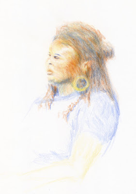
11/6/21 In this portrait exercise from Sarah Bixler's 
workshop, the facial skin tones and hair are optical mixes
of many pencil colors.

In Sarah Bixler’s color temperature workshops last year, my intrigue was reignited. Again, using dry colored pencils only, we explored the subtle shifts of color temperature that can be made with multiple colored pencil layers. Because most colored pencil hues are transparent and, by their physical nature, pencil pigments cover only some parts of the paper, whatever is underneath shows through. Even if a pencil pigment is on the opaque side, the marks can be made finely so that the effect remains transparent. The dry pigments don’t blend together the way wet paints do; the eye does the work of mixing and blending.

When other sketchers realize I use watercolor pencils, they sometimes ask why I am so selective in my use of water. Since water activation makes all watercolor pencil hues more vibrant, why not apply water everywhere?

One compositional reason is that I want to use different degrees of intensity to show depth or to direct the eye. But another reason is that dry pencils can show optical mixing more vibrantly – but only if they remain dry. I’ve made the mistake of drawing an area of pleasing optical mixing, and in my enthusiasm for the achieved mix, I activated it with water to make it more intense. The individual colors are lost, and the result is intense mud.

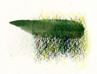
I still make this mistake occasionally, but here’s an example in which I didn’t: Shown below is a detail from a recent sketch at Green Lake (the one that prompted the reader comments about optical mixing). In those background trees, I used four of my chakra palette pencils in varying degrees. To demonstrate what can happen when water is applied, I tried to replicate the mix in the swatch. I swiped my waterbrush through half of it so that you can see the dark mud that results. When left dry, the individual colors show through subtly, making a complex blend that’s more interesting (and hopefully more visually pleasing) than fully blended mud. In addition, activating with water would have intensified the colors and likely would have brought those distant trees forward. (By contrast, the sunny foreground trees were fully activated.)
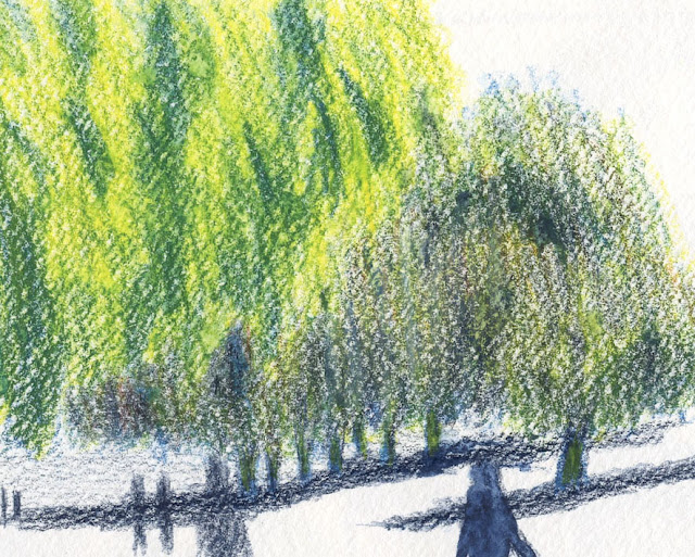
Detail of background trees. See below for activated swatch of replicated colors.
When water is applied, the optically mixed colors used
in the trees turn to mud.

In the sketch of the maples at the top of the post, I activated only the closer tree to bring it forward compared to the one just behind it. (The difference is subtle, but they were not far apart.) I used all five pencils in my chakra palette (ahh, all seven chakras were in balance that day!) for each tree, but in varying amounts and degrees of intensity. I used enough colors that a heavy-handed application of water with a brush could have turned the front tree muddy, but I kept the spritzing minimal. The Hahnemühle sketchbook’s cold-press texture did the work of giving my sketch a bit of the Pointillist effect even on the tree that I activated with water. Often that texture gets obliterated when a brush is used, which is why I favor spritzing when I want to retain some texture.

In the secondary triad sketch I made last spring (below), I used non-soluble pencils, so I couldn’t have made wet mud even if I’d wanted to. I know that it’s still possible to make dry mud, especially with a secondary triad, but I hope that optical mixing allows the individual colors to shine through while avoiding mud.
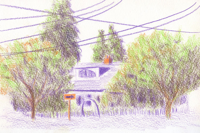
4/28/22 Optically mixed secondary triad colors

Other examples shown in this post are explained in the cutlines.

I hope I’ve been articulate, but even if I haven’t, trying to talk about all this has excited me about optical mixing all over again! I’m looking forward to giving these concepts and techniques a solid workout this fall with a secondary triad palette.
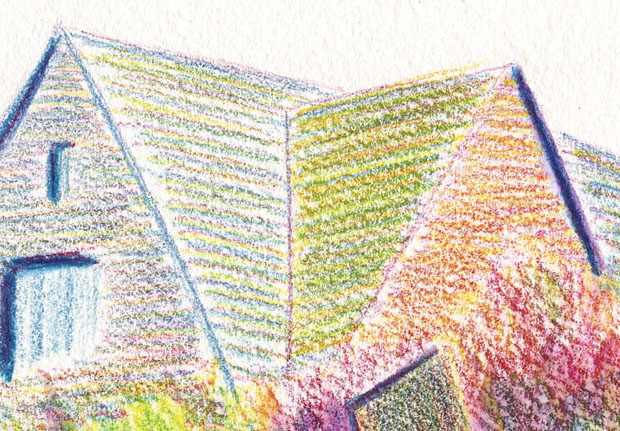
6/14/22 In this rooftop detail of a sketch I posted on June 18, I used color temperature to subtly indicate the side that had more light and optical mixing of pencils left dry.

12/4/21 This still life, which was a color temperature exercise, was made with the CMYK primary triad shown in the upper-right corner. The avocado shows an interesting example of optical mixing of only the three hues. Although the Stillman & Birn Zeta paper I used is relatively smooth, it has enough texture to bring out the pixelated or Pointillist effect that enhances optical mixing.

Saturday, February 15, 2025

Colored Pencils are Back!


2/10/25 Seven Market & Cafe, Ravenna neighborhood

My most recent play date with pals Roy and Mary Jean was fun (which it always is) as well as another media shake-up. While we’re indoors for the winter, I’ve been using our sketch gatherings to play with media that are hard for me to use in the field. Last time I used Caran d’Ache Neocolor II. Another time I tried Caran d’Ache Neopastels and Derwent Inktense Blocks. Last week, inspired by my reunion with colored pencils in Sarah Bixler’s class, I put together a palette of Caran d’Ache Luminance pencils based on the colors I’m using in class. Even if the pencils are different, I enjoy using the same limited palette so that I can get accustomed to how the hues work together.

Caran d'Ache Luminance pencils in Sarah Bixler's recommended palette 

We met at Seven Market and Café, a small, eclectic venue in the Ravenna neighborhood in a former old house. Offering provisions like wine, canned fish, stationery, and their own roasted coffees, not to mention excellent pastries, we laughed about how we could live there for a long time! The sketch at top of post looks down the aisle of working antique refrigerators and wine.

Of course, I always like to record the outing in my sketch journal, which is currently a limited edition Field Notes containing turquoise pages. I thought this notebook would be an acceptable, temporary break from Uglybooks, but I must say that the latter’s 80-pound paper has certainly spoiled me. This Field Notes contains 24-pound Astrobrite, and I love the color, but I’m getting bleed-through with some markers and brush pens, and the surface pills under rough Posca markers. Unexpectedly, I’m also feeling cramped by the standard Field Notes size (3 ½ -by-5 ½ inches). You wouldn’t think losing a quarter-to-half-inch in page size would make much difference, but it does. I’ll finish this one up, but I’m already looking forward to going right back to my beautiful Uglies.

Breakfast at Seven Market and lunch at Isarn Thai Soul Kitchen 

I’d been neglecting my round robin Seawhite of Brighton concertina, so I hastily made a sketch facing the storefront with a window view of a Chinese pinwheel palm. After sketching in the book we each had that day, we made another rotation in our round robin. We already have plans for our next group project after the concertinas are full!

Through the front window

A learning opportunity: After I took my “trophy shot” (below) of the colored pencil sketch to share on social media, I frowned at how wimpy the colors and especially the values were. I thought the sketch was done, but sometimes I don’t see how easily I could improve it until after I take a photo. Something about a flat, digital image enhances flaws – which is very helpful! I went home and layered the same colors over different areas and added more contrast overall (the finished sketch at top of post).

Wimpy colors and values
One last highlight: In addition to colored pencils, guess what else is back in action? My beloved Peg & Awl mini Sendak (one of them, anyway)! My commitment to a small everyday-carry bag has prevented me from using any of my Sendaks regularly, which makes me very sad. On our mixed-media play dates, though, I always bring a larger sketchbook and enough additional media that I need to use an auxiliary tote bag anyway, so I’m thrilled to have a purpose for a Sendak again!

Mini Sendak back in action! (Photobomb by Weather Bunny adorning the cover of my concertina's slipcase.)

Monday, August 4, 2025

Gouache: Mind Blown Backward and Inside-Out


7/30/25 Elliott Bay beach (gouache in Stillman & Birn Delta sketchbook)

After taking several colored pencil workshops with Sarah Bixler to learn her fascinating take on color temperature, I got brave and plunged into a totally new medium: gouache!

Sarah's workshop met at a strip of beach on Elliott Bay, where
I learned to balance my palette, sketchbook, water cup, and butt on a handy
but uncomfortable log. Only the five paints in my CMYK set are in the palette
(the rest are watercolors).
Oh, sure, I’ve dipped into pink gouache during cherry blossom season, and we’ve all used touches of white gouache for snow or highlights. But making an entire, full-on painting with nothing but gouache was completely new territory for me. And because I prefer to plunge into the deep end before sticking my toe in the water, I took Sarah’s plein air workshop so that I could struggle with all the usual challenges of being on location (on this day, it was heat, humidity and sitting on a log) while also learning a new medium. Yay for tough art love!

A color-mixing study in which we make an arrangement of 
squares and rectangles indicating the percentage of a
particular hue we might use in the composition. Without
trying to make the actual composition, we can see how the hues
might play against each other.
Although I’m certainly no pro at watercolors, I’ve used them enough to know that gouache is basically the opposite in every way. They both squeeze out of tubes to make you think they are similar, but their similarities end there. When watercolors are glazed, their transparency allows the previous colors to show through, resulting in optical mixing. Colored pencils, too, are transparent like watercolors, so I’m used to that kind of layering.

By contrast, gouache is opaque, so succeeding layers completely obscure whatever was underneath (definitely a benefit in many cases, but difficult to wrap my head around). Instead of saving out the white of the paper for the brightest highlights with watercolor, with gouache, you can simply paint the white on last!

The biggest head explosion (or implosion, perhaps, given the backwardness of my perception), however, was in the way shifting values can be achieved: If I’m using a watercolor that turns out to be more vibrant or darker than I want, the simplest way to lighten the hue is to dilute it with more water. With gouache, you don’t add water – you add white! Whaaat!!

Sarah at her demo easel and some classmates.
Even though I understood this in concept, it still took me many (perhaps habitual) dips into the water cup before I learned to dip into the white instead. Once I did, though, what a game changer! I found it much easier to shift the value of a hue one way or the other with the simple addition of white or the hue (or occasionally black). Although Sarah had given us a supply list with a fairly typical palette of basic colors, I chose to bring only five paints to the workshop: the cyan, magenta, yellow, black and white that came in the Holbein primary mixing set I had purchased a couple of years ago. With only the three CMY primaries plus white and black made the job of shifting hues and values much easier than with a full palette.

My painting is a bit of a mess, especially the pile of rocks in the foreground, but as a first painting in a new medium, I’d say it’s not a bad start. I was pleased by the range of muted hues I was able to mix with that basic CMY triad (it helped that I was already familiar with using the CMY triad with colored pencils). The result looks more cohesive than I would probably otherwise achieve.

Elliott Bay beach just below Olympic Sculpture Park
My biggest frustration was how much time it takes to mix the hues and values I’m looking for. Gouache dries so quickly, especially on a hot day, that I was constantly fighting with making the paint fluid enough to apply without adding so much water as to dilute the opacity. As with any wet medium, learning how to hit the right ratio of water to paint is critical to mastering gouache.

But never mind mastery. Sarah’s workshop has whetted my appetite, and I’m looking forward to more stumbling and fumbling with gouache. I might even concede that some studio practice would be helpful before I go full-on urban sketching with gouache.

Tuesday, November 9, 2021

My Color Temperature Brain Blowout


11/6/21 Final exercise. Polychromos on Strathmore Bristol Smooth

“Temperature” is a color concept that I have long been familiar with and have actively worked with when a book or instructor has made me conscious of it. The traditional painter’s palette is based on color temperature principles: To avoid mud, mix cool with cool or warm with warm; mixing the right warms and cools together creates interesting neutrals. So color temperature is not new to me.

Yet something about the way Gage instructor Sarah Bixler presented these principles in a colored pencil workshop last Saturday blew the top of my skull right off!

I was first introduced to Sarah’s work and unique approach several years ago when I was thumbing through the sketchbook of a sketcher friend. Some striking colored pencil life drawings caught my eye, and my friend had described Sarah’s class in which she had learned the techniques. I had been wanting to take a class from Sarah ever since, but she offered it only sporadically or when I had conflicts. This quarter was the first time the stars had aligned in my favor.

As a painter, Sarah mixes colored pencils with a very painterly approach. As a bonus to me, her method takes advantage of “optical mixing,” which I have lately been intrigued with, so the workshop sparked my interest in more ways than one. Although the workshop subject was portraits, the principles she taught could be applied to any subject, of course, and I’m eager to eventually use them with urban sketches. In fact, if I ever decide to take up painting, I’m sure those principles I learned with colored pencils would apply to paints. (Incidentally, this workshop probably could have been taught with a still life because there was no instruction at all in terms of “how to draw” a portrait. Human skin tones, however, are challenging opportunities to mix beautiful neutral tones, which is why I think a model was chosen as the subject.)

We began by making “clouds” of color blocks using only primary colors (another key interest of mine! You can imagine why I was so inspired last Saturday!). The objective was not to “render” the subject but to simply squint and look for the relative color temperatures and apply those hues. For example, the model’s skin tones are warm, while her dark hair is cooler by comparison. Her hair is warmer than her dark shirt. How do any of these warm or cool color tones compare in temperature to the background? Even one wall is cooler than the adjacent wall. These are things I had never thought about while drawing anything!

Identifying blocks of color temperature

Next we did the same exercise twice using only two complements (one warm, one cool). In all of these exercises, we were to mix the complements and push the resulting neutrals in either the warmer or cooler direction.

Purple and yellow as cool/warm complements

Blue and ochre as cool/warm complements

We then chose one neutral to do a value study.

Value study

When urban sketching, I tend to sight-size everything: Draw the subject at the same scale as what I see. The next two exercises were a good challenge for me in scaling. We were to choose one small area on the model – for example, just the area between the ear and shoulder – view it through a rectangular hole cut in a piece of paper to eliminate everything around it, and work out color temperatures combined with values. The limited view would force abstraction of what we see: The ear would stop being an “ear” and would become a warm-colored shape with cooler shapes around it. The first attempt was my usual sight-sized scale. For the second one, she encouraged us to work larger so that we could put in more small areas of dark or just see different things. I made the earring a bit too large!

Two limited-area studies at different scales

For the last exercise of the day, we spent two sessions (the model always gets a break every 20 minutes, so we worked for a total of 40 minutes) putting together everything we learned to make a portrait (top of post). I don’t know if it shows in the sketch, but at this point, I was working with the top of my head blown open! Stay tuned as I put my brain back together and try to apply what I learned in the real world!

Although I’m still not thoroughly comfortable spending extended time indoors with others, I am reassured by Gage’s vaccination requirement and am trying to move toward normalcy. I’m so excited and happy to be off Zoom and back in the Gage classroom again!

The instructor had recommended Faber-Castell Polychromos pencils, so that's
what I brought. It felt good to have somewhere to bring my pencils to instead of clicking on Zoom!

A few Prismacolor neons that the instructor had also suggested are on the end. I didn't get a chance to use them, though.

The muted triad I used in the final exercise was Ultramarine, Light Yellow Ochre and Sanguine.

Sunday, July 13, 2025

Color Temperature at Volunteer Park


On location at Volunteer Park

In February I took an online class with Sarah Bixler on a topic that has intrigued me ever since I took two workshops with her several years ago: color temperature. In all cases, although she didn’t necessarily describe her classes as having color temperature as the focus, her personal approach to color is so strongly centered that way that it became the focus, regardless of subject matter.

I wasn’t necessarily interested in portraiture or figure drawing, but I tried to learn and understand the concepts so that I could apply them on location. Along the way, I’ve made attempts to do this on my own, but I havent feel confident doing it. That’s why I was thrilled when she offered several plein air workshops this summer. I couldn’t sign up fast enough!

Our subject: tree limbs turned into a jungle gym
Meeting at Volunteer Park on a thoroughly overcast afternoon, we lucked out on a comfortable temperature, but the flat lighting seemed less than ideal. Sarah pointed out, though, that while we lacked strong shadows, we had the benefit of seeing local colors more easily without the glare of direct sunlight.

The subject she chose for her demo were the remains of multiple trees that had been arranged in a sculptural-like effect (and used frequently by kids as a jungle gym). Hearing her talk through her thinking process continually as she sketched was highly informative and also gave us opportunities to interrupt with questions. Although her near-abstract approach was identical to how she approaches figures or portraits, seeing subject matter on location somehow felt more “real” and natural to me than even live studio models.

Choosing a relatively muted secondary triad (yellow-green, blue-violet, burnt ochre) that was very different from the palette she used, I sketched the same subject she had demo’d. Although I could have chosen a different subject, I thought it would be a good challenge for myself to think about the interpretations and analysis she had talked through while using my own color choices.

My sketch completed during the workshop. The blending triangle at lower left shows the palette I used. Value thumbnail at lower right.

After focusing on color temperature for my main color application, I tried something on my own: Despite keeping it somewhat abstract, I felt like the tree “sculpture” was unclear as a three-dimensional object, which I might have rendered more fully if I had been using my natural, more descriptive approach. To bring the front-facing branches forward, I added yellow to the palette and applied it sparingly to those branches as well as to the foreground grass. At the same time, I made the background cooler than it appeared to push it back. When Sarah pointed out that the background trees could be a darker value, she suggested Payne’s Grey as a neutral cool, and she was right that it made the background darker without affecting my palette choices.

Due to her approach and technique, my result is more abstract than I am used to making, so it doesn’t feel like my own (though I must say that it was a relief to focus on large shapes and not worry about drawing all those tree limbs accurately). But I’m very happy with the optical blending I achieved with dry colored pencils; I really like the “pixelated” effect on this toothy Canson XL mixed media paper I used. And I especially appreciated the opportunity to finally apply her approach to color in the field with her feedback.

Pencil notes: From my previous experience in Sarah’s classes, I knew she recommended Faber-Castell Polychromos pencils. But to make the process my own as I would use it on location, I had to use watercolor pencils, even in their dry state, because my favorite Caran d’Ache Museum Aquarelles (extremely soft) blend very differently than Polychromos (extremely hard). This was probably the largest (5-by-7 inches or so) sketch I’ve done with Museum Aquarelles completely dry, and it was delightful to really push their softness to cover the entire composition (which I rarely do even with small sketches). I’m thinking that Caran d’Ache Neocolor II water-soluble crayons would also lend themselves well to this technique and approach.

After scanning the image as completed in the workshop (above), I applied a tiny bit of water to the darkest areas of the background to bring the foreground object further forward (below). It was hard being so restrained with water activation, but I didn’t want to lose the optical blending effect that appeals to me so much with this approach. (See captions for more notes.)

7/9/25 Volunteer Park (After I got home, I added a very restrained amount of water only to the darkest areas of the background to further help push the focal point forward in the composition.)

Warm palette. Instead of using Sarah's recommended Polychromos pencils, I picked out pencils from the Museum Aquarelle palette to match her color suggestions as closely as possible. It's fairly close to my typical daily-carry palette.

Cool palette 

I couldn't resist snapping this pic of Sarah's disorganized, grubby and well-used pencils! I love seeing pencils that look hard-working, while my own look lazy and pristine in their tidy case (above). I can't help being tidy, but a part of me wishes I weren't.

Wednesday, November 24, 2021

Color Temperature: Back for More


11/20/21 Dee, 5-minute pose (Prismacolors and Strathmore Bristol Smooth used on all drawings)

After I took Sarah Bixler’s portrait workshop a couple of weeks ago, I felt like I had barely touched the tip of the iceberg in terms of understanding color temperature. I wanted another opportunity to internalize the concepts so that I can apply them on my own. Last weekend, she offered a second workshop on the same concepts, this time for two days in figure drawing, and I jumped right on it.

5-minute pose; warm/cool scale

The exercises during Day 1 were similar to ones we did in the portrait workshop. With a complete figure to work with, though, instead of a head and clothed shoulders only, we could more fully explore a wide range of color temperatures. Humans have a remarkable range of subtle hue changes throughout the body: The palm is a different color from the back of the hand; the thigh is different from the forehead. In the previous workshop, I thought that the same concepts could be taught using inanimate subjects like still lives, but I no longer think that’s true. The human figure is a much richer though subtler “palette” of local hues than a blue vase of red flowers – a palette that’s much more challenging to see.

Further complicating matters is the type of lighting – natural or synthetic – and how close it is to the model: Skin closest to the light source tends to be warmer in color temperature, and local color is usually more apparent on the side away from the light. In the morning, we took advantage of natural light in the studio and kept the spotlight off. By late afternoon, we needed the lamp, which was cooler than natural light.

After a set of one-minute poses to warm up, we used two contrasting colors – one warm, one cool – to draw model Dee for a series of five-minute, 10-minute and 40-minute poses. Before settling on this pair of muted blue and red, I tested it by making a scale from warmest to coolest in two values (above).

40- and 10-minute poses

For the final 40-minute pose, we were to use two analogous colors (I chose green and blue), which made it much harder to make distinctions between cooler and warmer areas. By the end of the second 20-minute session, I felt I had lost the warmest spots, so Sarah suggested I add something like neon yellow to make those spots pop.

40-minute pose - analogous colors

On Day 2, with Randy as our model, we explored a wider range of exercises and palettes. In the morning, we used a veritable rainbow of hues. The colors were not used randomly, however; they were all still used to express color temperature differences (though not very subtly). Since the human figure is basically a palette of neutral tones, these extremely non-neutral, saturated hues really forced us to observe and then decide on the relative color temperatures we saw. One of my stated goals for the workshop was to get out of my rut of depicting colors so literally in sketches, and these exercises in drawing “rainbow man” certainly helped!

11/21/21 Randy, 40-minute pose

40-minute pose

In the afternoon we did a fun value study using adhesive tape in two colors to make a collage.

Tape collage value study, 20-minute pose

For the final two drawings, first a 40-minute and then a 20-minute pose, we were to choose three colors and then two. For the 40-minute pose, I used a secondary triad of a bright purple, a muted orange and a bright olive green. Surprisingly, the green turned out to be the warmest hue when I made the initial color swatch (shown below after the sketch).

Secondary triad, 40-minute pose

Testing color mixes in a triangular format

When testing three hues such as a triad, Sarah prefers this triangular-shaped format instead of the traditional circles. With circles, the blended areas end up being fairly small. Triangles give all the swatches equal space. I prefer triangles too and will be making my blends this way going forward.

When we got to the final 20-minute drawing (I chose complementary orange and blue), I repeated the neon yellow trick to bring out the warmest spots at the end.


20-minute pose

Throughout the weekend, Sarah showed us examples from art history and even computer animation in which the artists had manipulated color temperature to give the sensation of the direction of the light. It was all so fascinating!

In the same way that I marveled at Crystal Shin’s sharply honed eye for color inbotanical subjects, I was impressed by Sarah’s equally keen eye for subtle differences in color temperature.

With a more intensive weekend of training under my belt, do I know enough now to apply what I learned about color temperature to real-world sketching? I guess we’ll both find out! In any case, it was an amazing opportunity to have my eyes opened to an aspect of color that I had never paid much attention to before.

Instead of the Faber-Castell Polychromos I used at the first workshop, I used Prismacolors this time. I found the softer Prismacolors to be easier to work with when under time constraints of even the longer poses. 

Related Posts Plugin for WordPress, Blogger...