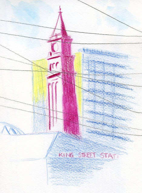
Thursday, December 16, 2021

Ballard


12/10/21 Ballard

A couple of weeks ago when we visited the National Nordic Museum, we had lunch at the museum’s Freya Café. Promising good coffee, food and hygge, the café has one more feature that caught my attention: good natural light from huge windows on two sides. I knew I’d be back to sketch there.

12/10/21 Ballard

Arriving when it opened, I grabbed a bright table that gave me a great view of the kitty-corner liquor store (above). I picked out a primary triad (plus indanthrene for the darkest spots) to work on seeing the color temperatures in this otherwise mostly colorless corner.

Instead of parking in the museum’s pay lot, I had found a spot several blocks away on a residential street to get a little walking in, too. I had been wanting to make a postcard, and the view from my mobile studio gave me just the right amount of “nothing.” Using a subdued purple and yellow complement, I got a color temperature study for myself along with a postcard to send to a friend.

Newsflash: These urban sketches are the last I will make with Caran d’Ache Luminance (or any other non-soluble) colored pencils. They are terrific pencils that I love to use when I’m making leisurely, detailed drawings at home. But on location, they are just too slow! Both of these sketches look wimpy in color, but I didn’t want to take the time to keep layering on more pigment, especially on the toothy Hahnemühle postcard. I am too spoiled by the fast bang of rich color I can get with Museum Aquarelles and water.

As soon as I got home, I switched back to Museum Aquarelles – but not my standard palette. Taking a cue from the warm/cool primaries and secondaries I have been studying color temperatures with, I picked out watercolor pencils to make up a similar minimal palette. It seems like it should be a simple matter of swapping out Luminance for Museum Aquarelle pencils in the same colors – they are both Caran d’Ache lines. Unfortunately, that’s not the case – quite a few colors are not available in both lines (I’ll show you my picks soon). My color studies will continue. And I’m still using the Tombow “sandwich,” which is working out well – no need to throw out the baby with the bathwater.

This also means that I will finally be giving the Hahnemühle watercolor A5-size sketchbook an earnest try. 

Pencils and hygge -- a good winter combo.

Wednesday, December 15, 2021

Drawing Jam: Virtual Again but Still Worthwhile


12/11/21 Life drawing during virtual Drawing Jam . . . though my heart wasn't in it.

A year ago when I participated in Gage’s virtual Drawing Jam, I wondered whether we would be able to attend in person again by this December. Sadly, the annual event was once again on Zoom. I so miss the actual community of other artists – both students and instructors. Having to attend virtually yet again seemed even more depressing than last year.

Ellie Doughty uses a variety of pens to add interest and indicate depth.

Still, I made the best of it and attended a wide variety of instructor demos at this free event. (Despite my complaints about the Jam’s virtuality, the one huge benefit of Zoom is the ease of viewing demos well.) One of the best was by urban sketcher and illustrator
Eleanor Doughty, 
Ellie adding color.
whose mixed media landscape demo was so much fun to watch! With nearly 90 participants, she had by far the biggest attendance of the demos I saw. In addition to simply enjoying the excellent view of her mark-making techniques using a wide variety of media, I really appreciated when Ellie talked about compositional decisions she made as she was making them. I think some artists compose so intuitively that they forget that students can’t read their minds. I find it immensely helpful to hear what artists are thinking.

Another excellent demo was presented by Ned Mueller, who has been teaching art for 60-some years! One reason I was interested in seeing his demo was that I am considering taking one of his workshops. The first hour was spent talking through a prerecorded video of a portrait he made in Bistre Conte crayon. A major benefit of showing a prerecorded video is that the artist is freer to elaborate without having to interrupt their own process. I appreciated his sense of humor and the vast years of wisdom and teaching experience behind some of his nuggets:

“Don’t draw the flea before you draw the dog.”

“If you get the shapes accurately, you don’t need much detail.”

“Give students what they need, not what they want.”

The latter remark was related to the importance of values, which he felt that most students can barely tolerate studying for more than a week or two before they want to get on with color. He contrasted that to the years that classical drawing students work with monochrome media to understand values before they ever touch paint. “Now that I’ve said that, I’m sure I’ve lost a lot of potential students,” he quipped. (But it made me even more interested in studying with him.)

Ned Mueller showed us numerous examples of his painting process from value study to finished painting.

After the prerecorded portrait demo, he gave a slide presentation showing many examples of how he progresses from a value study to a color study to a finished painting. Mueller said that he might do as many as 20 value studies, from which he’ll choose five options to work from to “cut down on the clunkers.” From there, he might do several color studies before finally making the finished painting. Again, the biggest value in seeing his process was in hearing him talk about how he makes decisions.

Between demos, I did a little life drawing, but my heart wasn’t in it. After finally being able to participate in real life drawing outdoors last summer, going back to Zoom was harder than ever.

As I did last year, I made a donation afterwards to show Gage that I want it to be around for a long time to continue bringing excellent community programs like Drawing Jam.

Dare I say that I hope the Jam will not have to be virtual next year?

Tuesday, December 14, 2021

Understanding Light

The latest title in the Urban Sketching Handbook series

Understanding Light, Katie Woodward’s addition to the Urban Sketching Handbook Series, includes four of my sketches, and I’m thrilled to pieces! When this excellent series was introduced by Gabi Campanario in 2014 with Architecture and Cityscapes, I considered it one of my “bibles” in learning how to draw on location. Now with 14 titles, the series continues to cover many topics of interest to sketchers. Each time I picked up a new one, I thought what an honor and privilege it would be to have my work included in one someday – and the day finally arrived!

I’m not going to write a full review of this one since it would probably not be perceived as impartial 😉. But I will just say that Understanding Light is one of the best in the series. Not just an eye-candy collection of sketches (though it is that, too), Katie’s book includes solid information about how to observe and depict light using any medium. I was especially pleased that this volume is not medium-centric, as so many books that discuss light usually focus on paint. Graphite, ink, colored pencil, pastel – any medium can be used to express mood, atmosphere and emotion by closely observing and conveying light.

The book is pre-orderable now at online booksellers for a Dec. 28 release, and it will also be available at the Seattle Public Library.


Monday, December 13, 2021

Inside and Outside King Street Station


12/12/21 King Street Station from 4th S. & S. Jackson St. (another primary triad/color temperature study)

It was bitterly windy, 38 degrees and likely to rain. Although staying home and having a second cup of coffee seemed like a better idea, I put on my warmest, waterproof down parka, boots and fingerless gloves before I headed out for King Street Station to meet with USk Seattle yesterday. My initial reluctance faded, however, when I saw that we had another great turnout, despite the cold. USk Seattle members are nothing if not hardy!

Surprisingly, the sun came out briefly, so I went outside to see if I could stand the cold. Although I’ve sketched the station many times, I tend to choose a head-on view from directly across the street. With morning light on one side, it made more sense to cross kitty-corner and catch that light.

By the time I finished, the sun had disappeared, and all my fingers unprotected by fingerless gloves were getting numb, so I retreated to the station’s ornate upper level. In the past, I’ve attempted ambitious compositions from up there (especially as a newbie who didn’t know better), but this time I kept them small and full of sketchers.

Station upper level

With only a half-hour left before the throwdown, I was planning to head downstairs to sketch more people on the main station level, but a window at one end caught my eye. It gave me an ideal view of several tents across the street – only a few of the many, many tents surrounding the station area. By “ideal,” I mean that I was warm, safe and comfortable, none of which these residents were. Feeling voyeuristic and even opportunistic, I nonetheless couldn’t resist a sketch. Having rushed inside earlier after standing on the sidewalk for only 30 minutes, I felt guilty and wondered what it was like to spend a night on the sidewalk sheltered only by flimsy tents intended for casual camping. Night after night.

The individual on the left may look like he was checking his phone, but he was actually sweeping the area around his home.

Hardy sketchers!

Sunday, December 12, 2021

Sun Break


12/8/21 Maple Leaf neighborhood

After days and days of gray and rain, we were treated to sunshine! I knew it wouldn’t last, so I dashed out as soon as I could. My weather app told me I still had several hours before the rain would return.

To avoid wasting time looking around, I drove only a couple of blocks from home and parked at the top of a steep hill. I thought the distant blue horizon (and the silhouette of downtown Seattle) with dark trees in the middle ground would make an interesting study of atmospheric perspective using color temperature. Wouldn’t you know it: A few minutes into the sketch, it started raining, so I had to make most of it through the wet windshield. I would have liked to have deepened all the colors, but at some point, it became ridiculous trying to see.

Shortly after I returned home, the rain stopped and the sun came back out again.

Technical notes: This was one of those times when I missed my tried-and-true watercolor pencils. It is so much faster and easier to deepen colors quickly with a swipe of a waterbrush or a spritzer.

After momentarily dithering over paper, I decided to go back to my Stillman & Birn Zeta after all. I used it at Zoka Coffee last week, too. Since I’m not using water, a smooth surface somehow feels “faster” to work on with soft Caran d’Ache Luminance pencils. I don’t know if that makes sense or is even actually true, but I’m sticking with it for now.

Sandwich in the mobile studio

I’m pleased that my Tombow pencil “sandwich” is working out well, especially in my mobile studio. I just lean it up against the steering wheel on my lap, and it’s much handier than going through my bag. I have a sketch outing coming up, though, where I’ll probably want to sketch standing . . . I’ll probably switch back to my usual Tran Portfolio case for that.

Saturday, December 11, 2021

Across the Street, 6:35 a.m. (and Updated Night Sketch Kit)


12/8/21 Maple Leaf neighborhood, 6:35 a.m.

I sketched this house about a year ago, probably at about the same time of day. This time I tried a more vertical format and included a car. These neighbors never put up holiday lights on their house. The soft illumination of their porchlight is comforting on these darkest of mornings.

Looking at last year’s post reminded me that I showed my nocturne sketch kit then. I’ve simplified it this year. I’m still using the ever-handy Mighty Bright XtraFlex2 book light, of course. I kept the white Sakura Gelly Roll and white Derwent Drawing Pencil, chose just a few warm and cool near-white Prismacolors, and took out the rest of the colored pencils. My recent use of limited palettes has taught me that having fewer choices is better. Besides, when sketching in the dark, I can barely distinguish one near-white from another!

However, anticipating sketches of holiday lights, I also added a fistful of Kuretake Zig Fudebiyori metallic brush pens (my review at the Well-Appointed Desk).


Metallic brush pens in; lots of whitish colored pencils out

Friday, December 10, 2021

Fog, the Great Flattener


12/7/21 Maple Leaf neighborhood

If you’ve studied classical drawing as I have, you know that much of the emphasis is on depicting form realistically. It’s all about observing and using light to give the impression of three dimensions on a flat picture plane. Even when thick clouds obscure the sun, you’re supposed to squint hard and try to see whatever shadows there might be to help you describe the forms.

Simple tools for a flat day.

On foggy days, I am always struck by how flat everything looks. Fog obscures light so uniformly that everything in the far and middle distances looks two-dimensional, and even the closest parts show only slightly varying shades of mid-gray. It’s also hard to resist giving distant trees more texture. In fact, I pulled out a blending stump to take away what little texture the side of my pencil point had made.

Two years ago I sketched the same scene in the fog from a slightly different angle.

Related Posts Plugin for WordPress, Blogger...