 |
| 1/12/23 Final portrait |
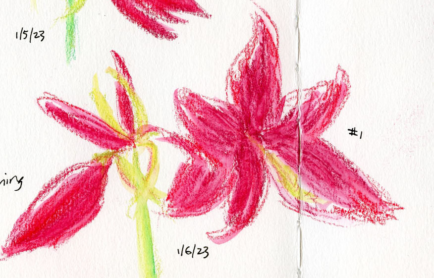
Delighted by the sketches I had made of it last year, the
same friend who had given me that amaryllis gave me another for
Christmas. Last year I wanted to focus on documenting its rapid growth and
changes accurately – more like a nature journal. Using an illustrative style helped
me to pay attention to proportions and details. This year, similar to the more gestural portraits I’ve been trying lately, I took a more gestural approach without
attention to precision.
 |
| Spread 1 (1 of 2) |
 |
| Spread 1 (2 of 2) |
Instead of last year’s fine liner and colored pencils, I used water-soluble Caran d’Ache Neocolor II crayons, which encourage me to avoid details and stick to larger shapes. Just like the gestural portraits, capturing the blossoms’ “expression” without getting fixated on “resemblance” was quite the challenge.
 |
| Spread 2 (1 of 2) |
 |
| Spread 2 (2 of 2) |
 |
| I used this Neocolor II palette throughout (though I used yellow only when the blossoms were still buds). |
I also decided not to try to match the petal hues exactly as I had last year. I just picked out three shades of red and mixed them spontaneously as I sketched.
More than a decade ago, I took a basic drawing course from Seattle artist and urban sketcher Anita Lehmann. We drew mostly still lives in the classroom, but as part of the course, we attended one life drawing session for the experience of working from a live model. Despite the many instructors I have had since then, including life drawing, I was amused that it was Anita’s voice I heard in my head when I felt myself struggle to capture the amaryllis blossoms.
“Now, don’t get all drawsy on me,” she would say, encouraging me to use the wide side of the charcoal to “paint” the model’s gesture – not draw a stiff outline around the figure. As a beginning drawing student, that concept alone was a brain blower: How do I draw anything without “getting drawsy”?
Hearing Anita’s advice in my head, I had to chuckle. Although I certainly understand now what she was trying to say all those years ago, fighting the urge to get drawsy still isn’t easy. Nonetheless, the amaryllis was just as much fun as before. I looked forward each day to seeing and sketching a new bloom – a welcome wintertime splash of color. And amaryllis blossoms do make excellent life-drawing models with their expressive, dancer-like poses.
 |
| This was an awkward gutter split, but I wanted to fill the space. |
Design and process notes: Although I think about composition, I rarely give thought to overall page design before I begin a sketch. Usually that’s because I almost always put only one sketch on a page. These page spreads are a rare exception, so I did have to consider things like avoiding placing the gutter in an unattractive spot or leaving awkward blank spots. Because I’m left-handed, I tend to begin on the right, which I did on the first spread, then jumped around to make the shapes fit better. Later, I regretted it because the growth sequence would have “read” more logically from left to right. On the second spread, I started on the left. When all four blossoms opened, I made a final portrait on separate paper (top of post).
 |
| Keeping the other blossoms unactivated brings attention to the featured blossom (in this case, still a bud). I wish I'd thought of this idea sooner. |
My drawing process changed as the series progressed. In the earlier sketches, I gave all parts of the amaryllis – buds, stem, blossoms – equal attention. Later, I wanted to give the latest-blooming blossom more attention than other parts, so I gave them equal color but left the background blooms unactivated. By the time I got to No. 4 (which opened more slowly than her sisters), I simply implied the other blossoms with loose marks (at left). I like that approach best and wish I had thought of it sooner. But that’s what “process” means: Learning along the way.
 =
=
 |
| At this stage, I started worrying that the top-heavy plant was too unstable to keep carrying upstairs to my studio to sketch, so I started sketching it from the kitchen. |

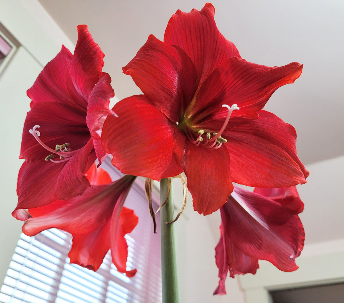 |
| For the final portrait, I carefully carried it back upstairs. I wanted to draw it from slightly below so that all four blossoms would be visible. |
Well, now that I see that amaryllis have "expressive dancer-like poses", I'm definitely switching from hyacinth. The poses of my hyacinth are more...hive-like. ;-) Anne HwH
ReplyDeleteI wouldn't have minded being able to use purple, though! ;-)
DeleteHa Ha!! At one point I was going to make that comparison, "At least I can use blue and purple!" Now why I thought that was an advantage, I'm not sure. Anne
Delete