 |
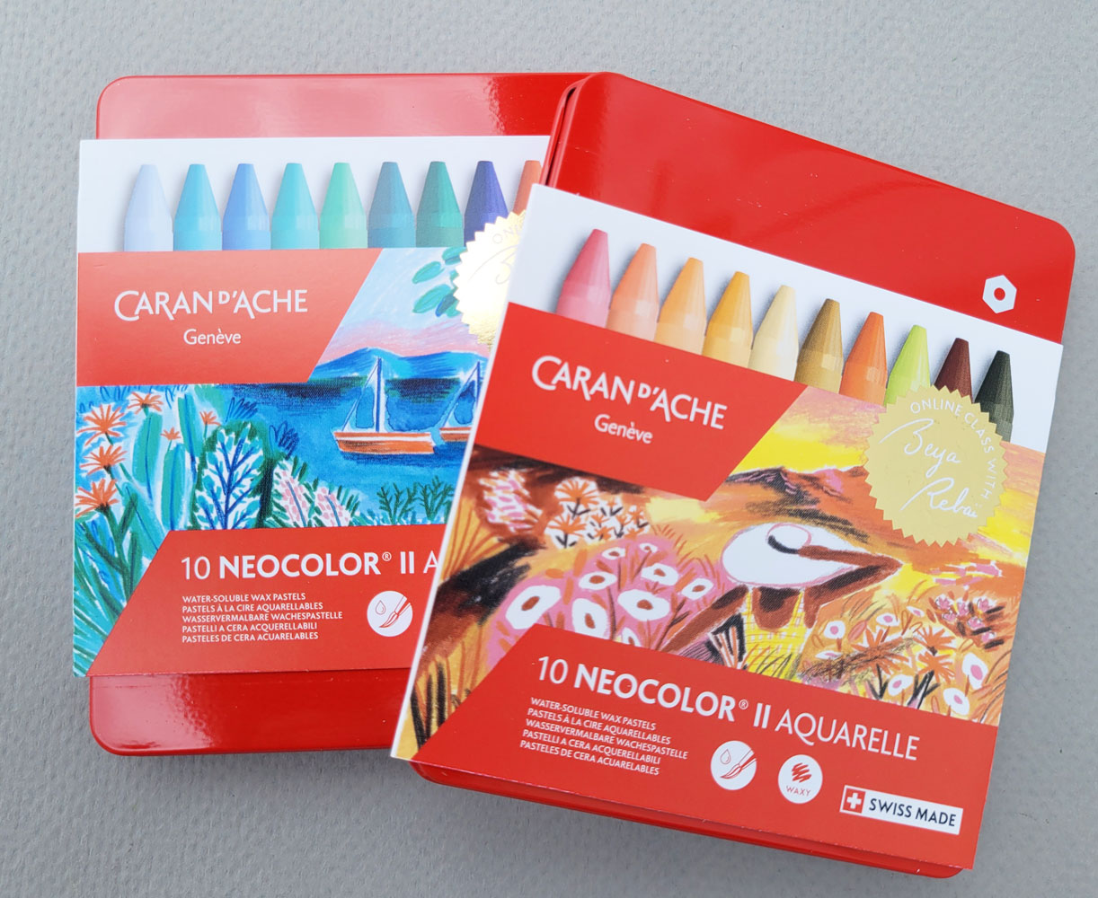
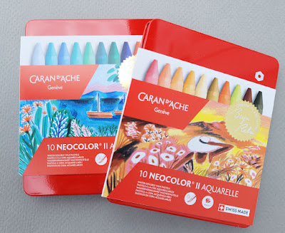
| Limited-edition Beya Rabaï sets of Neocolor II |
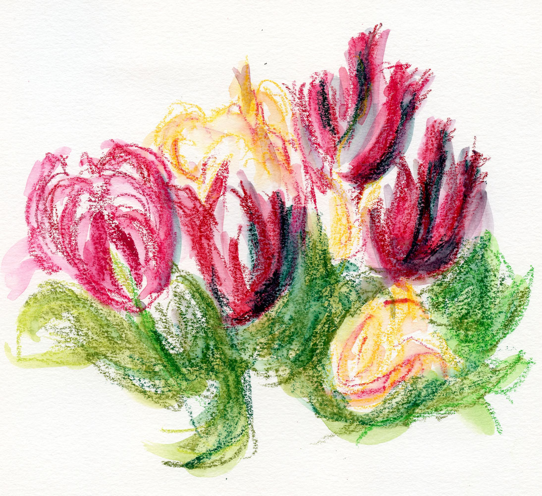
A few months ago when I was loosely sketching some tulips
with Caran d’Ache Neocolor II crayons, I realized that I had not yet
written a review of these water-soluble wax pastels. I suppose it’s because I
don’t use them on location unless the location happens to be my own backyard.
They are more fiddly to hold and look for in my bag compared to pencils, and
I’d rather be seated at a table so that I can spread them out easily. In
addition, the soft, chunky sticks are better used with a sketchbook larger than
I like to carry. It means that I don’t use them often, even though I do love
them. In fact, they are probably one of my oldest art materials that I still
use, going all the way back to my abstract, mixed-media collage days
more than 12 years ago.
(Please note that in this review I’m referring to
water-soluble Neocolor II, not non-soluble Neocolor I, which I began playing with earlier this year. I wish Caran d’Ache would come up
with more distinctive product names to distinguish between these lines! I bet
there’s a lot of confusion at stores.)
 |
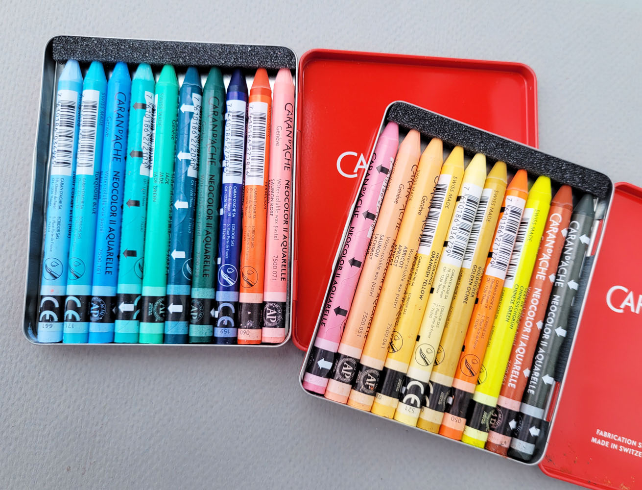
| Cold set and warm set |
With that long history, it’s funny how I seem to “rediscover”
Neocolor IIs every year or so. A product review is long overdue.
What prompted me to finally write one was the recent release of two limited
edition sets in collaboration with the French illustrator Beya Rebaï. According
to Caran d’Ache’s website, “The artist and Caran d’Ache have joined forces to
dream up two assortments of 10 Neocolor® II Aquarelle pastels. One in cold
shades, playing on a range of blues, greens and pinks. The other in warmer
tones with a range of yellows, oranges and umber. Two original palettes
consisting of the artist’s favourite colours.”
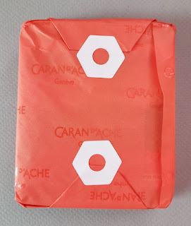 |
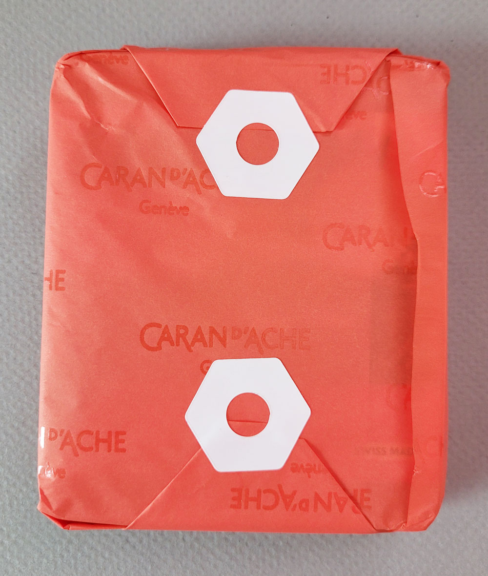
| I adore this wrapping paper and stickers from Papeterie! |
If I’d had a normal amount of patience, I would have waited
to get the sets at Blick. Lacking that, I opted to order them from
Germany before they were available in the US. (Surprisingly, though, I paid
about the same as I would have at Blick for the products and even the shipping
because the latter has gone through the roof lately [except when Blick
occasionally offers free shipping deals]). The benefit of ordering from Papeterie in Berlin is that the sets came wrapped in lovely Cd’A-branded paper and
adorable stickers! (Yes, I’m a Caran d’Ache fan, but I also appreciate shops
that give customers a nice hand-wrapped touch like that.)
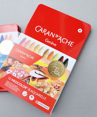 |
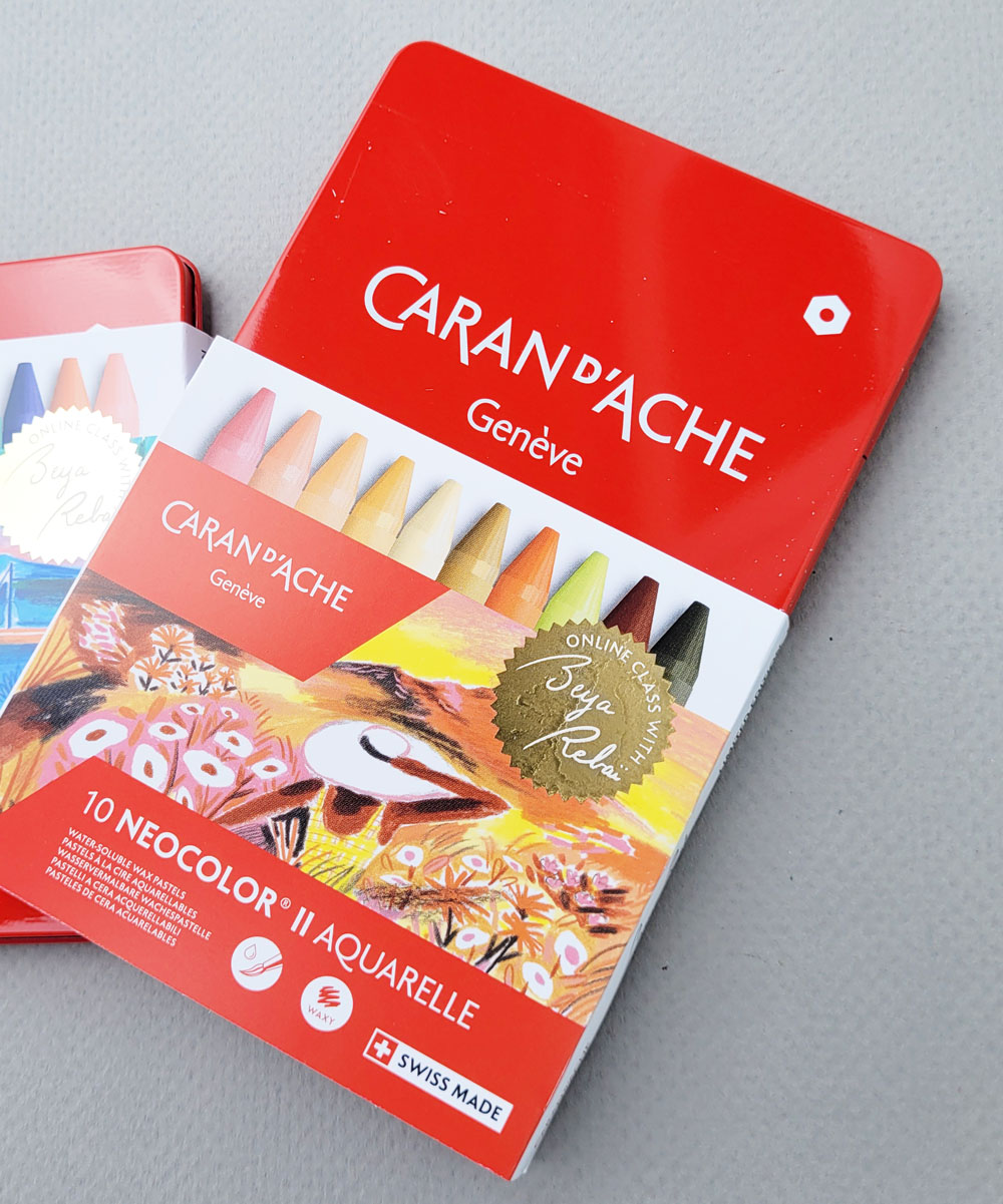
| Sleeve slides off to reveal the classic red Caran d'Ache tin. |
While the tin sleeves indicate that they are limited
editions, the tins themselves are the same iconic red used to hold the Wonder Forest Bicolor set and other products in Caran d’Ache’s “professional”
product line (Supracolor, Pablo, Neocolor I, Neocolor II, gouache, Fibralo
markers, Fibralo brush tip markers). I always find it amusing that even
when the tin contains brush markers or gouache, the white icon on it represents
hexagonal pencils – likely alluding to Caran d’Ache bringing the first
water-soluble colored pencils to the world in the form of the Prismalo line in
1931.
So what’s special about these Beya Rebaï sets? Are the
colors themselves new or different from the regular Neocolor II line? No – they
appear in standard Neocolor II sets and can be purchased open stock. As is my
habit with most of my higher-end colored pencils, I have acquired lots of
Neocolor IIs open stock over the years, but I’d never purchased a set of any
size. These were a good excuse to finally have some tinned sets.
I was also attracted to Beya Rebaï’s selected palettes, both
“cold” and warm. All those pastel peaches and pale blues – they are not part of
my usual palette all, nor are they much of an urban sketching palette (except
maybe in Italy’s Cinque Terre or Positano!). In addition, I was
intrigued that the cool set included a pink and a red-orange that I would have
put into the warm set. Clearly, they are intended as lovely complements to the
cooler hues. I thought it would be fun and challenging to use a palette so
different from my own.
 |
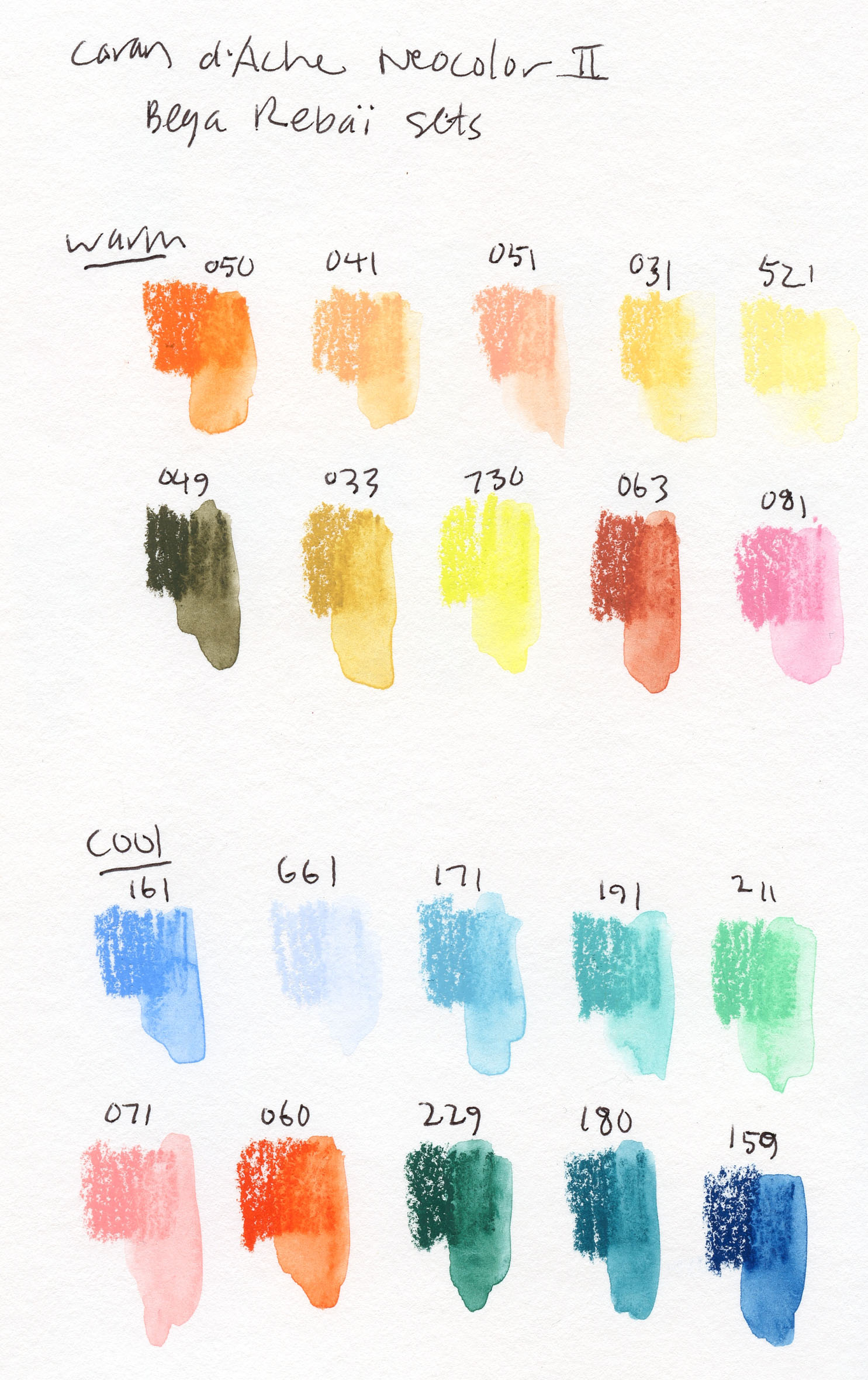
| Swatches in Stillman & Birn Beta |
 |
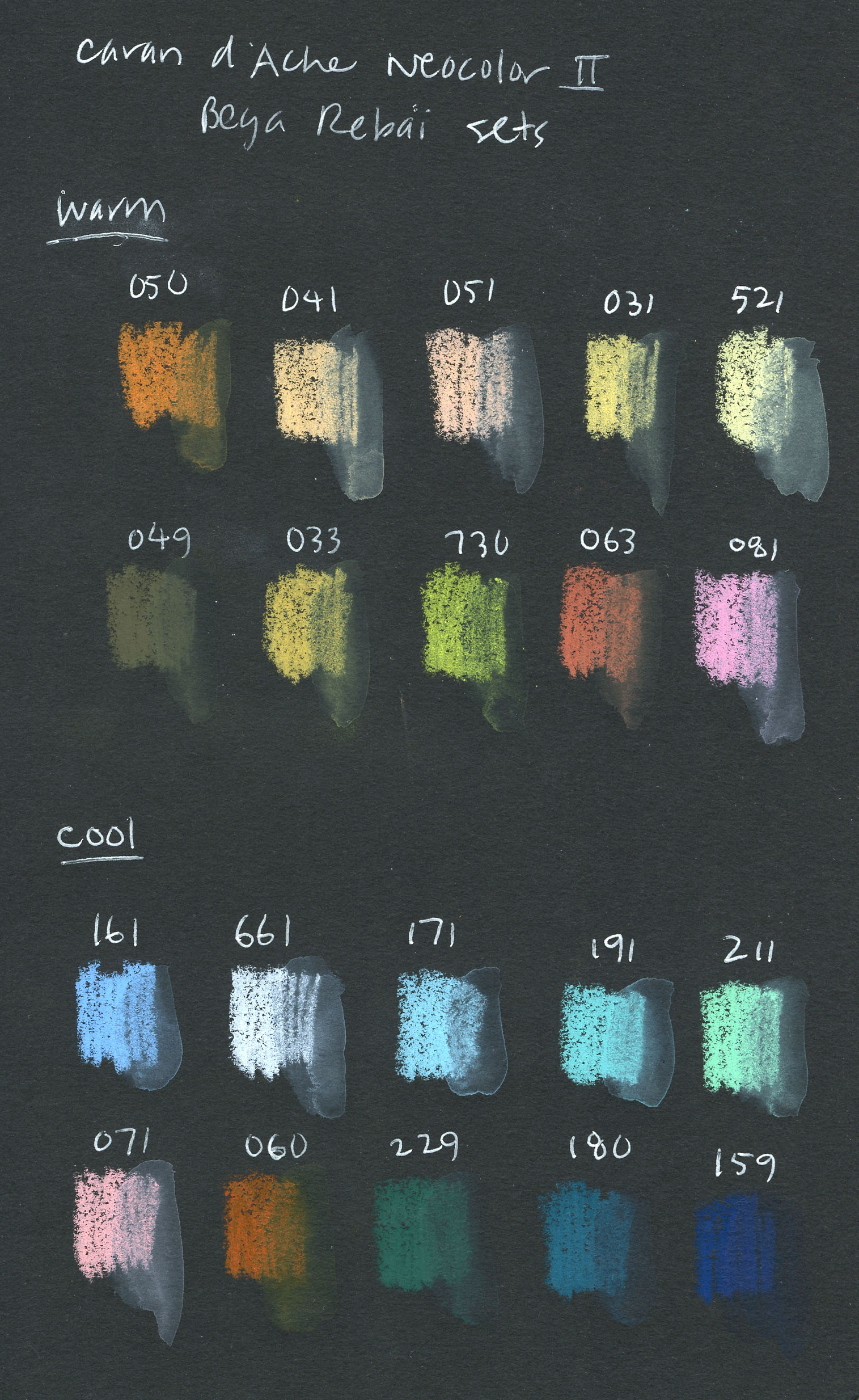
| Swatches in Stillman & Birn Nova |
The top swatches were made in a Stillman & Birn Beta
sketchbook. I also made swatches in a black S&B Nova
sketchbook to see how opaque the colors are. I love the way the paler colors
pop on black. As expected, however, they tend to become less intense and dull
on the dark background when activated with water. Although richly pigmented,
compared to Caran d’Ache Museum Aquarelle pencils, they don’t dissolve
as easily and require a bit more scrubbing.
These limited-edition sets also come with access to two
30-minute online videos of Rebaï demo-ing a few techniques using Neocolor IIs
and explaining inspiration for her palettes.
 |
| 5/12/22 No wimpiness allowed. |
One thing I love about Neocolor wax pastels (both insoluble
and water-soluble) is that they demand boldness. Unlike colored pencils, which
can be used very delicately, it’s almost impossible to lay down lipsticky,
crayony, water-soluble wax pastels and be timid about it. You can’t be wimpy
with these bad boys, even if you want to. Even after years of using colored
pencils, I can still succumb to wimpiness. Putting Neocolors in my hand is a
good shove in the bold direction that I can always use. They also encourage
looseness, which is another benefit to me.
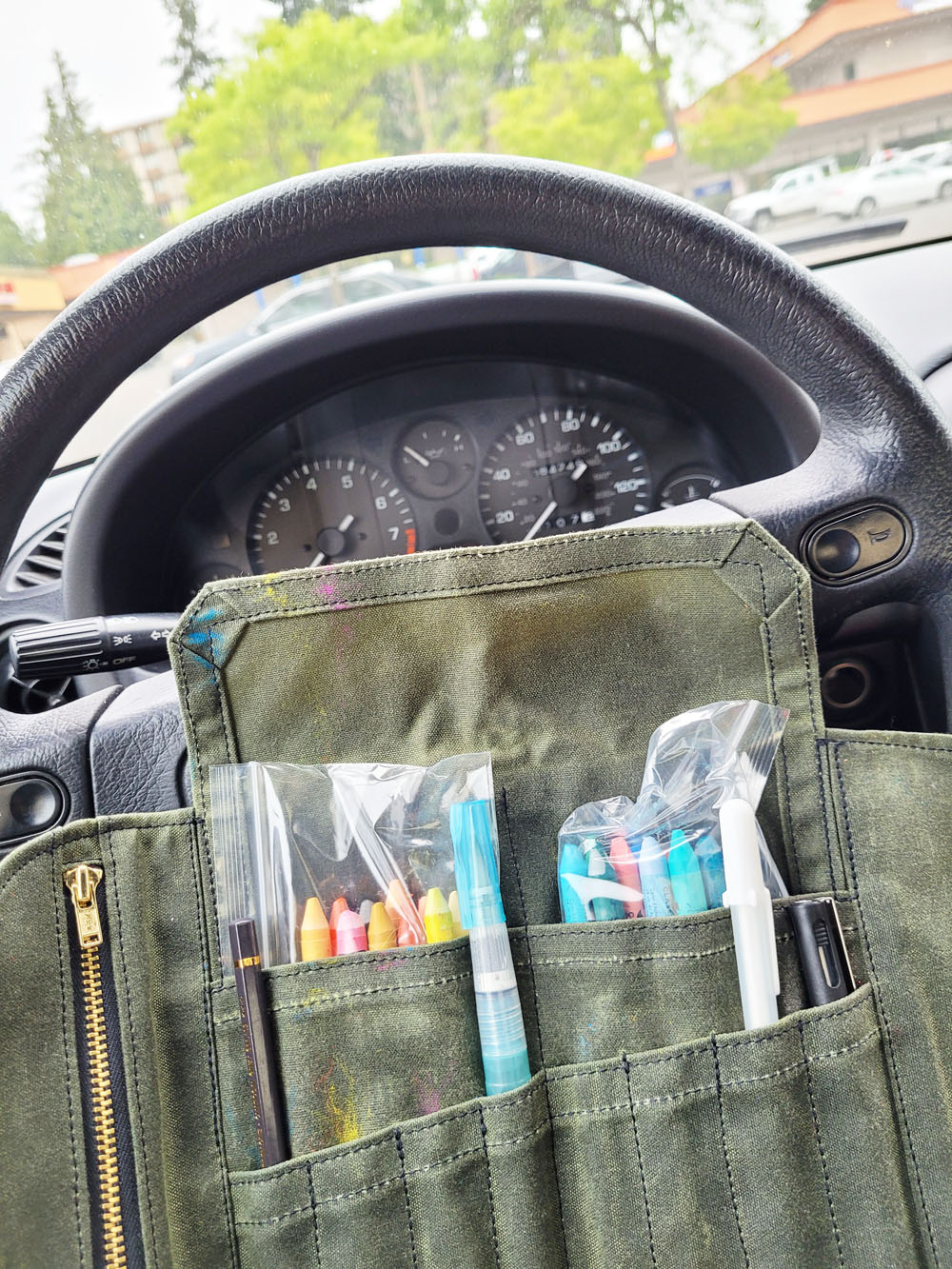
On the first overcast morning after our heatwave broke, it
was cool enough to sketch from my car. As I mentioned, the Neocolors are a bit
cumbersome to handle while standing, so using my mobile studio was a convenient
solution. Driving around Northgate after an errand, seeing nothing that seemed
appropriate for those cotton candy-like, summery tints, I realized that it’s
just a matter of seeing the palette as a range of cools and warms instead of
specific hues. A-ha – color temperature to the rescue! It immediately
became less intimidating to use an unfamiliar palette that someone else had
picked out for me.
 |
The Neocolor IIs are in plastic bags to keep them
from sliding down into the Sendak pockets. Not ideal,
but tolerable in my mobile studio. |
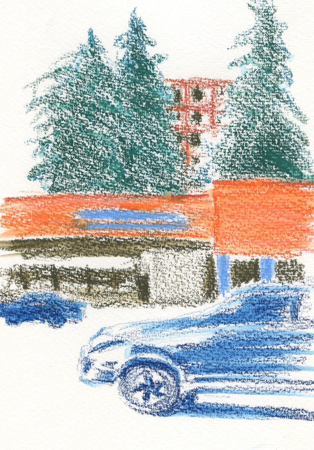
But how’s this for weird? I happened to pull into Northgate
Plaza, a typically blah strip mall, and the Rockler Woodworking store had a
peach and blue color scheme! So my first sketch with the palette turned out to
be a no-brainer (though I forgot to note which colors I used, I think they were
mostly English Red ([063], Saumon Rose [071], Light Blue [161], Prussian Blue
[159] and Dark Green [229]). I thought my A5-size Hahnemühle sketchbook
would be a bit cramped for these chunky sticks, but I made it work.
 |
| 8/2/22 Neocolor II in Hahnemuhle sketchbook, Northgate Plaza (which serendipitously coordinates well with the palette) |
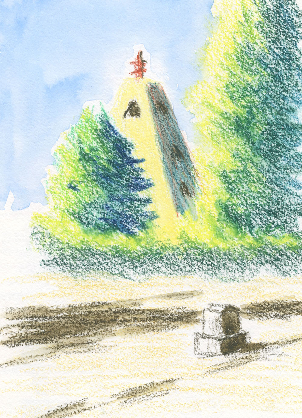
The sun came out in the afternoon, so I took the Neocolor
IIs to Evergreen Washelli cemetery ( |
| 8/2/22 Neocolor II in Hahnemuhle sketchbook |
I showed this sketch yesterday
and wrote about what I learned about the interesting shape of this monument). I
love that bright yellow (called Chinese Green [730]) for the sunny side of
blue-green foliage made with a combination of Malachite Green (180) and Dark
Green (229). The monument is off-white, which is something I would typically
leave paper white. With this palette, however, I tried Sahara Yellow (521) for
the sunny side and a mix of one of the peaches and one of the blues (I forgot
to note which) for the shaded side. It’s fun and challenging to push myself to
use unfamiliar hues and mixes this way.
Standing in a cemetery path to sketch this, however, I found
the wax pastels clumsy to use, as I expected. The tins are altogether unwieldy
while standing, and the crayons are too short to fit in the slots of my Sendak.
I carried them in Ziploc bags, which required tedious fumbling. (If I decide to
use these more in the field, I’d definitely need to come up with a better
carrying and usage solution.)
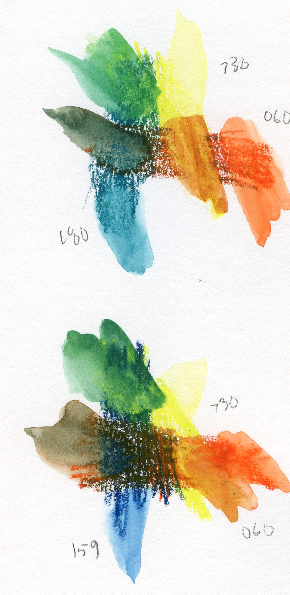
Intrigued by the palette but still experimenting with how to
approach it, this thought suddenly popped into my head: What kinds of primary
triads could I find? Clearly, I wouldn’t find a CMYK in there, but with a
stretch of interpretation, there’s certainly one (or more) triads to be found.
Below are two I mixed. In both cases, for yellow, I used Chinese Green (730),
and for red, Vermillion (060). The only variable is the blue – Malachite Green
(180) in the top trio and Prussian Blue (159) in the lower.
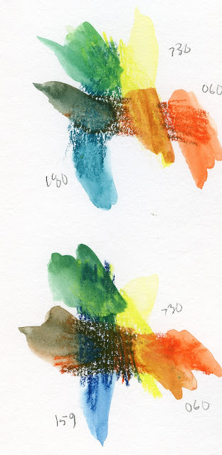 |
| Two primary triads from the Rebaï palette |
Neither triad mixes a violet, but the grays/browns that
result from the red/blue mixtures are interesting neutrals. I preferred the
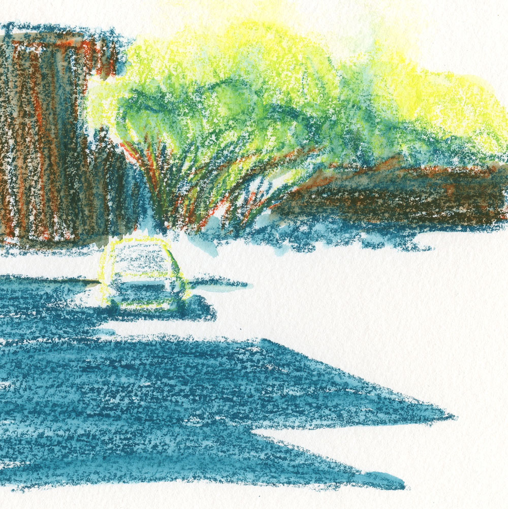
green that came out of the top combo, so I decided to focus on that triad for
my next sketch. Sipping an iced latte at Green Lake’s Retreat Coffee, where I
had a table to make handling the Neocolors easier, I looked up and saw an
intriguing shadow and composition across the street (below). This odd triad is hardly
recognizable as a primary one, but once again, I let color temperature be my
guide. The buildings were slightly warmer than the street shadows, and I like
the contrast against the bright yet cool trees.
I know that some sketchers enjoy using color “recipes” that
other artists develop, and many seem to find this easier than working out their
own palettes. I suppose my recent explorations of the CMYK-based triad is the
closest I’ve come to a “recipe,” but that still requires interpreting hues that
can vary widely. In general, I’ve spent so much time exploring and honing my own
idiosyncratic palette that it’s actually strange and more challenging to use a
store-bought palette – but fun to explore, nonetheless.
From my previous experiences using Neocolor IIs combined
with Museum Aquarelle pencils, I’ve discovered that they don’t necessarily mix as well as I had imagined, even though they are similarly high in pigment. If
pencils are applied first, wax pastels will layer over them easily, but not
vice versa. Neocolor IIs leave behind enough of a waxy surface that pencils
seem to slip and slide over it. I do
appreciate how easy and efficient it is to color large areas quickly with the
Neocolors, and pencils can be used for finer details. It just takes a bit of
planning so that they don’t fight each other.
 |
| 8/3/22 Green Lake (Neocolor II in Hahnemuhle sketchbook) |
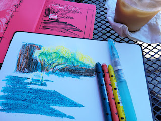 |
| Neocolors are easy to use when I have a cafe table! |
As much as I still love Neocolor IIs (and surely intend to
keep using them in studio), I don’t love them more than my Museum Aquarelles
and the convenient versatility of pencils, at least for sketching on location.
I’m unlikely to keep them in my daily-carry bag. Beya Rebaï’s intriguing
palette, on the other hand, is worth further exploration – but not with
Neocolors. What am I up to? I’m sure you can guess. 😉 Stay tuned!