Showing posts sorted by relevance for query light on dark. Sort by date Show all posts

Tuesday, May 9, 2023

Light on Dark

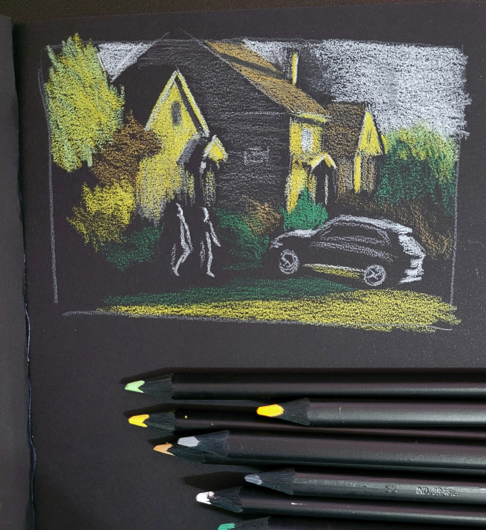
5/2/23 black Stillman & Birn Nova sketchbook

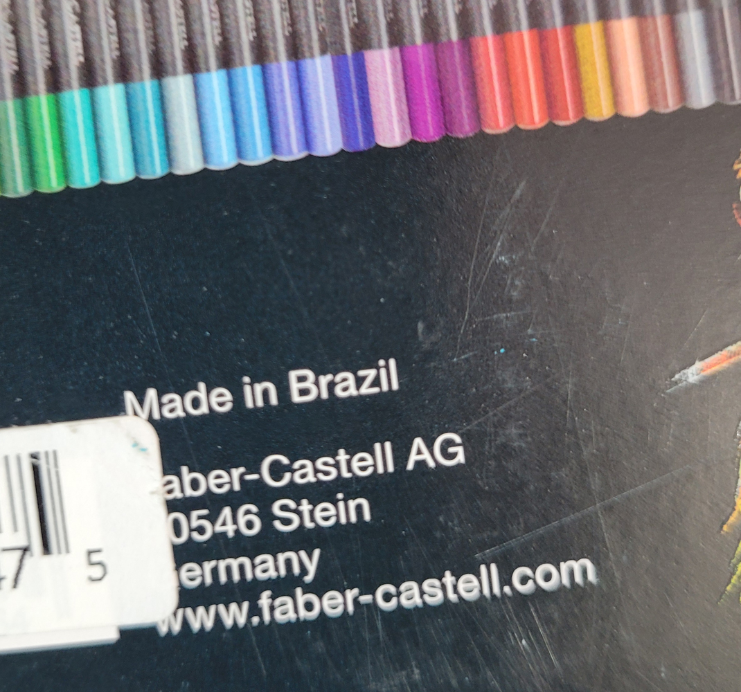
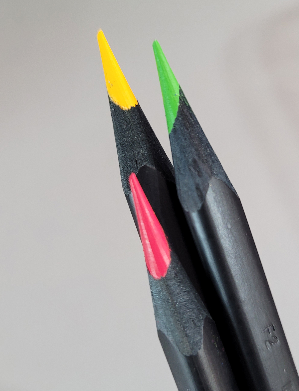
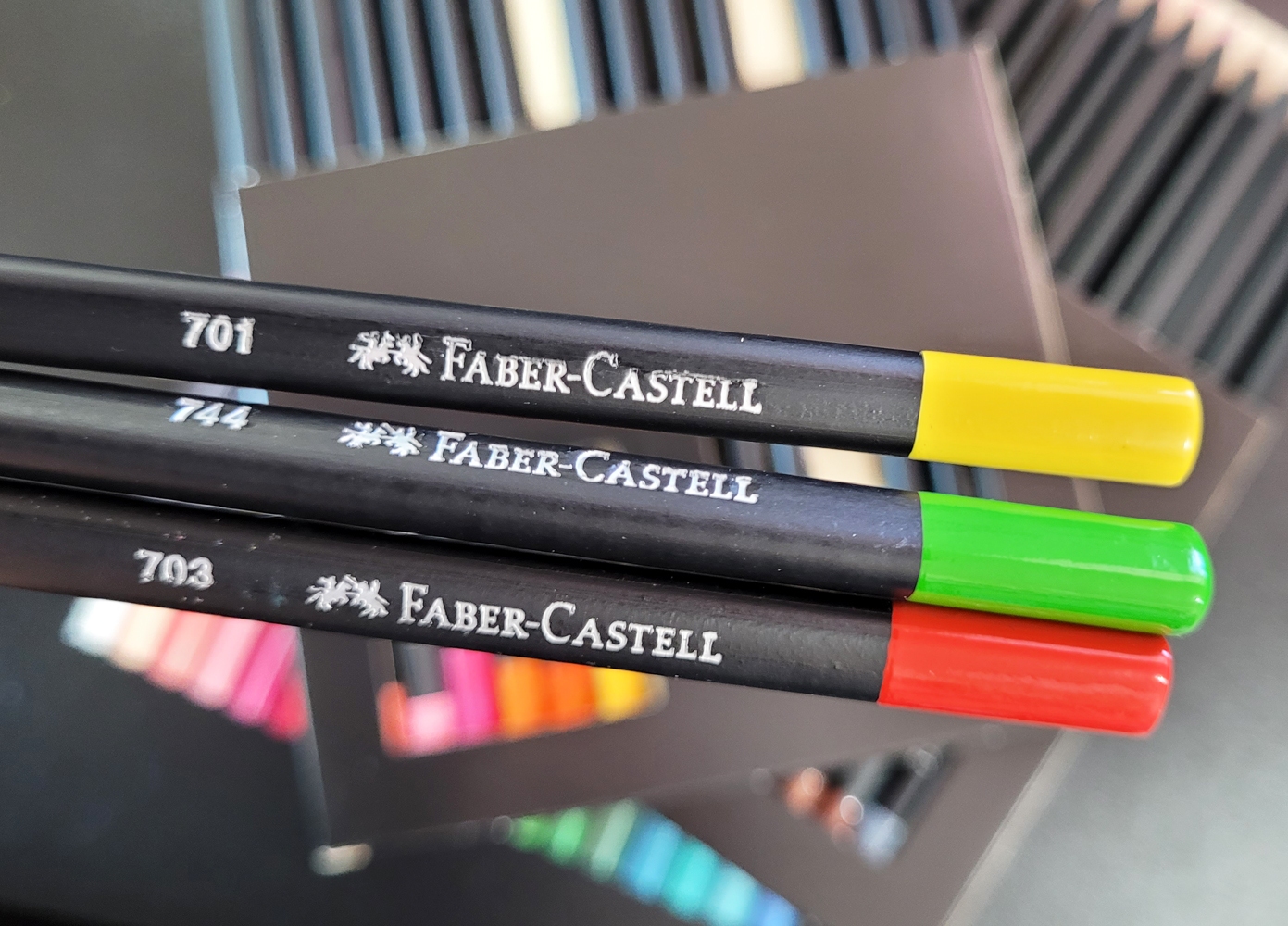
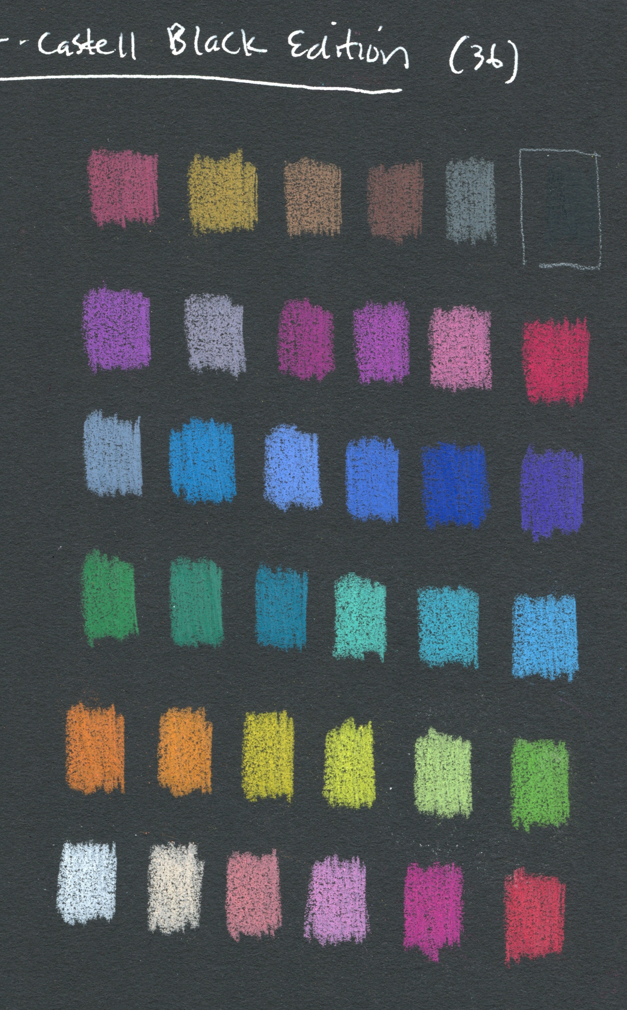
If you follow me on Instagram, you may have seen that I made these sketches with a new set of Faber-Castell Black Edition colored pencils. The entire range in this collection is pastel tints ideally used on darker papers. You’ll see a full review of the pencils soon, but before that, I wanted to write a few thoughts about sketching light on dark.

The process of drawing only the lights is not new to me. For the past few winters, I’ve had a ton of mind-boggling fun making nocturne sketches, almost always with white (or variations of white) on black paper. I’ve also made some skyscapitos at dusk on a base of dark blue paper. This new set of pencils, however, has pushed me to think more about color and light simultaneously on dark-colored papers.
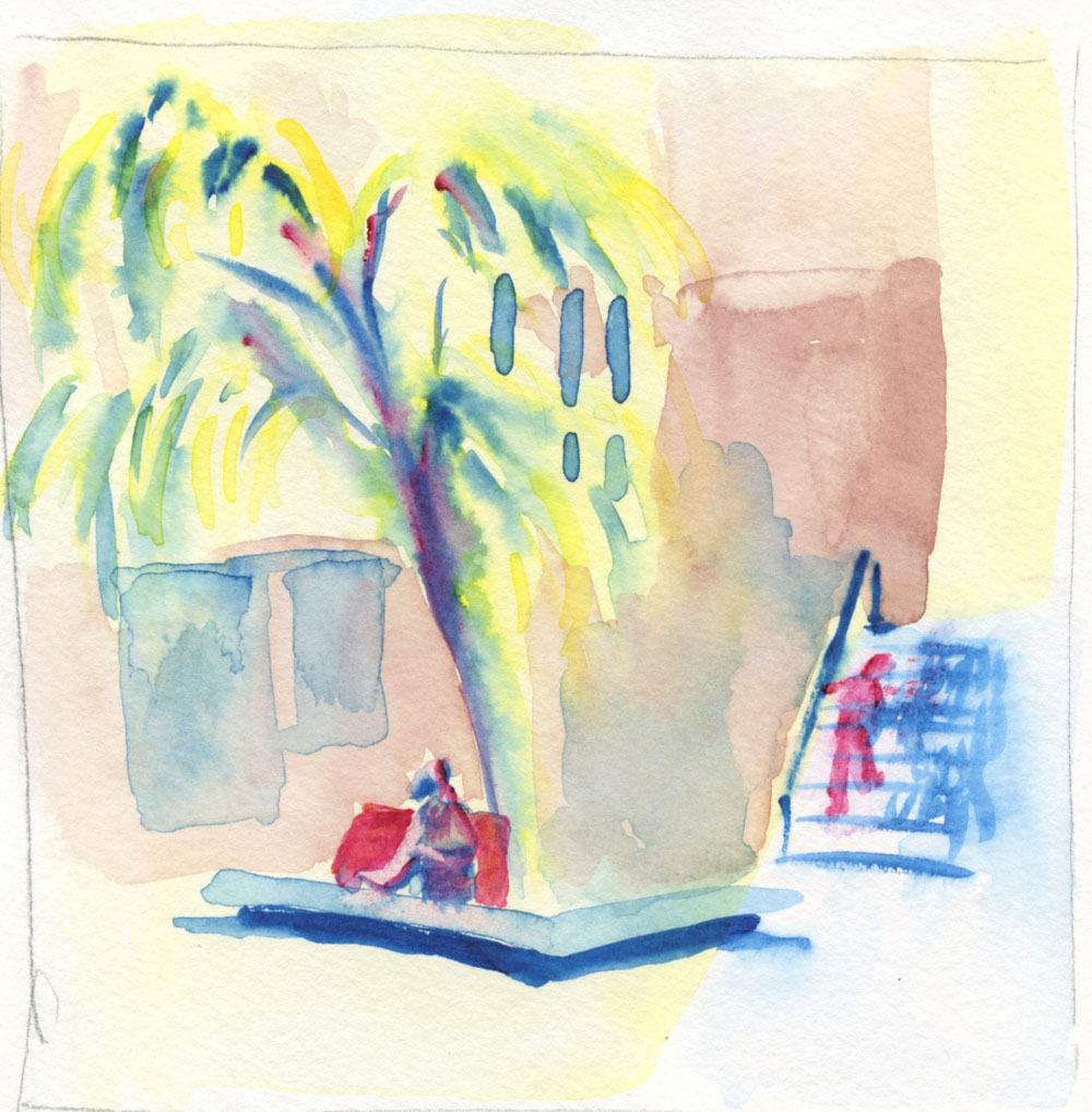
5/3/23 Uglybook

All sketches shown here were made from photos. Two were taken during the golden hour when the low sun cast a beautiful warm light on houses. The third was taken at Green Lake as I was waiting to cross a street on a dark, rainy morning. In all cases, plenty of light was in the sky, so I could see colors – which is very different from sketching in the dark when colors disappear.

Thinking about both color and light is challenging and confusing in new ways. Having Uglybooks in various dark colors also adds to the challenge, especially in terms of color temperature. I’ve done some thinking in this direction in my underpainting studies, but in those cases, I usually chose a paper color with a mid-tone value so that I could apply the darks and lights as I drew. In addition, I often tried to emulate the way painters cover the entire support with their medium so that the underpainting color barely shows, giving all the colors a shimmer of the hue beneath.

With these colored pencils, however, I have been using only dark papers to make the light pencil tones pop, and I leave more of the paper visible. The result is that the darks and mid-tones all sort of mush together without much distinction.

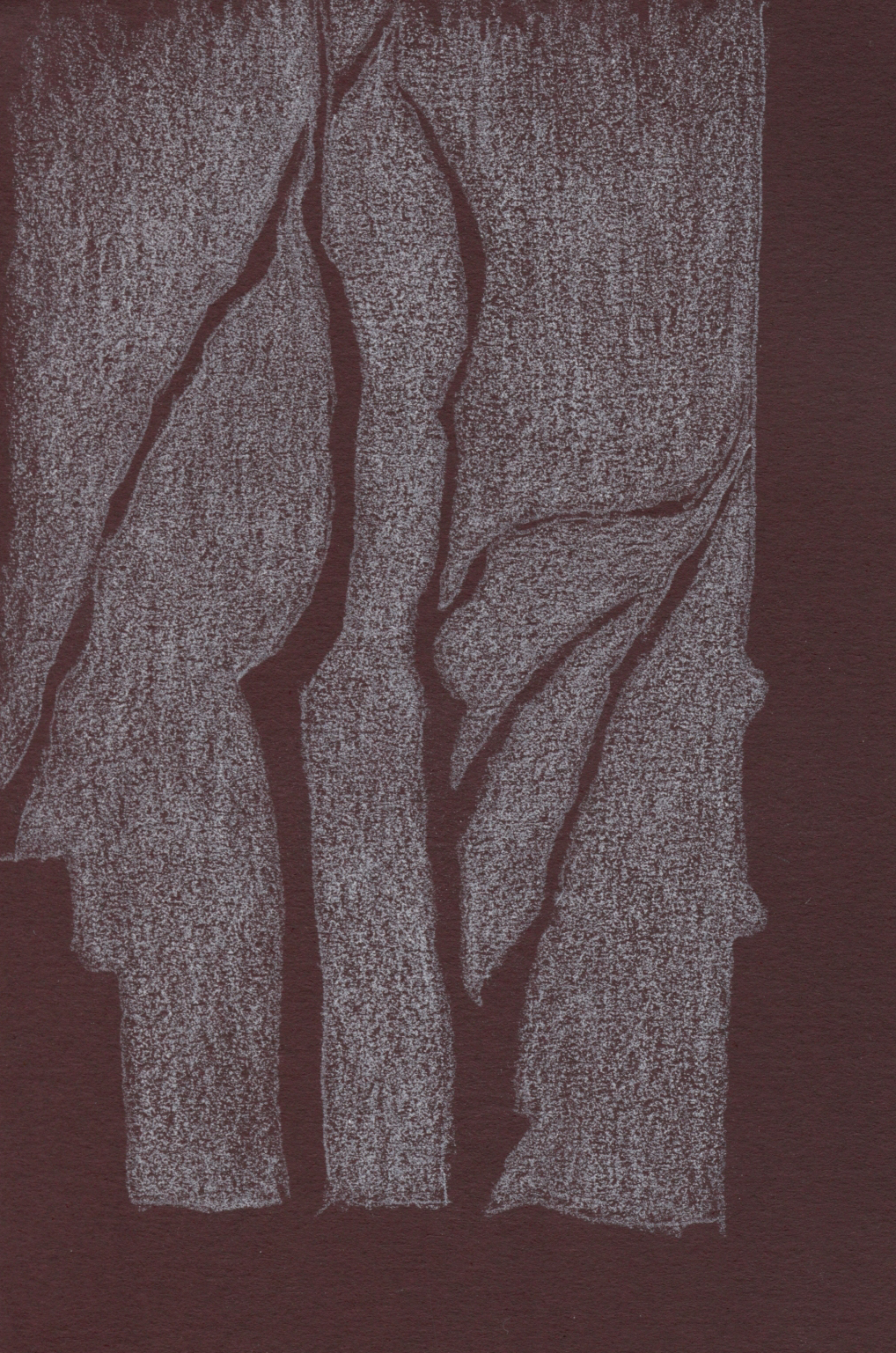
5/4/23 Uglybook. This dark burgundy paper can be problematic in
terms of color temperature. Since it's basically reddish, I would normally
think of it as warm. But because it's such a low-key hue, I think it reads
more as cool. 

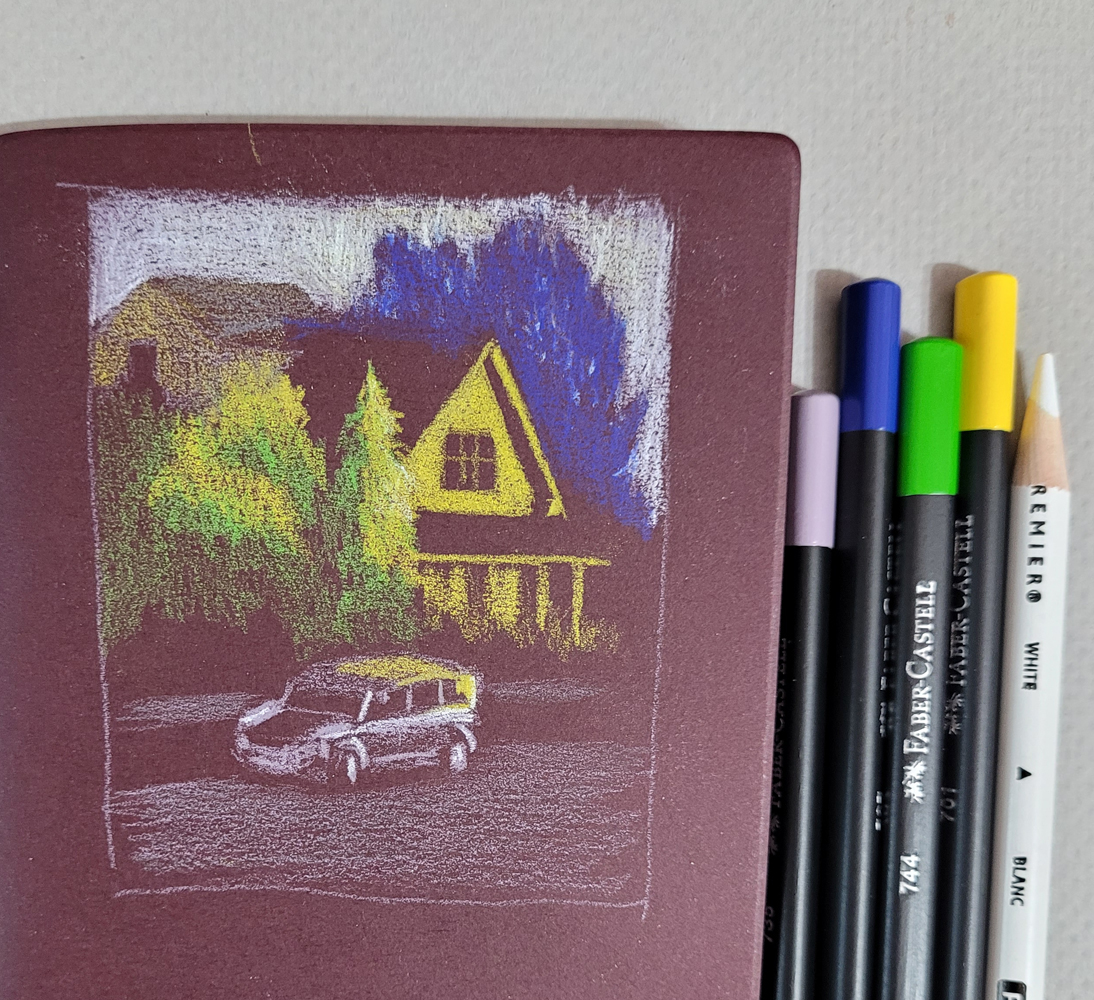
An additional huge challenge is resisting the urge to draw too much. (I guess that challenge is ever-present, but it’s worse here.) When drawing light on dark, I think my results are better when I draw as little as possible. With the pitch-black nocturnes, it’s much easier, because I can’t see much. In these photos, I could still see almost everything, but crossing the line into “too much” is easy to do. For example, I could see a lot of bright “sky holes” in the dark blue background trees (at right). I started to put some in to show that the blue darkness was trees, but they were distracting, so I tried to cover up most of them with more blue. Painting instructors always talk about painting only the large shapes – not the itty-bitty sky holes – and I found that I have to think more like a painter with these.

Believe me, I didn’t anticipate any of these challenges when I got these pencils. My only thought was, “Light-colored pencils – cool!” Ha!

Making these sketches presented the usual tension I experience whenever I sketch scenes from photos that I took myself: I wanted to do them from life instead. However, the conditions of these particular scenes – the golden hour light that lasts about a minute and a very wet day – helped me feel OK about using photos because trying to do them from life would have been terribly frustrating. In addition, using photos allowed me the time I needed to focus on things like confusing colors. Yes, I know I don’t have to justify drawing from photos to anyone, least of all myself. But that’s what happens when you’re a born-and-bred urban sketcher.

(In case you’re interested in seeing what I was working with, I’ve included my reference photos below.)


Yes, it pained me to crop out the trash can, but
Ian Roberts' voice was loud in my head.

Sunday, May 14, 2023

Light on Dark on Location


5/89/23 Dogwood tree, Maple Leaf neighborhood

Whenever I experiment with a new technique or approach using photo references, it doesn’t feel “real” until I try it from life. With several light-on-dark sketches practiced in the studio, I decided it was time to take the approach on location.

One advantage to working at home is that I have at my disposal lots of colors to see what works in a variety of dark-colored Uglybooks. On location, it’s tricky, because I don’t want to carry more than a few pencils, so I have to take a chance with a limited palette of tints that will work with most subject matter and in the Uglybook I’ve chosen to carry.

Real-life conditions are also more challenging. In the sketch on dark blue paper below, I had strong sunlight when I began, but within minutes the sun had ducked behind clouds, and suddenly the light and dark contrasts I depended on were less visible.

5/8/23 Green Lake neighborhood


With nocturnes, it’s easy to draw only lights and darks because I can’t see midtones. In daylight, the darks should not be totally dark like night, but if I put in midtones, the brightest lights will lose some contrast. I usually choose to eliminate most midtones and focus on exaggerating the contrast between the lightest and darkest areas. Both of these sketches look a bit like photo negatives because the shadow areas are darker than they should be in daylight. I’m still working on that balance.

It felt good – and “real” – to finally try this in the field!


Prismacolors and a white Derwent Drawing pencil are my current favorites for this light-on-dark approach.

Tuesday, October 29, 2024

Smart Bulbs Changed My Life


10/27/24 Observation and imagination

After sharing the house with the spouse guy for more than 35 years, surprisingly and with relief, I have adjusted well and relatively quickly to living alone. One of the few things that were harder to get used to, though, was returning to an empty house after dark.

The first time I experienced this was when I traveled to Dallas last April. Past the equinox, days were getting sufficiently longer, but my return flight had me coming home around 9 p.m. It was totally dark by then, and of course it hadn’t occurred to me when I had left home that I would be walking into a totally dark house after fumbling for keys on my totally dark porch. I didn’t like that at all.

Now that we are heading squarely into the Big Dark (I dread this Saturday when we turn the clocks back), I’ve been thinking about how to address the dark house issue. Years ago, we had an automated system that controlled many house lights, including a nice one that brought our “sunrise” light up slowly – a humane way to wake on dark mornings (and they were all dark, even in summer, at the hour we used to get up for all our working years). Over time, the mechanical system became antiquated and eventually stopped functioning. By that time, we had retired, it was no big deal to turn on lights manually, and I rarely returned home to an empty house.

I wanted an automated lighting system again, and I wanted it to be simple and straightforward – no talking to Alexa or some such. Conversations with friends and a little YouTube research led me to inexpensive smart plugs and smart bulbs – and they have instantly improved my life so easily! I use Govee, but there are lots of brands, and they all operate with a phone app.

The only difficulty was that I couldn’t reach my porch light. When my neighbor came to my door at my request, I started to go get my stepladder, but he was already reaching up to open the lamp. Life must be so easy when you’re over 6 feet tall! Now my porch light is smarter than I am, and I’m thrilled about it!

In addition, I put two interior lamps on smart plugs that were equally easy to program. One turns on in the livingroom before I usually wake, giving the house a warm, ambient light that begins to gently contract my pupils for the day (so much nicer than snapping on the harsh bathroom light first thing!). They are all on simple timers, but if I get cocky, I might use the preset program for the porch light that synchronizes with local sunset and sunrise times. (By the way, most of these smart bulbs can change to 16 million colors synching to music for dazzling dance party effects; I’ll stick to basic white, thanks.)

I’m sure tech savvy people have known about these products for years, but until walking through a dark doorway into a dark room brought the issue to my attention, I didn’t know I needed to get smart about it. Now I do, and I am.

Sunday, July 30, 2023

More Light on Dark


5/14/23 photo reference

Back in May when I was somewhat obsessed with working light-on-dark with colored pencils and colored papers, I had been saving sketches in a folder with the good intention of gathering the many thoughts I was having at the time into a coherent post. Then the whole month of June was taken over by direct watercolor, and then July was too warm and sunny to think about dark papers. And then instead of becoming coherent, the thoughts I was having at the time disintegrated into muddle. Well, you know what they say about good intentions and where they lead to.

In any case, I didn’t want to forget about posting the rest of these light-on-dark studies, the process of which I’m still intrigued by. I’ll probably return to making them in the dark of winter when I can use more of my golden hour reference photos to work from.

5/9/23 photo reference

5/8/23 Earthsworld reference photo


5/6/23 Earthsworld reference photo

5/11/23 Maple Leaf neighborhood (on location)

5/11/23 Maple Leaf neighborhood (on location)

Sunday, May 28, 2023

“Painting” Without Brushes


5/22/23 thumbnail study

Here’s how an interesting process unfolded:

On my walk near Green Lake, I made a one-minute thumbnail study (at right) capturing the shapes of organic foliage next to stark, straight utility poles – my favorite compositional contrasts. I thought the composition had potential for further study, so I snapped a photo reference. Just as I did, a woman and her dog walked through – but unlike most photobombs, they improved the composition and added interest!

Reference photo fortuitously photobombed. 

Among the darkest values in the scene are the shaded parts of the trees, so I thought my dark maroon
Uglybook would make an intriguing complementary “underpainting.” Using it for other light-on-dark sketches, I’ve found the color to be difficult to use. It doesn’t exactly “read” like darkness, and it seems like it should be warm, but it’s so dark that it looks cool next to most colors. With those challenges in mind, I decided to treat it the way painters treat an underpainting – by covering the entire “canvas” instead of using the maroon as the darkest dark.

To do that was a brain buster! The woman and the dog were also among the darkest values, but it was difficult to draw around them with white, and dark colors are hard to see on dark paper. I employed the colored pencil technique of applying white first, then coloring over it with the desired color, which makes the intended color appear brighter. This stage looks sort of like a photo negative.

Most areas covered with white, even where dark colors would ultimately appear.

Finally, I went in with the colors I wanted to use. I think the only part of the sketch revealing the actual paper color is the dark part of the stairway behind the woman. But the little bits that show through do provide a subtle complexity that would be missing if I used, say, black paper or white paper. It’s like the “sparkle” that watercolor painters revere, but in reverse – dark instead of paper white.

5/22/23 Prismacolor and Derwent colored pencils in Uglybook (photo reference)

Unbelievably, this little sketch (4-by-6 inches) took more than an hour because I had to think so much! Fortunately, it was evening, because by the time I was done, I needed a nap.

A couple of my social media followers keep accusing me of being a painter. Others ask when I’m going to give in and start painting. I say I’m already doing the fun part – who needs brushes to clean? 😉

"Painting" without the cleanup.

Thursday, May 11, 2023

Review: Faber-Castell Black Edition Colored Pencils


Faber-Castell's Black Edition

A few weeks ago, Faber-Castell USA’s Instagram account made a big splash with several posts showing some black-barreled colored pencils with candy-colored cores shown off on black paper. “JUST DROPPED: THE BLACK EDITION COLLECTION” implied that the pencils were new. Huh? I’d been seeing them on Amazon for months, dismissing them as kids’ stuff. In what way had they “just dropped”? Confused, I posted a question, but it went unanswered. Another follower had commented, “Already have this set since Christmas.”

It turns out that F-C wasn’t being misleading by announcing this product as having “just dropped.” Making inquiries with knowledgeable pencil friends, I learned that the Black Edition line is manufactured in Brazil, and up until recently, had been available only in South America. So the big splash was to let us know that we could expect to see them in US stores. OK, that’s fair.

Regardless of the actual newness of the product or where it was available, F-C’s marketing ploy worked supremely: I found myself looking more closely at the set of 36 I had dismissed previously – hmmm, an interesting set of all pastel colors – and then clicking “add to cart.” Funny how that happens.

Available in a variety of set sizes, including the largest of 100 (mentioned by reviewers, but I didn’t see it on Amazon), the set of 36 I bought for $17.99 comes in simple cardboard packaging. The pencils are in two “drawers” that slide out. The drawers are a bit fiddly to get back in, but it’s a nice, compact set. If I paid double that price, I could get the same 36 pencils in a tin. Since I usually use and store pencil sets in plastic storage bins, I’m happy with the cardboard packaging (especially at half the price).

Compact, economical packaging

Originally made for the South American market,
the Black Edition pencils are manufactured in Brazil.

The package information indicates that they are, indeed, made in Brazil (I’ve seen other F-C pencils made in India). The Black Edition seems to be part of F-C’s EcoPencil Supersoft collection, all made in Brazil and at the same price point of about $0.50 per pencil.

The triangular barrels are made of lightweight wood with the distinctive feature of being black all the way through. (They evoke early sets of vintage F-C Design Spectracolor pencils made of black wood; later sets were made of natural wood. Some sources reported that the change was made because the black wood was found to be toxic. That was a long time ago, so I’m hoping that this black wood is different.)

The matte black barrel has a glossy end cap identifying the color. The color number but no name is stamped on one side. Although I’m not a fan of using triangular-barreled pencils, I do like the appearance of the round-cornered, triangular end caps.

The cores are not off-center as they look here... I think sharpening the triangular barrel gives that appearance.


Compared to F-C Polychromos, the “super soft” Black Edition pencils are surprisingly soft. Not Prismacolor or Caran d’Ache Museum Aquarelle soft, but softer than I expected for Faber-Castell. They are also a bit dry and crumbly, but not so much to be unpleasant to use.

Since the Black Edition pencils are obviously made to be used on dark paper, first I swatched the colors in a black Stillman & Birn Nova sketchbook. After three layers, most colors do pop off the page with brilliant opacity.

Swatches made in Stillman & Birn Nova sketchbook

Swatched in a Stillman & Birn Epsilon sketchbook, most colors look unremarkable, and some look downright blah. Clearly they are ideally used on dark paper.

Swatched in a Stillman & Birn Epsilon sketchbook (Sorry that these swatches are not in the same sequence as the black-page swatches! It was my intention to put them in the same order, but you know what they say about that pathway paved with good intentions.)  

To be fair, the Black Edition colors are no more blah on white paper than most other pencils in the same colors would be on white. It’s just that when you have a whole set of nothing but high-key hues, they are bound to look washed out on white compared to black.

In addition to Polychromos, I grabbed a few other favorites to compare color opacity (from left: Black Edition, Museum Aquarelle, Prismacolor, Polychromos; three layers each). The yellow Black Edition shows strong opacity, but white less so. (It’s hard to beat Prismacolor’s white for opacity.)

Opacity comparison (from left: Black Edition, Museum Aquarelle, Prismacolor, Polychromos)

In the abstract-looking sketch, below left (it was actually a negative-space drawing of trees), I was frustrated that the Black Edition white didn’t cover the paper enough. In the sketch of the house (below right), I wanted the sky to be as white as possible, so I had to bring in a Prismacolor for assistance.

5/4/23 The white Black Edition pencil
didn't cover the dark burgundy Uglybook well.

5/4/23 I used a white Prismacolor to assist with the sky (photo reference).


In general, the Black Edition colors are good but not so opaque or bright that they are better than other good-quality pencils, and some other pencils are more opaque. However, to get a range of reasonably opaque, high-key colors as wide as this, you’d have to buy a huge set of some other pencil. From that perspective, 36 colors for $18 is a good value for decent pencils in an intriguing color range.

I say “intriguing” because, more than anything else about the Black Edition, the idiosyncratic benefit to me is that it inspired me to experiment with light-on-dark drawings. These pencils pushed me to think about both light and color simultaneously, which is a fun challenge that I’m going to continue exploring. You’ve already seen most of these sketches in that post and read about my challenges with them, so I won’t repeat all of that here. I’ll just end this review by saying that, for me, $18 is a very cheap price to pay to start thinking in new ways.

5/2/23 Stillman & Birn Nova (photo reference)

5/3/23 Uglybook (photo reference)

5/5/23 Uglybook (photo reference)

Thursday, June 1, 2023

Peony Petal on Black


5/24/23 Pinks appear too cool

One morning I came into the kitchen to find that the palest pink peony in my bouquet had fallen apart in an explosion of petals. Before sweeping up the counter, I picked out a few petals to sketch.

It would have been relatively easy to sketch a nearly white petal on white paper, but to make it stand out would require some kind of tedious background. Since my mind is lately fixated on light-on-dark drawings, I wondered what it would be like to sketch it on black paper. I’ve seen works by colored pencil artists who use black or other dark papers, and one trick they use is to apply white or a very pale tint first to make the later colors show more easily. (I showed how I had used that technique a few days ago.)

In my black Uglybook, I first put down a few layers of a white Derwent Drawing Pencil, which wasn’t opaque enough to completely cover the black, but I thought it was good enough to start. The peony is a relatively cool, pale pink, so I dug through all my Prismacolors, Faber-Castell Polychromos and even Caran d’Ache Pablos (which I rarely use) to find suitable candidates. I started with five. What I hadn’t anticipated was that the black paper cooled the pinks significantly, so although test swatches looked right on white paper and even on black, by the time I had applied several layers, I could see that the hue was still too cool (above). It might have helped if I had put down several more initial layers of white to obscure more of the black.

Warmer pinks applied later -- but still not warm enough.
I then went back through my pencils to find warmer tints of pink. Interestingly, at least among pinks, the Pablos seemed slightly more opaque than either the Prismacolors or Polychromos. That surprised me, as I’ve never used Pablos seriously enough to notice their opacity. (Worth testing further to see if that’s generally true of the range.) Even with those later layers of warmer, more opaque pinks, I didn’t capture the right petal hue (at left). I was at the point where the paper probably couldn’t take more layers, so I stopped.

But here’s something that I only noticed when I took the photo below: The petal lying on the sketchbook is so translucent that the black paper shows through, cooling down its actual pink hue (compare with the other petals on white paper). So my sketch looks closer to the actual petal – if I lay it on black!

I find drawing on dark papers challenging and intriguing in unexpected ways!


Friday, July 15, 2022

Arboretum From Life and Photos (Plus Grafwood Revelations)


7/11/22 Arboretum

On another perfect afternoon for drawing outdoors, Kristin Frost’s graphite class met at the Washington Park Arboretum. During her demo, Kristin talked about the importance of choosing a composition orientation. Tall trees seem to demand vertical compositions, but when viewing a tree close-up and possibly not even seeing the top, a horizontal composition might be more dynamic.

In addition, she pointed out that even when the entire tree can be seen, a composition may be less static if parts of the tree disappear past the boundaries. The latter was an especially good reminder for me. Although my recent composition studies have made me more conscious of the edges of my rectangles, and I have been trying to push objects past the boundaries, I do tend to include “the whole thing” in compositions, and I often regret it afterwards.

Outdoor studio . . .
A couple of other students and I were all attracted to this tree, which had the white bark of a birch, but its trunk was much heftier and its growth pattern different from tall, skinny birches. On the one hand, the light-colored bark surface made it easier to see dappled shadows as well as form shadows. On the other hand, the sun moving in and out of clouds kept us all guessing.

After a couple of hours of work, I had barely begun, so I had to finish the drawing at home using several reference photos. I simplified the tree by ignoring leaves growing on the trunk and some of the distant branches that were, in reality, a tangled mass of confusion.

. . . and indoor studio.

As usual, I greatly preferred drawing the tree at the park to using photos. Although the changing light could be confusing and frustrating at times, it also gave me permission to fudge. The temptation with using photo references is trying to draw each leaf shadow or spot of light on the ground. In the end, I fudged, just like I would do at the park, and tried to capture the essence of the tree and the light that afternoon without simply copying a photo. It feels murky to me – dark foliage in the background, mostly dark foreground, mostly shaded tree – I think I lost the little available light, and I don’t know how I could have retained it. But I’m pleased with the composition, especially the challenge of letting the tree grow beyond my rectangular edges.

Pencil notes: For the first class, I brought my favorite graphite pencils, Mitsubishi Hi-Uni. But I have (surprise, surprise) lots of graphite drawing pencils, many of which I rarely use because I don’t care for them, and others that I love nearly as much as Hi-Uni but also rarely seem to use. Instead of going on autopilot, I have decided to bring different pencils to each of the five weekly classes with a special attention to ones I don’t use much.

As much as I love Caran d’Ache colored pencils, I have not been a fan of the Swiss company’s graphite pencils, even the high-end Grafwood line. In addition to being much harder than Hi-Unis (though that could be said of all European-made graphite pencils), they have a slip-slidey feeling on paper that doesn’t appeal to me. For Week 2, I decided to focus on Caran d’Ache to see if I was missing something. I didn’t have all the needed grades in Grafwood and Technograph, so I tossed in a Derwent and a Staedtler to fill the holes based on my perception of relative grades.

Eclectic European mix for Week 2.

Newsflash: Although I still don’t care for Caran d’Ache Technograph, I adore the Grafwoods! What changed? The paper! In the past, I have always tried Grafwood with Bristol Smooth or other smooth drawing papers, which tend to amplify the slip-slidiness that annoys me. This time I used Lenox Cotton, a Stonehenge paper that pairs beautifully with colored pencils. The very slight tooth, which grabs both pigment and graphite in just the right way without revealing a strong texture, made all the difference: No more slippiness, and the graphite layered as beautifully as I’d expect from a premium Cd’A pencil.

I’ve mentioned this before, and it’s worth stating again: A pencil cannot be thoroughly or fairly evaluated without considering the paper it is used with. I fully admit that I am guilty of evaluating most colored pencils after using them only in my favorite sketchbooks because that’s how I plan to use them most often. But this experience with Grafwoods has reinforced the importance of the paper/pencil relationship.

Addendum: I said that I didn’t have all the Grafwood grades I needed for class. Ive since corrected that problem. In fact, I now have the complete set, even all those hard-as-nails H grades that I’ll likely never use – because look at this stunning gradation! Visually, Grafwoods are the colored pencils of graphite pencils! Or should be. . . but what’s wrong with this picture? I think HB and F got their lovely lacquered finishes mixed up. Other Grafwood users have confirmed that this is not an anomaly: They have seen the same hiccup in the gradation. Graphite-wise, the relative grades seem true to their letters, despite the shade of their barrels. Still, for a top-of-the-line pencil at a premium price, that’s certainly disappointing.

Doesn't the HB look out of place in this otherwise gorgeous gradation?

Friday, June 23, 2023

30x30 Direct Watercolor, Days 11 – 20


6/11/23 photo reference

With the 30x30 Direct Watercolor challenge more than two-thirds done, I’m finally feeling a bit more comfortable (though certainly not confident). To give myself a goal for the second half, I started focusing on trees – an urban element I am especially disappointed with when using watercolors. I don’t like the trees I paint that look like flat, formless blobs. Maybe because I have spent a lot of time and work learning to draw trees with graphite and colored pencil to render their unique, beautiful forms, I feel like I’m missing a lot when my painted trees look flat.

The sketch above is one of my favorites from this batch. I used a good reference photo taken during the golden hour of low, warm light. Do you ever reach the “ugly” stage in the middle of a sketch, and you think it’s irretrievable? This painting reached that stage twice, but ultimately, I was happy with it. The biggest loss was the light on the left side of the tree, which refused to be lifted.

The pair of sketches below was done from the same reference photo, which I thought had clear, strong shapes and values (but apparently not simple enough to paint without lines!). I abandoned the first one because I didn’t like the Derwent waterbrush I happened to be using, not to mention losing an important spot of light on the house. I tried again, this time with a secondary triad, which isn’t much better, but at least I could rely on my dependable Kuretake waterbrush. Thinking I had nothing to lose, I went in at the end with a pen to define the architectural shapes better. I think the only thing I like is the truck!

6/11/23 photo reference

6/11/23 photo reference

I’ve been looking for more opportunities to take my watercolors out into the field, which, at this point, requires locations that will give me a seat at a table to put my palette on. I sketch often at the Green Lake Village courtyard (below), so I thought the familiar scene would make it easier. I was disappointed with the wimpy colors and distracting figure climbing the stairs and right out of the composition. I was going to leave it alone as a finished disaster, but when I got home, I tried using colored pencils to darken some areas and “dull down” the unfortunate figure. It’s a bit better, but not much.

6/12/23 Green Lake Village

With colored pencil added later.

One day as I waited for a friend at Green Lake, I made a quick thumbnail study of this scene I’ve sketched before (below left). Later I painted it from a photo taken on that dully lighted, overcast day and using the value study as reference. Overall, it’s not bad, but that central, foreground tree is the type I mentioned at the beginning of the post: a flat blob of color.

6/13/23 photo reference

Thumbnail study from life

The sketch below was made from a photo I took at Volunteer Park last summer. While I wouldn’t say this one is a flat, formless blob, it doesn’t “read” well as a tree – the light spots in the center make no sense, as the light wouldn’t be that bright there. I also knew before I began that I probably wouldn’t like that primary triad, but I used it anyway, and I was right. That dark blue (called Indigo by Kuretake, but it looks more like Prussian to me) doesn’t mix into a good green with either of the two yellows in my Kuretake Gansai set (but keep reading, because I use it again later, and it turns out to be useful after all).

6/15/23 photo reference

At an outdoor table at Columbia City’s PCC was the first time I felt less conscious of “painting” – it felt more like “regular” urban sketching – so that was the turning point when I started feeling more at home with watercolors. There wasn’t much color in this metal and concrete architecture, but I was pleased with the variety of grays I got with the secondary triad I used – which I chose because I needed orange for that inexplicable stack of cones in the dining area!

6/17/23 Columbia City PCC

One evening in my “downstairs studio,” too lazy to go get the Kuretake watercolors or even a mixing tray, I pulled out the Sakura Koi set I keep on my reading table. With nowhere to mix or dilute paints, I used only the water in my waterbrush to make two portraits (Earthsworld reference photos). With little hope of capturing resemblance, I felt liberated to focus on the facial forms using a warm and a cool tone.


6/19/23 Earthsworld reference photos

On Day 20 I was back to trees – specifically, ornamental plums and the elusive near-black, dark red of their foliage that I had chased with colored pencils a few years ago. I wanted to capture both their hue and their form. Here’s where that Indigo came in: It mixed beautifully with Rose Madder Deep to get that plum foliage color.

6/20/23 photo reference (Etchr 100% cotton cold press paper sample)

As for the trees’ form, I’m happy with the result I finally got after several wet-in-wet layers (is it still called glazing if they are wet-in-wet?), but this tiny, A6-size sketch took an hour because of all the drying time. With colored pencils, I could do a sketch like this in 20 to 30 minutes – another thing that keeps me from eagerly running out on location with watercolors.

(A couple of days are missing from this post. . . they were covered in this post.)

Related Posts Plugin for WordPress, Blogger...