 |
| 9/15/22 Grapes on the vine (watercolor pencil; color completed at home from memory) |
On one of my neighborhood routes, I have been walking past a
grape vine all summer. Initially the tiny grapes were as green as the leaves. Last
week they were finally plump and ripe. Fall is such an ideal time to be using a
secondary triad palette!
Standing on the sidewalk under an overcast sky is not the best way to make a botanical study, but I got as much as I could in the 15 minutes I had before an appointment (shown below is what I did on location). Later at home, I wanted to make the grapes stand out a bit more while staying with the secondary triad, so I tried layering green and purple together. I like the way the Uglybook paper’s light texture sets the grapes off.
What about the cooler green of the paper, though? I didn’t choose it specifically for these grapes; it just happened to be the one in my bag. I think something warmer might have been better. I might try again before the grapes are gone.
 |
| Done on location |
This brings me to a topic that I have lately been intrigued by: using colored pencils on colored papers. The red paper in Field Notes Sweet Tooth changed my life in 2016, and I have been using black and white inks on colored paper ever since. I have also used more traditional tan and gray papers sporadically, especially at life drawing, and I love using black paper for nocturnes. Discovering the wider range of colors in Uglybooks, however, has opened my eyes to the greater potential of colored papers.
Colored pencil and pastel artists have long used colored supports, and now I’m beginning to understand the appeal. Even if a paper’s toned surface is entirely covered by the medium, its color still shows through subtly, especially with colored pencils, giving everything a consistent undertone. I also love how easy it is to put in highlights with a white pencil. Learning how to best take advantage of colored papers, of course, takes practice. I’m only just beginning to see the possibilities.
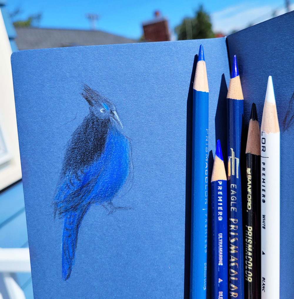 |
| 9/7/22 Steller's jay (colored pencil) |
A couple of weeks ago after sketching a Steller’s jay on black paper, I got the idea to try it on dark blue, too. The next time a jay posed on our deck, I was ready (dark blue paper is not just for supermoons!). The blue paper gave me a head start on trying to capture all the subtle variations in blue hues that I could see in its feathers. In this case, I wanted the bird’s blue to be as intense and saturated as possible while still being dark blue. But if the subject matter requires subtler, less saturated hues, maybe the paper should be a complement? I see exciting and fascinating experiments in my future!
I like the grapes done with the primary triad. Will be looking forward to more cps on different colored papers.
ReplyDeleteThanks! I'm looking forward to more experiments!
Delete