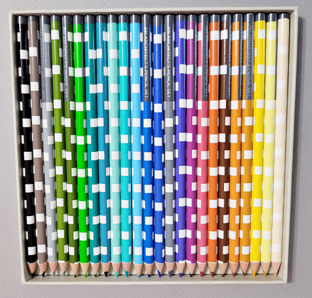
At least a year or two ago, I had spotted an interesting set
of colored pencils online. Although the theme caught my attention, I knew the
pencils would likely be disappointing, so I kept those 25 dollars in my pocket
(see, I do occasionally exercise willpower). Fast-forward to a few weeks ago,
when I was perusing the unusual and unique wares at Princeton Architectural
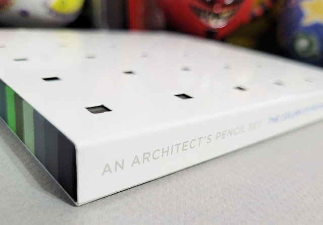
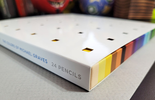
Press. There it was again: An Architect’s Pencil Set: The Colors of Michael Graves
– but on sale for 6 bucks! Score!
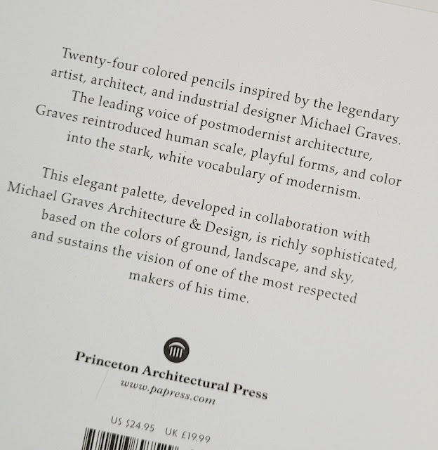
I didn’t know much about architect, industrial designer and professor Michael Graves (1934 – 2015), so buying the set prompted me to learn more about him. In addition to award-winning architectural work, he was also well known for consumer product designs for companies like Alessi, Target and J.C. Penney. The New York Times described Graves as “one of the most prominent and prolific American architects of the latter 20th century, who designed more than 350 buildings around the world but was perhaps best known for [a] teakettle and pepper mill” (quoted by Wikipedia).
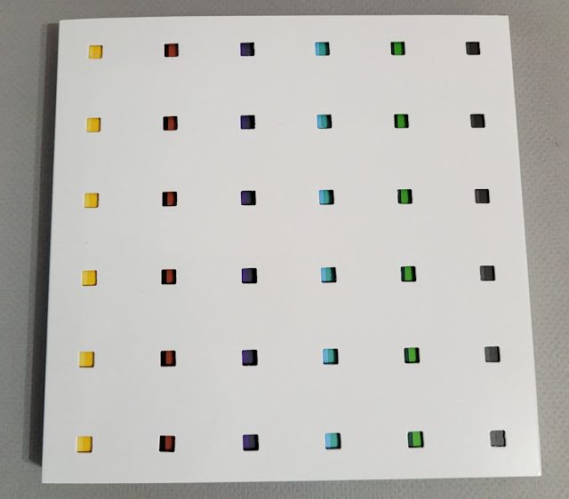
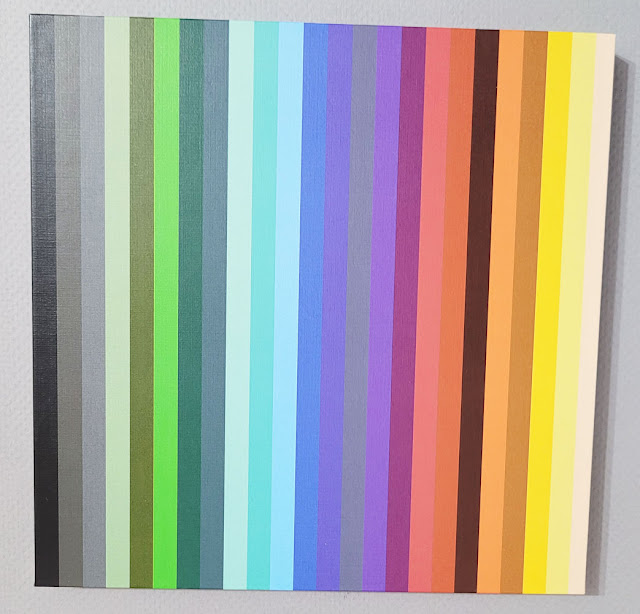
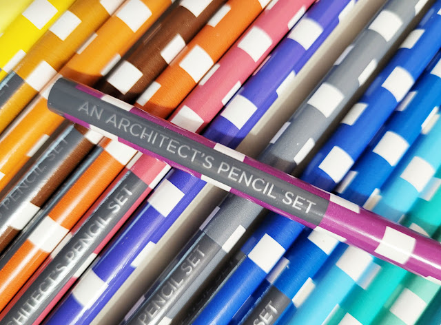
As I had surmised, the pencils are nothing to write home about, but the chosen palette is what makes this set intriguing. The enclosed brochure, taken from text Graves wrote in 1990, explains his concepts for how color can be used in architecture:
“If we use nature as a reference, then the floor refers to the ground, the ceiling to the sky, and the columns to trees. Interpretation in color would call for warm, heavy tones at the base of the structure, shades of green in the middle range, and cool, light yellows or blues at the top – colors of the ground, landscape, and sky. . . .
“Although color is two-dimensional, when used in this way to replicate nature, we understand it in three-dimensional terms. If a surface is painted terra-cotta to allude to brick, our first association is with brick, in its full depth. Even though we are conscious that the color is applied to a surface, we see color first as representational. To some degree, therefore, it possesses the quality of an object.”
Learning Graves’ principles of architectural color is certainly worth 6 bucks! Not to mention the packaging – what a visual delight! I’ll stop talking now so you can enjoy the pictures.
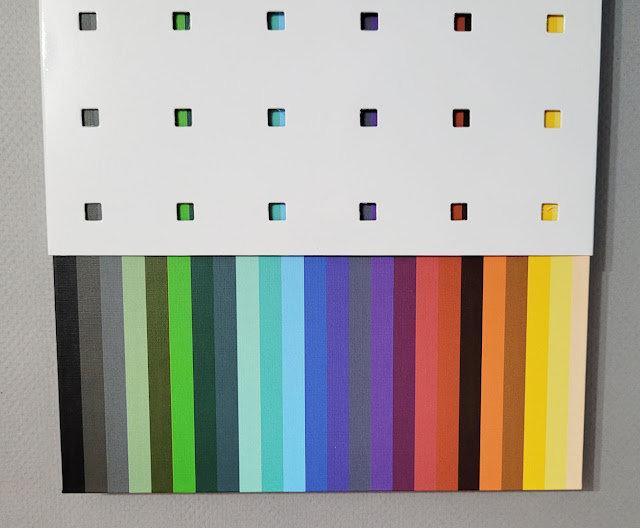 |
| The outer box is perforated to reveal color stripes on the inner box that correspond to the pencil colors. |

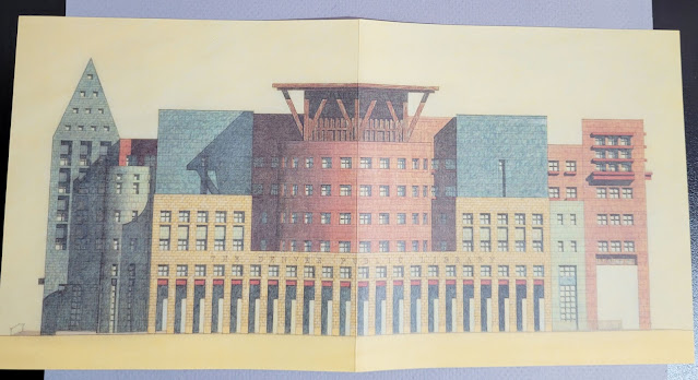 |
| The opened brochure shows a rendering of the Denver Public Library, 1995 |
Love the packaging and the design on the pencils!
ReplyDelete