Showing posts with label chalk pastel. Show all posts

Wednesday, October 22, 2025

White on Black at Asian Museum


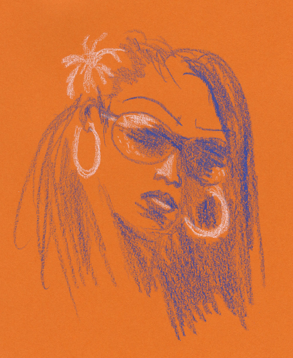
10/19/25 Lokeshvara with raised arm, 11th century Cambodia, Seattle Asian Art Museum
(white colored pencil, chalk pastel on black Arteza paper) 

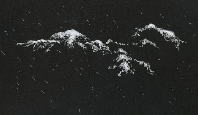
Followers of this blog know how much I love making nocturnes during the darkest part of the year, especially around the holidays. I’ve also occasionally enjoyed doing life drawing (when the model had sufficiently dramatic lighting) using white pencils on black paper. I had never thought to use white on black to draw museum sculptures, but it actually makes a lot of sense, since museums typically allow only pencil use inside the galleries. When I saw that Gage was offering a unique workshop on this subject, it blew my mind open.

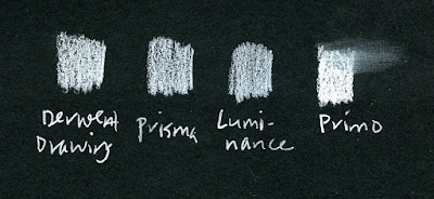
Taught by Rebecca Strong, the three-hour workshop had a single, distinct focus: Draw a sculpture at the Seattle Asian Art Museum using white pencils on black paper. In her supply list, she mentioned a number of types of pencils – white colored pencils as well as pastel, chalk and so-called “white charcoal.” She offered to share her own pencils, and we could also bring whatever we already owned. (I had to laugh at that part: If I brought “whatever” I already owned, it would be quite a load! But I do love it when I take a workshop and don’t have to buy a single new thing!)

Avoiding drawing lines, we were instructed to squint to see tonal values more clearly and use white media to shade only the light. After a short demo, she let us loose in the exhibits that housed the most sculptures, and we were to choose one to draw.

A simple supply list: black paper and an assortment of white pencils.
In the same way that we use a range of grades from hard to soft when working with graphite, Rebecca suggested using a range of white pencils from hard to soft. I started with a Stabilo All (Im not sure what that pencil is made of, but it is billed as a marking pencil that can write on glass and metal) and Faber-Castell Polychromos as my harder “grades.” I then moved progressively softer and more opaque with Prismacolor, Holbein and finally a Conte pastel pencil. The Conte worked especially well as a smudgy background on the right side of the drawing.

As it always does when I draw only the light, my brain had to do a rollover. Of course, my tonal work in colored Uglybooks the past several years certainly helped me make the rollover more quickly. Using nothing but pencils, the result is more interesting and dynamic than it often is (at least for me) using only graphite.

What a fun challenge! I see myself visiting more museums this winter with this new focus in mind and more white pencils in my bag.

Wednesday, February 1, 2023

Portraiture as Playground

1/23/23 Pitt Artist pen and Prismacolors in Uglybook sketchbook

My portraiture practice based on Earthsworld’s photos has become an excellent playground for trying different media as well as approaches (for those of you who do not have access to Instagram, that link above goes to his website instead). At right, I again used a colored “grisaille” with a Faber-Castell Pitt Artist Pen, this time in dark, cool green. Inspired by the pale green Uglybook paper, it was an odd choice for a portrait, but I thought the complement with the mostly red Zorn palette would be interesting, and I’m pleased with the result.

The portrait below was a dabble in Caran d’Ache pastel pencils. Despite my ongoing aversion to the messy dust they produce, I keep wanting to explore pastels because of their vibrant opacity. I worked on it one evening up to the point shown at left. When I looked at it in the morning, I realized what it needed to make that brilliant white hair pop – and what an easy fix! I also used a stump to blend the facial colors a bit.

1/24/23 Pastel pencils in Uglybook
1/25/23


For the next two portraits, I tried some Stabilo Arty brush pens. Yikes – markers can be so harsh and unforgiving! Apologies to these models!

1/26/23 Stabilo Arty brush marker in Uglybook

Below, I tried one with a vintage Walnut Hollow Farm colored pencil, which was such a delicious match with the slightly toothy Uglybook paper. (I was given a few colors of these rare, much-sought, long-extinct pencils, which are now on my eBay saved-search list!)

1/28/23 Walnut Hollow Farm colored pencil in Uglybook

1/22/23 Bic ballpoint in Moleskine sketchbook

As much as I love to explore different media, sometimes I go back to a beloved Bic ballpoint – an instrument that I struggled with for a long time but that now feels like a familiar, old friend. I now make all ballpoint sketches with gratitude to France Van Stone, whose online courses changed both the way I approach portraiture as well as this common tool.

Most of the reference photos for these portraits were selected by the Drawing Earthsworld Challenge Facebook group. The moderator tends to choose photos that I would typically avoid – those that are either fully in shade, fully lighted from the front, wearing large hats or are otherwise “difficult” by my initial glance. This is exactly why it’s an excellent challenge for me: I am “forced” to use references I would otherwise avoid, and I always learn from them.

Saturday, January 21, 2023

More Than a Hundred and Still Going


1/3/23 Prismacolor, Derwent colored pencils (all reference photos by Earthsworld)
When I first started practicing portraiture in late September, I didn’t commit to a certain quantity, frequency or time span (other than the 31 days of InkTober). Initially inspired by France Van Stone’s crosshatching course, I figured I would keep going for as long as I was challenged and engaged and stop when I felt like it. I recently decided to collect all my Earthsworld-inspired portraits into a Flickr album, and I found I had made more than a hundred. (Please check out the album – the grid of faces is visually fun!)

Before I began this self-challenge, I had always been reluctant to take on portraiture because there’s such a natural pressure to capture resemblance when drawing a face. Although resemblance is still hit and miss (I’m trending in the direction of more hits than misses lately), the biggest change I’ve observed is in my ability to capture the essential facial gesture more quickly and without hesitation. In the early part of the hundred, I often hemmed and hawed about how and where to begin and fussed about measuring or not. Somewhere along the way, I began to simply pick an Earthsworld reference photo and draw it – no fussing at all. (If I’m too lazy to choose, I simply go to the Drawing Earthsworld Challenge Facebook group and draw whichever face the moderator has chosen for the day.) If I have any hesitation, it is in choosing the medium (a process which, of course, I relish).

1/4/23 Neocolor I

1/4/23 Neocolor I (same photo reference as above)
I enjoy practicing different approaches – looser and more gestural as well as more precise and detailed. I want to practice in a variety of ways so that the approach will be my choice – not a default setting. 

1/5/23 white charcoal, graphite

1/6/23 Prismacolor, Derwent colored pencils

I would like to eventually practice on more live models, which I still believe is the only way to study portraiture thoroughly. But there’s also much to be said for the vast variety and range of faces I have practiced drawing by using Earthsworld’s photos – a far greater variety than I could ever draw in a life-drawing studio (even a good one like Gage, which is well known for bringing in excellent, varied models). Any book on portraiture will give you the handy guidelines for proportions and placement of features on the average human face. After making more than a hundred of these portraits, I’m here to say that no face is “average”! Humans and their utterly unique faces are fascinating to study and draw, and each must be studied as a unique exercise.

1/11/23 Bic ballpoint 

1/11/23 Neocolor I (two takes on the same photo reference)

An Instagram follower recently commented on one of my portrait posts: “although I find your earthworld [sic] subjects ugly and non-inspiring, your approach as well as the rendering are noteworthy and a great source of inspiration for my own learning.” I was happy to hear that this follower was inspired, but I felt that she had entirely missed the point. If we draw only people we deem attractive and “inspiring,” our screening process will keep us from practicing as much – and the whole point is practicing.

1/11/23 Bic ballpoint

1/13/23 Nero pencil, chalk pencil

As long as I am engaged, challenged and having fun, I’m going to keep practicing. 

1/13/23 Prismacolor

1/14/23 Bic ballpoint

1/15/23 Bic ballpoint


1/15/23 Prismacolors

1/15/23 graphite

1/16/23 colored pencil


Wednesday, January 5, 2022

Mini Review: General Pencil Primo Bianco


12/28/21 General Primo Bianco white charcoal pencil in Stillman & Birn Nova sketchbook

Sketching all the nocturnes put my head back into using black paper again. Since snow on gray paper wasn’t cutting it for me, it was time to try black. It wasn’t night when I sketched the snow-covered fir boughs, but the branches were dark enough that the high contrast was ideal. One thing I always struggle with when drawing trees is showing the branches that are growing toward me (as opposed to all the branches growing sideways, which are easy to indicate). Looking at and drawing only the snow somehow made it so much easier to draw those branches. And Im also happy that I captured the lightly falling snow.

I haven’t written a full review or otherwise said much about General Pencil Company’s Euro Blend Primo Bianco pencil, but it’s probably the most opaque white, dry material I’ve tried. I have used it occasionally at life drawing for highlights on tan paper, but I gave it the biggest workout during my pandemic hand series on red paper when I was drawing with my non-dominant hand. Since it’s made of “white charcoal,” it requires very little pressure to make a bright white mark. The comparison below with some of my more opaque white colored pencils shows one layer of each material using medium pressure. As you can see, white charcoal does smudge, but I love how easy it is to apply and show subtle variations in opacity.

From left: Derwent Drawing Pencil, Prismacolor, Caran d'Ache Luminance, General Primo Bianco

What exactly is “white charcoal” (which sounds like an oxymoron)? General’s website is not forthcoming. According to a Google search, it is “made by charring the wood at a relatively low temperature for some time, then, near the end of the process, raising the kiln temperature to about 1000ºC to make the wood red-hot. The charcoal is then pulled out and quickly smothered with a covering of powder to cool it.” Another source says it’s the same as chalk pastel, while another says it’s “calcium carbonate and a binder.”

I guess that means I still don’t know. I do know, however, that I love using it on black paper, and that’s good enough for me.

Sunday, April 11, 2021

Hope and Heartbreak


My week began with hope and jubilance: Receiving my first jab symbolized the beginning of the end of a virus that has taken so many. Science wins, patience and good sense win, and those of us who have survived all win against a formidable foe.

The next day I received the news: After five months of fighting COVID-19, Toni had passed away of pneumonia. Just when we all thought she had turned the corner toward recovery, our hearts were broken.

There are no winners after all.


This week I focused mostly on giving my right hand a workout with a brush. Initially I had thought that a brush, which requires more control than a pencil or other dry materials, would be even more challenging for my nondominant hand. But it’s challenging with either hand, so my right is not disadvantaged by much. In fact, the brush requires less pressure than dry materials, so my right did about as well as the left. Even after a six-month break, my right hand apparently remembered how to ride a bike.

I received my first Pfizer dose on Day 386.

I think I’ll change it up again for the remainder of the series, which will end on Day 407 when I receive my second Pfizer dose.


Sunday, April 4, 2021

Sitting on My Hands


After all the teeth-gnashing, hair-pulling frustration we went through to find Greg a vaccine appointment a month ago, my process seemed almost anti-climactic: I put myself on every available waiting list on the day I became eligible and then forced myself to sit on my hands. Two days later, I was invited to make an appointment. Dose No. 1 is tomorrow.

Meanwhile, my right hand continues its workout, now with a brush, relieved that it won’t be much longer than three weeks: As soon as I schedule the second dose, this series will have an end date.


April Foot's Day!


Sunday, February 7, 2021

Mixed


This week was a mixed bag of media and styles that reflects my restlessness about this series. I want it to end. I’m tired of it – just like I’m tired of the pandemic and impatient about being vaccinated. I’m trying hard to take the altruistic high road – I realize that it doesn’t matter who gets vaccinated; what matters is that as many people as possible are vaccinated as quickly as possible, because then we are all safer.  

Then I read reports about ineligible people lying and cutting ahead of the more vulnerable by working the system with technical savvy, hospital board members “invited” to receive vaccine privileges, and, least surprising, racial and ethnic inequity in vaccine distribution – and I seethe with resentment and disdain. But then I remind myself that I, too, am among the privileged: I have easy access to technology, and I don’t work or have other needs to expose myself to risk. I can wait.

So I go back to sitting on my hands. Or rather, I draw one.


I ended my brief series of experiments with blind
contours with this one -- a blind contour shaded 
traditionally. Not bad, except for the missing finger!


Sunday, January 31, 2021

Blind

Now that I am nearing my one-year mark of drawing my hand every day, I must work harder to keep the project interesting for myself. The spoon has over-stayed its welcome as a prop, but I haven’t found its replacement yet. In desperation on Day 320, I reverted to a standby that anyone who has ever studied drawing has done: the blind contour. I find the odd tangle of lines strangely intriguing. It’s easy to see where I began, but since the rule is to avoid lifting the pen from the page, a blind contour requires backtracking many times to complete a contour. The result is like the path of a bug.

Then I did another. They are liberating because they are completely without pressure. I might do a few more.


Same pose drawn twice, each starting from opposite sides.

Related Posts Plugin for WordPress, Blogger...