Showing posts with label Rhodia notebook. Show all posts

Sunday, August 4, 2019

The Spires of Haarlem

7/22/19 Zijlstraat, Haarlem

The town of Haarlem is the quintessential type of place we like to begin a visit to an unfamiliar country: It’s calm and gentle so that we can recover from jetlag while still enjoying the local color. About a 30-minute bus ride west of Amsterdam, it was easy to get there directly from Schiphol Airport.

7/19/19 Grote of Sint Bavokerk, Haarlem
Despite the wide mix of quickly changing weather conditions – sunshine, wind, thunder, torrential rain, sometimes all within the same hour! – I sketched more per day during our four days in Haarlem than I did the rest of the trip. This small town has more than its share of distinctive church spires and towers, and I made it my mission to sketch as many as I could see.


7/19/19 Haarlem Town Hall
7/21/19 Bakenesser Kerk, Haarlem

7/19/19 Paterskerk, Haarlem

St. Bavo Cathedral has a lovely Verdigris-colored domed top that I was determined to sketch – but why sketch it from the ground? Instead, we climbed 341 narrow, spiraling steps to the top of an adjacent tower, where I could sketch the dome at eye level.

 
7/21/19 The domed top of St. Bavo Cathedral...
... and the 341 steps I climbed to sketch it!


Grote of Sint Bavokerk is a Reformed Protestant church and former Catholic cathedral located on Haarlem’s central market square (see the spire above). Only a few hours after stepping off the plane, we decided to attend a free organ concert there – and what an amazing organ it was! Jetlag was fully settling in by that point (I think we’d been awake about 30 hours by then), and despite the music, I was in danger of nodding off. To stay awake, I doodled one of the lions embellishing the top of the organ in my travel journal. Strangely, I found myself dozing off anyway, even as I drew!

 
Grote of Sint Bavokerk's organ
7/18/19 organ detail


Haarlem’s windmill was the only one I sketched in the Netherlands (though I did see them from a distance in both Amsterdam and Delft). Although it’s still fully functional, it no longer operates as a mill and is instead a museum that offers public tours. Using beautifully handmade, mechanical models, our tour guide explained how the sails operate and told us about the various industries – flour, cement, snuff, lumber – that use windmill power. I found it especially fascinating to learn the traditional “code” of the sails when they are stationary. For example, sails left at one angle signal a sad occasion, such as a death (like flags at half-mast). All sails in Holland turn counter-clockwise, which is the direction that accommodates right-handed millers (if you’re a left-handed miller, you’re out of luck – you still have to turn according to the convention).
 
7/19/19 Haarlem windmill

7/19/19 windmill tour notes


This windmill site was also the location for a sketchwalk with USk Haarlem a few days before the symposium began. Since I’d already sketched the windmill, I decided to focus on the Spaarne River that runs past the mill. It was fun to meet a few local sketchers, and I felt like it gave me a head start on the symposium.
 
7/21/19 Spaarne River, Haarlem
7/19/19 
Since Haarlem was our first stop in the Netherlands, we wanted to start trying traditional foods there, and our hosts at the boutique Malts Hotel where we stayed were very helpful in directing us. It turns out that because of Indonesia’s colonization by the Dutch in the 1800s, Indonesian food is considered part of Dutch culture. One of the best meals we enjoyed in the Netherlands was rijsttafel, an Indonesian rice dish that’s a veritable banquet of amazing flavors.

Haarlem was also where I tasted my first salt-cured haring in the traditional Dutch style: held by the tail and eaten from the larger end. (Hint: Its texture is similar to sashimi.) I regret that I didn’t sketch it first, but I wish someone had sketched me eating it.

Stroopwafel, with and without gluten

Eating herring the way the locals do
(or so they told me).


The Saturday morning market was an ideal way to sample the herring and other snacks, such as stroopwafel, my favorite cookie from Trader Joe’s. A friend who has visited the Netherlands told me that stroopwafel in Holland are exactly the same as the ones from TJ’s, but I couldn’t believe that. Surely they are more authentic and better in their country of origin! Newsflash: They are exactly the same. Still, out of principle, I bought several packages at the market to eat and take home. Greg was delighted to find gluten-free stroopwafel (which are not available at TJ’s).

Of the three cities we visited, Haarlem was my favorite. Fun without being frantic, all the architecture of Amsterdam but without the million bikes to dodge, it was just my pace and enormously sketchable. I would return in a heartbeat.

7/18/19 statue of Laurens Coster in Grote Markt
7/21/19 busker at Grote Markt

7/19/19 one of many cafes in Grote Markt

One of many canals in Haarlem

Saturday, August 18, 2018

Analog and Digital

8/13/18 Green Lake (graphite)

When my niece was young and studying both piano and violin, her father (my brother, an engineer) made an interesting observation. He said that while piano is digital (discrete units expressed in a scale), violin is analog (a continuous physical variable). It’s an intriguing metaphor that has stayed with me.

8/9/18 Summit & Boren (fountain pen and Pitt marker)
You know how fickle I am about my sketching materials. My first several years, I used ink line and watercolor. The past few years, “mixed media” has been the only accurate term for what I use. In a single sketch, I might use colored pencils, ink, Pitt markers and a brush pen together. It’s not so much that I want to use so many things at once. It’s more that certain media do things faster or more easily than others, so I grab the tool that gets the job done for the subject matter I’ve chosen or the length of time I have.

Having sketched with a wide variety of materials, I recently started thinking about the difference between “digital” art media (and here I’m using the term metaphorically, not in reference to iPad sketching) and analog media. Markers (like my favorite Faber-Castell Pitt Artist Pens) strike me as very digital tools – either on or off. When you make a mark with one, it’s a solid, discrete unit (like 1 or 0). Once put in place, it will not change. Unless you have fast fingertips like Don Colley, who can smear Pitt ink quickly enough before it dries that it can blend or have a slight gradation, marker marks tend to look streaky. Markers come in handy when I want a flat, solid surface, like shading the side of a building. But without Don’s fingers, I find it almost impossible to give soft, rounded shading to a person’s face, for example, with a Pitt.

The past couple of years as I’ve gotten to know colored pencils and graphite pencils better, I have come to realize that what I love most about both is their potential for endless, seamless gradation. They are the quintessential analog material. If you look at a pencil mark under a microscope, you’ll see that it’s made of a bunch of particles of varying sizes that adhere to the paper’s surface. The mark is a continuous physical variable, like a violin note. By smudging or applying more, a pencil mark can be changed almost indefinitely. Maybe it’s just my training in landscape drawing (with Suzanne Brooker at Gage) that influences this opinion, but pencils seem to be made for soft or organic subject matter.

Wednesday, August 15, 2018

Drawing Nature – This Time From Life

7/31/18 Tree study at Volunteer Park

A few days after I returned from Portugal, I was still getting over jetlag when I hit the ground running and started a new class at Gage Academy called Drawing Nature, taught by Kathleen Moore. It’s a five-week, half-term class, which is a format that the school offers only in the summer. I’ve taken other five-week courses, and I wish they’d offer them year-round. The commitment isn’t too long to feel burdensome (in either time or cost), and it’s also a great way to try out an unfamiliar instructor before possibly committing to the same instructor for a longer term.

8/7/18 Kubota Gardens

What caught my attention when I initially read the course description was that the class meets on location in various city parks. Yes – on location! Last year when I was studying colored pencil and later graphite with Suzanne Brooker, you heard me complain about how frustrating it was to work only from photos instead of from actual landscapes. Although I understand why learning from photos is useful and even necessary, and I certainly learned more that way than I ever could if I had to work with unpredictable factors like weather and shifting light, I still missed the energy and real-ness that comes only from drawing on location. So when I saw that this late-summer class would meet only outdoors and not in the classroom, I couldn’t sign up fast enough!

Although Moore’s focus is on nature, she encourages us to include whatever human-made objects might appear in city park landscapes (such as the Moon Bridge at Kubota Gardens or the cranes at Green Lake), so it all feels like urban sketching to me. In the first two classes, we used graphite. In the third, we used ink (bottom of post). Although on the supply list she had recommended a technical pen, I talked to her about using a fountain pen instead, and she wholeheartedly encouraged me to use one. I appreciate her openness to media.
 
7/31/18 Thumbnails before starting a drawing at Volunteer Park
Before starting a drawing, we are required to make at least three thumbnails to explore composition and, more importantly, to map out the values clearly. While I’ve heard the thumbnail mantra from nearly every instructor and book I’ve studied from, thumbnails are generally used for composition study. This is my first experience with using thumbnails as a values map, and while it feels tedious, I must admit it’s helpful. Making thumbnails forces me to look for the values and consequently reject some compositions quickly if I see that the value contrasts might not be strong enough for a good drawing.


8/14/18 Green Lake

Friday, May 26, 2017

Italy, Part 5: Sketch Kit Follow-Up

Sketch materials I used most in Italy (and at home)
As I do after every major trip, in this post I take a look at the sketch kit I brought to Italy and review how well its contents worked for me. (You can see the detailed contents here.)
  • It’s no surprise that my most-often-used implements are the same as those I use most often every day (and used most often during my last international trip): a fistful of water-soluble colored pencils; a Sailor fude fountain pen filled with waterproof Platinum Carbon Black ink; a waterbrush filled with slightly diluted Iroshizuku Kiri-same ink (a warm gray that I used frequently for shading); and a Zig Mangaka (non-hairy) waterproof brush pen. Without actually counting, I’d say that 90 percent of my sketches were done with the combo of colored pencils, the fountain pen and the ink-filled waterbrush. I had expected to use the Mangaka brush pen regularly in the Field Notes notebook I brought along, and I did, but I also used it several times for larger sketches, too. (It’s currently my favorite non-hairy brush pen because the tip has held up a long time without mushing down as many do.)
  • I used every one of the 25 colored pencils I brought. Of course, I used some colors more than others (especially the secondary triad palette; more on that in a future post), but they all got used well. It was satisfying to know that I had chosen my palette well. The only specific pencil color I missed was the verdigris I found useful in France a couple years ago. The photos I had seen of regions in Italy we were visiting didn’t show much of that color on buildings and monuments like the ones we saw all over France, so I didn’t think I’d need it. I was able to mix it easily enough with the colors I had when I needed it, but it would have been a convenient pencil to bring along. (It’s going to become a permanent part of my European travel palette!)
Waterproof Rickshaw Bagworks Zero messenger
  • Speaking of colored pencils, it was a bit of a gamble taking my Tran Portfolio Pencil Case on the trip because I had been using it for only a couple of weeks. It was serving me well at home, but I still considered it unbroken-in. A worthwhile gamble, it turned out to be the single-most functional part of my sketch kit (in addition to the bag itself, of course, which is the waterproof version of the Rickshaw Bagworks Zero messenger bag). Whether standing or sitting, the pencil case made it so easy to see all my pencils and grab the ones I need.

    The Tran Portfolio Pencil Case -- the single-most functional part of my sketch kit.
  • I regretted that, at the last minute, I decided to fill the Sailor Cross Point fountain pen with Platinum Carbon Black instead of the water-soluble ink I had initially planned on. My logic was that I always use waterproof ink with water-soluble colored pencils and generally use water-soluble ink only when I want quick shading on sketches of people or small objects, so I felt better having the second waterproof-ink filled pen as a backup. But the few times that I sketched people or small objects, I really missed having water-soluble ink and the quick washes it makes. My daily-carry bag always contains at least one pen of each ink type, so I should have stayed with the tried-and-true.
  • I had swapped out a second Sailor fude for the Sailor with the broader Cross Point nib, which I thought would be an interesting option when doing larger scenes (like those cliffside houses in Positano). It gives me a bolder line than the fude, but not quite as broad as a brush pen. I did have fun with it several times, but the Cross Point just isn’t as versatile as a fude.

    Filled in Italy (from left to right, top to bottom): Field Notes notebook,
    pocket-size Rhodiarama journal, A5 size Stillman & Birn softcover
    landscape-format Beta sketchbook, three 6x9 signatures
    (to be handbound soon)
  • On previous trips of about the same duration, I’ve typically filled five to seven of my usual 16-page, 6-by-9-inch sketchbook signatures, so halfway through our trip, I was surprised to find that I was filling them at half the usual pace – and yet it didn’t seem like I was sketching less. (I ended up filling three of those signatures.) That’s because the dark horse of my sketch kit turned out to be my landscape-format Stillman & Birn Beta softcover sketchbook! I realize now that I didn’t even include it in my bag dump post because I think of it as an optional supplement to my standard sketchbook, and sometimes I don’t have room for it. Wherever I go, I often find one or two uses for a long, skinny sketchbook spread, so it’s nice to have, but not essential. I sure wasn’t expecting to make 12 full landscape spreads in that sketchbook in Italy! Whether held vertically or horizontally, I used it for both hillside scenes and panoramic skylines. It was more essential than I realized! (It bothers me a little that I now have some of my favorite sketches from the trip in a separate sketchbook that won’t be bound into my main Italy sketchbook, but I guess I can’t have it both ways.)

    Just a few moments captured in my Field Notes.
  • An important supplement to my main sketchbook continues to be my Field Notes notebook. This time I chose a multi-colored one that a friend made for me by disassembling red, blue and yellow Sweet Tooth books and reassembling the pages so that the page colors alternated. It was perfect for Italy’s candy-colored landscape! This little book, which takes so well to black brush pens highlighted with a white gel pen, was essential for sketches that I had only a few minutes for – a snoozing cat; a detail of an interesting water feature; fellow train travelers. I use one regularly in my “normal” life too, but it’s especially useful on the go. The small, informal format is ideal for capturing the small moments that might otherwise get lost because they aren’t the big scenes I tend to look for when I travel.
  • The only items I didn’t use at all were the two graphite pencils. I had a feeling that would be the case – I rarely sketch with graphite except in the colorless winter months – but they weigh almost nothing in my bag, so I had left them in. I might as well take them out until winter.
    Sketching in Bellagio on my Daiso stool.
  • My little Daiso stool made it into my suitcase, and on at least a couple of occasions, I was happy to have it. As usual, I chose to stand when making most sketches, mainly because I got a better view or composition that way. But at certain times a lower viewpoint was useful, and the stool made sketching much easier.
  • Although it’s not related to the sketch materials I brought, I did have one disappointment: Despite our water-focused itinerary, I didn’t get close enough to any body of water (lake, sea or canal) to fill a waterbrush. I had fun incorporating ancient Roman spring water from Bath and the Pacific Ocean from L.A. into my sketches when I had filled waterbrushes from those sources on previous trips, but trying to dip into a Venice canal seemed precarious at best (maybe I should have befriended a gondolier for the task?).
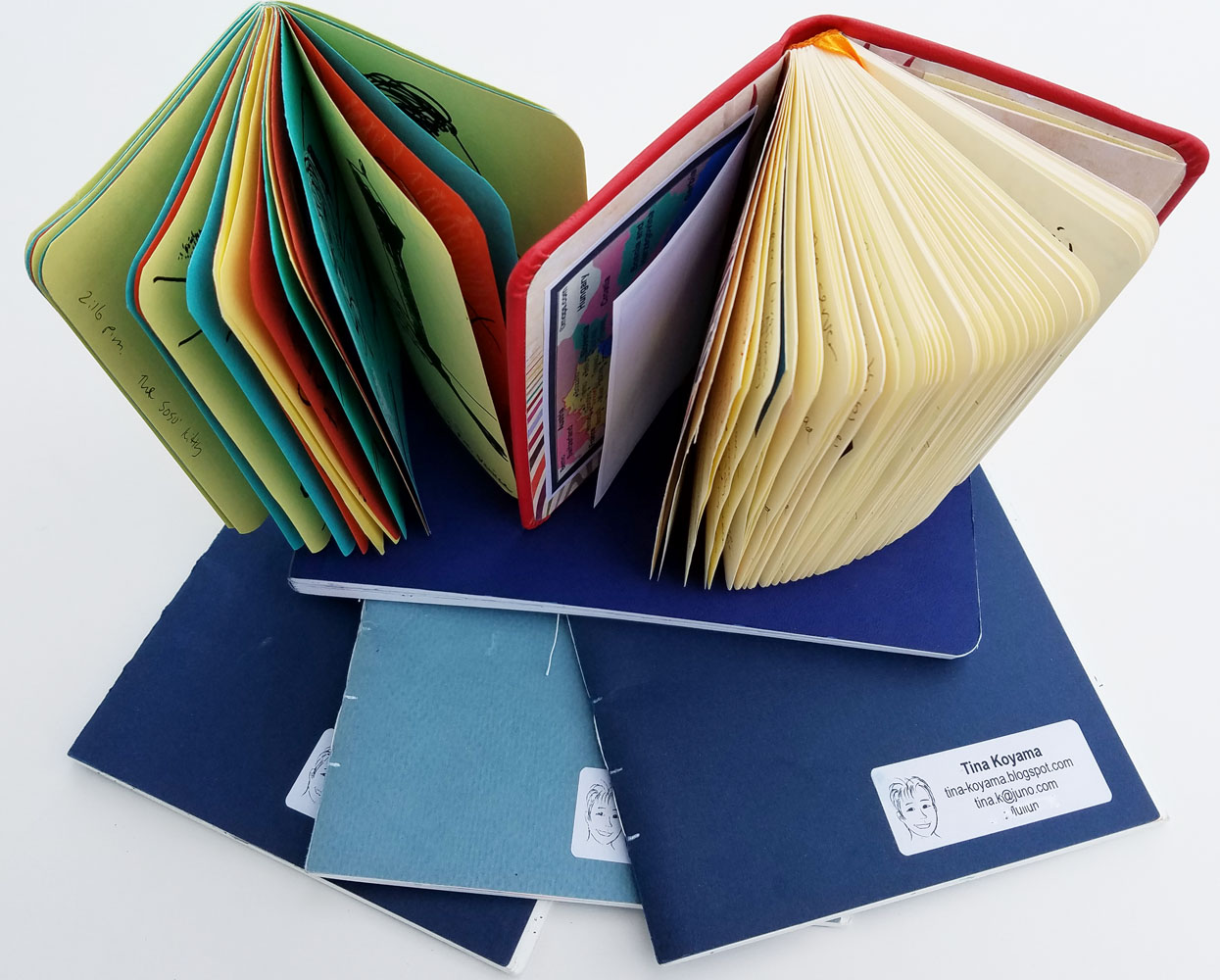
  • Also technically not part of the sketch kit but worth mentioning is the Rhodia Rhodiarama pocket-size notebook I used as my journal. I’ve used these sturdy, hardcover notebooks as travel journals for several years now, and they continue to serve me well as a receptacle for writing, collage and Zip printer photos. (I used to also make small sketches in them, but now I use the Field Notes for that.) During downtime while riding trains or in our hotel room or flat in the evenings, I enjoyed reflecting on my experiences, gluing in ticket stubs and receipts and printing out one or two favorite photos from the day’s explorations to stick into the journal.

Key Learnings

  • When in doubt, stick to my usual daily-carry materials (such as two Sailor fude pens, one with water-soluble ink and the other with waterproof). If they serve me well day-to-day, there’s no reason to think I’d need something different just because I’m traveling.
A versatile secondary triad palette
  • I carefully selected a useful colored pencil palette, especially the secondary triad part of it. I like it so much that I think it might be versatile enough to use here in little ol’ Seattle as well as Italy. I’m going to leave the selection in my bag for a while and see how it does at home.
  • I now realize a landscape-format sketchbook is an essential part of my travel sketch kit – not an optional supplement – because I can’t always predict when a particular location is going to be well-suited for a long, skinny page. I’m happier than ever that Stillman & Birn came out with a softcover version that packs well.

Thursday, August 18, 2016

UK, Part 5: Sketch Kit Follow-Up and Swag

Most-often used items in my sketch kit.
I know this is the post you’ve been waiting for – the one in which I review which things I used most in my sketch kit and which I could have left at home and never missed. (My complete bag dump shows everything I brought.) It’s actually a favorite and important post for me, too, because it helps me evaluate what I bring on future trips (and what I keep in my bag day to day). Here are the results:


  • Of no surprise at all was the fact that the things I used daily were the ones I also use most regularly when I’m not traveling: my Sailor fude fountain pens; a Kuretake brush pen; a waterbrush filled with gray ink; and about eight basic colored pencils.

  • As usual, I brought a few ink refill cartridges just in case I ran out of ink – but I didn’t (one fountain pen and the brush pen came close to running dry, though). However, they take up little space in my bag and weigh nothing, so I suppose there’s no harm in packing them for peace of mind.

  • The bag dump photo shows four fountain pens; I actually took one out at the last minute, but even that third one never got used (at least for sketching; I did use it for journal writing, however, so it still earned its keep). Two are all I ever need – one with waterproof ink; one with water-soluble ink.

  • Although I didn’t use Zig markers often, when I did, they were super-handy for making bright spots of color very quickly. They earned their keep in my bag several times.

Watercolors: Not used much,
but still essential.
  • The thing I hardly ever used surprised me somewhat: my watercolor box. While sketching at the symposium, I learned immediately that I had to keep things as simple as possible. Most of my sketches were done while standing on drizzly and sometimes very windy sidewalks under tight time constraints. Although I know many sketchers use watercolors under these conditions (check out Kumi Matsukawa’s symposium posts in which she uses watercolors beautifully with the same constraints), I just find it easier and simpler to grab pencils or markers for spots of color. Even when I had more time after the symposium, I still tended to use the same simple materials. I guess that’s not really a surprise – I’ve been leaning away from watercolors for a while now. But. . .

  • Despite the little I used watercolors, I still can’t leave them out entirely. A few times in Wales and Bath, I had the time and stable conditions to make more leisurely sketches that deserved watercolors, and I was very happy I had them. Again, my Trader Joe’s mint tin of paints takes up very little space; I may as well have it.

One of many brews captured in my Field Notes. The blue
paper is pale enough that I could even use colored pencils on it. 
  • A few other daily users were the pens I like to use specifically in colored Field Notes notebooks (more on that shortly) – a non-hairy brush pen and a white gel pen. Since I brought a light blue notebook instead of my usual red, I was even able to use colored pencils occasionally (when I wanted to enhance the brew effect ☺).

  • Several colored pencils that I had chosen specifically for the trip (based on Google images of the places I would visit) turned out to be less than useful. The particularly warm tan of all the buildings in Bath eluded me – I didn’t have that pencil with me at all! But my shortage forced me to mix a close color with what I had, so it wasn’t really a problem. Ultimately I brought too many colored pencils – or not the right ones.

    My sketch of Elizabeth Alley that
    I donated to the USk auction.
  • I relied on the waterbrush filled with sky-blue Iroshizuku Tsuyu-kusa ink frequently when I wanted a streak to simply represent the (rarely) clear sky. The one with Chiku-rin, which I use for splashes of foliage, will probably be taken out of my bag permanently. More and more, a lower-maintenance colored pencil does the same job.

  • The Stillman & Birn spiral-bound hardcover Beta sketchbook in the 10-by-7 size that I had gotten specifically for the symposium worked perfectly as intended. The hardcover back gave me a stable base for sketching while standing, and the size was ideal, too. I sketched on only one side of each page until I filled the book, then I started working on the back sides of a few. My intention was to donate at least one sketch to the auction, which I did, and the spiral binding made it easy to remove. The book was an excellent solution for that specific need.

  • As for the rest of my sketches? I was as happy as I always am with my hand-stitched signatures, and I look forward to binding them into a cohesive single volume from the trip. I filled only five of the seven signatures I’d prepared, however (I forgot to account for all the sketches that would go into the S&B during the symposium).

Left: Rhodia Rhodiarama notebook nearly full of journaling, photos, ephemera.
Right: Field Notes showing a little wear-and-tear from daily use but also
full of UK memories.
  • Perhaps the biggest surprise of all was how I used my Rhodia journal in relation to a blue Field Notes notebook (that I almost didn’t bring). For the past three years, I’ve been happily using a pocket-size Rhodia Rhodiarama notebook as my travel journal (nearly filling one on each trip). Small enough to fit in any bag or pocket, it has paper that takes fountain pen beautifully with sizing that allows the ink to wash nicely. It’s been a great catch-all book for travel musings and memos, ephemeral collage and small sketches made in trains and cafés.

    But the past several months I’ve been having so much fun filling red Field Notes notebooks with exactly the kind of sketches I’m likely to put into the Rhodia that at the last minute I decided to take a blue one along to the UK (I still prefer red for the way it makes highlights pop, but it was fun having a different color while traveling). I feared the two notebooks would be redundant, and I’d waste time waffling over which notebook to sketch in. As it turned out, I hardly sketched in the Rhodia at all because I’ve grown so fond of the brush-pen-and-white-gel-pen combo that goes so well with colored paper. I completely filled the Field Notes with random chimney pots in Wales, heads in trains and planes, and all the brews I sampled throughout the UK.


    As for the Rhodia journal, it wasn’t wasted or redundant, either. Although I didn’t sketch in it, each evening as I relaxed in our hotel room, I’d pick out just two or three of my favorite photos of the day and print them with my
    Polaroid Zip printer. The self-adhesive ZINK paper made it easy to put them into the journal, and the sheets are exactly the right size. Filled with those photos as well as ticket stubs and other ephemera to accompany my notes and thoughts, the 192-page book came home with only a dozen or so empty pages. Although I would have preferred to keep doodly sketches in the same book as the writing, I’m happy that each book filled different needs without redundancy or waste. 

    I’ve decided to make a colored Field Notes a regular part of my travel bag – just as it is now a regular part of my day-to-day bag.

Images from my camera go directly into my journal with
the Zip printer.

I know I’ve said this before, but each time I come back from traveling, I learn the same lesson: The things I take with me when I travel should be the same things I use every day here at home. The bag I carry to Wales can contain exactly the same things it contains when I walk to Maple Leaf Park. Whenever I think I need something “special” or additional, I end up bringing it home unused. (Future self, please take note and remember this!) Overall, however, I’m pleased that my kit served me well with no serious regrets.

Finally, here’s a photo of the swag bag I received at the Manchester symposium! I appreciate the months of work the symposium team went through to acquire all the goodies from sponsors. (The photo also includes some cards I exchanged with other participants.) I’ve already enjoyed trying some of the Cretacolor pencils, especially a water-soluble graphite that I used on my first sketches back home in Seattle last week. The Leuchtturm 1917 sketchbook also looks interesting. (They come in a variety of colors, and I managed to snag a bright pink one!) As a keepsake, though, nothing makes me happier than the symposium-logo tote bag that all the swag came in. I’ve used and abused my Barcelona and Paraty symposium totes for years, and I look forward to doing the same to my Manchester bag.

Swag from the Manchester symposium!

Tuesday, June 14, 2016

Simplify, Complicate: My Multi-Book Life

My many daily-use books. From left: Field Notes for memos, DIY journal/log book
(Rhodia notebook), DIY planner (Leuchtturm notebook), hand-stitched signature
for most of my sketches, red Field Notes for more sketches
Some things get simpler even as others get more complicated.

Years ago before I had started sketching, I saw the sketchbooks and art journals of Roz Stendahl, Cathy Johnson, Liz Steel and Danny Gregory (among many) and so admired the way they artfully integrated their words and sketches on the same page. I loved the idea of making a book containing the “story” of my daily life in both words and pictures. As a lifelong journal writer, I was used to filling pages with words, but making pictures on the same pages felt like stilted, self-conscious add-ons. I tried it off and on, but the practice never lasted. (It further convinced me – falsely– that I must be a “word person” and not a “visual person.”)

When my urban sketching habit finally took hold, I had no problem filling sketchbooks (even when one cost $160!) – I burned through page after page without hesitation. But whenever I tried to write and sketch on the same page, both the writing and the sketch felt tight, restricted, uncomfortable. If I could both write and sketch with ease, why was doing both on the same page so difficult?

A minor reason was incompatible papers. I don’t like writing on thick, toothy paper that I prefer for sketching. While I enjoy using a fountain pen to sketch with, I write much faster than I draw, and the slight drag of the nib on cold-press paper when I’m writing annoys me. I also don’t like using wet media on thin, smooth paper that I prefer for writing.

But the more significant reason is related to privacy: I want to share my sketches but I have no intention of sharing my journal writing. If I put a sketch online, I don’t want to have to digitally blur the writing surrounding an image. If someone asks to see a sketchbook, I want to be able to hand it over without hesitation. And most important, I don’t want either my writing or my drawing to be hindered by whatever else might be on the same page.

My DIY planner
Once I understood this, I accepted that my sketchbook would never be the words-and-sketches kind I admired of others – and that it was perfectly fine to have a separate book for each task. But that’s when things got complicated.

For the past several years, my planning and journal keeping processes have become more and more streamlined, and I’ve gotten them down to two A5-sized notebooks that I’ve DIY’d into a planner and a journal/log book. So at least my writing life has gotten simpler. (Oops, I forgot about my occasional travel journal. . . more on that later.)

My sketching life, however, has gone both ways. After experimenting with many sketchbook sizes, types and formats and using several simultaneously, the past three years I’ve been very happy binding my own in a single consistent format – apparently the only way to get everything I want. That simplified my primary sketchbook need beautifully. But I’ve also always had a secondary need – a smaller, catch-all sketchbooklet that I could pull out quickly and use with simple materials. After going through nearly every commercially produced pocket-size notebook, ranting about the crappy papers in them, I finally resorted to the same DIY solution: making my own.

Field Notes Workshop Companion: Just right for both sketches
and notes.
For a while I was happy with those – a large and a small sketchbook, both portable, both handmade. Then last summer I stumbled upon a surprise: Field Notes finally came out with an edition containing paper I could happily sketch on. I started using the Workshop Companion for small sketches as well as memos and other brief notes when I’m out and about; I was able to eliminate the small scratchpad I used to carry for brief notes. And I decided I liked the Workshop Companion well enough that I wouldn’t have to make my own sketchbooklets anymore.

Then a few months ago Field Notes surprised me again – with the Sweet Tooth edition’s booklet of red paper! You know from my recent sketches how much fun I’ve been having with those (I’ve filled three so far, and I’m on my fourth). I may eventually go back to white or lighter colored papers, but in the meantime, I’ve bumped up against another complication. Since the red paper is a little too dark to take notes on easily, I’ve had to start carrying an auxiliary notebook just for memos again. One step forward, two steps back.
Messy notes and sketches in my auxiliary Field Notes.

And then there’s still the occasional need for a travel journal, which is currently being met by a pocket-size Rhodia notebook. When I travel, I leave my planner and journal/log book at home, so the pocket Rhodia serves both those needs. It holds not only my written musings; it also contains reference information; glued-in ticket stubs and other ephemera; even some sketches. (Interestingly, my travel journal comes closest to the fully integrated words/collage/drawings book I’d always wanted – and what a beautiful mess it always ends up being!)

Just recently I started pondering whether I could use red or Workshop Companion Field Notes instead of the Rhodia. . . ? One Field Notes is certainly slimmer and easier to carry than the chunky Rhodia, but I’d need four of five of them to match the number of pages I typically fill in a Rhodia. Can I stand having all those separate books for one trip? (The one with reference info I need will inevitably be the one I happen to leave back at the hotel.)

My France travel journal filled with writing, sketches and
collage (pocket-size Rhodia notebook).
Some things get simpler even as others get more complicated. 
Related Posts Plugin for WordPress, Blogger...